


Small Act is a hydration and wellness brand built on clarity. Their mission is simple: remove the noise and return to what’s essential. In an industry crowded with sugar, additives, and claims, Small Act offers a different approach — one rooted in honesty, precision, and calm.
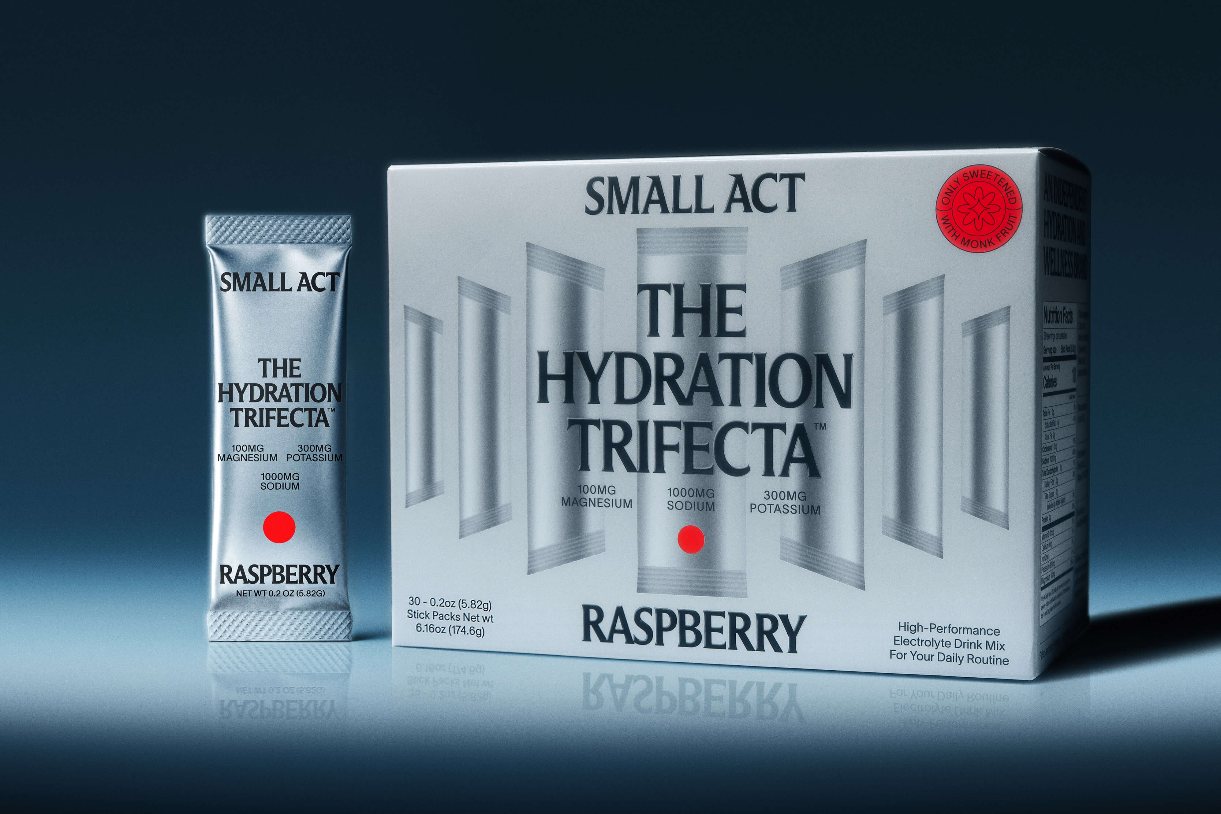
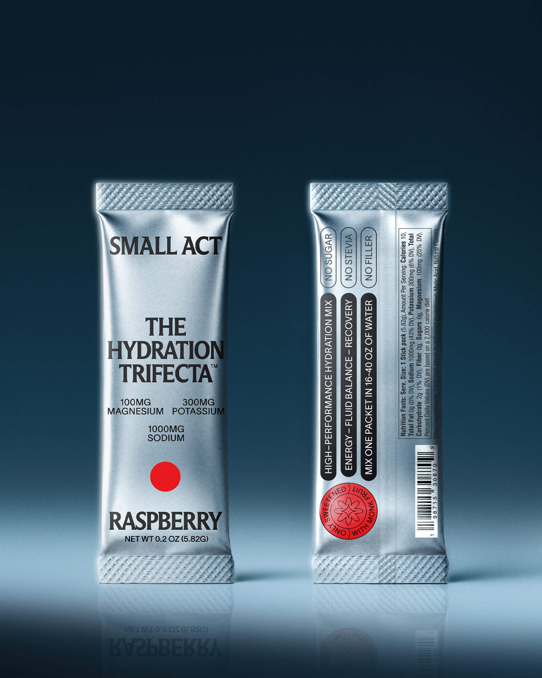
Their first product, The Hydration Trifecta, combines three key electrolytes that form the foundation of true hydration: sodium, potassium, and a highly absorbable form of magnesium. Nothing more. Each mineral plays a vital role in restoring balance and supporting energy, yet together they create a formula that feels effortless — effective without excess. There’s no sugar, no stevia, and no unnecessary flavoring. Only monk fruit, chosen for its clean sweetness and natural simplicity. The result is a product that hydrates without distraction — a formula you can trust, built around balance and clarity.
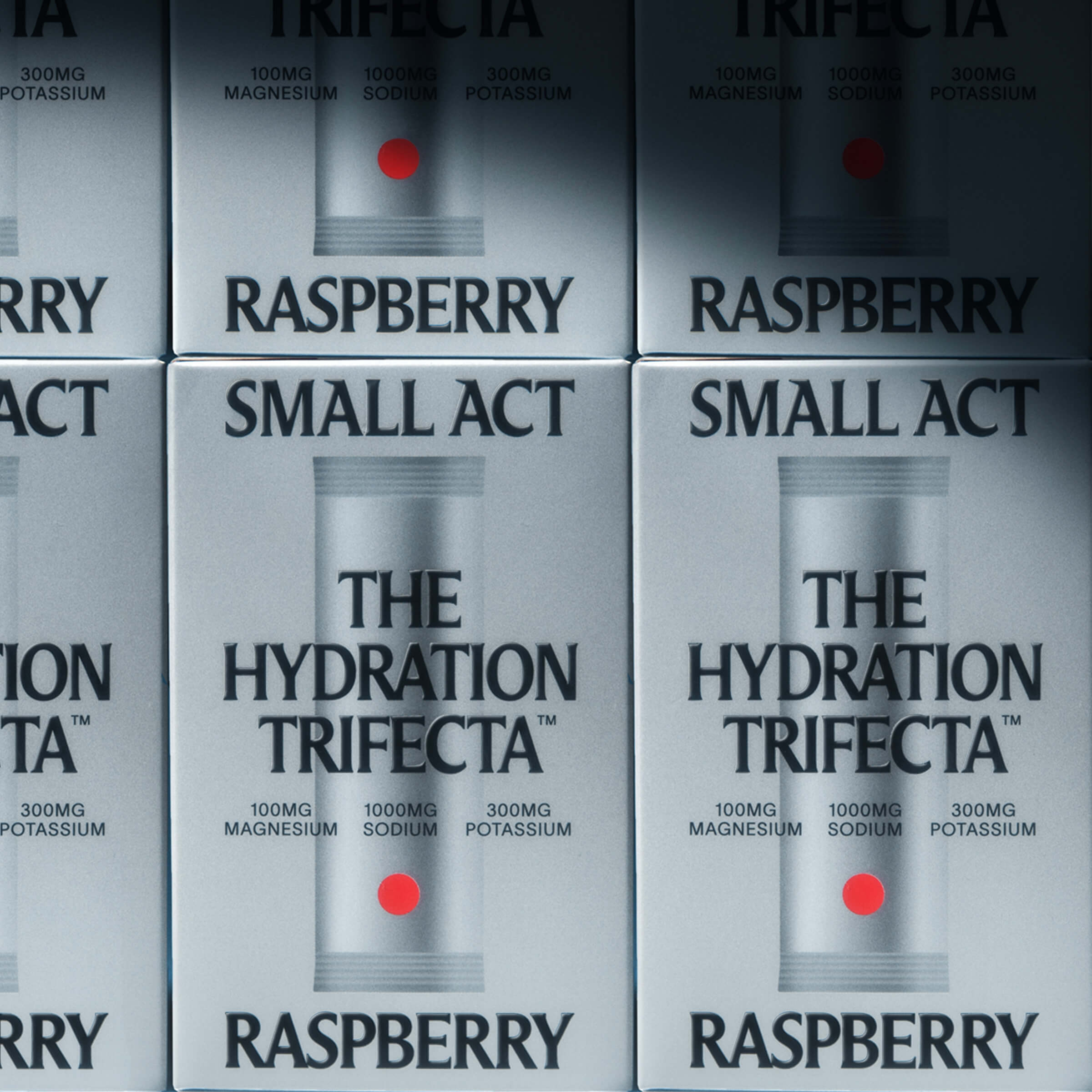
The design follows the same logic. Every decision — from layout to typography — stems from a philosophy of reduction. What’s not needed is removed. What remains serves a purpose. The system is clear, minimal, and highly structured, echoing the functional purity of the product inside. In a category defined by bright color, aggressive gradients, and constant noise, Small Act stands apart through restraint. The palette is mostly monochrome, with color introduced only where it holds meaning — a nod to mineral composition and elemental balance.
Typography carries the quiet authority of the brand. A condensed hybrid typeface — part sans, part serif — offers structure without rigidity. It’s technical but not cold, confident yet calm. The typeface lends rhythm and hierarchy, guiding the eye with clarity rather than spectacle. Composition and spacing do the heavy lifting. Information is measured, orderly, and easy to read — designed to inform, not overwhelm.
The tone of voice mirrors the visual approach: direct, transparent, and free of hype. There’s no exaggeration, no inflated promises — just a steady confidence that invites trust. Every element, from ingredient listing to iconography, contributes to a sense of precision and purpose.
The result is packaging that feels deliberate and balanced. A system where every line, space, and word has intention. Much like the product it contains, the design is efficient, honest, and composed — built around what truly matters. Through simplicity, Small Act communicates strength. Through restraint, it earns attention.


CREDIT
- Agency/Creative: Jens Marklund
- Article Title: Jens Marklund Creates a Calm and Purposeful Identity for Small Act The Hydration Trifecta
- Organisation/Entity: In-House
- Project Type: Packaging
- Project Status: Published
- Agency/Creative Country: United States
- Agency/Creative City: New York
- Market Region: North America
- Project Deliverables: Packaging Design
- Format: Box
- Industry: Food/Beverage
- Keywords: Electrolyte Packaging Small Act
-
Credits:
Designer: Jens Marklund


