


Rowad is an early stage pre accelerator that supports founders in Saudi Arabia who are driven by bold ideas but need the structure, clarity, and guidance to turn those ideas into investable startups. At its heart, Rowad is about more than training. It is about giving entrepreneurs the first real push that allows them to move from abstract vision to minimum viable product, from scattered ambition to focused progress. The brand identity had to capture this delicate balance of energy and structure, of limitless imagination and disciplined frameworks.
The challenge was clear. How do we build a brand that reflects both motion and stability, one that signals the excitement of entrepreneurship while also communicating the credibility and reliability of an institution that can guide founders through their earliest, most fragile stages? Rowad wanted to be seen as a partner that inspires and elevates, while still being practical and grounded in process.
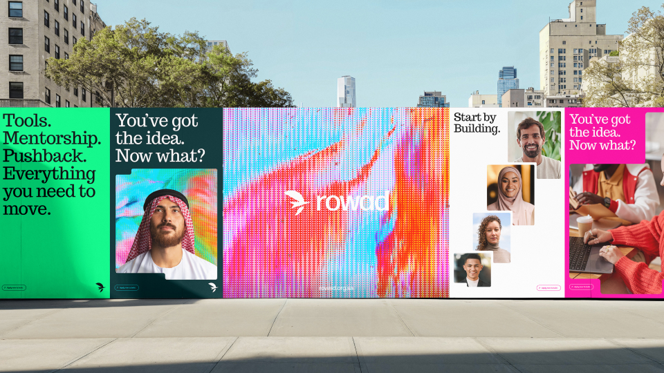
The creative solution came through a set of visual metaphors. The logo was designed as a fusion of an arrow and a bird, two universal symbols of direction and movement. The bird conveys lift, freedom, and the ability to soar beyond limits, while the arrow anchors the concept with precision, focus, and clarity of path. Together, they create a mark that is simple yet deeply symbolic, immediately recognizable, and able to scale across all brand touchpoints.
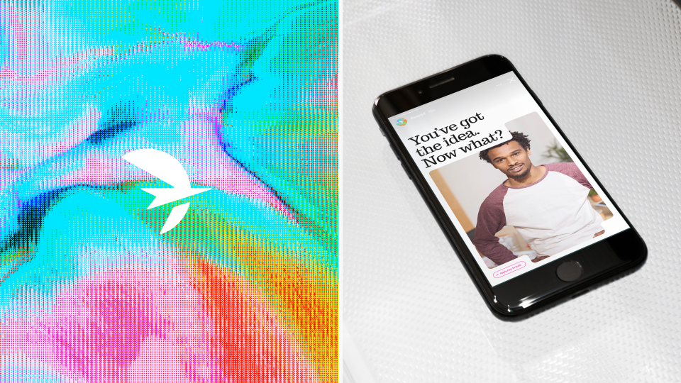
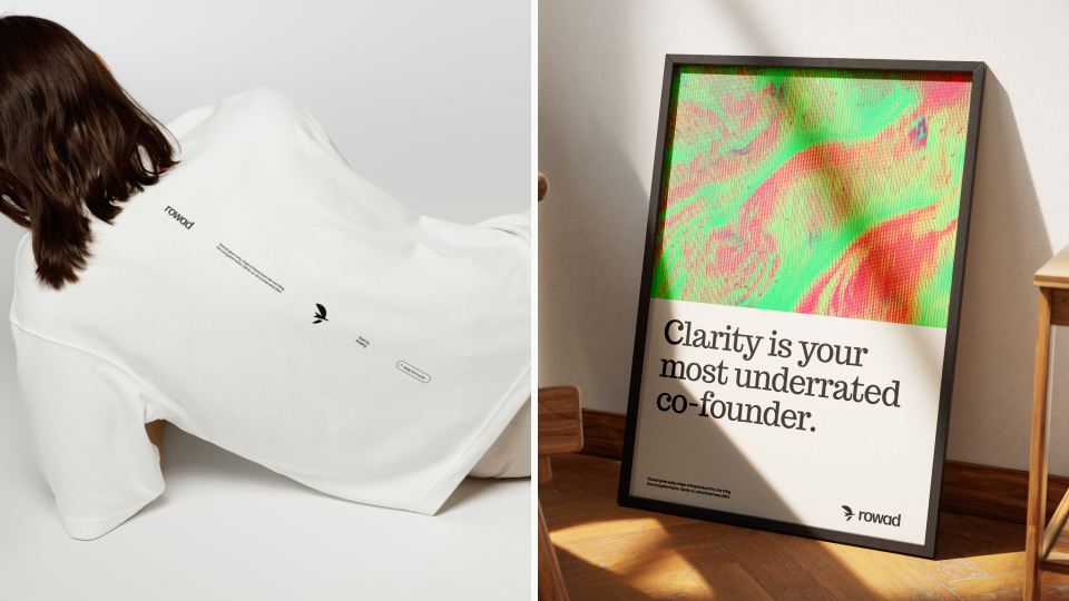
To extend the identity beyond the logo, we developed a system called GridFlow. This pattern combines the order of a grid with the fluidity of motion, representing the idea that founders thrive best when given both structure and freedom. The GridFlow system is versatile, allowing for a wide range of applications while always remaining consistent and recognizable.
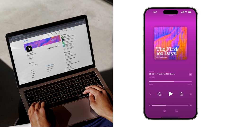
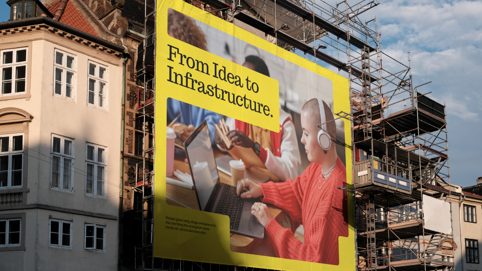
Typography and color choices reinforced these ideas. Bold typefaces were selected to create a sense of confidence and authority, while accent colors injected energy and modernity into the brand. Photography guidelines were built around authenticity and human connection, ensuring that every communication feels relatable, grounded, and inspiring. The overall system was modular by design, able to adapt seamlessly from digital platforms and event branding to print and social media.
What makes this project stand out is not just its aesthetic quality but its strategic depth. Every decision was tied back to Rowad’s mission of empowering the next generation of Saudi entrepreneurs. This is an identity built to be more than visual decoration. It is a tool that communicates values, instills confidence, and builds trust in a growing ecosystem that is becoming increasingly significant on the world stage.
Rowad now has a brand that positions it as both culturally relevant and globally competitive. It speaks the language of ambition while staying rooted in local context.
This project demonstrates how identity design can move beyond visuals to become a catalyst for progress, proving that branding has the power to shape ecosystems, inspire communities, and launch the next wave of global entrepreneurs.

CREDIT
- Agency/Creative: David Charles
- Article Title: Rowad Visual Identity for a Pre Accelerator in Saudi Arabia by David Charles
- Organisation/Entity: Freelance
- Project Type: Identity
- Project Status: Published
- Agency/Creative Country: Nigeria
- Agency/Creative City: Lagos
- Market Region: Middle East
- Project Deliverables: Animation, Brand Design, Brand Identity, Brand Redesign
- Industry: Technology
- Keywords: Pre Accelerator
-
Credits:
Brand Designer: David Charles


