


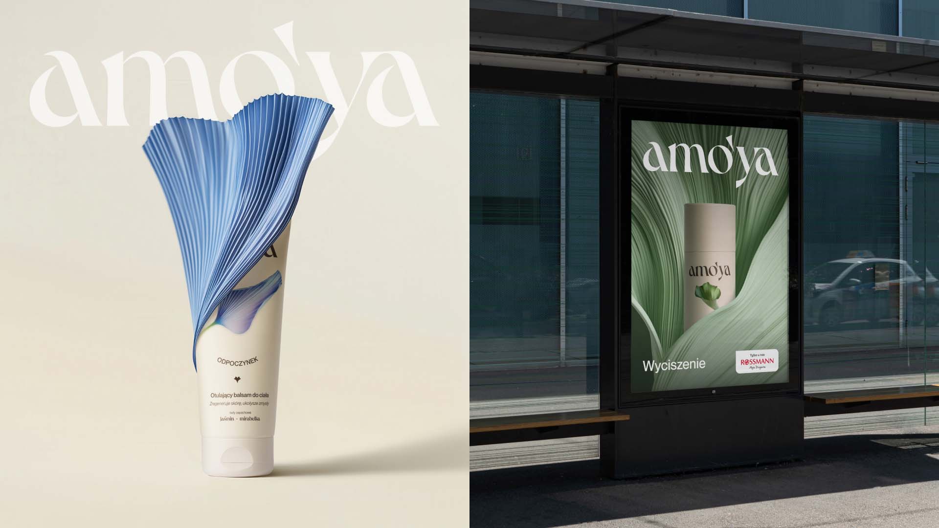
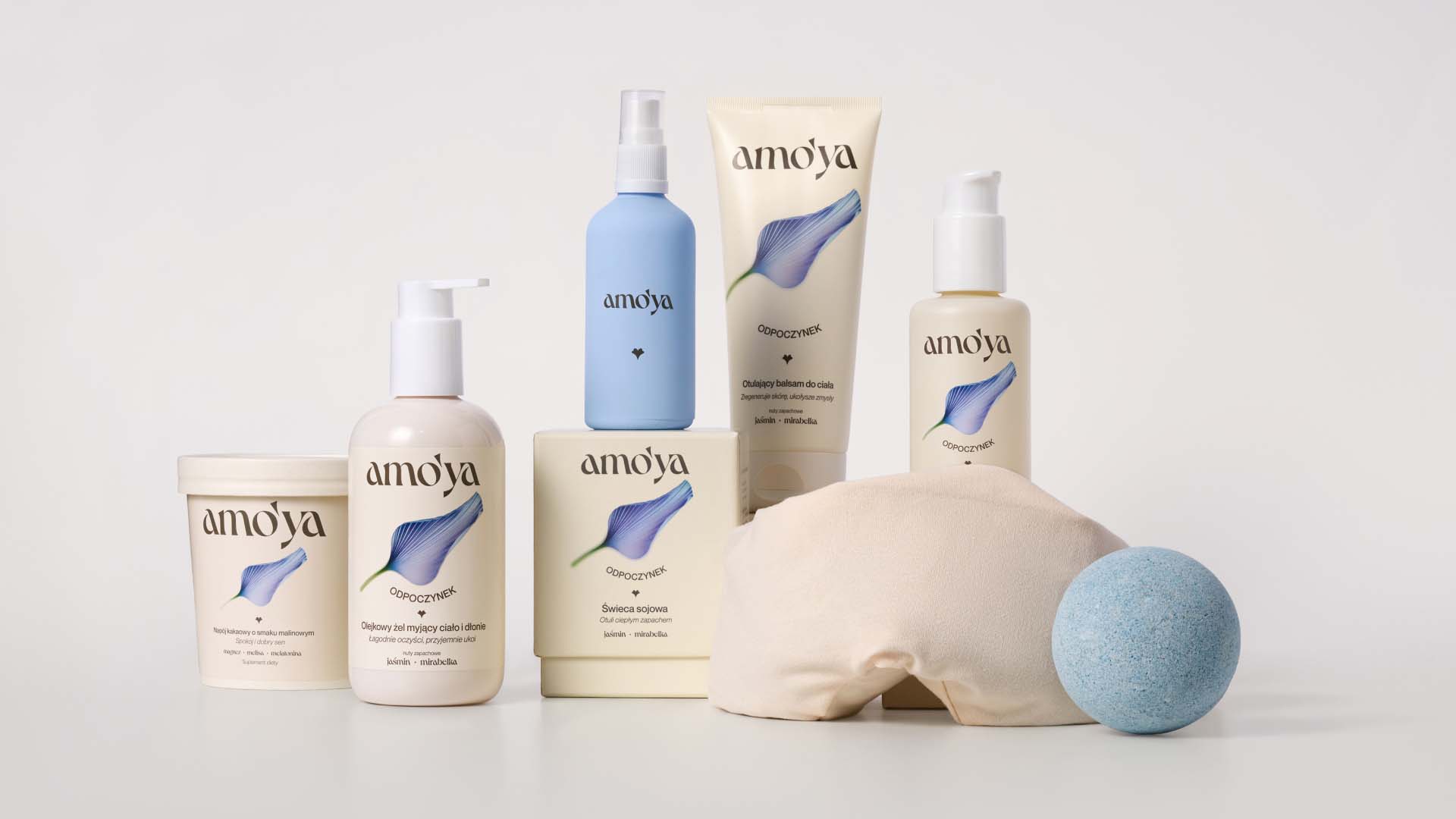
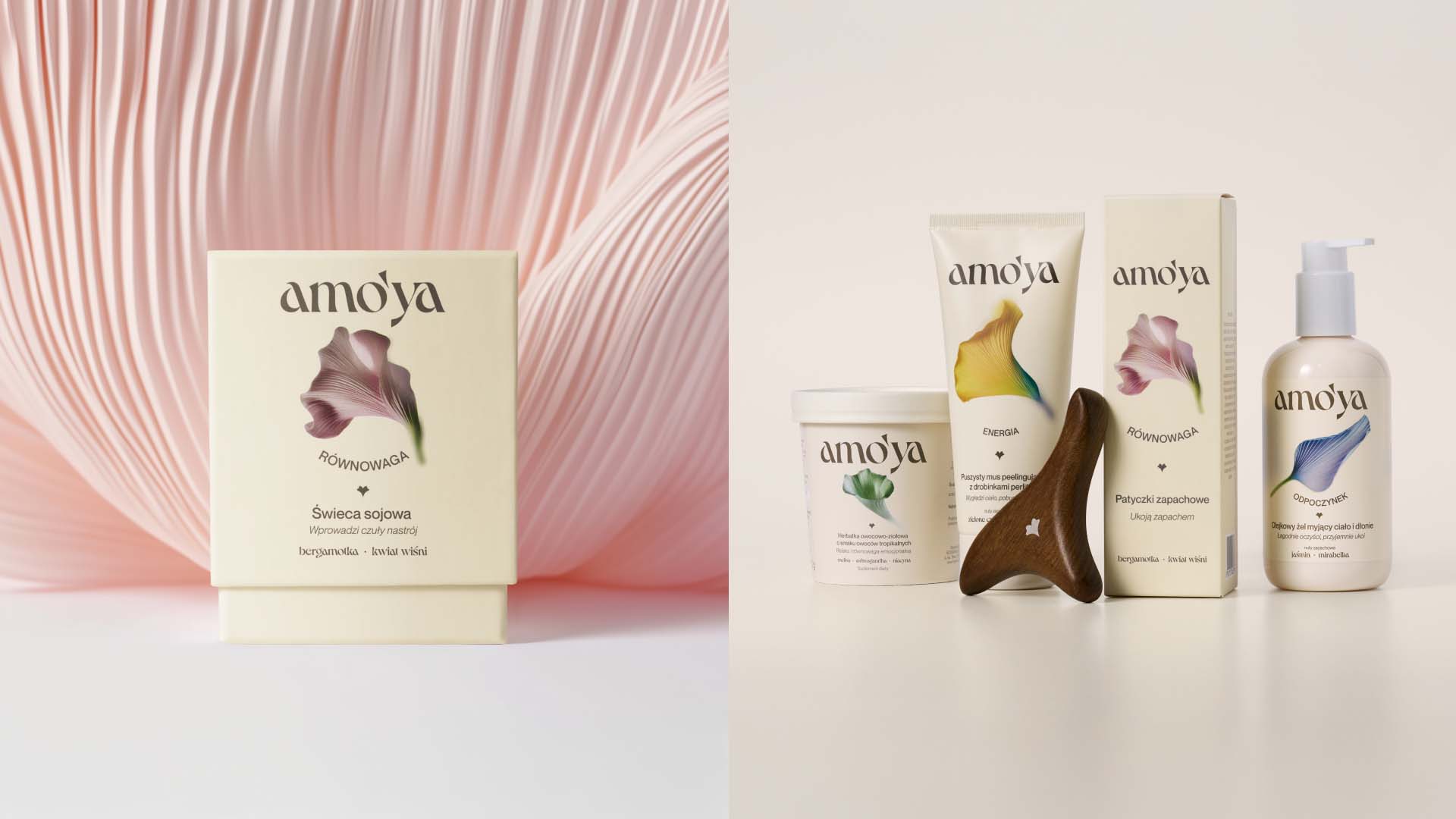
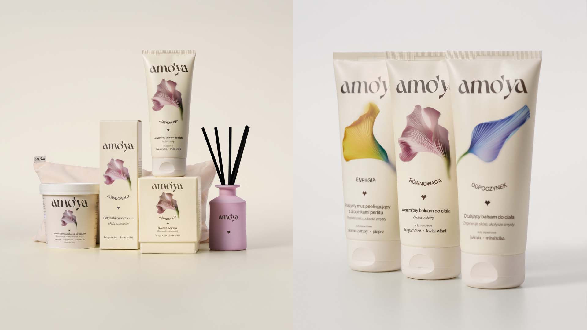
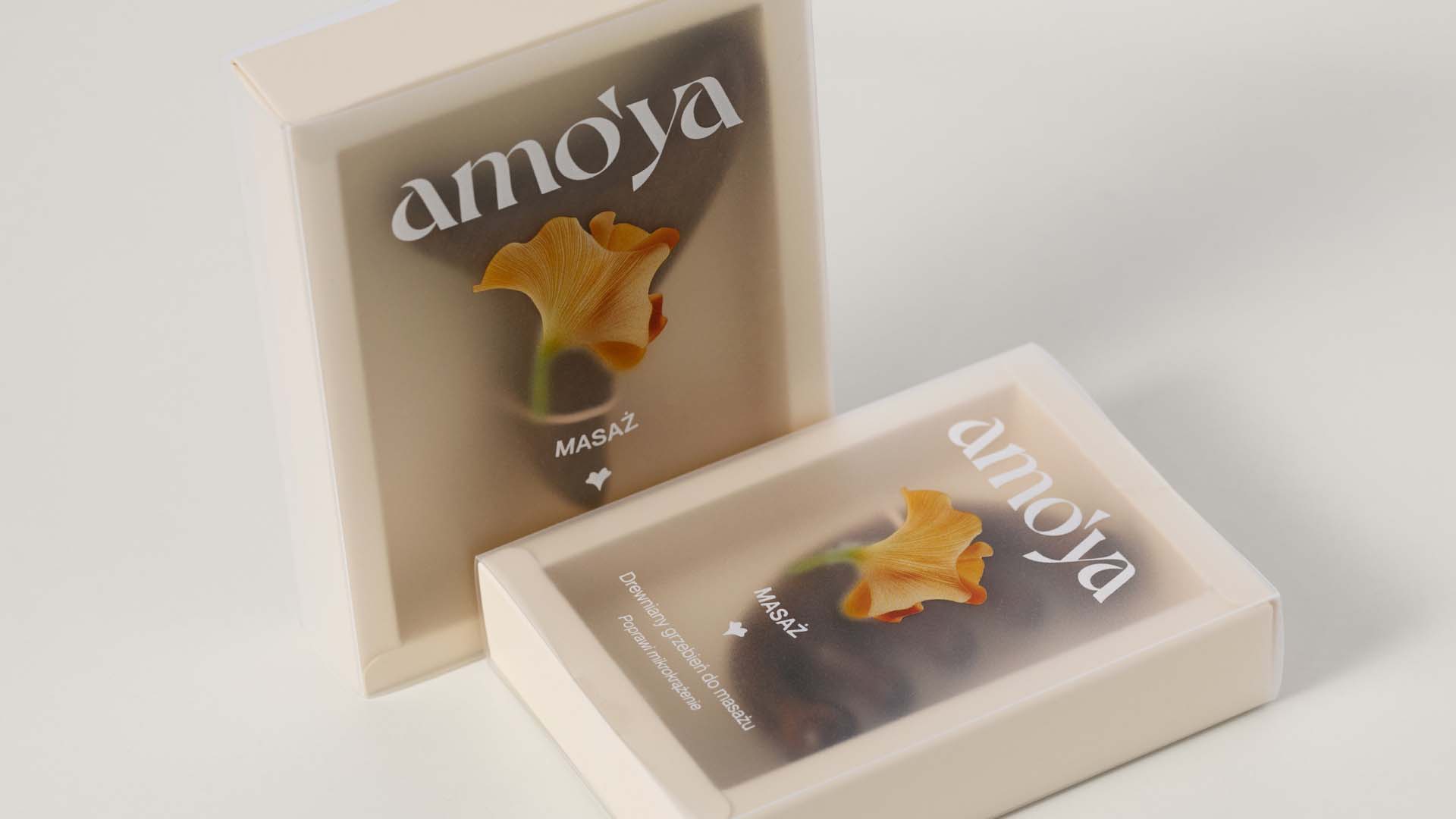
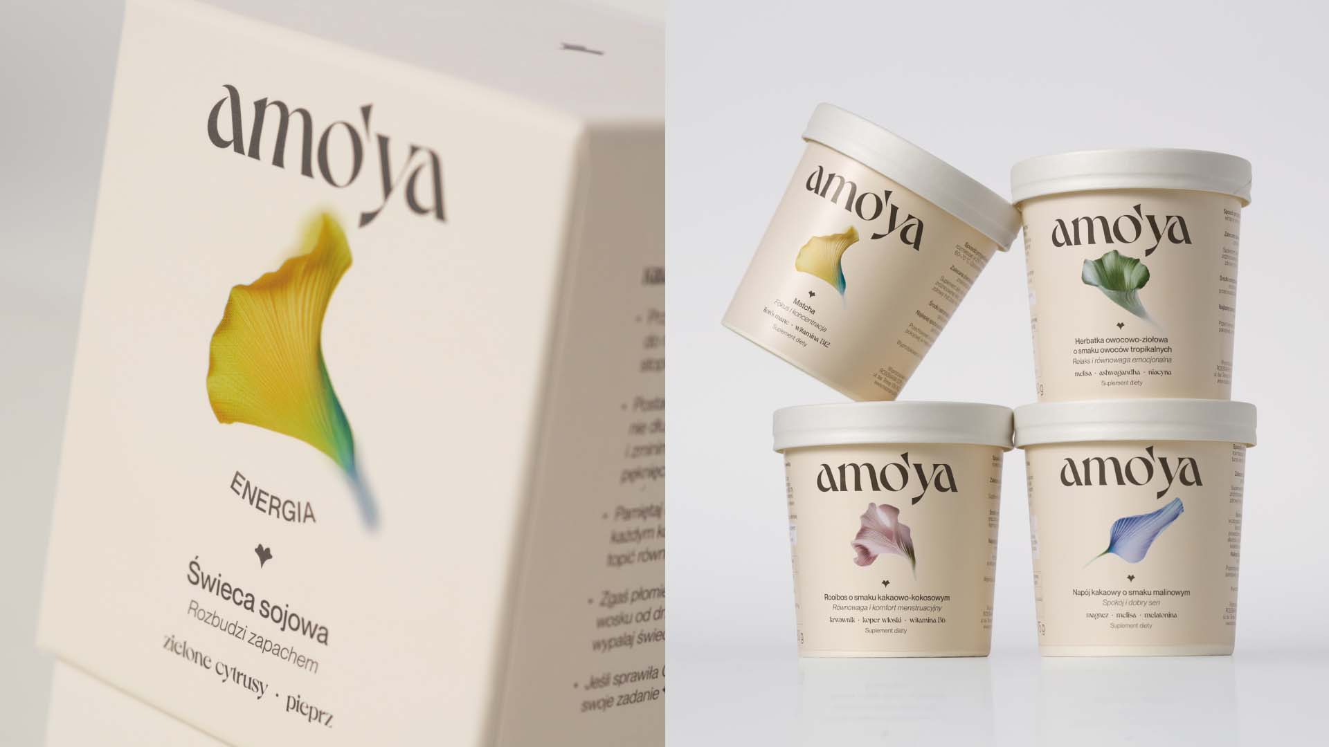
Amo’ya was created with everyday tenderness and care for both body and senses in mind. The brand is divided into lines – rituals made up of small steps that help take care of yourself in a holistic way.
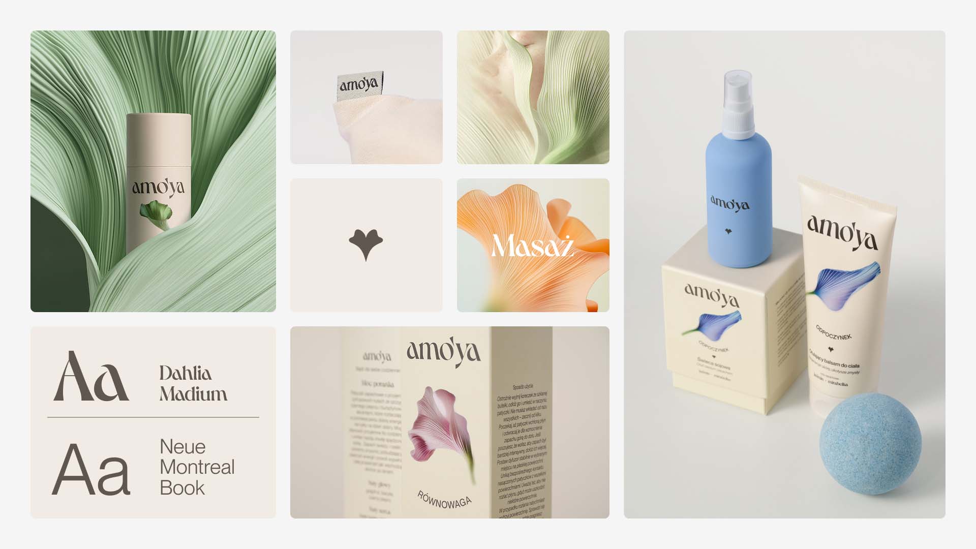
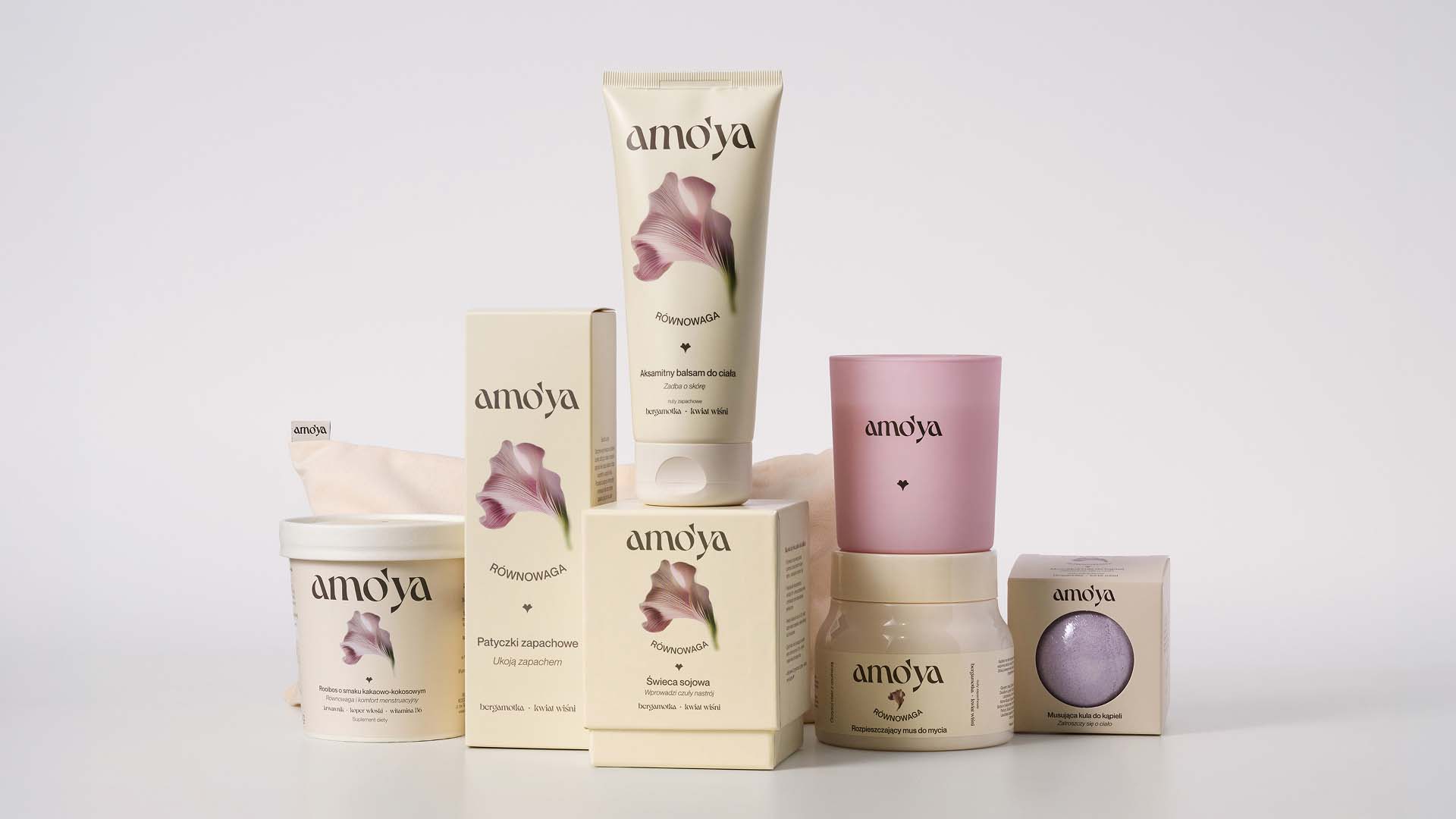
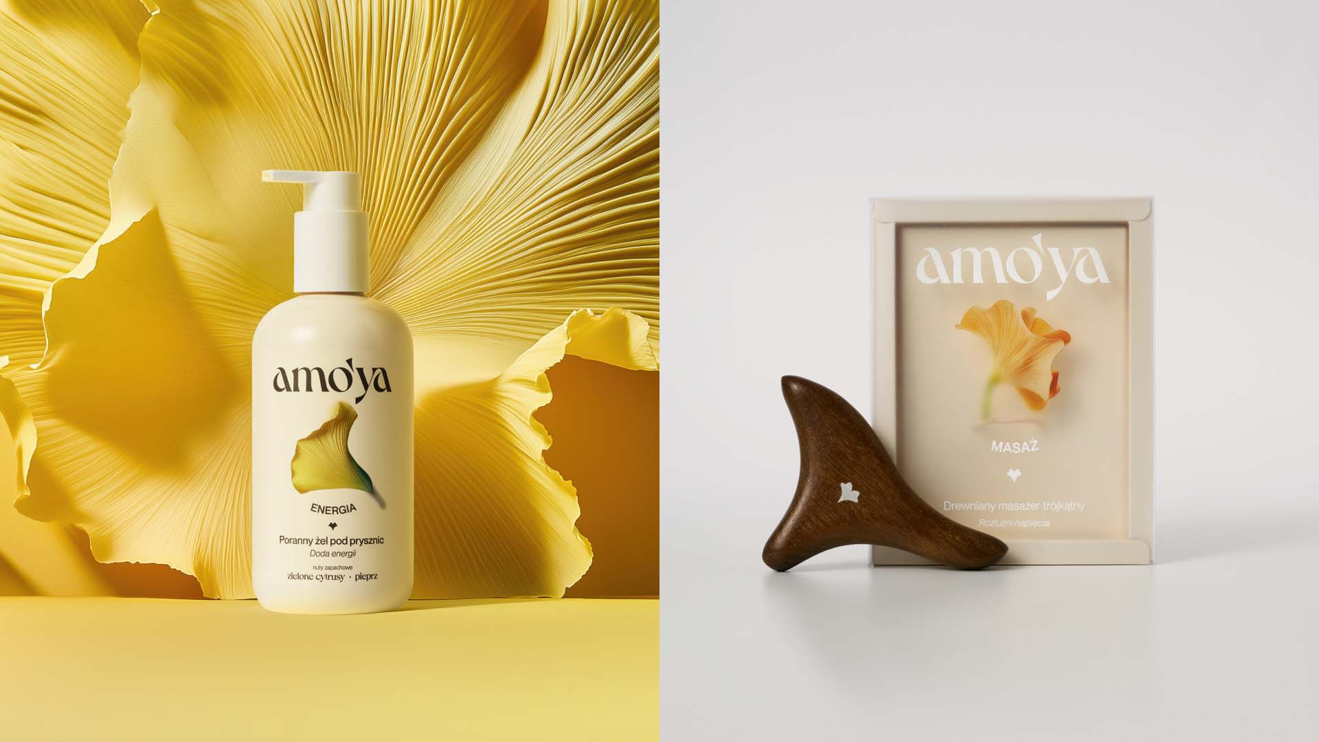
The logo uses the Dahlia typeface, subtly resonating with the brand’s values and floral key visual. It is accompanied by a symbol inspired by both a heart and a flower, which can also be used independently from the logotype. Each ritual is distinguished by a different abstract flower and color, making it easier to recognize products both on the store shelf and in digital communication.
An important element of the process was the use of AI tools to generate floral illustrations – thanks to this, the project was completed faster and more efficiently, while maintaining the unique character of the brand.
Even though we used AI tools, this was first and foremost the work of designers who were able to anticipate and decide:
1. Which of the hundreds of generated flowers would best convey the intended emotions
2. How to combine them into a coherent visual narrative
3. Which details would strengthen the message and brand positioning
Sometimes everything has to change for things to stay the same – technology is advancing at lightning speed, but design is still about understanding emotions and needs. The process showed us that AI is just like any other tool – its value depends on how we use it.
CREDIT
- Agency/Creative: Motyw
- Article Title: Motyw Shapes Amo’ya Into a Floral Ritual Brand Rooted in Care and Emotion
- Organisation/Entity: Agency
- Project Type: Packaging
- Project Status: Published
- Agency/Creative Country: Poland
- Agency/Creative City: Warsaw
- Market Region: Europe
- Project Deliverables: Branding, Packaging Design
- Format: Box, Cup, Tube
- Industry: Beauty/Cosmetics
- Keywords: beauty, health, cosmetics
-
Credits:
Designer: Iwona Martynowska
Project Management: Michał Martynowski


