


In the world of design, where form often follows function, Uncle Paul’s offers a refreshing return to a more honest aesthetic. The brand’s identity, a masterful exercise in restraint, eschews fleeting trends for an architectural purity that speaks directly to the product’s quality.
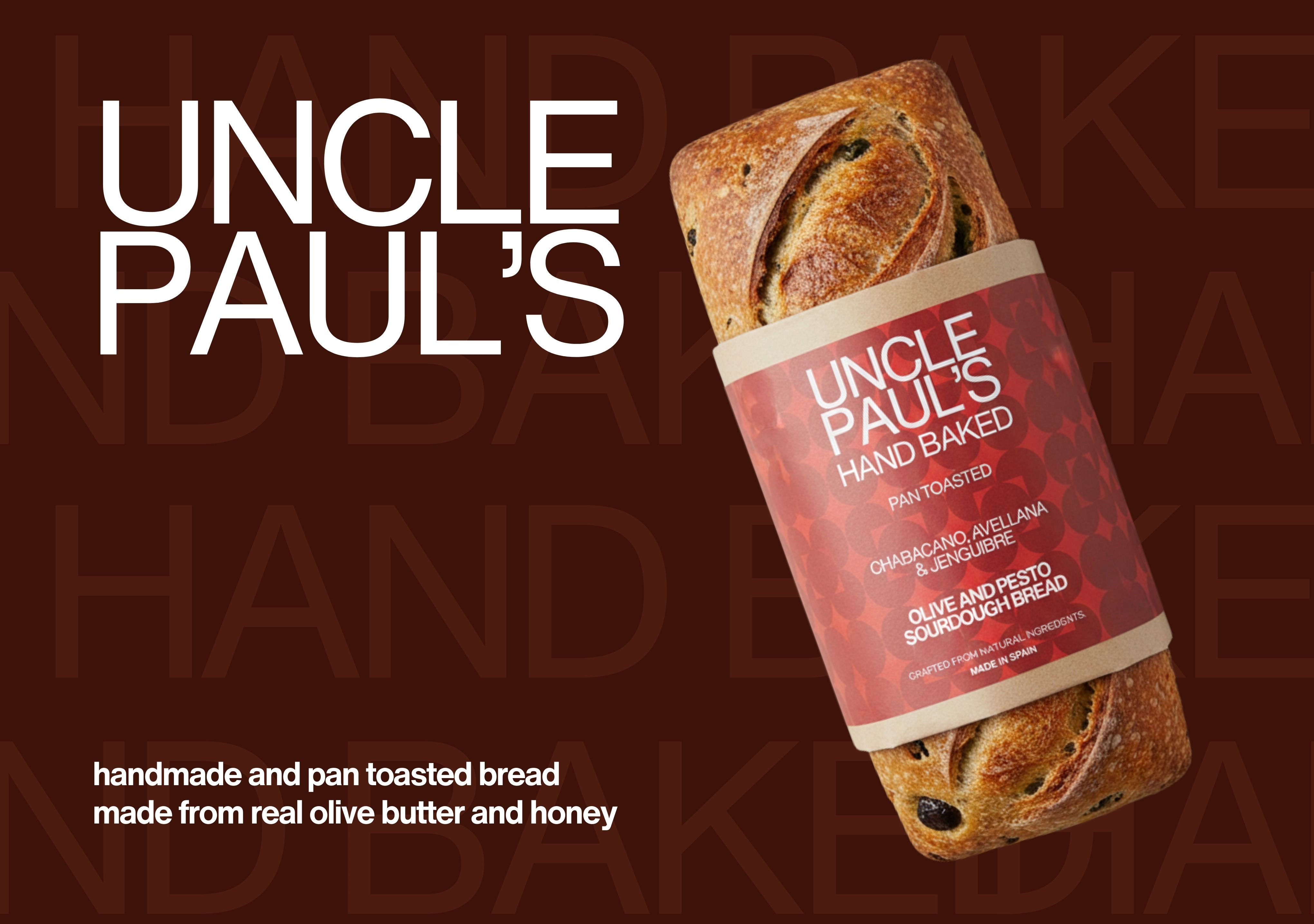
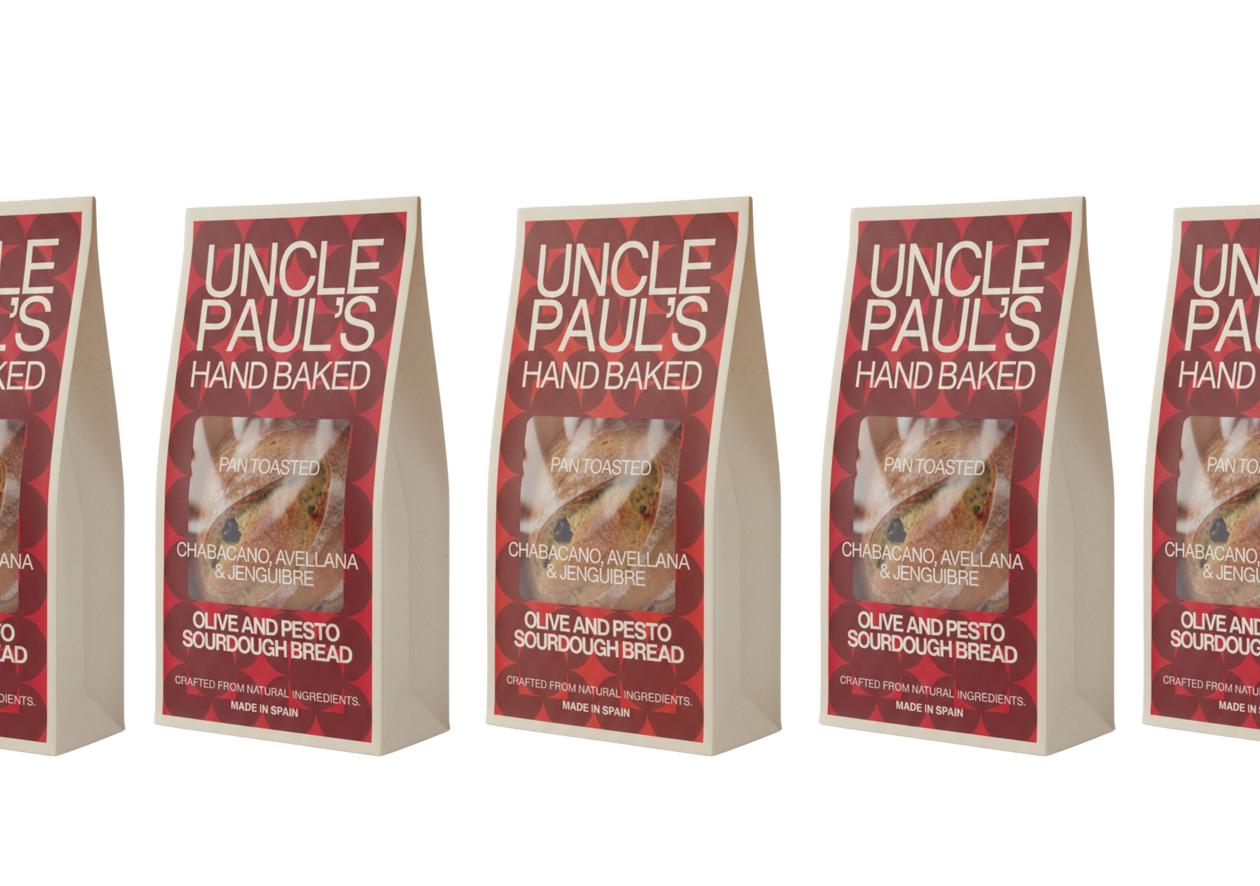
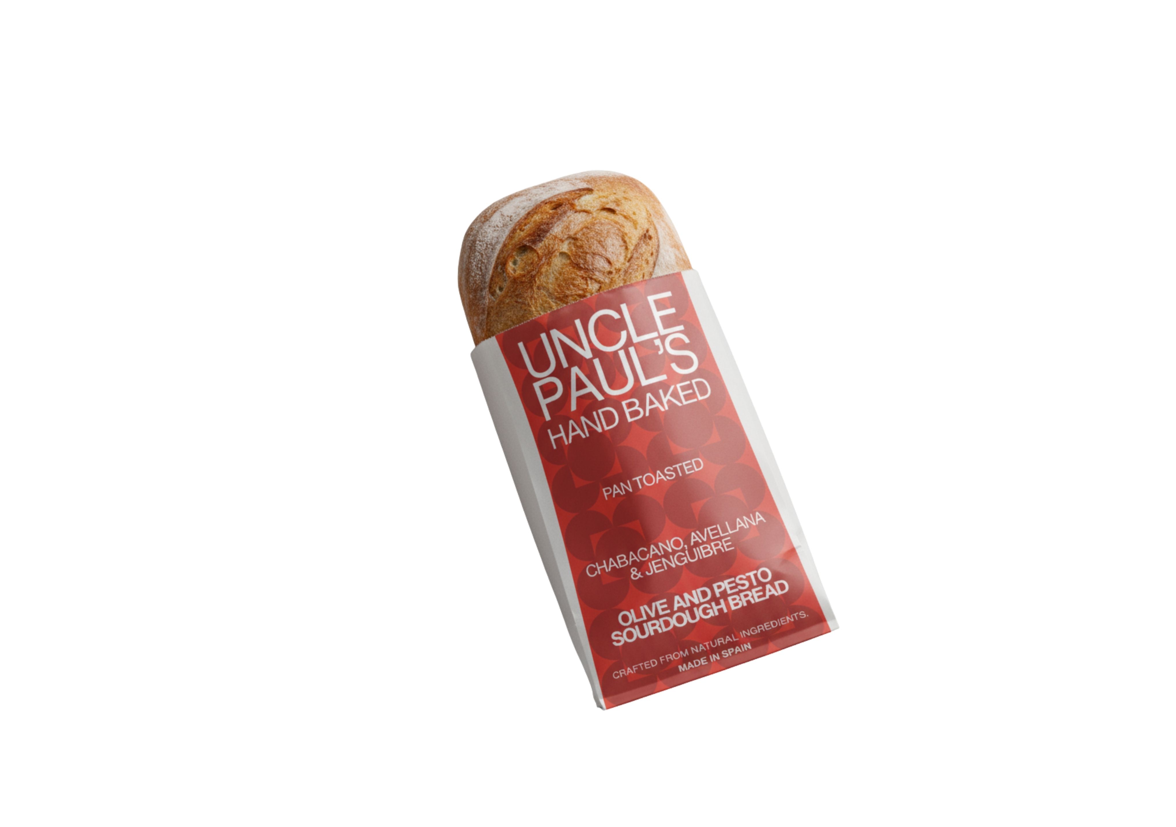
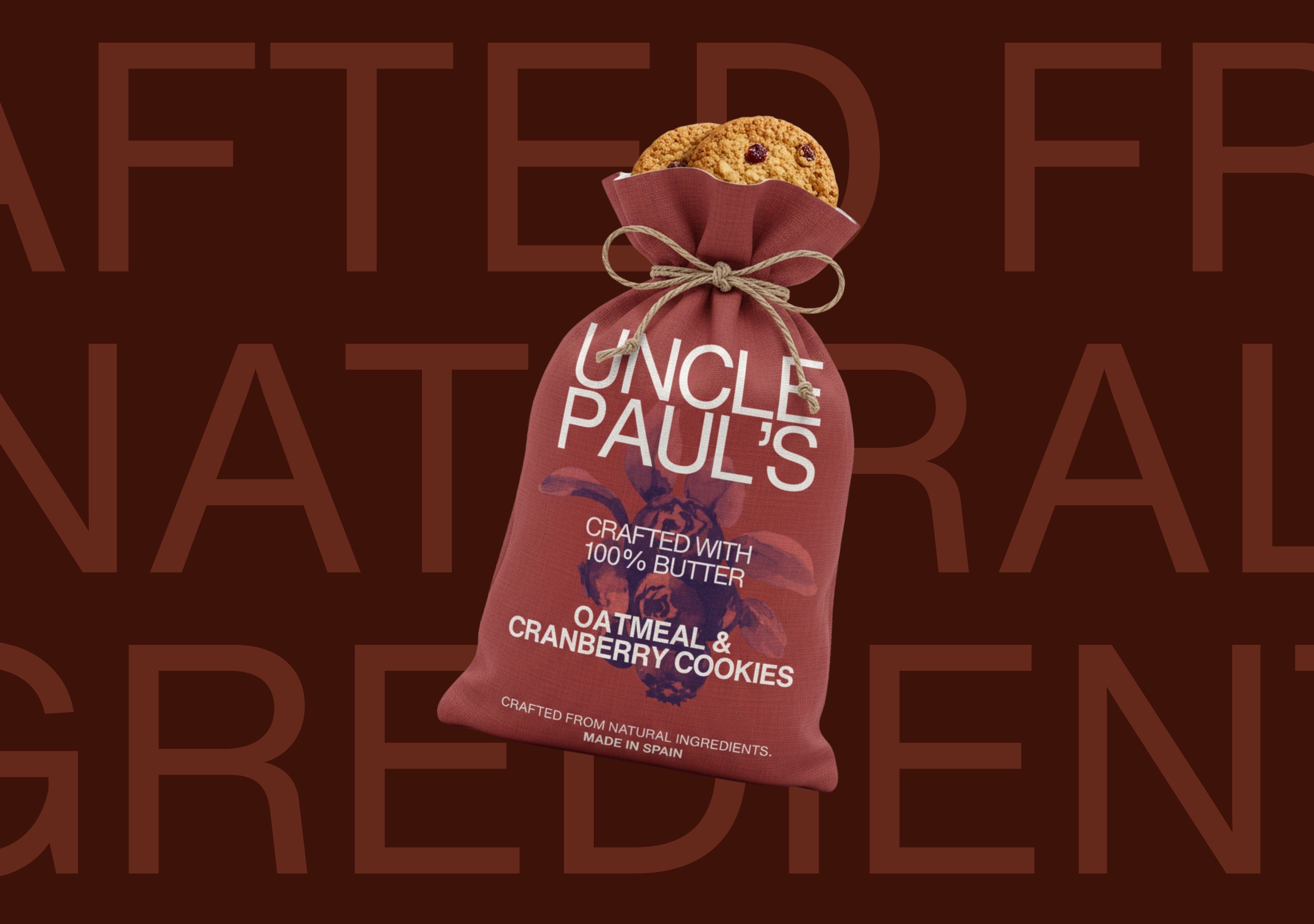
The palette is a striking study in simplicity—a deep, confident red serves as the brand’s foundation, reminiscent of a classic country barn or a rich, earthy clay. It’s a color that anchors the design, creating a sense of timelessness and warmth. The typography, a clean and powerful sans-serif, is not merely text but a structural element. It provides a clear, legible framework that organizes information without embellishment.
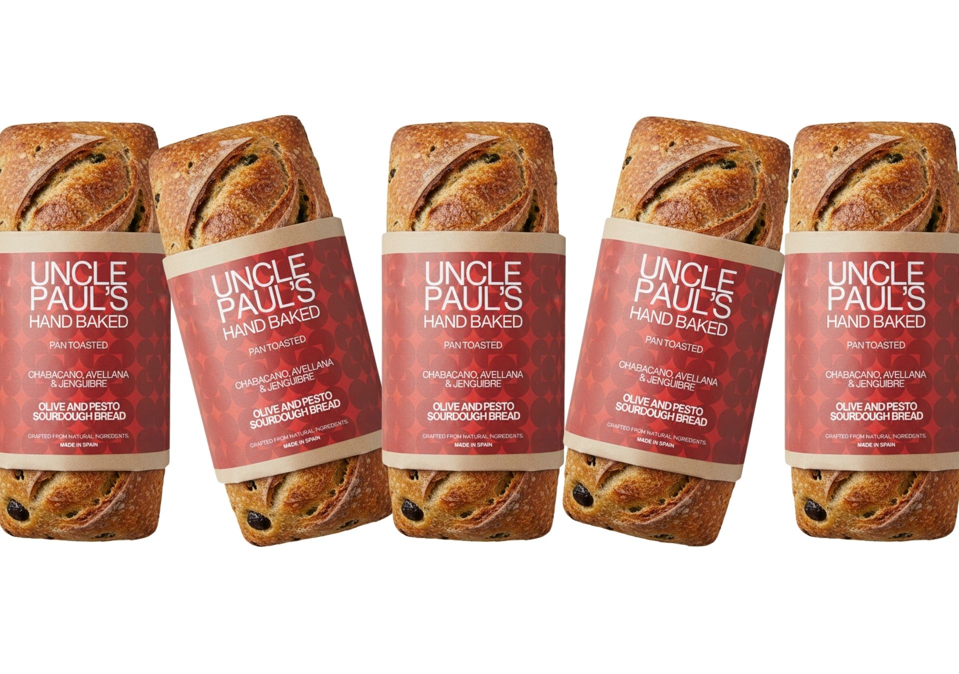
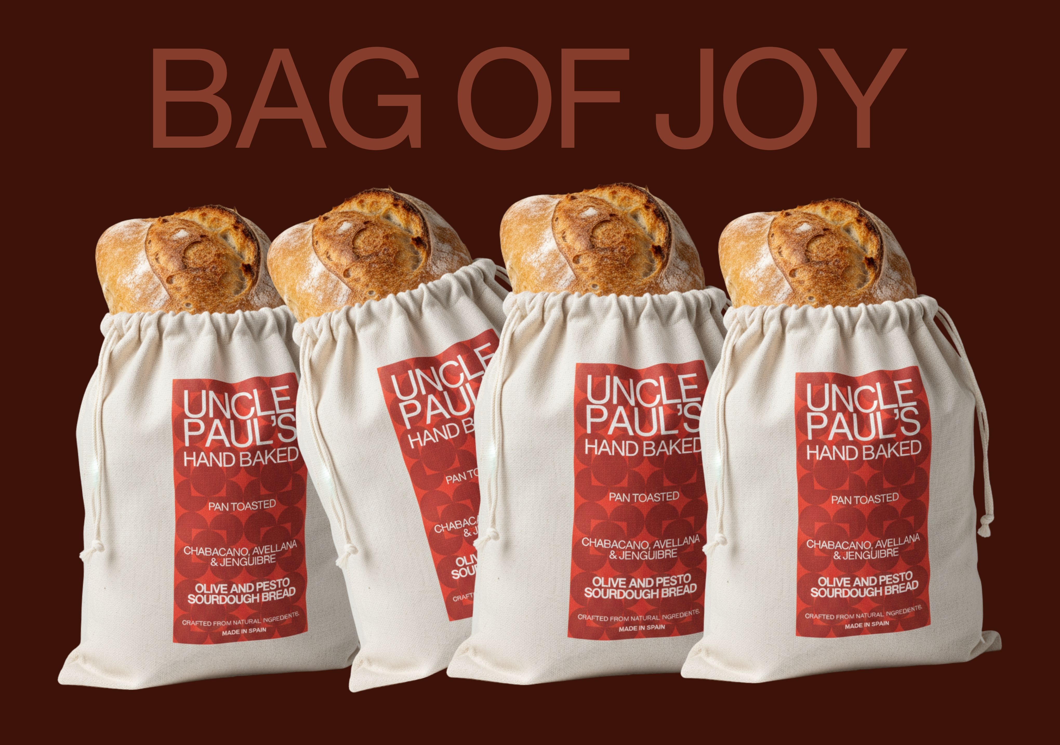
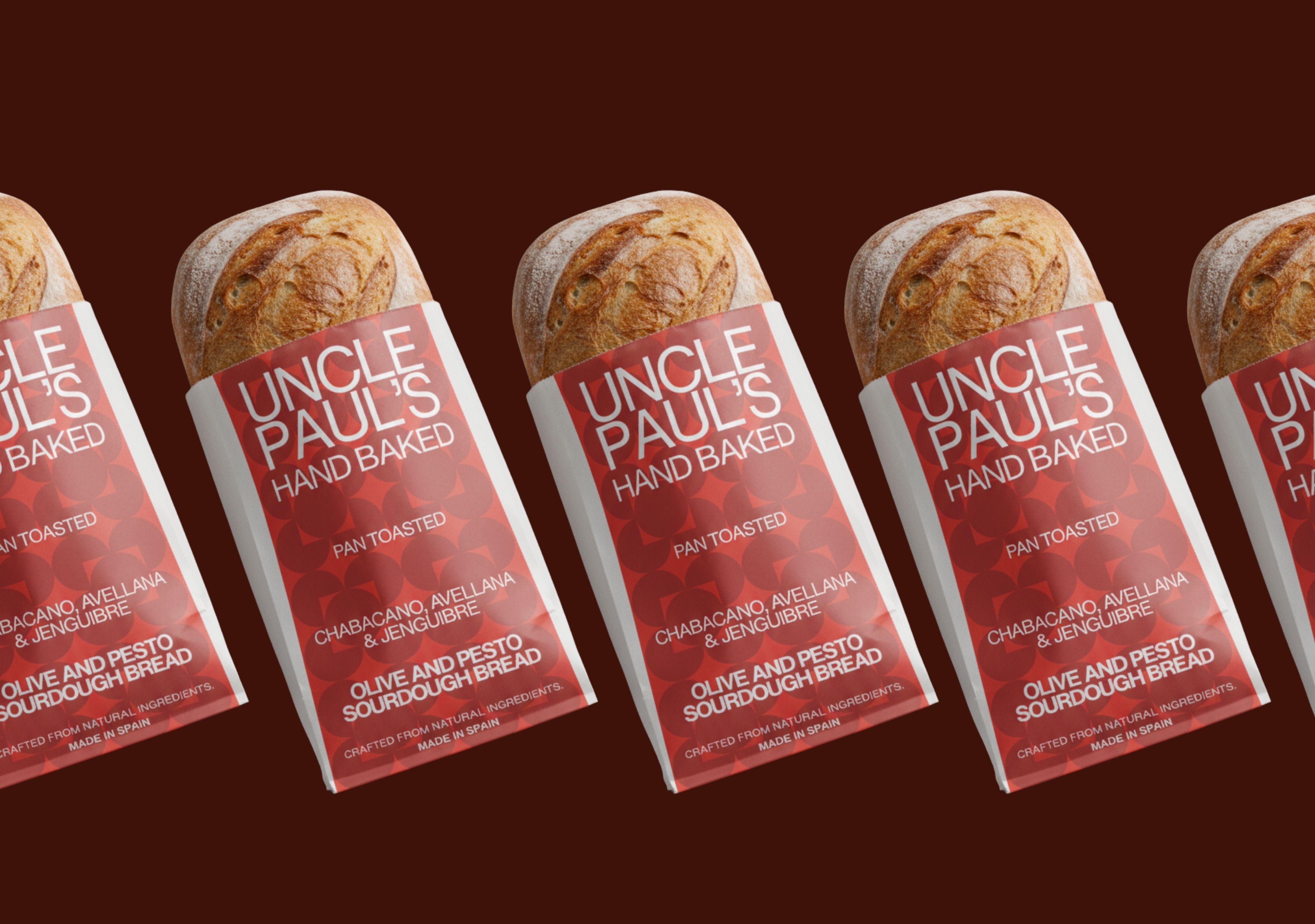
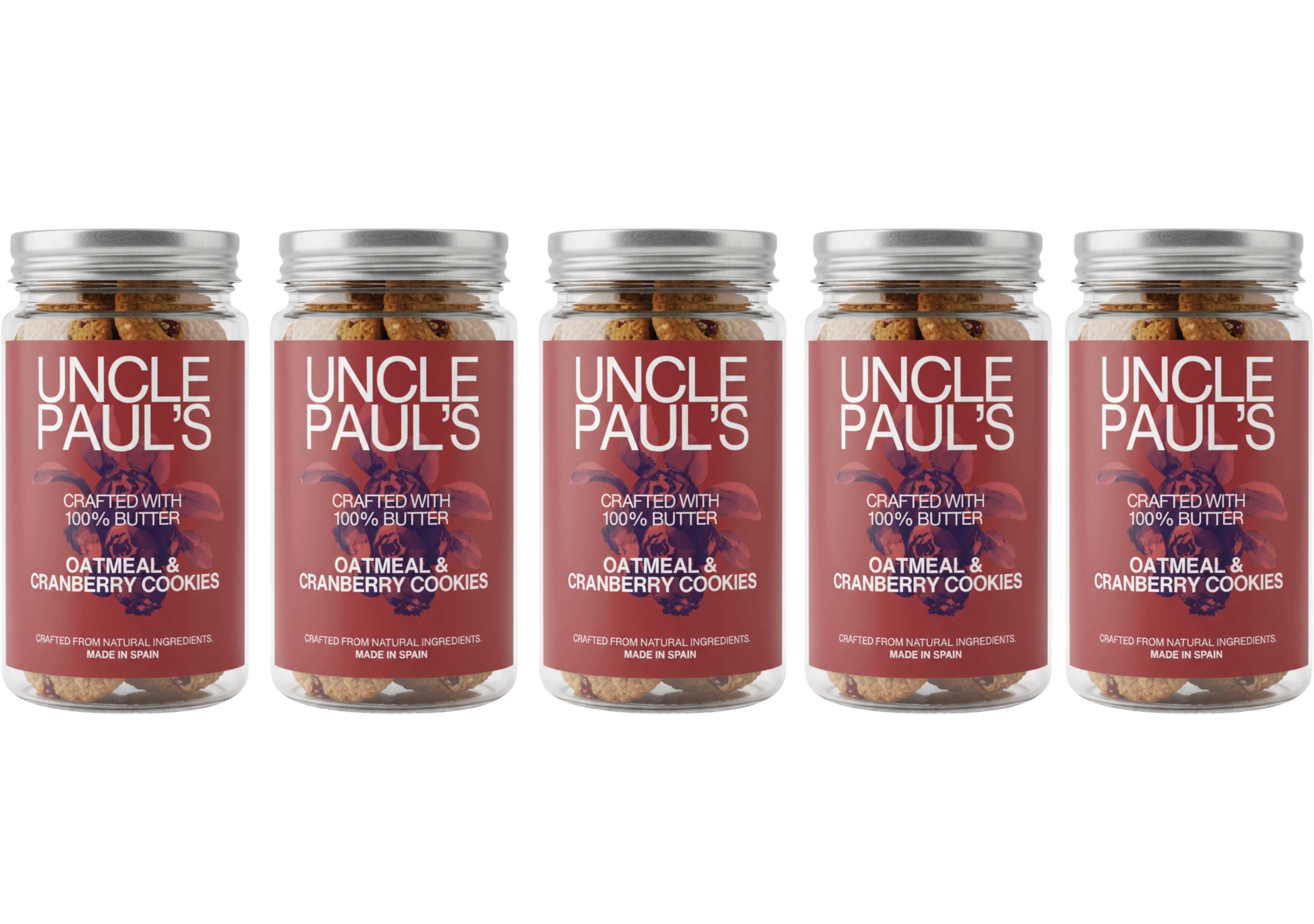
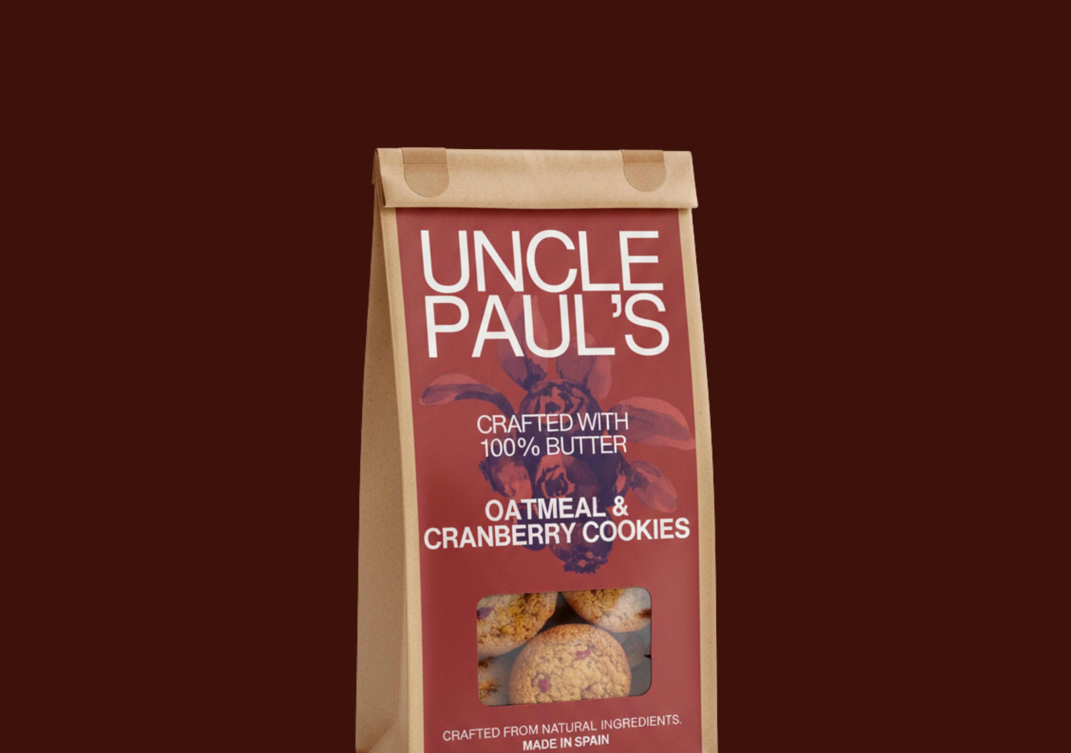
This architectural integrity extends to the packaging itself. The glass jars for the cookies are not just containers; they are display cases, their transparency celebrating the honest, handmade texture of the treats inside. Similarly, the minimalist paper wraps and durable cloth bags for the sourdough bread are designed to function like a second skin, protecting the product while allowing its unique form—its crust and its crumb—to remain the focal point.
In a market saturated with visual noise, Uncle Paul’s stands apart. Its design isn’t about ornamentation; it’s about essence. It’s a built environment for a consumable product, where every element has a purpose, every line is intentional, and the final result is a beautiful, functional, and deeply satisfying experience.
CREDIT
- Agency/Creative: Ansh
- Article Title: Uncle Paul’s Redefines Quality with a Direct Approach by Ansh
- Organisation/Entity: Freelance
- Project Type: Packaging
- Project Status: Published
- Agency/Creative Country: India
- Agency/Creative City: dubai
- Market Region: Asia
- Project Deliverables: Brand Identity, Packaging Design
- Format: Bag, Jar
- Industry: Food/Beverage
- Keywords: packaging
-
Credits:
ansh verma: ansh verma


