


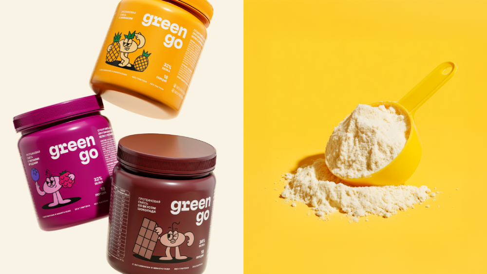
The brand’s products are protein bars and shakes based on vegetable protein from yellow peas. The key benefit is pure, easily digestible and hypoallergenic protein, which distinguishes it from whey proteins and soy analogues.
The products are designed for consumers who lead a healthy lifestyle and are focused on high quality, natural ingredients and pleasant taste, which meets the needs of both vegans and people with lactose intolerance.
The current situation is the launch stage: the company is building its own production, which in the future will allow quality and cost control, as well as the sale of raw materials. However, right now it is necessary to create a positive image of the product, to convey the benefits of pea protein (hypoallergenic, easy digestibility, vegan).
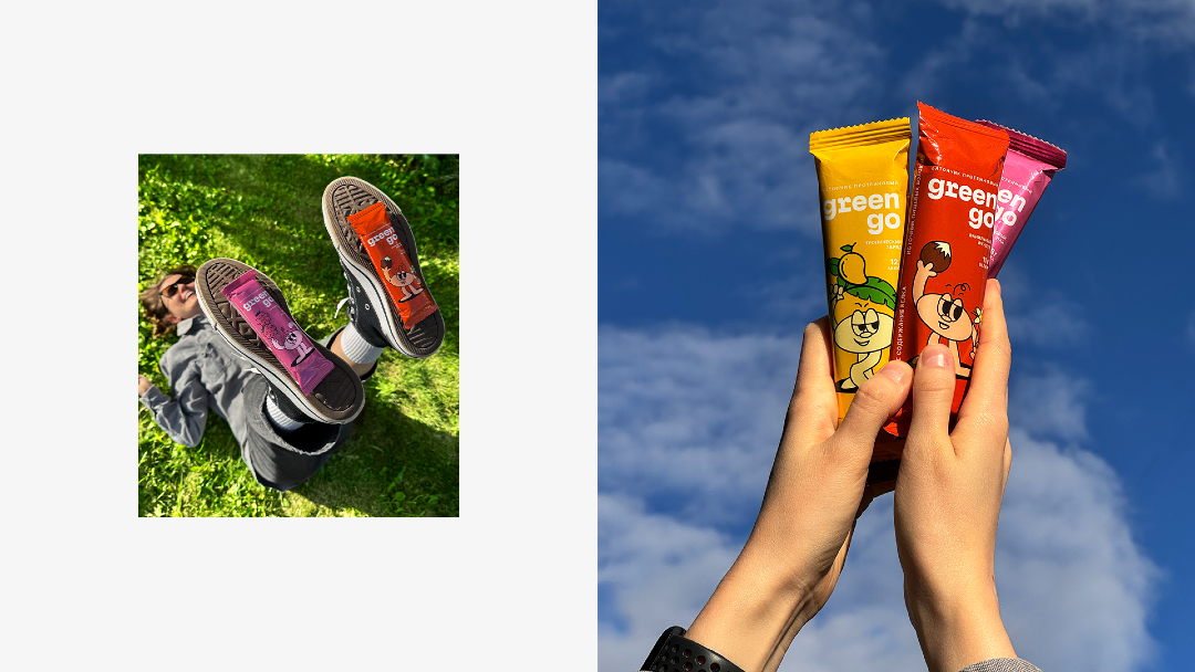
The target audience is men and women aged 18-45 with average and high incomes, leading an active lifestyle. They monitor nutrition, but they are not experts in proteins. Taste, convenience, and benefits are important to them: they perceive bars and smoothies as a healthy dessert or snack, not as sports nutrition. They are hedonists who appreciate the pleasure of eating and are looking for products that combine naturalness, well-taste and health care without compromise.
The key challenge for the new brand is overcoming consumers’ skeptical attitude towards pea protein and entering highly competitive mass retail (B2C). Many consumers associate vegetable protein with unpleasant digestive effects or poor efficacy compared to whey protein. At the same time, the company competes not only with sports brands, but also with major brands in the mass market of healthy food.
The modern consumer wants to eat right, but faces three main obstacles: irresistible temptations in the form of delicious but unhealthy food; difficult to-understand information on labels, and, finally, the persistent opinion that healthy food is boring. We had to develop a brand platform, a name, and a vibrant design for a new product line.
Greengo is not just food, it is a personal assistant and friend on the path to conscious nutrition without stress and breakdowns.
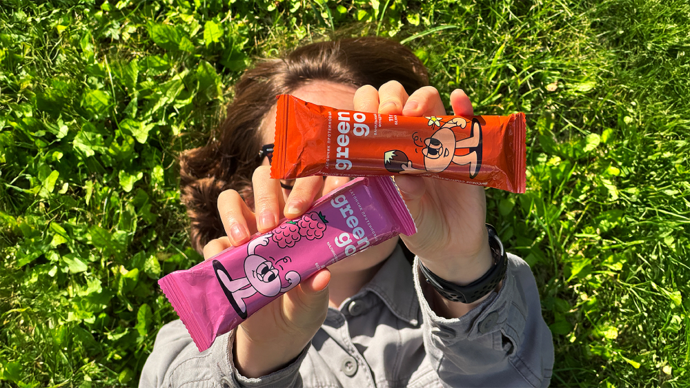
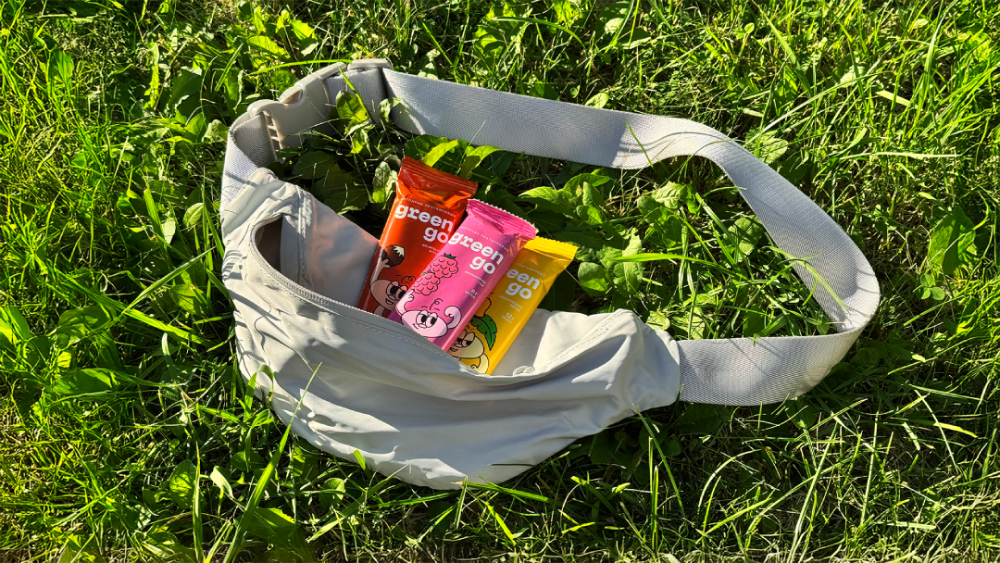
The name Greengo was born from a combination of two key ideas. Green symbolizes the natural origin, benefits of the product and vegan composition. Go conveys energy, convenience and mobility. The product is easy to take with you and eat anywhere.
The name sounds cheerful, is easy to read in Russian and English and perfectly reflects the essence of the brand.
We have abandoned the mentoring tone of “healthy” brands. Greengo is your friend who supports and is proud of you when you make the right choice; with humor and light irony encourages you if you suddenly break down; believes that healthy eating should be a joy, not a burden.
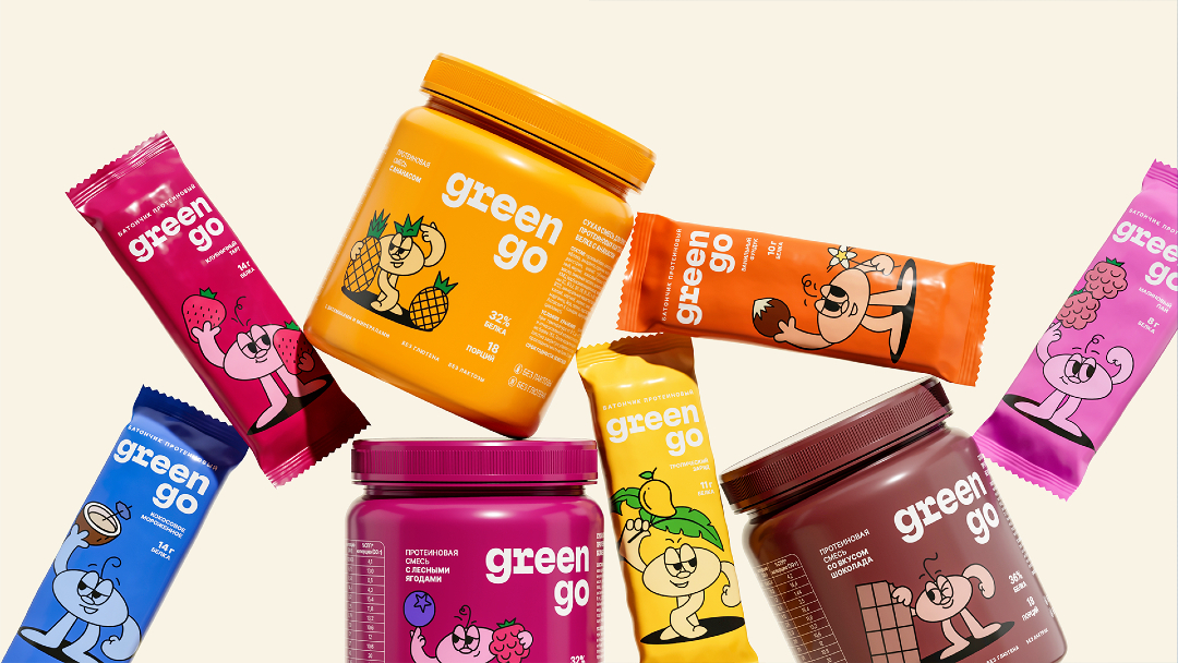
The personification of the friendly and energetic character of the brand is the mascot – Mr. Greengo. This is always a cheerful, funny character who is not afraid of restrictions and diets. For him, a good mood is as much an integral part of a healthy lifestyle as the quality of the products. We carefully worked on his facial expressions and poses so that he would be truly charismatic and recognizable.
We have abandoned the mentoring tone of “healthy” brands. Greengo is your friend who supports and is proud of you when you make the right choice; with humor and light irony, encourages you if you suddenly break down; believes that healthy eating should be a joy, not a burden.
Greengo’s mission is to make the transition to healthy eating easy, accessible and painless.
We created a design that speaks of quality and inspires confidence:
Purity and air: the logo is made in white against a background of deep and complex shades, which creates a modern and stylish combination.
Focus on benefits: the composition is designed to convey key information simply and clearly, without complex terms. The gram count of protein is displayed in front for convenience, so that it is easy to navigate when choosing.
Premium: matte colored cocktail jars and laconic packaging of bars emphasize the high quality standard.
Recognizability: Mr. Greengo is organically integrated into the design, which added individuality and friendliness to it. The mascot can be easily used in communications, social networks, etc.
We have created a brand that is understandable and attractive to a modern, busy person who values taste, convenience and usefulness, but is not ready to compromise for the sake of boring rules. Greengo is a tasty and healthy ally in a big city that will always lift your spirits and help you stay in shape without extra effort.
Today’s consumers strive for a healthy diet but encounter three significant challenges: the allure of delicious yet unhealthy food, complex label information, and the misconception that nutritious meals are unappetizing.
To address these issues, we have developed a brand designed to be both approachable and appealing to modern, time-pressed individuals. Greengo serves as a reliable companion in the bustling city, consistently providing support to maintain a healthy lifestyle without much effort.
CREDIT
- Agency/Creative: Ohmybrand
- Article Title: Greengo: The Temptations of Unhealthy Foods – No Matter What!
- Organisation/Entity: Agency
- Project Type: Packaging
- Project Status: Published
- Agency/Creative Country: Russia
- Agency/Creative City: Moscow
- Market Region: Global
- Project Deliverables: Brand Creation, Brand Identity, Branding
- Format: Bag
- Industry: Food/Beverage
- Keywords: design, packaging
-
Credits:
Creative Director: Nadezhda Parshina
Strategist: Olga Baturina
Namer: Roman Urban
Art-director: Yulia Zhdanova
Art-director: Alexandra Pershina
Senior Designer: Maria Egorova
Designer: Margarita Akimova
Project Manager: Natalia Kiryutenko
Photographer: Evgeny Nikitin
3D: Danil Volozhanin


