


Grace Street Korean Coffee House
Heritage Reimagined: A Modern Korean Identity for Grace Street
The rebranding of Grace Street set out to strengthen the café’s connection to its South Korean roots while reflecting the vibrancy and creativity of New York City. Known for handcrafted desserts and warm hospitality, Grace Street needed a design system that honored tradition while embracing a bold, contemporary spirit. The process began with in-depth research into Korean art and cultural symbolism, focusing on dancheong decorative patterns, color associations, and the geometric structure of Hangul typography. These influences shaped an identity that feels authentic, flexible, and emotionally resonant, designed to speak both to heritage and to modern urban culture.
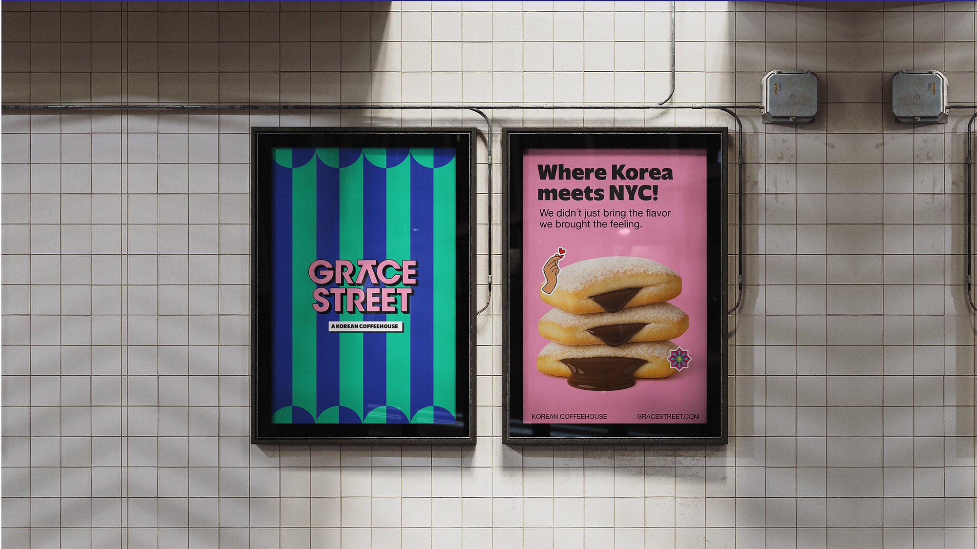
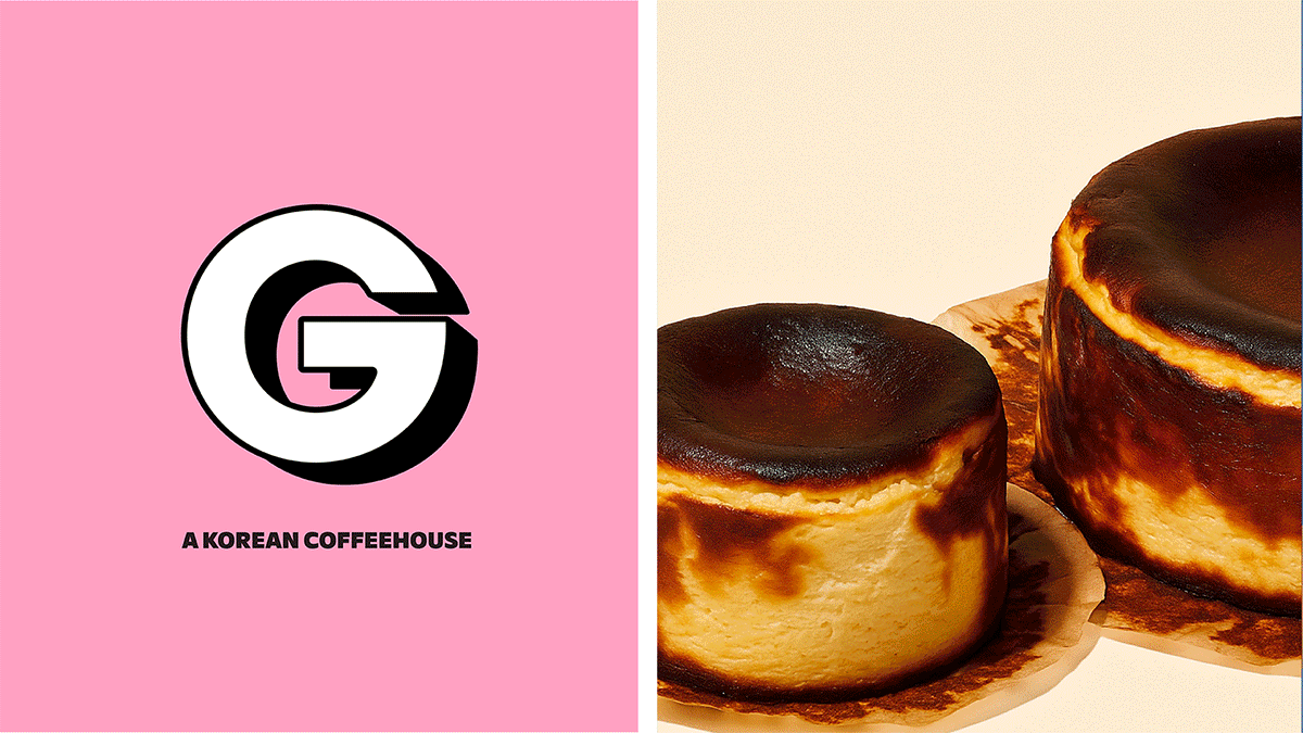
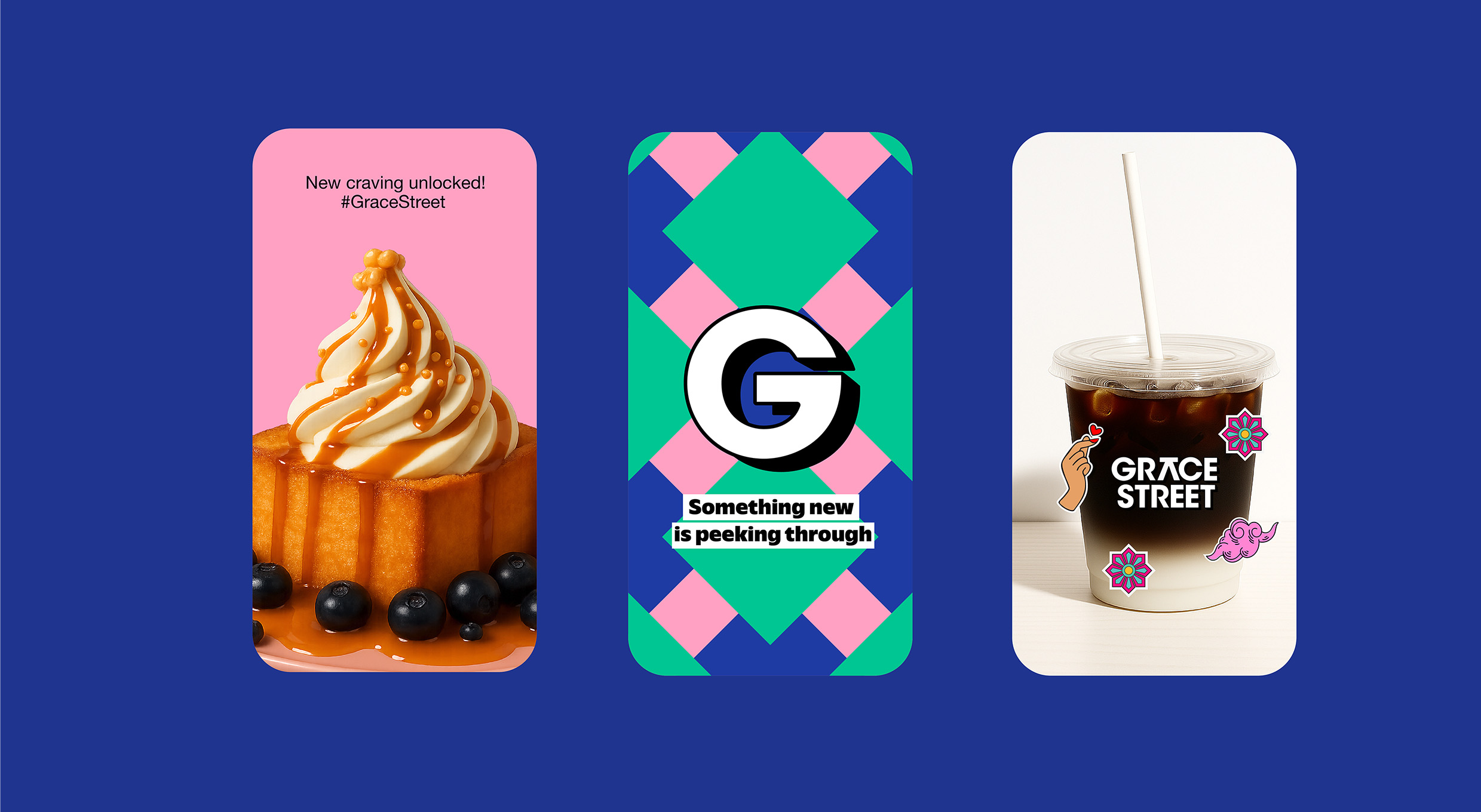
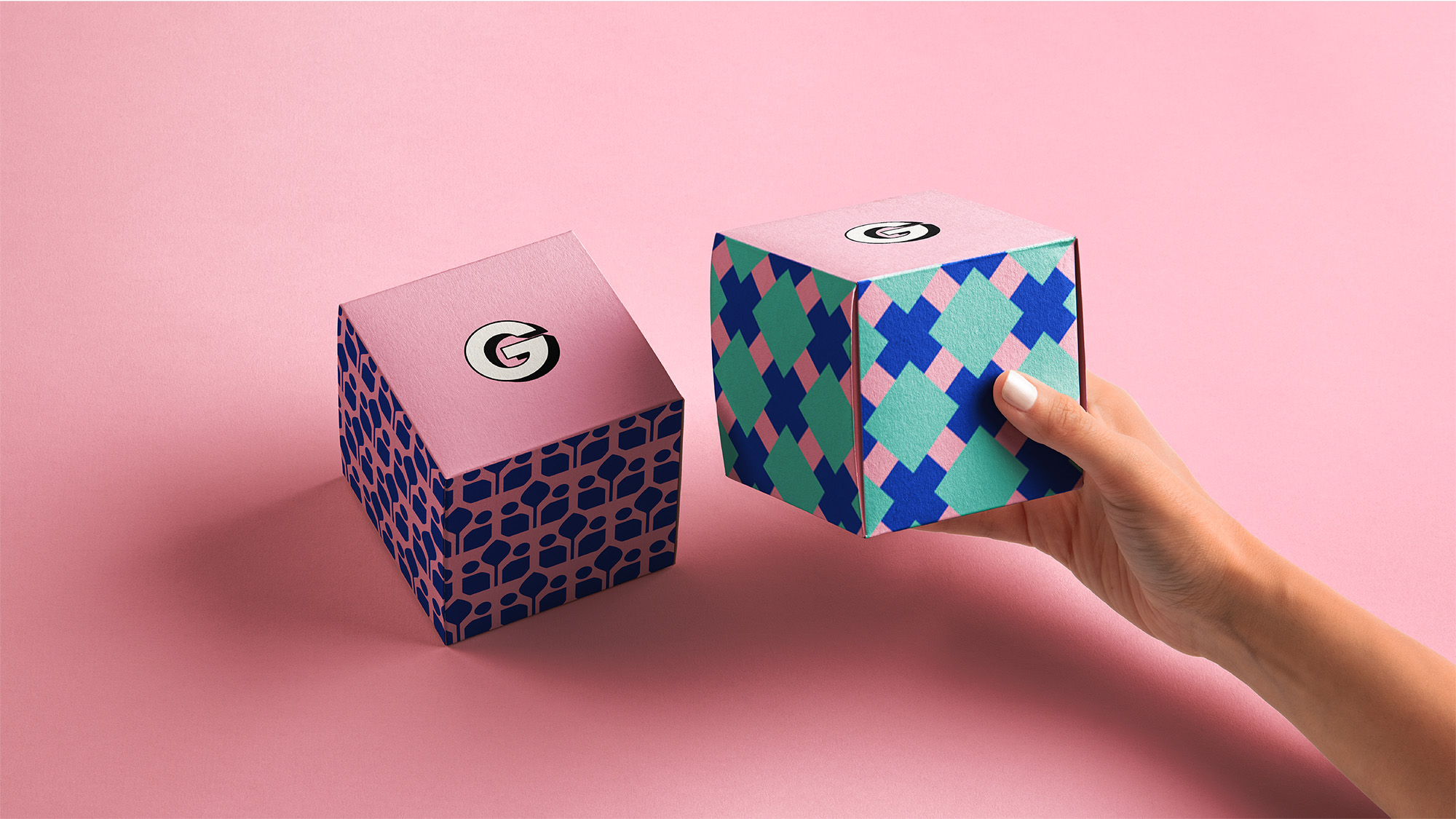
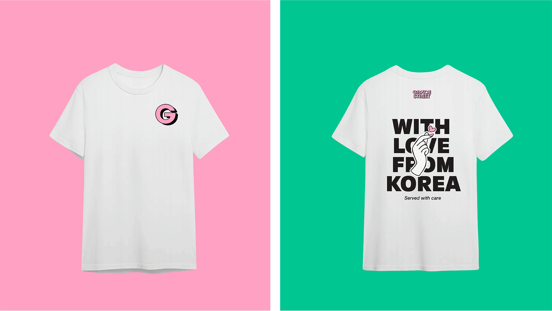
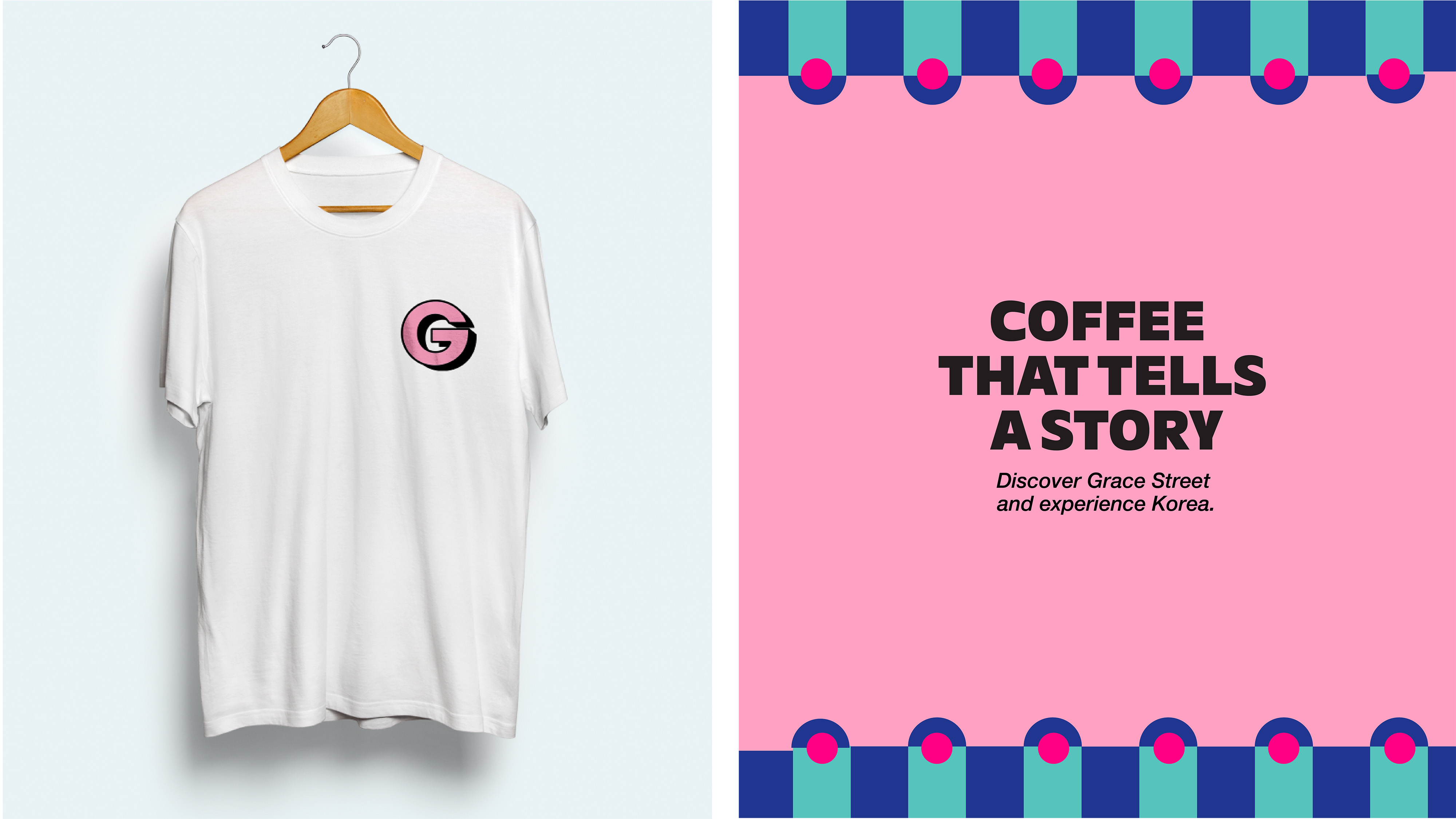
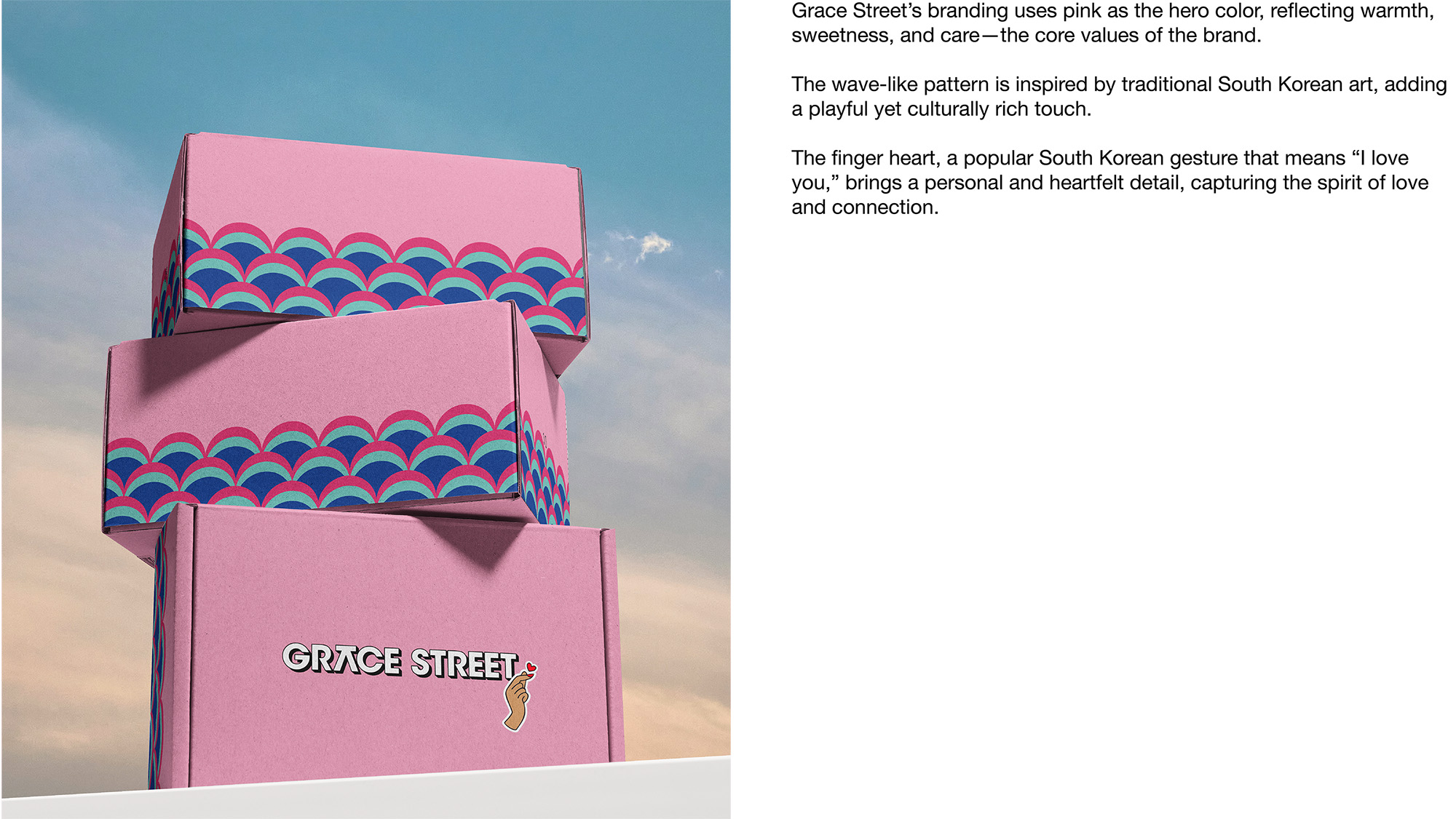
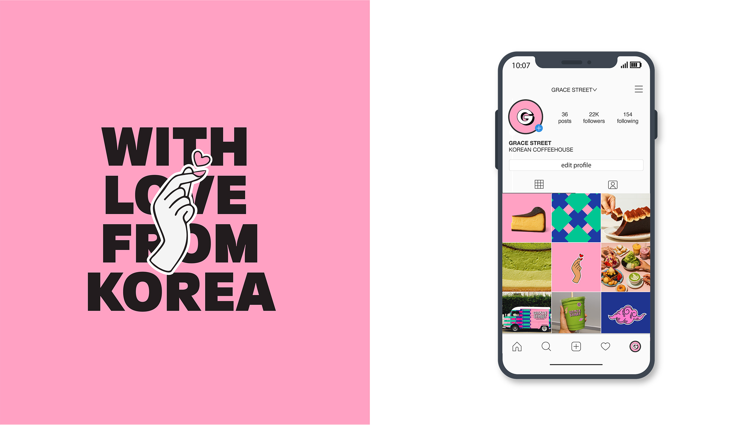
At its core is a logotype that balances clarity with cultural depth, featuring a custom A inspired by the geometric elegance of Hangul. Supporting typography was chosen for versatility, ensuring cohesion across packaging, signage, and digital platforms. Color became a defining tool—pink as the hero tone embodies warmth and sweetness, supported by deep blues and greens drawn from dancheong traditions. Simplified geometric patterns further reimagine cultural motifs, making them playful and adaptable across applications.
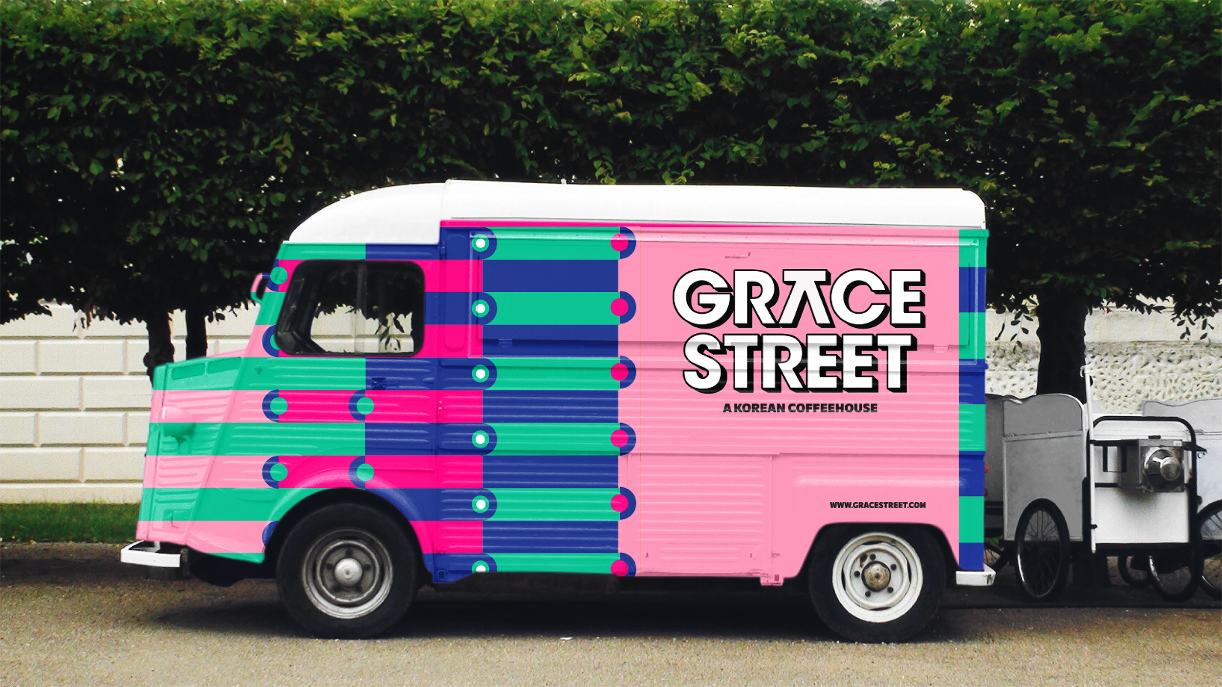
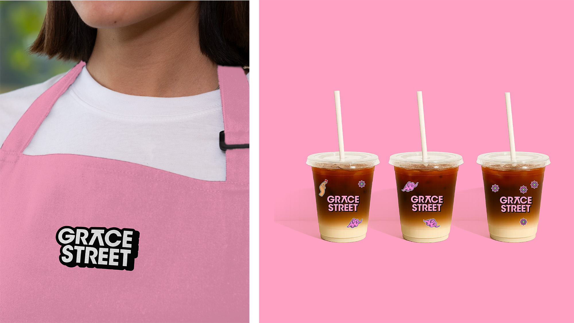
The identity was then extended into a full system of brand expression. Packaging incorporates customizable stickers with icons such as the Korean finger heart, encouraging personal interaction. Posters and in-store signage highlight the line Where Korea meets NYC, capturing both cultural pride and urban energy. Even the Grace Street food truck was transformed into a moving cultural canvas, wrapped in bold colors and patterns that carry heritage into public spaces.
The outcome is more than an aesthetic refresh—it is a comprehensive identity system that blends cultural storytelling with modern design sensibilities. Grace Street emerges not only as a café but as a cultural landmark, celebrating Korean tradition while thriving in the creative spirit of New York City, transforming every customer touchpoint into a meaningful and memorable experience.
CREDIT
- Agency/Creative: Better than Sunday
- Article Title: Better than Sunday Connects Korean Tradition and New York Energy in Grace Street Branding
- Organisation/Entity: Freelance
- Project Type: Identity
- Project Status: Published
- Agency/Creative Country: Sweden
- Agency/Creative City: Better than Sunday
- Market Region: Global
- Project Deliverables: Art Direction, Brand Identity, Creative Direction, Packaging Design, Rebranding
- Industry: Food/Beverage
- Keywords: Branding, Art direction, packagingdesign, korea, south korea, coffeehouse,nyc, new york, cage bradning, identity, visual identity
-
Credits:
Art & Creative Direction: Better than Sunday


