


Glowie is more than just a cosmetics brand, it is a joyful universe where beauty meets fun, self-expression, and bold creativity. In a world where beauty brands often present themselves in a very serious and sometimes intimidating way, Glowie was born to be the refreshing alternative. Instead of chasing the illusion of perfection, it celebrates imperfections, personality, and the radiant energy that comes from within. The brand started with a simple but powerful question: what if makeup could feel less like a daily routine and more like a party? Glowie answers this question by creating products and a brand experience that spark joy, encourage playfulness, and empower people to glow in their own unique way. From its design system to packaging, every single detail was crafted to feel vibrant, approachable, and expressive, building a brand that does not only sell cosmetics but also invites people into a lifestyle of color, confidence, and creativity.
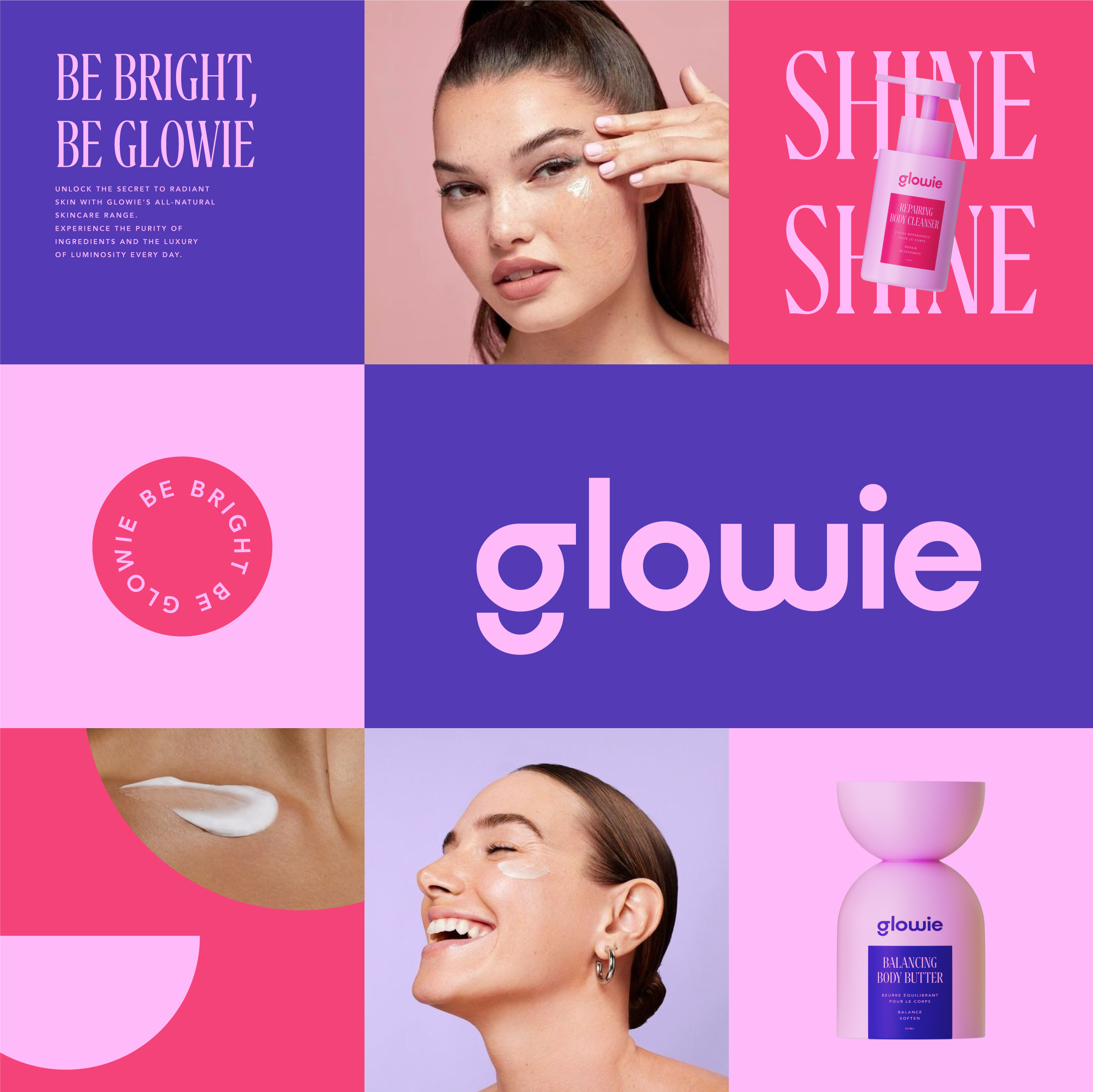
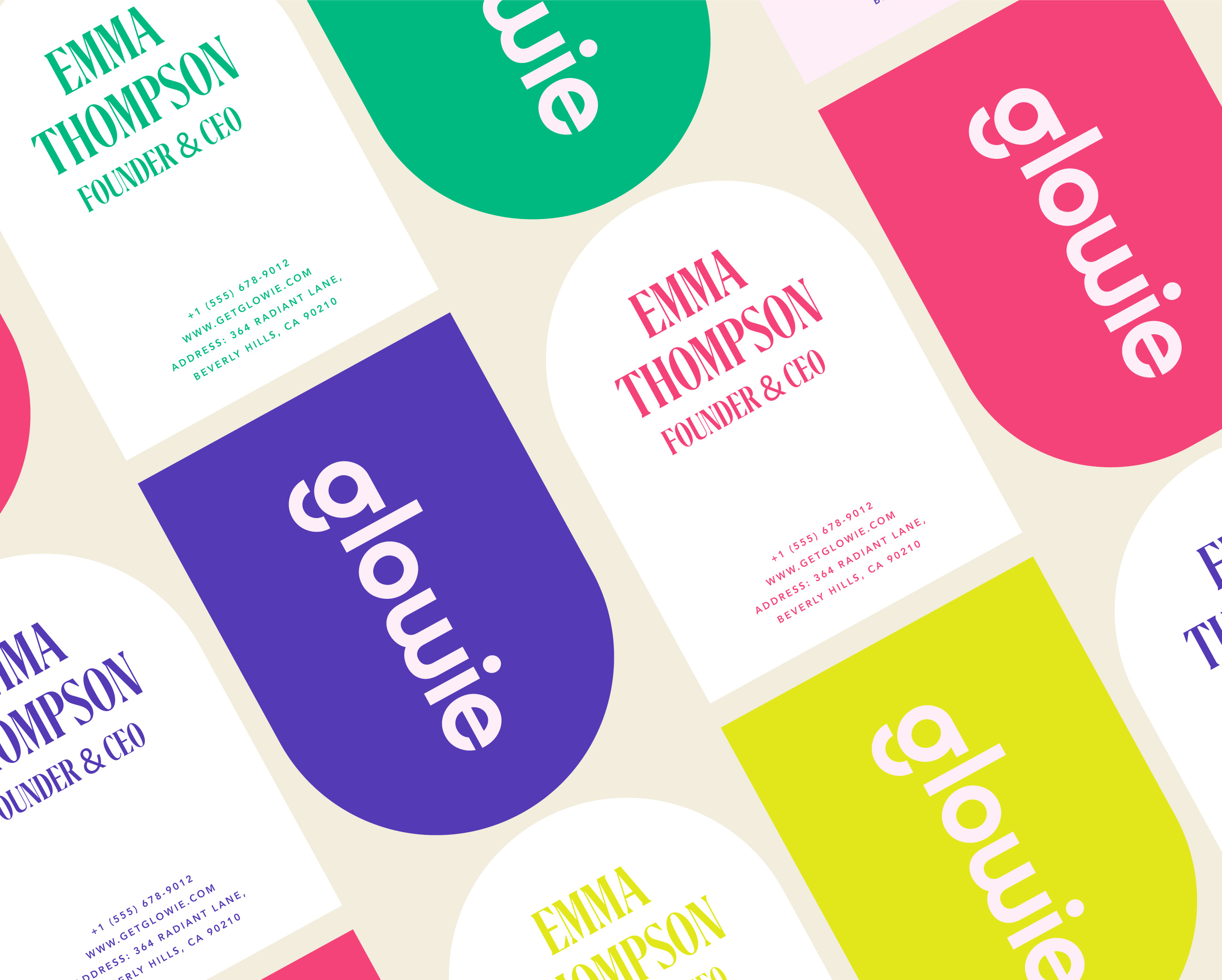
At its core, Glowie represents the belief that beauty is not about covering flaws but about highlighting individuality. Makeup is treated like a playful tool, almost the way children use crayons: bold, fearless, and unapologetically fun. This belief shaped the entire brand system. The identity revolves around three main pillars: playfulness, empowerment, and creativity. These values guided decisions in visual design, packaging, tone of voice, and strategy, ensuring that Glowie would consistently reflect the spirit of joy and inclusivity. The visual identity was designed to communicate this from the first glance. The logo, with its rounded, bubbly shapes, feels friendly and approachable, while still being simple enough to stand out on packaging and digital platforms. The color palette was intentionally vibrant, mixing neon pinks, energetic oranges, electric blues, and sunny yellows to symbolize diversity, inclusivity, and positivity. The typography system combines bold, contemporary sans-serifs with playful handwritten accents, striking a balance between professionalism and quirkiness. To complete the look, hand-drawn doodles, sparkles, and fluid shapes were integrated into the visual system, reinforcing the concept of play and creativity.
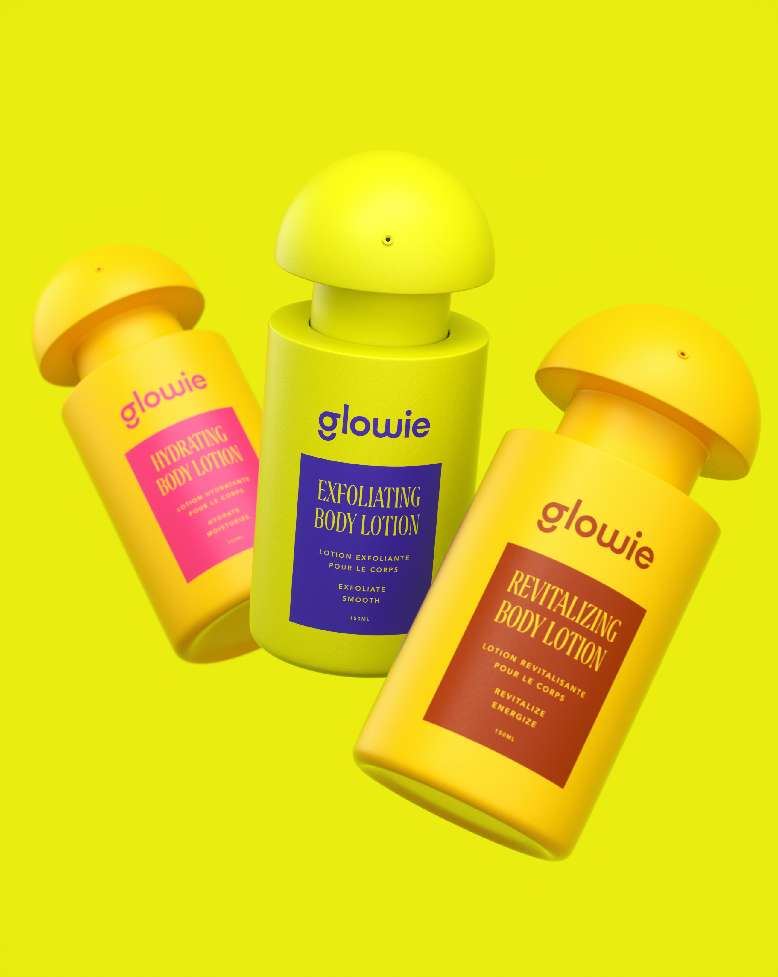
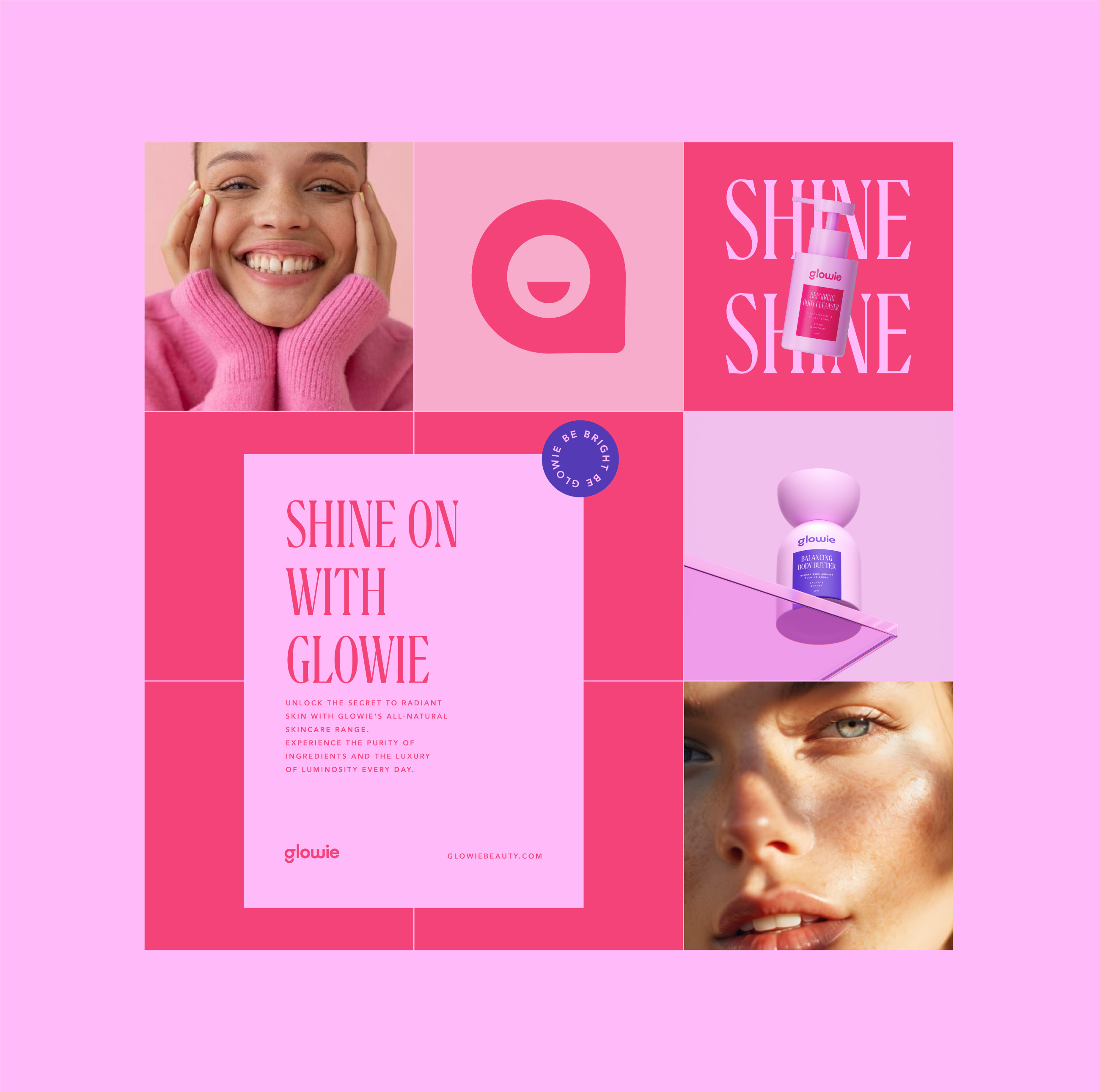
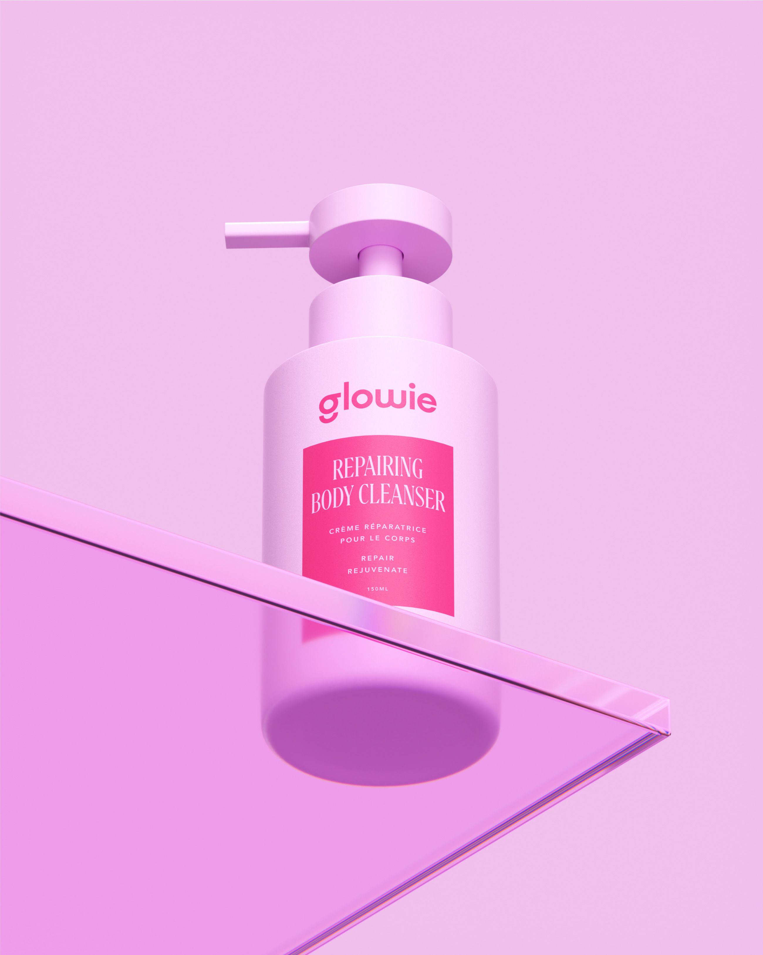
Packaging plays a central role in Glowie’s personality. Each product was treated as a little canvas that tells the brand story. Bold backgrounds, gradient combinations, and fun graphic elements make the primary packaging energetic and youthful, while secondary packaging, such as boxes, carry empowering phrases like “Glow Your Way” or “Shine On,” creating moments of delight for the customer. Sustainability was also a key focus, so packaging solutions use eco-conscious materials without losing the vibrant personality of the brand. The goal was to create products that are not just functional but also collectible, items that customers want to display proudly on their shelves or carry in their bags.
Equally important is the brand’s tone of voice. Glowie speaks like a supportive and playful friend. The copywriting avoids corporate jargon and instead uses uplifting, cheeky, and casual language. Phrases like “Glow isn’t just on your face, it’s in your vibe,” or “Beauty should be fun, not stressful,” make the customer feel included and understood. This friendly tone is consistent across every touchpoint — packaging, website, social media captions, and campaigns — ensuring that the brand experience feels personal and approachable.
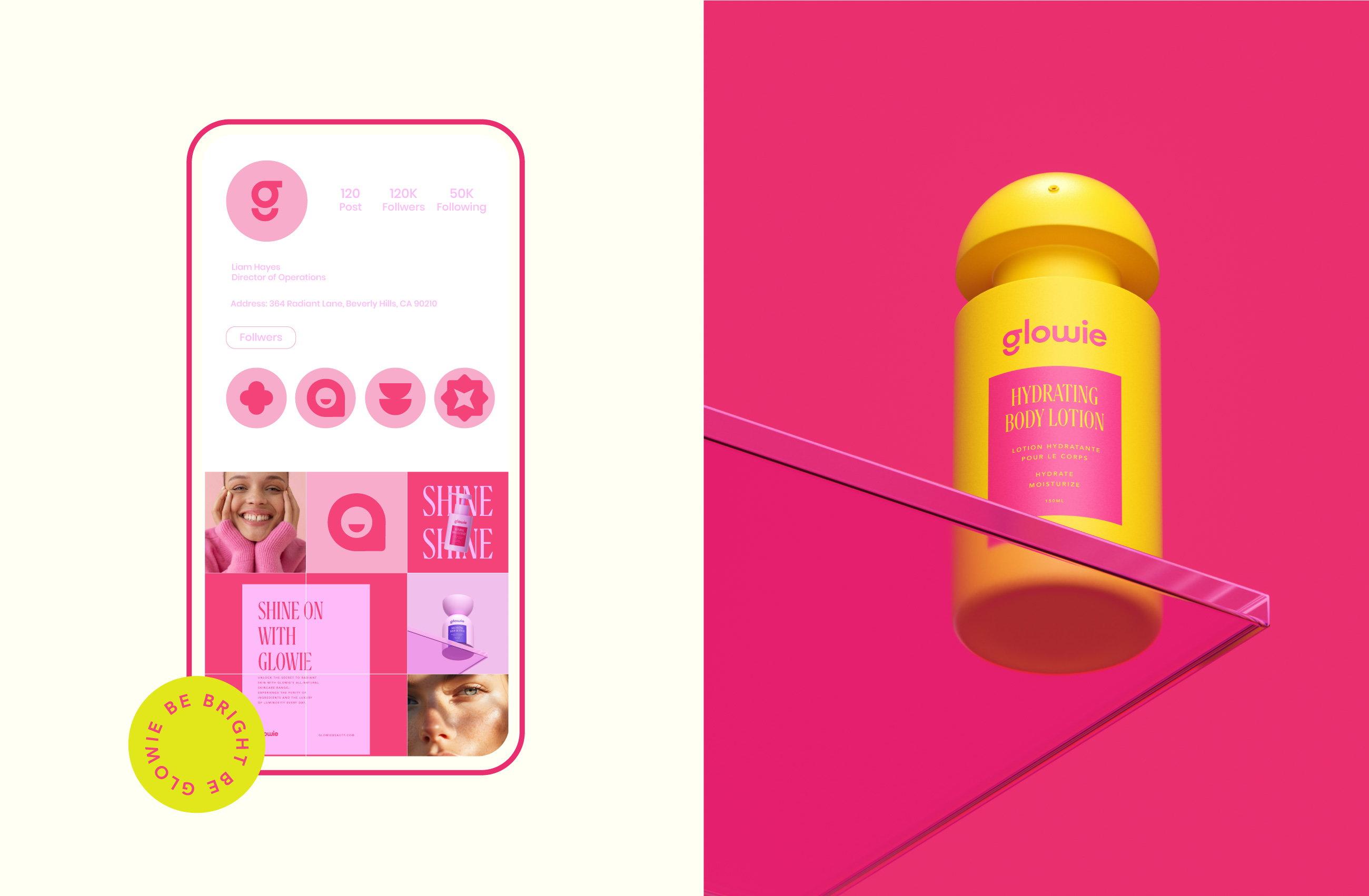
Glowie’s applications go far beyond just the product itself. The website was designed as a colorful and interactive platform that feels more like an experience than a store, with animations and dynamic layouts reflecting the playful nature of the brand. Social media embraces bold visuals and interactive content like polls, filters, and challenges, turning the community into active participants rather than passive followers. Marketing campaigns highlight seasonal stories, such as a summer edition called “Catch the Glow,” featuring neon visuals and beach-inspired collections. Even in physical spaces, Glowie maintains its playful spirit with pop-up kiosks and in-store displays that encourage customers to test and explore products in a fun, interactive way rather than in a formal setting.
The target audience of Glowie is as diverse as its color palette. It appeals to Gen Z explorers who see makeup as a tool for self-expression rather than conformity, to young professionals who want to add some playfulness to their routines, and to creative individuals who look for brands that reflect their artistic personalities. What unites them all is a desire for authenticity, inclusivity, and joy. Glowie taps into this mindset by positioning itself as the brand that celebrates individuality rather than enforcing rigid beauty standards.
Behind this energy lies a clear brand strategy. Glowie’s positioning is that of a “fun-first cosmetics brand that empowers individuality.” Its promise is simple yet powerful: to make every beauty moment feel like an opportunity to shine brighter. The brand’s core values are creativity, inclusivity, sustainability, and joy, and these values guide everything from product development to communication strategies. By aligning with cultural trends where consumers seek authenticity and purpose-driven brands, Glowie establishes itself as a disruptor in the beauty landscape.
The creative process behind Glowie was extensive and exploratory. Research showed that the beauty market was heavily saturated with luxury minimalism on one side and clinical precision on the other. There was a clear gap for something playful, bold, and modern. Inspiration was drawn from music festivals, street art, pop culture, and nostalgic childhood memories of stickers, toys, and candy packaging. Several directions were tested, from neon-heavy aesthetics to pastel minimalism, before finalizing the vibrant and joyful design system that defines Glowie today. Prototypes of packaging and visuals were tested with target audiences, ensuring they resonated emotionally and visually, and feedback helped refine the final details.
Glowie matters because it redefines what beauty can feel like. In a landscape where customers are often pressured to look perfect, Glowie shifts the focus to feeling good and having fun. Makeup, in this sense, becomes not a mask to hide behind but a tool to amplify one’s personality and mood. Glowie is not about chasing flawless beauty; it is about creating a vibe, a memory, and a little spark of joy. It invites people to embrace their imperfections and glow in their own unique way.
In the end, Glowie is more than a cosmetic brand; it is a movement toward joyful, inclusive, and fearless beauty. Every detail — from its vibrant colors to its witty tone of voice — was carefully designed to make the brand feel approachable, fun, and empowering. It is a colorful beacon in an industry that often pressures consumers with unrealistic ideals. Glowie’s message is simple yet powerful: you already have the glow, we are just here to help you shine it brighter.


CREDIT
- Agency/Creative: MarkaWorks
- Article Title: MarkaWorks Designs Glowie to Celebrate Individuality Through Joyful Cosmetics
- Organisation/Entity: Agency
- Project Type: Packaging
- Project Status: Non Published
- Agency/Creative Country: Turkey
- Agency/Creative City: Antalya
- Market Region: Global
- Project Deliverables: 3D Design, 3D Modelling, Art Direction, Brand Design, Brand Identity, Brand Naming, Brand Strategy, Branding, Graphic Design, Packaging Design, Typography, Web Design
- Format: Bottle, Box
- Industry: Beauty/Cosmetics
- Keywords: Branding, Packaging, 3D, Web Design,
-
Credits:
Creative Director: Mustafa Akülker


