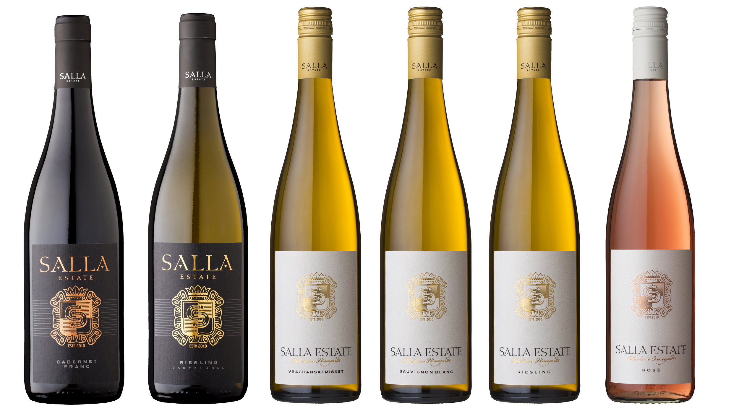
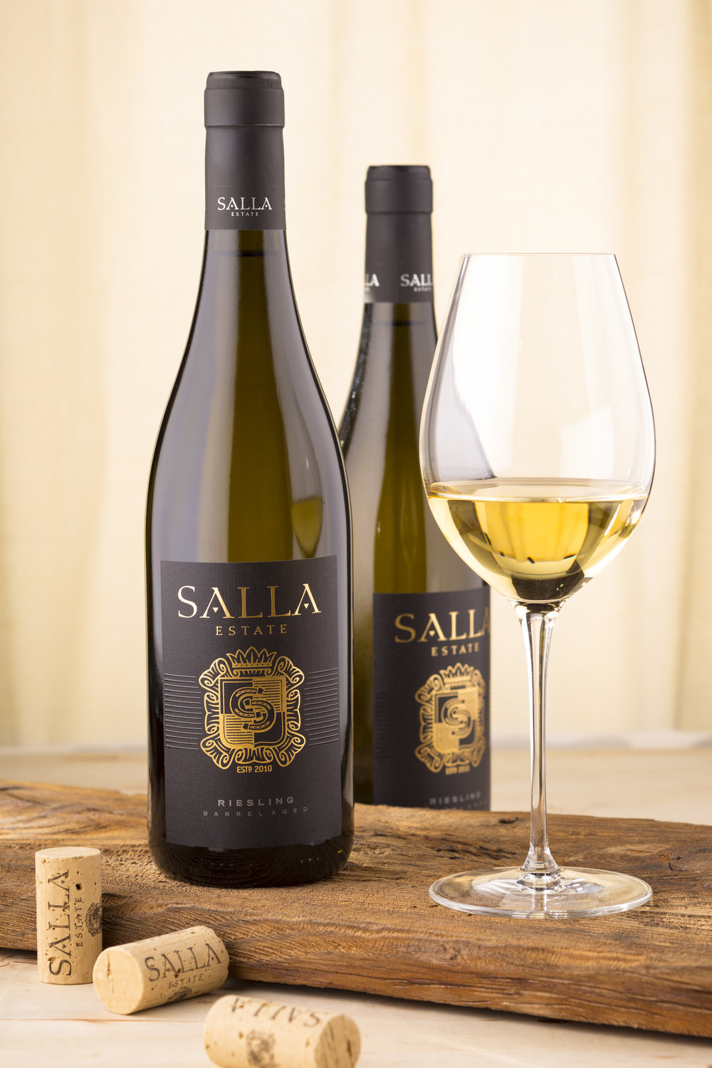
” Salla Estate is one of the most interesting wineries in Bulgaria. It is located in the heart of the famous Provadiya Plateau Sarta, only 60 km away from Varna. Nearby is the Muhaliysko Kale medieval fortress. The place is really ancient full with many artifacts dating back from the time of Stone Age till Middle Ages – a good reason to think of creating a modern heraldic label design. The name Salla comes from the word SALIH meaning – “PURE, NICE, GOOD” – in perfect unison with the idea to have a winery cellar in the area. Also the pronunciation of “SALLA” resembles the movement of the tongue to the palate when tasting our wines. Due to its close location to the Black Sea coast Salla is one of the best places for white wines. It is also a winery where tradition meets modernity in every aspect. That was the reason for me to create a heraldic logo for Salla when I started working for them back in 2009. Heraldry is the root of history and tradition. It is magnetic for almost everyone and it lives on in present days. In 2016 Salla’s team wanted fresh new look for their wines and I decided to use the moment and create a modern heraldic label because I wanted to cross past, present and future in my design.The label is very elegant containing only the most important information. I used Raflatac’s Velmart because I wanted thick classic paper with elegant random texture to strengthen the feeling of tradition. I like Velmart for many reasons and I often use it but in this particular case I think it was the perfect choice for modern heraldic label. Though looking simple this design was a difficult one because I had to keep good balance between modern shine and classic embellishment of the crest. They must live in harmony without one taking over the other.”
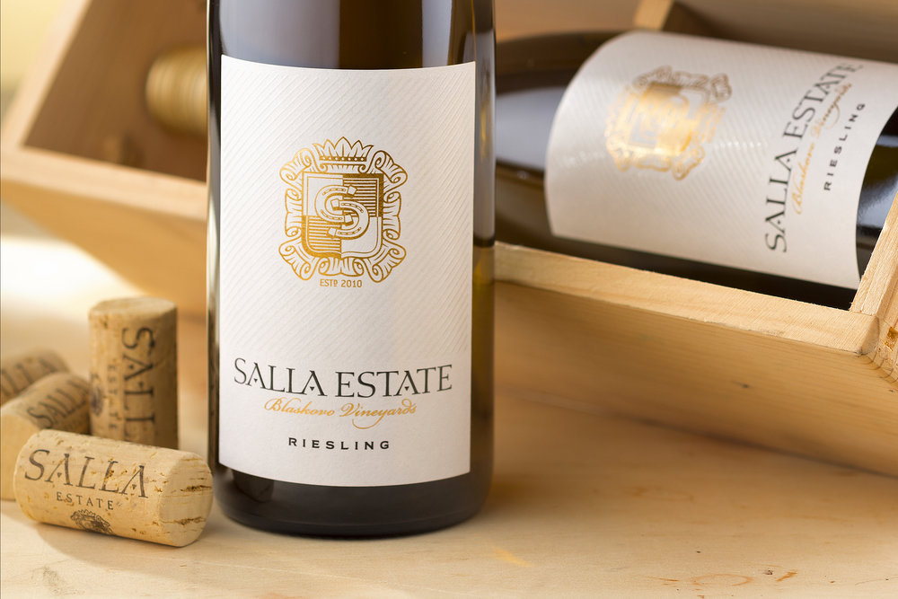
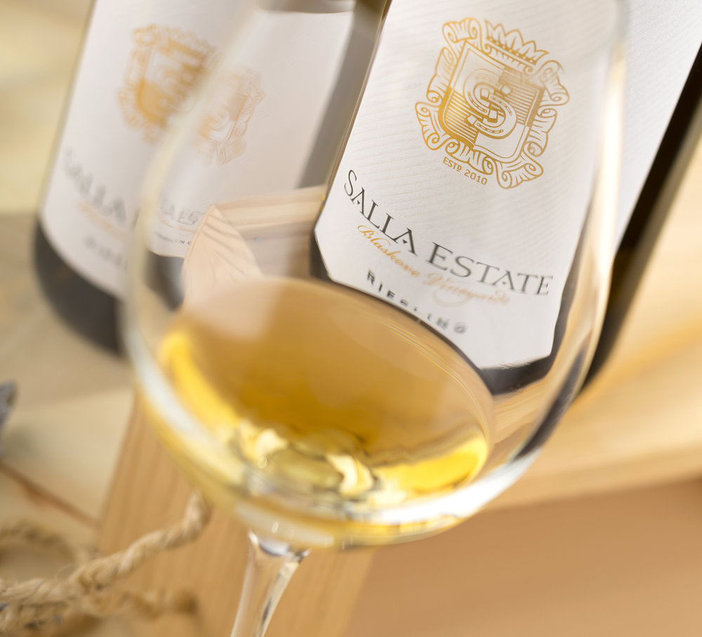
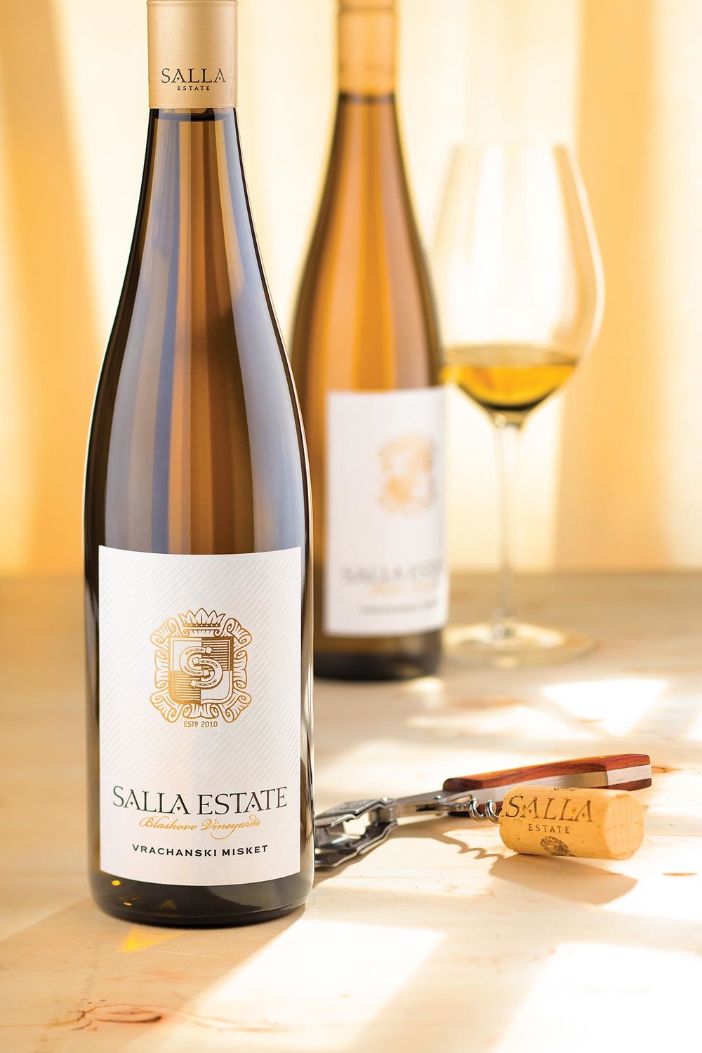
” When I made my paper choice I was 100% sure I had to use more saturated gold hot-foil to stamp the Salla logo. I picked one of my favorite ones by Lemaco – №336. Again influenced and inspired by heraldic tradition and modern design I created a pattern with diagonal lines printed directly with raised varnish against the paper background. I did some research for the lines’ thickness and spacing and the result was amazing. These lines made the whole label shine and they were the perfect addition to the paper background creating the best environment for the logo.As you know labels are my specialty, but there is a whole packaging here, not just the label. Looking for more harmony I decided to change the bottle along with the label. I picked an extremely stylish and elegant Rhein-type bottle by Saverglass and I never regret for my choice as it was the perfect complementary to my modern heraldic wine label.The bottle was designed with Stelvin sealing and our friends from Herti-M did a great job for our gold cap.Finally we had our whole packaging finished – a fresh modern look blended with old traditional heraldry. As I said in the beginning – my design is one of those examples where past, present and future cross in one point.”
CREDIT
- Agency/Creative: the Labelmaker
- Article Title: the Labelmaker – Salla Estate Wine Label design
- Project Type: Packaging
- Format: Bottle
- Substrate: Glass


