


In the dynamic and fiercely competitive ready-to-drink beverage market, launching a new product line requires more than just a great taste; it demands a compelling brand story and a visual identity that captures attention instantly. This was the challenge faced by APF Group for the launch of a new bubble tea line under its established King Island brand. The goal was to create a vibrant, engaging brand and packaging system that would not only stand out on crowded retail shelves but also resonate deeply with modern consumers. The result is METIME, a brand that masterfully transforms the simple act of drinking bubble tea into a cherished moment of personal indulgence and happiness.
The Core Concept: A Special Reward for Your Break
The entire brand philosophy is powerfully encapsulated within its name: METIME. The core design strategy was to forge an identity that speaks directly to the universal desire for a personal reward and a brief escape from the pressures of daily life. In a world that constantly demands our attention, the concept of “me time” has become an essential form of self-care. We wanted consumers to instantly perceive this beverage not just as a drink, but as a well-deserved treat—a special moment carved out specifically for themselves.
This central idea is brought to life with a charming and playful slogan, deeply rooted in a friendly, Thai-style conversational tone:
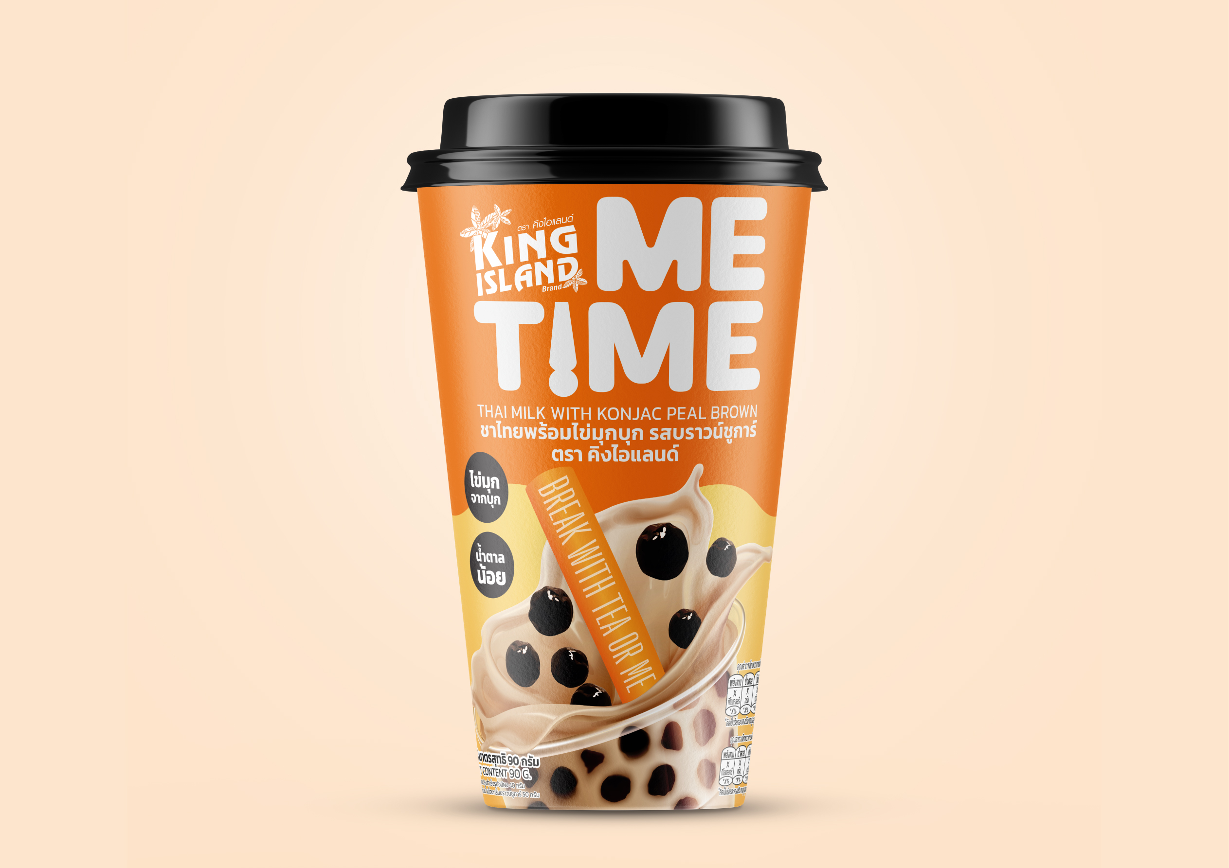
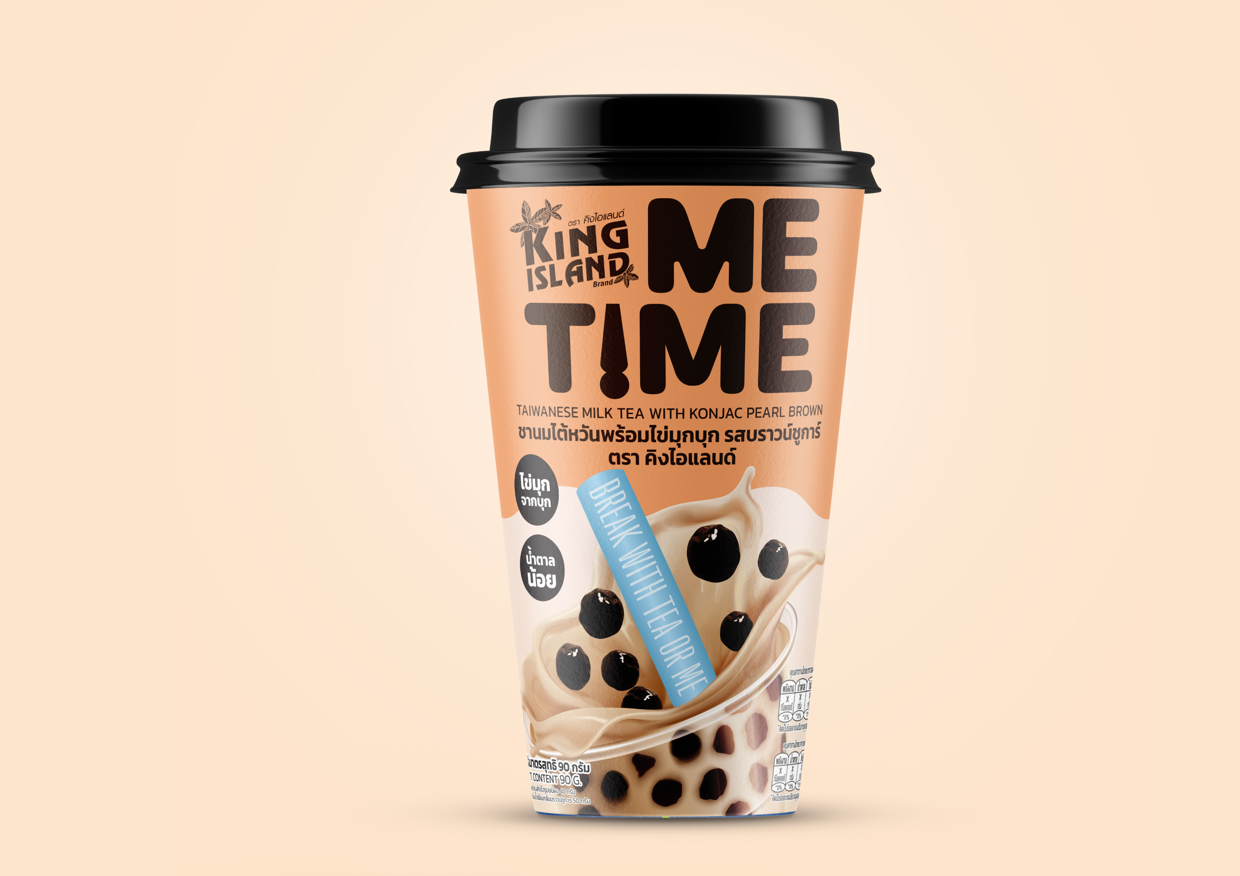
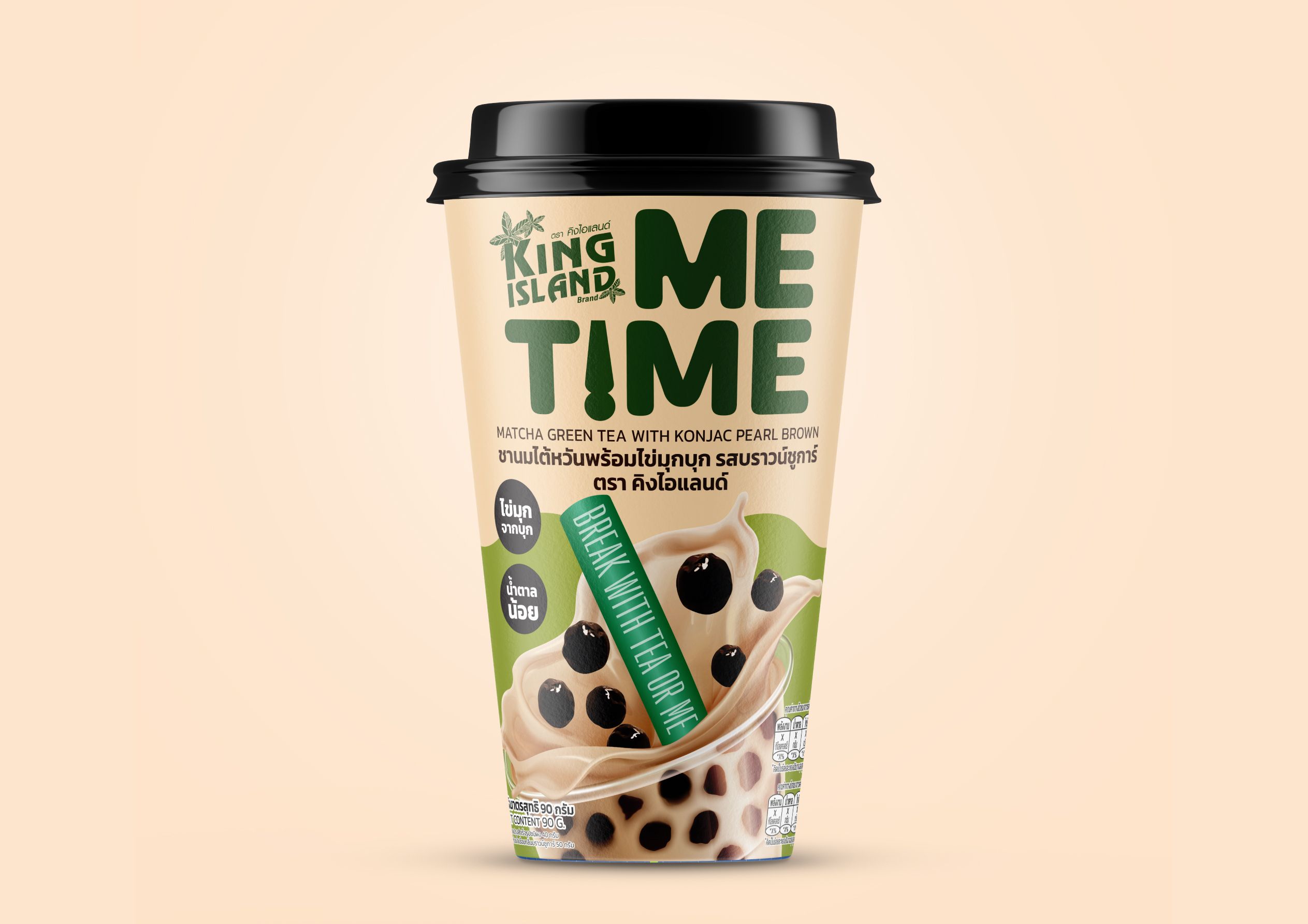
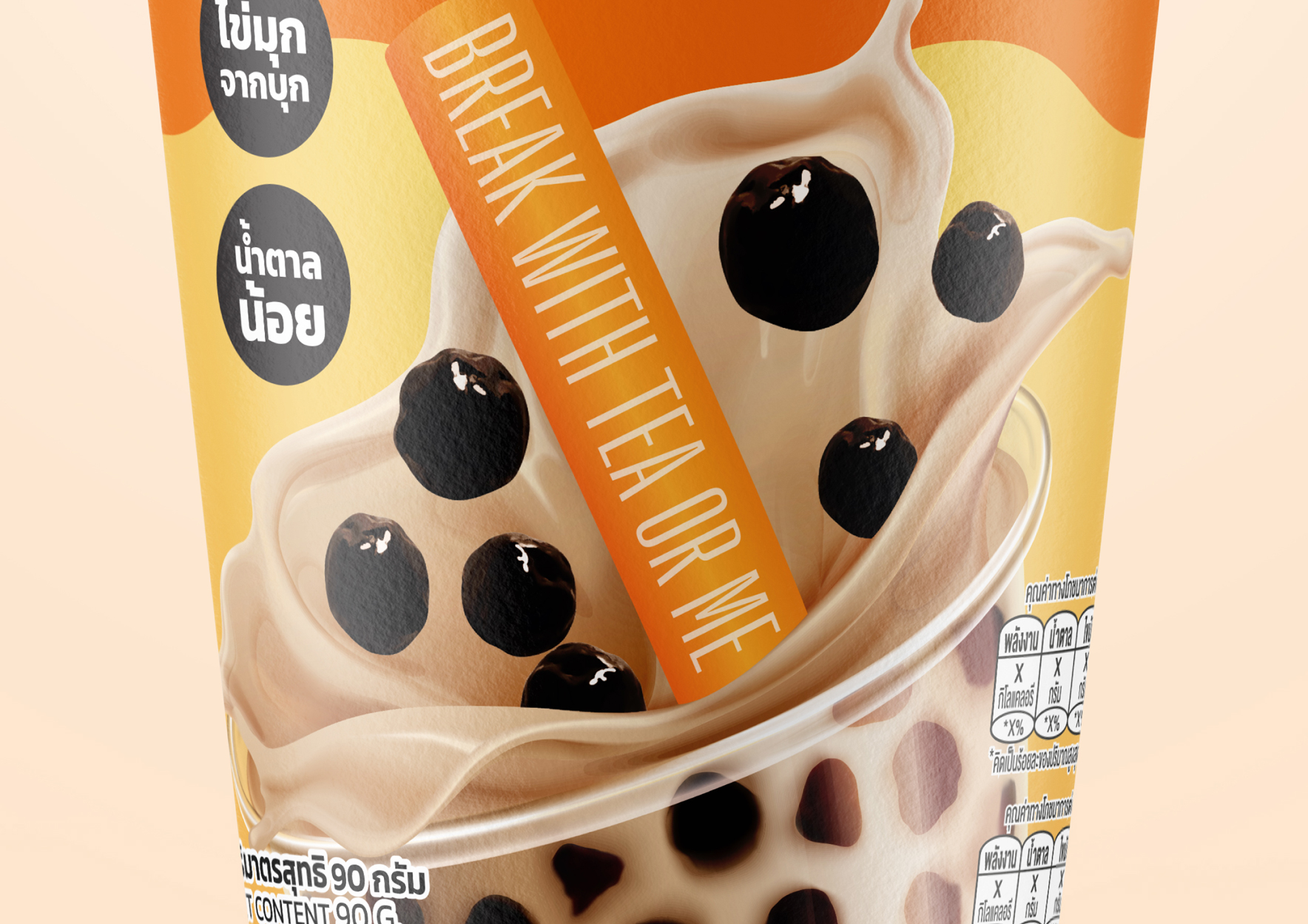
“BREAK WITH TEA OR ME”. This clever phrase, placed prominently on the packaging, functions as a delightful and charismatic invitation. The double meaning encourages consumers to take a physical “break” while playfully asking them to choose between “tea” or the brand “me,” personifying the product as a friendly companion for their pause. It’s a call to action that prompts a smile and reinforces the brand’s role in their personal moment of joy.
A Deep Dive into the Design System
The packaging design for METIME is a carefully orchestrated blend of modern aesthetics, vibrant energy, and a character that reflects the lively spirit of Thai daily life.
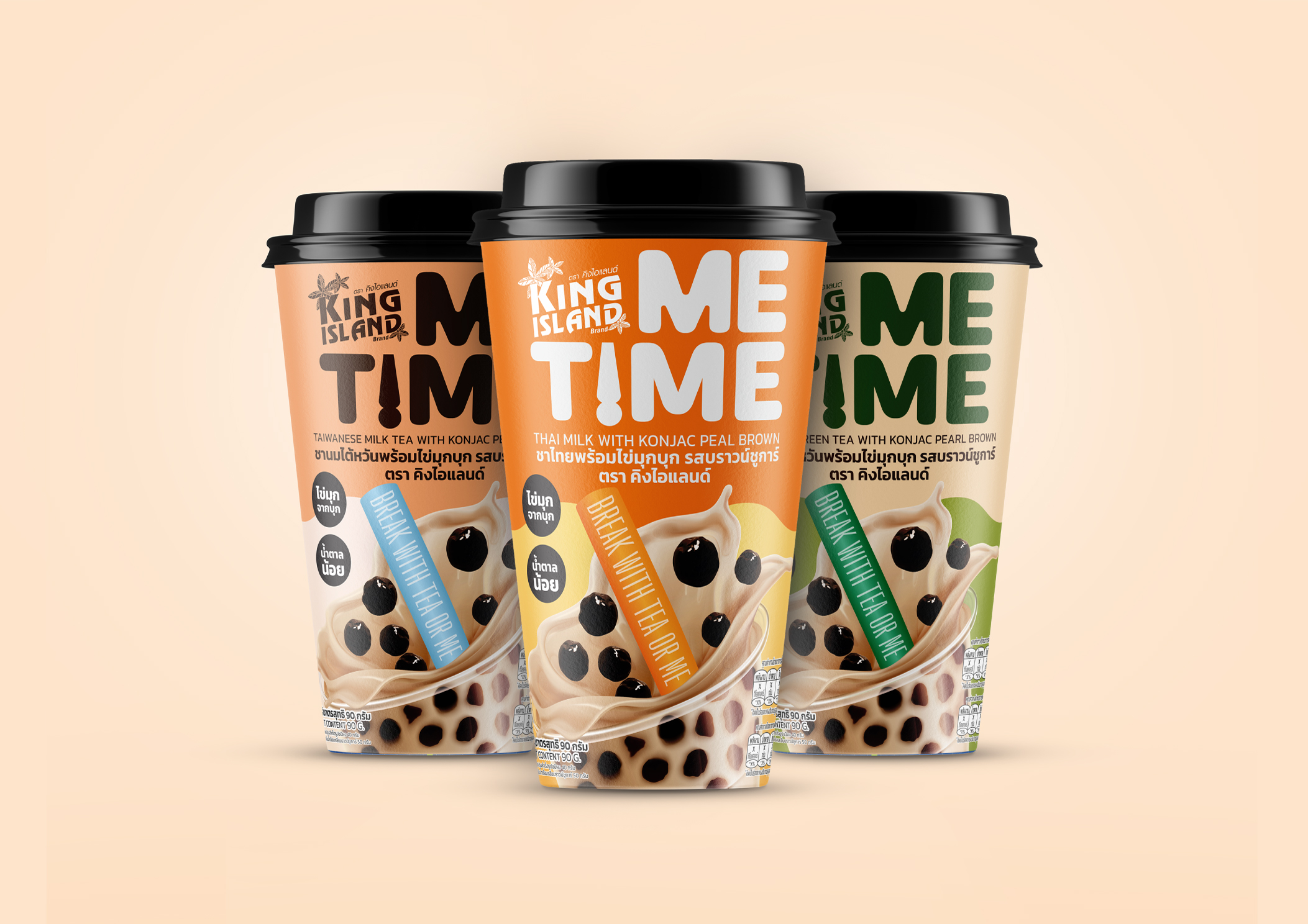
The Logo as a Mantra: The logo design ingeniously deconstructs the brand name, vertically stacking the words “ME” and “TIME”. This simple yet profoundly clever arrangement constantly reinforces the brand’s core message: “making time for me.” It becomes a visual mantra, a reminder of the product’s purpose. The design cleverly incorporates a large straw element, an iconic and instantly recognizable feature of the bubble tea experience, further grounding the brand within its product category.
Communicating Healthier Choices: Acknowledging the shift towards health and wellness among modern consumers, the packaging transparently communicates its key product advantages. Using clean, minimalist icons, the design clearly calls out that the drink features
”Konjac Pearls” —a healthier alternative to traditional tapioca—and is
”Low Sugar”. This approach builds trust and directly appeals to a health-conscious demographic seeking guilt-free indulgence.
A Strategy of Color: A vibrant and strategic color palette is employed to differentiate each flavor, creating a visually appealing product family. A warm and inviting orange signifies the classic Thai Tea , a rich brown and cool blue represent the authentic Taiwanese Milk Tea , and a calming, natural green is used for the Matcha Green Tea. This color-coding system not only facilitates easy flavor selection for the consumer but also creates a powerful and memorable block of color on the retail shelf, ensuring the brand is impossible to miss. The dynamic, splashing imagery of the milk tea itself evokes a powerful sense of refreshment and deliciousness, making the product visually irresistible from the very first glance.
Conclusion: A Resounding Success
The overall result is a packaging design that achieves far more than just aesthetic appeal. It is a powerful communication tool that effectively conveys the brand’s unique personality and key selling points. The thoughtful integration of concept, typography, color, and imagery ensures that METIME stands out as a leading choice for consumers seeking a beverage that offers both personal happiness and convenient, mindful indulgence.
CREDIT
- Agency/Creative: ihapstudio
- Article Title: ihapstudio Creates Playful And Modern Packaging Identity For MeTime Bubble Tea
- Organisation/Entity: Agency
- Project Type: Packaging
- Project Status: Published
- Agency/Creative Country: Thailand
- Agency/Creative City: Bangkok
- Market Region: Asia
- Project Deliverables: Logo Design, Packaging Design
- Format: Cup
- Industry: Food/Beverage
- Keywords: Bubble Tea, Thai Tea, Instant Tea, Packaging, Thailand
-
Credits:
Ihapstudio Co., Ltd.: Ihapstudio Co., Ltd.


