Introduction: Welcome to the Republic
Snicks Republic isn’t just a food brand; it’s a cultural moment. Born at the intersection of Afro-urban energy, sneaker culture, and unapologetic flavor, Snicks exists to redefine what it means to grab chicken in the streets.
In a world where food brands are either overly polished or forgettably bland, Snicks disrupts the space with raw authenticity. This isn’t simply fast food; it’s a full-blown culture drop. Every element, from the logo to the mascot, from the fried bucket to the bold tagline “Chicken tha Slaps,” was intentionally designed to create a brand that drips personality and crunches with confidence. Snicks is the Supreme of street chicken: fast, addictive, full of attitude, and made for the feed as much as it is for the streets.
Brand Idea & Essence
At its core, Snicks is about expression. Just like sneakers aren’t only shoes but a cultural badge, Snicks isn’t just chicken — it’s flavor you wear, taste, and flex. The essence of the brand is captured in three words: bold, street-bred, and flavor-charged. Bold means unapologetically loud in visuals, taste, and tone. Street-bred points to inspiration drawn from sneaker drops, music, and Afro-youth culture. Flavor-charged represents spice, texture, and visual punch that refuse subtlety. Where most fast-food brands sell meals, Snicks sells an identity. You don’t just eat Snicks, you belong to the Republic.
Logo Design & Rationale
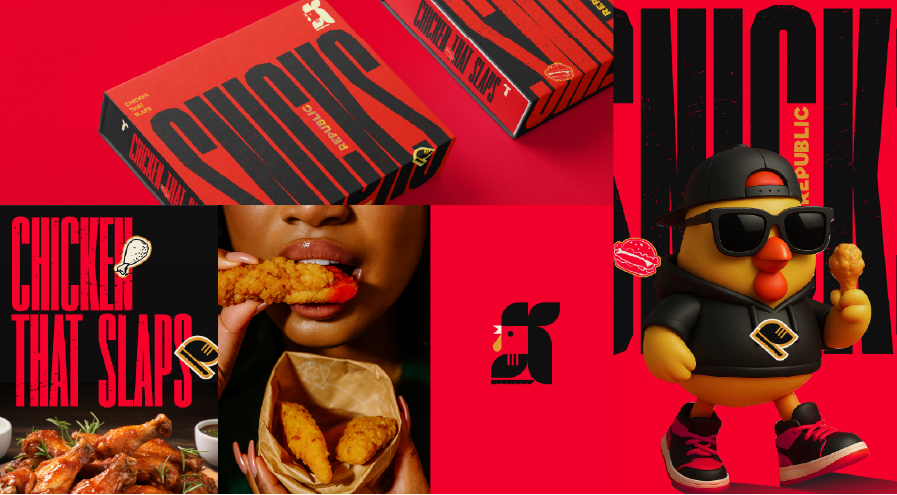
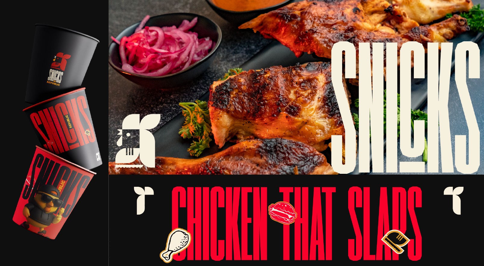
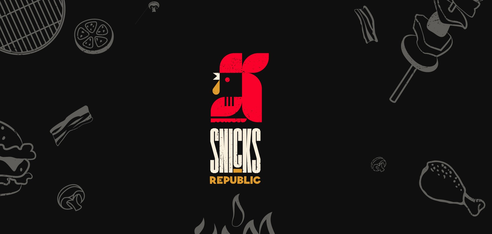
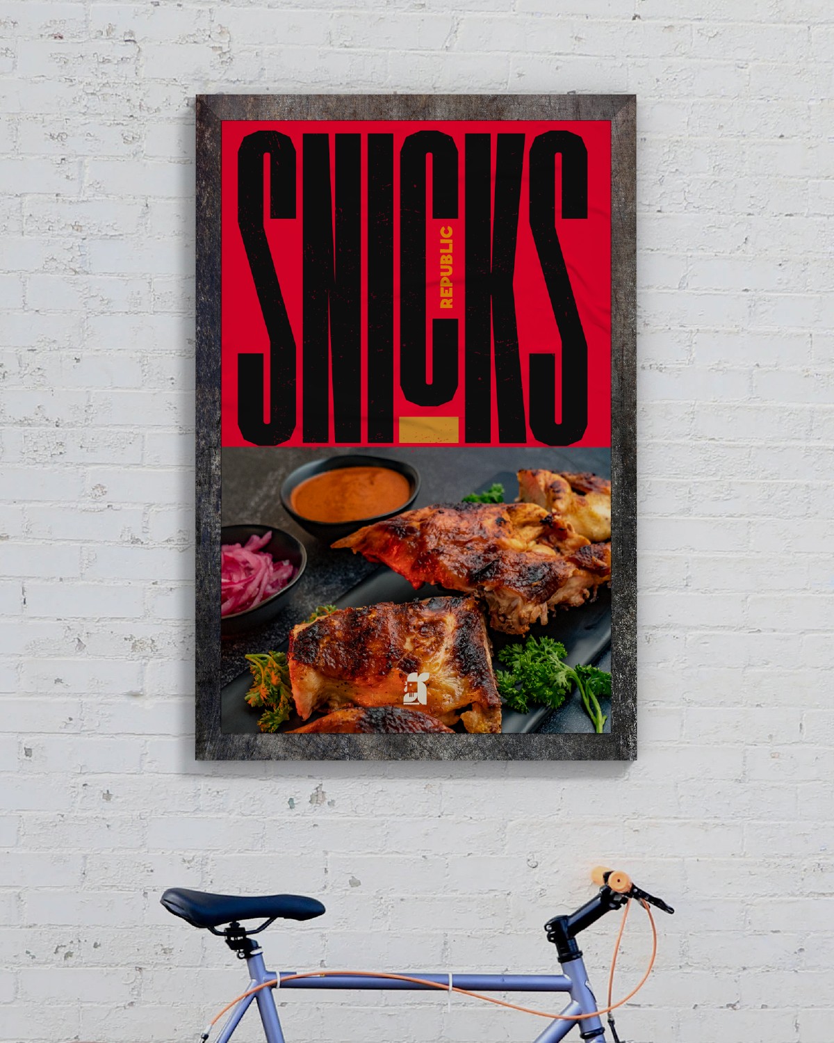
The Snicks logo was designed to feel like a streetwear badge. Its bold lettering resembles chunky sneaker typography, with tight spacing and edge cuts that suggest speed and bite. The typography itself nods to Afro-urban design language: geometric, playful, and versatile enough to work on packaging, merchandise, or graffiti-style murals. The wordmark is paired with strong iconography and adaptable lockups, ensuring it feels equally at home on a bucket of fried chicken, a hoodie drop, or a billboard in the heart of Lagos.
The Snick: Mascot Development
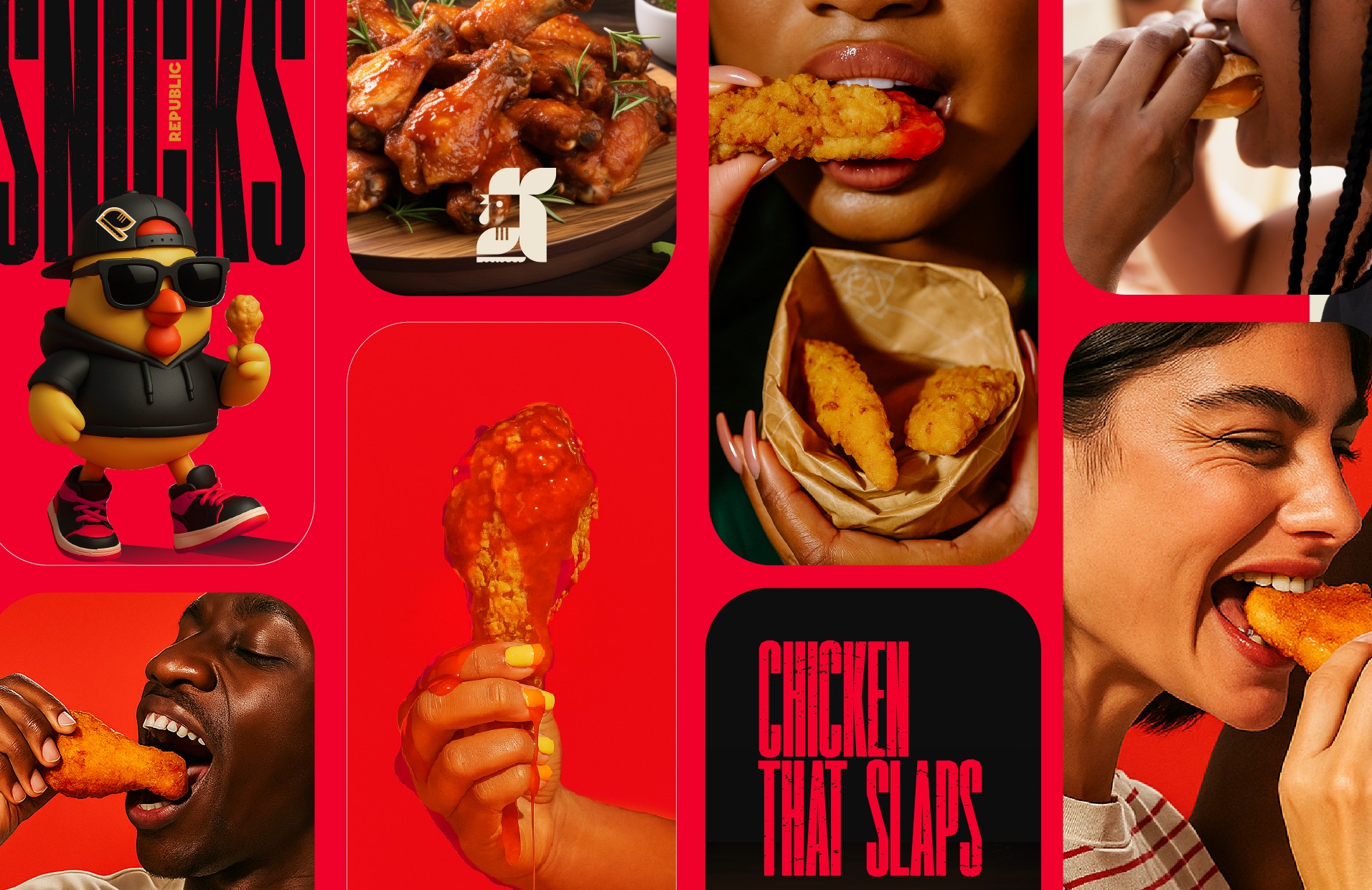
No Republic is complete without a face. Enter The Snick, a vibrant, cheeky mascot embodying everything the brand stands for. The Snick is a street-wise character that fuses sneaker culture and chicken cravings into one attitude-filled figure. Designed to be playful, street-cool, and versatile, it works across stickers, memes, animations, and lifestyle merch. More than just a mascot, The Snick is the Republic’s hype-man, rallying flavor fiends to join the movement.
Target Audience & Cultural Insight
Snicks was designed with Gen Z and young millennials in mind — flavor fiends, sneakerheads, and nightlife hustlers who live in cities, scroll endlessly, and flex identity through their food choices. This audience is often frustrated by boring, predictable fast-food brands and a lack of cultural resonance. They crave personality over polish, food that looks good on the timeline and tastes even better, and experiences that feel like community rather than transactions. By designing Snicks for both the feed and the streets, the brand positions itself as consumable, shareable, and proudly repped by its audience.
Visual Language & Style Guide
The Snicks identity was built to scream energy and attitude. The color direction combines fried-chicken golds with bold reds, neon greens, and street-black accents, chosen to spark appetite and feel fashion-forward, like sneaker colorways. Typography relies on heavy sans-serifs for headlines and flexible geometric type for supporting copy, echoing sneaker campaign posters. Patterns and graphics are inspired by sneaker soles, graffiti sprays, and Afro-centric line art, applied across packaging, social templates, and murals. The tone of voice is street, witty, and slang-driven. Instead of saying “Enjoy your meal,” Snicks declares, “Chicken tha Slaps.”
Packaging & Real-World Mockups
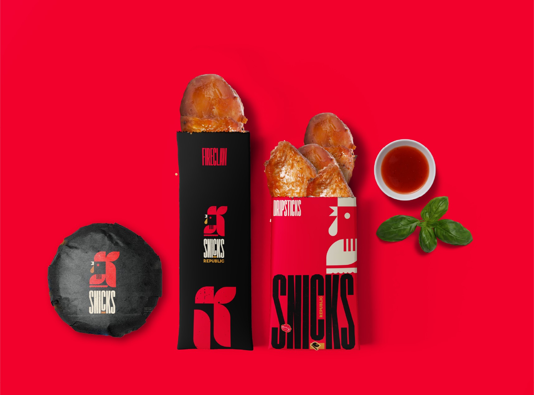
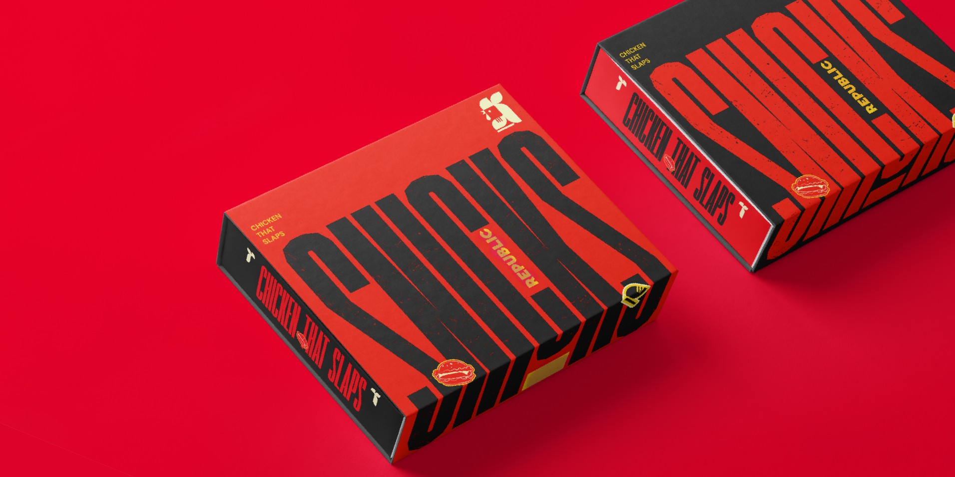
Snicks packaging was treated like sneaker drops. Every bucket, box, and bag was designed to feel collectible. Buckets and boxes carry bold colors, dripping typography, and The Snick mascot stamped like a badge of authenticity. Merch items such as hoodies and totes resemble streetwear, while delivery uniforms echo urban fashion. Environmental design extends the identity into urban billboards, fried-bucket lifestyle shoots, and city photography, ensuring that Snicks feels like part of the street energy.
Strategy: Positioning Snicks in the Market
Most chicken brands sell taste. Snicks sells attitude. The strategic positioning made Snicks the sneaker drop of food brands: limited, desirable, and cultural. This meant treating each product release like a streetwear launch, building hype through bold visuals and slang, and placing the brand in conversations not only about food but also about fashion and music. Snicks doesn’t compete with generic chicken shops; it competes with lifestyle brands.
Tagline: Chicken tha Slaps
The tagline distills the essence of Snicks into four words. It leans into Gen Z slang and flex culture, instantly connecting with its audience. Its adaptability makes it effective across campaigns such as “Merch tha Slaps” or “Flavor tha Slaps.” Memorable and flexible, it spreads organically online and offline.
Social Media & Community Strategy
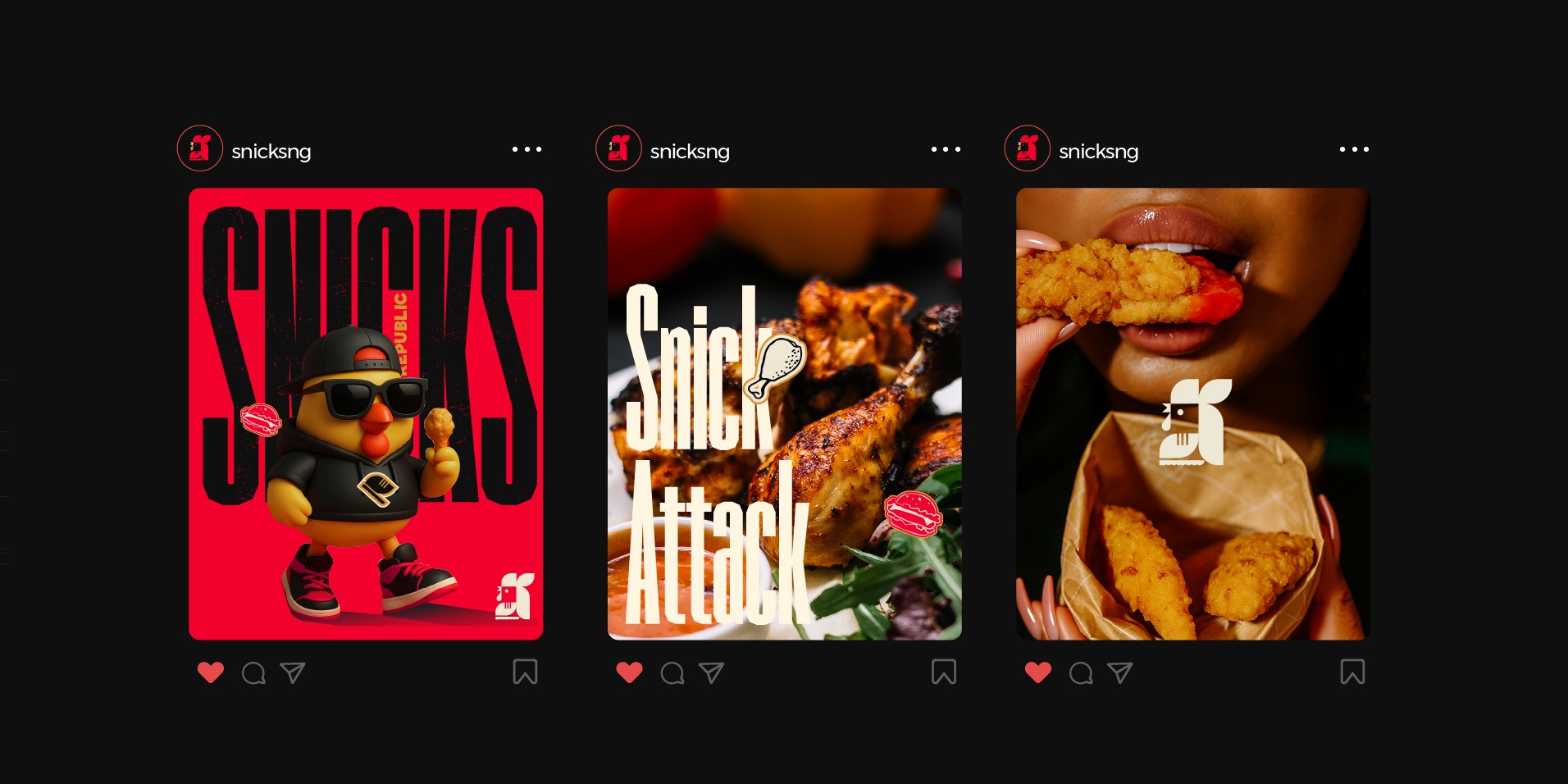
Snicks was designed for the timeline first. Every asset, from animated logos to mascot stickers, was optimized for engagement. The strategy included turning The Snick into memes and GIFs, shooting buckets like sneaker campaigns, encouraging user-generated content through “Snicks fits,” and launching collabs with music, art, and streetwear brands. In doing so, Snicks positioned itself as a cultural participant rather than just a fast-food vendor.
The Experience: More Than Food
At Snicks, grabbing chicken is about more than a meal. It’s the vibe of the packaging, the attitude of the voice, the shareability of the look, and the crunch of the flavor. Snicks delivers chicken that hits as hard as a bassline in a street anthem.
Conclusion: The Republic Stands
Snicks Republic is more than a brand; it’s a movement. Built for the culture, designed with precision, and delivered with unapologetic confidence, Snicks embodies the energy of a sneaker drop in food form. Whether it’s a midnight bucket grab, a lifestyle photoshoot, or a collab with local artists, Snicks stands loud and proud in the streets. Because Snicks doesn’t whisper — it yells with flavor.

CREDIT
- Agency/Creative: Dexios Graphics
- Article Title: Snicks Republic Visual Identity by Dexios Graphics
- Organisation/Entity: Freelance
- Project Type: Identity
- Project Status: Published
- Agency/Creative Country: Nigeria
- Agency/Creative City: Lagos
- Market Region: Africa, Global
- Project Deliverables: Brand Creation, Brand Design, Brand Identity, Brand Mark, Brand Strategy, Brand Tone of Voice, Branding, Logo Design, Motion Graphics, Packaging Design, Poster Design, Typography
- Industry: Food/Beverage
- Keywords: Brand, Identity, Design
-
Credits:
Art Direction and Brand Designer: Oluwatobiloba Otun


