


A Brand that Takes Flight: The Bird Solutions Identity
This project showcases the complete brand identity crafted for Bird Solutions, a new venture designed to soar above the competition. Our objective was to create a distinct and professional presence in the market—one that establishes immediate trust and positions the company as an authoritative, yet approachable, leader in its field. We began with the fundamental insight that a brand’s strength lies in its consistency, and with that, we built a comprehensive system of visual elements from the ground up.
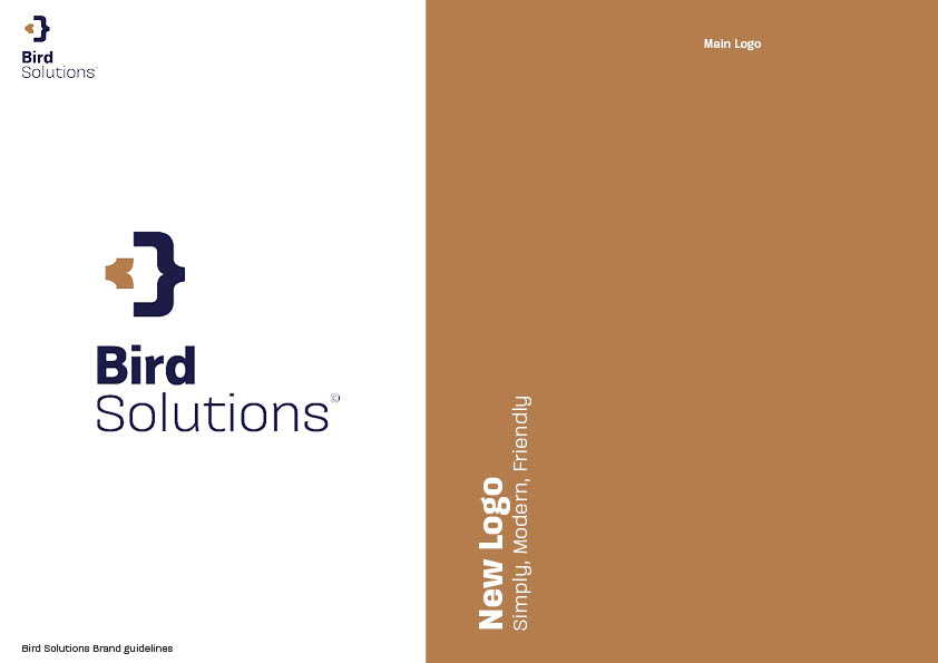
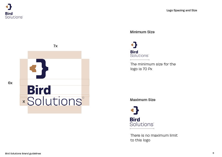
The core of the identity is a dynamic logo that skillfully blends a modern, geometric form with a recognizable feathered silhouette. This dual-purpose design visually represents both the company’s name and its commitment to precise, intelligent solutions. The primary logomark, a stylized bird in motion, suggests forward momentum and expertise, while the accompanying logotype features a clean, sans-serif font that projects clarity and confidence. This thoughtful combination ensures the logo is highly versatile and instantly memorable, whether it’s on a business card or a large-scale vehicle wrap.
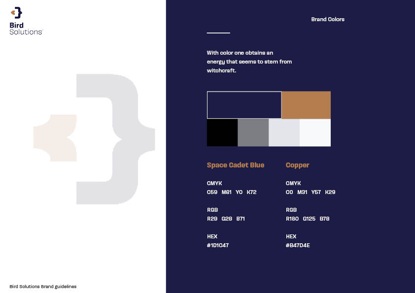
The color palette was chosen to evoke a sense of calm, reliability, and natural intelligence. A deep, professional blue serves as the anchor, symbolizing trust and expertise. This is complemented by a vibrant, energetic orange that represents warmth, innovation, and a proactive approach. Neutral tones of warm gray and crisp white provide the perfect backdrop, allowing the core colors to pop and maintain a modern, sophisticated feel.
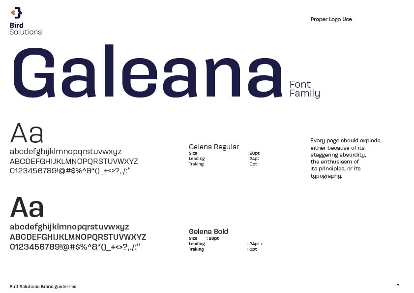
This visual language is further reinforced through typography. We selected a clean, highly legible sans-serif for headlines and key messaging to convey a clear, no-nonsense tone. For supporting body text, a slightly warmer, more open typeface was chosen to ensure readability and add a human touch. Together, these typefaces balance a sense of corporate authority with an accessible, friendly demeanor.
The final result is a cohesive and memorable brand that doesn’t just look good—it performs. By meticulously applying these visual assets across all brand touchpoints, from a modern website and social media graphics to professional uniforms and marketing materials, we’ve ensured that the Bird Solutions brand tells a clear, confident story at every interaction. This unified approach doesn’t just make the brand stand out; it actively communicates the company’s core values and message, building a strong connection with its ideal audience and fueling its long-term growth.
CREDIT
- Agency/Creative: Amr Gamil Serag
- Article Title: Bird Solution Branding by Amr Gamil Serag
- Organisation/Entity: Freelance
- Project Type: Identity
- Project Status: Published
- Agency/Creative Country: Egypt
- Agency/Creative City: Cairo, Egypt
- Market Region: Middle East
- Project Deliverables: Brand Identity
- Industry: Technology
- Keywords: Branding, Identity, Logo
-
Credits:
Designer: Amr Gamil Serag


