


REI Co-op is an outdoor retailer built on a simple but powerful idea: “We believe a life outdoors is a life well-lived.” Since 1938, when Lloyd and Mary Anderson searched for quality mountaineering gear and decided to form a cooperative to share it with others, REI has been driven by a pioneering spirit rooted in accessibility and discovery. That legacy continues today, shaping how the brand inspires people to explore, connect, and care for the natural world.
The outdoor retail industry often feels crowded with the same language and imagery. Bold sans-serif typography, green-heavy palettes, and glossy lifestyle photography dominate the space, with most competitors focusing narrowly on gear performance or discounts. REI stands apart by cultivating something deeper: a culture of community and shared experience.
Not only does REI offer countless options for their outdoor equipment, but they actively create community through monthly events, classes, podcasts, and campaigns. However, within the current brand, these offerings often feel tucked away, accessible primarily to loyal members or those who actively seek them out. To a new or casual customer, REI can still appear first and foremost as a retailer, with its deeper values less immediately visible. This rebrand addresses that gap by bringing REI’s unique qualities to the forefront. By making these differentiators more visible and accessible, the rebrand ensures that REI is understood from the start not just as a place to buy gear, but as a platform for guidance, connection, and possibility.
This rebrand builds on that foundation by shifting the focus from products to people, from selling equipment to celebrating the journeys those tools make possible. It asks a simple question: What path will you take?
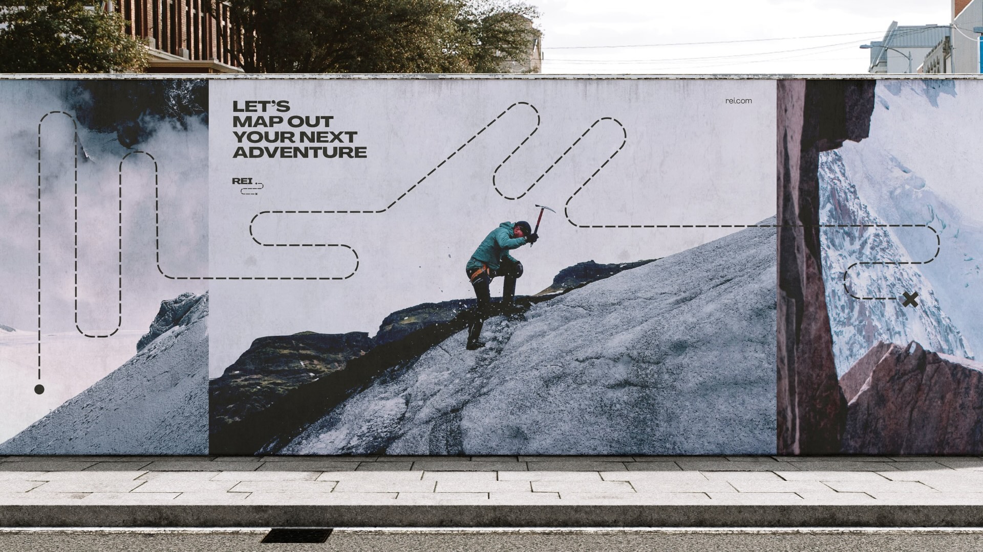
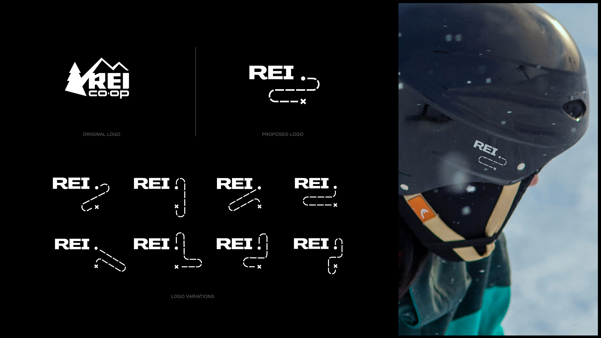
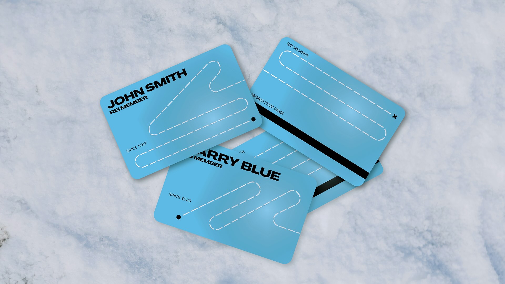
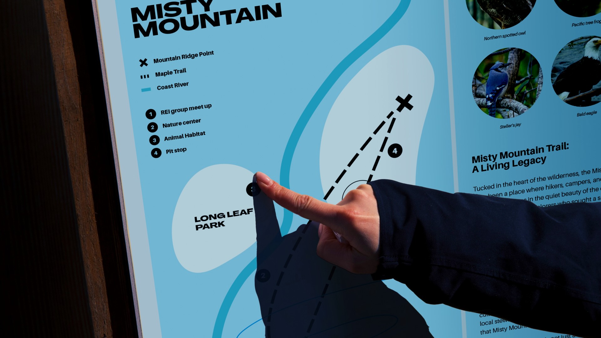
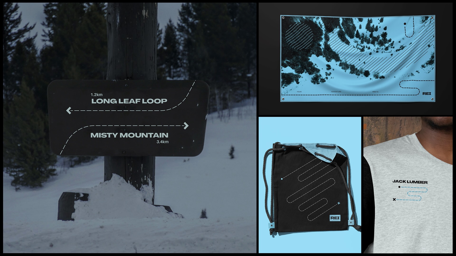
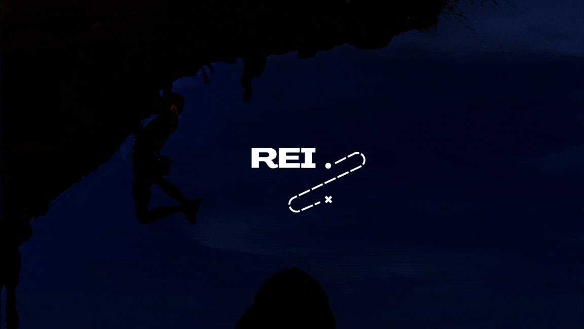
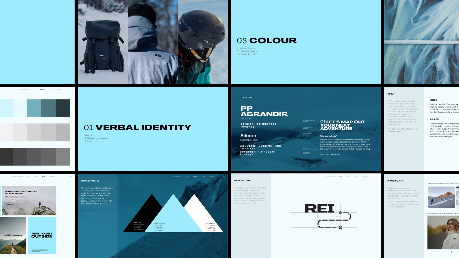
Inspired by trail maps and the spirit of “X marks the spot,” the new identity places exploration and discovery at its centre. The redesigned logo features a word mark with a dotted path weaving through it. It’s a variable mark that adapts and changes to reflect the countless possibilities to the outdoors. The design system expands on this idea, with shifting lines and patterns that echo trails, maps, and routes. All visual reminders that adventure is not a single destination but a series of choices, detours, and discoveries.
The colour palette is inspired by the brand’s origin story. Cool alpine tones reference REI’s mountaineering roots and the iconic ice axe that launched the co-op more than 80 years ago. The visual system carries the story of resilience and determination, making the outdoors feel approachable and inviting.
At the heart of the rebrand are two values that have guided REI since its beginning: accessibility and opportunity. Accessibility is not just about affordability. It is about lowering barriers so that anyone, regardless of experience, background, or means, can step outside with confidence. REI enables this through sustainable gear, inclusive pricing, and educational resources that help people begin their own outdoor story. Opportunity flows naturally from there. With the right tools and knowledge, anyone can discover new trails, strengthen old friendships, or simply find peace in a quiet park.
This brand evolution embraces the diversity of outdoor experiences. It celebrates both grand summits and small neighbourhood walks, the seasoned climber and the first-time camper. Adventure does not need to be far away or extraordinary. It begins where you are, with what you have, and grows into something personal and meaningful. By aligning its identity with the spirit of exploration and personal adventure, REI steps into the role of guide rather than just retailer. The rebrand makes clear that REI is here to map out experiences, to remind people that the outdoors is not exclusive or unattainable, but open to all. It reinforces that every journey is worth honouring, and every path has value.
This rebrand is a renewal of purpose. It honours how far REI has come since its first ice axe while looking ahead to endless routes and boundless possibilities. It ensures REI continues to stand not only as a place to buy gear but as a companion in the stories people create with the world around them.


CREDIT
- Agency/Creative: Eva Morenets
- Article Title: Eva Morenets Redefines REI Co-op With A Rebrand That Inspires Exploration And Community
- Organisation/Entity: Student
- Project Type: Identity
- Project Status: Non Published
- Agency/Creative Country: Canada
- Agency/Creative City: Richmond
- Market Region: North America
- Project Deliverables: Brand Identity, Brand Mark, Brand Redesign, Brand Refinement, Brand Rejuvenation, Brand Strategy, Brand Tone of Voice, Branding, Creative Direction, Design, Logo Design
- Industry: Retail
- Keywords: WBDS Student Design Awards 2025/26 , Adventure, accessibility, dynamic, spirited, loyal, exploratory, versatile, human-centred
-
Credits:
Instructor: Michael Cober
Educational Institution: Wilson School of Design


