


In a world overflowing with generic sauces and predictable packaging, one Spanish brand is rewriting the rules. Guay isn’t just selling sauces, it’s selling experience, emotion, and a splash of sunshine in every jar.
The name itself says it all. Guay, meaning “Cool” in Spanish, immediately sets the tone: playful, vibrant, and full of life. It hints at what’s inside the bottle, flavors that are as bold and memorable as the packaging itself.
This is not just marketing. It’s a philosophy: food is more than taste; it’s feeling, story, and a moment captured in color and shape.
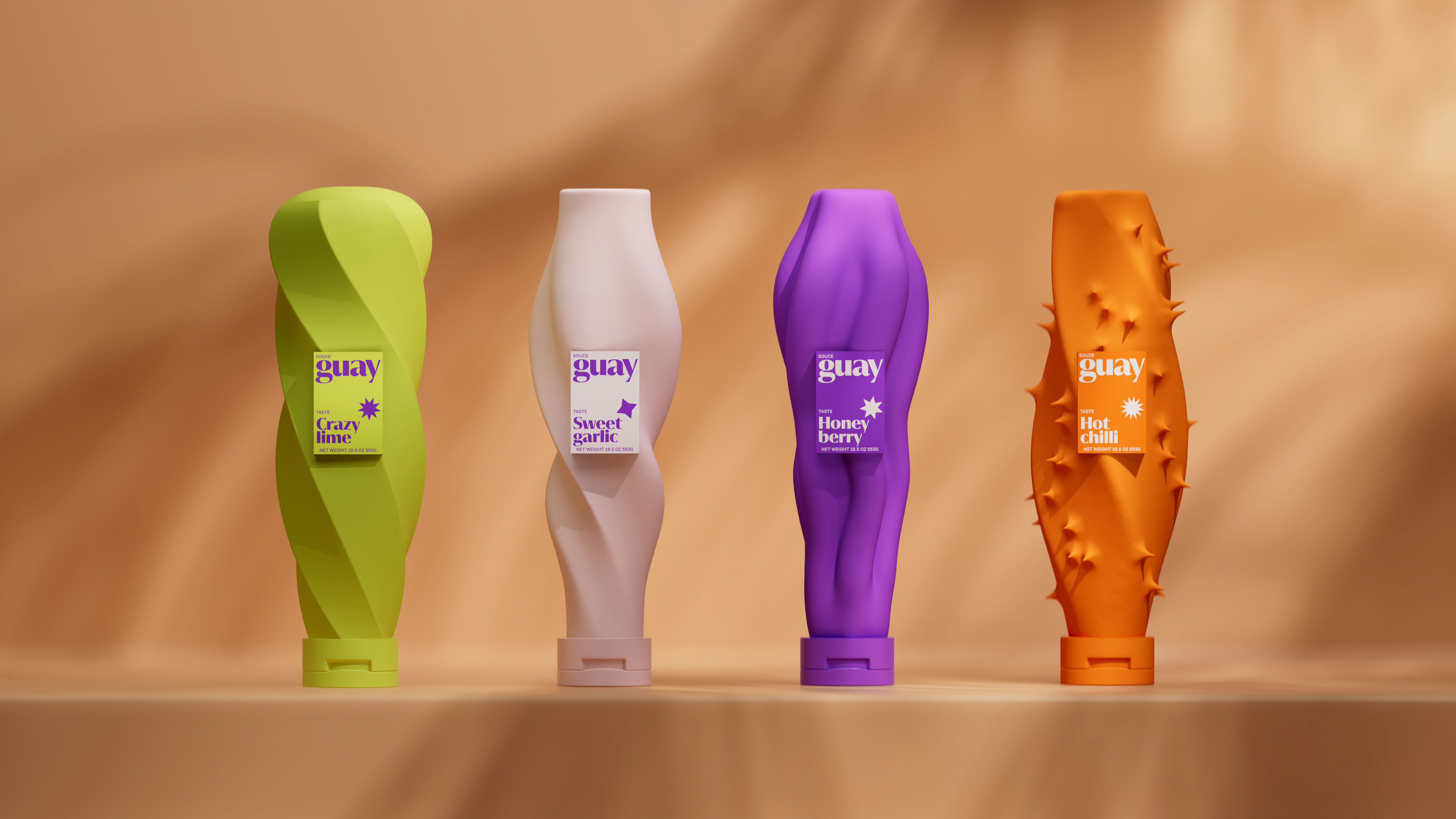
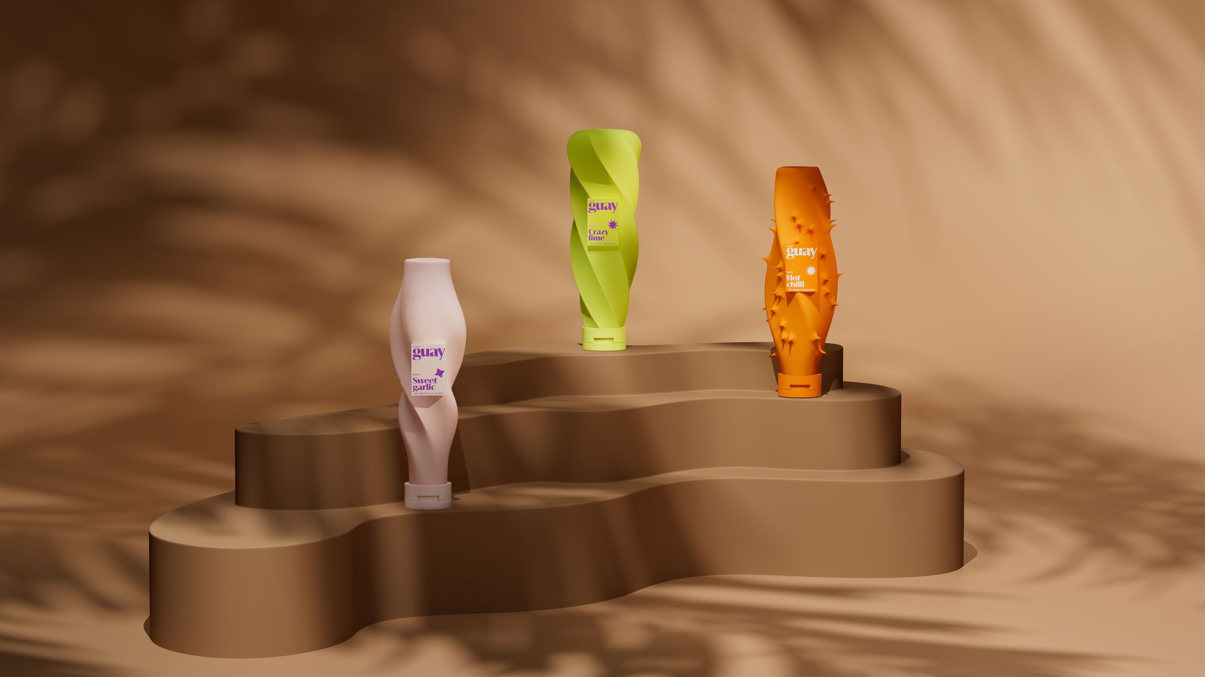
What sets Guay apart is its fearless approach to design. Each flavor has a unique, sculptural form that visually communicates its character:
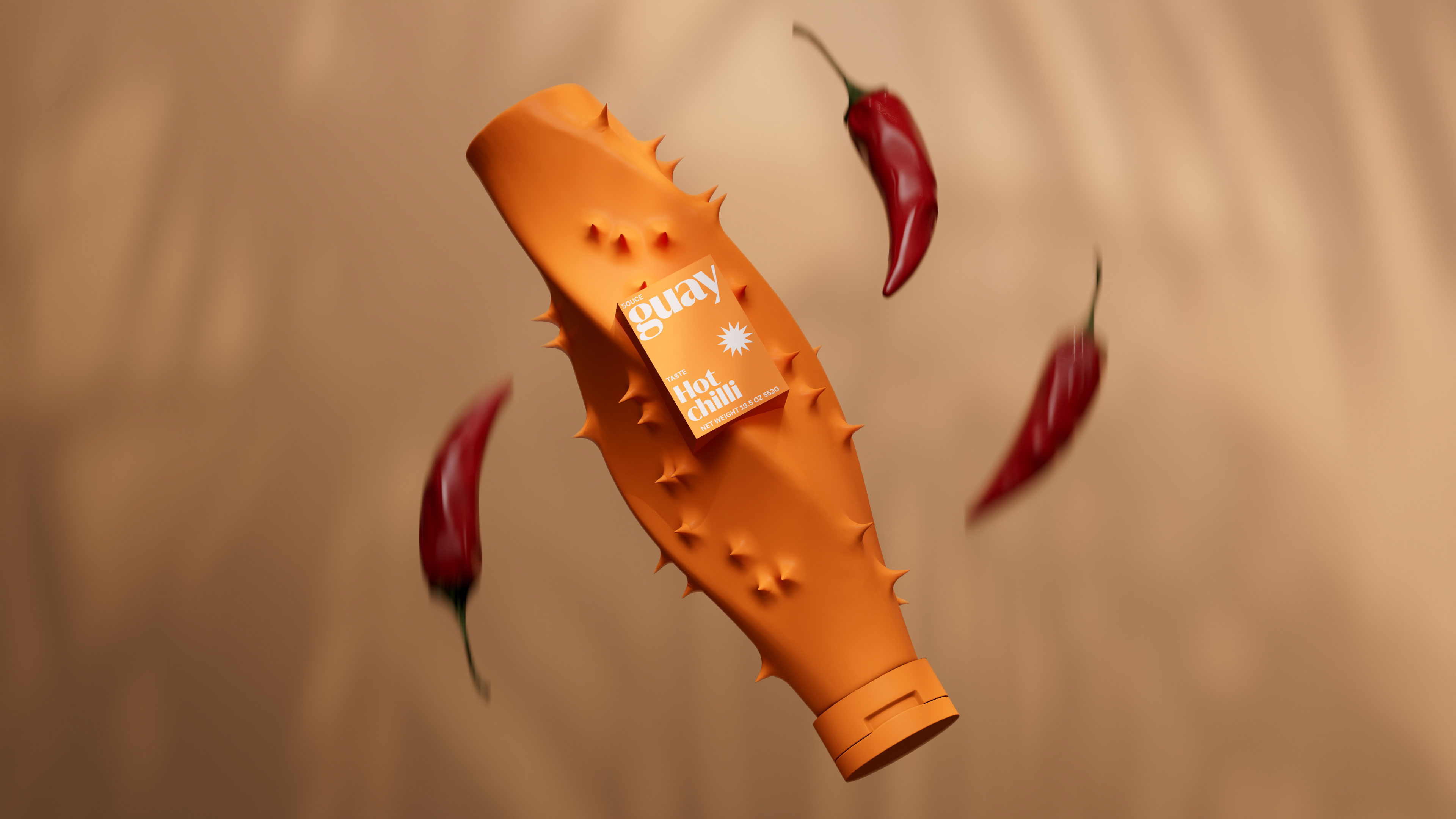
Hot Chilli: Jagged, spiked, and daring the moment you pick it up, you know it’s spicy.
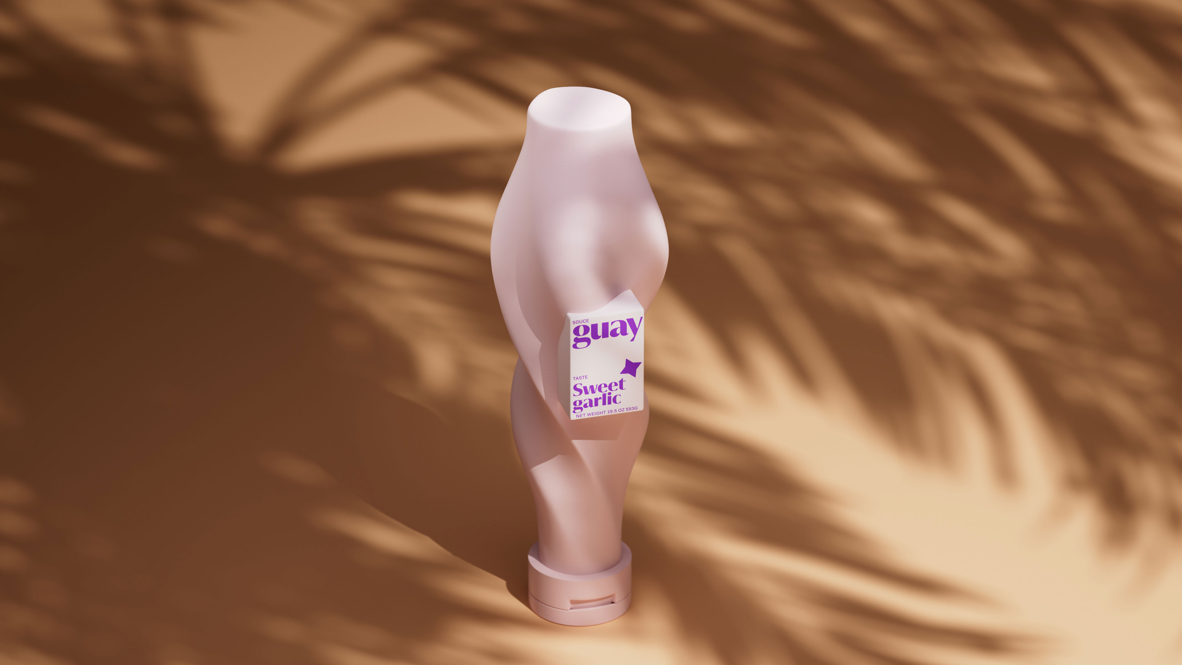
Sweet Garlic: Smooth, flowing lines that invite you in with their elegance and softness.
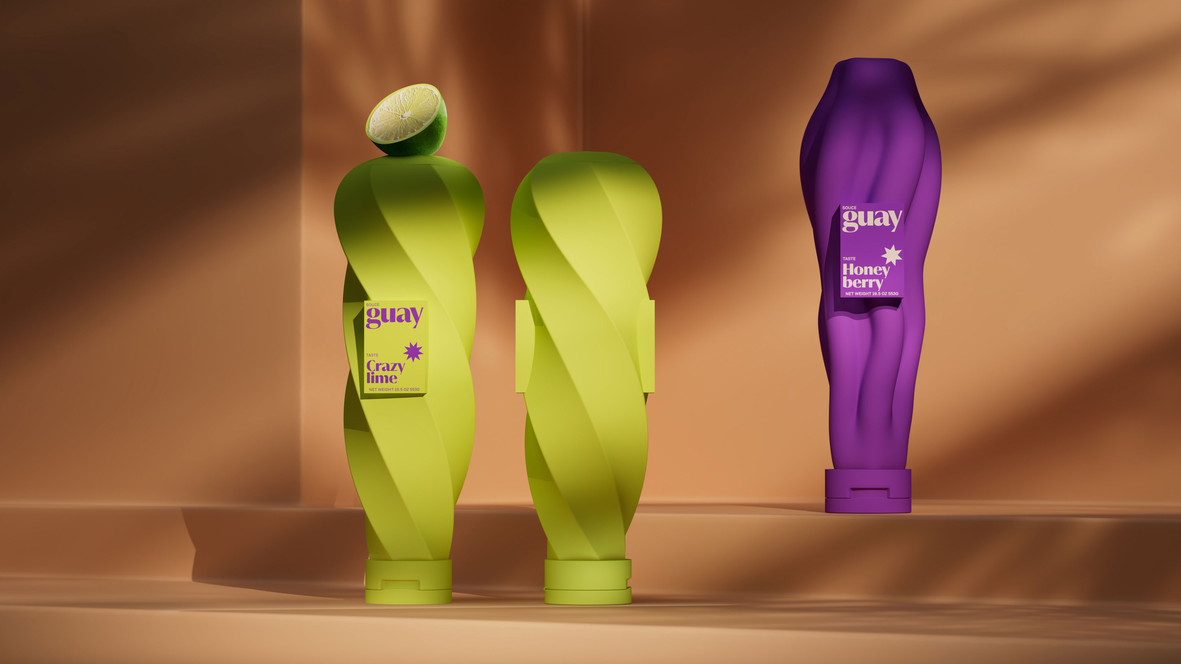
Honey Berry: Twisting streams resembling honey or caramel, evoking indulgence and sweetness.
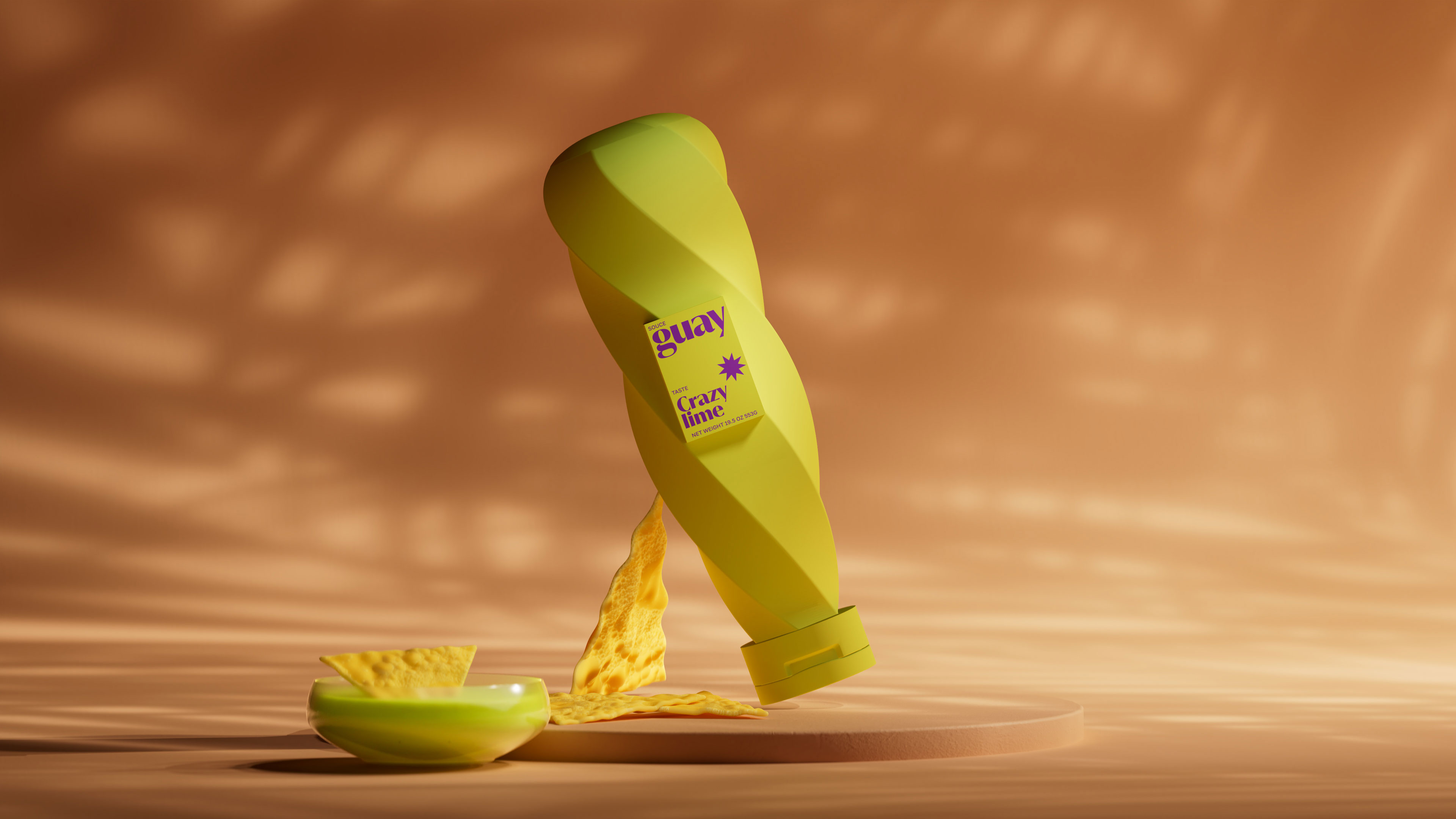
Crazy Lime: Tangy and twisted, mirroring the reaction your face makes to its bright, sour punch.
The packaging is deliberately asymmetrical and alive, capturing the exact feeling of tasting. Each jar is a frozen moment of emotion.
In a market dominated by boring, identical bottles with different labels, Guay stands out immediately.
The brand achieves instant shelf recognition, standing out so clearly that it is impossible to overlook. At the same time, the distinctive forms make selection effortless, guiding the consumer intuitively toward the right flavor. Beyond practicality, the design creates an emotional impact the packaging itself sparks curiosity and desire, turning the very first interaction into a memorable experience. Bold and playful, it transforms a simple sauce into a miniature work of art.
Beyond design, Guay carries the spirit of its Spanish roots. Sun, energy, and zest are in every curve and color. The sauces don’t just taste good. They feel good. Picking up a jar is like holding a small piece of the Mediterranean: bright, vibrant, and alive.
“Guay” was honored with the Honorable Mention at the DNA PARIS Design Competition. Additionally, the project has already made it onto several shortlists at popular festivals, yet the real peaks are still ahead.
CREDIT
- Agency/Creative: Inna Efimova
- Article Title: Guay: When Spanish Sauces Speak the Language of Emotion
- Organisation/Entity: Freelance
- Project Type: Packaging
- Project Status: Published
- Agency/Creative Country: Spain
- Agency/Creative City: Barcelona
- Market Region: Asia, Europe, Middle East, North America, Oceania, South America, Global
- Project Deliverables: 3D Design, Art Direction, Brand Design, Branding, Concept Art, Packaging Design
- Format: Bottle
- Industry: Food/Beverage
- Keywords: Packaging, Brand design, Concept, Art direction.
-
Credits:
3d Artist: Vladimir Kuznetsov


