


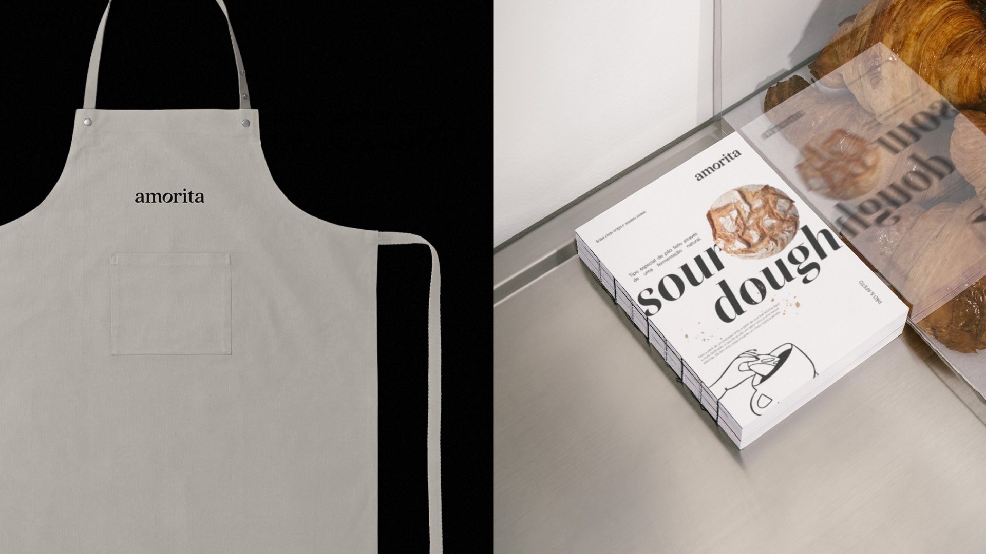
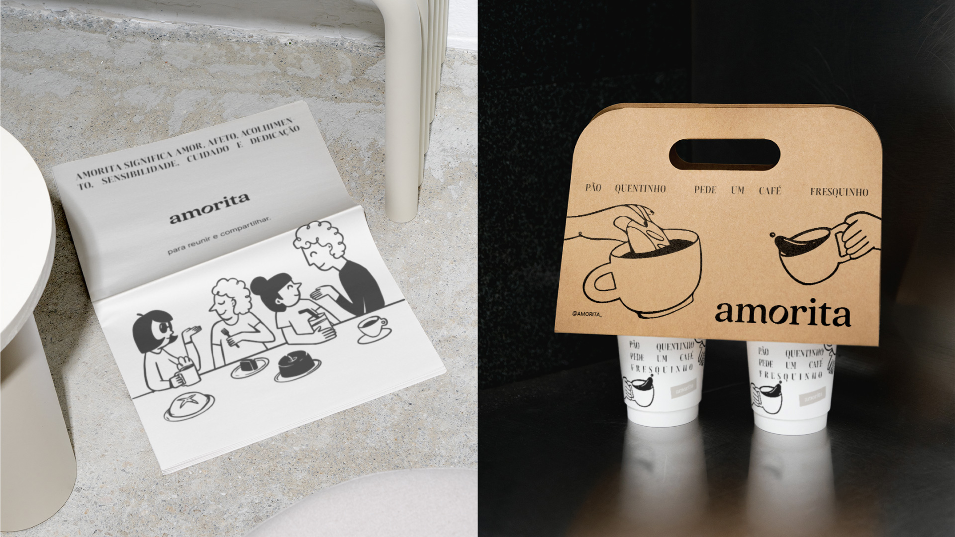
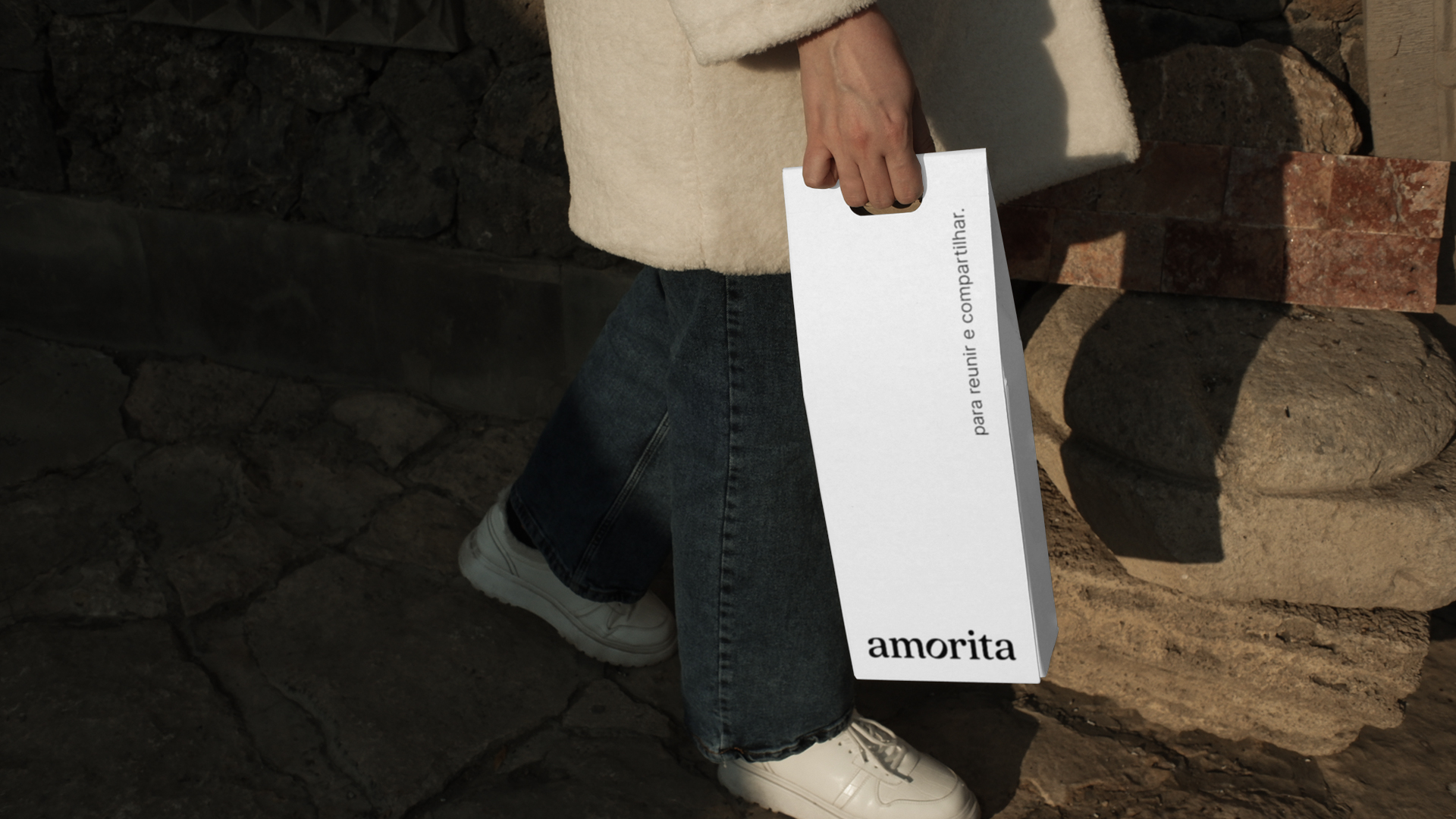
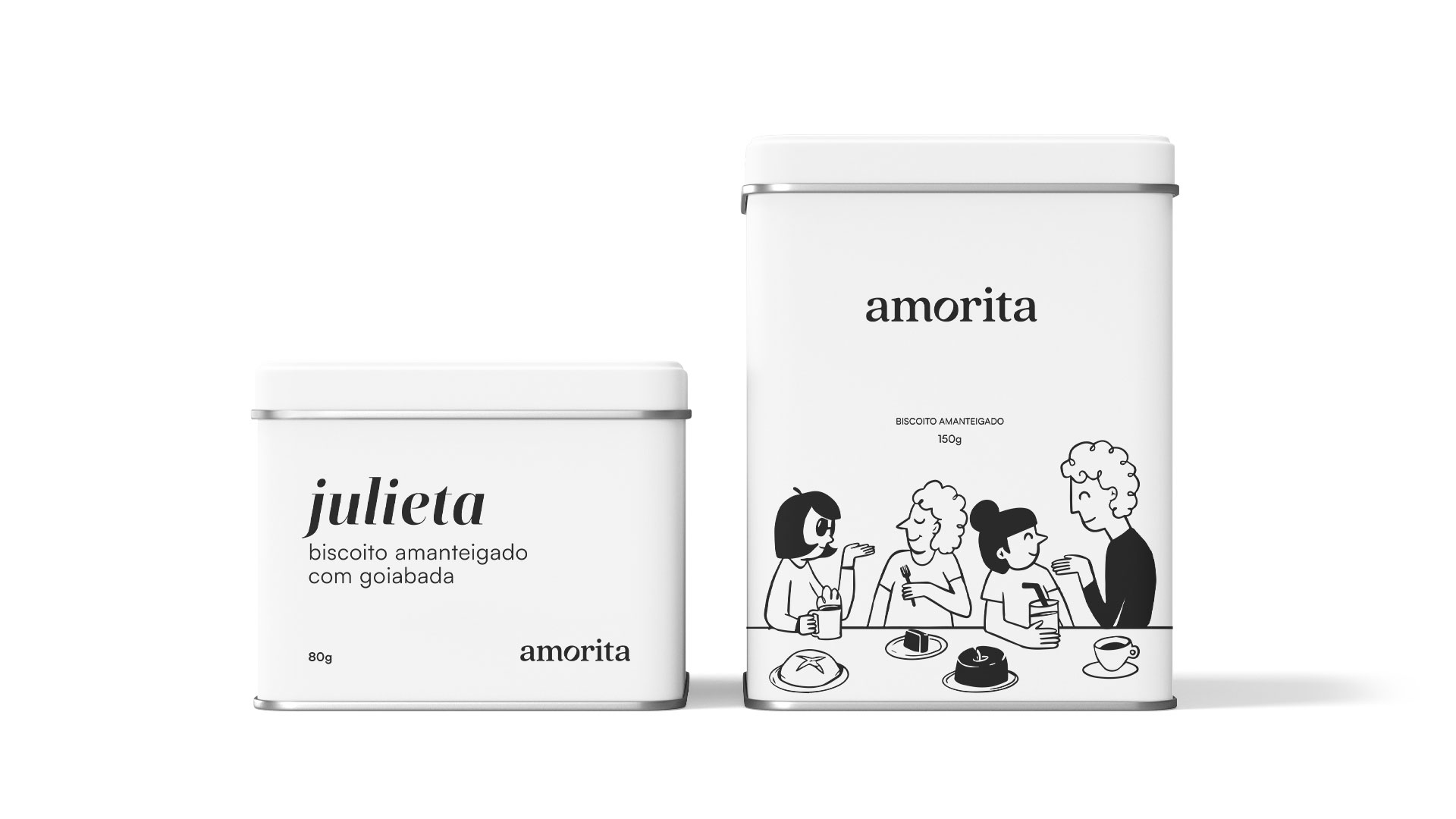
Amorita is an artisanal, naturally leavened bakery with a light, simple, and sensitive essence at its core. More than just making bread, it creates moments that become memories—experiences that remind us of affection, warmth, and the comfort of home. Each recipe is carefully crafted with high-quality ingredients, respect for time, and a genuine dedication to detail. This devotion, combined with a love for the artisanal process, makes Amorita not just a bakery, but also a place where flavors translate emotions and food becomes a gesture of care. Its visual identity embodies the balance between modernity and warmth. The minimal use of black and white creates an elegant and timeless atmosphere, while touches of beige and light green bring to life the human, passionate, and authentic side of the brand. These tones work together to express duality: sophistication and simplicity, refinement and intimacy, modern design and traditional craftsmanship. This harmony ensures that Amorita communicates consistency while maintaining an accessible and sincere personality. The name Amorita is deeply meaningful. It conveys the values of affection, hospitality, and care for food, encapsulating the brand’s promise to its community. Its logo reinforces these principles with a rounded serif font that conveys softness, sensitivity, and subtle movement. The highlight is the letter “o,” carefully designed to subtly resemble a loaf of bread, a symbolic tribute to the artisanal process. This detail reflects both the craft and the poetry behind Amorita. The use of lowercase letters strengthens the sense of closeness and humanity, aligning with the idea that food should connect people and be shared in a welcoming and familiar way. Overall, Amorita is much more than a bakery. It is a brand that values authenticity, human connection, and the art of fermentation, blending tradition with modernity. From the first visual impression to the taste of its bread, every detail reinforces its purpose: to bring people together through simple gestures of love, care, and dedication.
CREDIT
- Agency/Creative: Design Ultramar Nathalia
- Article Title: Design Ultramar Nathalia Shapes Amorita Into a Bakery Brand That Blends Modernity and Tradition
- Organisation/Entity: Agency
- Project Type: Identity
- Project Status: Published
- Agency/Creative Country: Brazil
- Agency/Creative City: Vitória
- Market Region: South America
- Project Deliverables: Brand Design, Illustration, Logo Design
- Industry: Food/Beverage
- Keywords: logotipo, identidade visual, marca, ilustração
-
Credits:
Diretor Criativo: Nathalia Ultramar


