


Birvy is a premium fertility-boosting supplement created to support women on their journey toward conception. Rooted in science and inspired by nature, the brand focuses on hormonal balance, reproductive health, and overall well-being. The identity needed to communicate both scientific credibility and emotional sensitivity, bridging the gap between clinical trust and personal hope.
The creative process began with research into the fertility and wellness sector, uncovering how brands positioned themselves visually and emotionally. Many leaned either too clinical, evoking a sterile, medicalized feeling, or too sentimental, losing authority in the process. Birvy needed a unique balance: modern, premium, and nurturing.
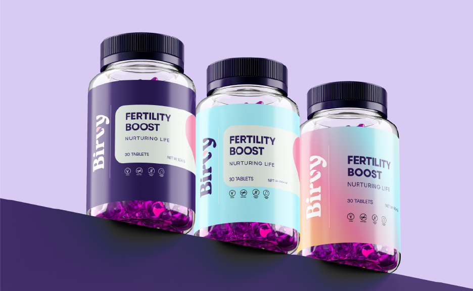
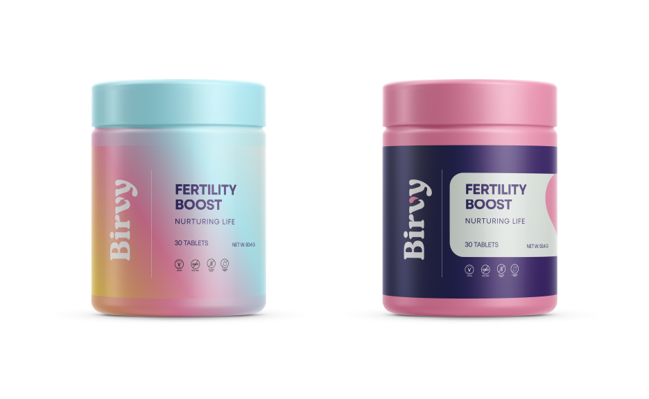
The exploration led to the droplet as a central motif, a symbol of nourishment, vitality, and the start of life. Integrating it into the “V” of Birvy created a distinctive mark that represents fertility and growth in a simple, elegant way. The form emphasizes balance and clarity, while also serving as a subtle reminder of nature’s role in nurturing new beginnings. Supporting design elements, including refined typography and a clean layout system, were chosen to enhance the brand’s premium yet approachable tone.
Designing for a fertility-focused brand required sensitivity. The main challenge was avoiding clichés, overused imagery of mothers, babies, or hearts while still communicating themes of hope and new life. Another challenge was ensuring the logo and identity would resonate across diverse audiences, acknowledging the deeply personal and sometimes emotional experiences tied to fertility without alienating or overwhelming the viewer.
The final identity resolves these challenges with simplicity and meaning. The droplet within the “V” embodies both scientific precision and natural nourishment, creating a visual language that is memorable, versatile, and emotionally resonant. It avoids clichés while still symbolizing life, balance, and care.
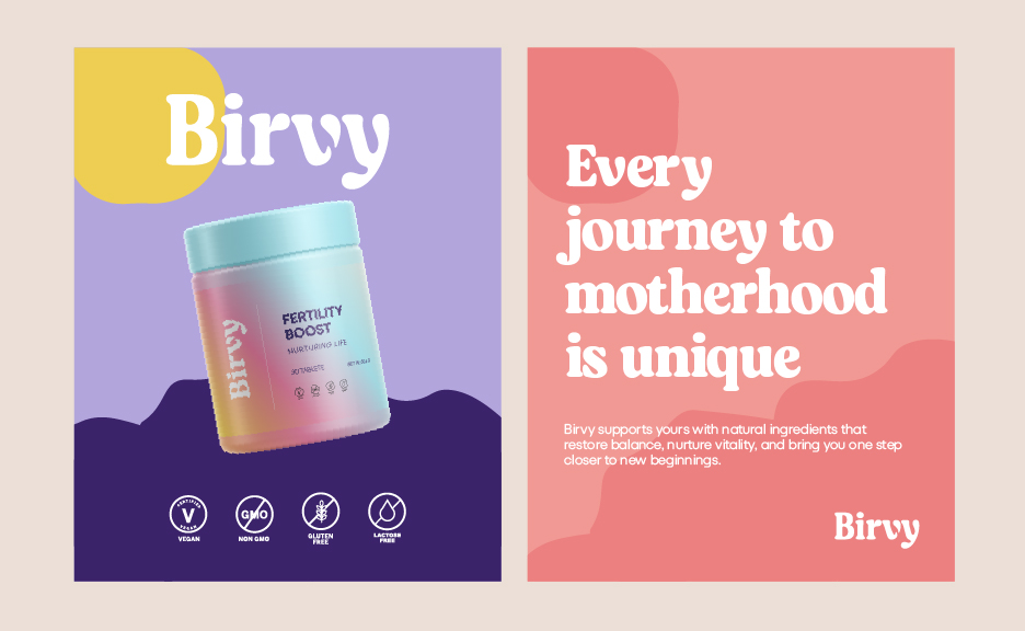
Complementary ad copy reinforces this positioning, offering language that is empathetic but confident: “Balance your body. Renew your hope. Begin with Birvy.” Together, the visuals and words establish Birvy as more than a supplement—it becomes a trusted partner for women, providing reassurance, clarity, and confidence on their journey toward motherhood.
The result is a brand identity that communicates warmth, trust, and premium quality, positioning Birvy distinctively in the fertility supplement market. It reflects the brand’s mission to empower women naturally and thoughtfully, while standing out with a clean, modern aesthetic.

CREDIT
- Agency/Creative: Juwon Taiwo
- Article Title: Birvy: Premium Fertility Supplement Brand Identity by Juwon Taiwo
- Organisation/Entity: Freelance
- Project Type: Packaging
- Project Status: Published
- Agency/Creative Country: Nigeria
- Agency/Creative City: Lagos
- Market Region: Global
- Project Deliverables: Brand Design, Brand Identity, Brand Mark, Creative Direction, Logo Design, Packaging Design, Poster Design
- Format: Bottle
- Industry: Health Care
- Keywords: Supplement
-
Credits:
Lead Designer: Seth Taiwo


