


GRIV: Translating Architectural Philosophy into a Timeless Brand Identity
From the very beginning of this project, we knew that GRIV was not just another architecture studio. Their work carried a quiet authority, a presence that distinguished them from the broader architectural landscape. Unlike firms that rely on ostentation or dramatic gestures to establish identity, GRIV operates through restraint, precision, and deliberation. Every project, every space, every material choice speaks of a philosophy rooted in balance, proportion, and material honesty. It is this philosophy — a calm confidence that is at once commanding yet understated — that became the foundation of the studio’s brand identity.
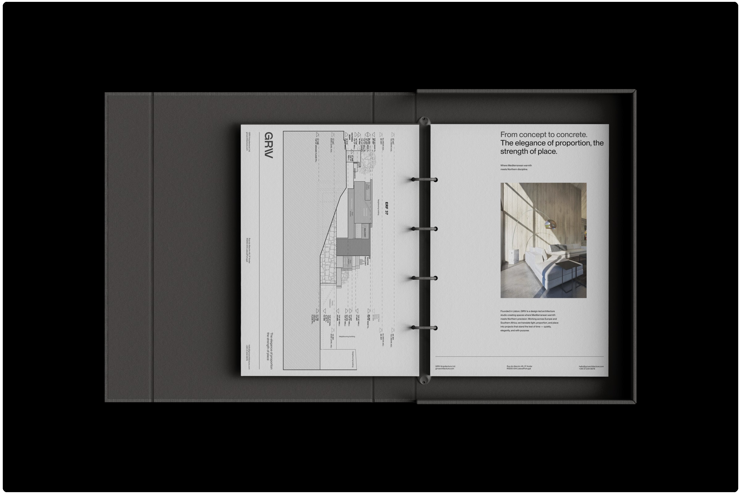
GRIV’s portfolio spans a remarkable variety of work. From private residences nestled in the Portuguese countryside to cultural and commercial spaces across Europe and Southern Africa, each project reflects intentionality and thoughtfulness. What is most striking about their work is how every space feels considered, almost meditative in its silence. The architecture does not seek attention for its own sake; rather, it invites reflection and engagement. This same approach guided our process in creating a brand identity that could capture not only the visual language of GRIV’s work but also the emotional tone and experiential quality embedded in every project.
Immersion and Discovery: Listening Before Designing
Before any sketches or digital explorations began, we committed to immersing ourselves in GRIV’s world. The first step was listening — not only to the studio’s brief but to their broader story, philosophy, and approach to architecture. We explored their completed works in detail, reviewing photographs, plans, and project documentation, and whenever possible, walking through their spaces in person.
Our goal was to understand the spatial narrative inherent in each project: how light moves across surfaces, how textures interplay with form, and how materials convey meaning. More importantly, we sought to capture the emotional resonance of their architecture. GRIV’s work is designed to be experienced, to evoke quiet contemplation and emotional response. Translating that into a visual identity required patience, observation, and sensitivity.
The design process was intentionally slow and reflective, mirroring the studio’s own methodical approach. Rather than imposing preconceptions or rushing to produce a visual mark, we allowed time to fully internalize the values, philosophy, and atmosphere that define GRIV. Every element of the brand — from typography to color to layout — needed to carry the same calm deliberation and thoughtful restraint that their architecture embodies.
Translating Architectural Philosophy into Visual Language
The translation of GRIV’s philosophy into a visual identity required deep alignment with architectural principles. Architecture, at its core, is about spatial harmony, material integrity, and the careful orchestration of elements to create meaningful experience. Similarly, the brand identity needed to communicate clarity, proportion, and refinement without relying on embellishment or excessive ornamentation.
We began by establishing foundational principles for the visual language:
Negative Space as a Tool: Just as GRIV’s architecture uses emptiness to define form, the identity system employs generous negative space to create breathing room and focus.
Material and Texture: Rich, tactile materials in physical applications and subtle textures in digital design reflect GRIV’s commitment to authenticity and material honesty.
Neutral and Warm Color Palette: Colors were chosen to be timeless, understated, and grounding, evoking warmth without becoming overly literal or predictable.
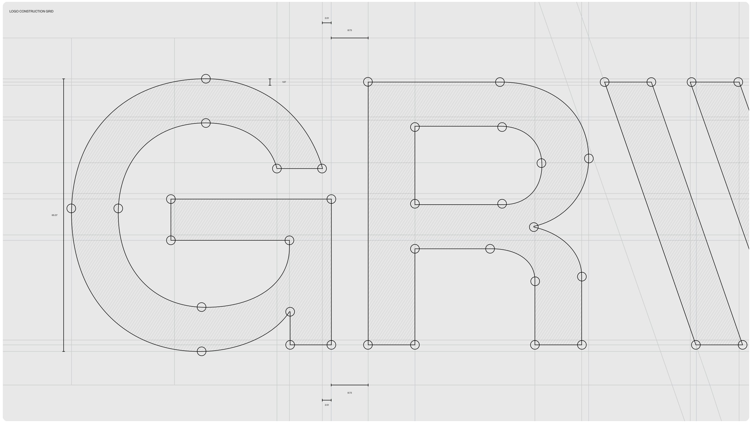
Proportion and Typography: Every typographic choice was guided by balance, hierarchy, and readability, creating a rhythm and structure that mirrors architectural spatial logic.
The design choices were not arbitrary; they were rooted in the experience of GRIV’s architecture, ensuring that the brand identity felt as deliberate, considered, and enduring as the spaces the studio creates.
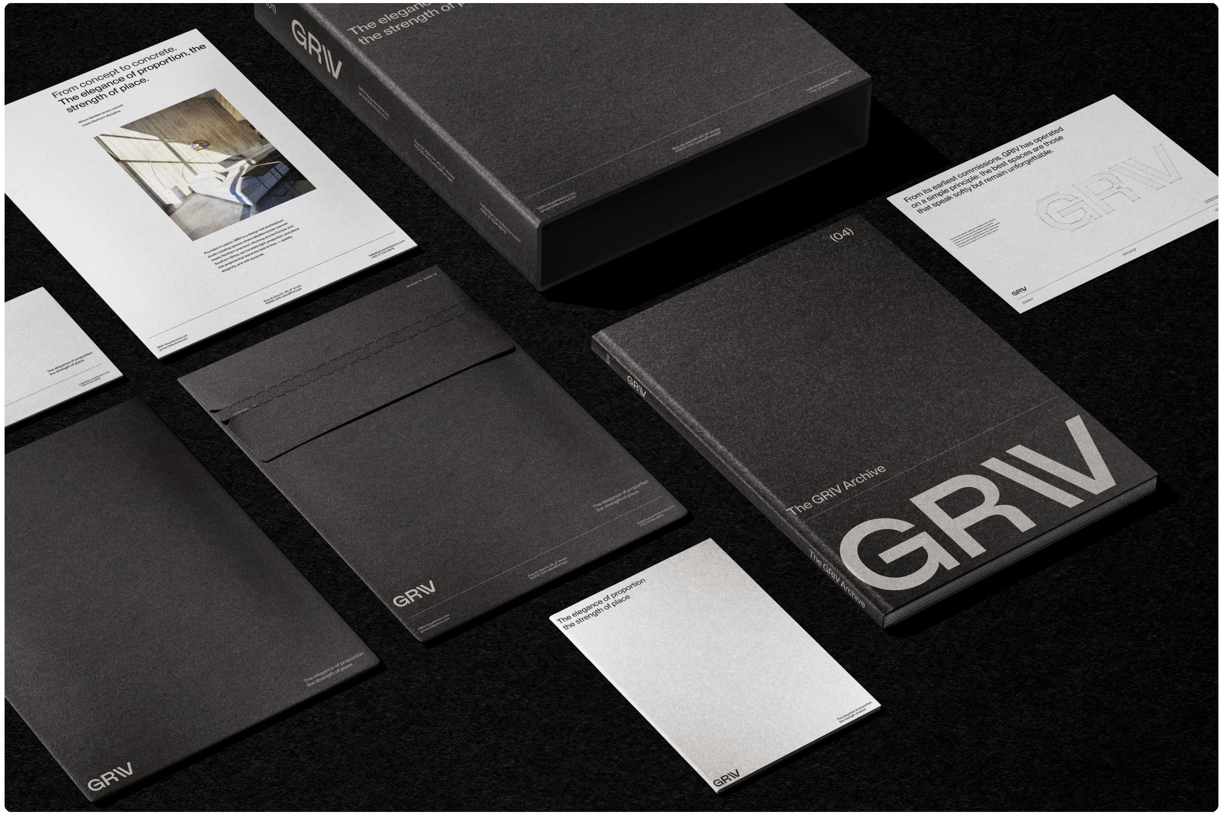
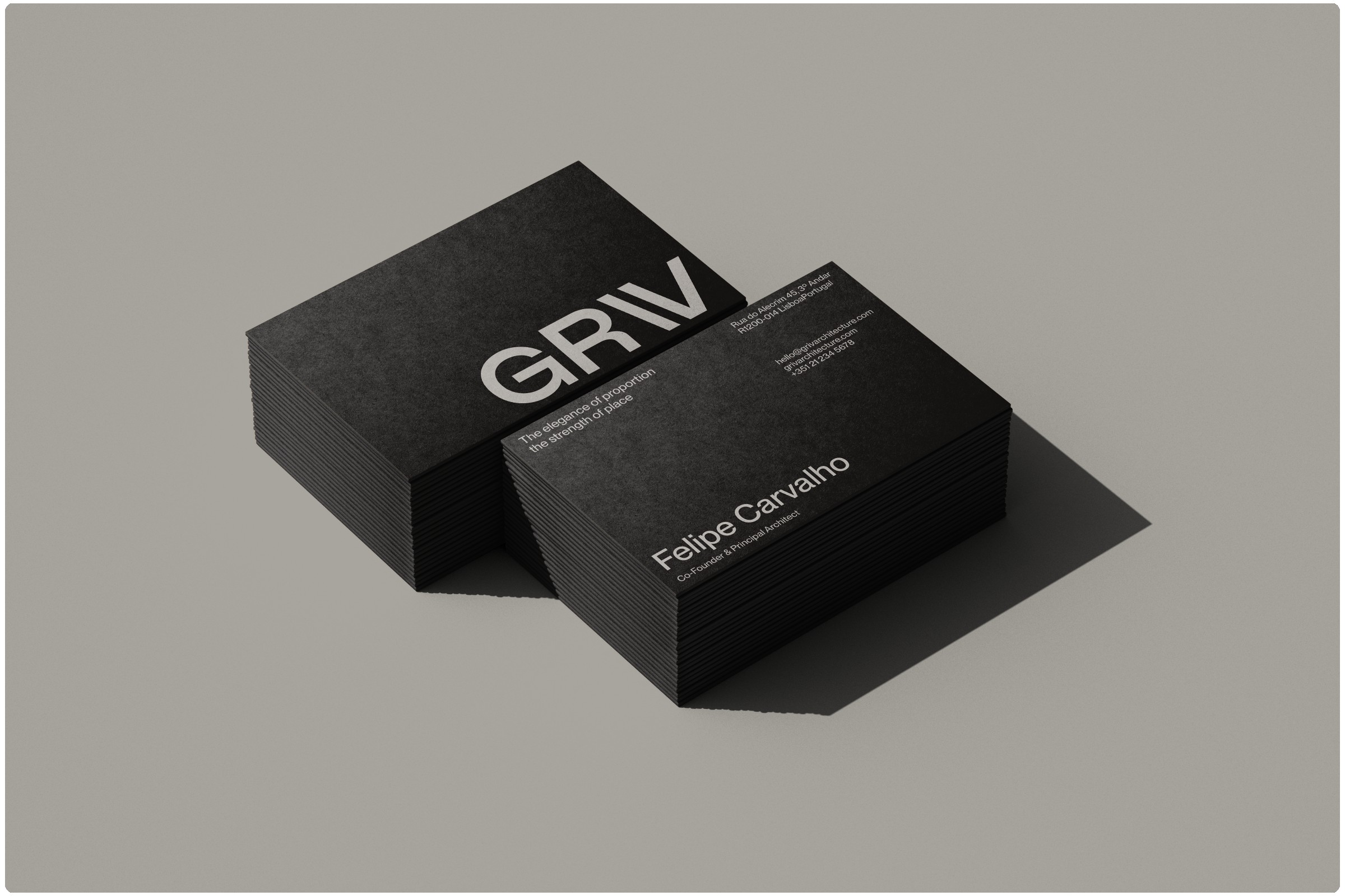
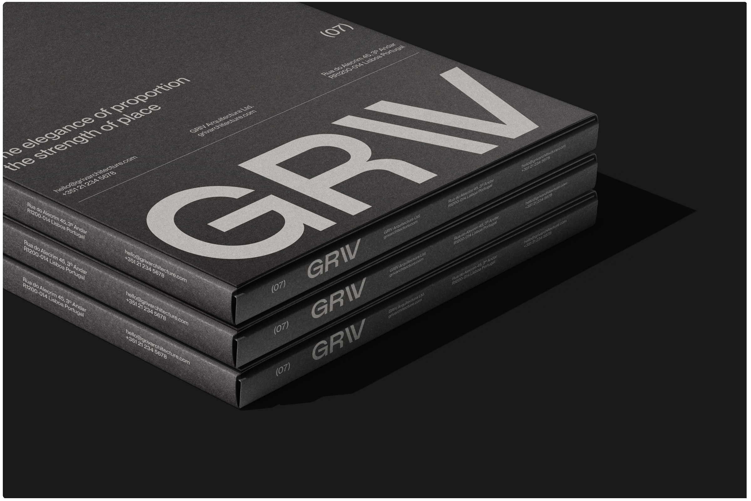
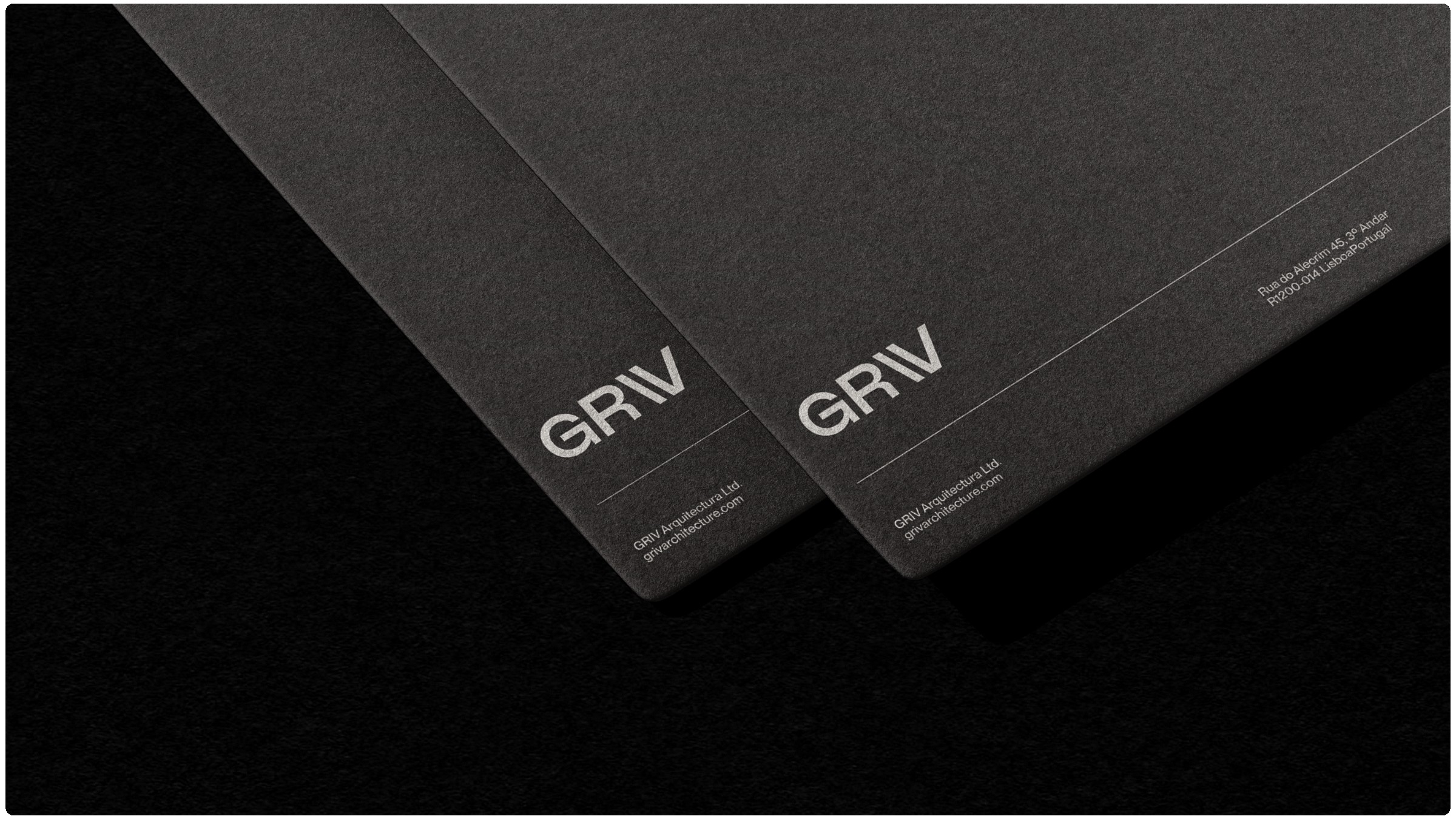
Crafting the Logotype
The logotype was central to the identity. It needed to communicate neutrality, quiet strength, and timeless sophistication, while avoiding the coldness or austerity that sometimes accompanies minimalist design. Achieving this balance required a meticulous approach to proportion, typographic weight, and letterform refinement.
A particularly pivotal decision centered on the “V” in GRIV. This letter was treated as an architectural gesture, evoking stability, structure, and deliberate design. Its shape anchors the logotype while maintaining a sense of openness, much like a carefully considered architectural intervention that balances solidity and space. Other letterforms were refined to emphasize clarity without sacrificing character, ensuring the mark would remain readable, elegant, and versatile across applications.
Through iterative exploration, sketches, and digital refinements, the logotype emerged as a symbol of architectural thinking, a visual representation of GRIV’s ethos in a single mark. It functions as both a brand signature and a reflection of the studio’s design philosophy, capable of enduring trends while remaining distinct and recognizable.
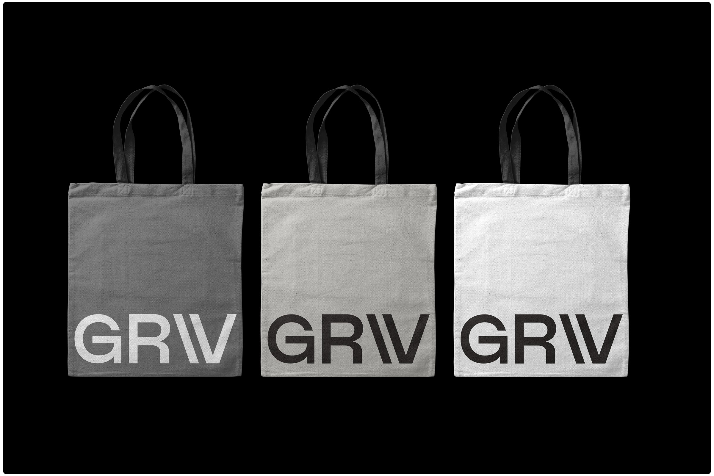
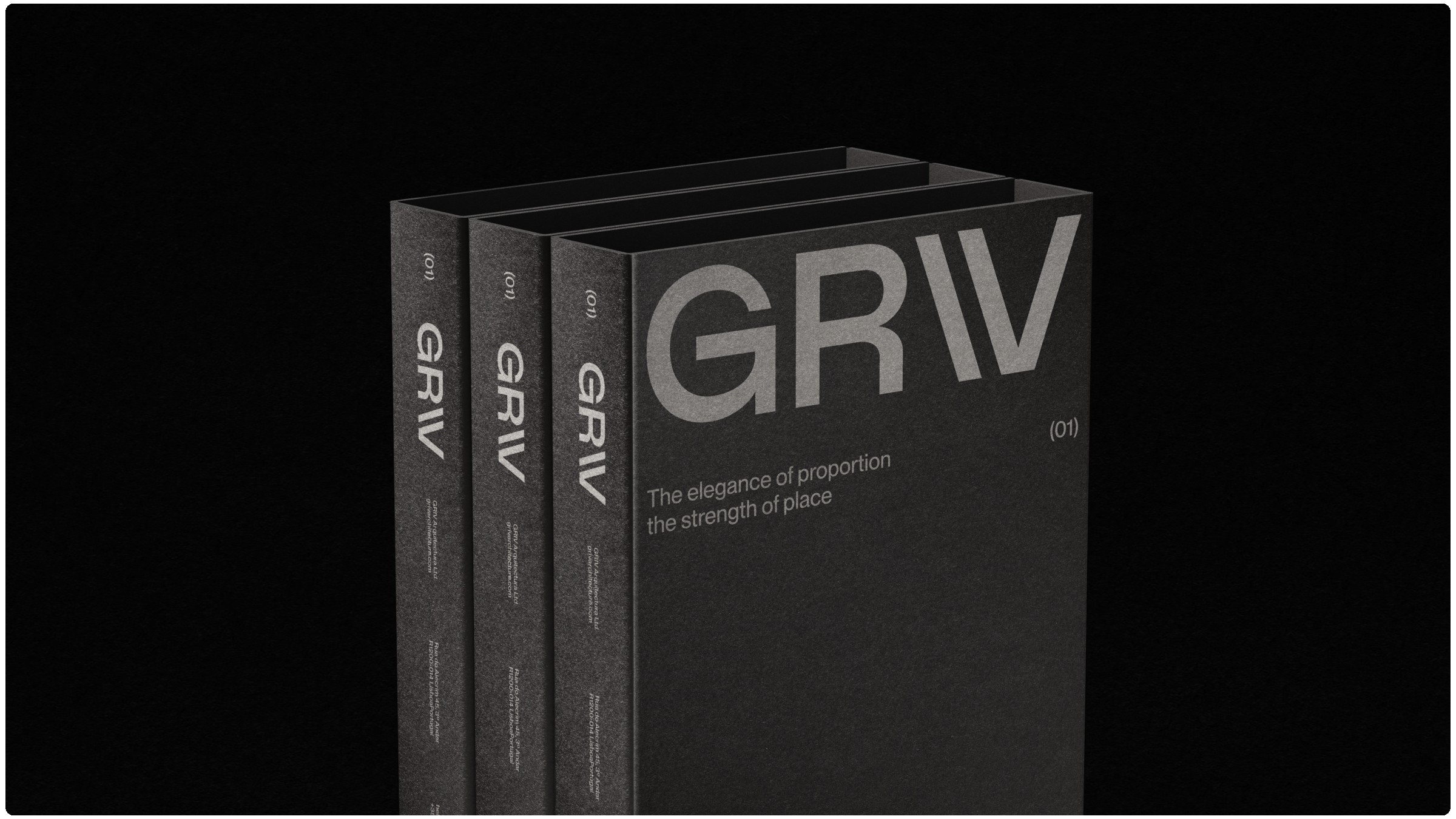
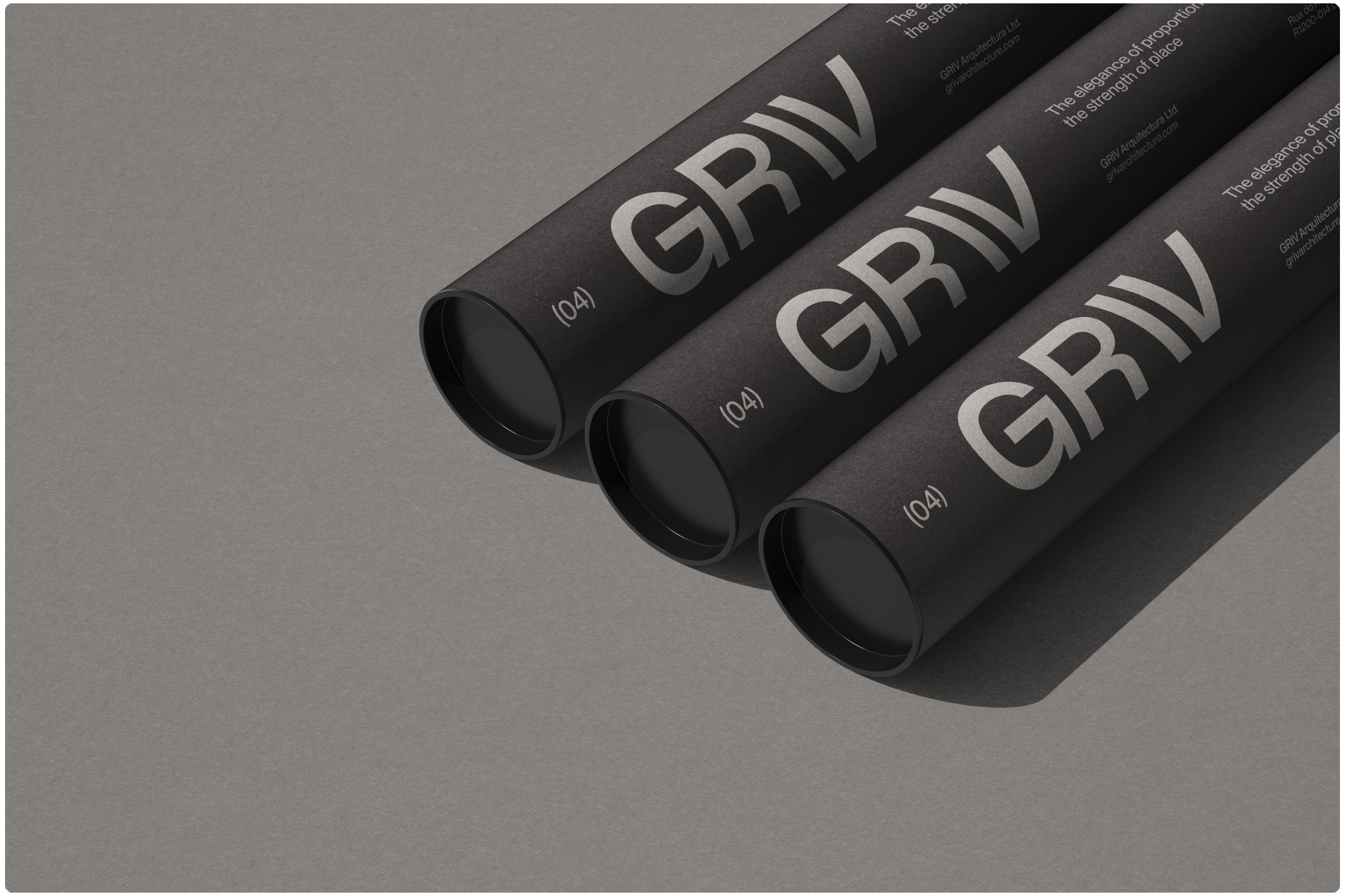
Expanding the Identity System
Beyond the logotype, the full identity system was conceived to support consistent expression across all touchpoints. Layout systems were designed to prioritize clarity, hierarchy, and visual rhythm, ensuring that every piece of communication — from stationery to presentations — felt intentional.
Typography was selected for its versatility, readability, and elegance, creating a hierarchy that guides the viewer through content naturally and intuitively. Photography, textures, and materials were integrated as part of the system, not merely as decoration, but as tools to reinforce philosophy and tone. Every visual element was evaluated for its ability to reflect GRIV’s values and the atmosphere of their work.
In digital applications, the identity extends seamlessly across the website, social media, and presentations. Generous spacing, clean layouts, and subtle interactive cues mirror the studio’s architectural rhythm, providing users with a reflective, considered digital experience. Animations are restrained and purposeful, emphasizing structure and flow rather than distraction. The identity is flexible yet cohesive, allowing for diverse applications while maintaining integrity and clarity.
Naming, Brand Positioning, and Art Direction
Creating GRIV’s identity extended beyond visual design into strategic branding, including naming, brand positioning, and art direction. GRIV’s positioning emphasizes quiet authority, precision, and intentionality, aligning the visual identity with the studio’s overarching narrative.
The art direction was guided by the principle of architectural empathy: every creative decision, from image selection to layout, was evaluated for its ability to reflect spatial and emotional experience. In doing so, we ensured that the identity communicates the studio’s philosophy consistently across all touchpoints, from print collateral to digital experiences.
Naming and positioning were crafted to express clarity, sophistication, and purpose, supporting the studio’s reputation and future growth. Whether applied to private residences or large-scale cultural projects, the identity needed to scale gracefully, maintaining cohesion and readability without compromising elegance or refinement.
Collaboration and Iteration
The success of this project relied on close collaboration with GRIV’s team. Their feedback was precise, thoughtful, and reflective of the same care evident in their architectural work. Each iteration — whether of the logotype, layout system, or materials palette — was discussed and refined in dialogue with the client.
This iterative process reinforced the belief that design is as much about conversation as it is about creation. Like architecture, branding is a collaborative endeavor: it involves listening, understanding, testing, and refining until every element resonates with intention. The client’s engagement was crucial in ensuring that the final identity system accurately represented GRIV’s philosophy, aesthetic, and ambitions.
The Outcome
The resulting identity is a visual articulation of GRIV’s architectural philosophy. It embodies quiet confidence, material honesty, and spatial clarity while maintaining warmth and approachability. The logotype, typography, color palette, layout systems, and supporting visual elements combine to create a cohesive, enduring identity that communicates both professionalism and personality.
Every application, from digital to print, carries the same sense of balance and intentionality found in GRIV’s architecture. The identity system provides flexibility for expansion and growth while remaining faithful to the studio’s core principles. It is a brand that ages gracefully, one that can evolve alongside GRIV’s work without ever feeling outdated.
Through this project, we learned that branding, like architecture, is about intention, experience, and reflection. By immersing ourselves in GRIV’s world, listening deeply, and translating their philosophy into a visual language, we created an identity that mirrors the precision, care, and quiet sophistication of their work. The result is a brand identity that is more than a logo or a color palette — it is an experience, a story, and a reflection of thoughtful design.
Reflection
Designing for GRIV reinforced the power of restraint, intention, and empathy in visual communication. The project demonstrates how a brand can embody the philosophy of its creators, translating abstract architectural principles into tangible visual language. It highlights the importance of slow, reflective processes, deep client collaboration, and the alignment of strategy, aesthetics, and experience.
The GRIV identity is now a living extension of the studio’s work — it allows each project, from private homes in rural Portugal to cultural landmarks in Europe and Southern Africa, to carry a consistent voice, one that is as elegant and considered as the spaces themselves. It stands as a testament to the notion that branding, like architecture, thrives on balance, proportion, and the thoughtful use of space.
In the end, the GRIV project was not just about creating a visual identity. It was about translating philosophy into form, designing an experience that resonates emotionally.
CREDIT
- Agency/Creative: KWIBA Agency
- Article Title: Griv’s Brand Identity Resonates With Architectural Intent Through Kwiba Agency’s Strategic Vision
- Organisation/Entity: Agency
- Project Type: Identity
- Project Status: Published
- Agency/Creative Country: South Africa
- Agency/Creative City: Johannesburg
- Market Region: Global
- Project Deliverables: Art Direction, Brand Architecture, Brand Creation, Brand Identity, Web Design
- Industry: Construction
- Keywords: archirecture, brand identity, contemporary architecture, modern, minimalism, editorial design
-
Credits:
Art Director, Lead Designer: Gideon Phillip


