


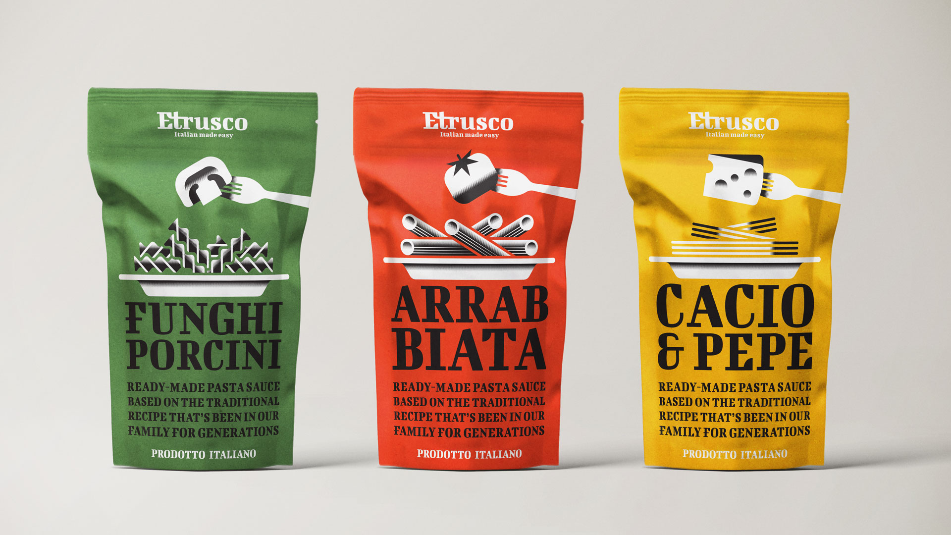
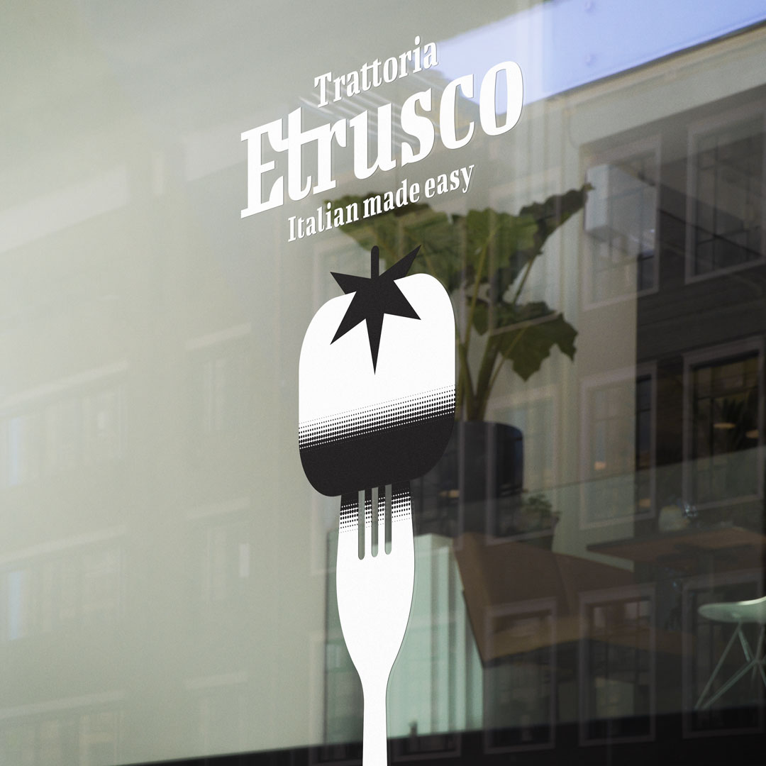
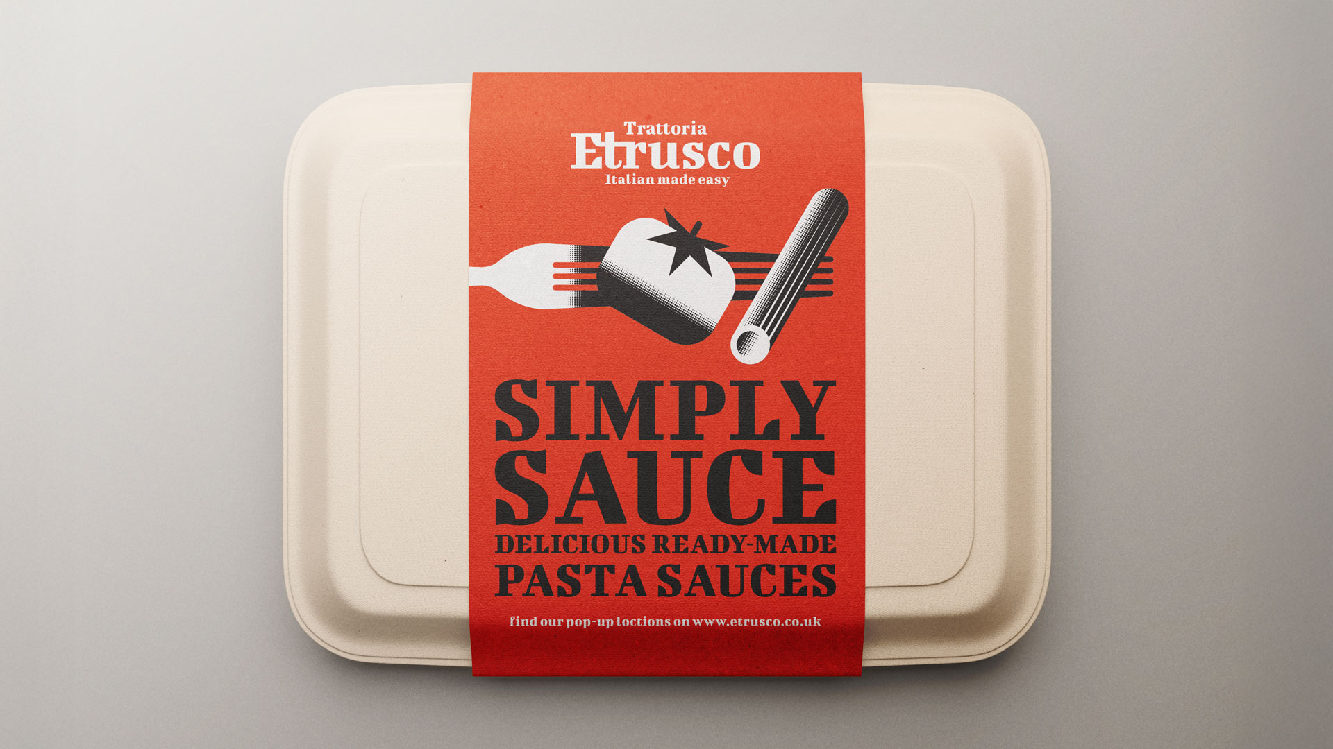
Following the success of my earlier packaging concepts for the fictional pasta brand Etrusco, the story of the brand received an exciting new chapter. The first series of designs transformed distinctive pasta shapes into bold and highly stylised black-and-white illustrations, which not only gave the brand a recognisable face but also showed how minimalism can have strong impact on the shelf. Building on that foundation, the project was expanded with a fresh and flavourful line extension: Etrusco Pasta Sauce.
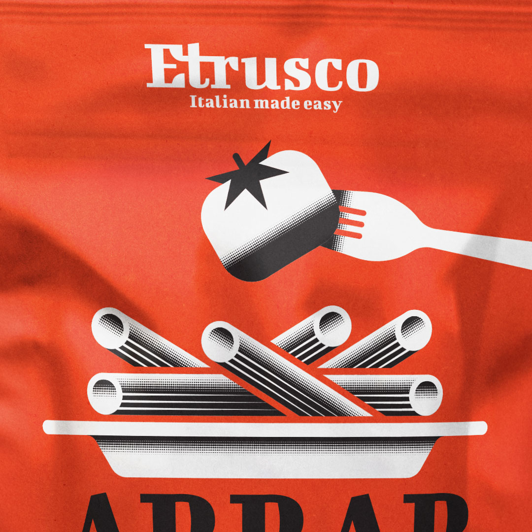
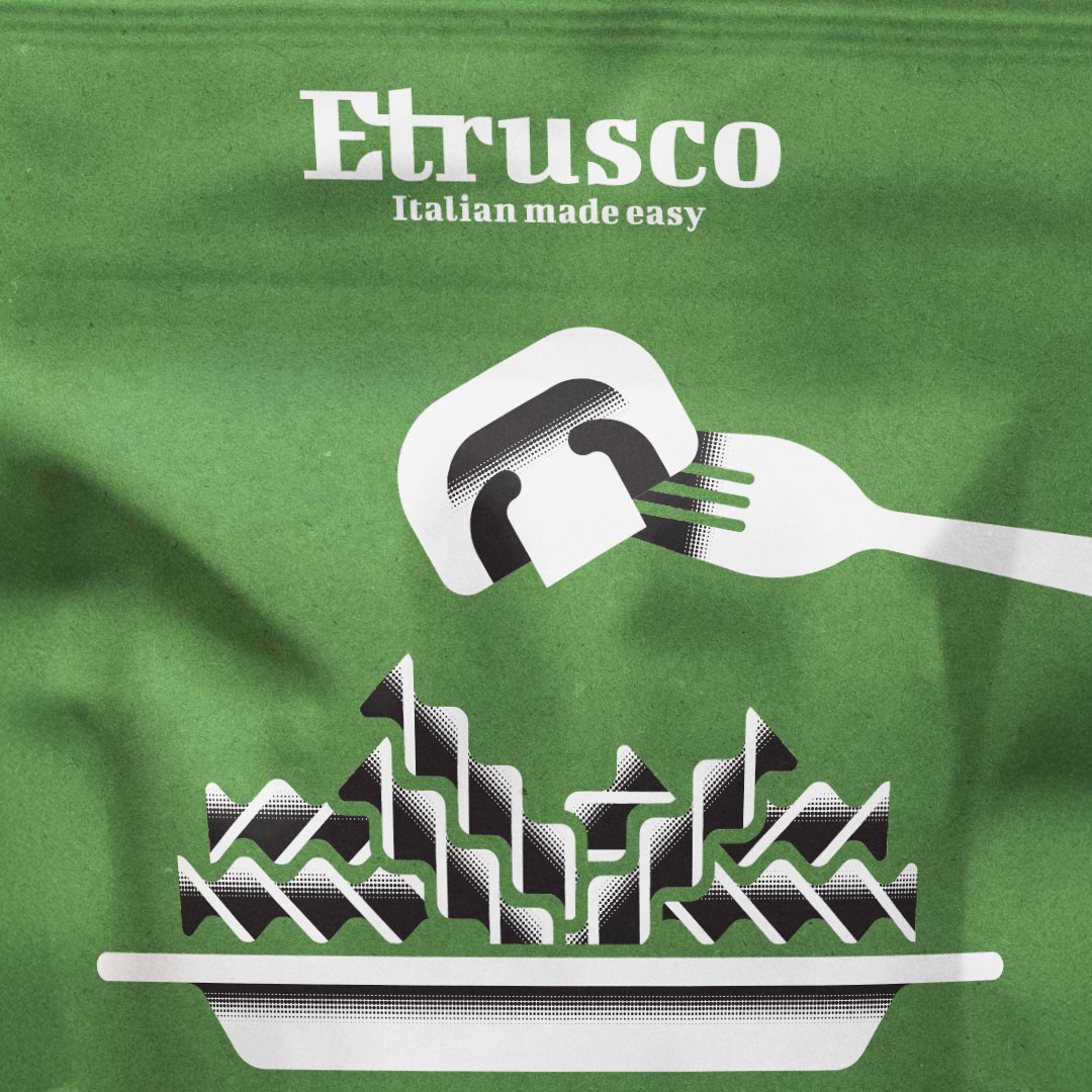
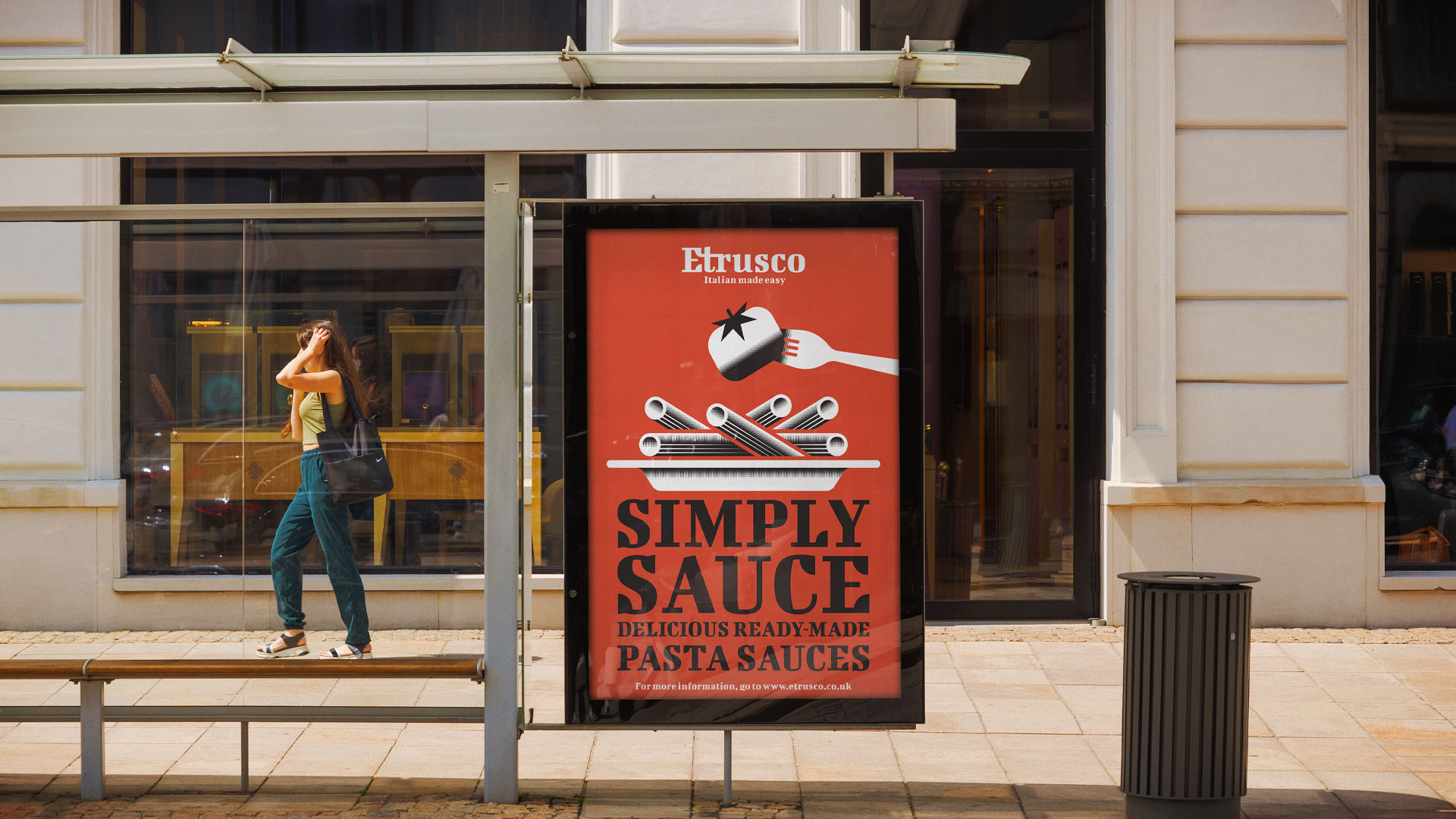
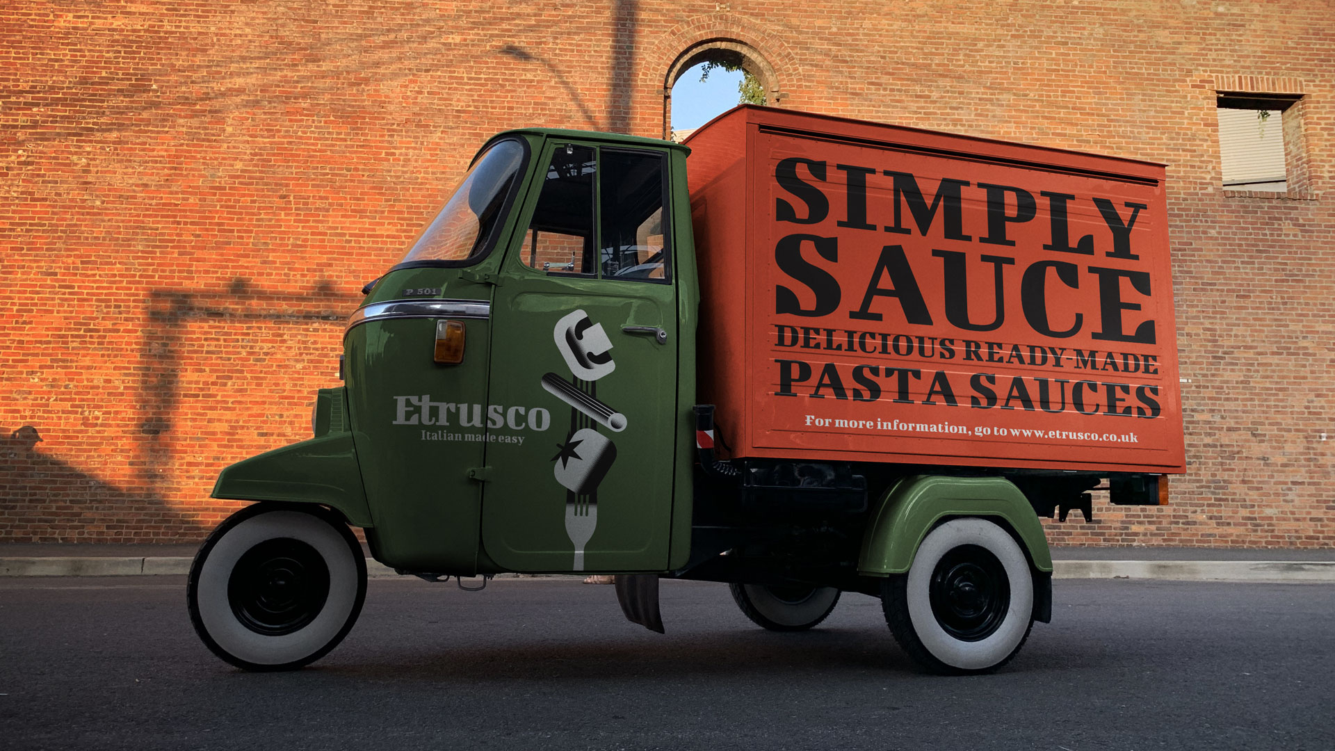
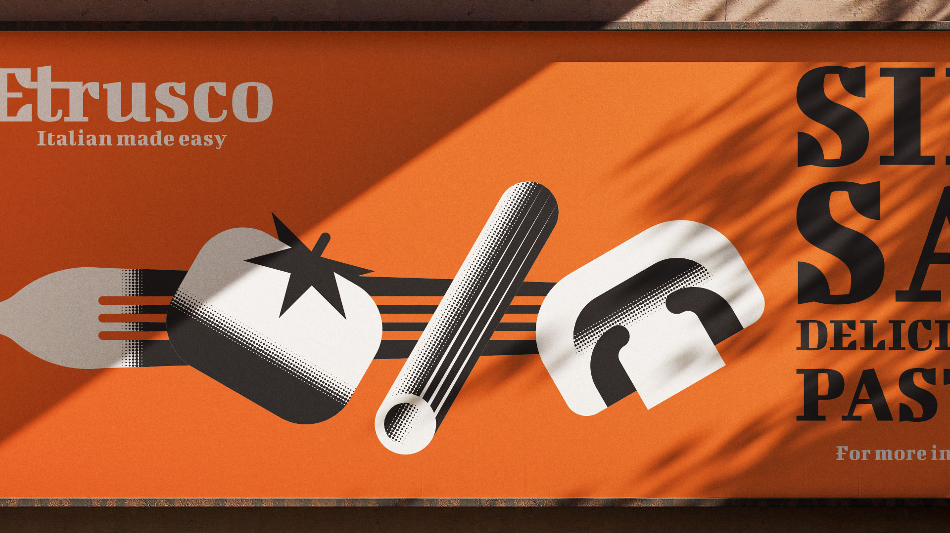
For this new range I continued the same strong visual language, ensuring clear consistency with the original pasta packaging while allowing room for growth and differentiation. I created a set of minimalist illustrations that depict both pasta shapes and key ingredients, complemented by striking colour fields that highlight the flavour profile of each sauce. The combination of clean graphics and vibrant tones results in packaging that is simple yet powerful—immediately visible on the shelf, and strongly associated with quality and authenticity.
The challenge in this project was to prove that a fictional brand can evolve in a coherent and strategic way. By maintaining a strong design system, the identity of Etrusco was able to stretch from dry pasta into ready-made sauces without losing recognisability. This shows how consistency across product lines builds trust with consumers, and how a design approach rooted in clarity can strengthen brand connection over time.
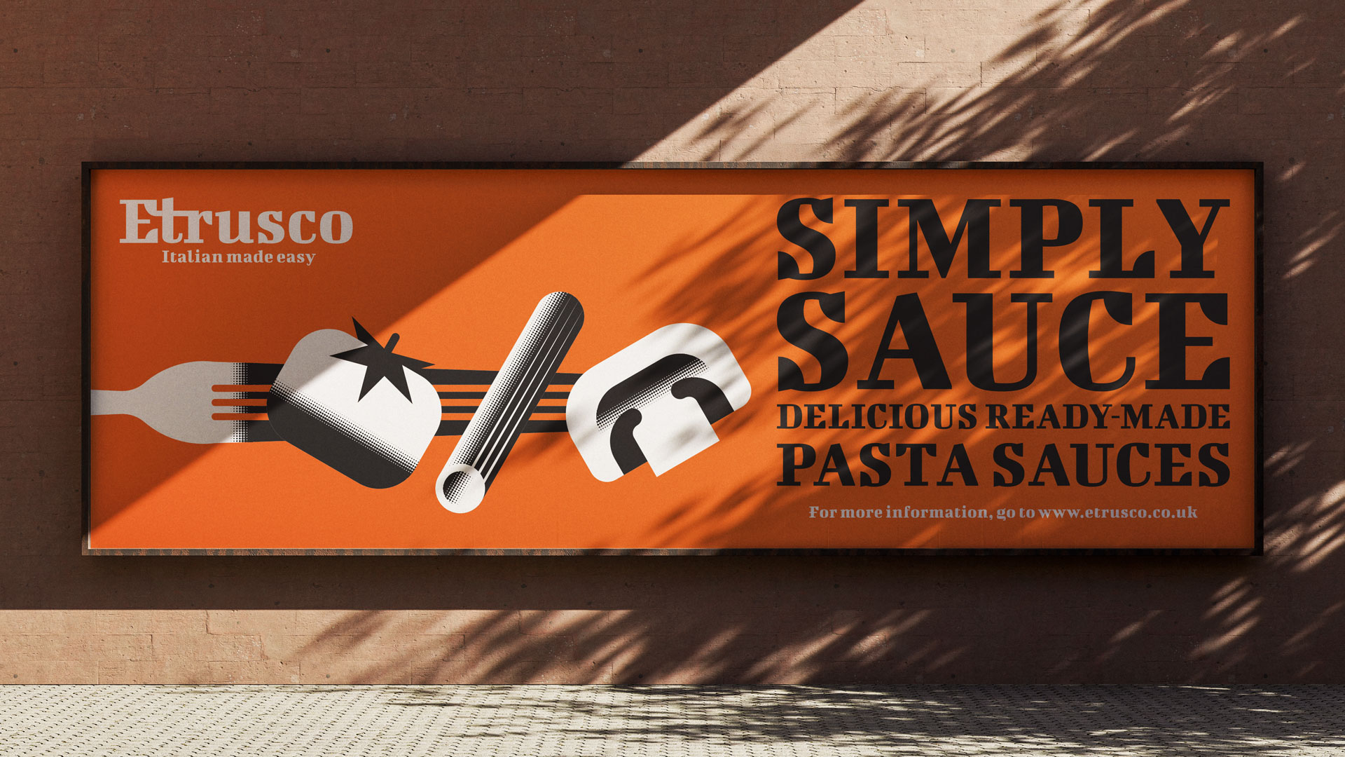
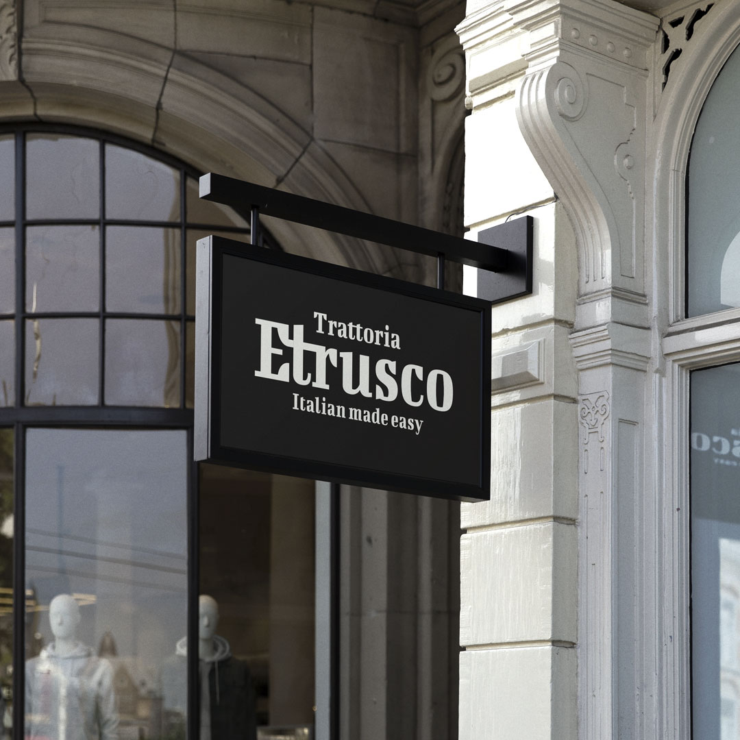
Beyond packaging, the identity was also extended into promotional materials and even a conceptual pop-up restaurant, further positioning Etrusco as a restaurant-quality experience. These brand extensions demonstrate how packaging design can serve as the backbone for broader storytelling, creating opportunities for meaningful engagement with audiences.
At the core, this project reflects my way of working: blending creativity with strategic design thinking. I help brands grow naturally yet distinctively—by creating designs that not only stand out visually, but also build long-term value. Whether fictional or real, I approach every project with the same mindset: to deliver work that is both visually striking and strategically sound, making me a reliable partner for agencies and companies looking to create design solutions that truly resonate.
CREDIT
- Agency/Creative: 3rd Floor
- Article Title: 3rd Floor Unifies Pasta and Sauce Ranges With a Distinctive Identity for Etrusco
- Organisation/Entity: Freelance
- Project Type: Packaging
- Project Status: Non Published
- Agency/Creative Country: Netherlands
- Agency/Creative City: Breda
- Market Region: Europe, North America
- Project Deliverables: 2D Design, Illustration, Packaging Design, Poster Design
- Format: Pouch
- Industry: Food/Beverage
- Keywords: Sauce, Italian, Traditional
-
Credits:
Graphic design, Illustration & Concept: Bart De Keyzer


