


For this project, I set out to design a cosmetics packaging system that would not only protect and present the products but also embody the values and emotions that a modern beauty brand should communicate. My main objective was to create packaging that feels premium, user-friendly, and visually striking — while still staying aligned with contemporary trends in sustainability and brand storytelling.
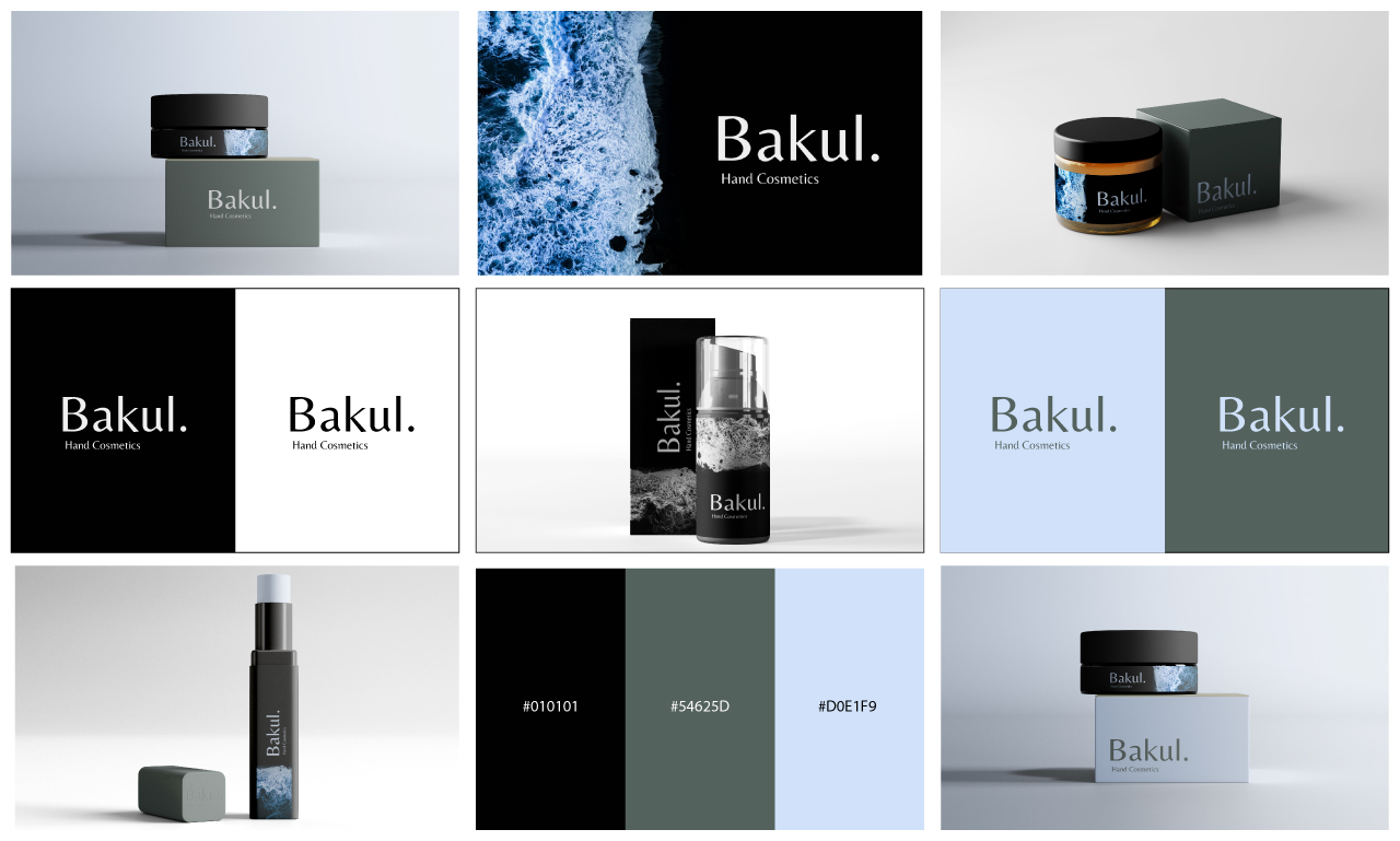
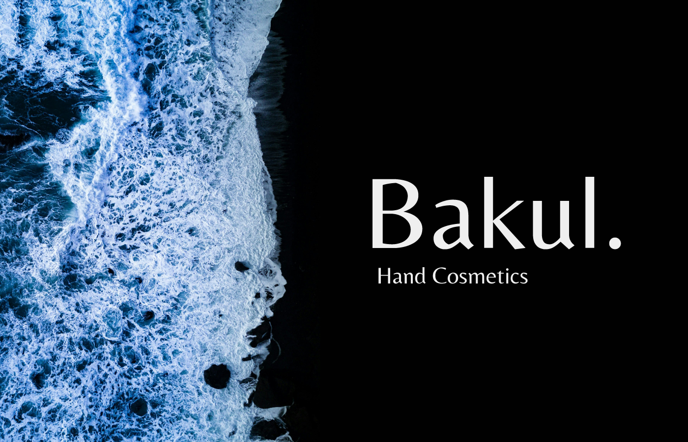
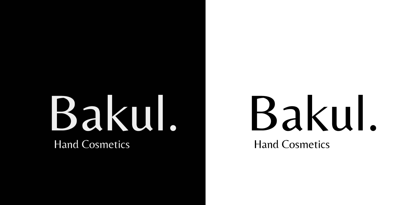
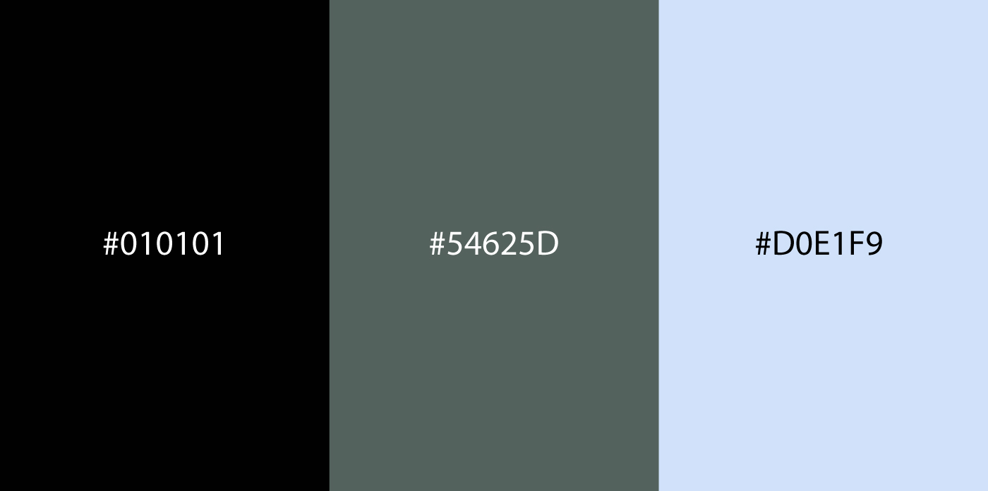
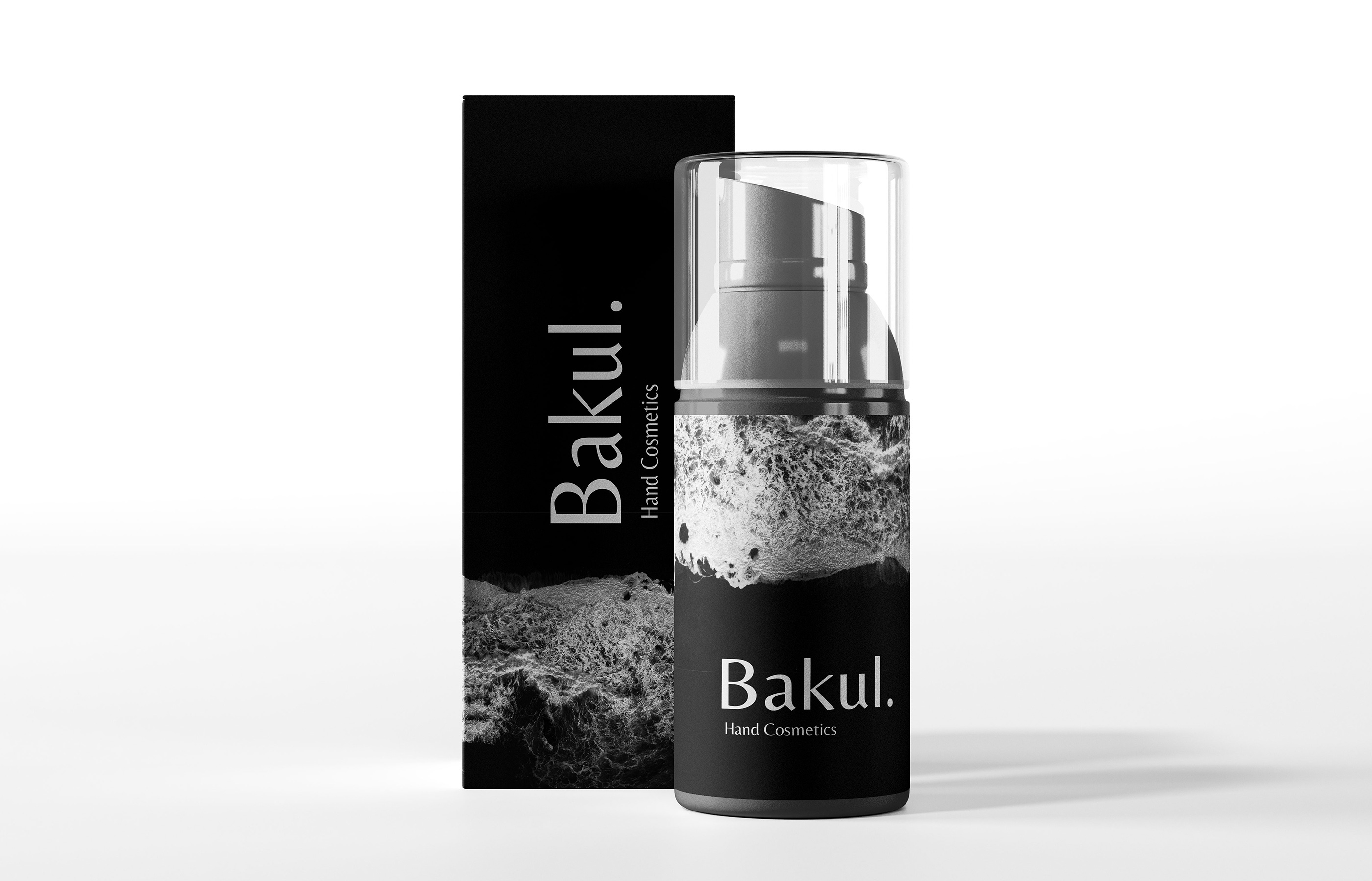
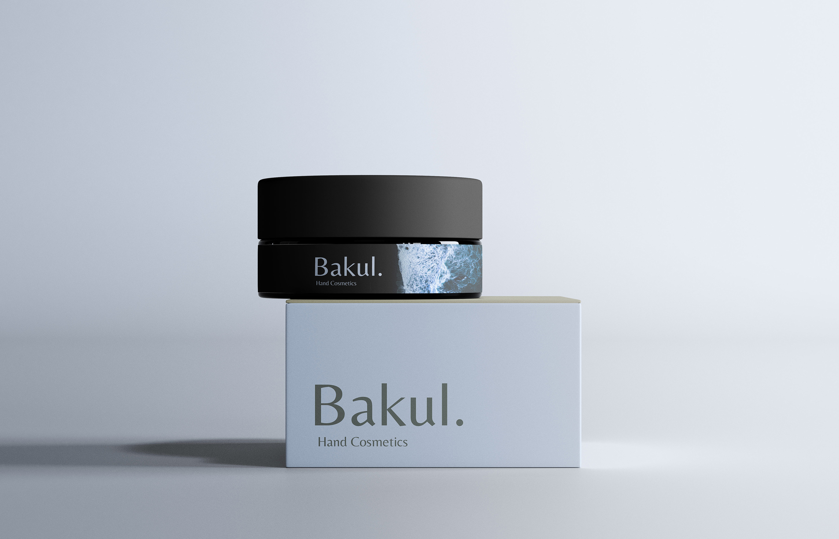
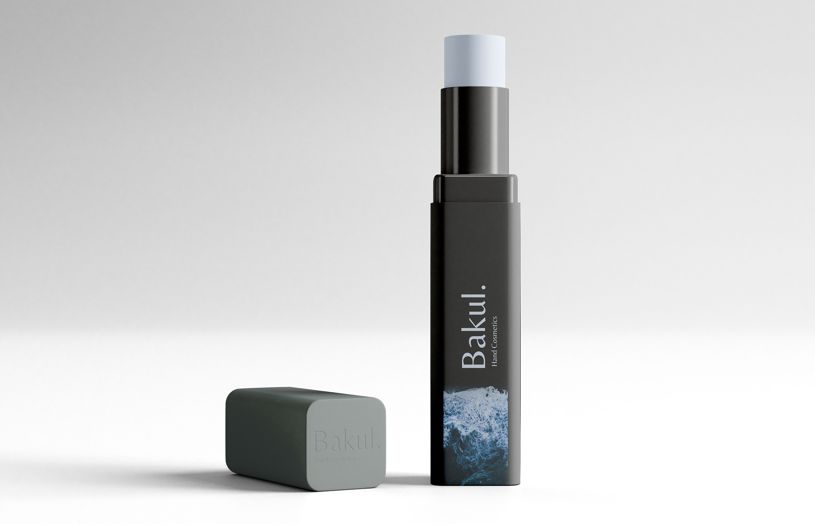
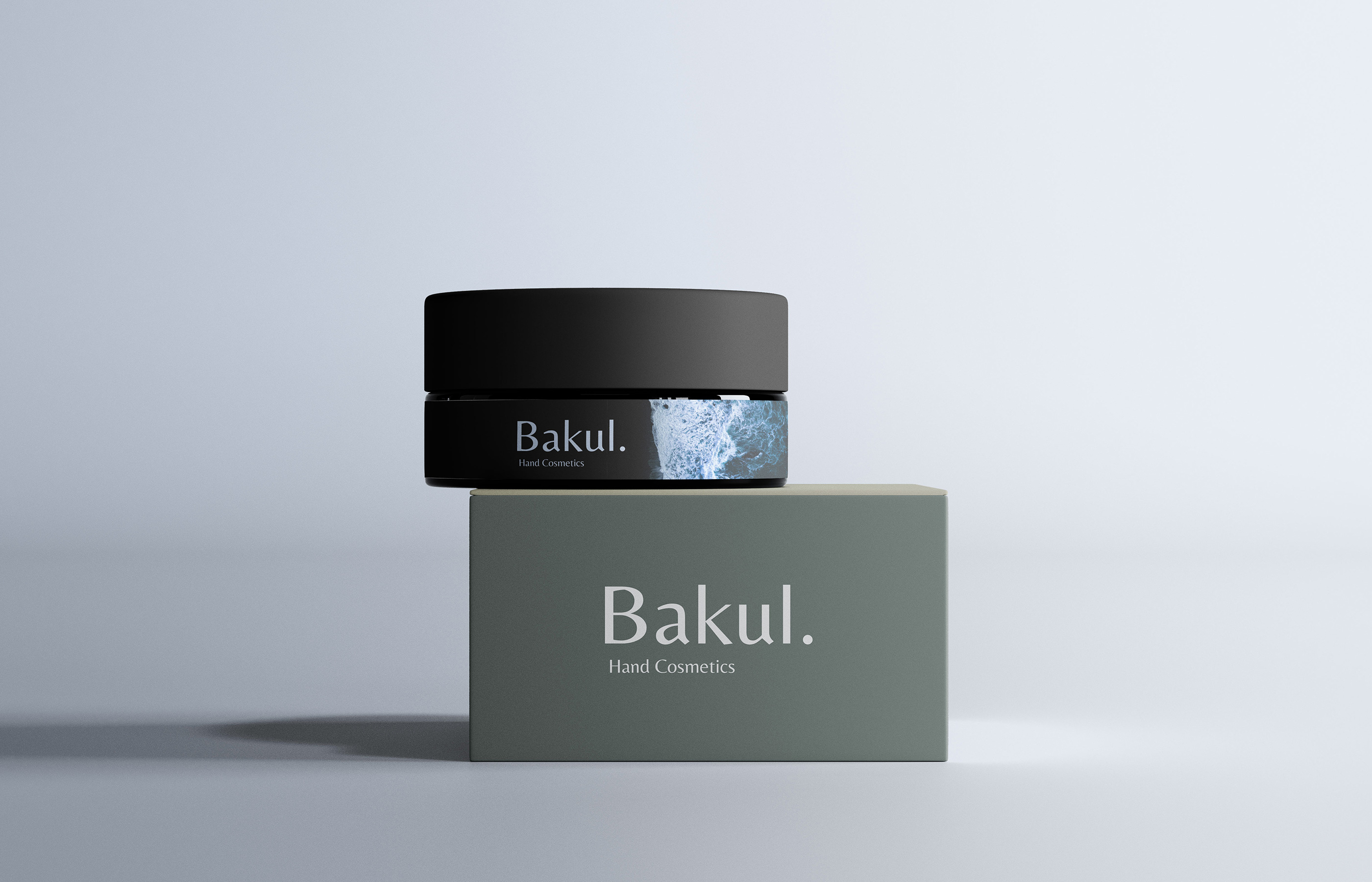
The design process began with research into consumer behavior in the beauty industry. I wanted the packaging to feel aspirational yet approachable, something that could stand out on shelves but also look beautiful in a personal collection at home. From there, I developed a visual identity system that includes carefully chosen color palettes, typography styles, and graphic elements. The colors were selected to evoke sophistication and purity, while the typefaces balance elegance with readability. Every choice was intentional, aiming to create harmony between luxury and clarity.
In terms of materials and finishes, I explored options that emphasize both aesthetics and sustainability. Matte coatings, soft-touch textures, metallic foiling, and embossed logos add depth and tactility, enhancing the unboxing experience. At the same time, I prioritized eco-friendly materials, such as recyclable paperboard and glass, as well as streamlined labeling to reduce excess waste. The result is packaging that feels luxurious in the hand while maintaining environmental responsibility.
I also paid special attention to label design and information hierarchy. In cosmetics, packaging must communicate essential details — product name, usage instructions, and ingredient highlights — without overwhelming the user. My solution was to create clean layouts with clear hierarchies, where the brand identity remains the focal point, supported by subtle graphic accents and intuitive placement of text.
Beyond aesthetics, my goal was to design packaging that enhances the overall user experience. Opening a box, holding a bottle, or twisting a cap are all small interactions that shape how people perceive a brand. I wanted these interactions to feel smooth, effortless, and rewarding. The packaging system therefore integrates ergonomic considerations, modern dispensing mechanisms, and versatile formats that cater to different product types — from creams and serums to lip products and compact powders.
This project was both a creative challenge and an exciting opportunity to merge design, storytelling, and functionality. By blending modern minimalism with thoughtful details, I aimed to create a packaging system that communicates trust, beauty, and innovation. Ultimately, this design represents my vision for how cosmetics packaging can transcend its practical role and become a key part of the user’s daily beauty ritual.
CREDIT
- Agency/Creative: alamgiritservice
- Article Title: Bakul Cosmetics Packaging Design by alamgiritservice
- Organisation/Entity: Freelance
- Project Type: Packaging
- Project Status: Published
- Agency/Creative Country: Bangladesh
- Agency/Creative City: Mymensingh
- Market Region: Middle East
- Project Deliverables: Packaging Design
- Format: Bottle, Jar
- Industry: Beauty/Cosmetics
- Keywords: beauty, cosmetics, skincare, packaging, bottle packaging, tube packaging, jar packaging
-
Credits:
MD Alamgir Hosen: MD Alamgir Hosen


