


Filhos do Reino is more than a burger brand — it’s a story of love, purpose, and connection. Born from the dream of Luisa and Eliton, two passionate entrepreneurs inspired by their Christian faith, the brand was created not just to sell handcrafted burgers, but to serve people with care and intention. Every detail, from the recipes to the brand name, carries a deeper message rooted in hospitality, faith, and community.
The creative challenge was to build a visual identity that could express this spiritual inspiration without being exclusive or overly literal. The goal was to engage with a young Christian audience while also being approachable and attractive to people of all beliefs. We needed a brand that felt emotional, authentic, and warm — a brand that could break stereotypes associated with evangelical identity while celebrating its values in a modern and inclusive way.
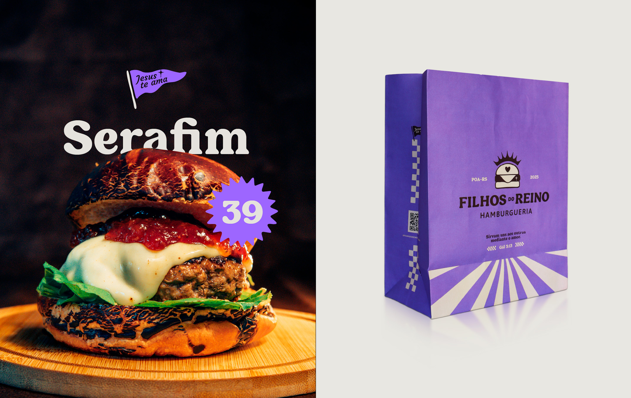
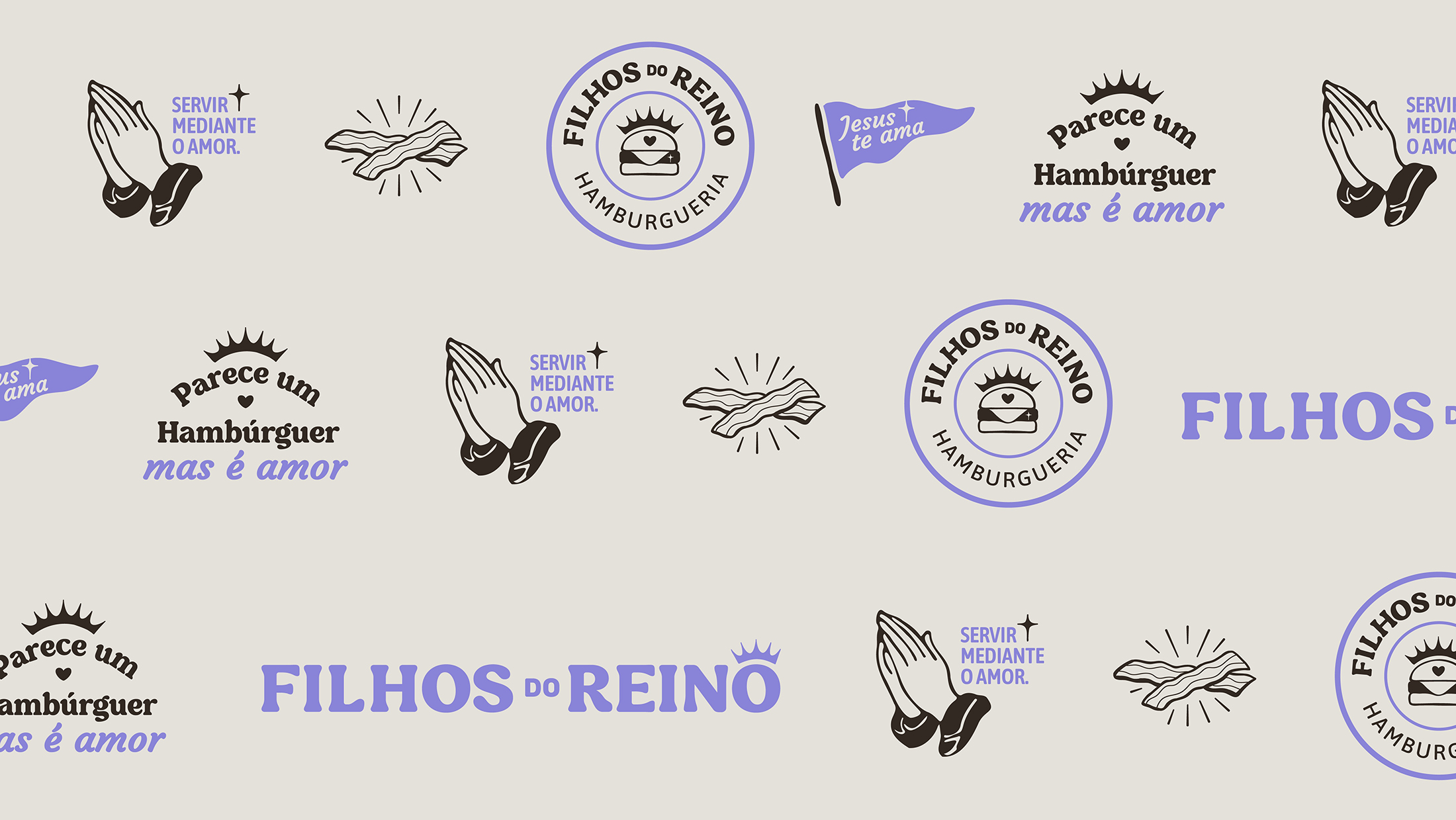
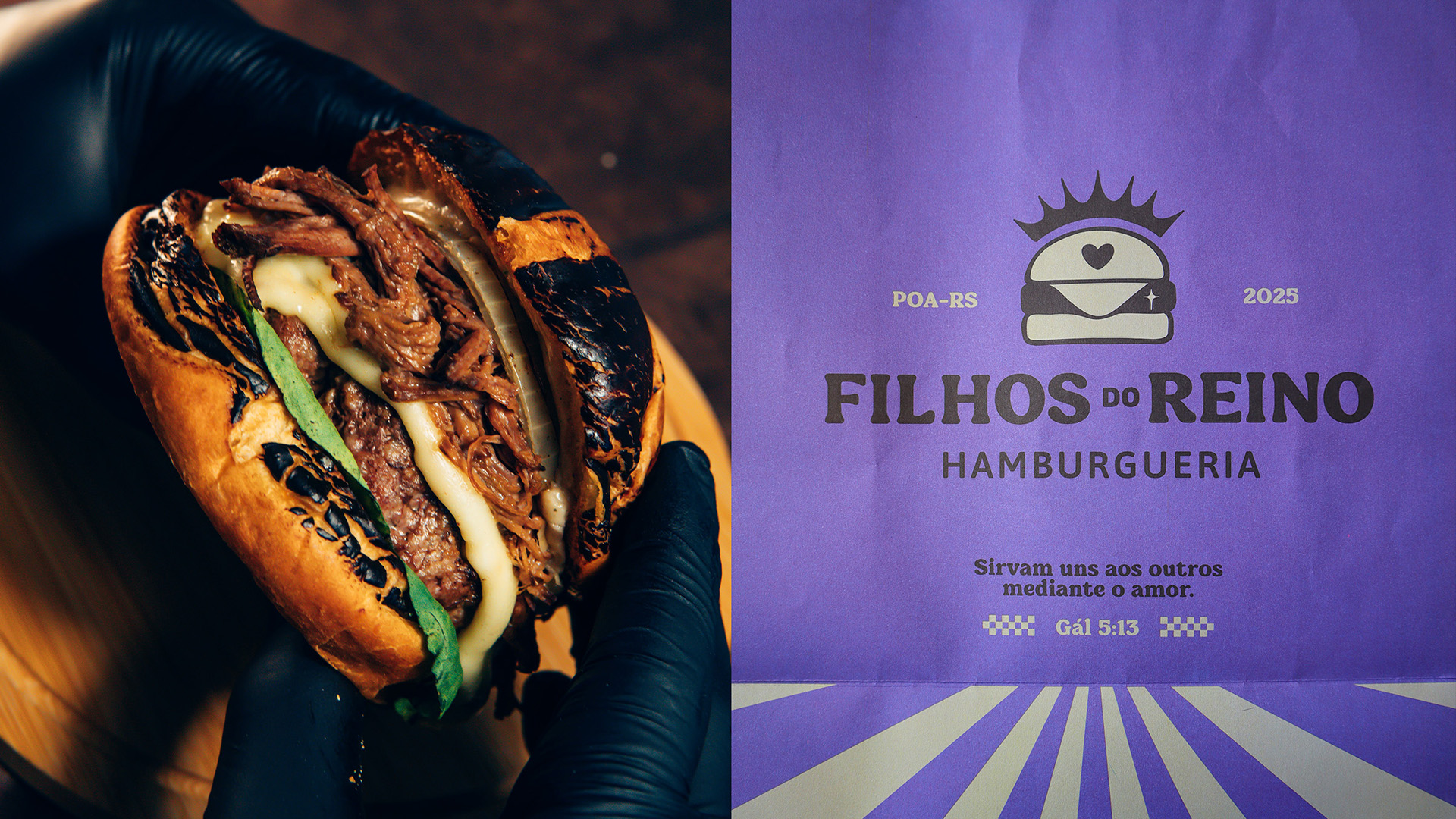
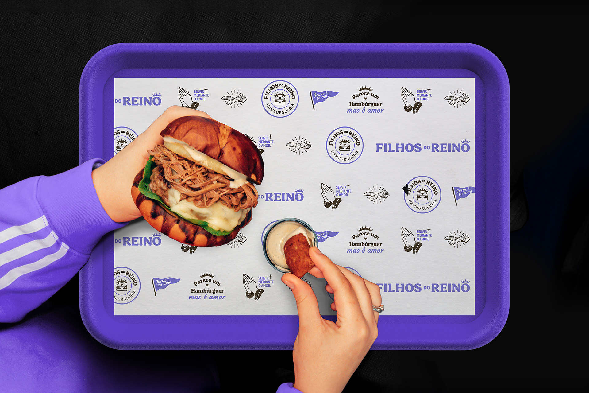
The entire design process was guided by the brand’s core attributes: welcoming, loving, joyful, and genuine. Visually, the identity brings together the classic visual codes of burger culture with subtle spiritual symbolism. The logo combines a burger icon with a crown of thorns — a powerful metaphor for the union between product and purpose. The main typeface, Mailbest, is a soft vintage serif that evokes nostalgia and appetite, while the rounded sans-serif Asap family brings functionality and warmth. The color palette includes earthy tones and a vibrant violet, used strategically to add freshness and personality without overwhelming the message.
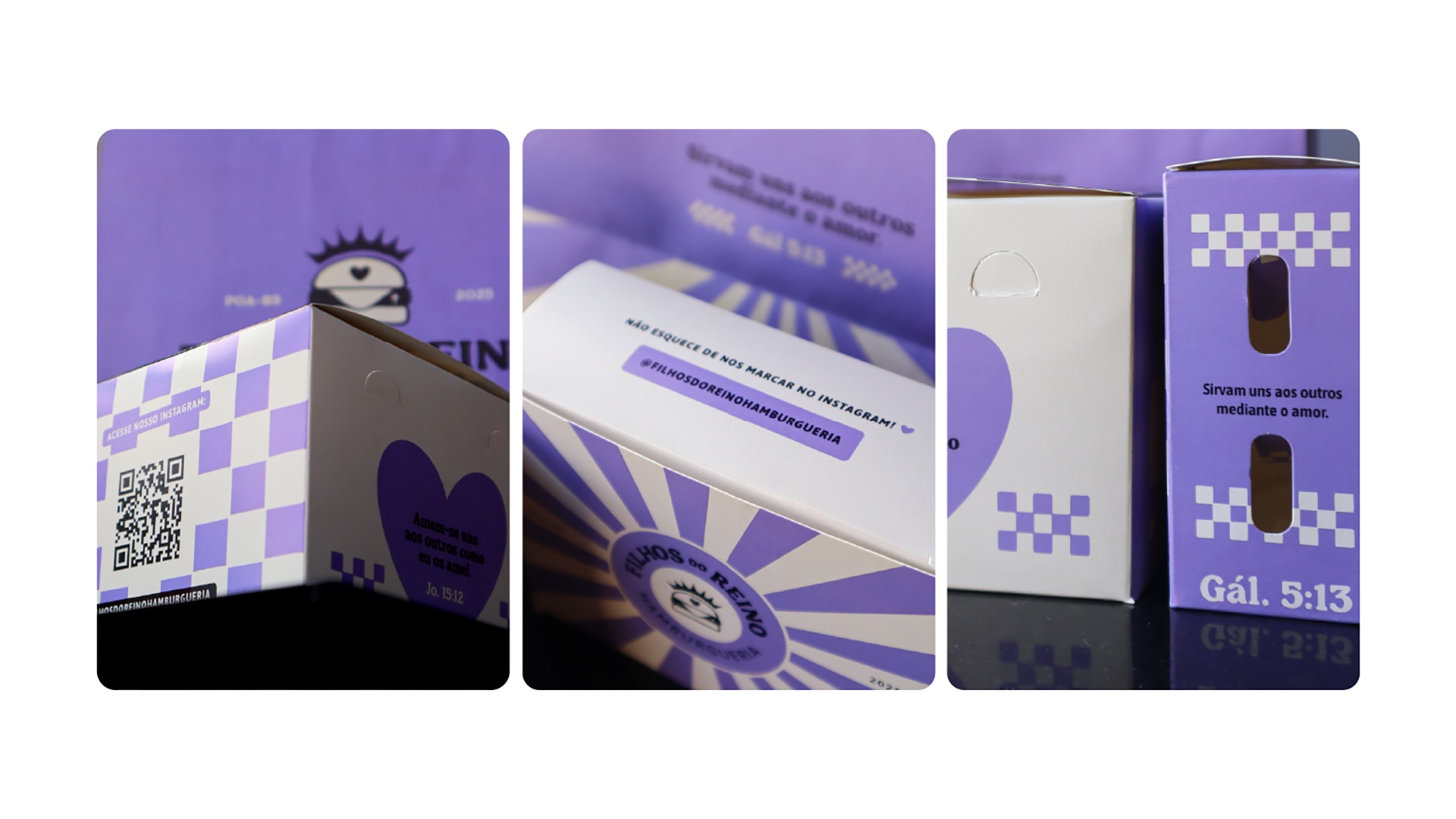
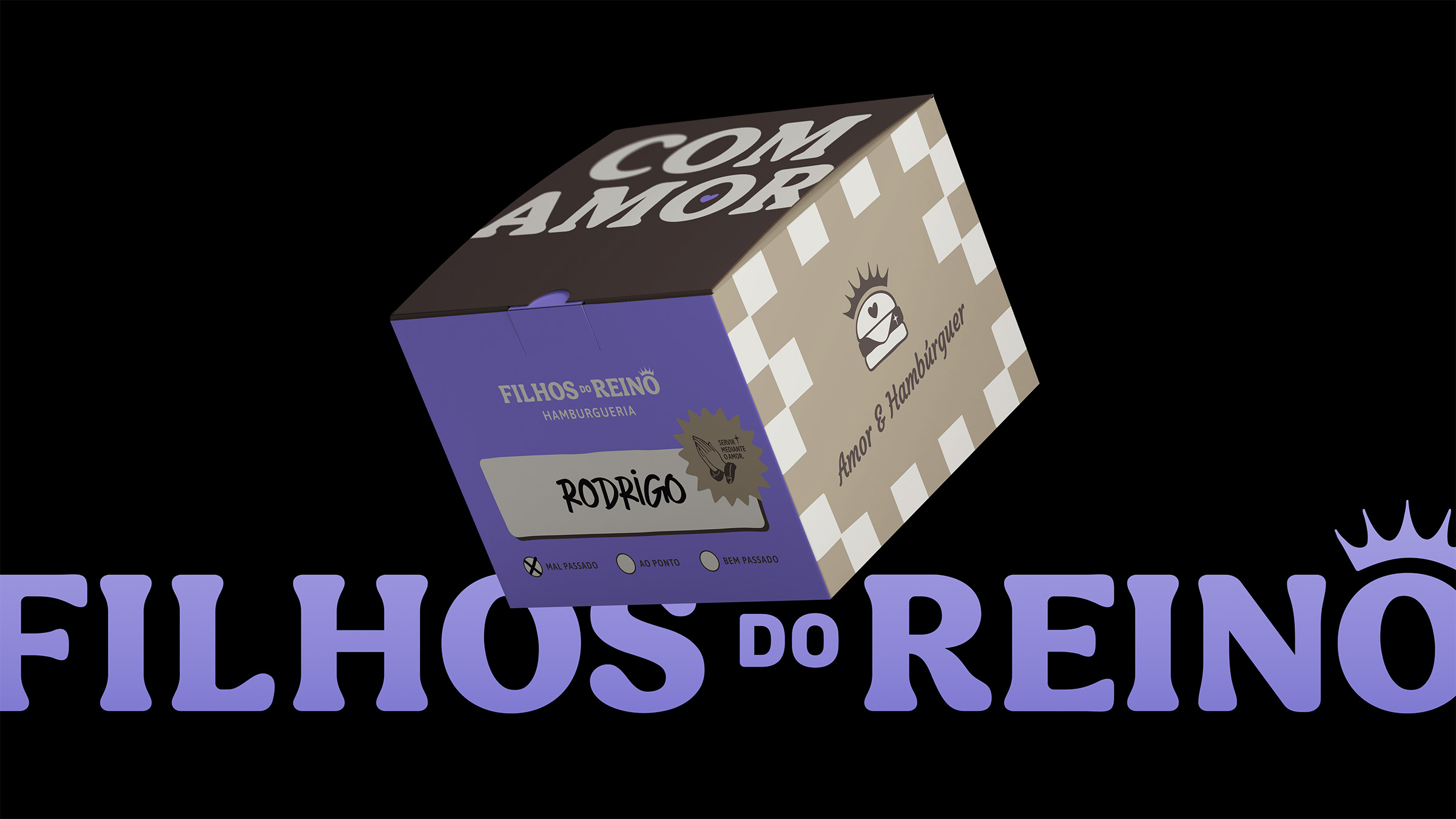
Packaging design played a central role in expressing the brand experience. As a delivery-focused business, each touchpoint — from the boxes and wraps to the stickers and paper bags — needed to carry the brand’s voice and purpose. We created a flexible system of verbal expressions and graphic elements that allowed for dynamic layouts while maintaining strong visual consistency. All applications were designed to communicate care, comfort, and originality.
The outcome is a brand that doesn’t preach — it invites. A business that uses food as a gesture of affection. Filhos do Reino proves that purpose and design can coexist in a way that is meaningful, contemporary, and commercially effective. It redefines what it means to be a faith-inspired brand in today’s world — without losing flavor, emotion, or relevance.
CREDIT
- Agency/Creative: Kaminski Studio
- Article Title: Visual Identity and Packaging Design for Christian Handmade Burger in South Brazil
- Organisation/Entity: Freelance
- Project Type: Identity
- Project Status: Published
- Agency/Creative Country: Brazil
- Agency/Creative City: Gravataí
- Market Region: South America
- Project Deliverables: Brand Design, Brand Guidelines, Brand Identity, Branding, Identity System, Packaging Design
- Industry: Food/Beverage
- Keywords: branding, burger, burger logo, Christian, design de embalagem, embalagem, hamburgueria, hamburgueria artesanal, handcrafted, identidade visual, illustration, packaging design, religious, visual identity
-
Credits:
Strategic Designer: Rodrigo Kaminski


