


Brand transformation studio Disegno has reimagined the Melbourne Symphony Orchestra (MSO) for a new era, launching a bold identity to mark the Orchestra’s 120th year. The work, built on the creative idea ‘Shape of Sound’, captures music in motion – rhythm, flow, resonance – and positions the MSO not just as an orchestra, but as a timeless and evolving cultural force in a fast-changing city.
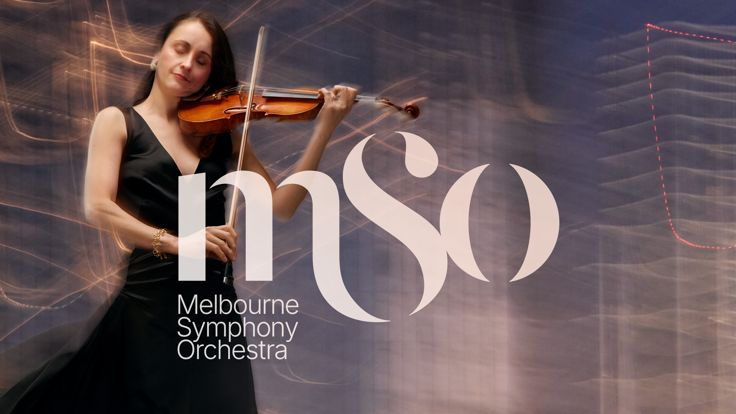
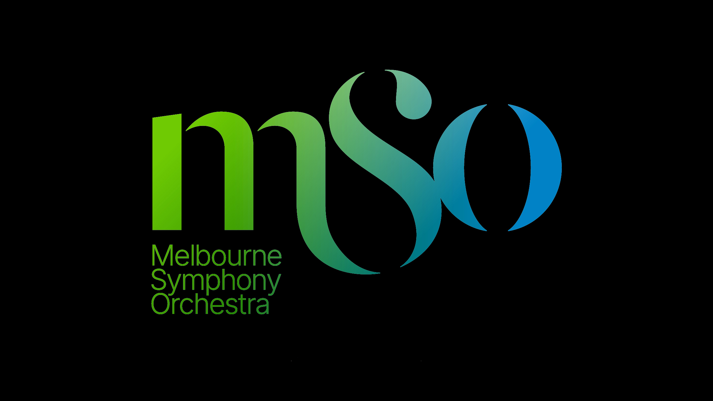
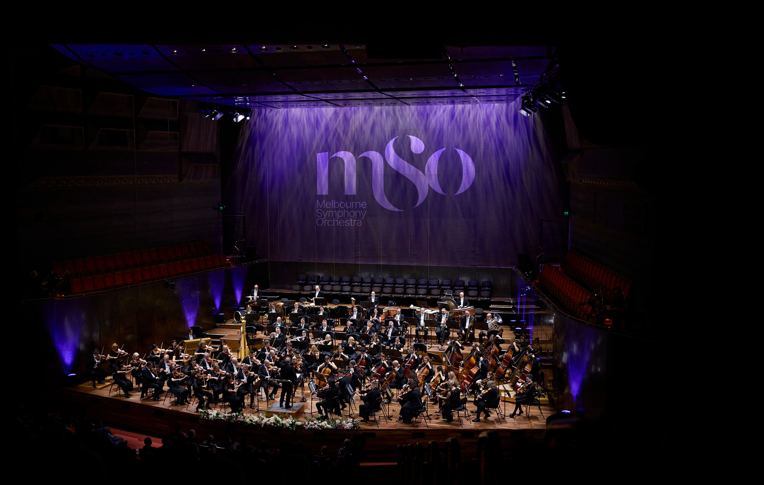
At the heart of the new identity is a custom logo where each letter carries meaning: the grounded ‘M’, the flowing ‘S’, and the resonant, open-bracketed ‘O’. This visual rhythm balances gravitas with energy, supported by a disciplined grid, expressive colour palette and flexible typographic system. Designed to perform across stage, screen, seasons and international borders, the brand is equally at home with first-time concertgoers and long-time subscribers.
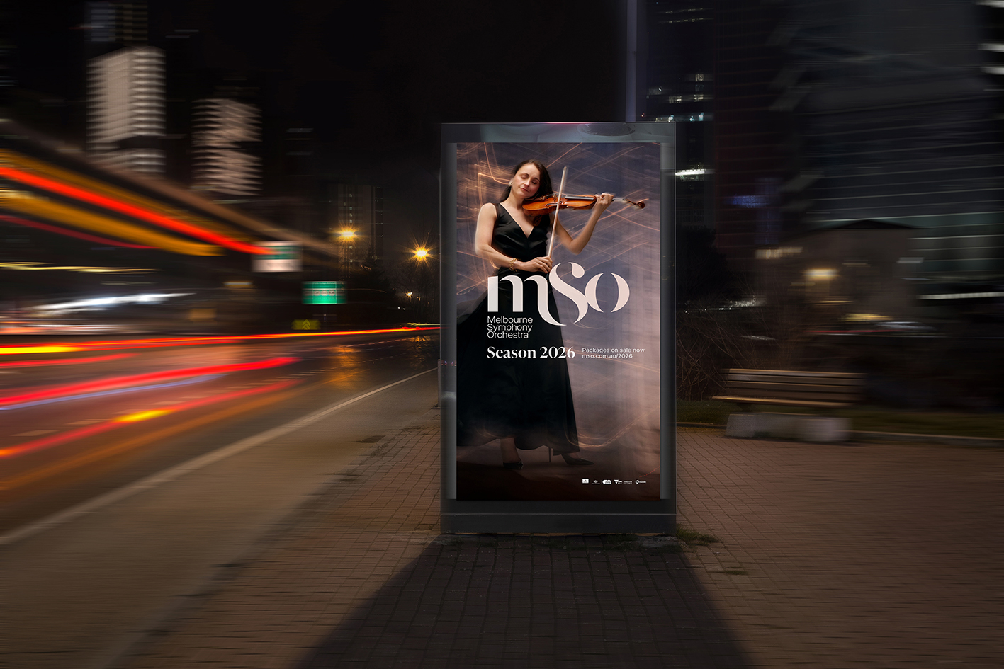
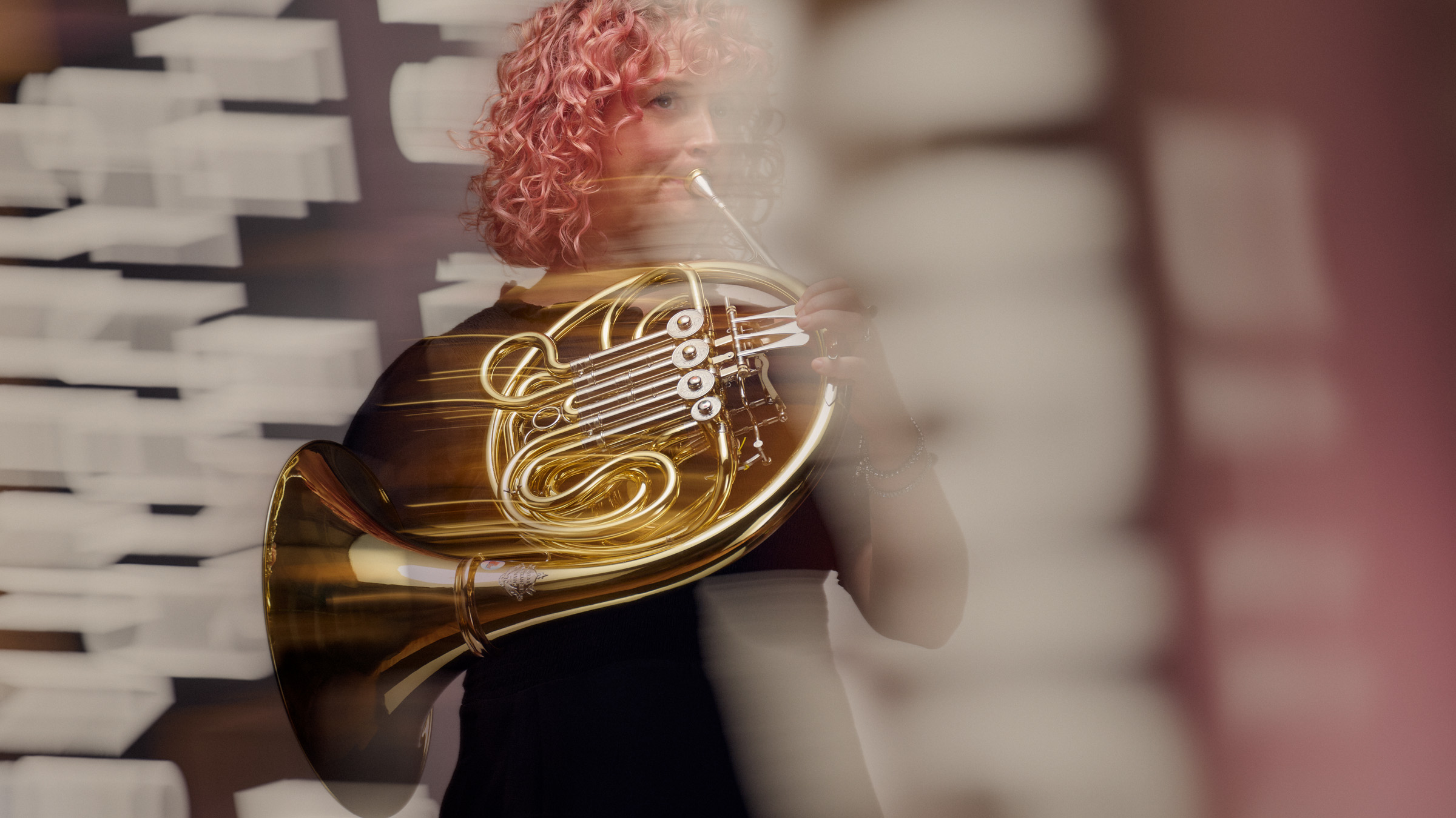
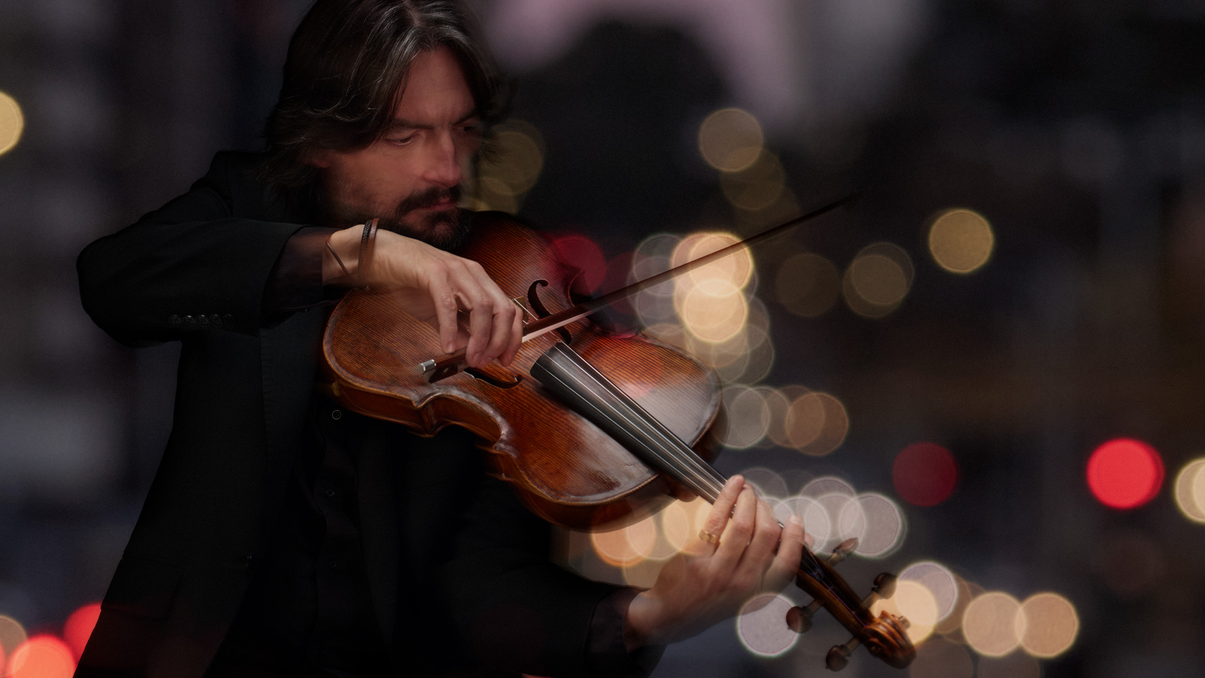
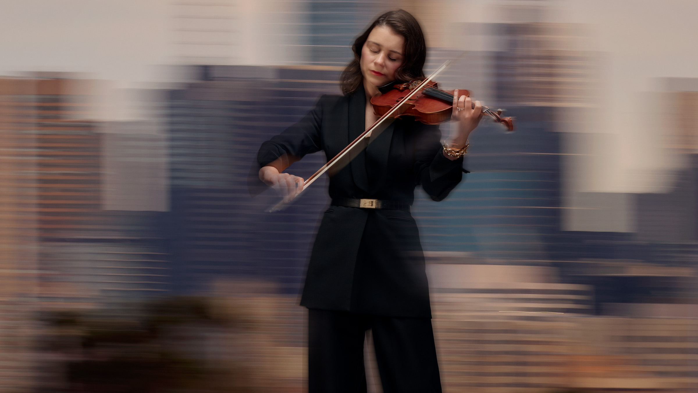
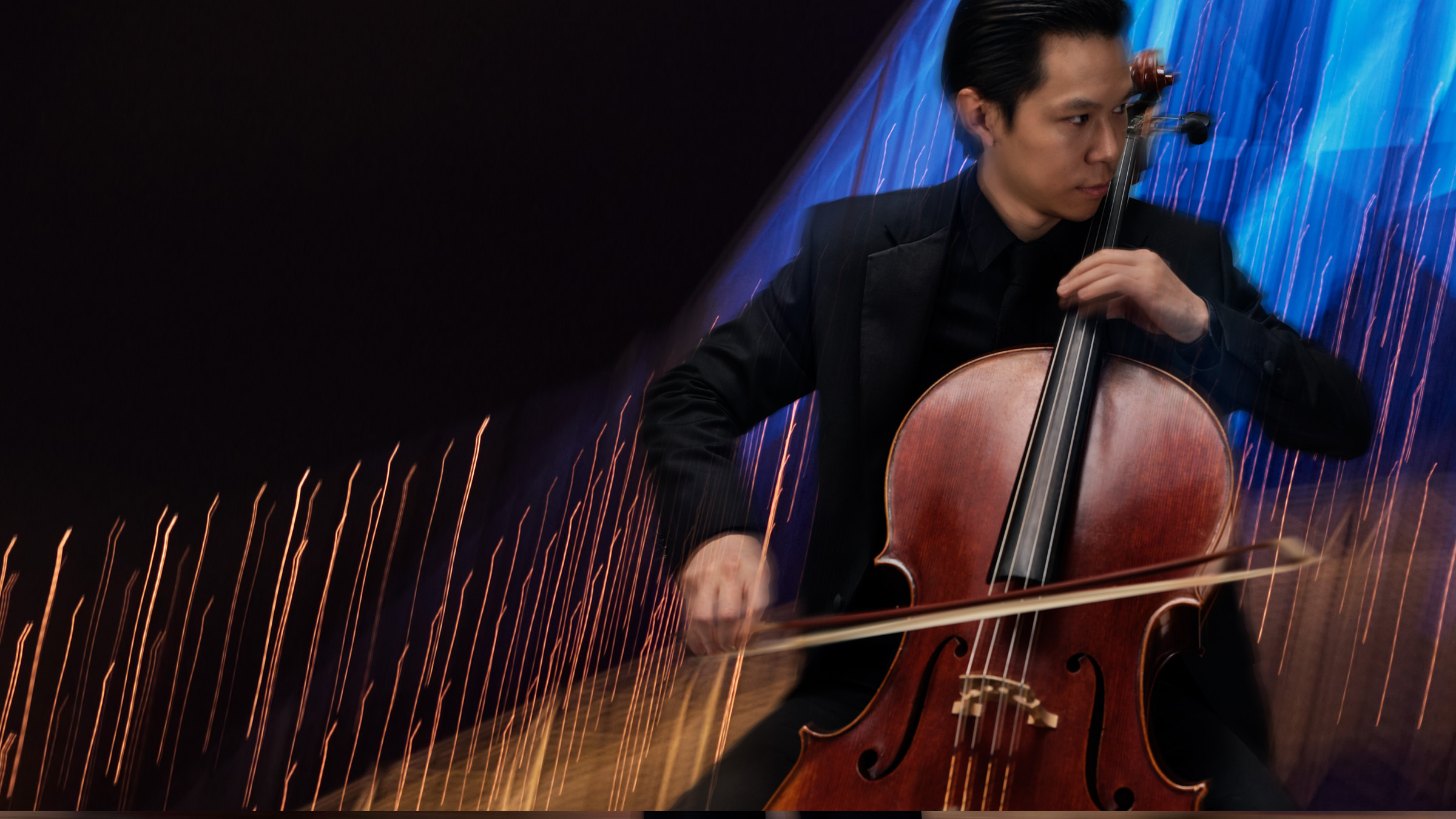
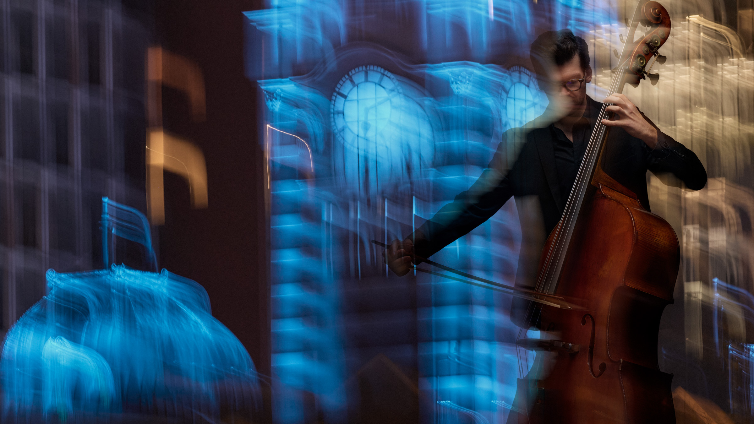
The brand toolkit was built to scale, with adaptable colour systems, graphic devices echoing musical gestures, and clear guidelines for photography, typography and layout. The first major outing came with the 2026 Season Campaign, ‘Music That Moves Us’, photographed by acclaimed photographer, Lucas Allen. Rejecting static portraits, the campaign placed MSO musicians in motion against atmospheric Melbourne backdrops, evoking the energy and humanity of live orchestral music.
Disegno’s remit extended beyond visuals to align with the MSO’s strategic goals: broadening audiences, deepening community engagement, supporting international touring and uniting internal stakeholders. As Partner & Head of Strategy Aaron Turner explains, “This was a cultural value exchange between Melbourne and the Melbourne Symphony Orchestra – an opportunity not just to reflect the city’s cultural identity, but to enrich it.”
The impact has been immediate. CEO Richard Wigley calls it “a brand that expresses our soul and strengthens our strategy… it doesn’t just look right. It feels right.” Director of Brand & Communications, Jayde Walker, describes it as “a new language” that invites every generation in, while Director of Sales & Marketing, Dylan Stewart, sees it as a growth tool for a city with a swelling population and appetite for shared experiences.
Through ‘Shape of Sound’, Disegno has created a living identity system – elegant yet energetic, deeply rooted in heritage yet ready for the future – positioning the MSO to connect with audiences locally and globally for decades to come.

CREDIT
- Agency/Creative: Disegno
- Article Title: Disegno Reimagines Melbourne Symphony Orchestra For A New Era
- Organisation/Entity: Agency
- Project Type: Identity
- Project Status: Published
- Agency/Creative Country: Australia
- Agency/Creative City: Melbourne
- Market Region: Oceania
- Project Deliverables: Advertising, Advertising Photography, Brand Guidelines, Brand Identity, Brand Strategy, Logo Design
- Industry: Entertainment
- Keywords: Brand Identity
-
Credits:
CEO: Richard Wigley
Director of Brand & Communications: Jayde Walker
Director of Sales & Marketing: Dylan Stewart
Senior Manager, Content & Digital: Phil Paschke
Founder: Marino Di Camillo
Partner & Head of Strategy: Aaron Turner
Executive Creative Director: Graham Purnell
Creative Director: Natasha Pandji
Design Director: Matthew Smith
Production: Oliver Bermes
Production: Paul Ryan
Photographer: Lucas Allen
Executive Producer: Josie Amato
Wardrobe Stylist: Bec Cole
Hair & Makeup: Darren Cartledge
Photography Assistant: Ashley Ludkin
Photography Assistants: Jonas Wong
Photography Assistants: El Wood
Photography Assistants: Stephanie Duncan
Retouching: Steven Simmonds


