


In a generation where many Gen Z youth are confidently speaking up and shaping the social narrative, the flip side is a tendency to conform to trends and a fear of judgment. This has caused a large number of young people to become hesitant and reserved in expressing themselves. As a result, their unique communication styles gradually fade, and their confidence retreats with it. “Ngôn Dạng” is a campaign that helps you rediscover your communication identity – clearer, deeper, and truly authentic.
In Vietnamese, “Ngôn” reflects how we speak – the essence of language. “Dạng” represents both form and diversity – the many shapes of expression.
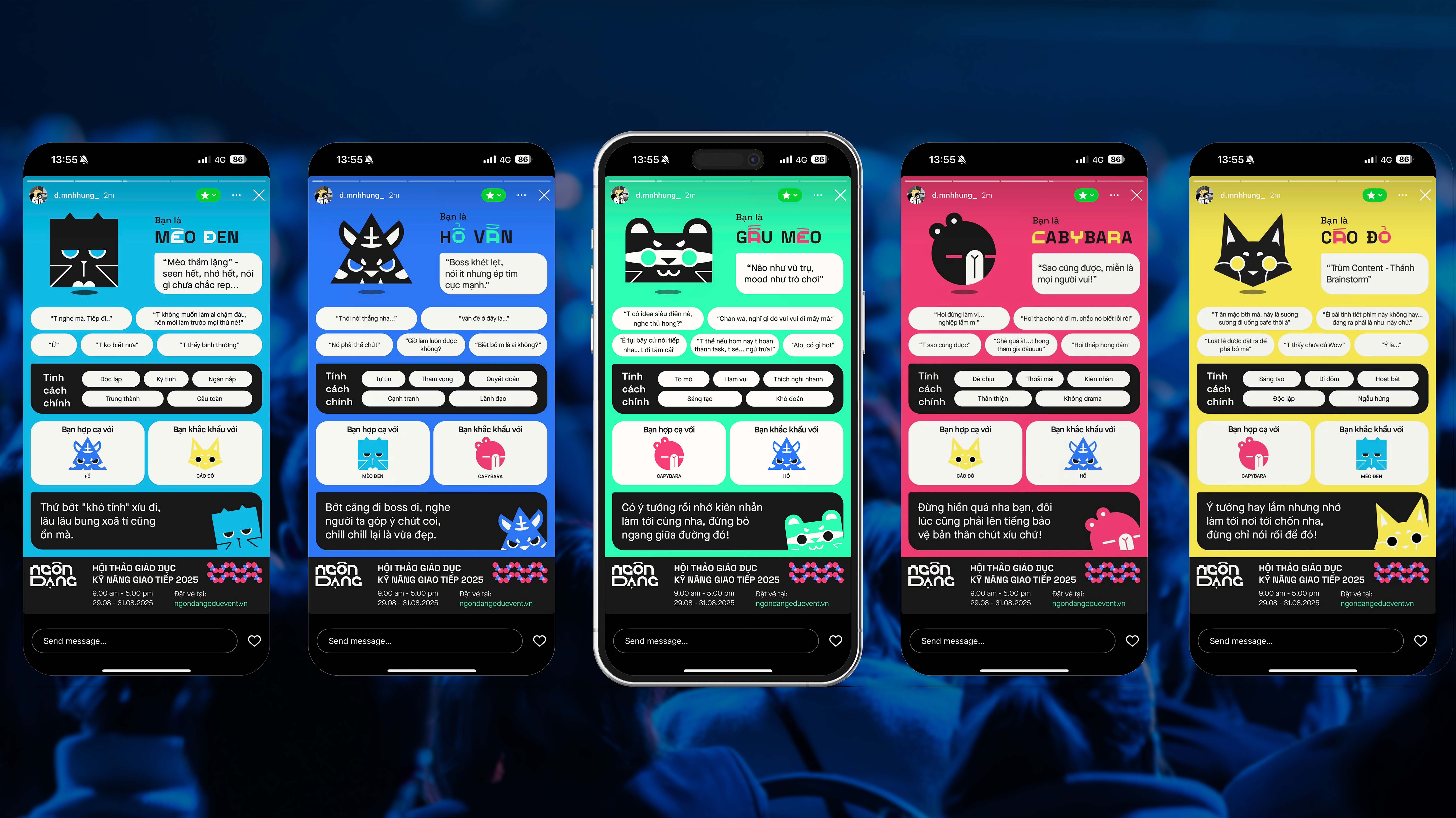
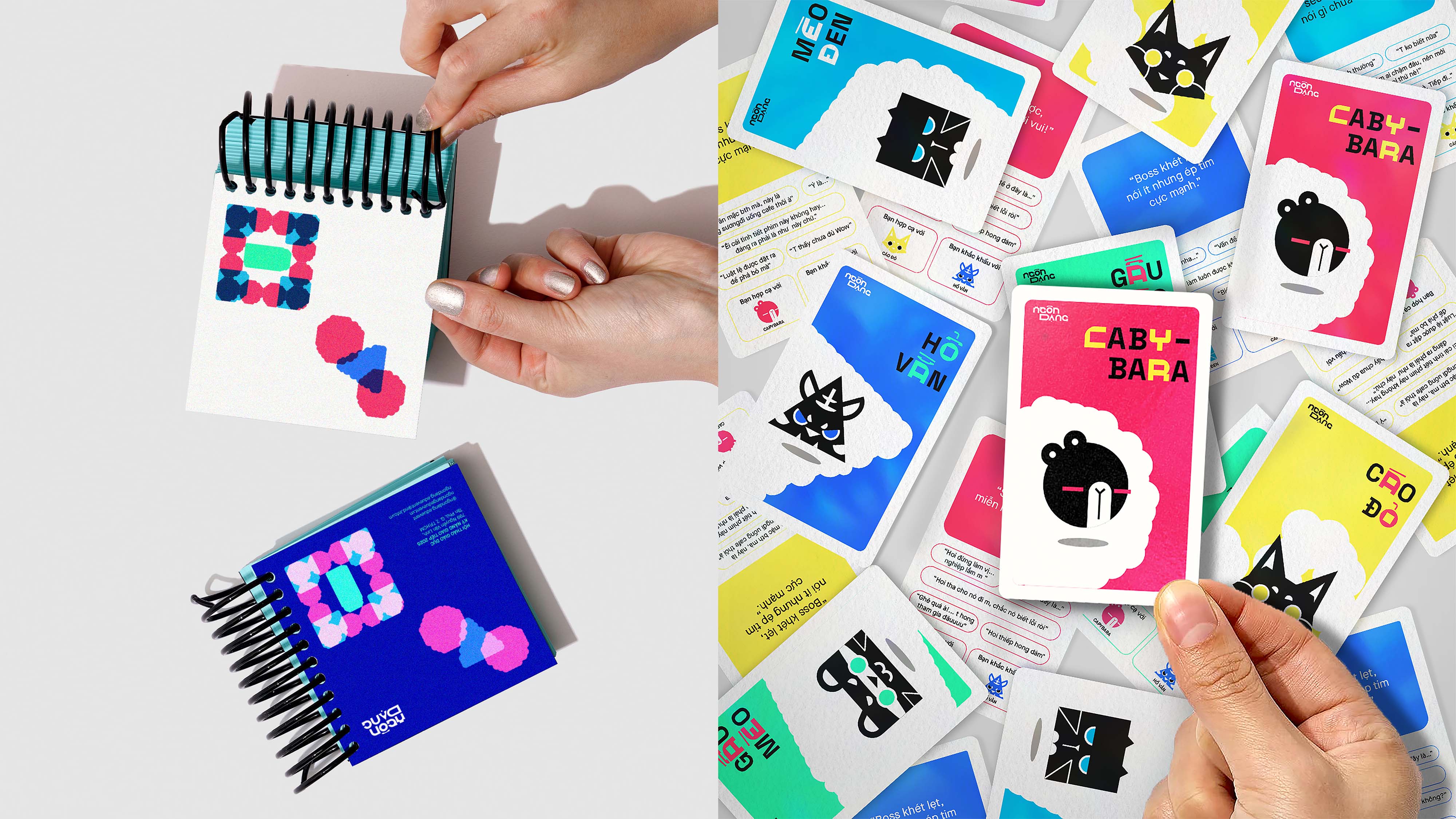
“Ngôn Dạng Campaign” explores a variety of personal communication styles, inspired by Dr. Dellinger’s Psycho-Geometrics, where five geometric shapes – Square, Triangle, Rectangle, Circle, and Squiggle – represent different natural communication strengths. This approach serves as the core visual and conceptual foundation for the project.
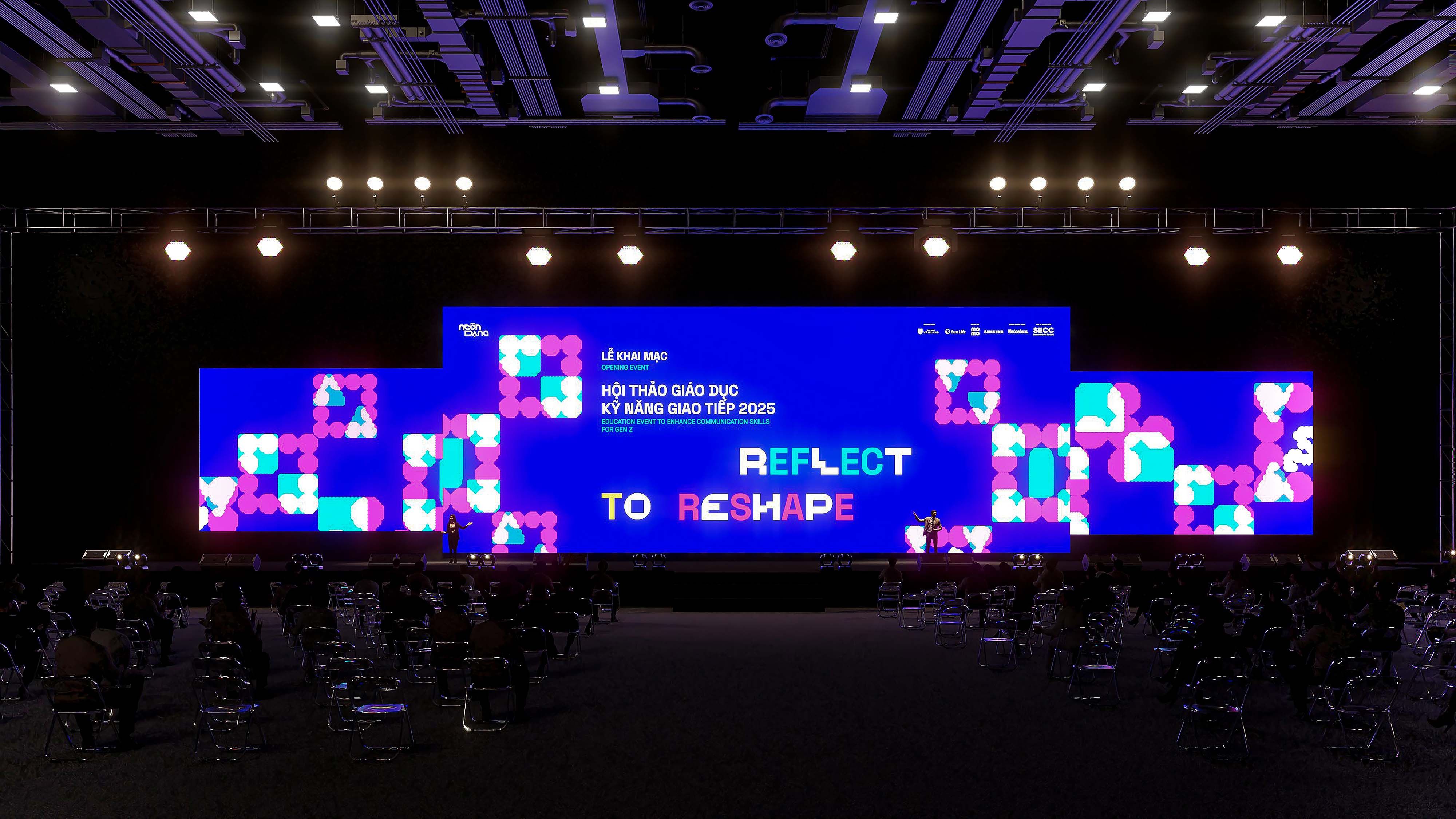
The campaign concept, “Reflect to ReShape”, draws inspiration from the phenomenon of light bouncing back from a surface. “Reflect”, in this context, is more than a physical process; it represents an inward journey to understand how we communicate with others, whether through habits, preferences, and challenges in communication, and thus, to “ReShape” how we express ourselves — more intentionally, confidently, and true to who we are.
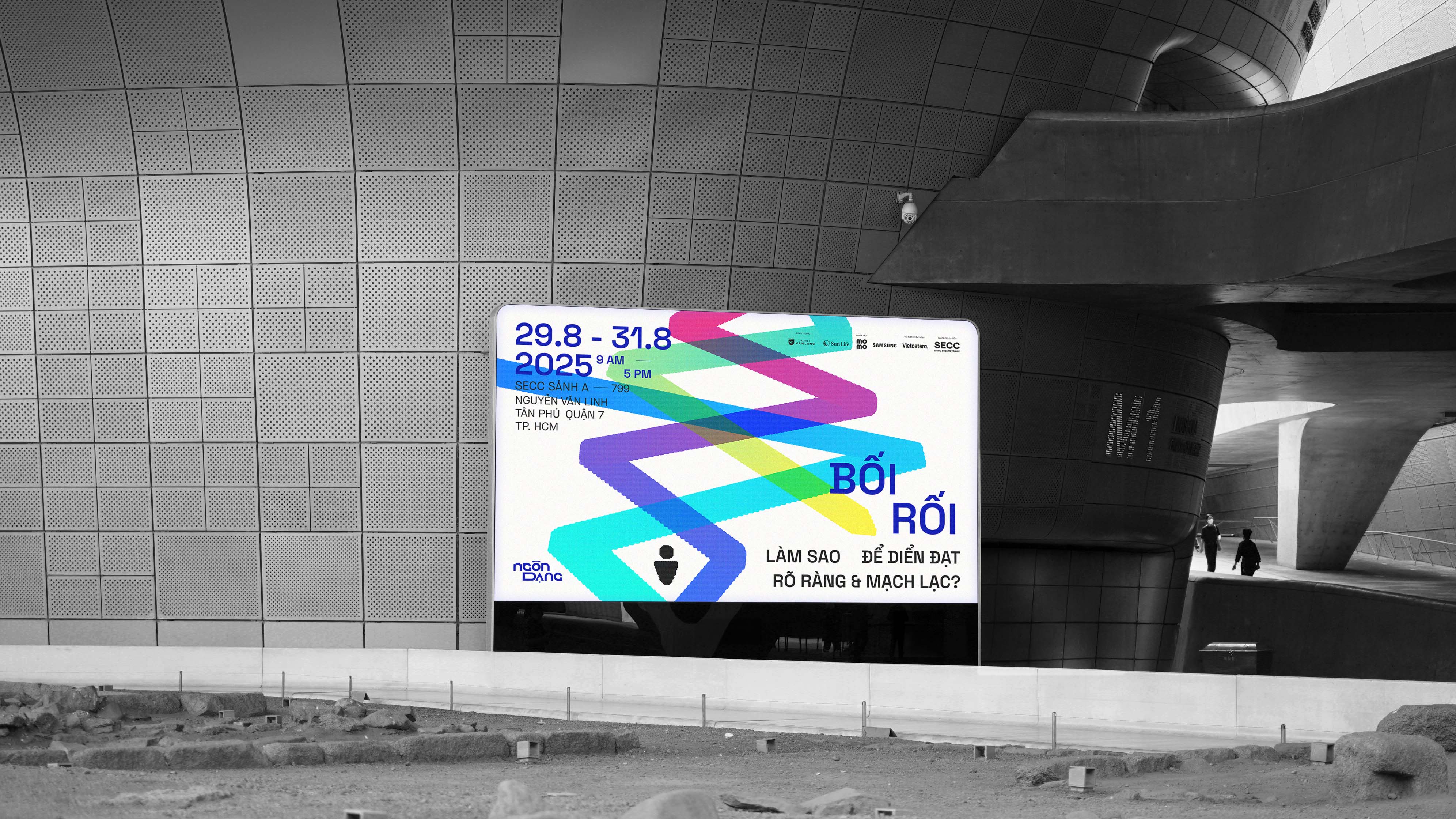
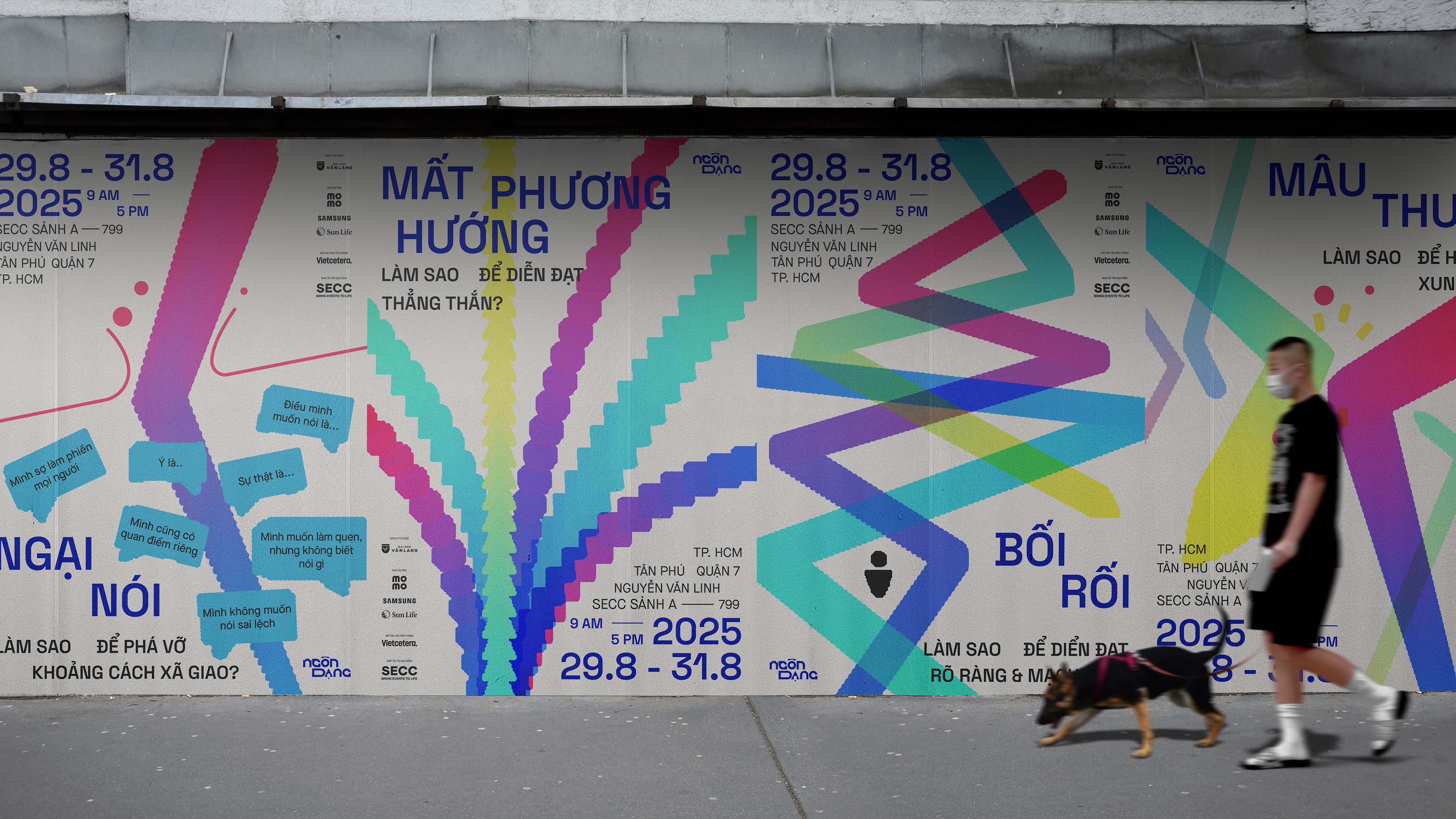
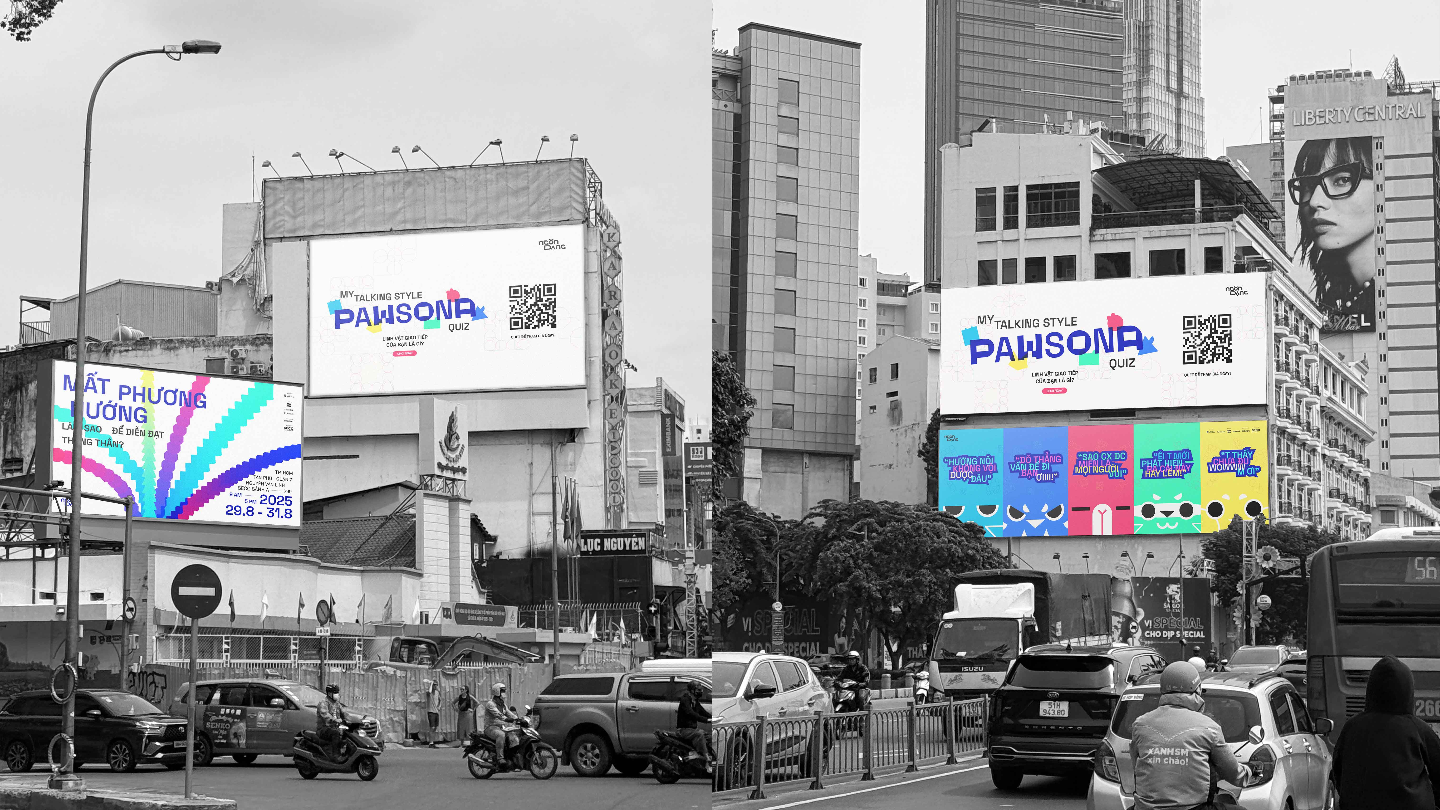
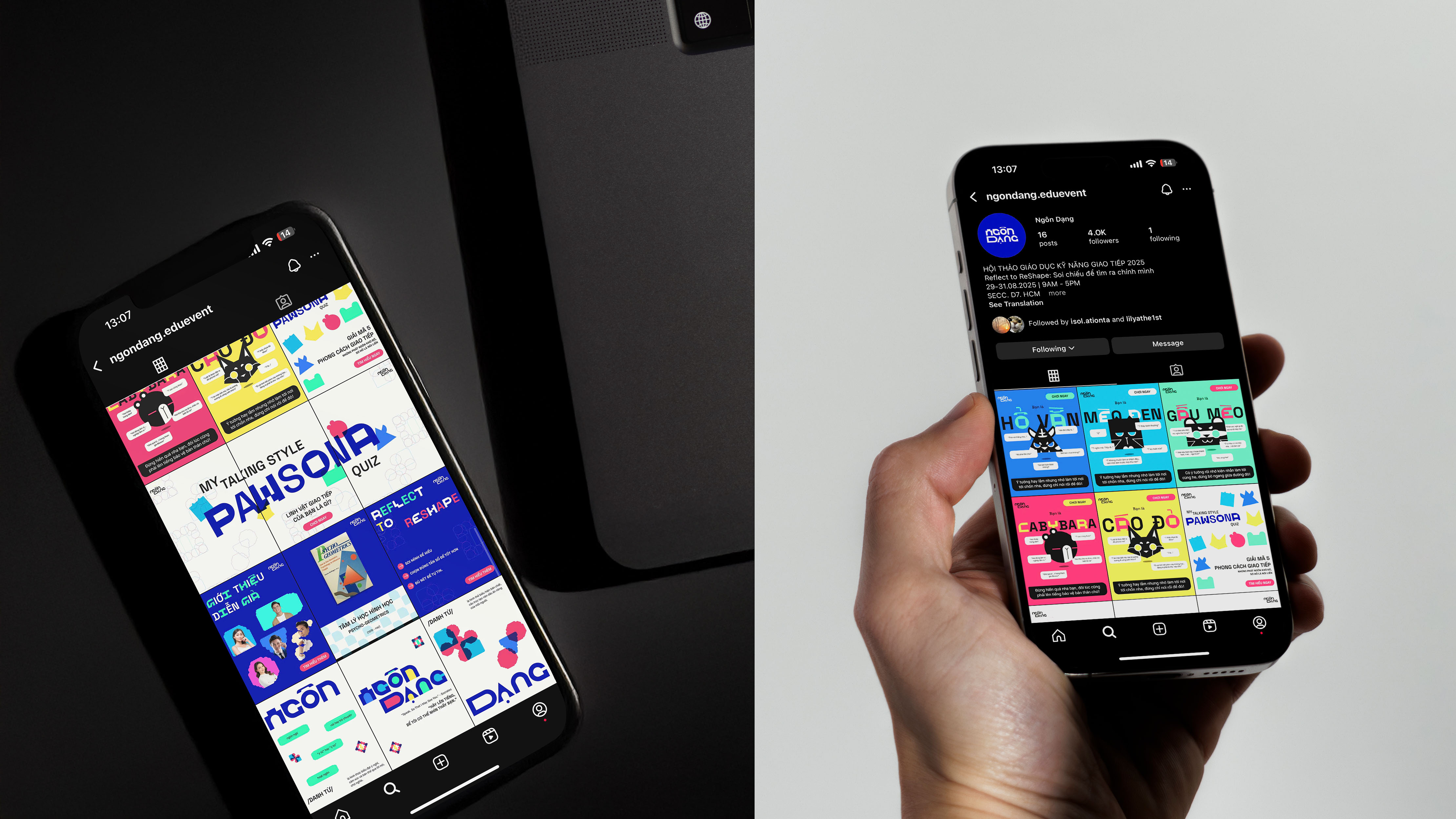
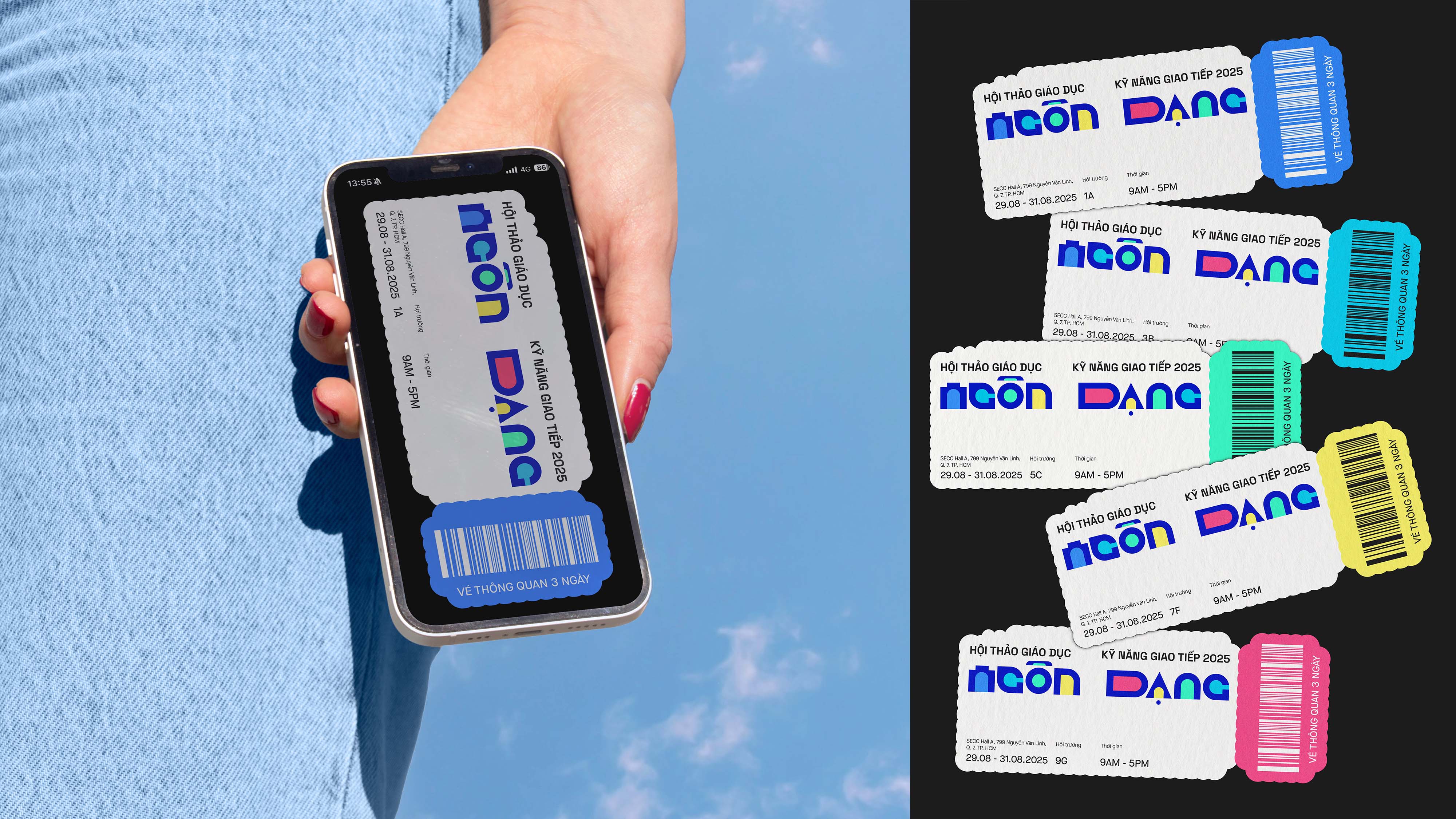
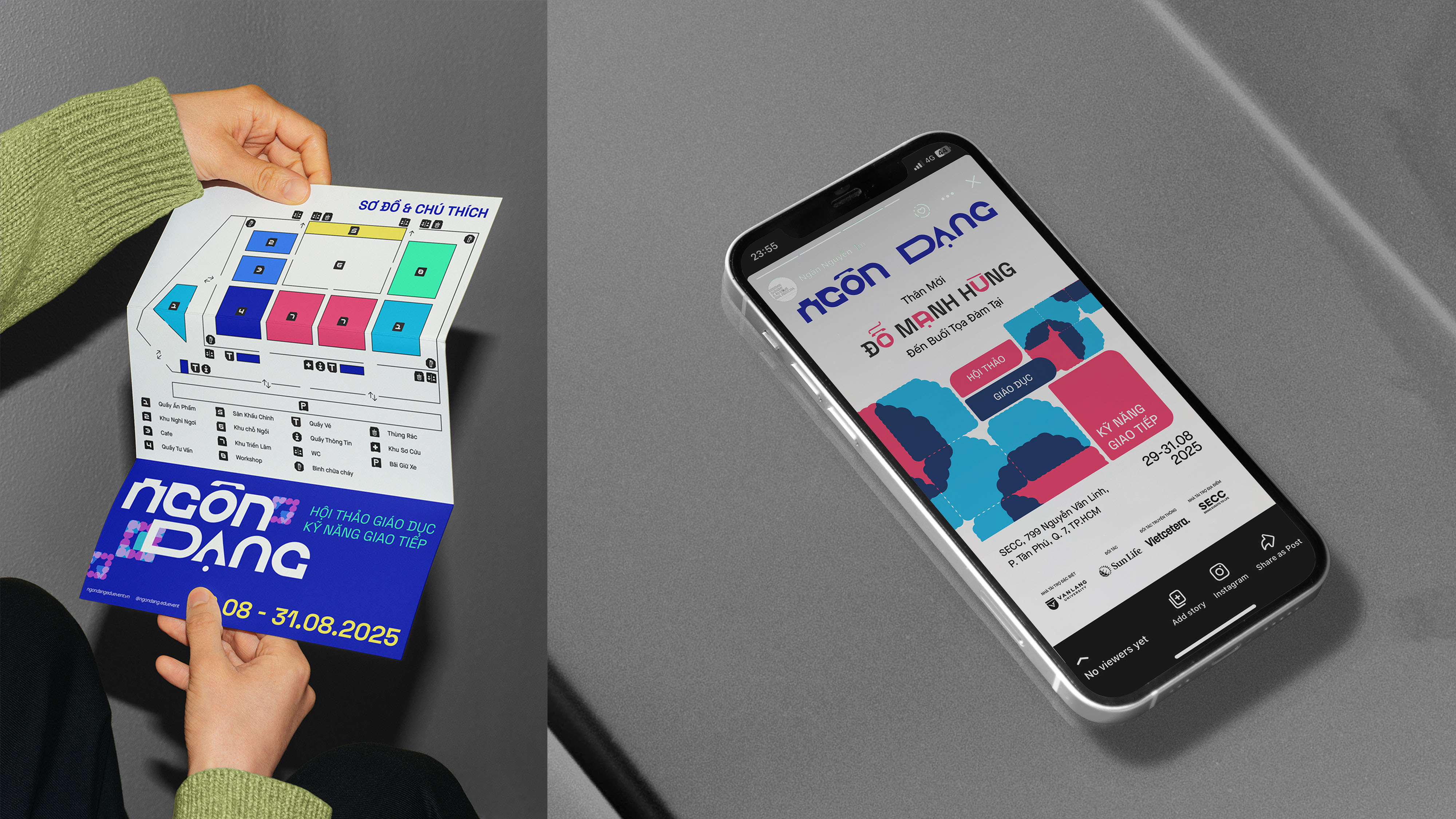
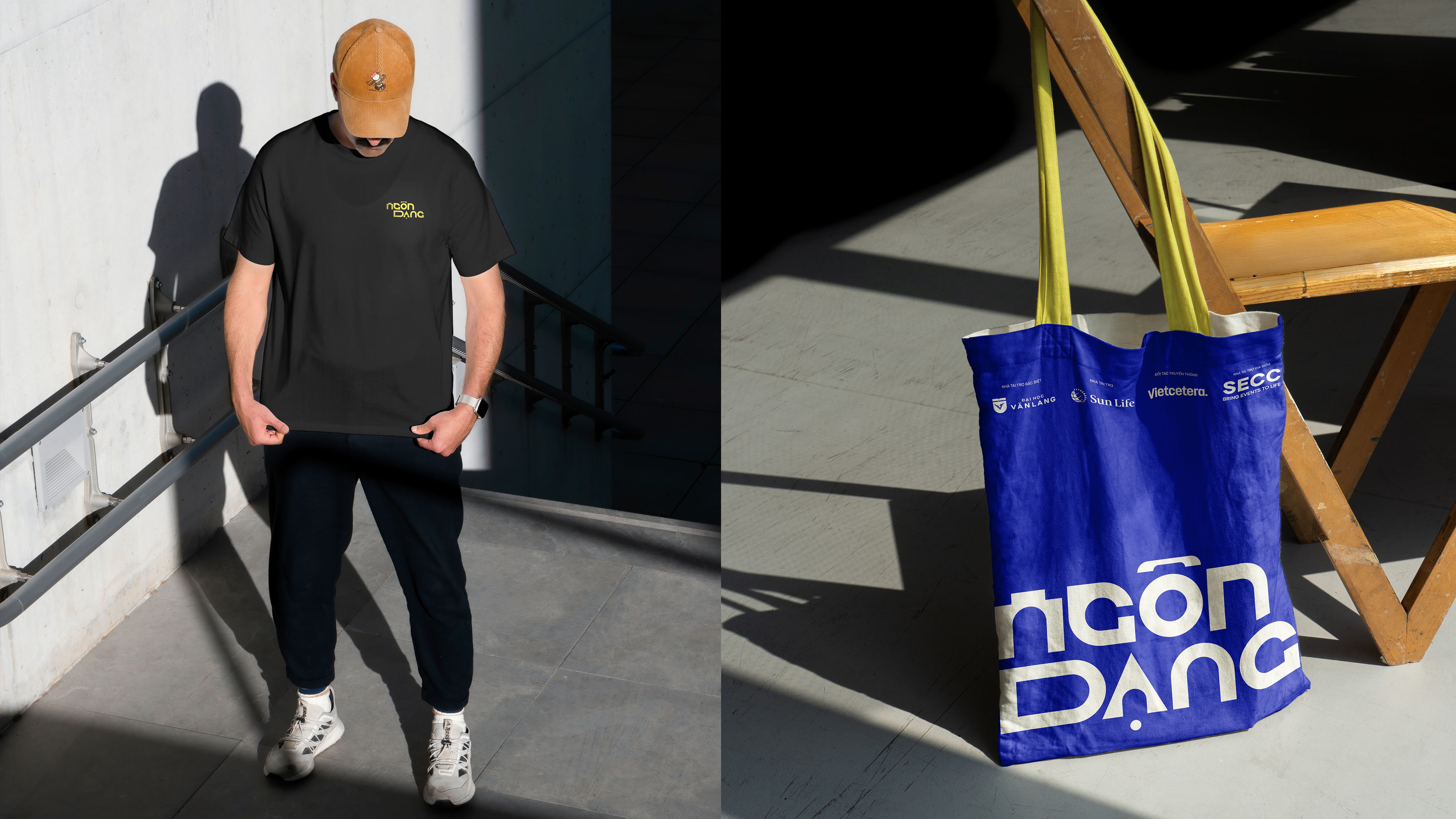
To raise awareness among young people, I developed a modular visual system — a flexible yet distinctive identity for the campaign — that would evoke both diversity and uniqueness in individual communication styles. The deliverables are campaign materials (posters, billboards, and brochures), digital content, and on-site tools such as wayfinding, tickets, and merchandise. Variety and distinction in characters are referenced in every element of the visual identity, from the mix-and-match of bespoke Ngôn Dạng Mono and Space Grotesk, representing verbal communication between people, to the graphic elements: bold, overlapping variations that serve as natural communication strengths in each of us. Meanwhile, the vibrant contrasting color scheme reflects the two distinctive thinking styles, i.e, cool colors for linear thinking and warm colors for configural thinking. From typeface to structure, from poster to ticket, the design narrates an experience that’s both dynamic and individualistic.
CREDIT
- Agency/Creative: Do Manh Hung
- Article Title: Ngôn Dạng – A Promotional Campaign to Enhance Communication Skills for Gen Z by Student Do Manh Hung
- Organisation/Entity: Student
- Project Type: Campaign
- Project Status: Published
- Agency/Creative Country: Vietnam
- Agency/Creative City: Ho Chi Minh City
- Market Region: Asia
- Project Deliverables: 2D Design, Advertising, Brand Mark, Graphic Design, Identity System, Web Design
- Industry: Education
- Keywords: Campaign, Gen Z, Personality Test, Education, Communication Skills
-
Credits:
Art Director/Graphic Designer: Do Manh Hung
Mentor: Chieu Anh Long
Advisor: Uyen Dong
Advisor: Meow Meow
Advisor: Thai Nguyen
Advisor: Doan Tram
Advisor: Dung Ngo
Copy Writer: Bao Khanh
Web Designer: Ngan Nguyen
Design Assistant/ Showcase: Dan Tan
Illustrator: Hue Man
Motion Designer: Minh Hanh
Motion Designer: Truc Ly
Interior Designer: Minh Quan
Supporter: Nam Phuong
Supporter: Duc Tien
Supporter: Hai Dinh
Supporter: Kim Sun


