


In a category brimming with personality and competition, getting noticed isn’t easy – even when your mission genuinely makes a difference.
Looking to amplify awareness and impact, UK brewer Big Hug partnered with independent brand design agency JDO for a bold rebrand that is cohesive, built for growth, and irrepressibly optimistic.
Big Hug has been brewing great-tasting beers for over a decade, donating a portion of its profits from certain beers to social causes. But the brand had ambitions to be better – and do more. Founder Matt Williams explains,
“It’s great being able to support organisations like Only A Pavement Away and YMCA DownsLink Group with two of the beers in our range, but in order to become a 100% positive impact business – where every beer makes a difference – it was crucial to get the rebrand and messaging right.”
JDO began by developing a brand strategy that clearly articulated Big Hug’s promise to brew for better, for people and the planet. The resulting redesign was crafted to create belief in this promise, with an identity and brand world that reflect Big Hug’s mission and positive impact more powerfully than ever before. Central to the design solution was to maintain the brand’s unique individuality, a powerful point of difference in its own right.
“Big Hug came to the table with a strong purpose and loads of personality,” comments Dan Bowstead, Design Director at JDO. “Our task was to set the brand up for growth with a bold, clear identity that stayed true to Big Hug’s roots. It was about taking all that wit, energy, and passion for making a difference – and making the brand impossible to ignore.”
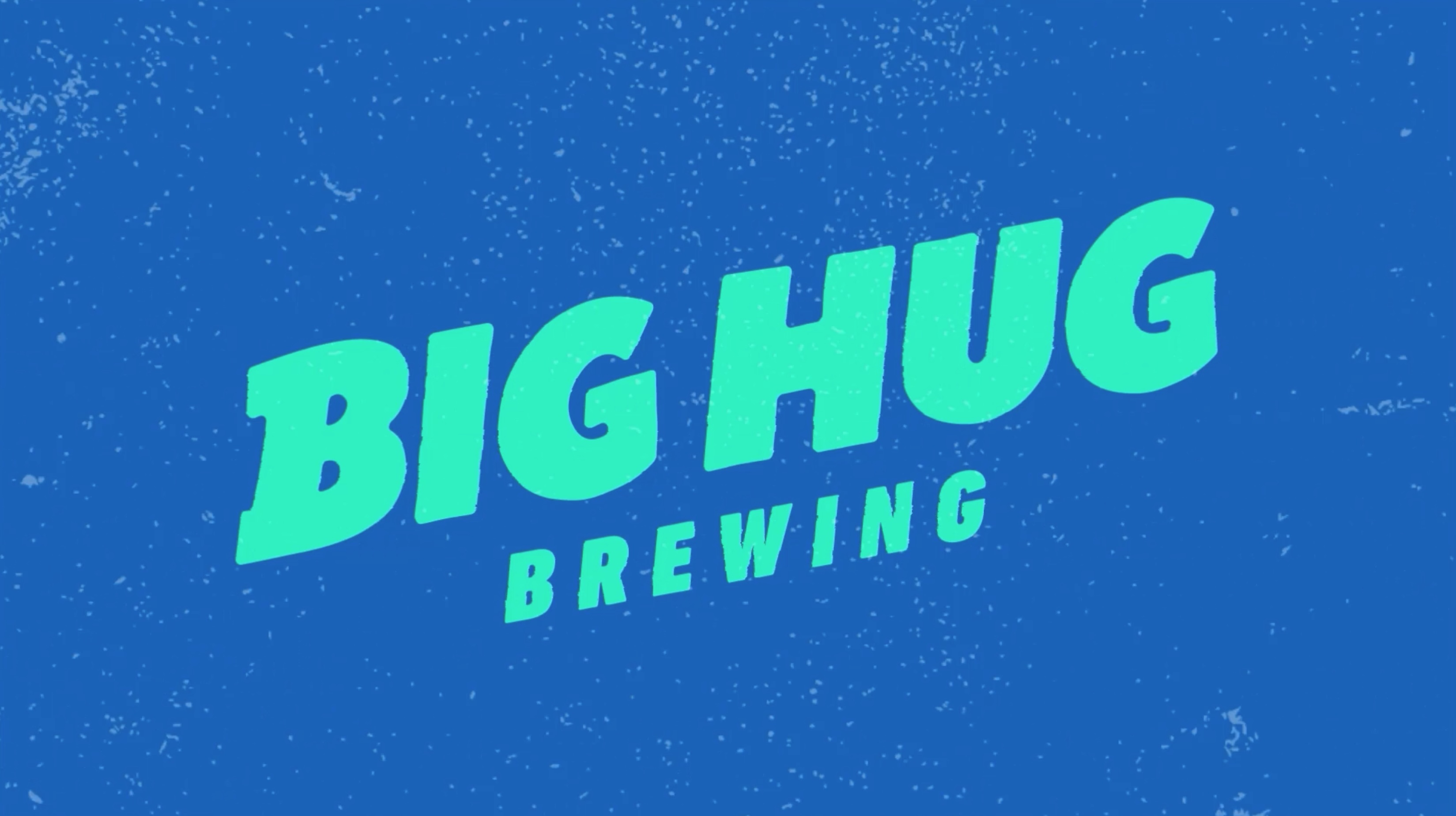
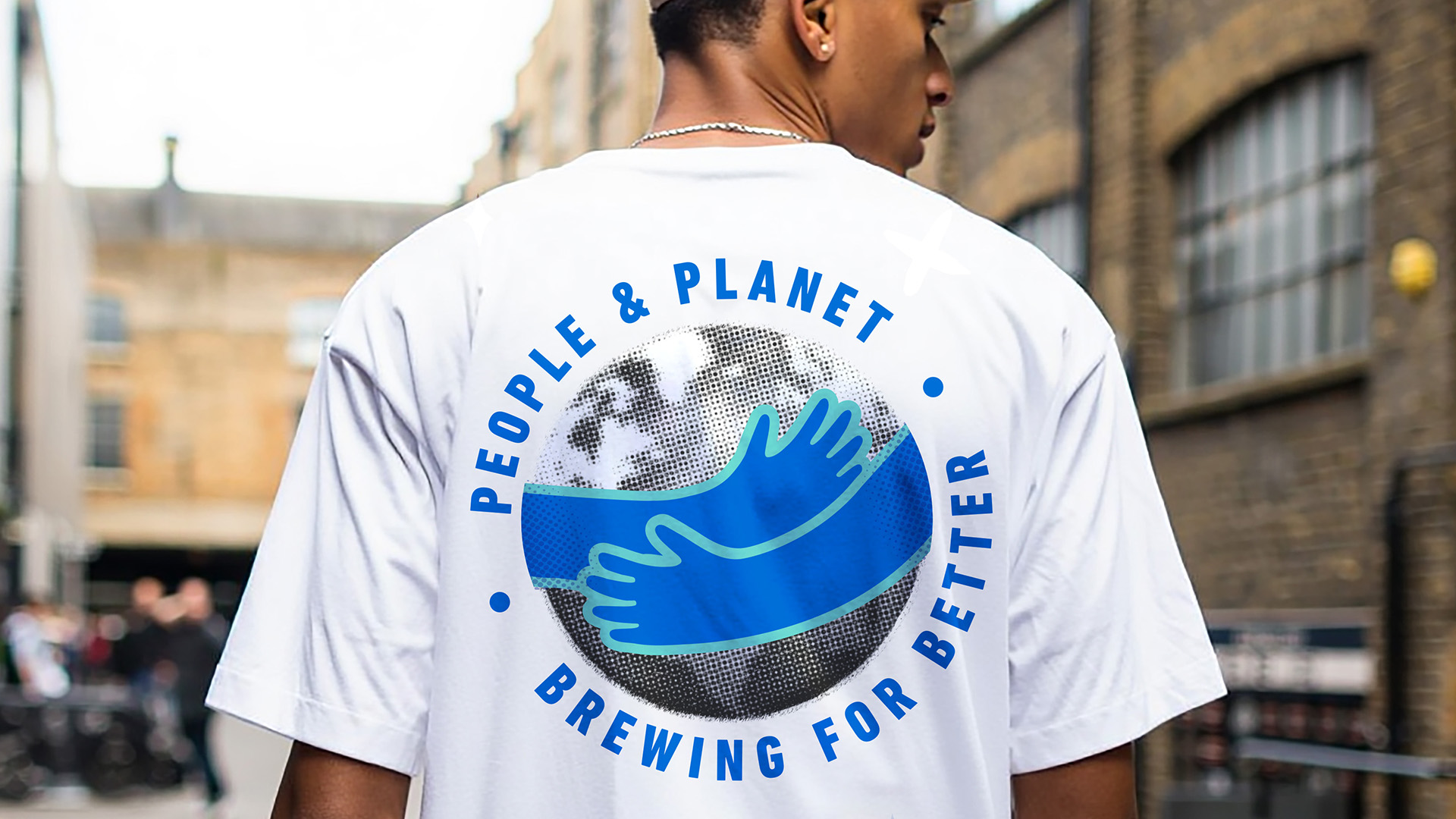
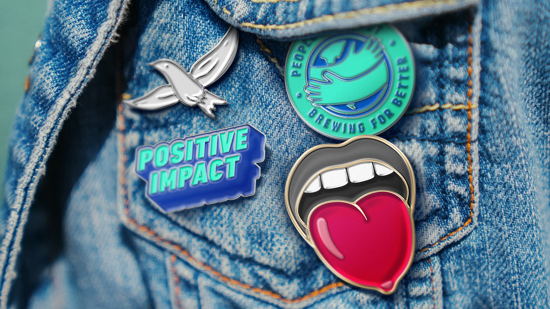
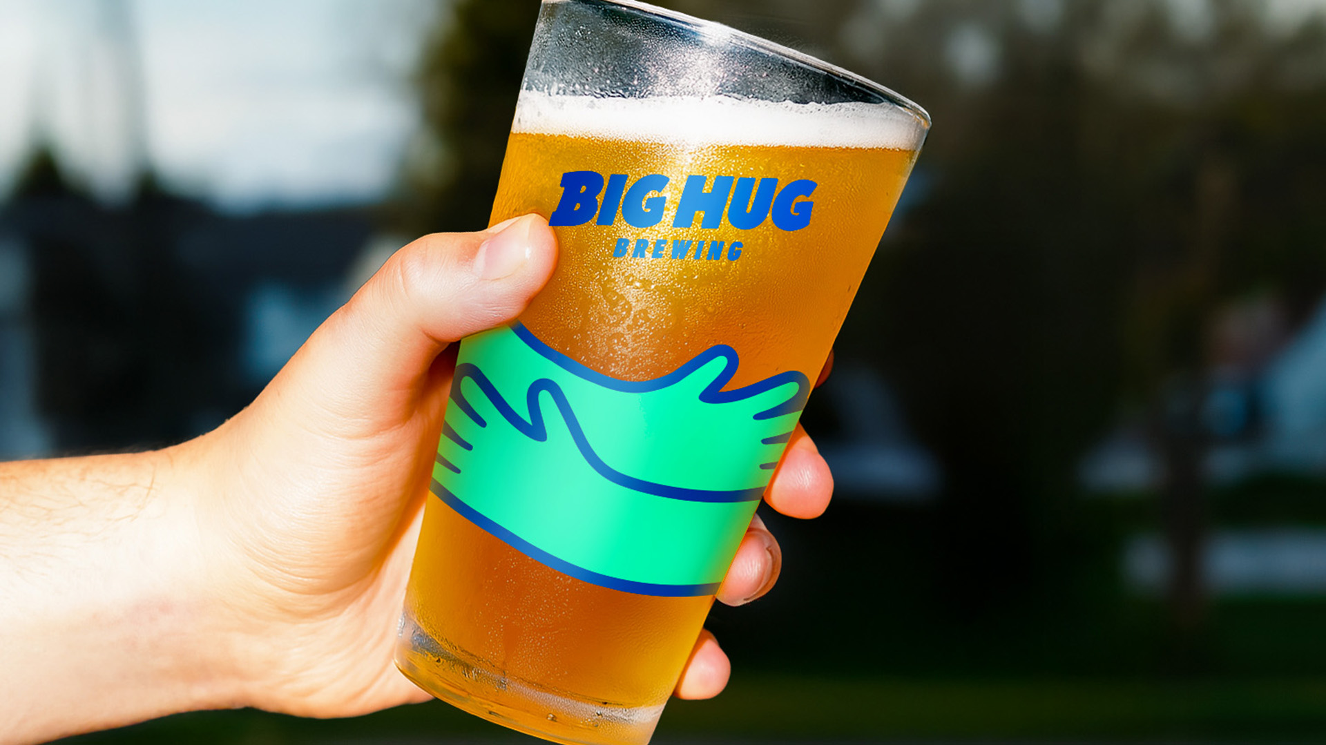
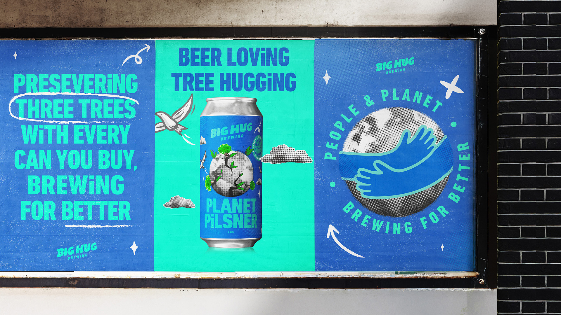
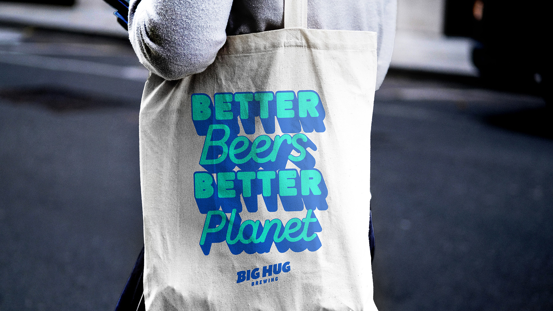
At the heart of the rebrand is a bold new brandmark and the new ‘World Hug’ logo – a meaningful symbol of Big Hug’s mission to inspire positive change, and a powerful stamp of social good. Surrounding this is a brand world bursting with riotous colour and character, designed to stand out across every touchpoint.
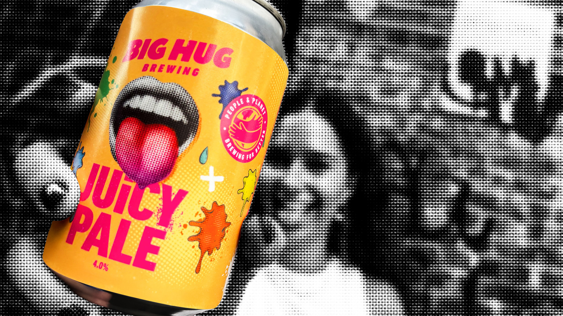
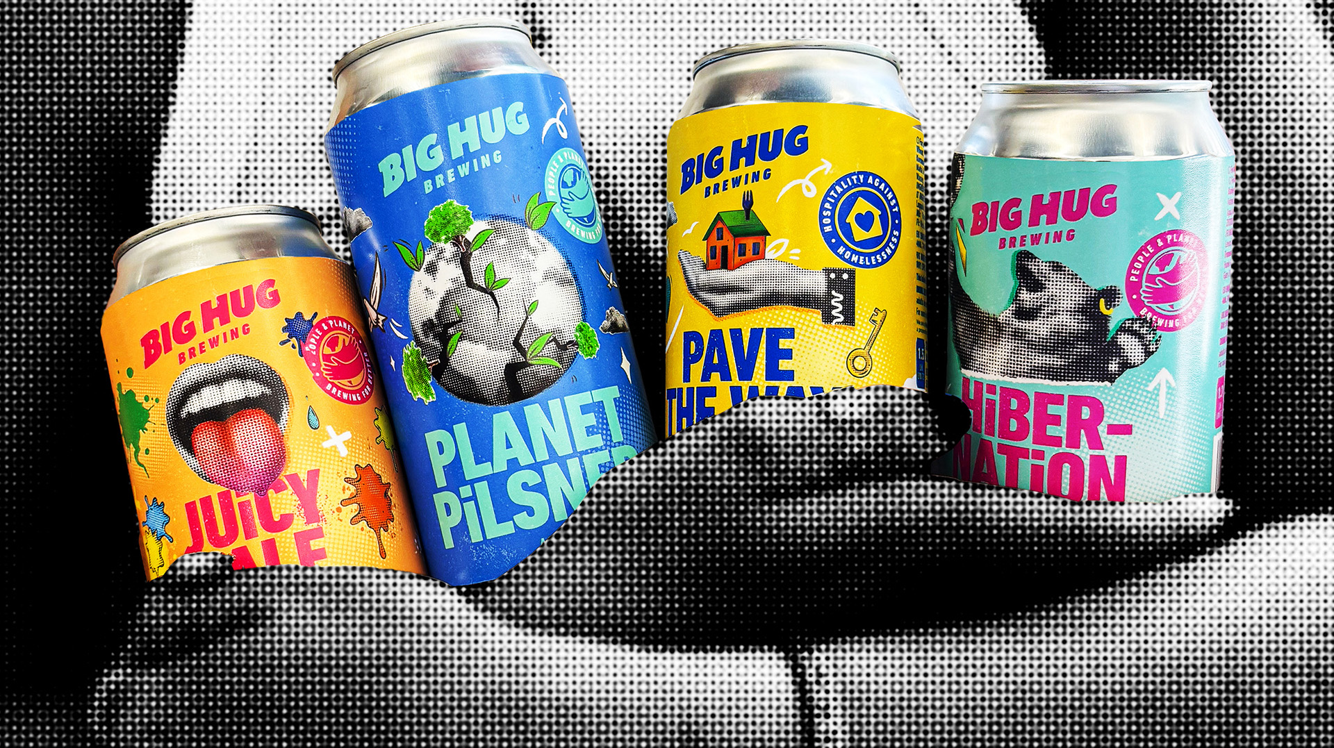
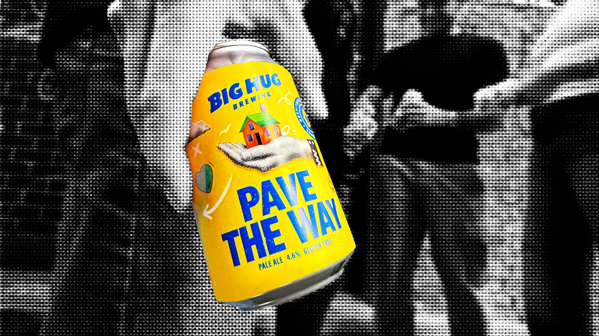
Packaging has been unified through a well-defined brand architecture. Vibrant collage elements and a distinctive halftone illustration style burst across the range, delivering a look that is fun, inviting, and instantly recognisable. Each pack now tells the story behind the beer and the cause it supports, making Big Hug’s commitment both visible and emotionally resonant.
Williams comments,
“One of the things JDO told me early on is that they help brands deliver on their promises, bringing ideas to life through powerful, effective experiences that people can see, feel, and believe. For me, that’s exactly what they’ve done. I’m genuinely excited for what the future holds. Whether it’s on-trade, off-trade, online or in the real world, Big Hug now reflects our mission with endless optimism and a powerful punch. Brewing For Better is our tagline, and the difference JDO’s work can help us make for both people and planet will hopefully be massive.”
The new identity debuted at London Craft Beer Festival and is set to roll out across on-trade and off-trade channels this month.
CREDIT
- Agency/Creative: JDO Global
- Article Title: JDO Gives Big Hug a Rebrand that’s Good All Around
- Organisation/Entity: Agency
- Project Type: Identity
- Project Status: Published
- Agency/Creative Country: United Kingdom
- Agency/Creative City: Royal Tunbridge Wells
- Market Region: Europe
- Project Deliverables: Advertising Photography, Art Direction, Brand Design, Brand Identity, Brand Mark, Brand Redesign, Brand World, Branding, Creative Direction, Identity System, Packaging Design
- Industry: Food/Beverage
- Keywords: Redesign, brand redesign, brand world, packaging design, brand mark, brand identity, creative direction, craft beer, photography
-
Credits:
Design Director: Dan Bowstead


