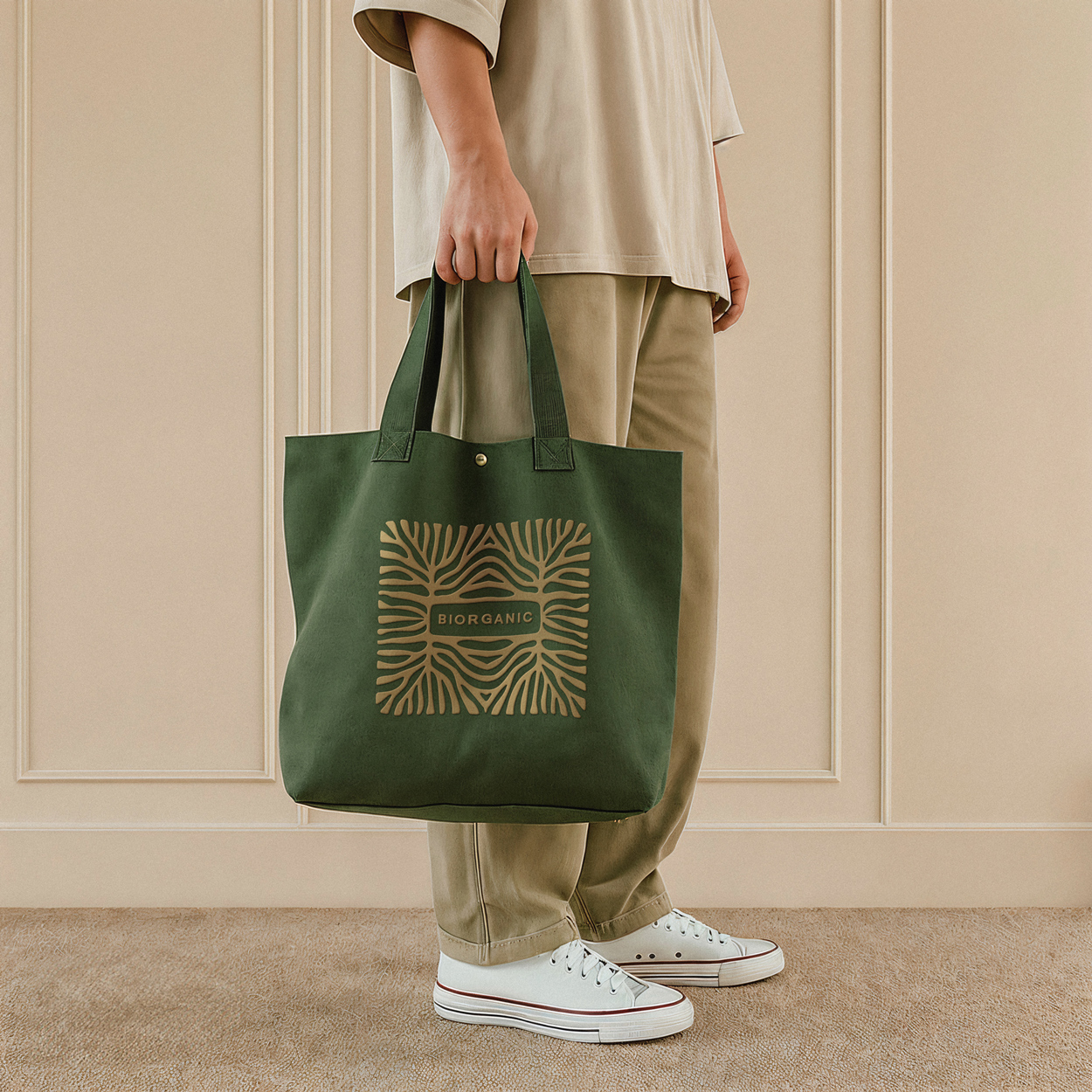
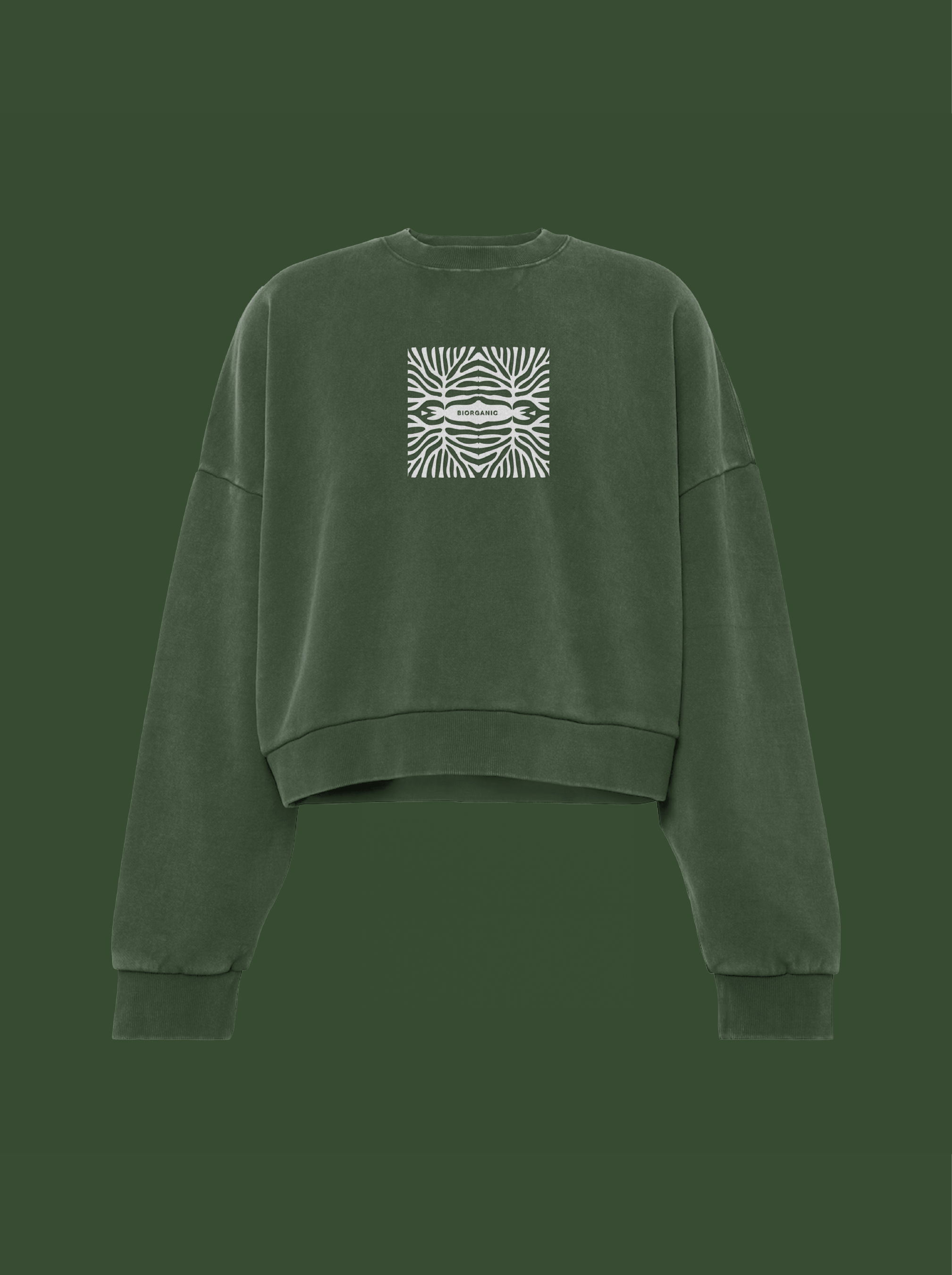
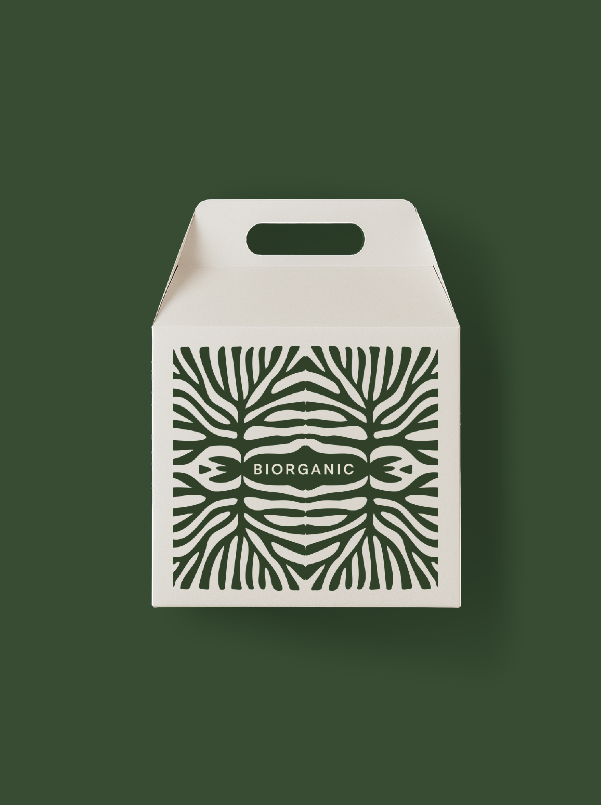
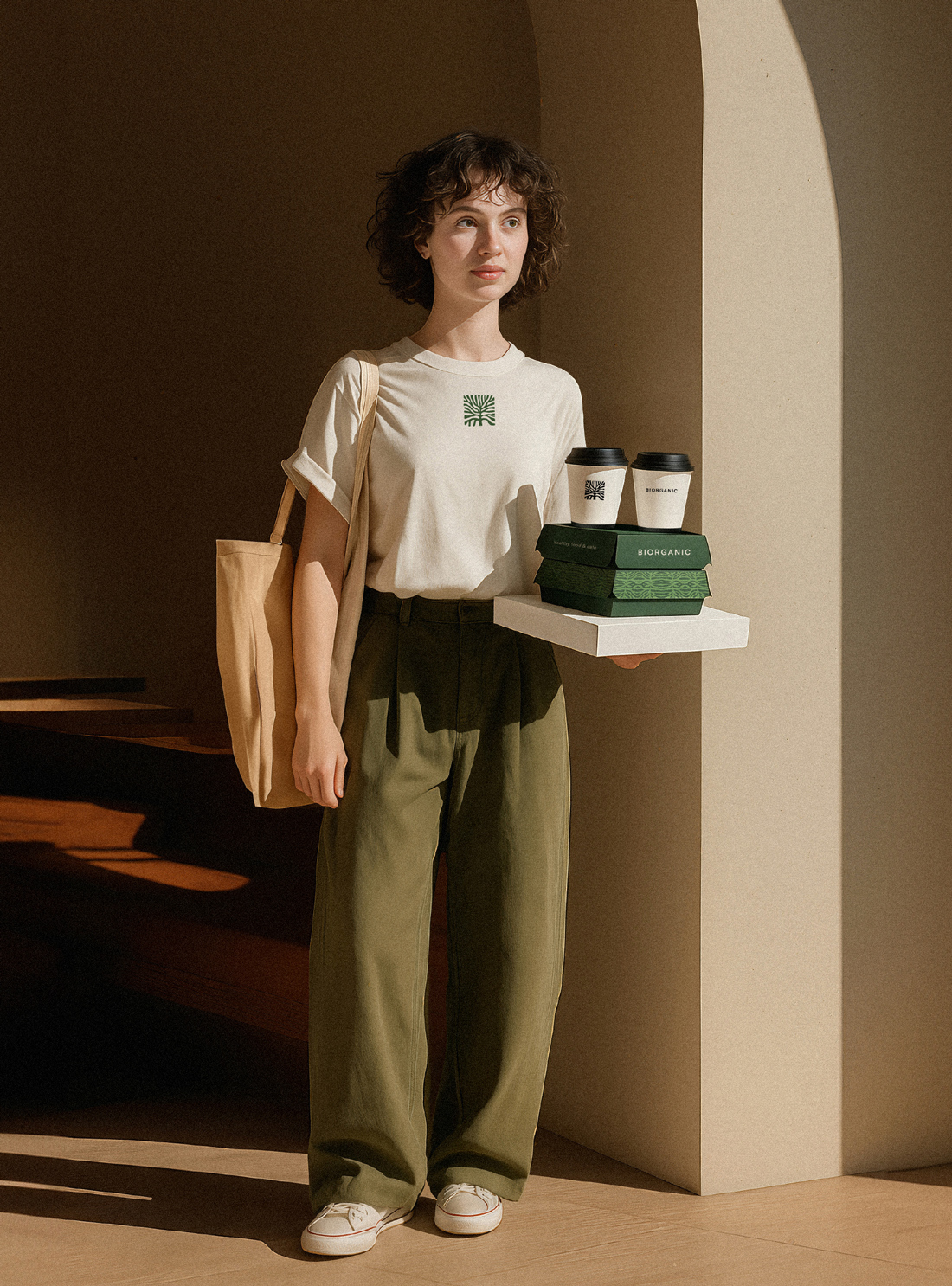
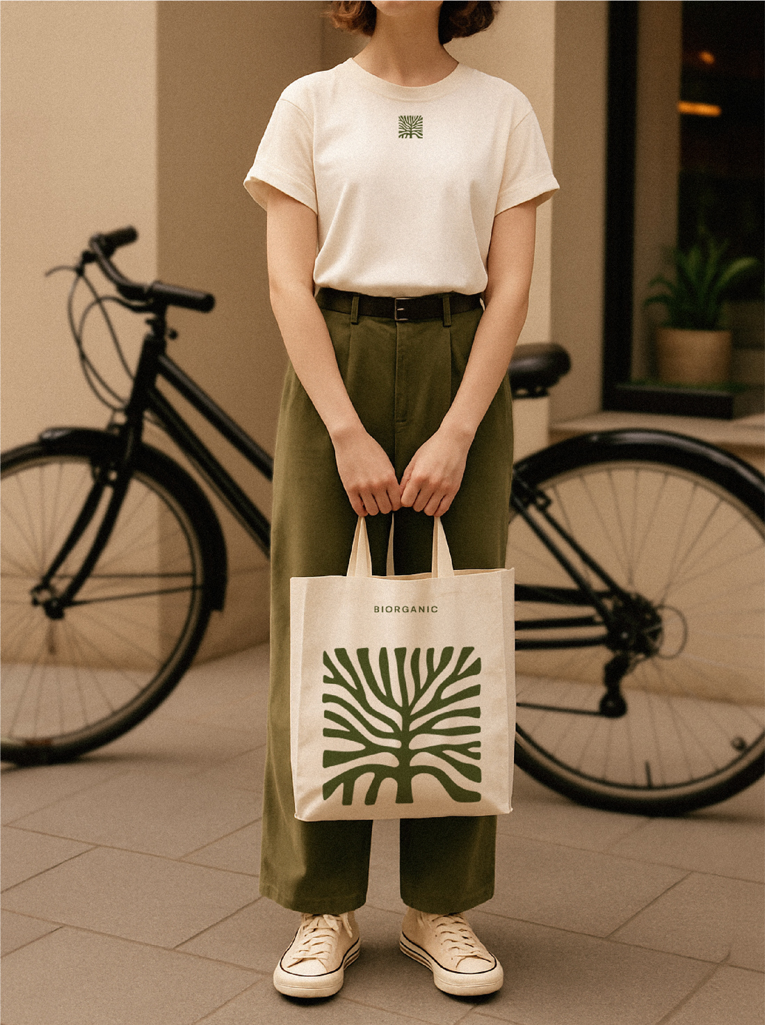
The visual identity for Biorganic evokes a sense of calm precision — a carefully crafted balance between structure and softness, where geometric clarity meets organic warmth. Rooted in the visual language of natural growth, repetition, and botanical symmetry, the design reflects a thoughtful, slow-living aesthetic. A stylized graphic motif, inspired by the geometry of plants and cut produce, becomes the central visual thread, applied consistently across packaging, textiles, signage, and spatial branding.
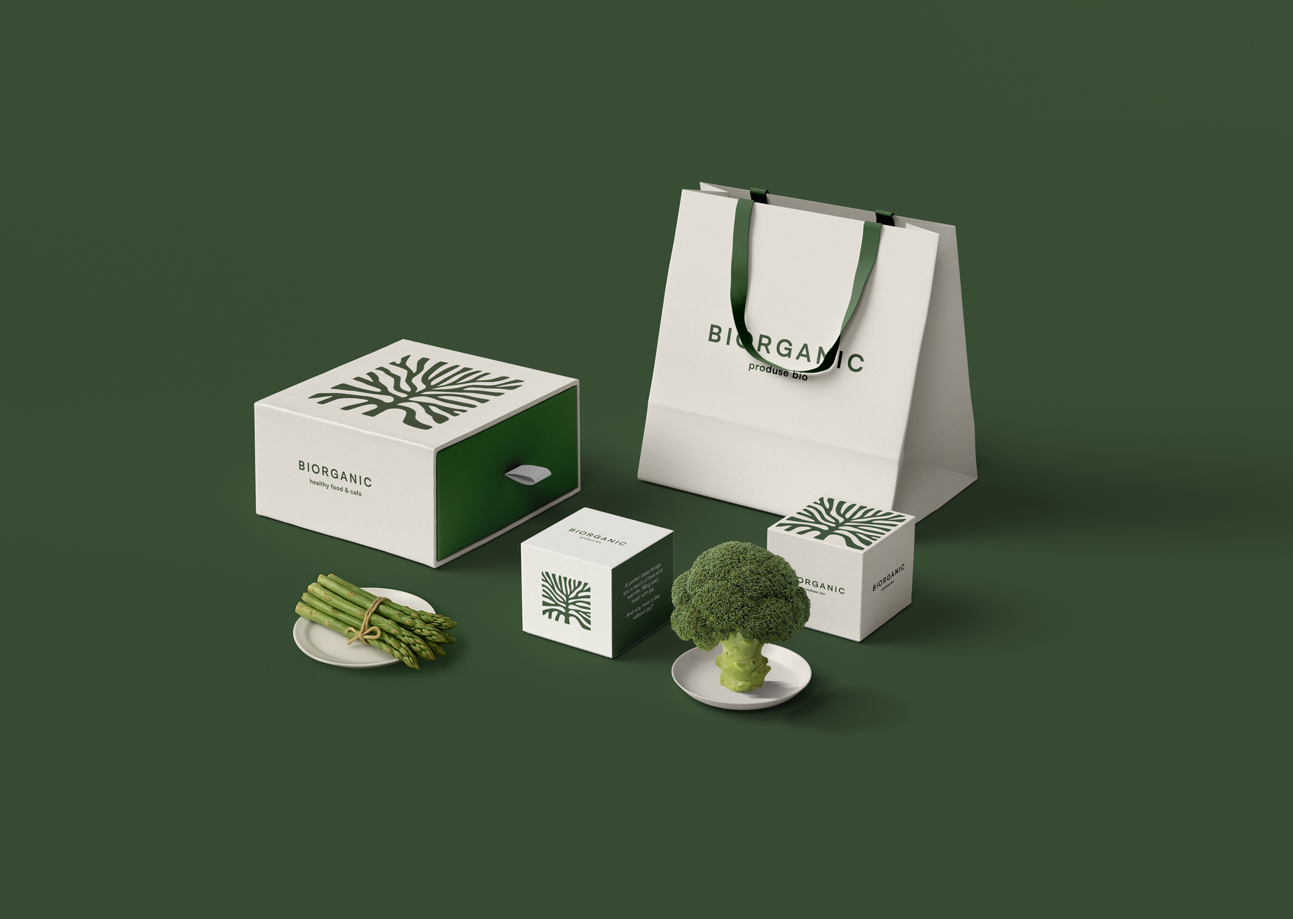
Rather than relying on loud or aggressive branding, the system builds recognition through visual rhythm, nuance, and repetition. The color palette centers around a deep, vegetal green paired with soft, earthy neutrals — evoking freshness, balance, and a grounded sense of purity. Typography is minimal but confident: a geometric sans-serif used with restraint, allowing materials, colors, and negative space to speak first.
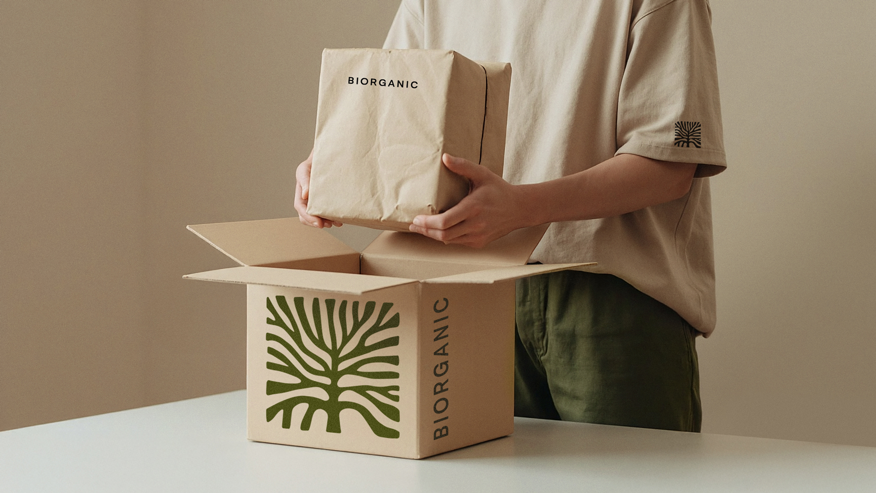
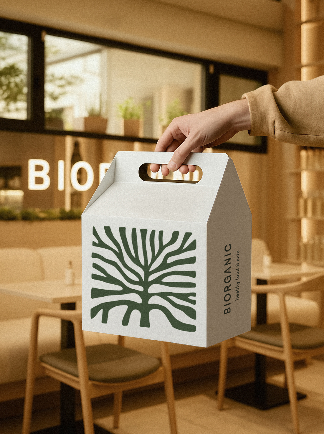
Packaging structures are soft-edged, tactile, and intuitive — incorporating monochrome prints, paper handles, and thoughtful folds that enhance the experience of interaction. Every element is designed to feel warm in the hand and calm to the eye, encouraging reuse and making the packaging feel like part of a daily ritual. The identity scales effortlessly across applications while remaining cohesive, composed, and quietly iconic — unmistakably and unapologetically Biorganic.
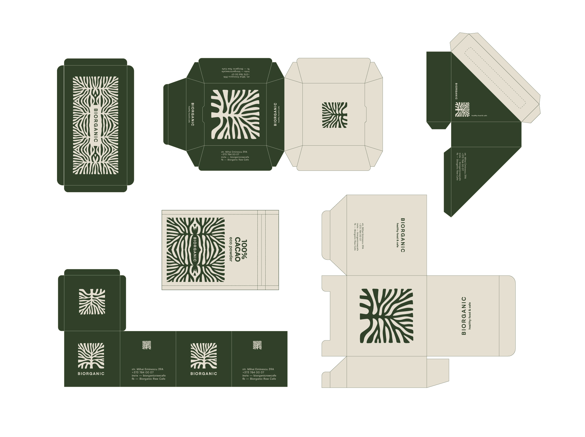
The packaging design is modular and adaptable, covering a range of needs from takeaway containers and coffee cups to apparel tags and grocery boxes. Special attention was given to the unboxing experience, with intuitive structures and minimal adhesive use, making each piece fully recyclable or compostable.
Typography is kept understated yet clear, using a geometric sans-serif typeface that supports both product information and brand messaging in a subtle, confident tone.
CREDIT
- Agency/Creative: true agency
- Article Title: Biorganic Packaging and Visual Identity by True Agency
- Organisation/Entity: Agency
- Project Type: Packaging
- Project Status: Published
- Agency/Creative Country: Moldova
- Agency/Creative City: Chisinau
- Market Region: Europe
- Project Deliverables: Brand Identity, Logo Design, Packaging Design, Packaging Guidelines
- Format: Bag, Box, Cup, Pouch
- Industry: Food/Beverage
- Keywords: Food, Packaging, organic, Sustainability, identity, branding, Logo Design
-
Credits:
creative director: Anta Petrenco


