


Challenge:
Prima Foods approached Minim Design with an innovative product—rice and corn chips made from whole grains, air-popped without frying or excess fat. Although they had a compelling brand name, TADA! (Japanese for “just” or “only”), there was no established visual identity. Our task was clear: craft an impactful logo and attractive packaging design that clearly communicated the brand’s health-focused philosophy and stood out on crowded snack shelves.
Research & Insights:
Our market analysis highlighted critical trends:
Over 65% of consumers aged 18–45 actively seek snacks labeled as natural, whole grain, or low-fat.
80% of snack purchasing decisions occur directly at the retail shelf, emphasizing the importance of immediate visual appeal and clear product communication.
Consumers demand packaging that is health-conscious but avoids appearing bland or uninspiring.
In Uzbekistan, a growing demographic—including young parents, office workers, and healthy lifestyle advocates—is increasingly searching for tasty yet health-conscious snacks.
Creative Solution:
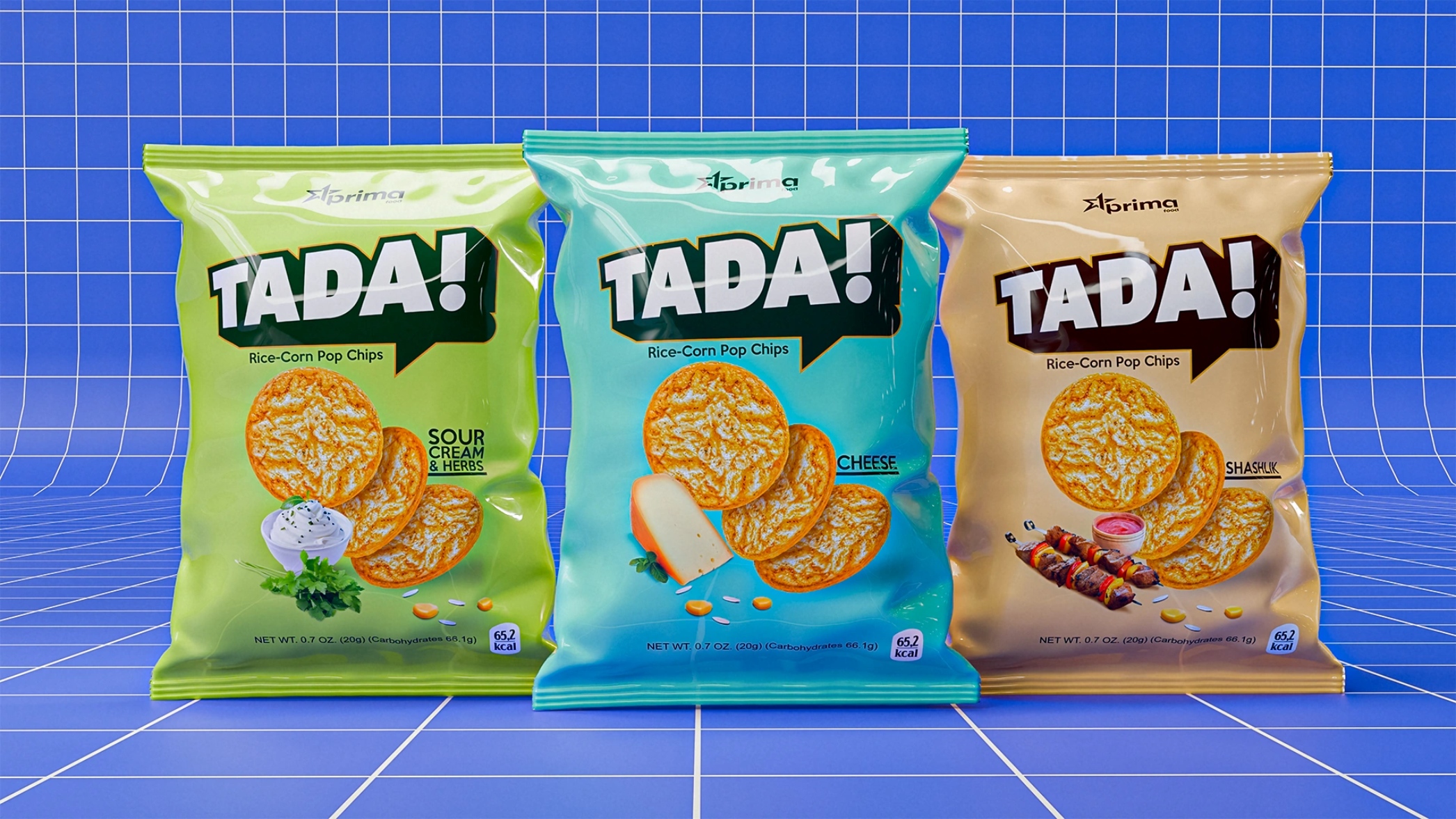
Logo Design:
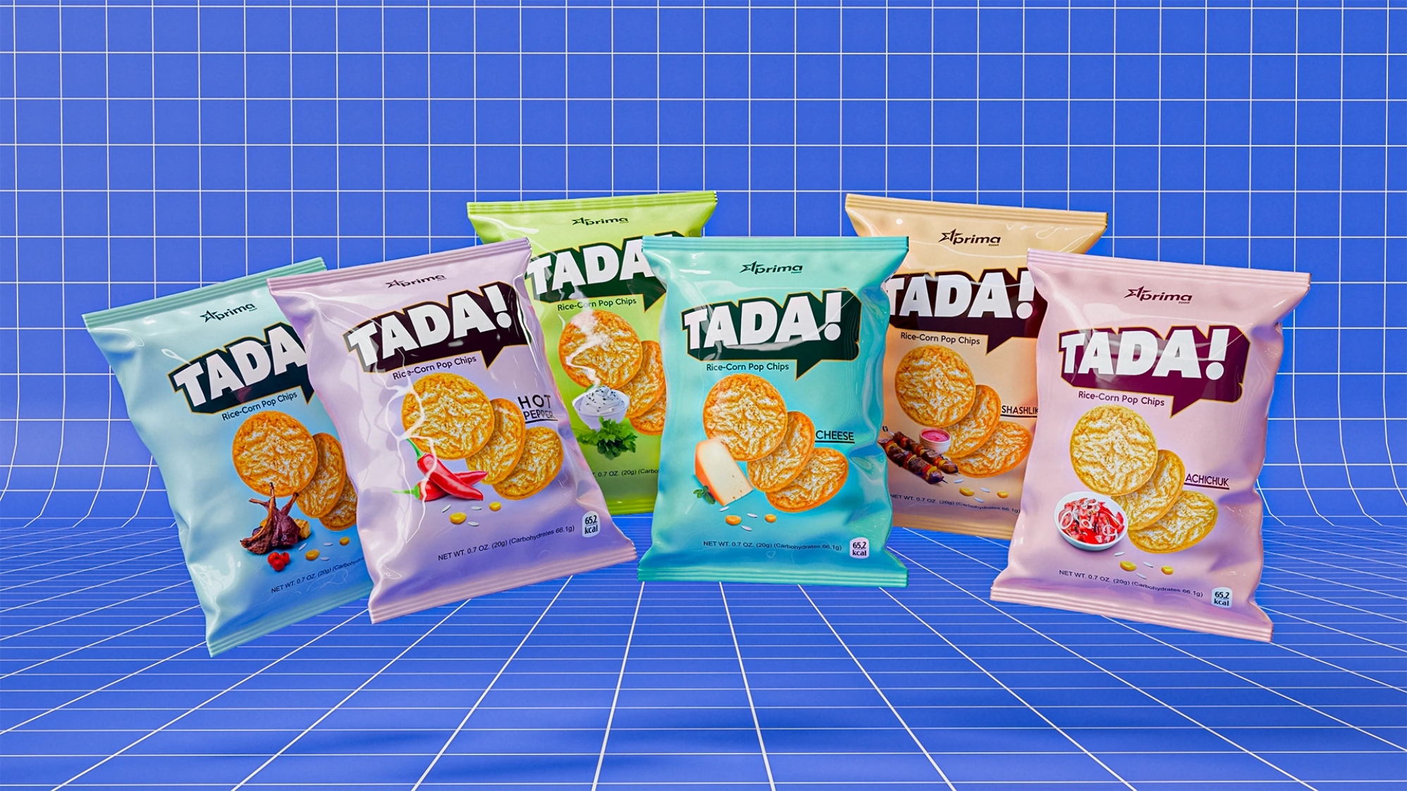
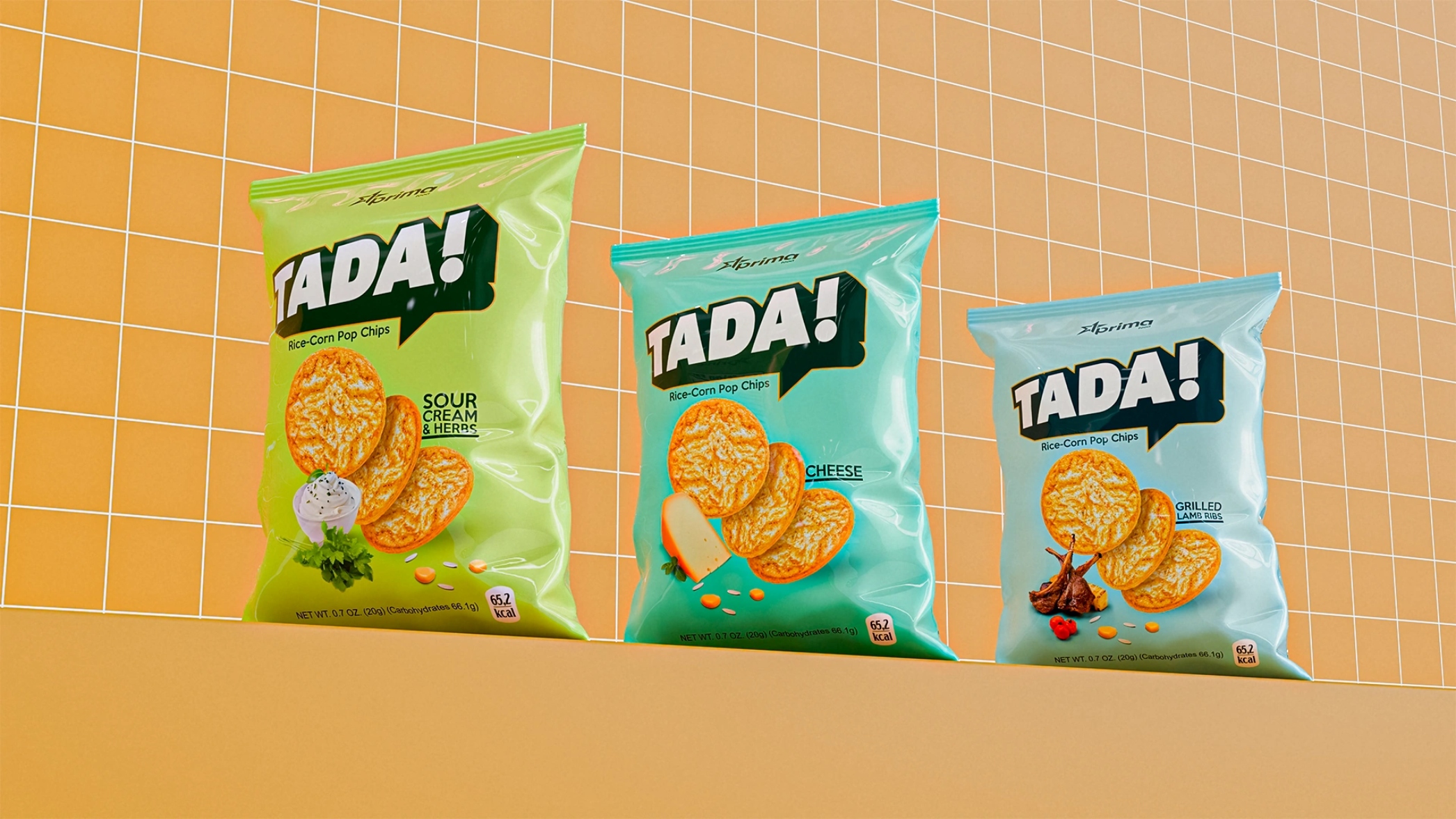
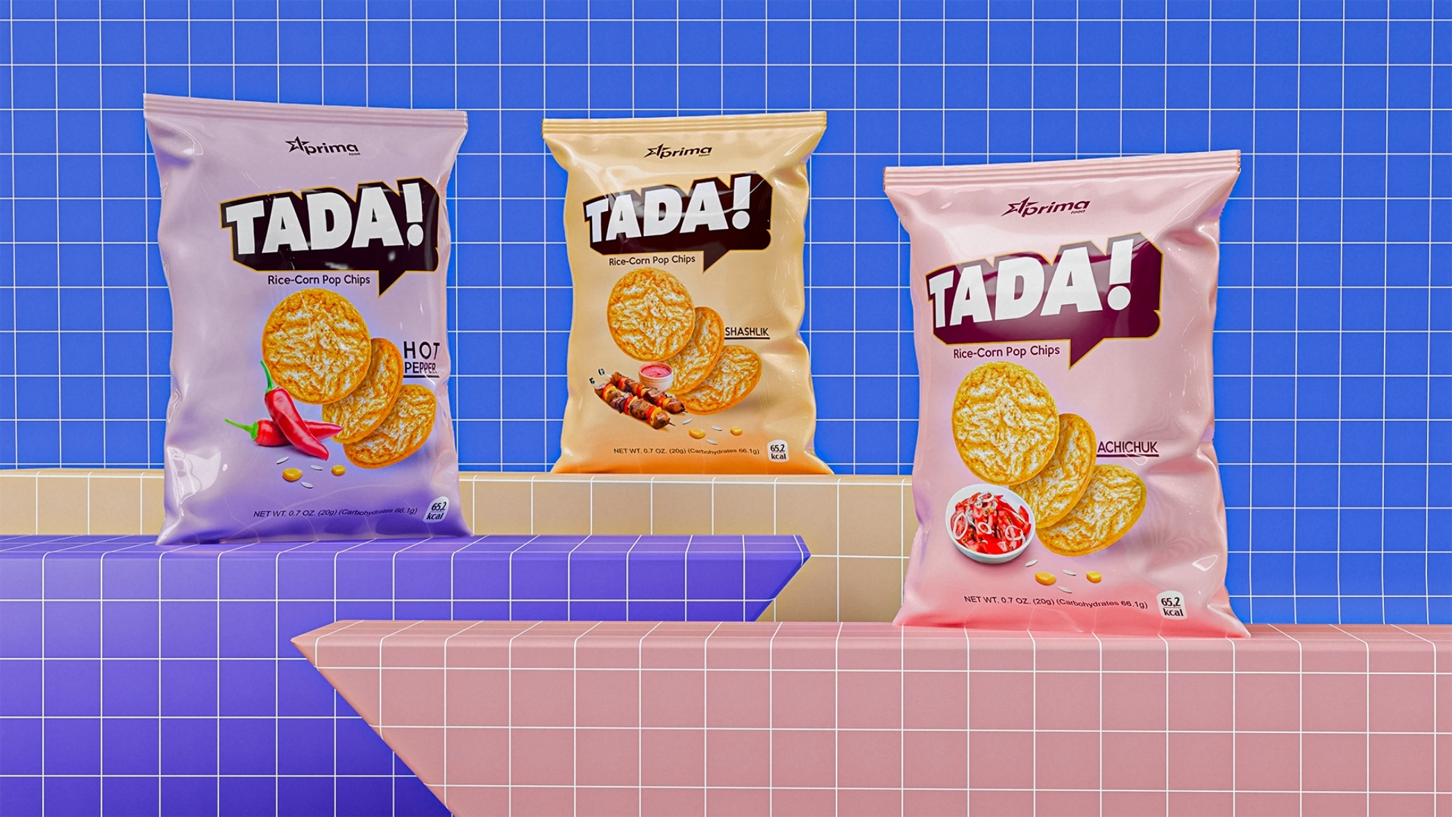
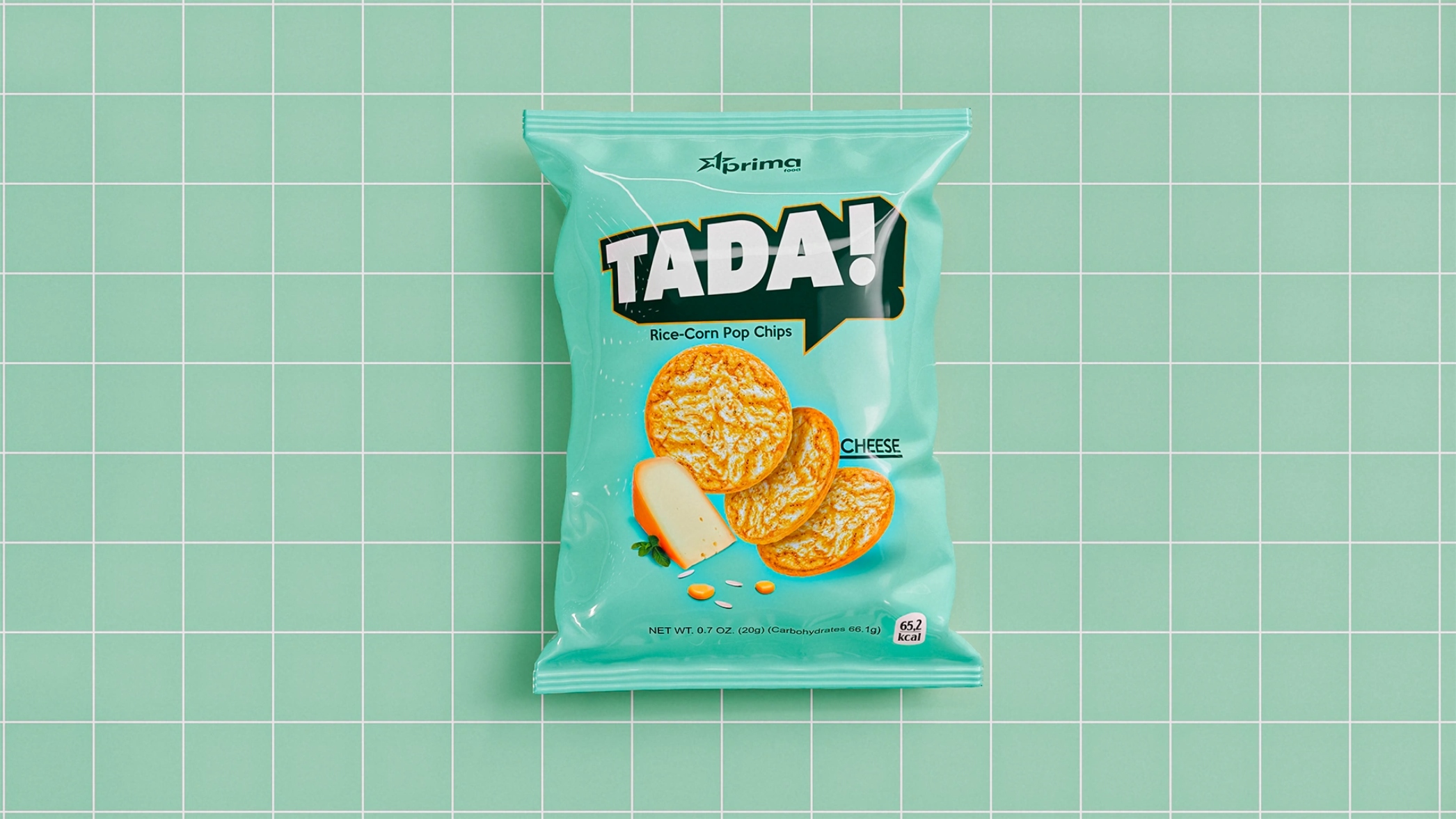
We created a dynamic logo featuring bold typography and a striking graphic “splash.” This playful yet structured design instantly captures consumer attention, emphasizing clarity, energy, and movement.
Packaging Design:
Key principles guided our packaging strategy:
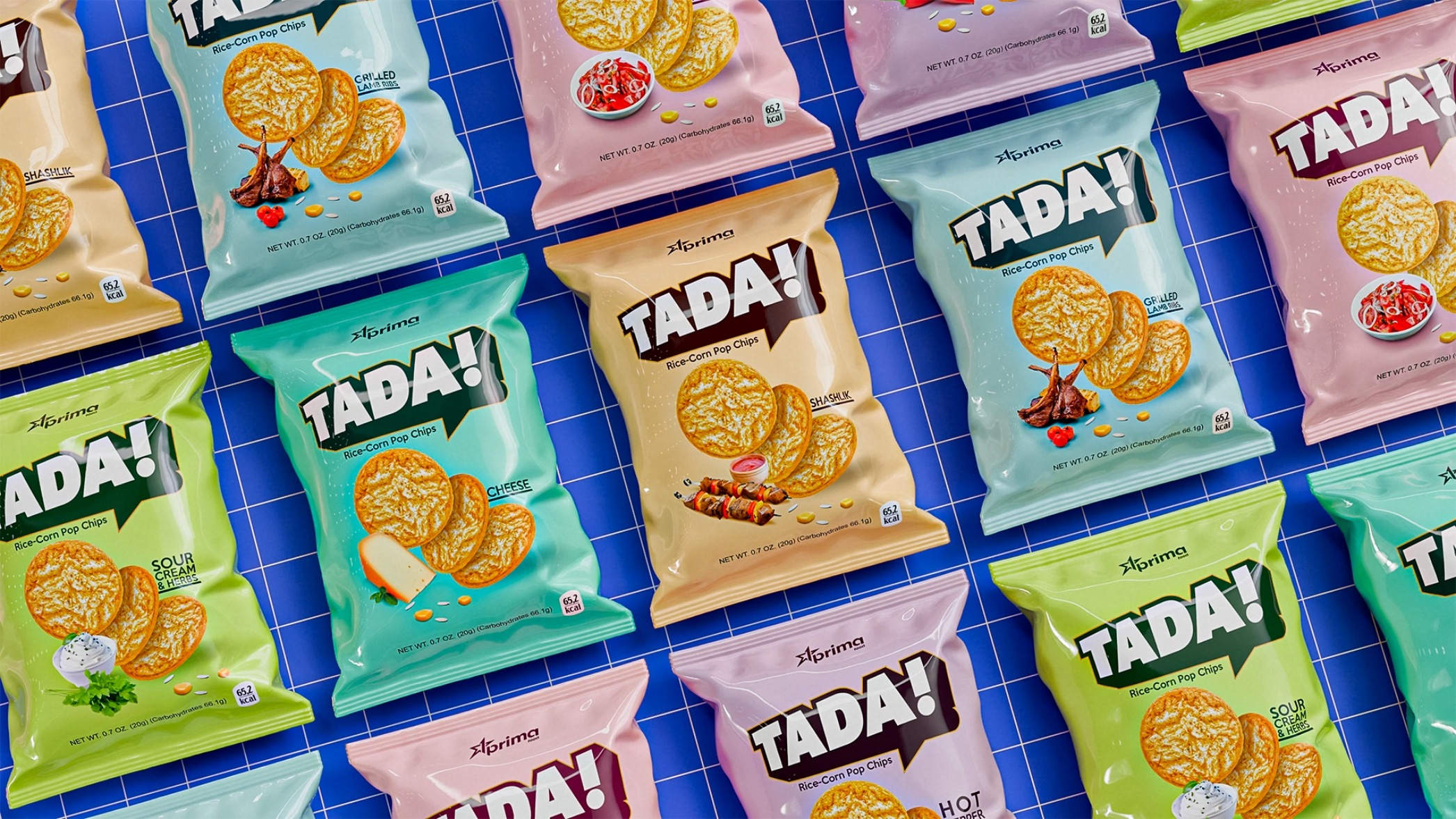
Pastel Color Palette: Soft, inviting colors evoke freshness and nutritional quality.
Clear Flavor Icons: Simple visual representations clearly communicate flavors (cheese, herbs, kebab, etc.) at a glance.
Product as Hero: Central placement of realistic chip images emphasizes product authenticity and quality.
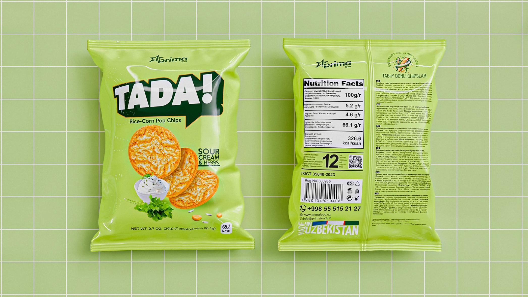
Enhanced Readability: Key textual information is legible from up to 2 meters, ensuring immediate understanding and trust.
Structured Information: Clear, organized backside modules detail nutritional values, ingredients, and company contacts following FMCG best practices.
Results:
The TADA! packaging design effectively positioned the brand as an appealing, trustworthy choice in the growing smart-snack category. The cohesive, visually unified system across the six-flavor product line instantly communicates quality, health benefits, and modern consumer appeal, successfully driving consumer interest and sales directly from the shelf.
Echoing Paul Rand’s ethos—“Design is not just what it looks like, but how it works”—this project demonstrates packaging design that effectively communicates, engages, and sells.
CREDIT
- Agency/Creative: Minim Design Agency
- Article Title: Tada! – Bold and Minimal Packaging for Smart Rice & Corn Chips by Minim Design
- Organisation/Entity: Agency
- Project Type: Packaging
- Project Status: Published
- Agency/Creative Country: Uzbekistan
- Agency/Creative City: Toshkent
- Market Region: Asia
- Project Deliverables: 3D Modelling, Brand Design, Logo Design, Packaging Design
- Format: Flow-Pack
- Industry: Food/Beverage
- Keywords: Smart Snacks, Rice Chips, Corn Chips, Packaging Design, Logo Design, Bold Typography, Healthy Snacking, Visual Identity, FMCG, Shelf Appeal, Consumer Goods, Pastel Colors, Flavor Communication, Brand Differentiation
-
Credits:
Agency: Minim Design


