


Project Genesis: Beyond Packaging — A Story Worth Sipping
Safinet El Sahraa was born not just as a tea brand, but as a vision to bridge cultures, landscapes, and legacies. The name, meaning “The Ship of the Desert,” is an intentional metaphor for the camel—a creature symbolic of resilience, trade, and continuity across generations and geographies. This project merges the spirit of the Algerian Sahara with the rich traditions of Chinese tea, presenting an experience that is not only visual but deeply narrative.
The conceptual foundation of this design project was to answer a powerful question:
“How do you design packaging that doesn’t just contain a product—but carries a cultural story?”
With this in mind, the packaging for Safinet El Sahraa was designed as a canvas of duality: the intersection of East and North Africa, modernism and tradition, luxury and minimalism.
Strategic Design Objectives
From the outset, the project set forth with four primary objectives:
Position the brand as a premium tea product suitable for export and high-end retail.
Convey cultural richness without falling into clichés or outdated orientalist motifs.
Design a functional system that distinguishes each tea variety clearly.
Ensure bilingual accessibility (Arabic and English) to reinforce regional identity while being globally understandable.
Each of these objectives was approached through deliberate design choices in form, color, typography, symbolism, and material.
Color & Flavor System: Designing for the Senses
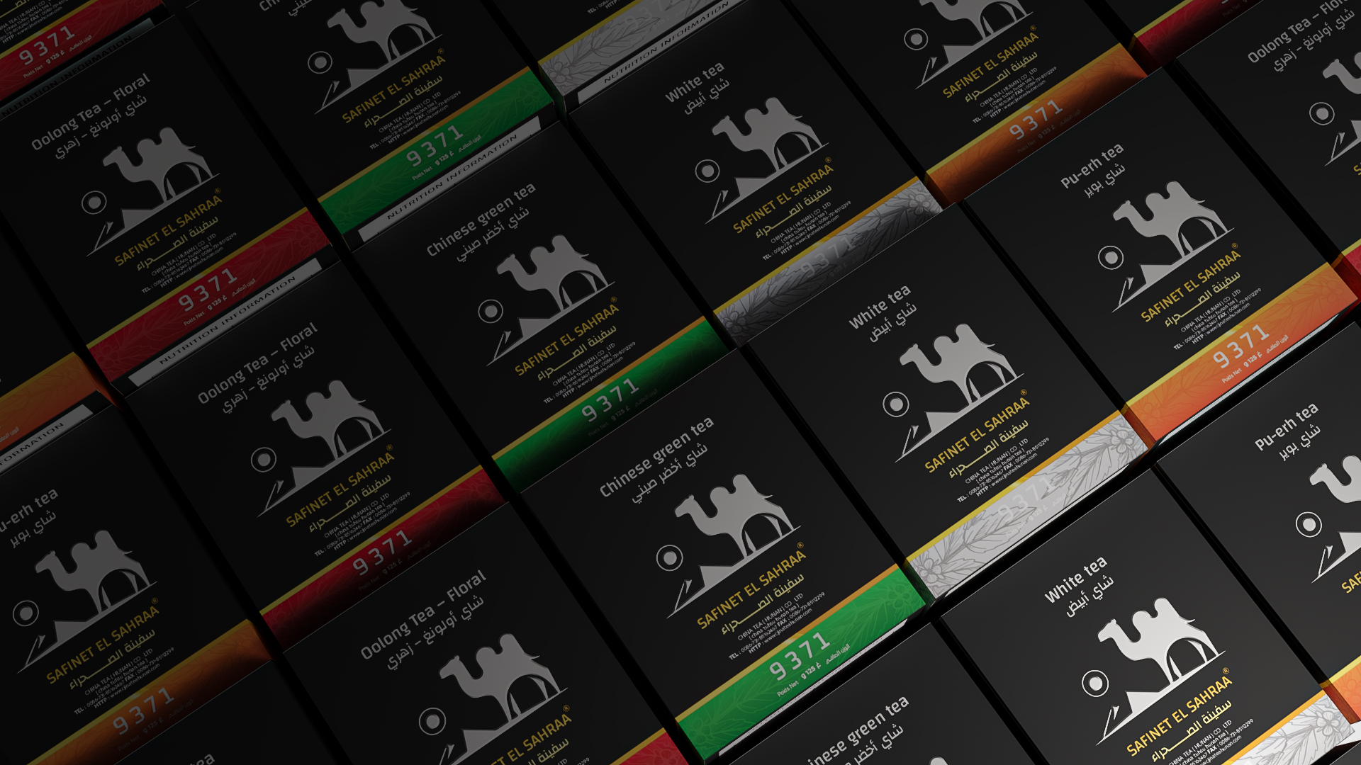
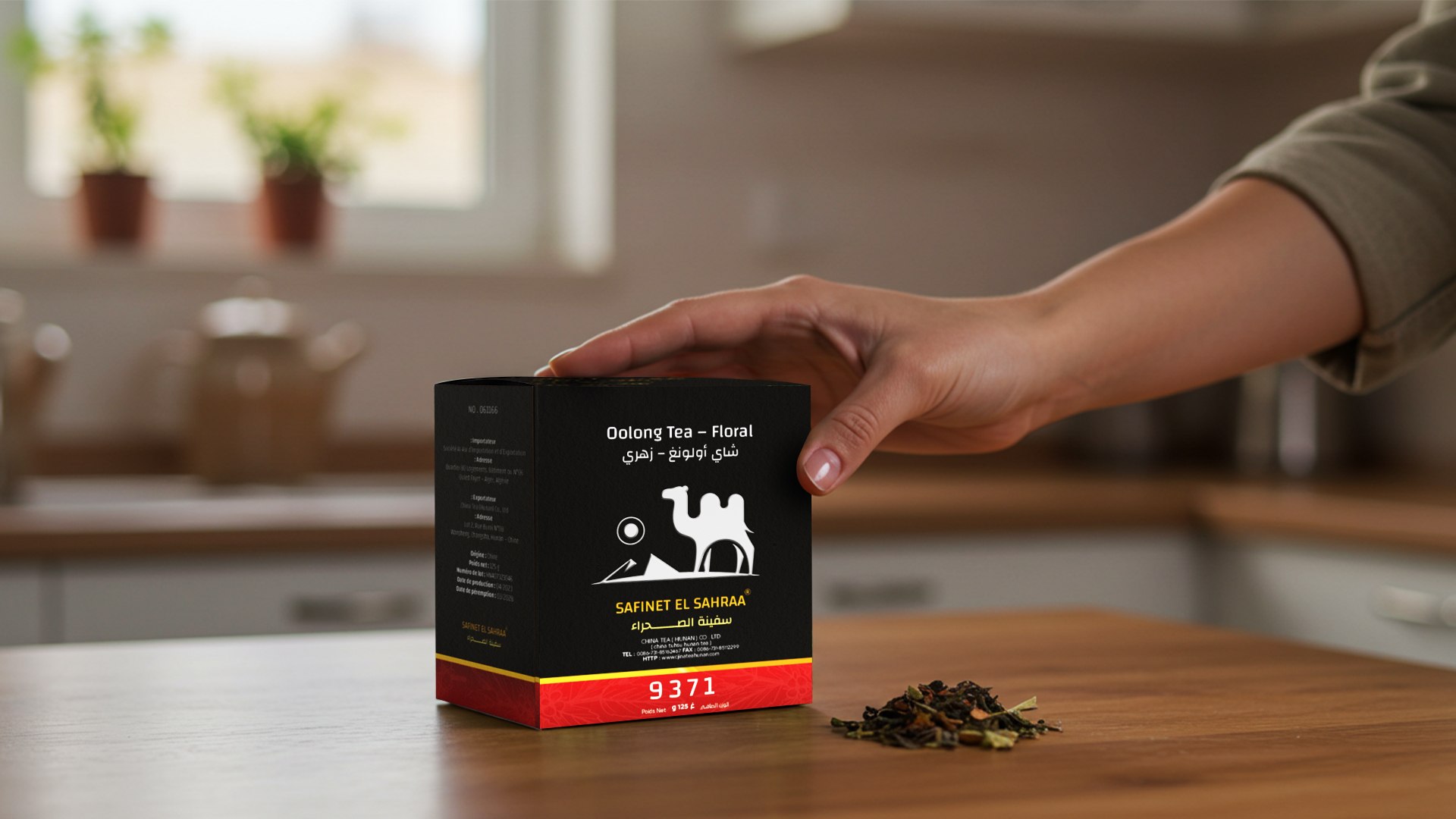
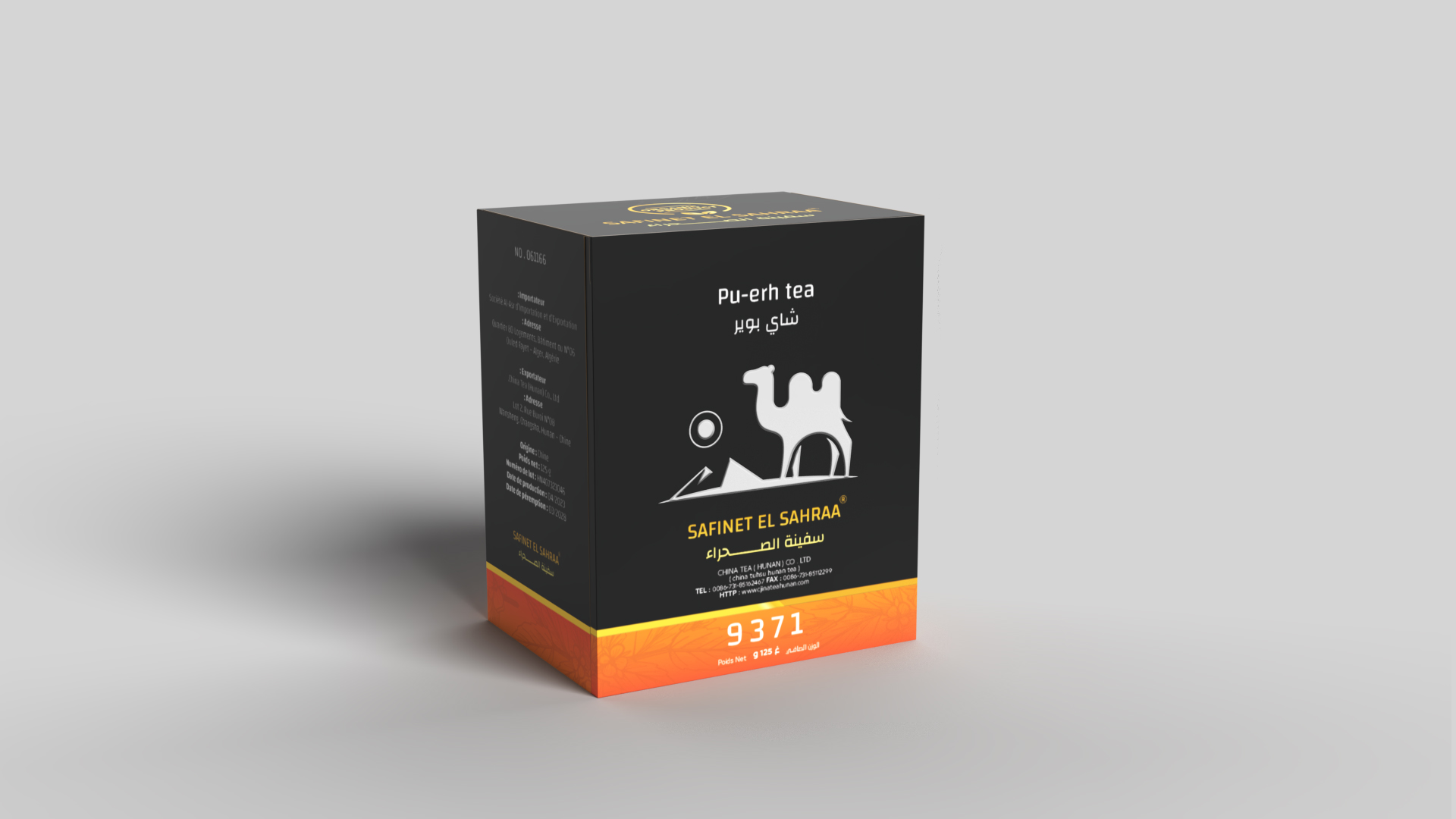
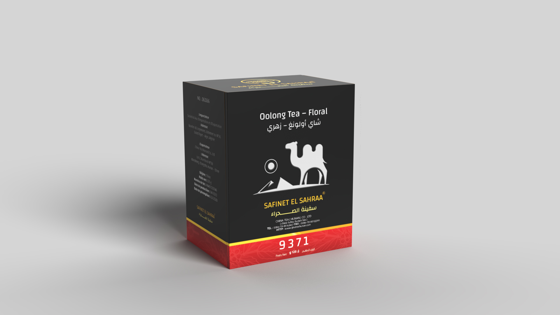
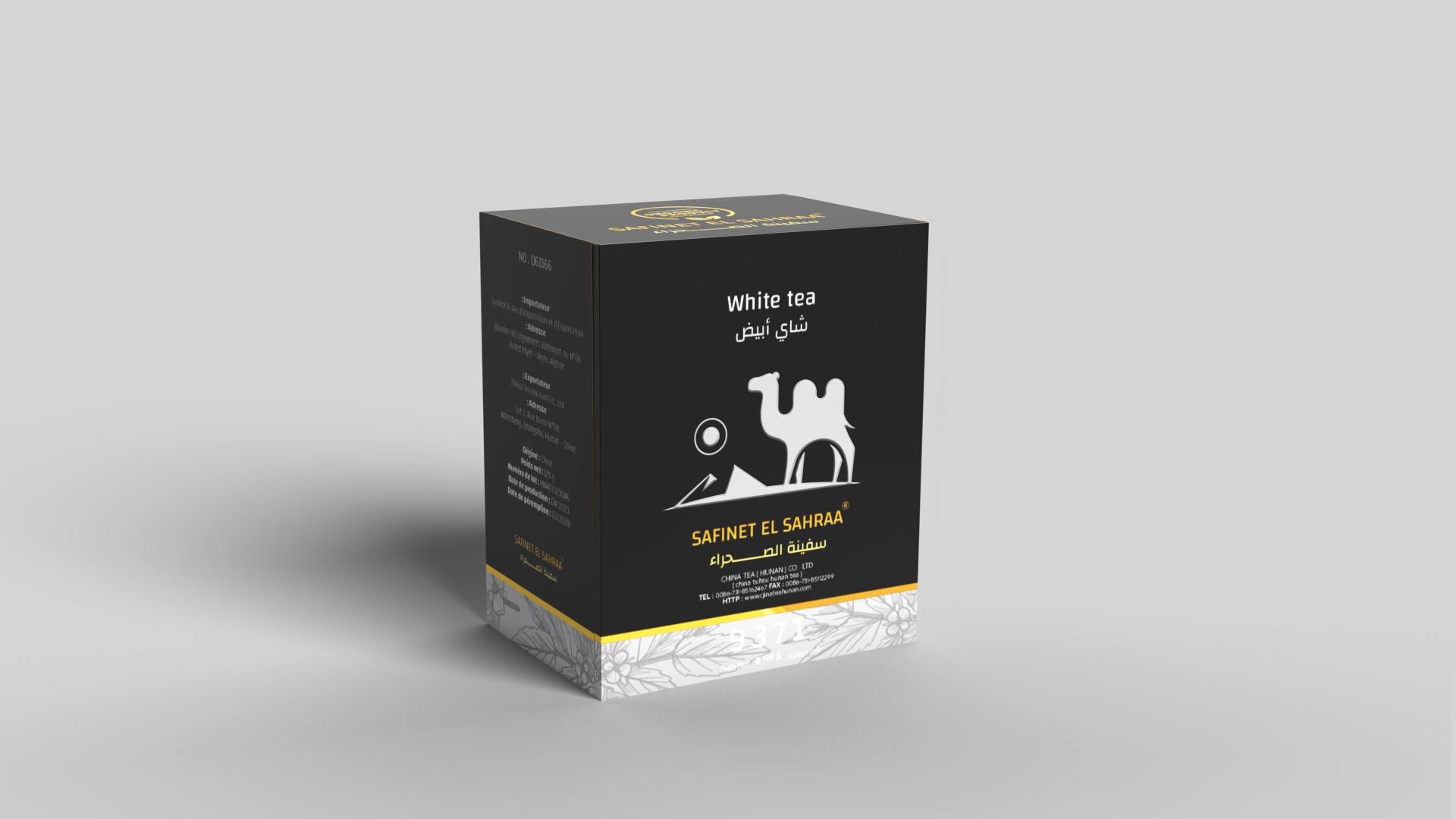
A major visual element in this packaging system is the color-coded flavor bar at the base of each box. Rather than relying on graphic illustrations of leaves or cups, the design uses color psychology to establish immediate associations:
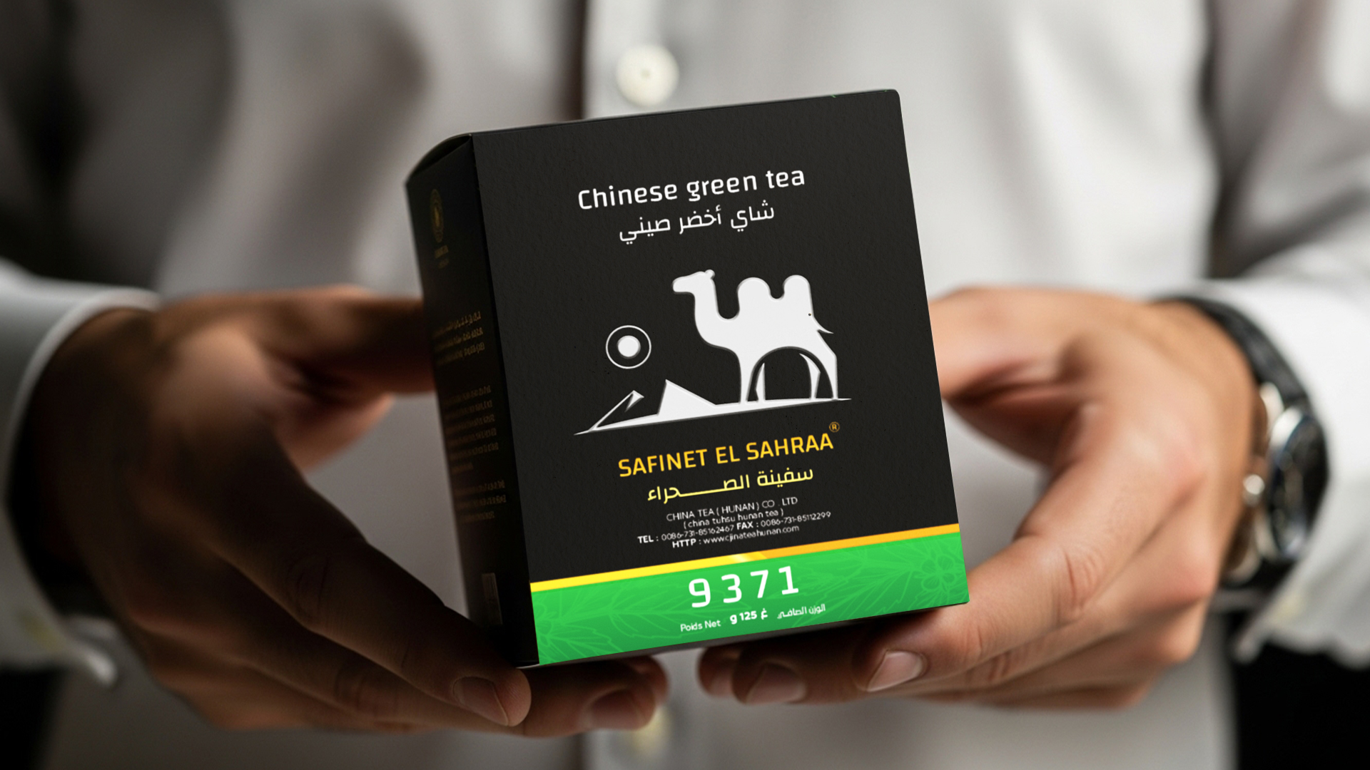
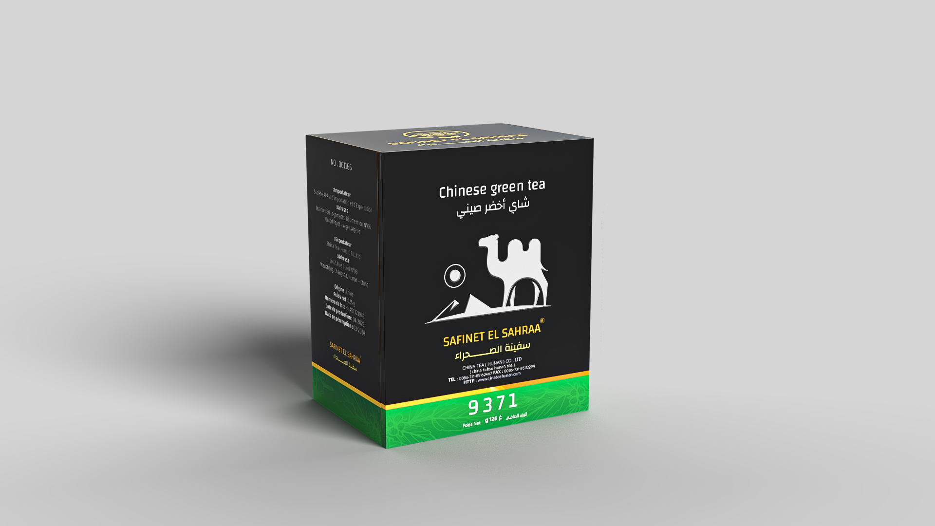
Green → Chinese Green Tea: freshness, energy, herbal balance.
Silver → White Tea: purity, sophistication, refinement.
Orange-Yellow → Pu-erh Tea: aged wisdom, warmth, depth.
Crimson Red → Oolong Tea – Floral: intensity, richness, aromatic notes.
These colors are subtle, with gradient inflections and delicate background patterns (botanical and floral) that hint at the tea type without disrupting the minimalist brand feel. The use of gradients and semi-abstract leaf patterns was inspired by Islamic geometric art and Asian ink textures, reinforcing cross-cultural visual storytelling.
Iconography: The Camel as a Brand Totem
At the center of the visual identity is the silver-foiled camel silhouette walking over dunes. This is not just an aesthetic icon but a deliberate totem of cultural meaning:
The camel evokes the name “Safinet El Sahraa” and signifies resilience, reliability, and rootedness.
The dunes symbolize the vast Algerian Sahara, where trade once flowed freely, connecting continents.
The silver foil material choice gives a tactile and reflective richness, meant to suggest value, nobility, and purity—core values the brand wants to associate with its tea.
Together, this icon tells a story of journey, endurance, and sophistication, without needing a single word.
Typography: Dual-Language Harmony
Typography plays a key role in cultural inclusivity. The challenge was to balance two entirely different scripts—Arabic and Latin—without compromising elegance or visual rhythm.
Arabic: A clean, modern Naskh-inspired typeface was used for product names and flavor descriptions. Care was taken to avoid overly decorative styles, choosing instead a more legible and professional tone.
English: A geometric sans-serif typeface complements the Arabic, chosen for its clarity and minimal contrast.
All type is carefully aligned, using typographic grid systems that ensure balance even in complex layouts. The product name, brand name, flavor, and unit weight are all hierarchically presented to aid rapid recognition in competitive retail environments.
Materials & Finishing: Packaging as Tactile Experience
Each tea box is constructed using high-density paperboard with:
Matte black lamination: for a soft, non-reflective luxury feel.
Selective foil stamping (silver): on the camel and brand name.
Color foil strips: for flavor identification and brand consistency.
The tactile contrast between matte black and metallic foil gives the user a sense of holding something valuable, thus enhancing perceived product quality. The rigidity of the material ensures protection during transport while conveying durability and premium value.
Brand Architecture: A Unified but Flexible System
One of the most difficult parts of tea branding is maintaining coherence across many SKUs. The Safinet El Sahraa system was designed as a modular packaging architecture, where:
The top 70% of the box remains uniform (brand icon, background, foil).
The bottom 30% changes depending on the tea variety (color + flavor text).
This creates a balance between brand consistency and SKU differentiation—ideal for shelf recognition and international expansion.
Market & Cultural Positioning
Local Market: Algeria & MENA Region
In Algeria and across the Maghreb, tea is not just a drink—it is a ritual, a hospitality symbol, and a daily companion. However, much of the local packaging remains either over-decorated or outdated in visual style. This project seeks to disrupt that pattern by offering something modern and export-ready, while still using Arabic language and local symbols.
International Market: China, Europe, Gulf
The clean, minimal aesthetic with strong storytelling positions Safinet El Sahraa as a luxury gifting item in foreign markets, especially among customers seeking authentic origin products with a curated, cultural edge. The use of English ensures international legibility, while the design stands out from traditional Asian-style tea boxes.
Visual Culture & Brand Narrative
In a world of over-illustrated, over-saturated FMCG packaging, the Safinet El Sahraa project resists noise. Instead, it offers quiet luxury—a design that communicates power through restraint.
This approach was deeply inspired by brands like:
Fortnum & Mason (UK) for elegant structure.
T2 Tea (Australia) for flavor architecture.
TWG Tea (Singapore) for luxury positioning.
But Safinet El Sahraa doesn’t imitate. It builds its own cultural lane, using Arab-African visual metaphors and desert-inspired cues that are rarely seen in mainstream premium packaging.
Challenges Encountered
Balancing Arabic and English without hierarchy conflict.
Choosing colors that feel natural yet distinct across SKUs.
Printing metallic foil details while avoiding over-glossiness.
Aligning design with production constraints for mass scaling.
Each challenge was addressed through prototyping, test printing, and client feedback loops over a period of 3 months.
Sustainability & Ethical Design
The choice of materials also took into account sustainability goals. The packaging avoids plastic, and the paperboard is FSC-certified, allowing future development into eco-friendly packaging systems (e.g., refillable tins, compostable pouches).
Commercial Impact & Future Expansion
Following a soft launch, the Safinet El Sahraa brand saw immediate interest from:
Specialty retail stores in Algeria and Tunisia.
Export distributors in Qatar and Malaysia.
Private label interest from North African hotel chains.
The next phases of the brand will include:
Glass jars for loose tea
Gift box collections for Ramadan / New Year
Merchandising and POS displays
Digital storytelling: brand films and interactive packaging with QR codes
Final Reflection: Packaging as Cultural Dialogue
Safinet El Sahraa is not just a tea brand. It is a cultural ambassador. Through a deceptively simple box, it speaks of trade, taste, identity, and belonging. It invites the user not just to drink tea—but to experience a journey through heritage, desert winds, and distant flavors.
As a designer, this project was not only a professional commission but a personal exploration of identity. How can we design modern brands that do not erase where we come from—but elevate it?
Safinet El Sahraa is one possible answer.
CREDIT
- Agency/Creative: Attik Badraddine
- Article Title: Safinet El Sahraa Premium Tea Collection Packaging by Attik Badraddine
- Organisation/Entity: Freelance
- Project Type: Packaging
- Project Status: Published
- Agency/Creative Country: Algeria
- Agency/Creative City: boumerdes
- Market Region: Africa
- Project Deliverables: 3D Modelling, Packaging Design
- Format: Box
- Industry: Food/Beverage
- Keywords: Tea Packaging Design - Premium Tea Branding - Pu-erh Tea Packaging - Minimalist Packaging
-
Credits:
Packaging Designer: badraddine attik


