


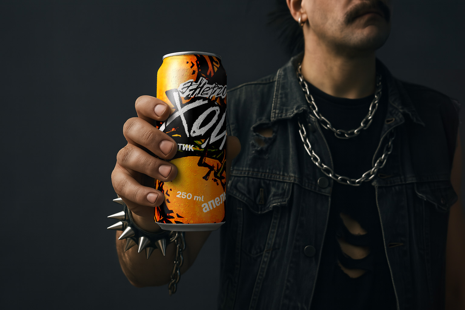
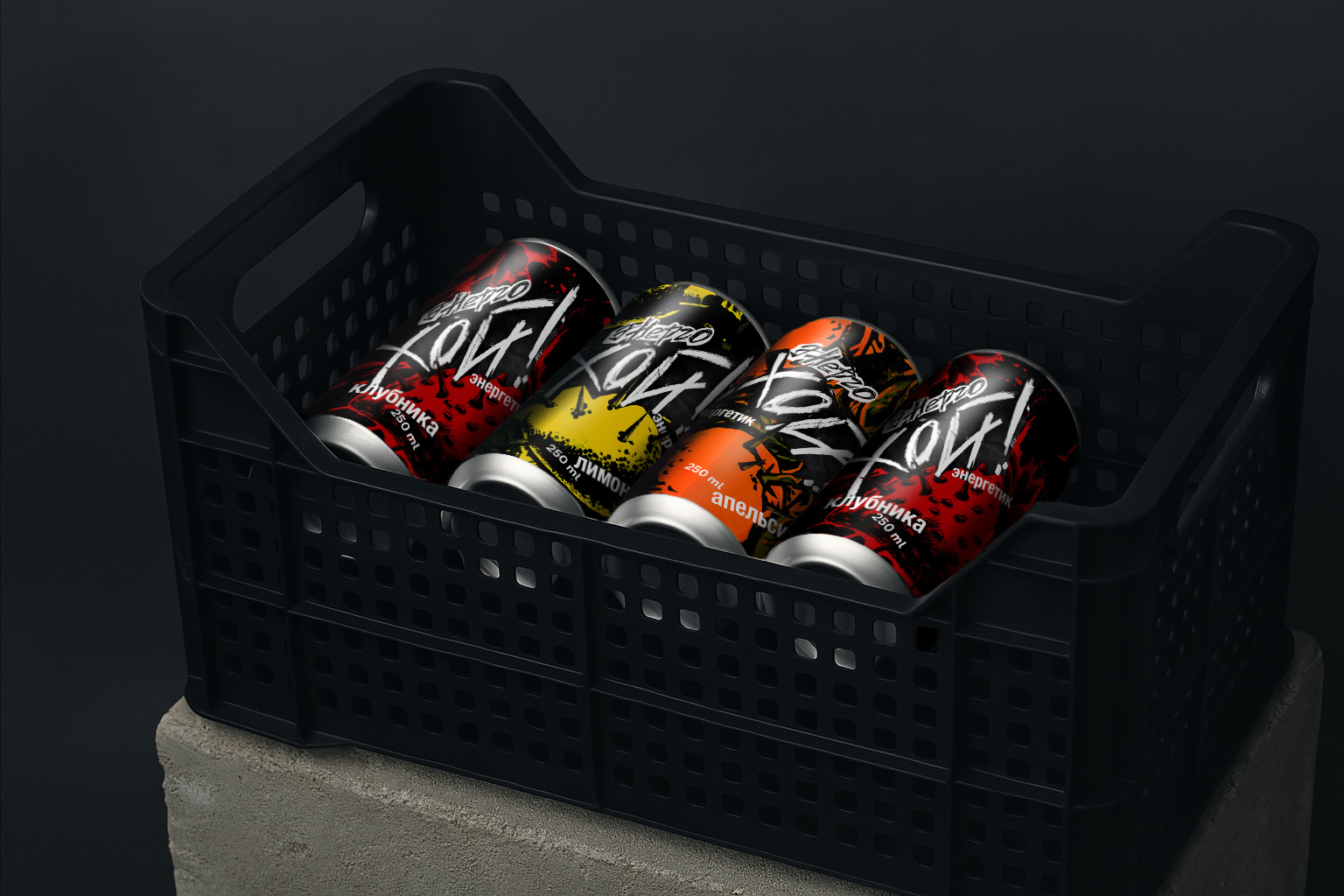
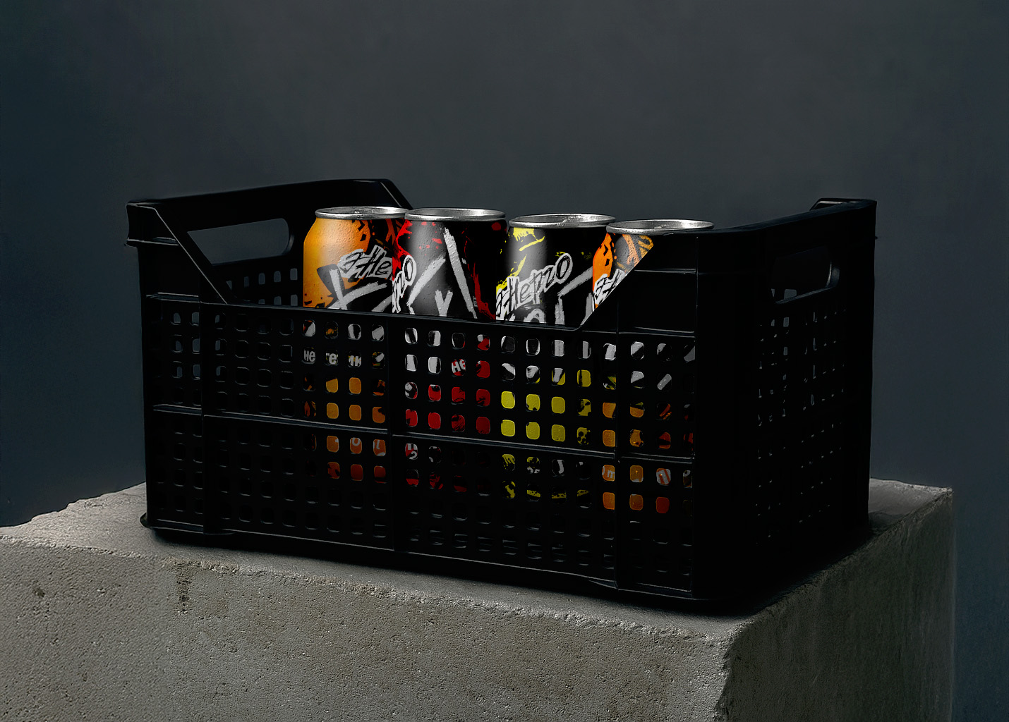
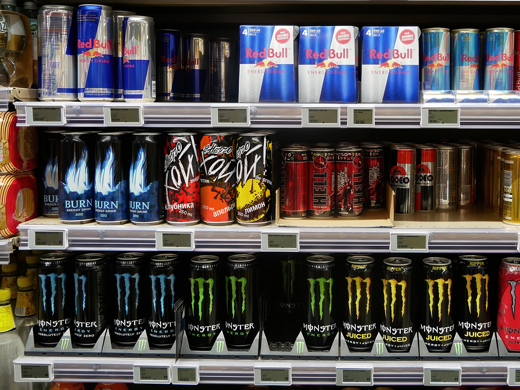
Energo Oi! is not just an energy drink it’s a bold scream in a world of monotony. Created for those who live in the rhythm of rebellion, it’s a high-voltage protest against fatigue, boredom, and quiet resignation. The name “Oi!” echoes a raw, iconic chant born in punk culture a call to action, a symbol of defiance, a burst of pure, unfiltered energy. It’s more than a word it’s a lifestyle.
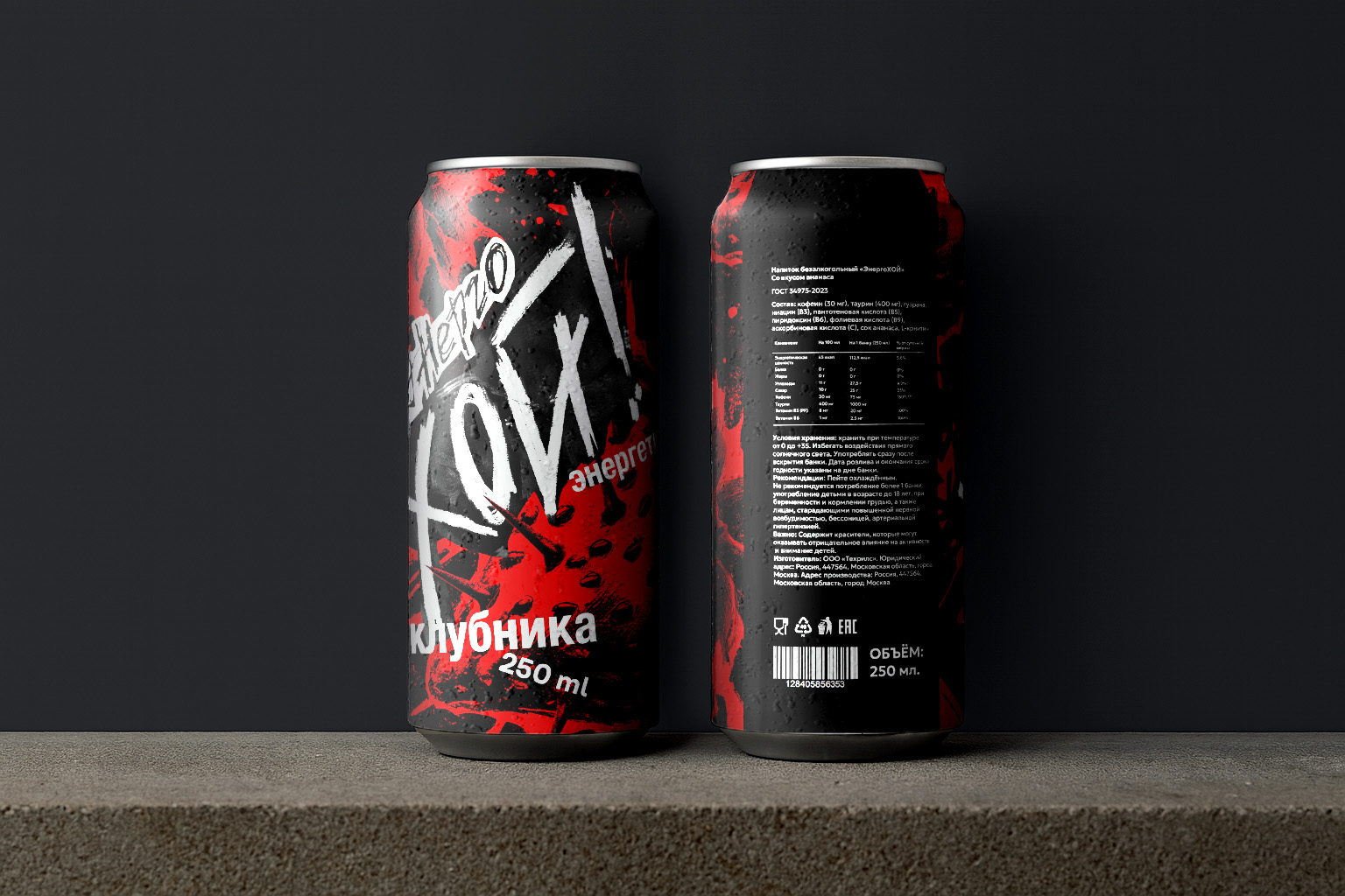
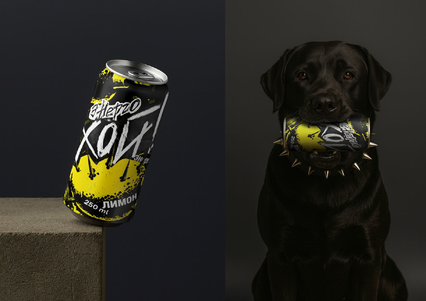
This drink doesn’t ask for your attention it grabs it. The design slams like a distorted power chord: sharp, loud, and unapologetically chaotic. Concrete textures, torn typography, acidic colors, and spiked elements channel the spirit of the underground. It feels like an alleyway after midnight, like the posters on club walls, like the bass you feel in your chest at a show that never ends.
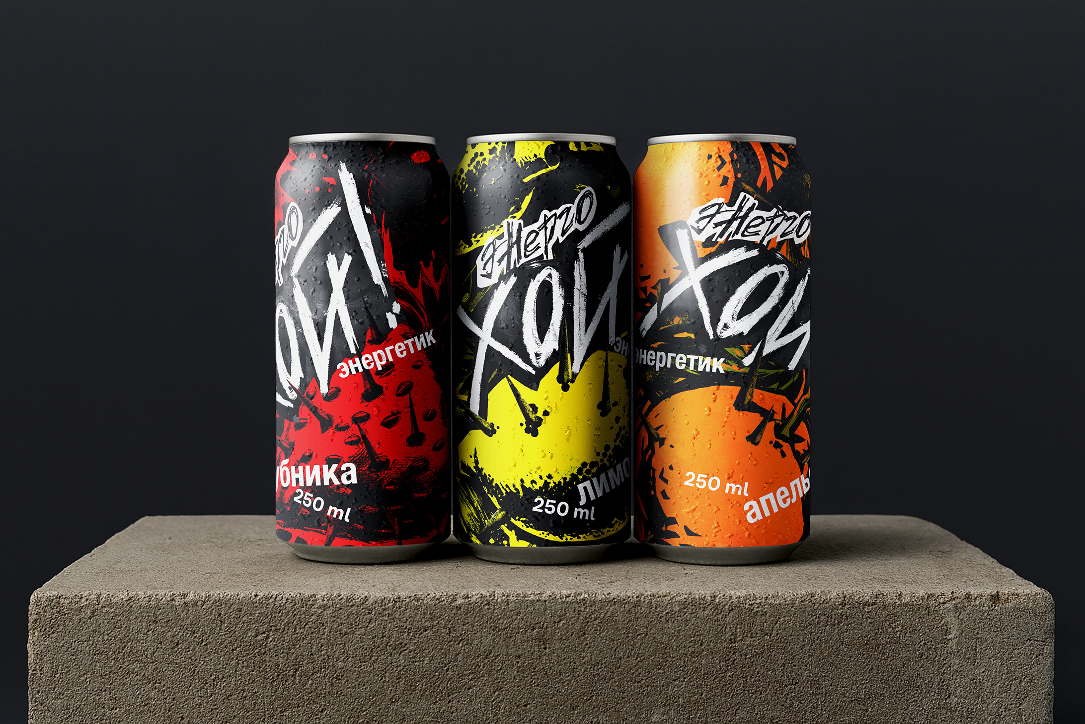
The can becomes a manifesto. The three bold flavors Strawberry, Lemon, and Orange — hit like an opening riff. Each one is a sensory jolt, crafted to awaken and provoke. Together they form a trio of taste that doesn’t just energize it electrifies.
Whether you’re in the middle of a 2 a.m. creative session, dancing in a mosh pit, or staring down the weight of another long night Energo Oi! is your companion. It’s built for those who refuse to surrender to the ordinary. For the loud, the restless, and the fiercely alive.
This is not just caffeine in a can. This is a war cry in aluminum. Energo Oi! is here to charge you up, shake you awake, and keep your fire burning.
CREDIT
- Agency/Creative: Natalya Bronnikova
- Article Title: Energo Oi! Energy Drink for Rebels Packaging Design by Natalya Bronnikova
- Organisation/Entity: Student
- Project Type: Packaging
- Project Status: Published
- Agency/Creative Country: Russia
- Agency/Creative City: Moscow
- Market Region: Asia, Europe
- Project Deliverables: Brand Naming, Graphic Design, Packaging Design
- Format: Jar
- Industry: Food/Beverage
- Keywords: packaging, graphic design, energy, punk, punk-rock
-
Credits:
Designer: Natalya Bronnikova
Curator: Pavel Borisovsky
Education Institution: HSE University Art and Design School


