


SushiWushi isn’t just sushi—it’s a joyful culinary experience designed to spark curiosity and smiles before the first bite. From its name to its playful aesthetic, SushiWushi is all about blending Japanese tradition with modern charm. The goal behind the brand was simple: make sushi more than just a meal. We wanted to create a brand that turns unboxing into a moment of delight, and that’s where the Sushi Squad was born.
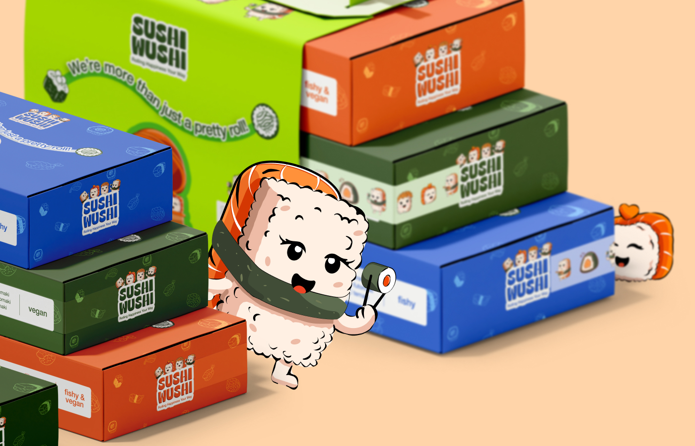
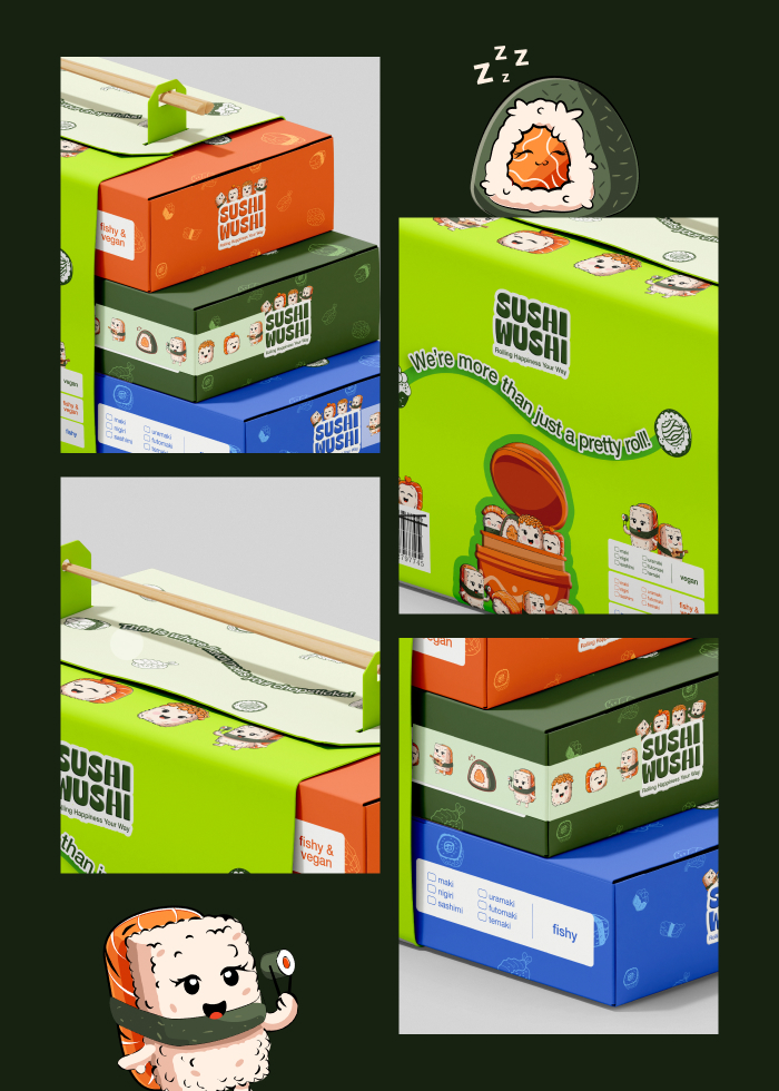
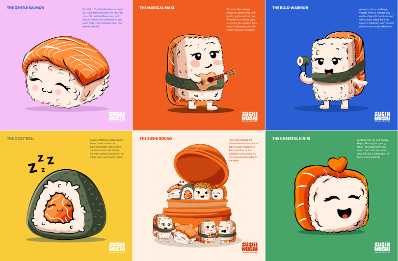
Each piece of sushi in the set was transformed into a quirky, lovable character—an illustration-first approach to branding that gave the packaging life. These characters weren’t just for fun; they helped establish a memorable identity for the brand, giving customers something emotional and relatable to look forward to with every purchase. Whether it’s a bold salmon or a shy avocado maki, each Sushi Squad member reflects the brand’s core values: fun, freshness, quality, and personality.
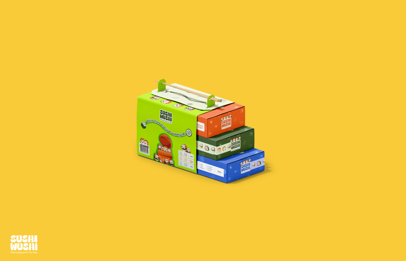
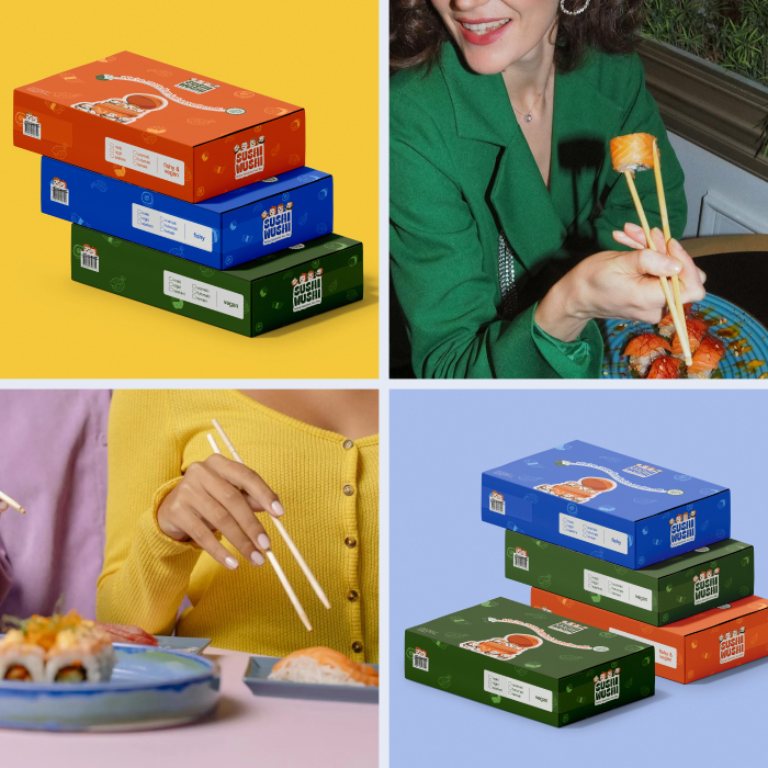
The packaging system was designed to feel like a tiny adventure. From the exterior visuals to the way the box opens and reveals each character, every moment was crafted to offer a delightful user experience. Bright, minimal backgrounds allow the characters to pop, while soft color palettes inspired by Japanese stationery and pop art create a comforting, aesthetic balance.
But SushiWushi is not only about looks—it’s also about functionality. The structure is designed to hold sushi securely while being easy to open, portable, and eco-conscious. Every decision—from the typography to the container shape—was carefully considered to balance form and function.
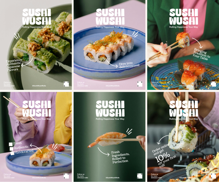
We chose illustration as the heart of the packaging because illustration connects emotionally—it tells stories. By using character design as a storytelling tool, we created packaging that not only looks good on the shelf but also creates an emotional connection with the buyer. This story-driven visual identity resonates particularly well with Gen Z and millennial audiences who value experience, authenticity, and shareable aesthetics.
Whether it’s a lunchtime treat, a weekend grab-and-go, or a gift, SushiWushi offers more than just sushi—it delivers an interactive, emotional experience through packaging and playful storytelling.
This project showcases how strategic illustration and branding can transform a traditional food item into something emotionally engaging, visually iconic, and absolutely unforgettable.
CREDIT
- Agency/Creative: Irin Shorme
- Article Title: SushiWushi : A Playful Sushi Brand Wrapped in Whimsy, Culture, and Kawaii Charm
- Organisation/Entity: Freelance
- Project Type: Packaging
- Project Status: Published
- Agency/Creative Country: Bangladesh
- Agency/Creative City: Sylhet
- Market Region: Asia, North America, Global
- Project Deliverables: Brand Design, Branding, Character Design, Design, Digital Art, Graphic Design, Illustration, Logo Design, Packaging Design
- Format: Box
- Industry: Food/Beverage
- Keywords: Sushi packaging, kawaii branding, character design, playful identity, Japanese food branding, tray packaging, food illustration, visual storytelling, cute packaging, Gen Z branding,branding,packaging,illustration,character illustration
-
Credits:
Creative direction & packaging design: Md. Tanvir Ahmed Saimon
Illustrations: Irin Shorme


