


Challenge:
Honest approached Minim Design for a comprehensive packaging redesign of their paper towel rolls, aiming to refresh their visual identity, enhance shelf appeal, and shift the perception from economy-level to mid-premium quality. The redesign included updating the logo and creating packaging that resonates emotionally with consumers, distinguishing Honest from competitors.
Research & Insights:
Detailed analysis of the paper goods market revealed prevalent use of cluttered, visually uninspiring designs lacking emotional appeal and differentiation. Key insights from target consumer research (primarily women aged 25–45) indicated:
Strong preference for neat, visually appealing packaging.
Aesthetic presentation significantly influences purchasing decisions beyond price and functionality.
Clarity, freshness, and emotional warmth in packaging designs directly correlate to consumer trust and loyalty.
Creative Solution:
We executed a thoughtful redesign focused on simplicity, modernity, and emotional connection:
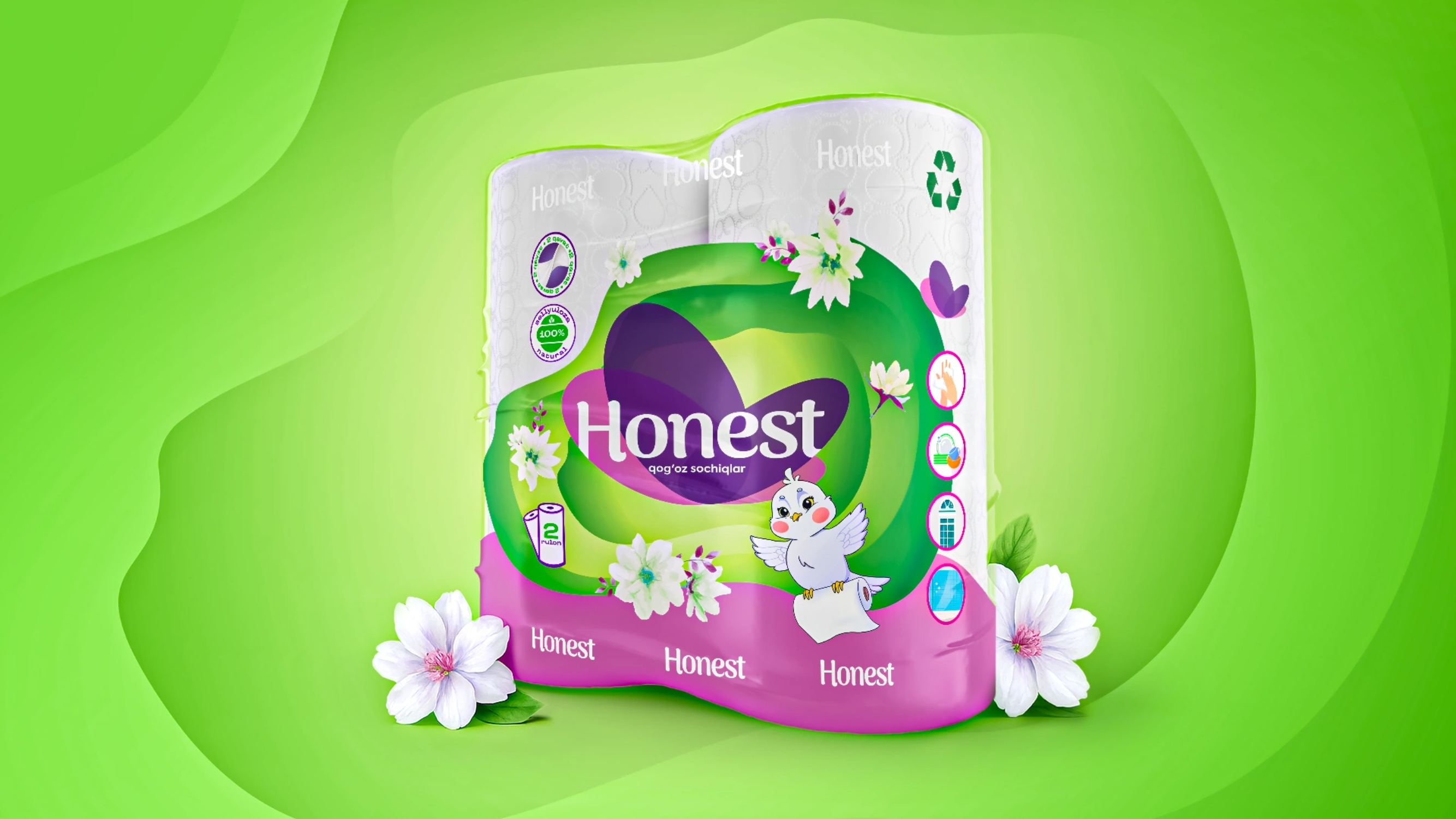
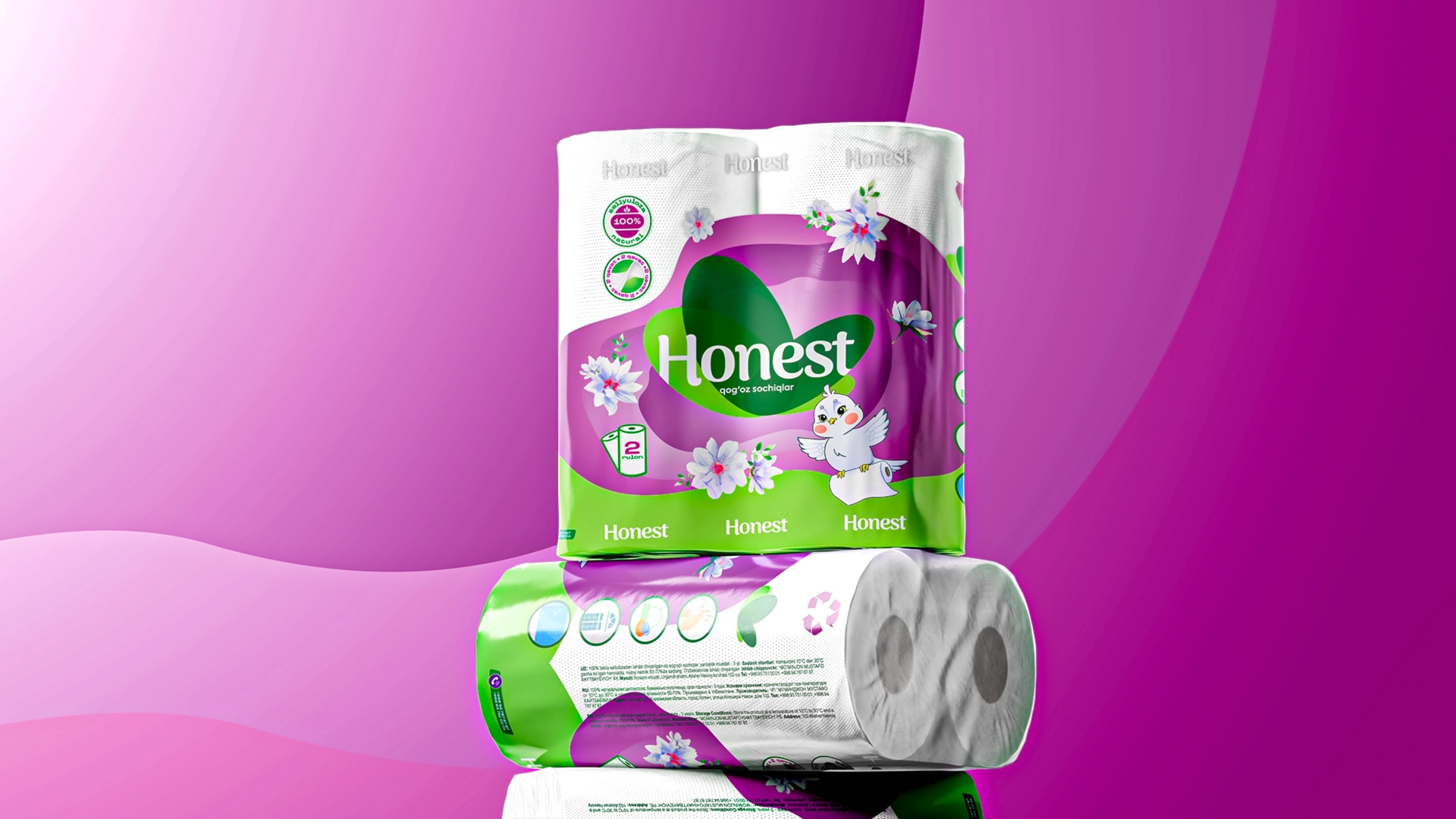
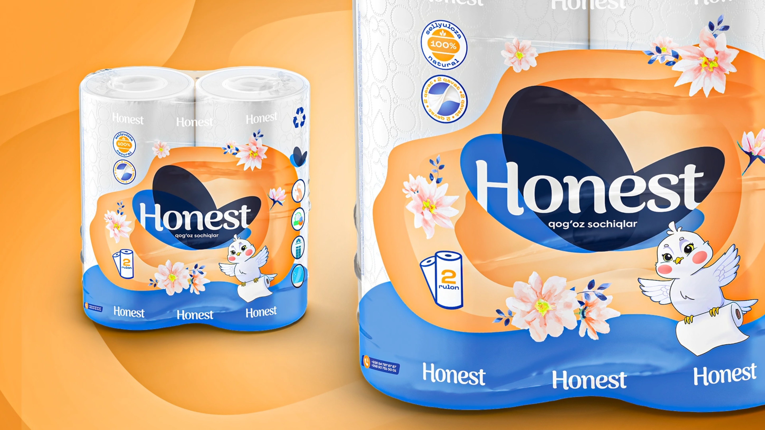
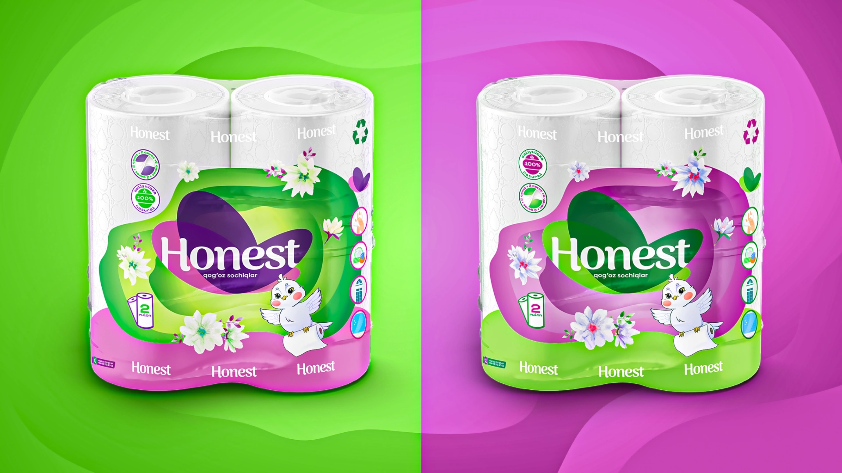
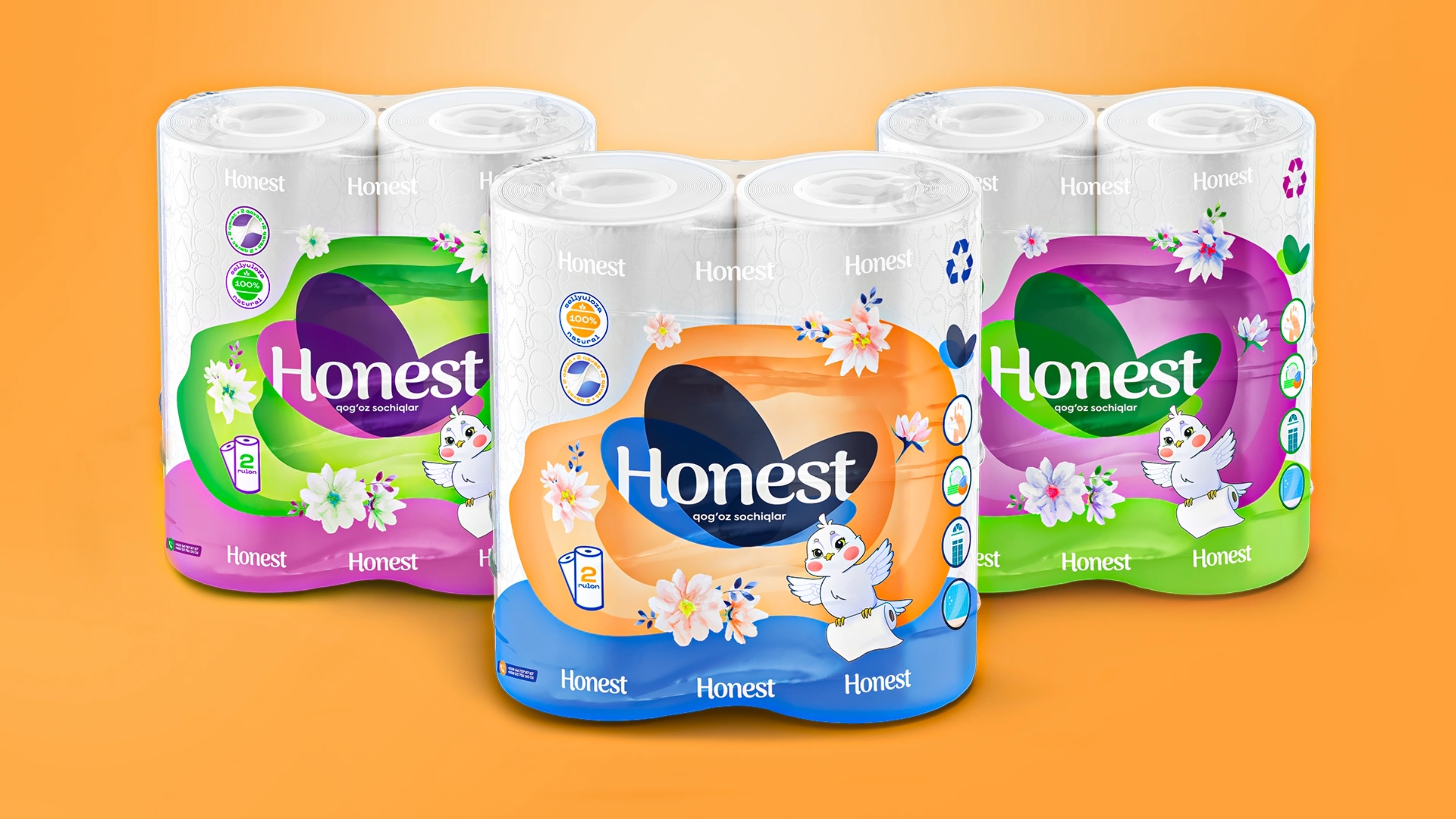
Logo Refresh: Maintained brand recognizability, refining the logo for increased friendliness and visual harmony.
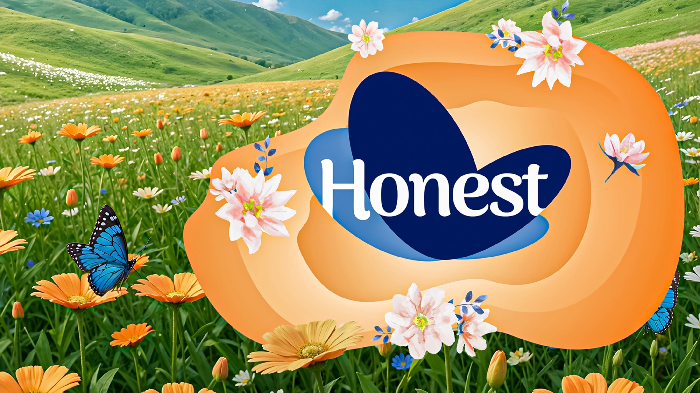
Fresh and Inviting Color Palette: Soft gradients and pastel tones evoke freshness, naturalness, and softness, directly aligning with consumer preferences.
Watercolor Floral Elements: Subtle decorative touches provided emotional warmth, evoking gentleness and trustworthiness.
Clear Communication: Prominent icons highlighting key product features—2 rolls per pack, 100% cellulose, softness, and density—were strategically positioned for instant recognition.
Distinctive Color Variants: Multiple color schemes (orange, green, purple) offered variety, appealing to diverse consumer tastes while maintaining unified branding.
Clean Aesthetic Approach: A minimalist background ensures visual clarity and standout shelf presence.
Results:
Honest’s new packaging significantly enhanced brand visibility and consumer engagement. The refreshed visual identity successfully repositioned the brand as a trusted, mid-to-premium choice, positively affecting consumer perception. The design not only revitalized the brand image but also increased consumer loyalty and attracted new customers, solidifying Honest’s competitive edge and market appeal.
CREDIT
- Agency/Creative: Minim Design Agency
- Article Title: Honest – Paper Towel Packaging Redesign Focused on Clean Aesthetics and Consumer Trust by Minim Design
- Organisation/Entity: Agency
- Project Type: Packaging
- Project Status: Published
- Agency/Creative Country: Uzbekistan
- Agency/Creative City: Toshkent
- Market Region: Asia
- Project Deliverables: Brand Design, Logo Design, Packaging Design
- Format: Flow-Pack
- Industry: Health Care
- Keywords: Packaging Redesign, Paper Towels, Home Care, Branding, Visual Identity, Logo Refresh, Consumer Trust, Clean Aesthetics, Soft Design, Floral Motifs, Premium Positioning, Shelf Appeal, Emotional Branding, Household Products, Consumer Goods
-
Credits:
Agency: Minim Design


