Louise Agency – ESR You
These supplement liquids are specifically formulated to improve workout performance. The brand identity needed to be strong, influential and appealing to both genders.
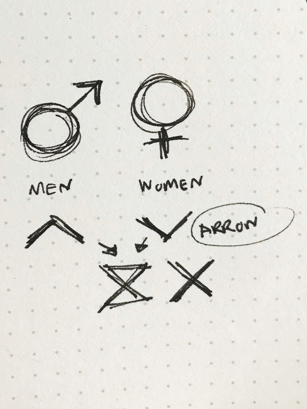
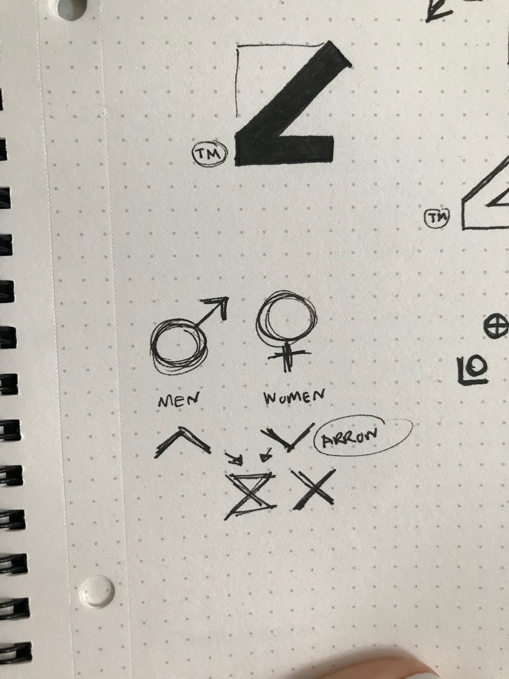
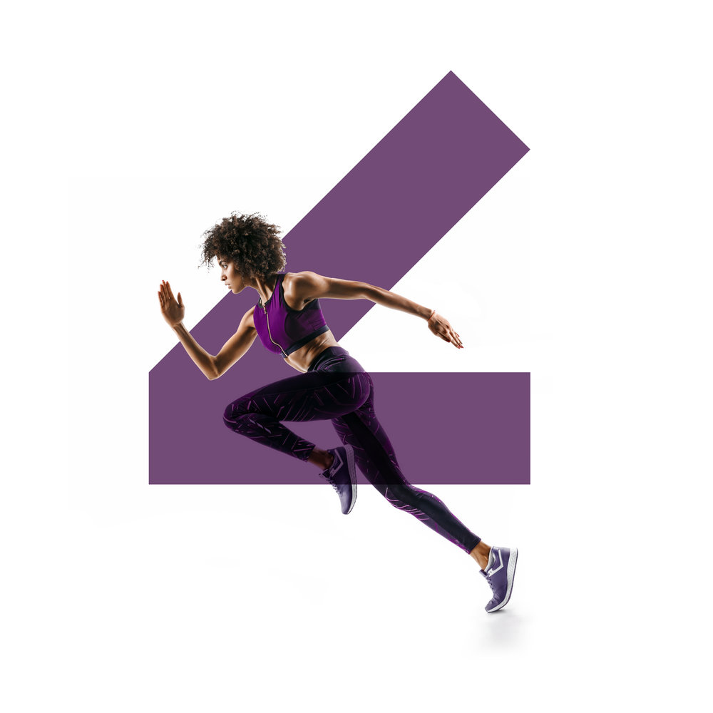
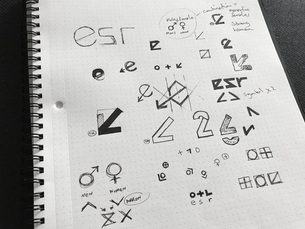
In such a saturated supplement market filled with intense masculinity, the logo needed to blend in without looking overly feminine. The logo design is an icon configuration of both gender and pagan symbols with a soft and rounded typeface to compliment.
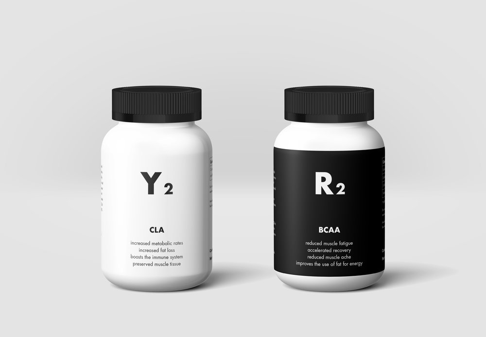
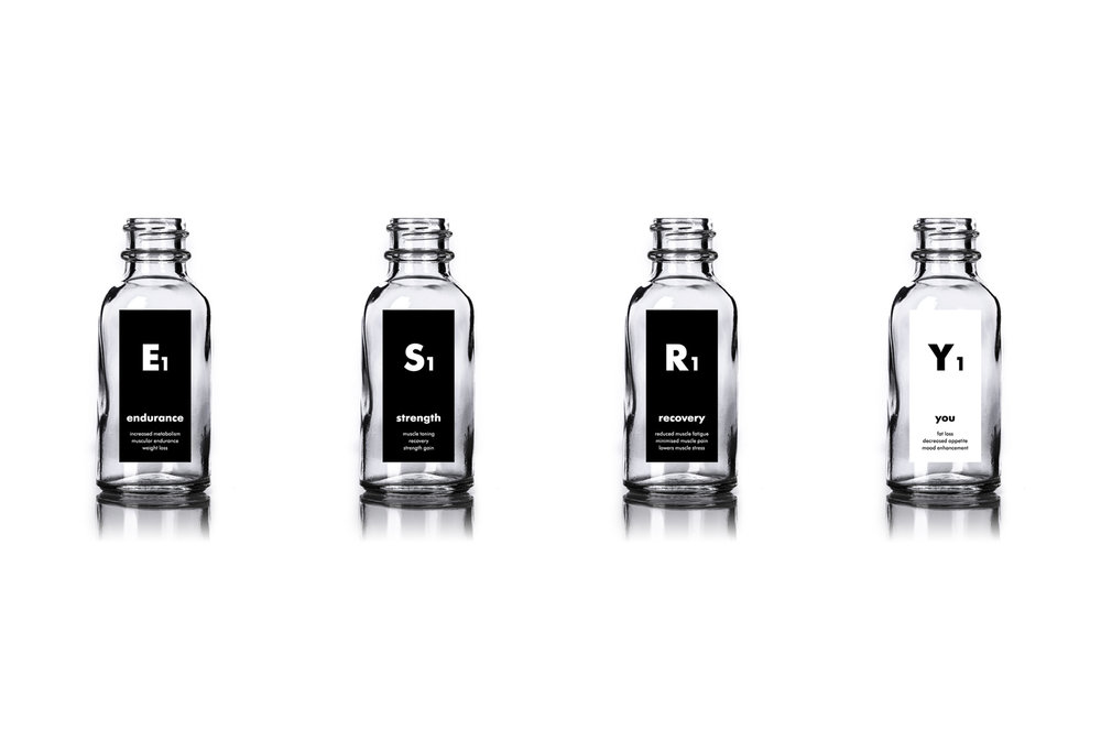
The brand name (formed by the client) stands for the product range (ESRY). The expansion of the product range was considered in the approach of the design whereby the decision to add a numeric value would therefore differentiate each product future release (E1/E2). In keeping a medicinal look and feel, the product designs stemmed from the influence of the periodic table.
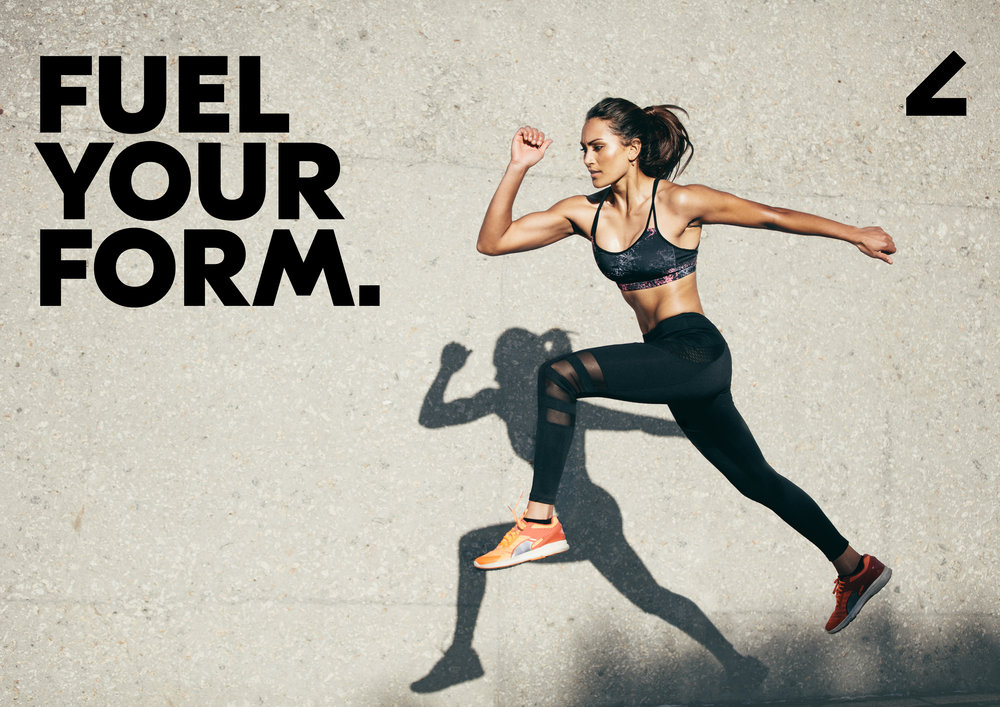
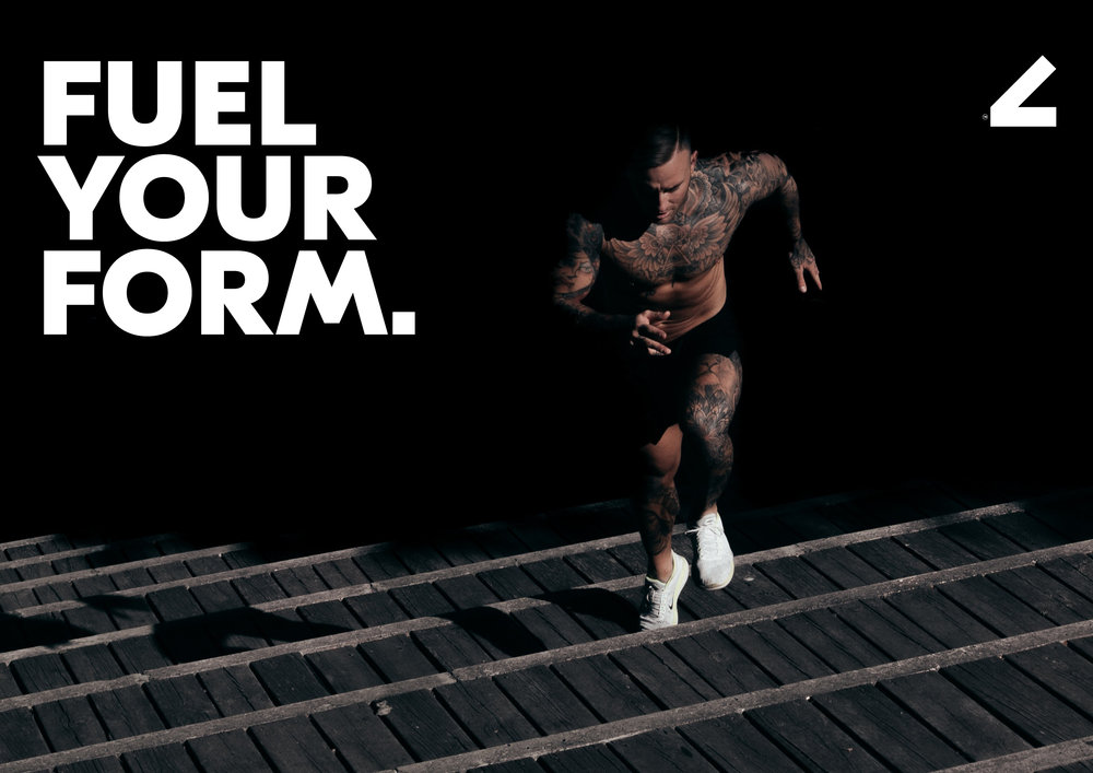
The black and white colour palette is in line with the clinical approach and allows for the strong, bright and energetic imagery to pop with colour. Where possible, type colour treatment will reflect the colour palette found within the supporting imagery.
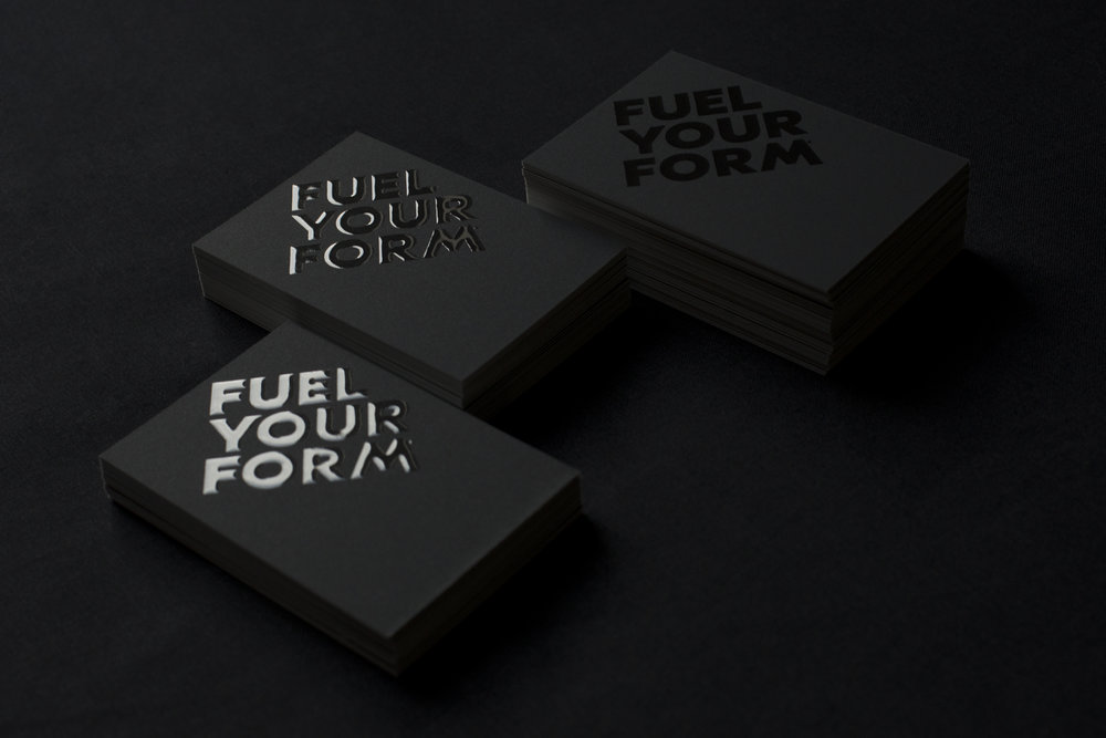
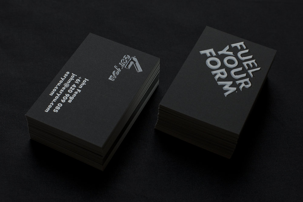
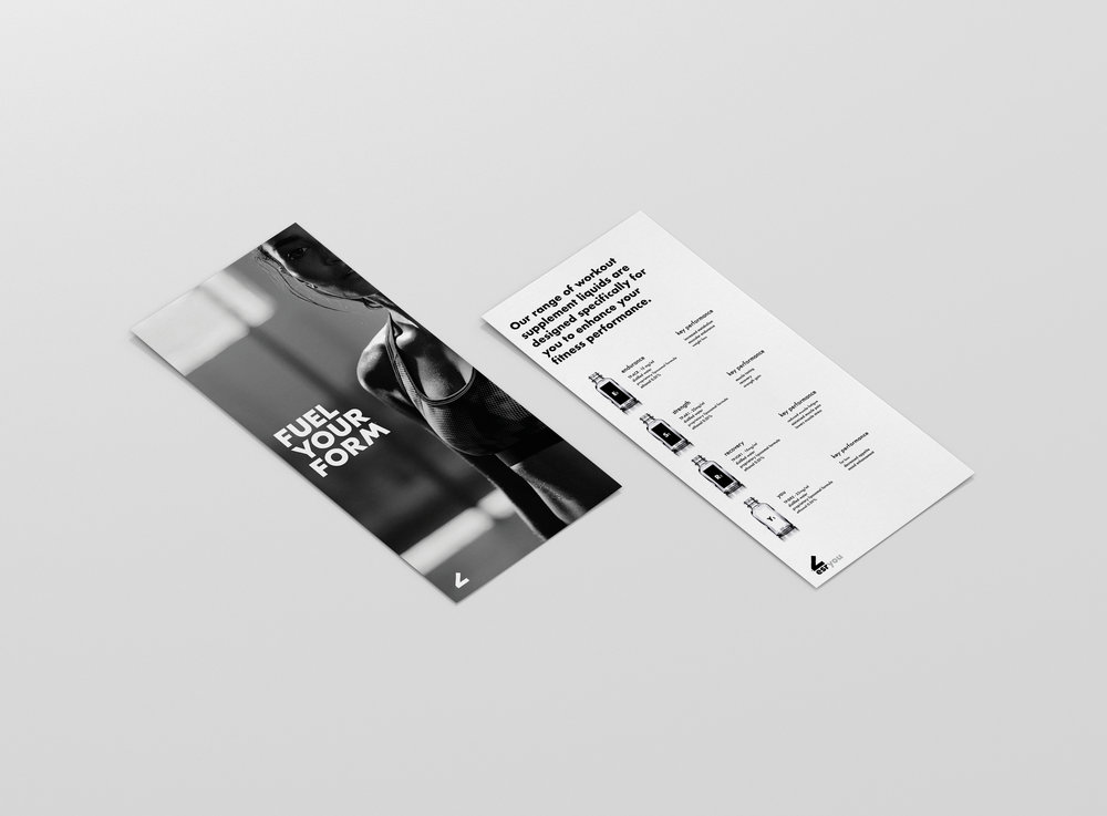
The tagline for this brand needed to reflect the purpose of the product range along with the application method–a first of its kind. Droplets from a small pipette bottle that don’t require refrigeration is the main point of difference to other brands. A supplement to be taken on the fly just before a workout session that improves performance was the key takeaway. And so, the tagline ‘Fuel Your Form’ was decided.
The website design was created as a single flow layout to help explain the product range easily with relatable supported imagery for each.



CREDIT
- Agency/Creative: Louise Agency
- Article Title: Fitness Brand for Both Him and Her
- Project Type: Packaging
- Agency/Creative Country: Australia
- Market Region: Multiple Regions
- Format: Bottle, Wrap
- Substrate: Plastic
- Industry: Fashion, Retail


