


Brand company Ragged Edge reveals the new brand identity for Solflare, a crypto wallet committed to creating a secure, transparent platform designed for the billionth user.
Security above all
Crypto has a trust problem. Hype and jargon conceals a lawless landscape where every transaction presents a risk. Solflare was founded in 2021 to change that, making it simple, seamless, and secure to interact with Solana, the world’s fastest-growing blockchain. With 2.5 million users and a mission to broaden access, Solflare approached Ragged Edge with a huge ambition.
“Solflare delivers the speed, affordability and security that can bring the promise of cryptocurrency – true financial independence – to anyone. We’re building for the billionth user” says Filip Dragoslavić, Co-Founder & Co-CEO.
But to open up Solflare to a broader audience who might otherwise choose a better known but less secure solution, Solflare needed to change the narrative. They worked with Ragged Edge on a rebrand which frames Solflare as a Stronghold of the Free.
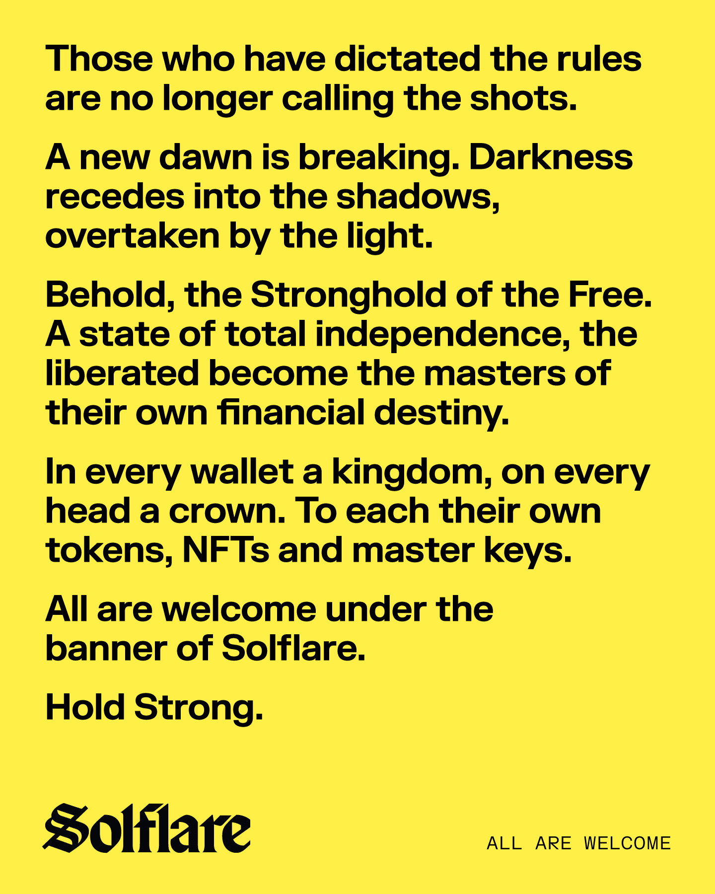
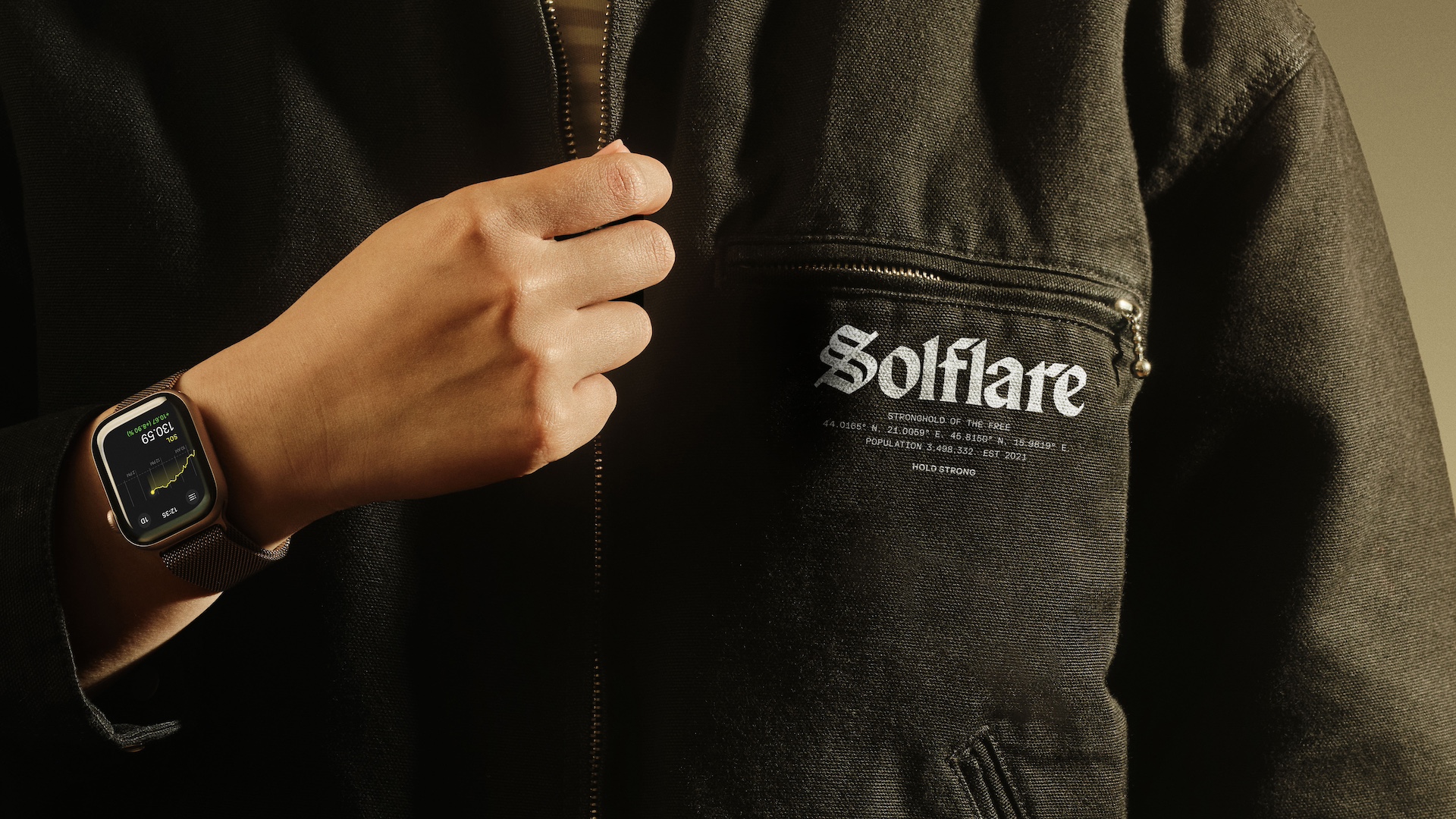
Stronghold of the Free
“Financial independence is a key aspect of crypto” says Christy Madden, Strategy Director, Ragged Edge. “You, and you alone, hold the seed phrase to access your wallet. It frees people from reliance on financial institutions or governments, giving them true autonomy.”
“Reimagining the wallet as a Stronghold unlocked a rich territory for the brand. Hold strong is a term used in trading – to stand firm during market turbulence – so it resonates in this space, while the term stronghold speaks to a community bound together by a shared belief, a safe place from which to explore the world of crypto.”
Trusted codes refined for a digital era
“The new identity borrows from early financial codes, when banks were the pinnacle of trust and honour, and refines them for a digital era. A far cry from the clichéd aesthetic that has come to define the space”, says Luke Woodhouse, Executive Creative Director, Ragged Edge.
The logotype is inspired by the script of the earliest bank charters and institutions, where trust was the most valuable currency.
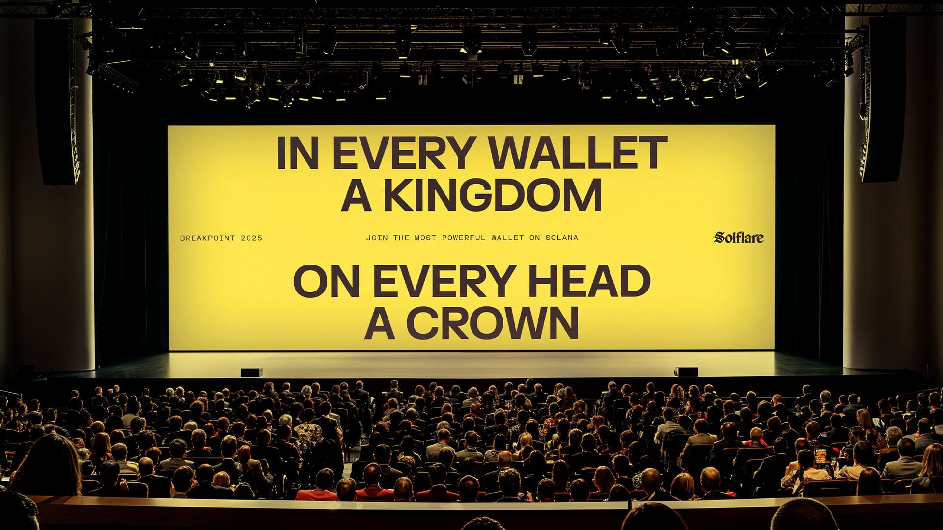
A bank of illustrations reclaim old money engraving for the new digital era. So crowns, castles, shields and locks become a suite of insignia for the stronghold of the free.
The voice plays with grit and determination, while staying grounded in hope and freedom. “It blends the philosophical wisdom of the classics with the lyricism of contemporary rap,” says Luke.
Jessica Bong-Woon, Associate Creative Director at Ragged Edge adds, “Across each part of the identity, our challenge was finding that sweet spot, creating something that would welcome newcomers to crypto (like me), while still feeling bold and meaningful enough for hardcore crypto fans to connect with. That’s how the Stronghold came to be.”
Transformative leap forward
The new brand identity appears across the website, designed and written by Ragged Edge, alongside a redesigned digital product and a full range of physical touchpoints created by the Solflare team.
A digital launch campaign generated 44.5 million impressions, as the community used the new identity to create over 3,200 different memes. One fan even had the new logo tattooed onto his ribcage.
The platform has onboarded 1.5 million new users since launch, an uplift of 75%. As of today 3.5 million people use Solflare regularly, holding over $20 billion in assets.
A big part of the brand’s success comes down to the client’s conviction. “We’ve been blown away by Solflare’s commitment,” says Luke Woodhouse, Executive Creative Director. “They truly embodied the brand, which matters, because a brand is only as powerful as the belief behind it. The founder even booked a spa day to prepare for a workshop so he’d be fully present. At the internal launch in the Maldives, every employee received a box of branded
swag. That kind of energy shapes how the brand is experienced by the team and, ultimately, the customer.”
Dragoslavić concluded “Ragged Edge really brought our vision for Solflare’s identity to life. And it’s already changing how people see us. With our old identity, only 4% of US consumers chose us over the market leader. That’s shifting fast. We’re gaining ground and changing how people see crypto in the process. Revamping our brand so that it reflects our mission and meets the expectations of our highly engaged community was no easy feat, but they nailed it. From bold iconography to striking colours and a clear yet characterful typeface, they’ve breathed new life into Solflare’s personality and brought it in line with the future we’re building, where crypto works for the billions, not just the millions.”
CREDIT
- Agency/Creative: Ragged Edge
- Article Title: Ragged Edge Rebrands Solflare as a Stronghold of the Free
- Organisation/Entity: Agency
- Project Type: Identity
- Project Status: Published
- Agency/Creative Country: United Kingdom
- Agency/Creative City: London
- Market Region: Europe
- Project Deliverables: 3D Design, Brand Design, Brand Identity, Brand Redesign, Brand Strategy, Brand Tone of Voice, Branding, Copywriting, Icon Design, Logo Design, Rebranding, Type Design
- Industry: Financial
- Keywords: ragged edge solflare rebrand crypto fintech
-
Credits:
Executive Creative Director: Luke Woodhouse


