


A Brand Identity That Reflects Light, Warmth, and Timeless Hospitality
WELCOME, WORLD.
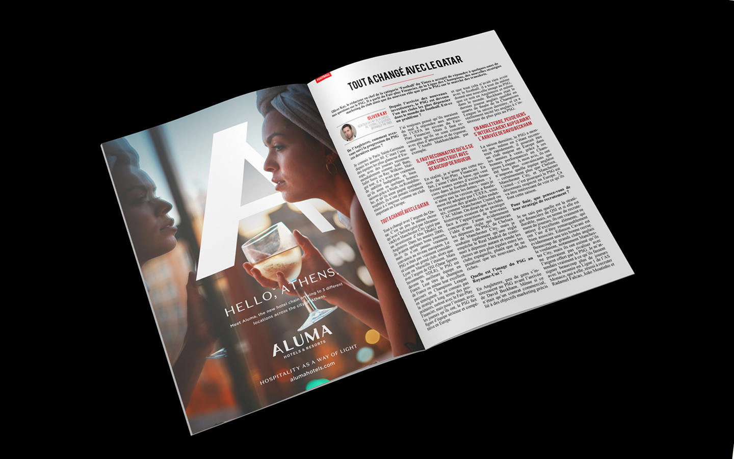
Aluma is a new international chain of hotels and resorts, offering a wide range of experiences that cater to today’s global travelers. The brand’s name—Aluma—was inspired by a commitment to sharing light and warmth with the world. As a sister company of Isrotel, Aluma is guided by a passion for people, and all its actions are guided by its core value: Hospitality as a Way of Light.
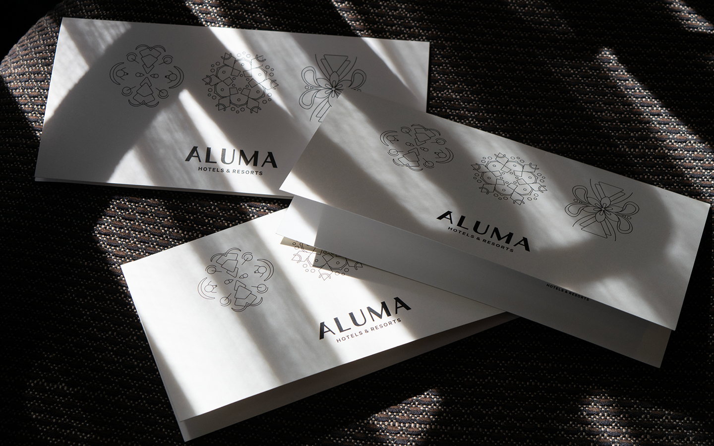
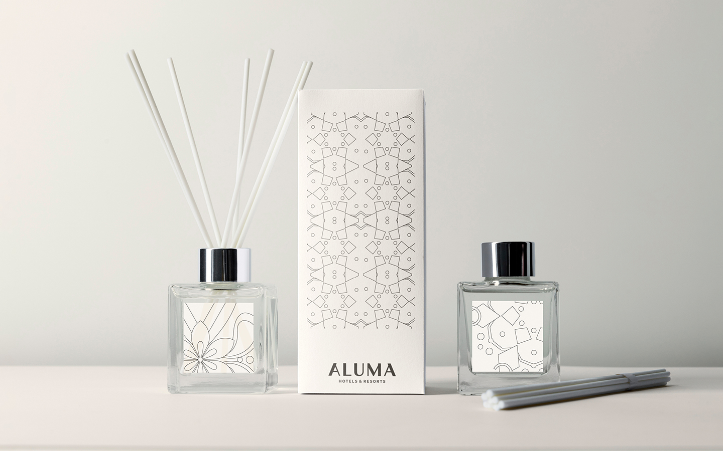
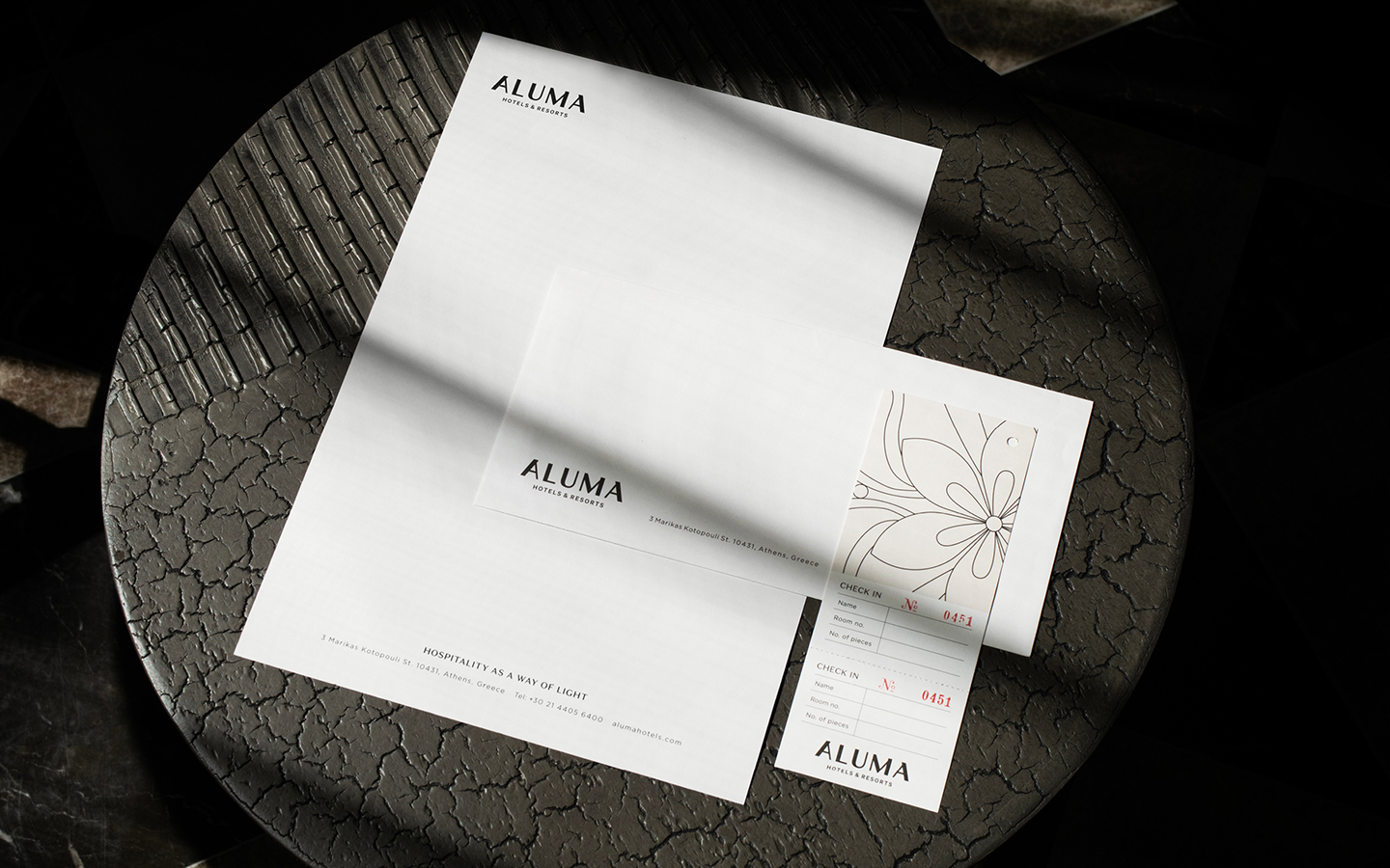
Aluma Chain Brand Identity
The logo is inspired by the motion of light throughout space and time. Rays of light change and move during the day and night, creating unique shapes and shades, guided by their source of warmth. Aluma is an ever-present ray of light that is always there, always diverse, and always a sense of warmth and hospitality for all.
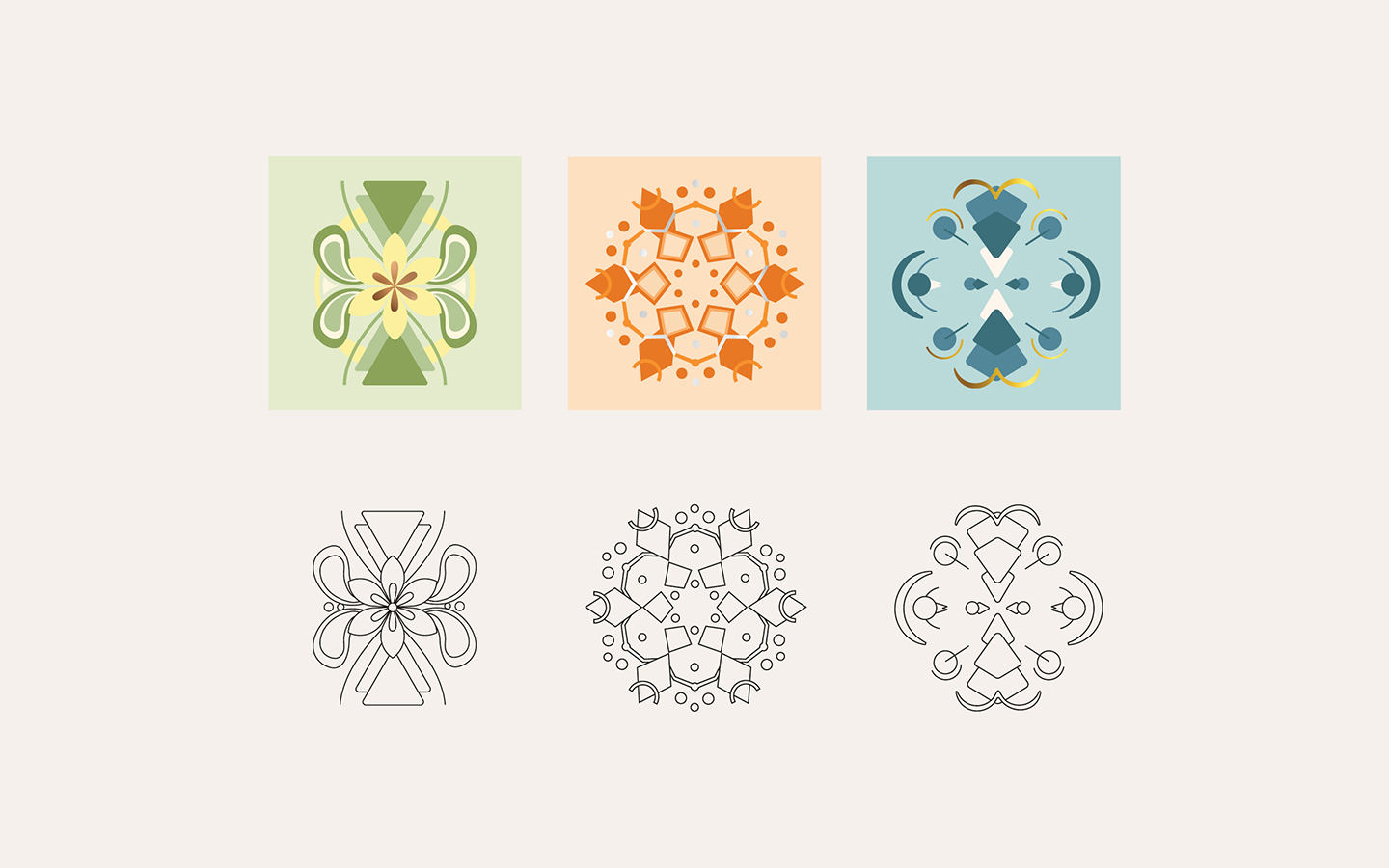
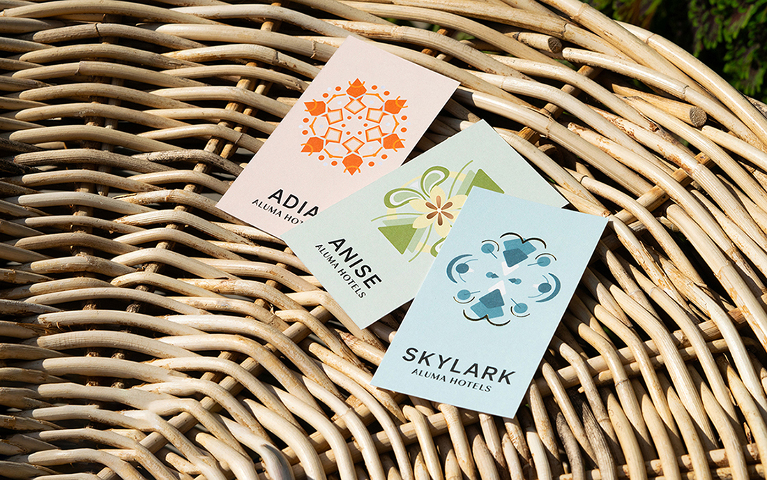
The graphic language is inspired by the motion of light as seen through a kaleidoscope, playing with the light and producing colorful shapes and designs. This visual language is diverse, yet distinct, enabling the development of a unique color palette and visual elements for each hotel and location.
Skylark – Fly High Above The City
Located at Omonoia Square, one of the oldest squares of the city, forming the city’s historic triangle. A lively hub for leisure and commerce, full of shops, bars, restaurants and clubs, Skylark is perfect for both leisure and business travelers who want to be in the heart of it all. The main visual is inspired by the hotel’s name, Skylark, portraying a bird in flight, as well as the hotel’s interior color palette.
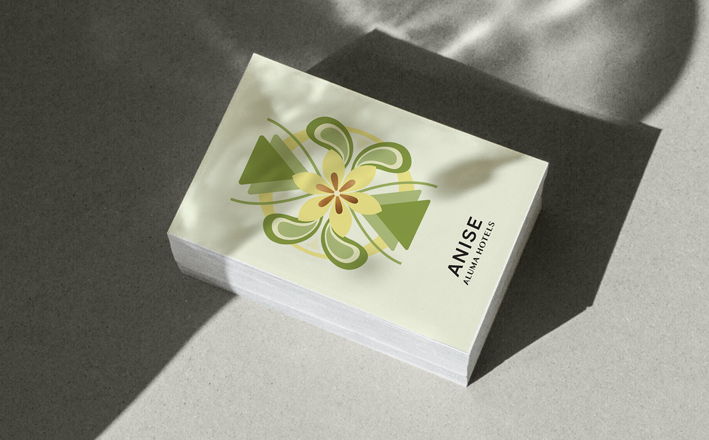
Anise – A True Taste of Athens
Located on the “spice road”, in the central, vibrant and colorful neighborhood of Psyri, known for its artisans, specialty stores, artisan accessories, antique shops, exotic spice markets, bohemian café-bars, and boutique hotels. With its “village vibe” and “bohemian chic”, this hotel is in the heart of an up and coming area that attracts many tourists, for daytime strolling and a bustling nightlife. The main visual for Anise is inspired by the hotel’s name and location along the spice road of Athens, and portrays the star-like shape of the anise plant, one of the signature tastes and scents of Greece. Its color palette offers a complementary contrast to the hotel’s pastel and nature-inspired tone.
Adia – A Gift of Luxury and Style
Located in the historic triangle of Athens, in the heart of the city and with access to all of the city’s attractions, for both commercial and leisure activities. The quality of the hotel, along with unique location, size and rooftop pool and great view, make this a great choice for travelers looking for a special and pampering experience. The main visual for Adia is inspired by the hotel’s name, which means “a gift”, expressing the appearance of a jewel or precious stone. The color palette is inspired by the hotel’s interior design.


CREDIT
- Agency/Creative: Basman Tenenbaum
- Article Title: Aluma Hotels and Resorts Visual Identity by B/T Design
- Organisation/Entity: Agency
- Project Type: Identity
- Project Status: Published
- Agency/Creative Country: Israel
- Agency/Creative City: Tel Aviv - Yafo
- Market Region: Europe
- Project Deliverables: Advertising, Art Direction, Brand Identity, Brand Naming, Logo Design, Typography, Visualisation
- Industry: Hospitality
- Keywords: hotel design typography aluma graphics branding Basman Tenenbaum Isrotel Chain
-
Credits:
Designer: Dor Tenenbaum
Designer: Danielle Haimovich
Strategy: Sharon Guesthalter
Photos: Daniel Madmoni


