


Client:
National Packaging is a female-led Indian B2B brand dedicated to turning packaging from a silent utility into a confident statement of brand character. Serving diverse industries across scale, the brand stands at the intersection of thoughtful design and operational precision.
Challenge:
To create a brand identity that feels distinctly Indian yet globally relevant; striking a balance between cultural nuance and modern clarity. The brief asked for a system that could move effortlessly across physical touchpoints like shipping boxes and collaterals, and translate into a cohesive digital presence, all without falling into generic industry clichés.
Solution:
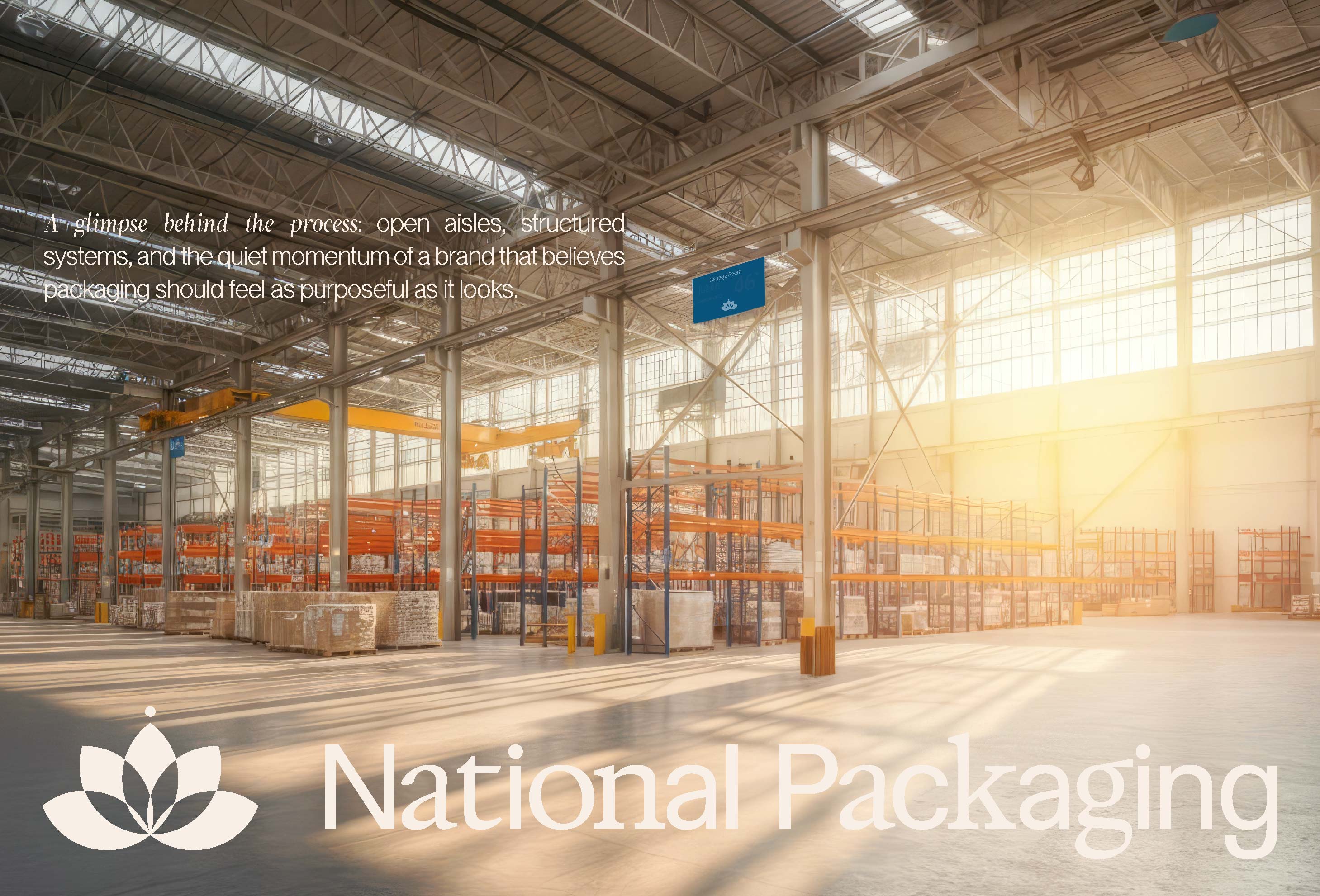
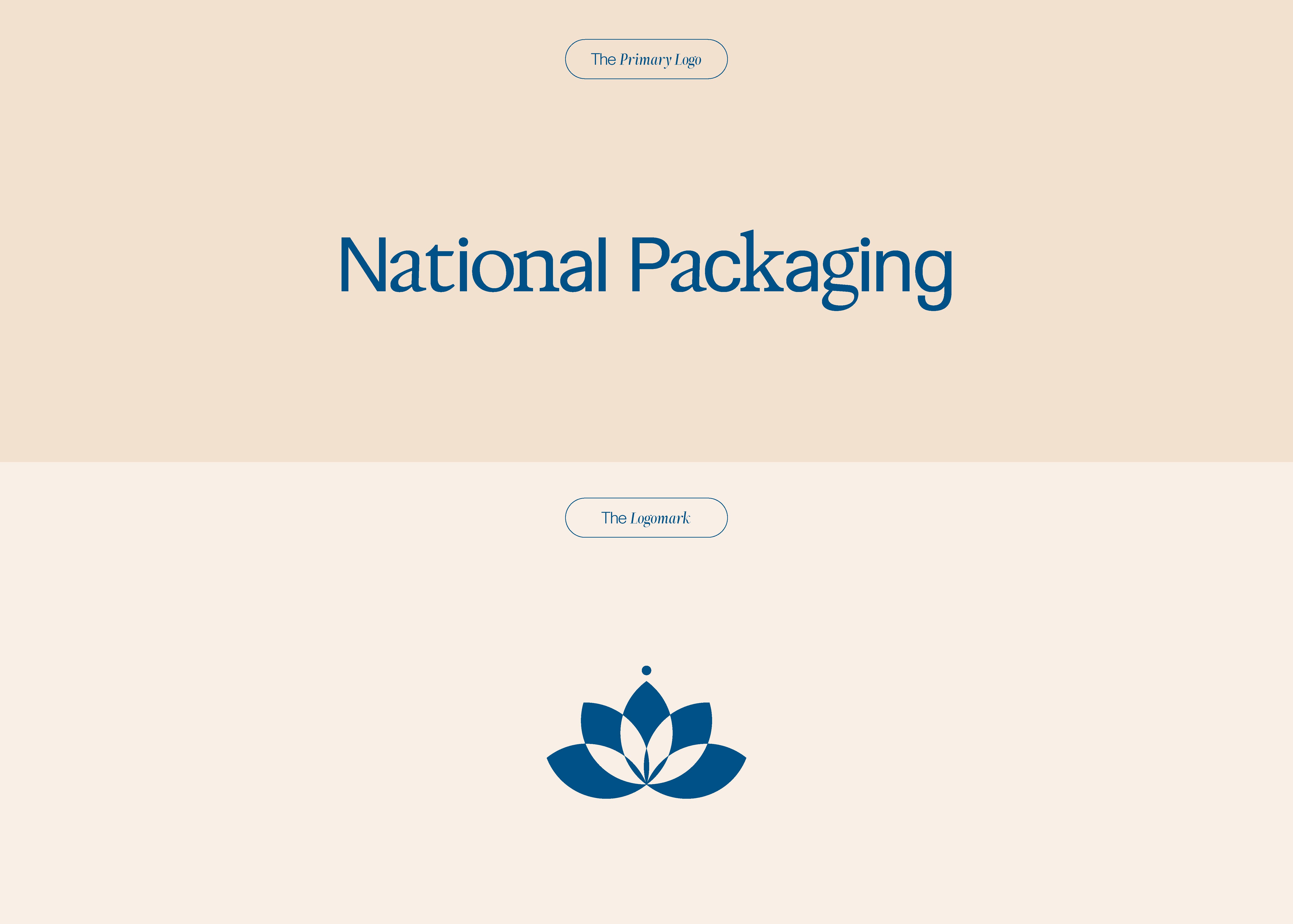
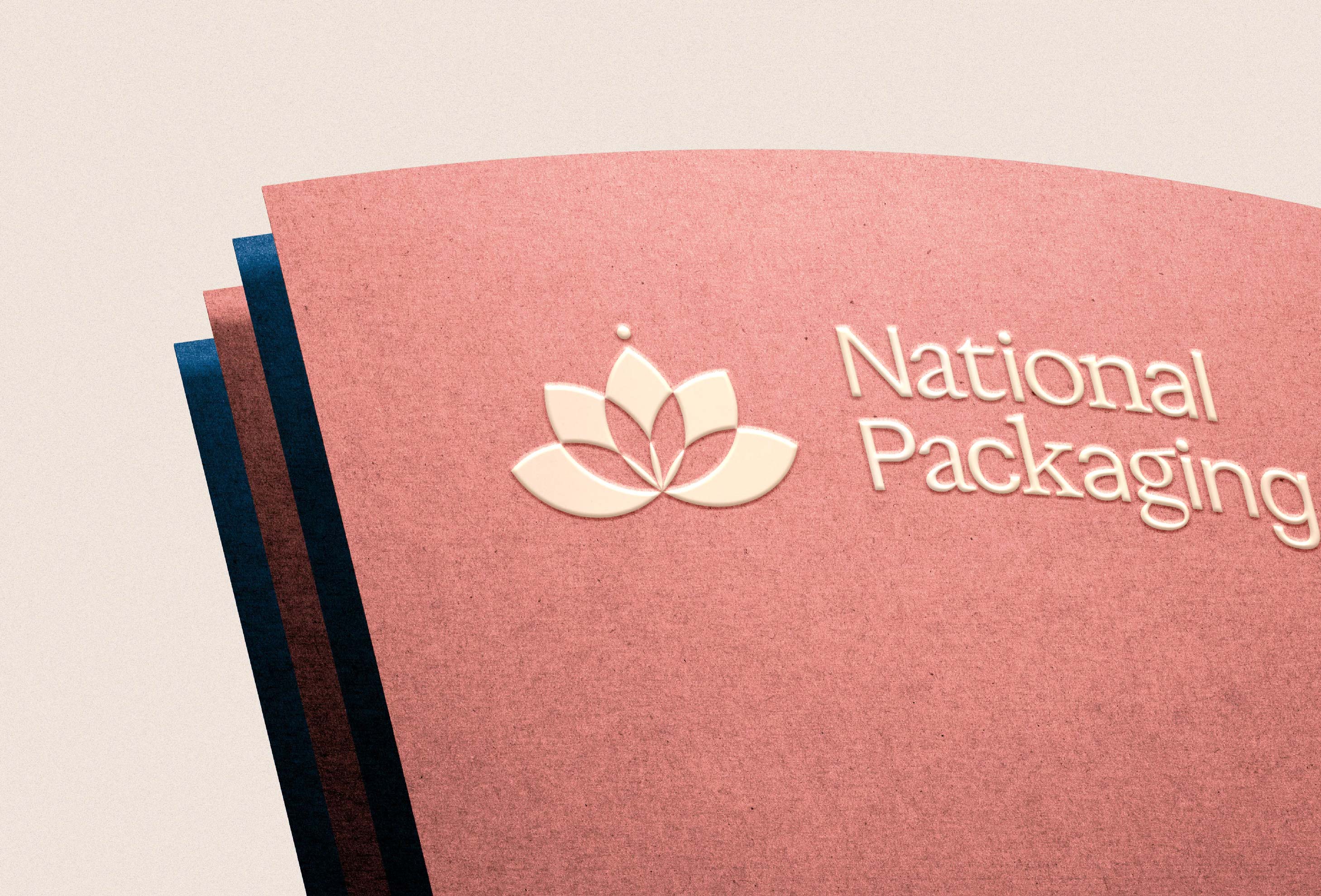
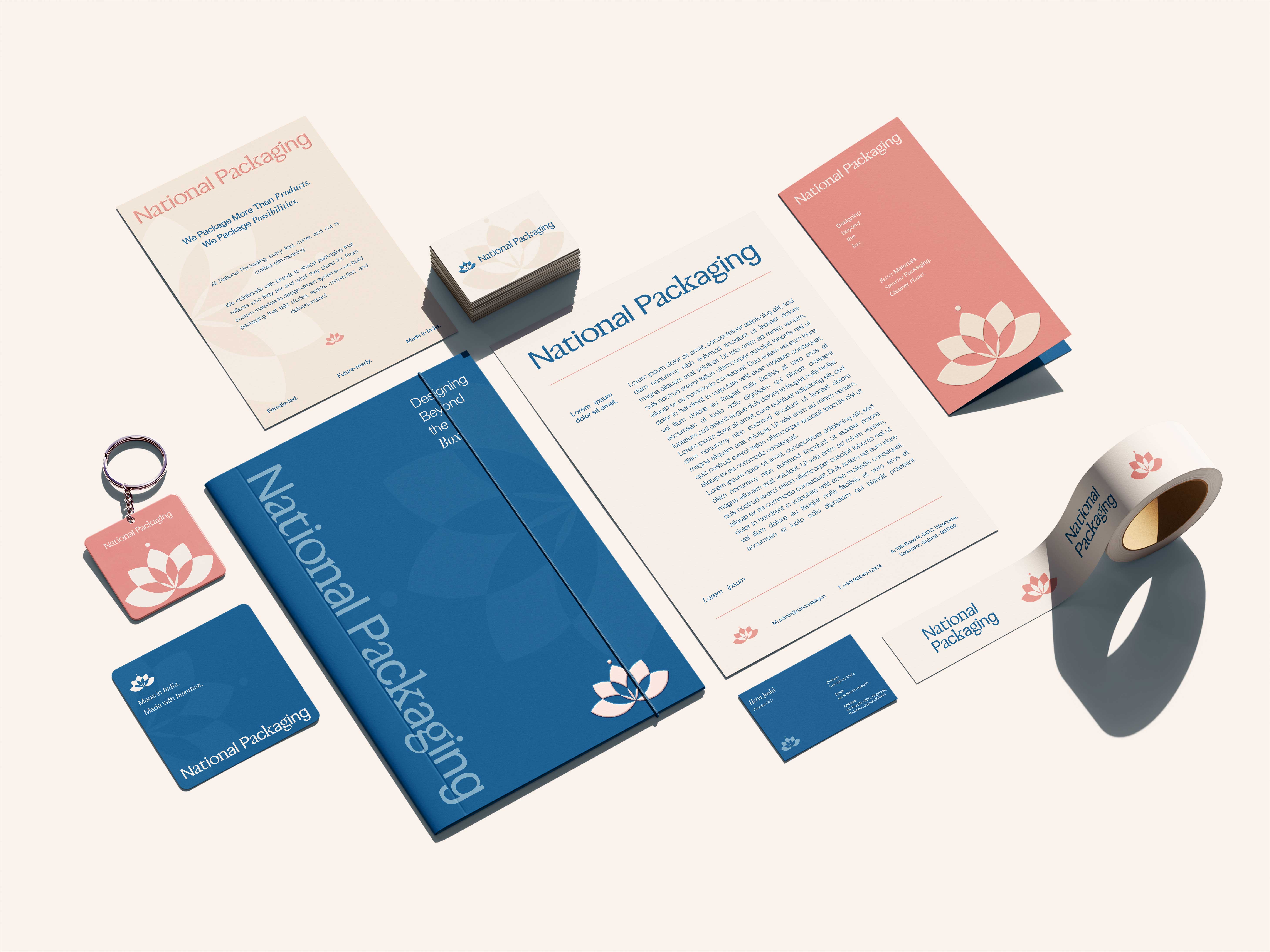
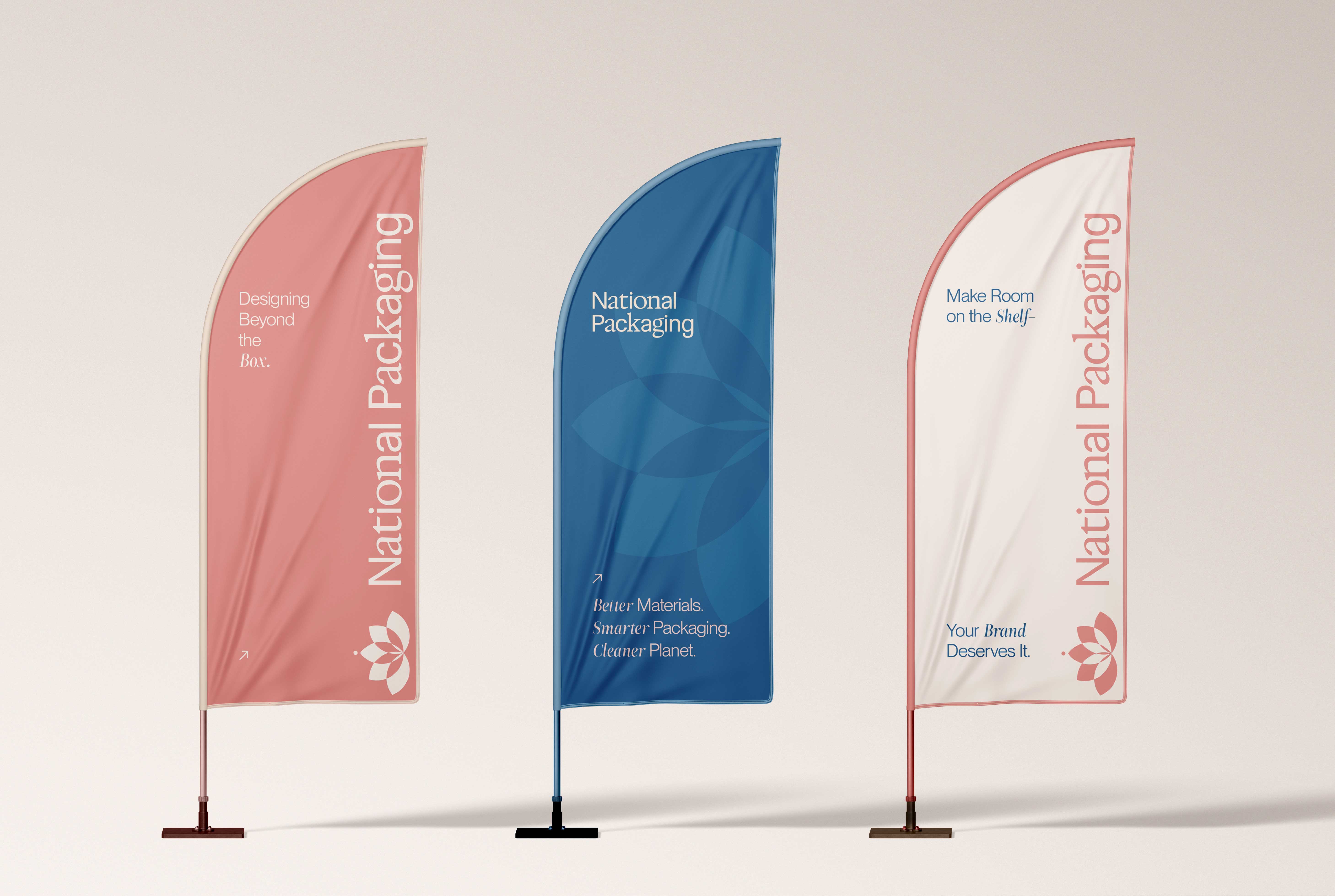
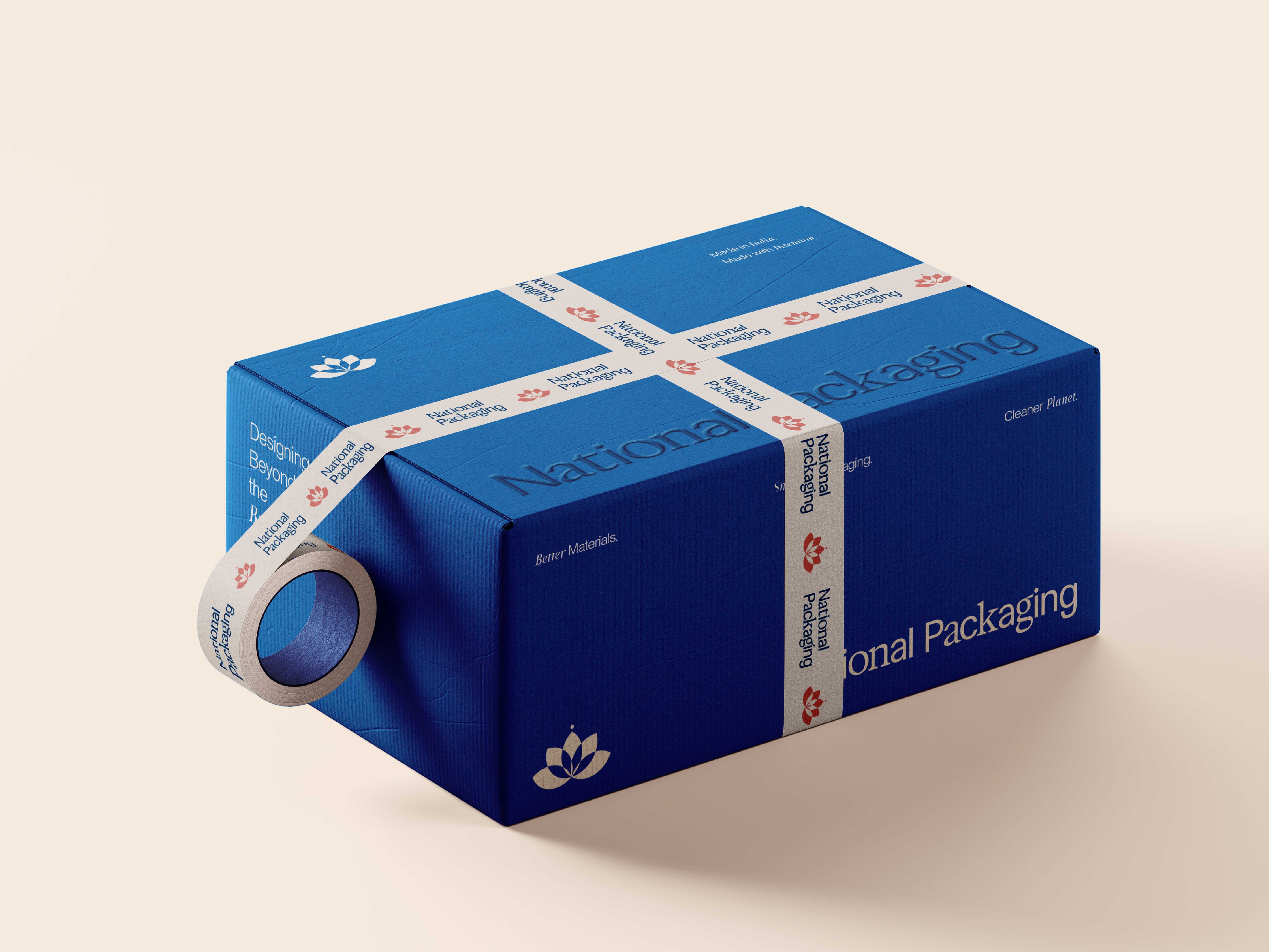
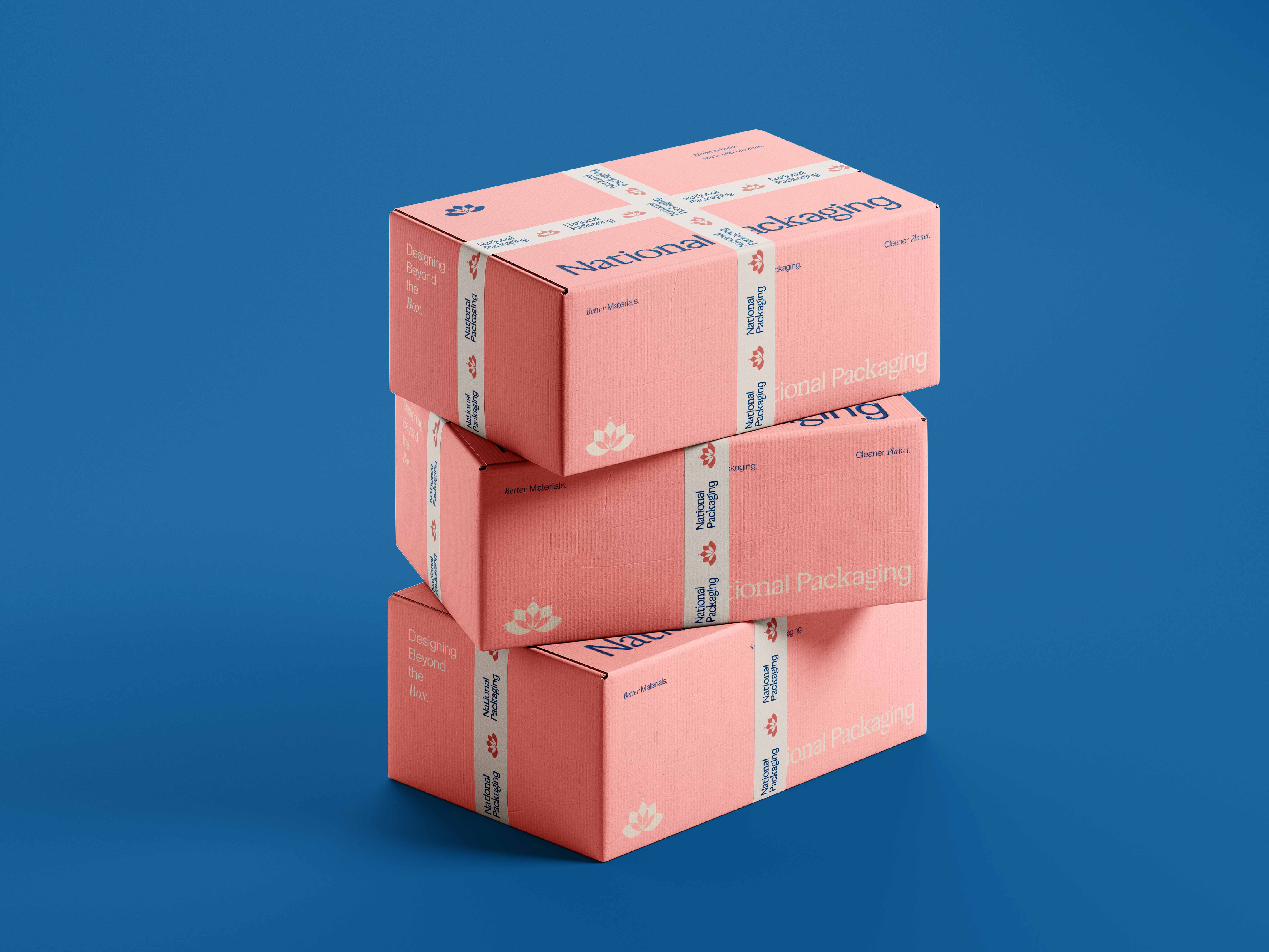
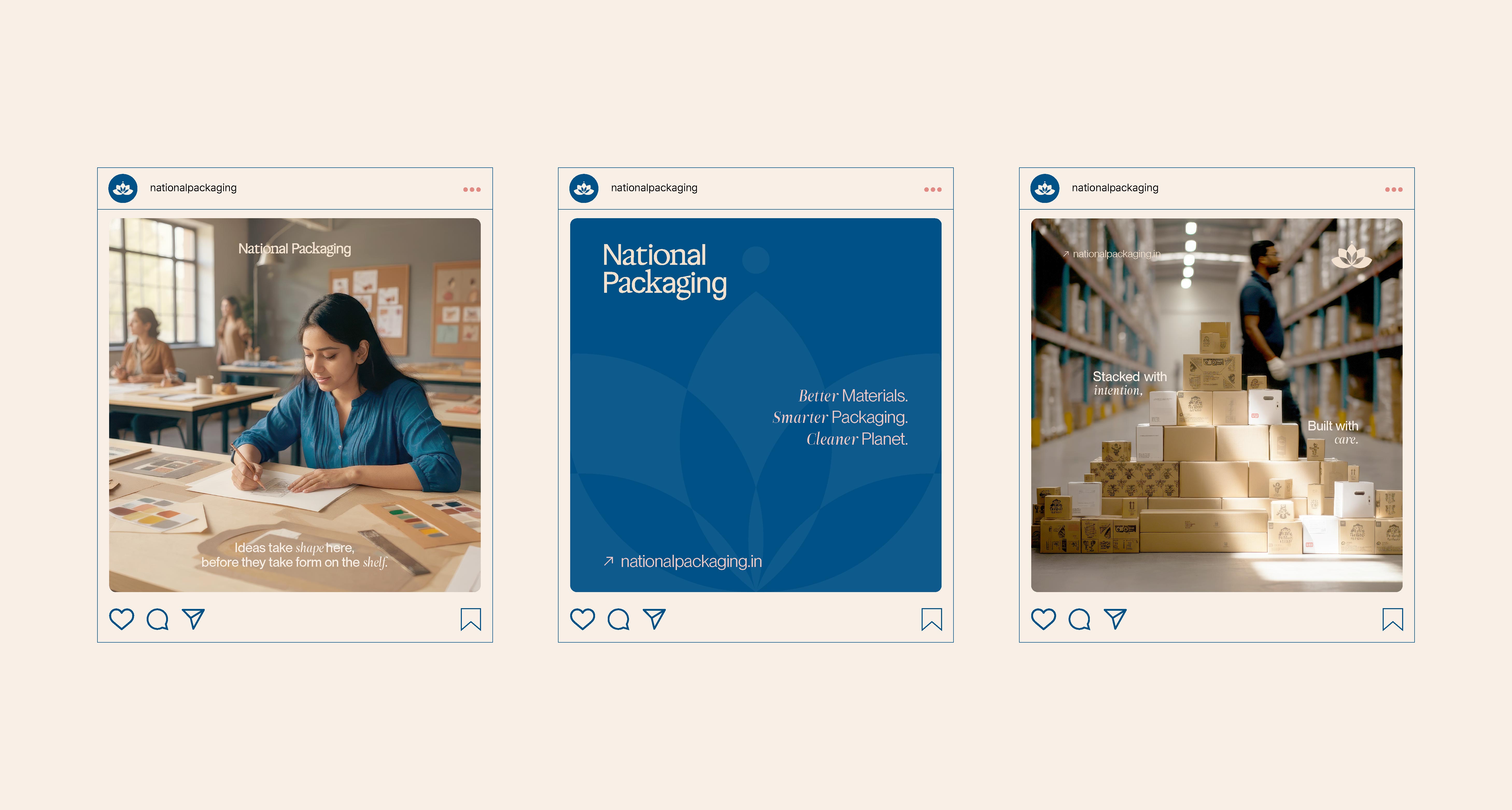
Grounded in a clear brand strategy, the design process set out to capture National Packaging’s dual spirit: rooted in Indian context, yet speaking a clean, modern visual language. The wordmark blends subtle serif nuance with sans-serif structure, achieving a balance of craft and clarity fit for B2B scale. The lotus-inspired logomark was redrawn with geometric precision, transforming a familiar cultural symbol into something quietly distinct and unmistakably contemporary. A curated color palette – Champagne Pink, Linen, Rudy Pink, Baby Pink, Midnight Blue, and Air Superiority Blue – brings warmth, sophistication, and recognisable consistency across touchpoints. Typography choices echo the brand’s confident but understated tone, while a flexible visual system guides everything from business cards and brochures to shipping boxes and digital templates. Together, these elements build a coherent brand presence that feels considered, adaptable, and deeply authentic from the physical factory floor to the digital feed.
Impact:
The result is an identity that doesn’t just mark boxes but builds perception: a modern Indian B2B brand narrative rooted in detail, clarity, and cultural depth. A visual system that brings coherence from the factory floor to the digital feed – proving that even in the most practical industries, design can speak volumes.

CREDIT
- Agency/Creative: Design.by.Souvik
- Article Title: National Packaging: Designing a Modern B2B Brand Identity Inspired by Heritage and Scale
- Organisation/Entity: Freelance
- Project Type: Identity
- Project Status: Non Published
- Agency/Creative Country: India
- Agency/Creative City: Kolkata
- Market Region: Africa, Asia, Europe, Middle East, North America, Oceania, South America, Global
- Project Deliverables: Brand Design, Brand Guidelines, Brand Identity, Brand Mark, Brand Strategy, Brand Tone of Voice, Branding, Logo Design, Packaging Design
- Industry: Manufacturing
- Keywords: Brand identity design, B2B packaging branding, Indian brand design, packaging design strategy, visual identity system, lotus inspired logo, custom wordmark design, modern brand typography, brand color palette design, packaging collaterals, digital brand presence, corporate branding, heritage inspired branding, geometric logomark, brand storytelling, professional brand design, female led brand identity, creative packaging direction, cultural visual language, scalable brand identity
-
Credits:
Brand Identity Designer: Souvik Paul


