


Founded in 1953 by the Clarins family, Élysées Marbeuf is a renowned institution specializing in the fields of luxury and beauty. With decades of expertise in training professionals for careers in aesthetics, cosmetics, wellness, and luxury services, the school holds a unique place in the history of French beauty culture. However, despite its prestige and strong legacy, the school’s visual identity had not evolved in step with its ambitions and had begun to appear outdated and disconnected from the expectations of today’s students and the high standards of the industry.
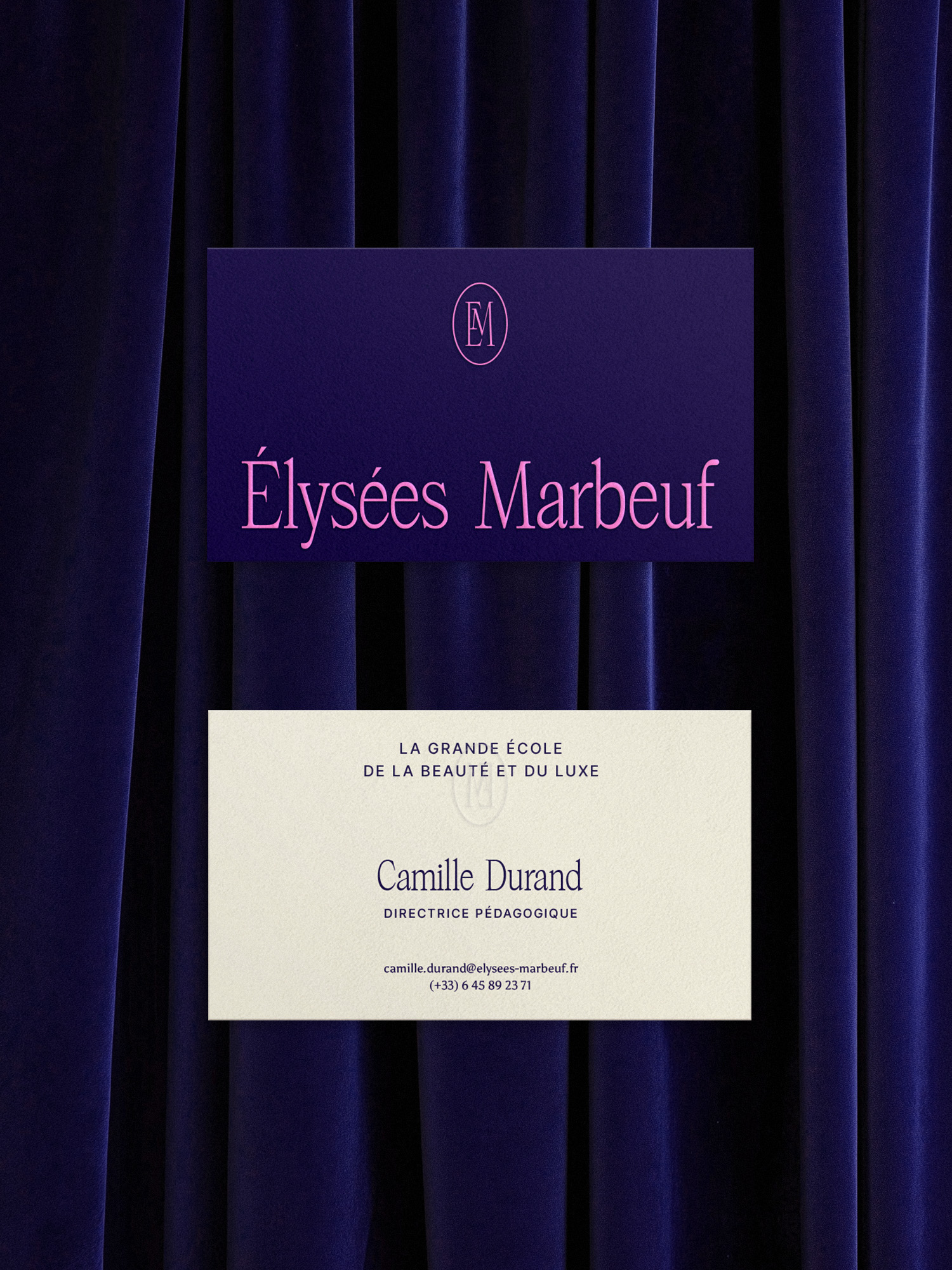
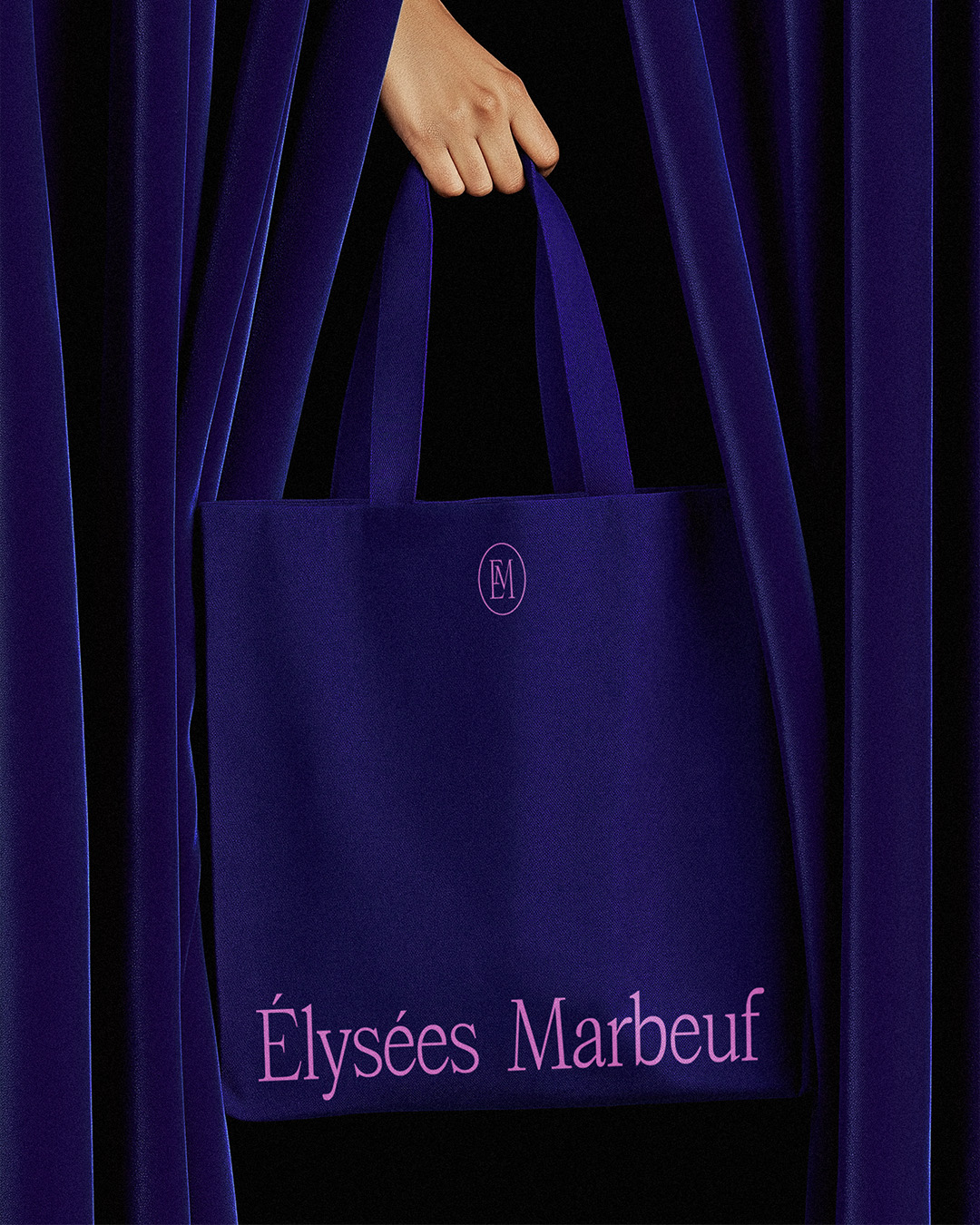
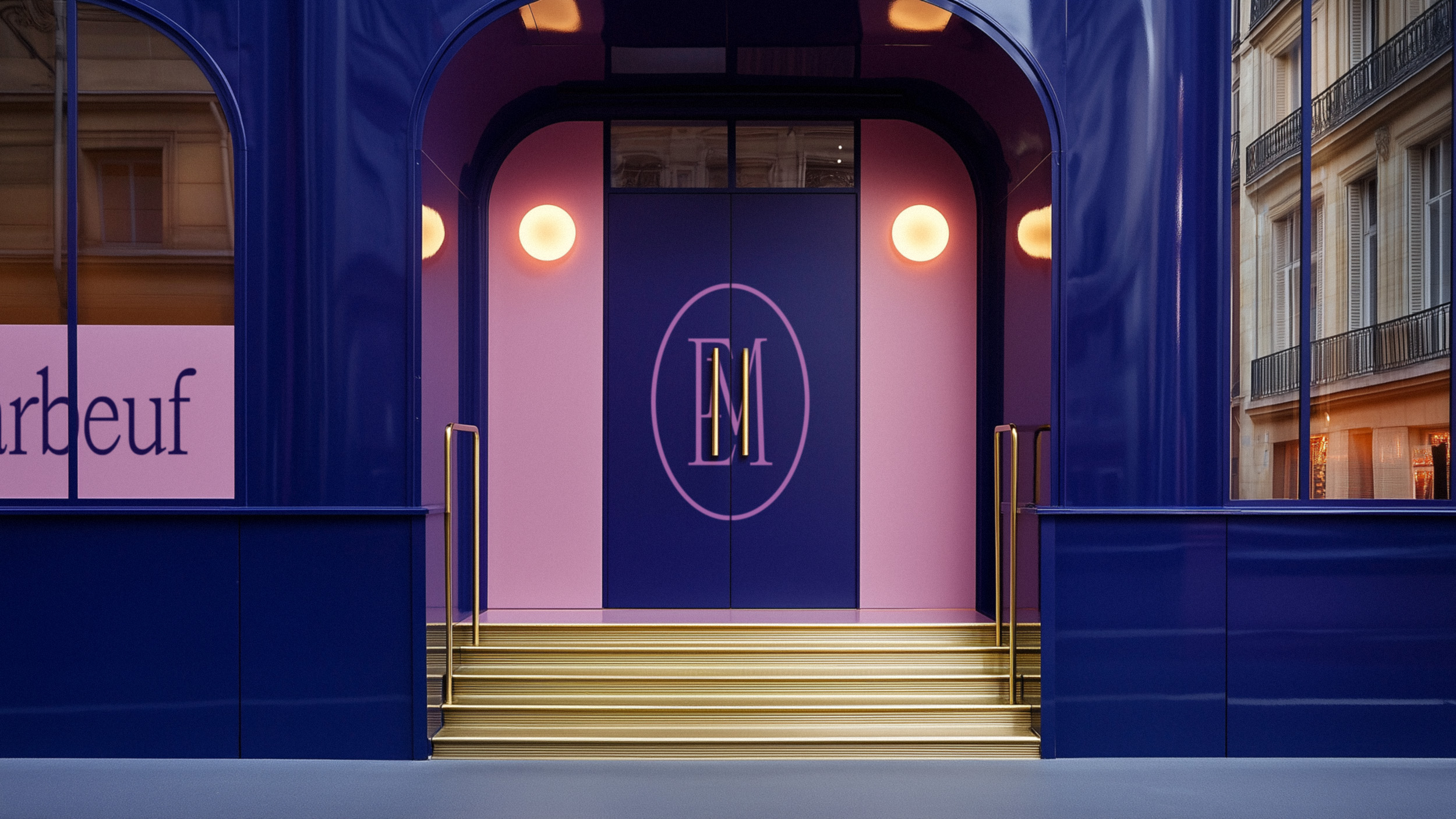
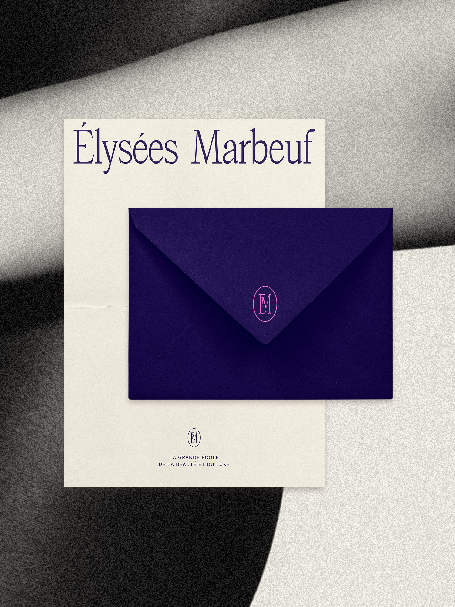
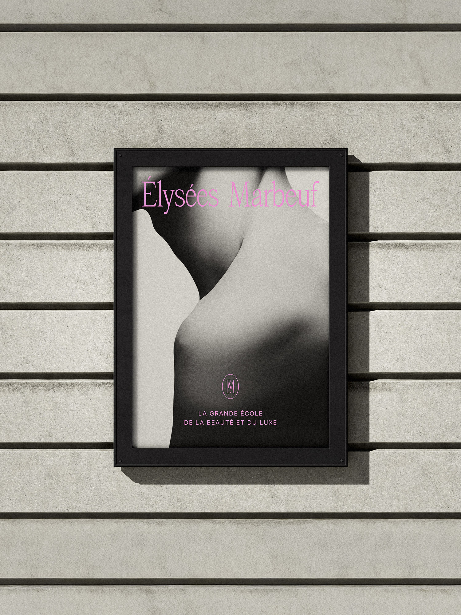
To address this, I led a comprehensive redesign of the school’s visual identity, aiming to modernize its image while honoring its heritage and reinforcing its positioning as a premium, inclusive, and forward-looking institution. At the heart of this rebranding was the creation of a new logo, set in the elegant Atelier Femme Serif typeface. This typeface was chosen for its ability to convey both character and refinement—reflecting the balance between professionalism, creativity, and elegance that defines Élysées Marbeuf.
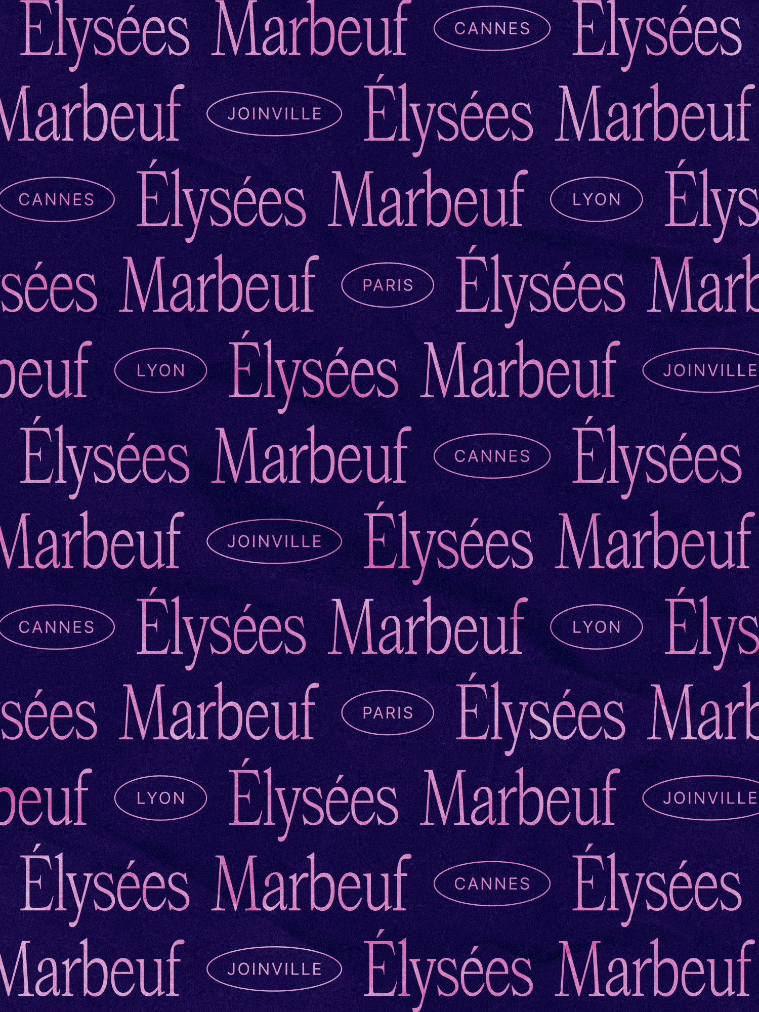
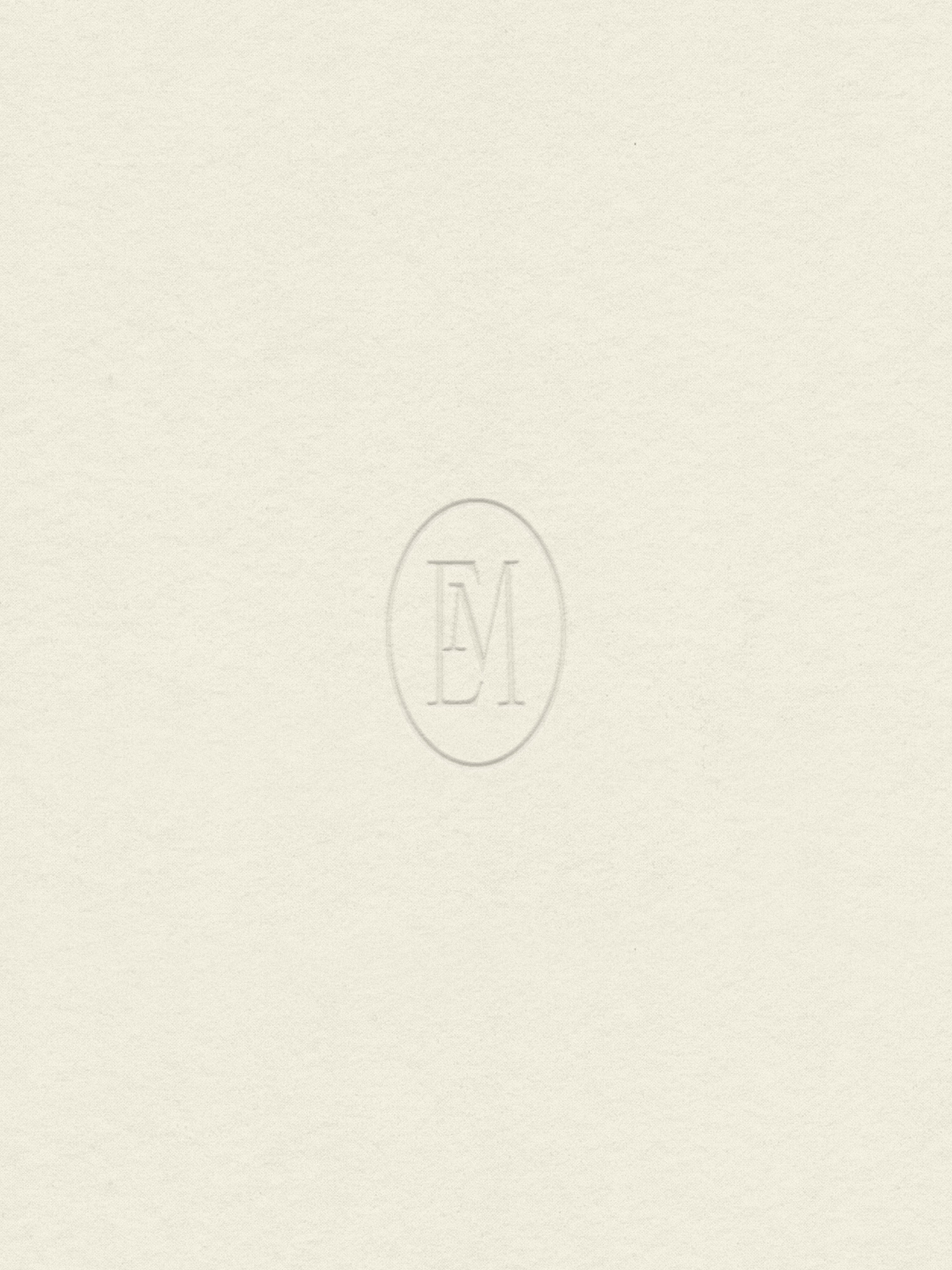
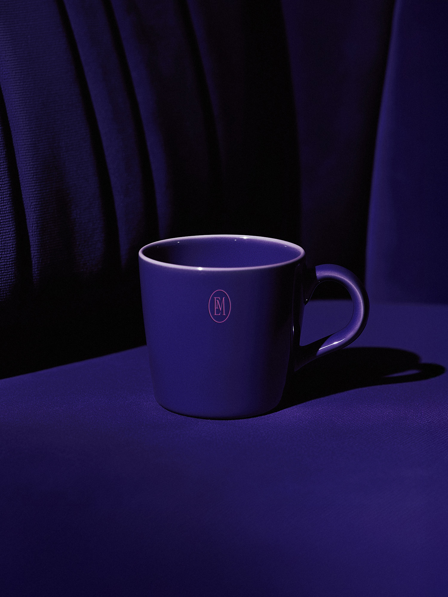
The identity system was designed to be flexible and adaptable across the school’s various campuses. Each campus benefits from its own distinct variation of the logo, maintaining visual coherence while reinforcing a sense of place and community. A custom oval monogram was also developed, subtly referencing the brand’s origins with Clarins and adding a timeless, almost emblematic, touch to the identity.
In parallel with the logo redesign, the photographic direction was carefully considered to differentiate the school from competitors in the beauty education sector. Many institutions rely on generic, overly polished visuals featuring models posed in static, often emotionless scenarios. To break away from this aesthetic, I chose to focus on authenticity, craftsmanship, and human connection.
The resulting imagery captures real-life moments within the school: students practicing techniques, sharing experiences, and engaging in hands-on learning. Close-ups highlight the precision of gestures and the emotional richness of the learning environment. This visual approach brings to the forefront the core values of Élysées Marbeuf—technical excellence, creativity, and human sensitivity.
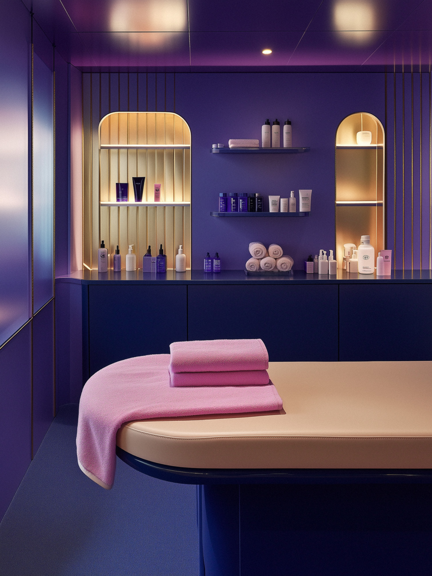
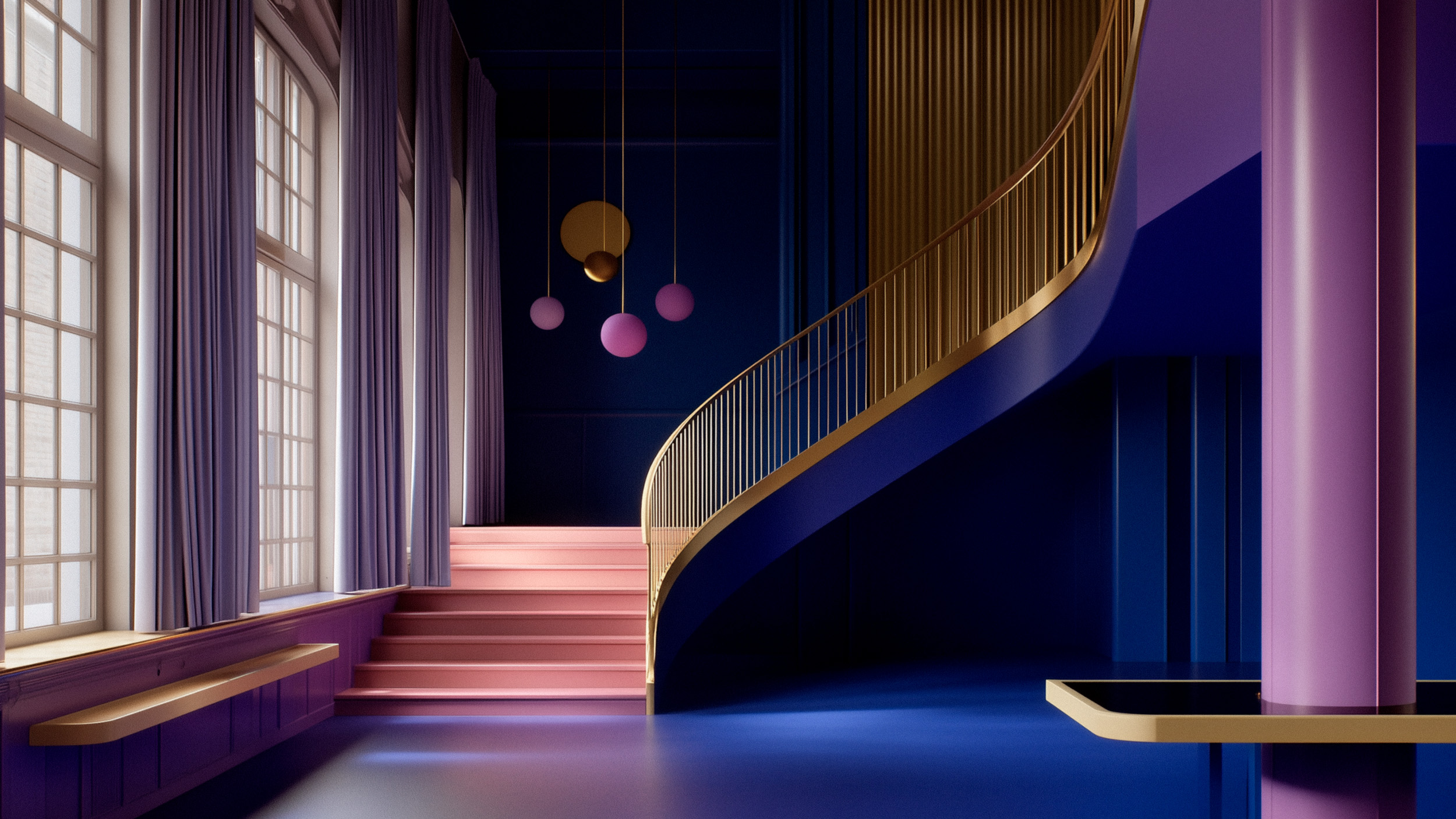
The new color palette was designed to evoke both sophistication and warmth. A vibrant fuchsia pink adds a bold, contemporary energy; a deep midnight blue brings a sense of trust and depth; and a soft linen beige balances the composition with elegance and calm. To add texture and emotion, images are treated with a refined black-and-beige duotone effect and a subtle grain, creating a cohesive and expressive visual universe.
Altogether, this rebranding project repositions Élysées Marbeuf as a modern, aspirational, and inclusive leader in beauty education—one that remains rooted in tradition while confidently embracing the future.
CREDIT
- Agency/Creative: Chloé Camille
- Article Title: Visual Identity Redesign for a French Luxury and Beauty School Élysées Marbeuf to Modernize Its Image and Emphasize Its Premium Positioning
- Organisation/Entity: Freelance
- Project Type: Identity
- Project Status: Published
- Agency/Creative Country: France
- Agency/Creative City: Paris
- Market Region: Europe
- Project Deliverables: Brand Design, Brand Guidelines, Brand Identity, Brand Redesign, Branding, Graphic Design, Logo Design
- Industry: Beauty/Cosmetics
- Keywords: Beauty School, Luxury School, Branding, Rebranding, Logo, Education
-
Credits:
Art director & Graphic Designer: Chloé Camille


