


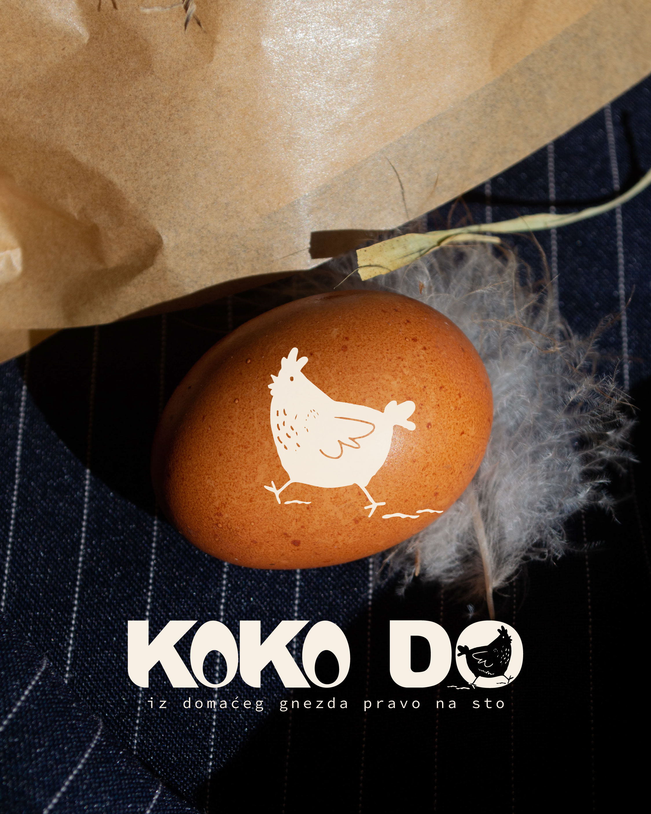
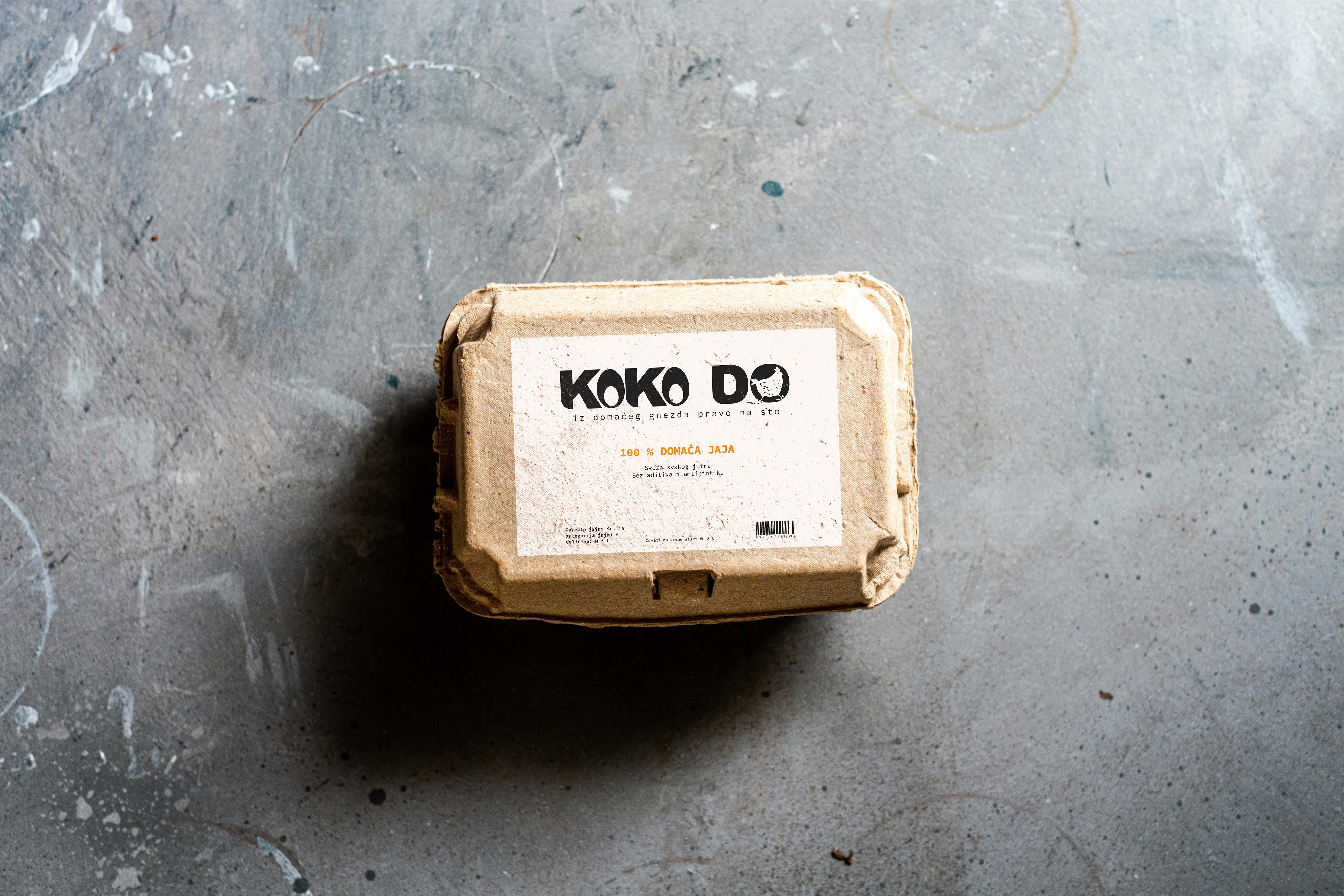
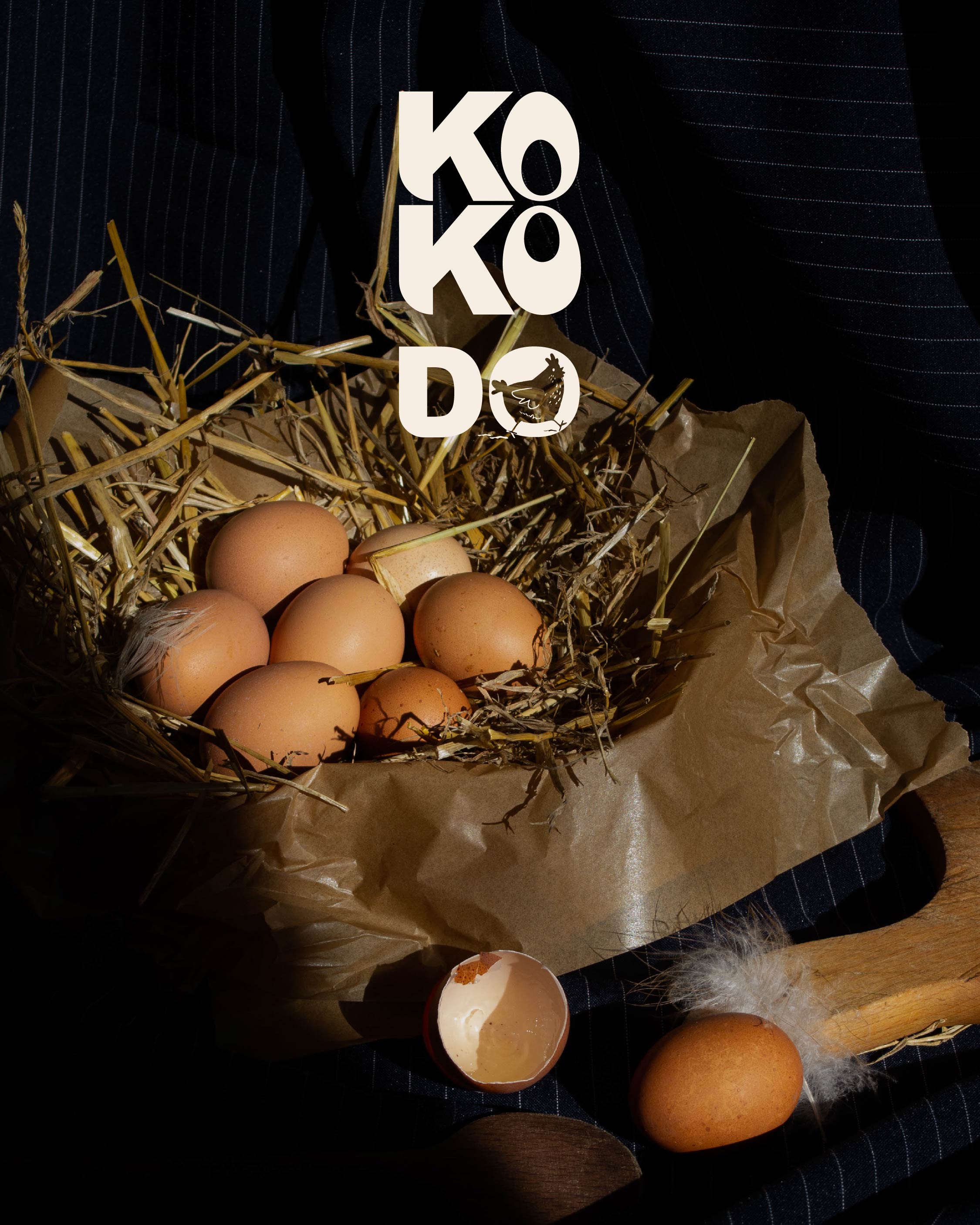
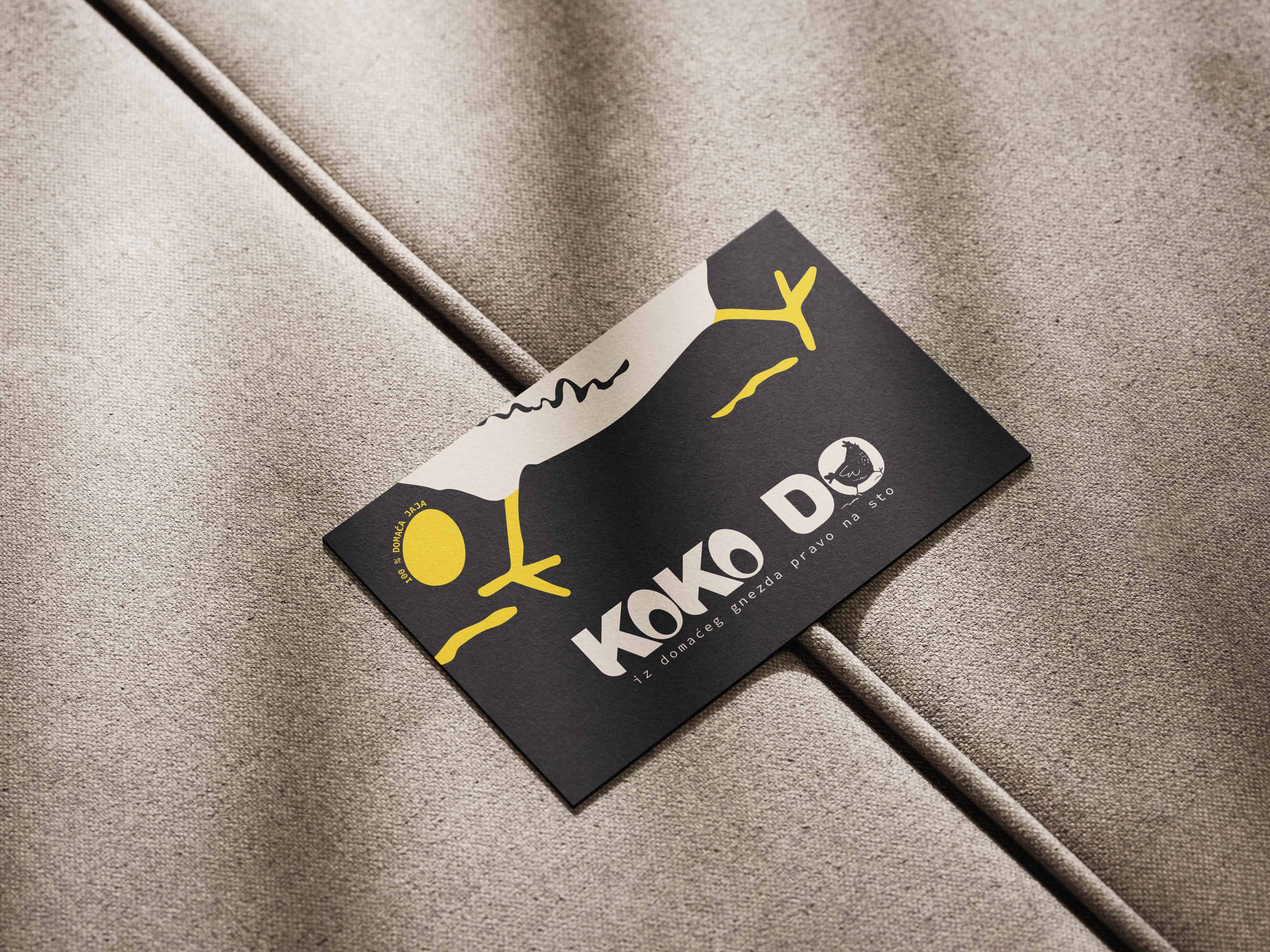
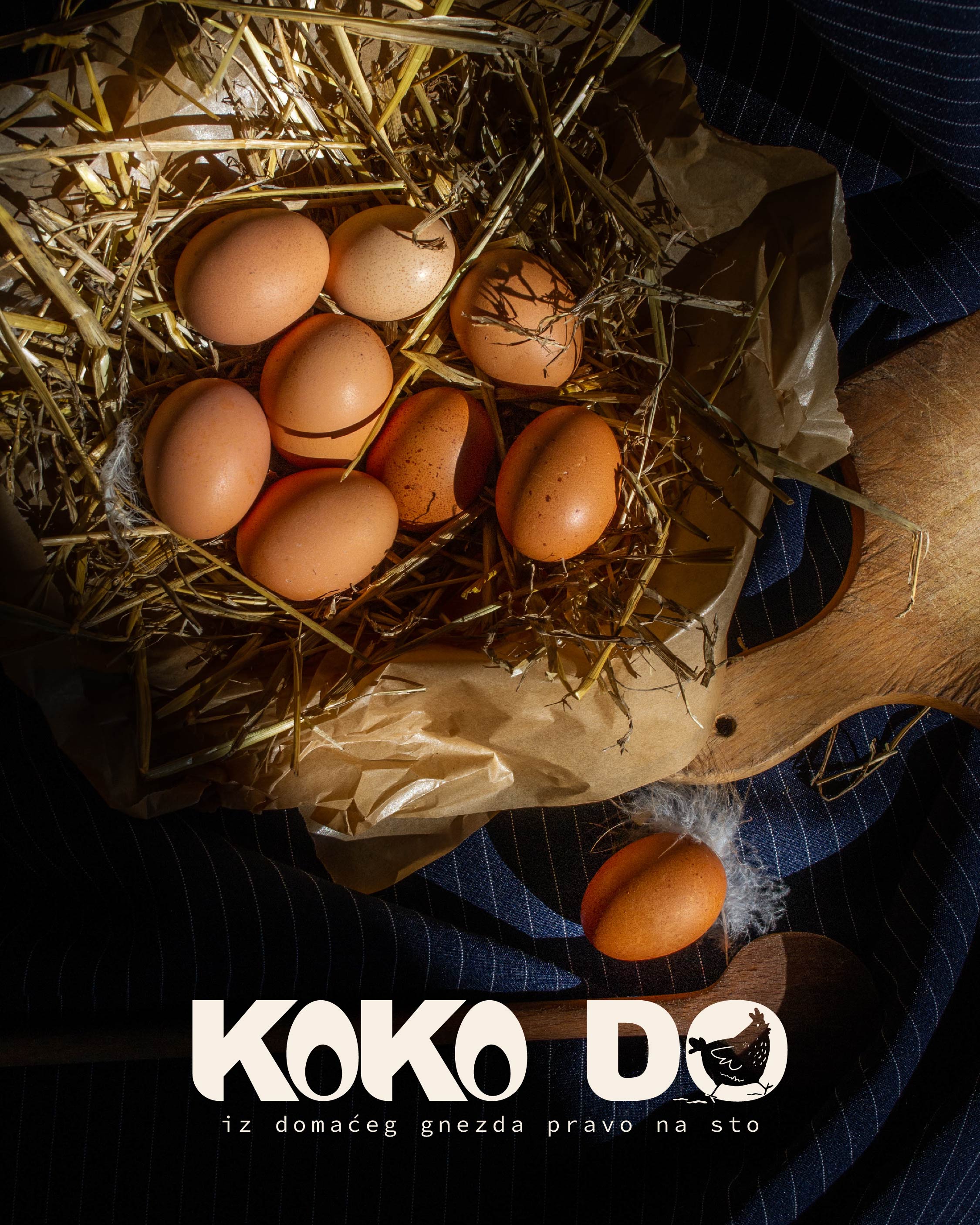
Koko Do is a locally-inspired brand dedicated to delivering 100% fresh, organic eggs from free-range hens raised in a healthy and natural environment. The visual identity was designed to reflect the authenticity and purity of the product, emphasizing trust, tradition, and the rural roots of the brand. The packaging and logo aim to communicate both the freshness and origin of the eggs “from the local nest, straight to the table.”
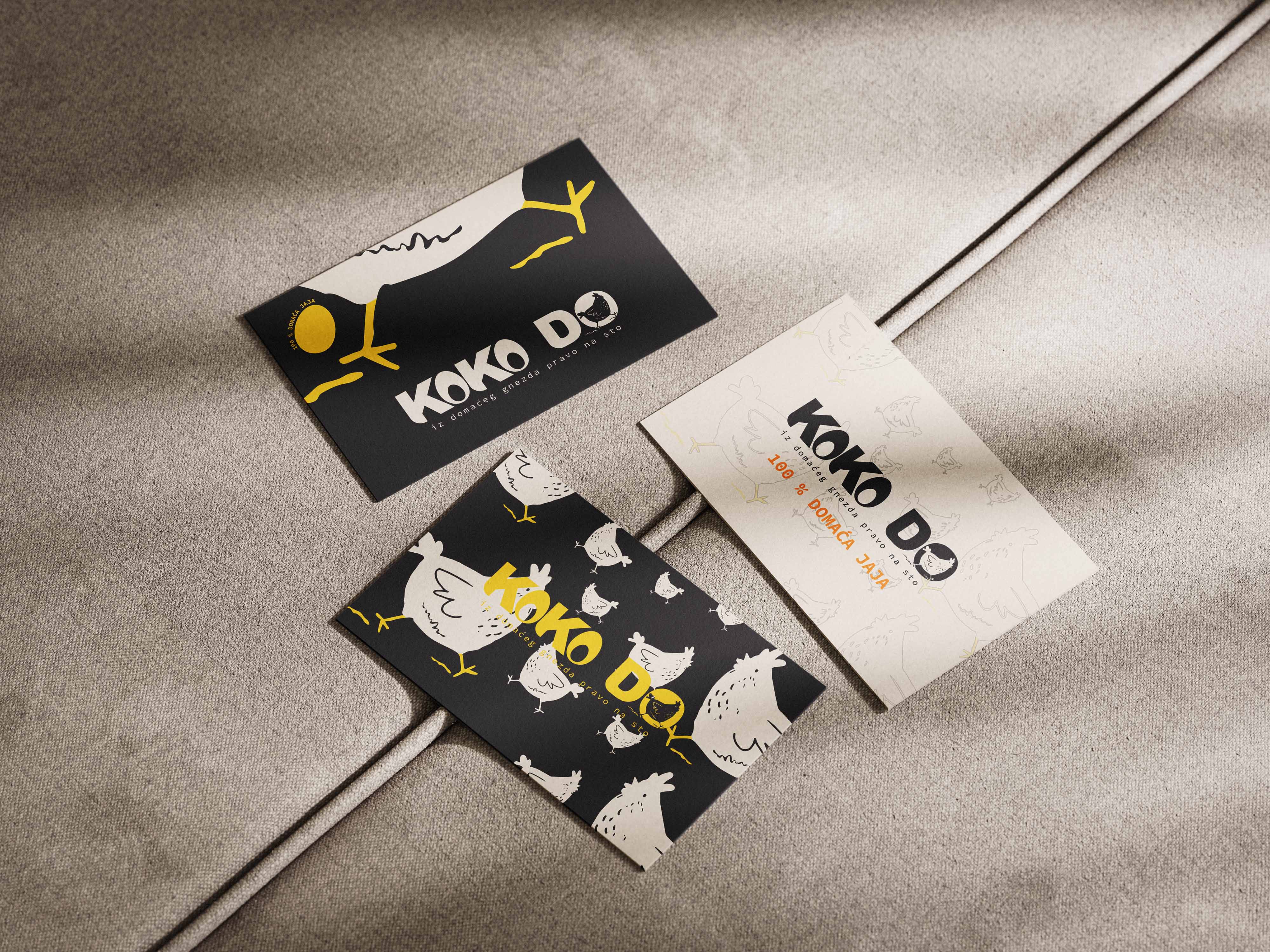
The concept revolves around a rustic yet modern aesthetic. The brand name “Koko Do” is playful, memorable, and mimics the sound of a chicken, immediately evoking the core product. The bold typography, paired with organic textures and neutral tones, helps the brand stand out on the shelves while maintaining a handcrafted, earthy feel. Special attention was paid to achieving a balance between simplicity and identity strength, ensuring recognizability in both digital and physical contexts.
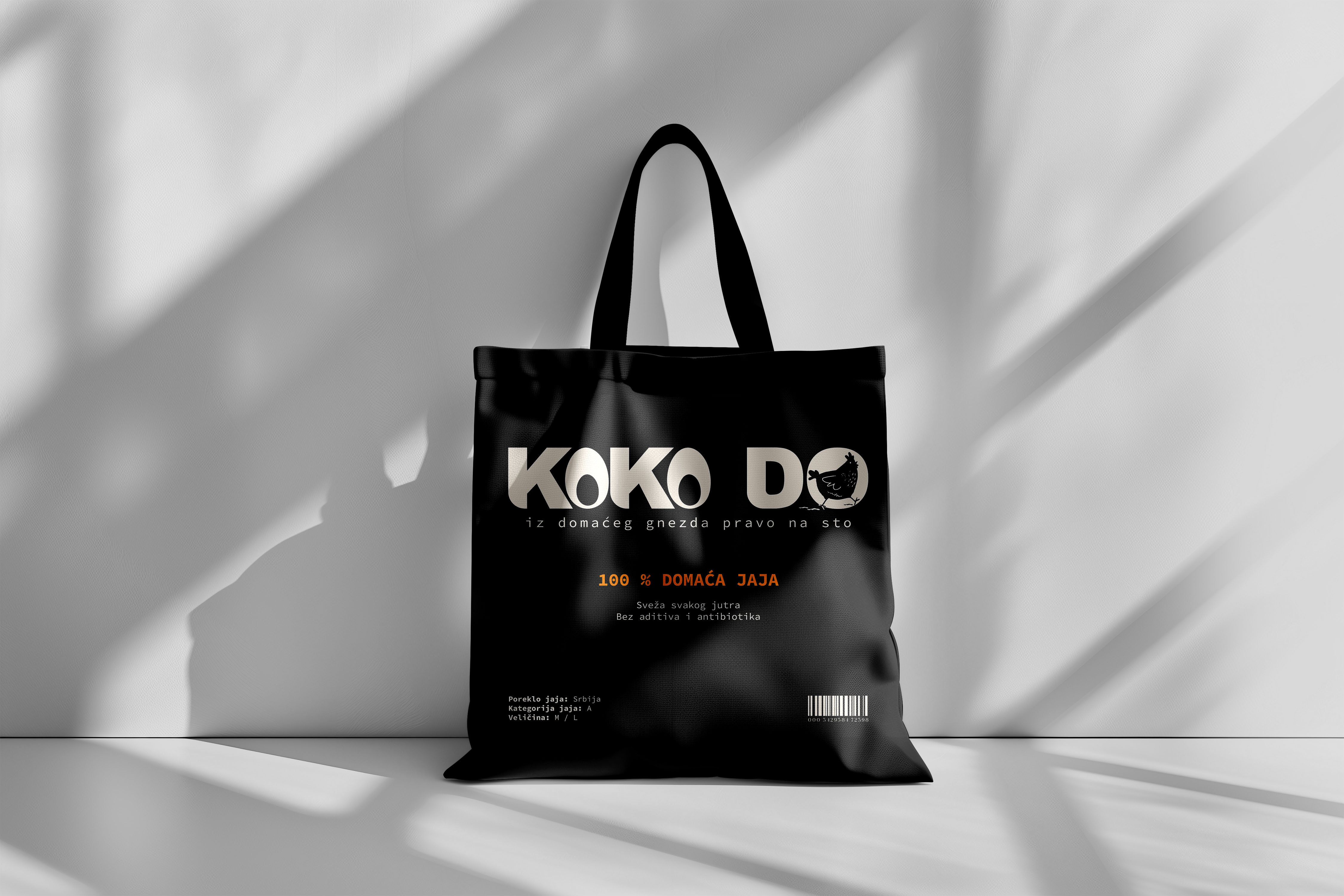
The packaging is made from eco-friendly, recycled material, aligning with the brand’s values of sustainability and care for nature. The label design is minimalist and functional, featuring essential product information such as “100% domaća jaja” (100% local eggs), and the slogan “iz domaćeg gnezda pravo na sto” (from a local nest straight to your table), which reinforces the product’s origin and freshness.
The visual system is scalable and adaptable, with future potential for brand extensions including promotional materials, outdoor campaigns, and other product lines. The branding was developed to be flexible across platforms, ensuring consistency in print, web, and social media use.
This project was developed with a full-scope design process: from concept development and logo design to visual identity guidelines and packaging layout.
CREDIT
- Agency/Creative: Tijana Katic
- Article Title: Koko Do Fresh Farm Eggs Branding and Packaging Design by Tijana Katic
- Organisation/Entity: Freelance
- Project Type: Product
- Project Status: Non Published
- Agency/Creative Country: Serbia
- Agency/Creative City: Trstenik
- Market Region: Europe
- Project Deliverables: Art Direction, Brand Design, Branding, Design, Digital Art, Drawing, Graphic Design, Illustration, Label Design, Logo Design, Packaging Design, Photography, Textile Design, Typography
- Industry: Food/Beverage
- Keywords: Packaging Design, Logo Design, Branding, Visual Identity, Food Packaging, Egg Packaging, Sustainable Design, Eco-friendly, Rustic, Minimalist, Farm Fresh, Organic, Typography, Serbian Brand, KOKO DO, Fresh Eggs, Graphic Design
-
Credits:
Concept, Logo Design, Packaging, and Visual Identity Development: Tijana Katic


