


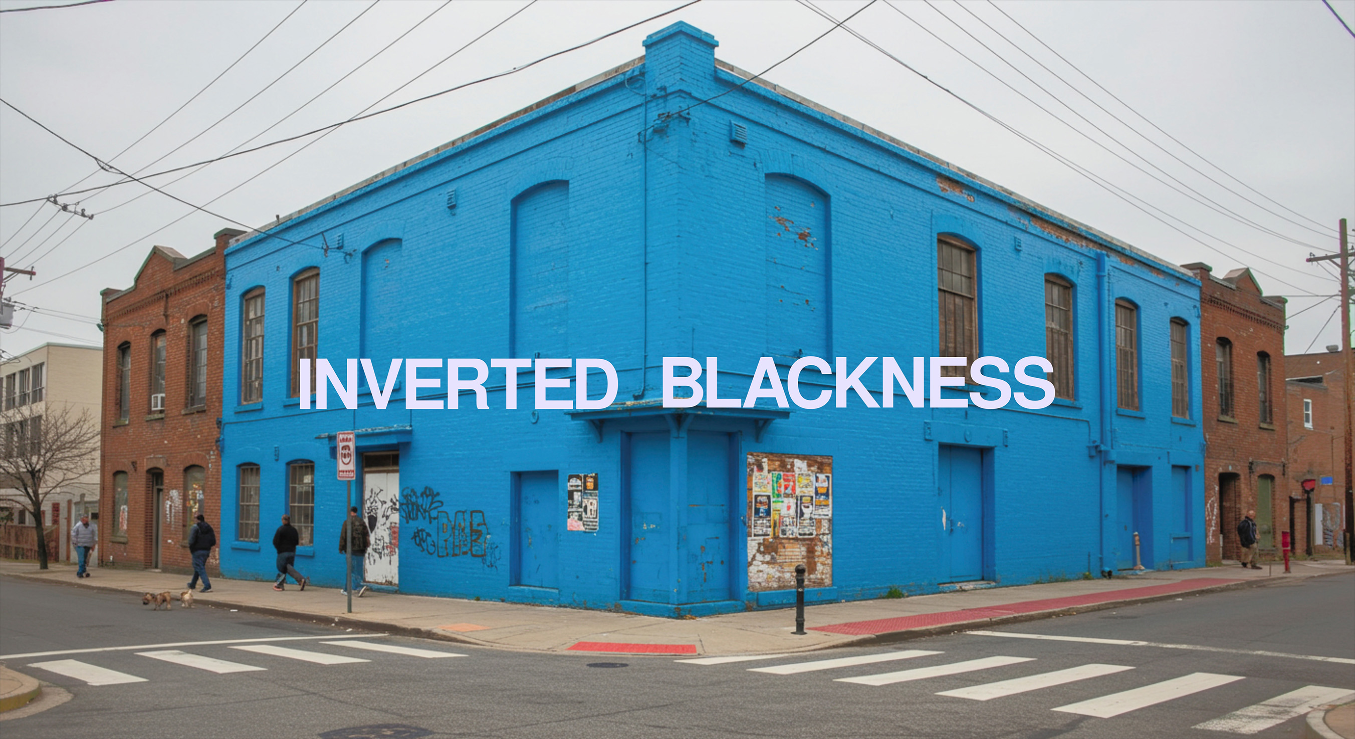
Inverted Blackness: Unframed Stories
Inverted Blackness is a gallery initiative dedicated to reframing how Black identity is perceived and presented. Through photography, storytelling, and visual inversion, it challenges societal narratives by encouraging viewers to see Blackness not as fixed or monolithic, but as layered, fluid, and full of contradictions.
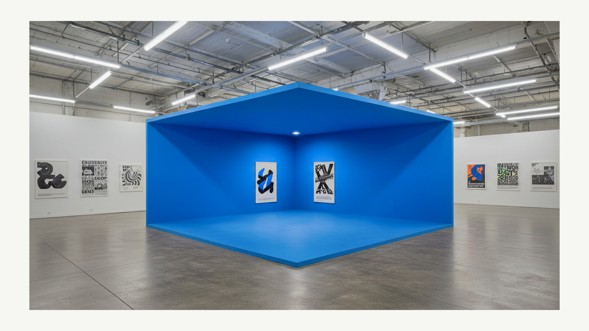
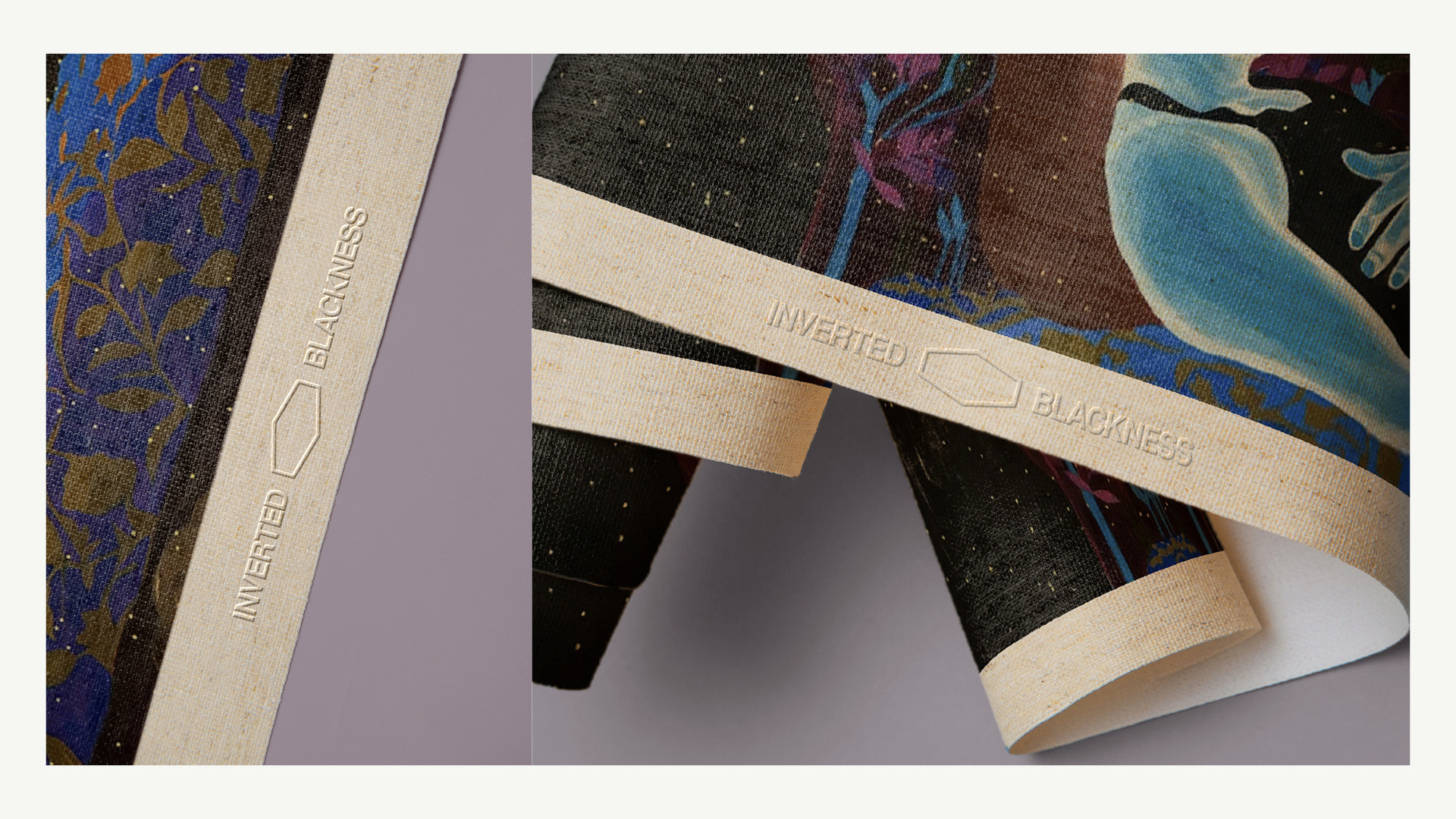
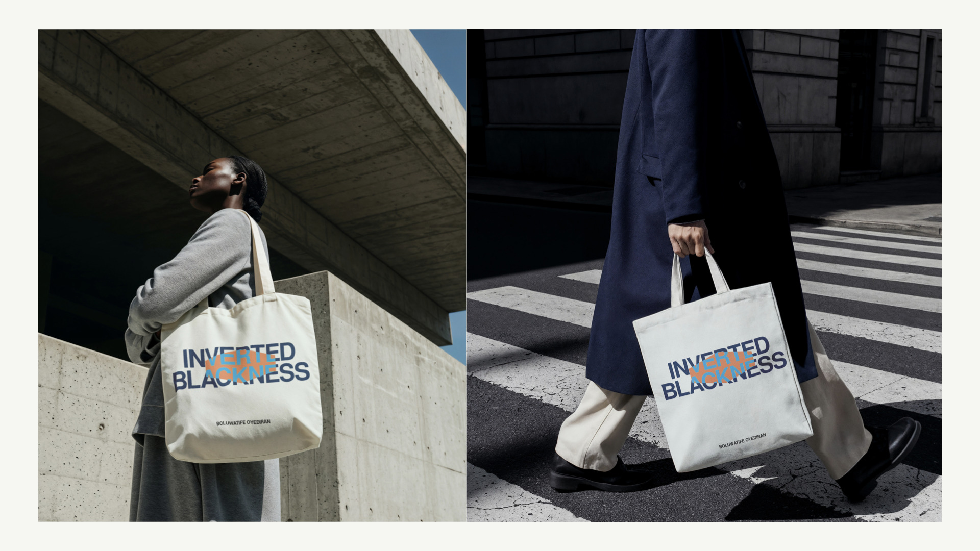
The aim was to design a brand identity that could hold space for this complexity—a system that felt alive, flexible, and grounded in perspective. More than a logo, the brief called for a mark that could evolve with the stories it represents. The project spanned research, conceptual development, visual identity, motion design, and applications across apparel, gallery installations, and digital touchpoints.
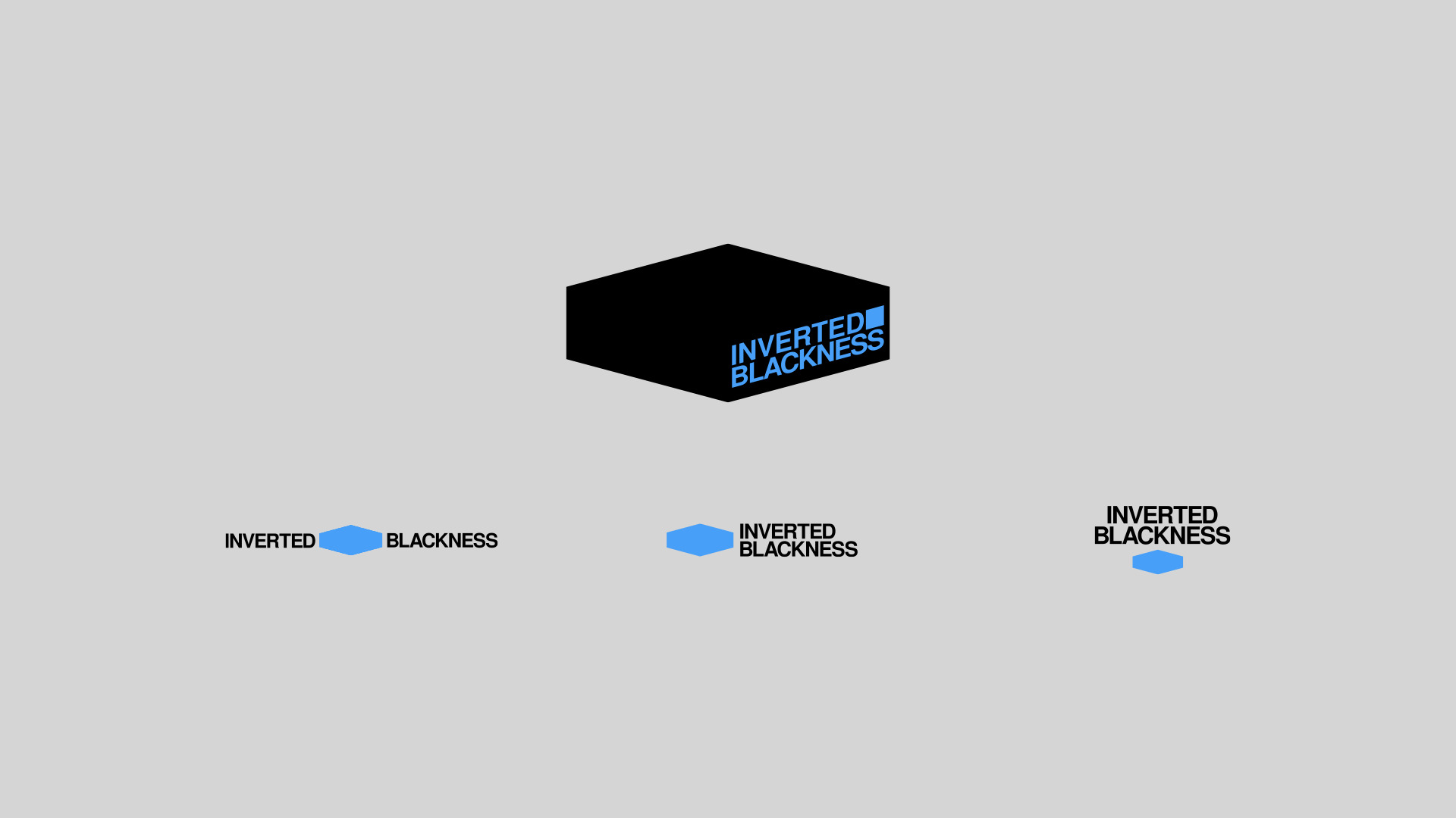
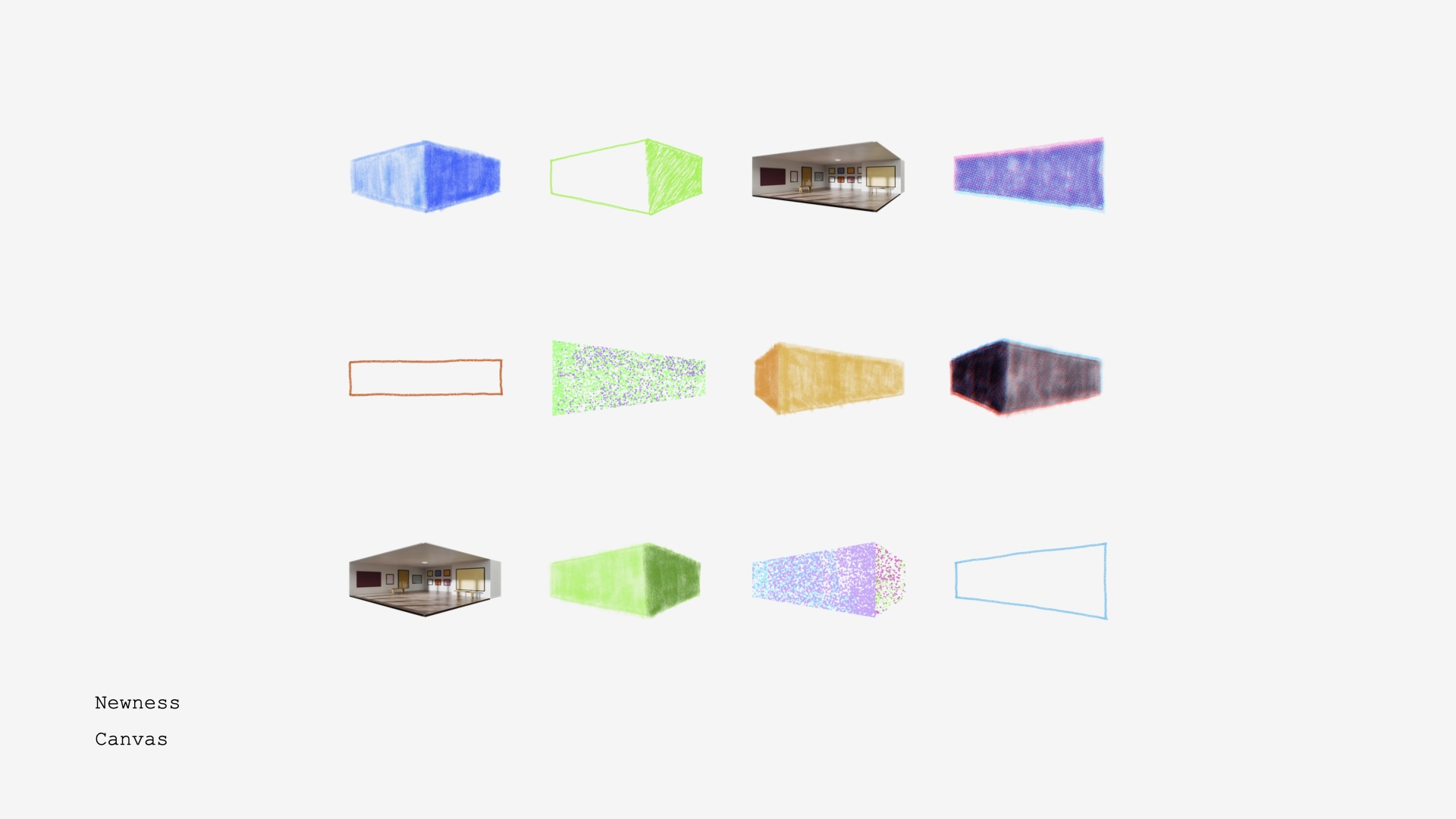
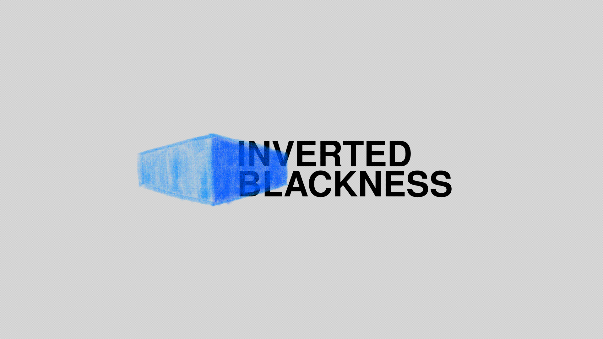
The result is a living visual system anchored by a dynamic hexagonal form—part box, part canvas, part invitation. Each use offers a new lens through which to see the work, reflecting the project’s core principle: to unframe the narrative and invite multiplicity.
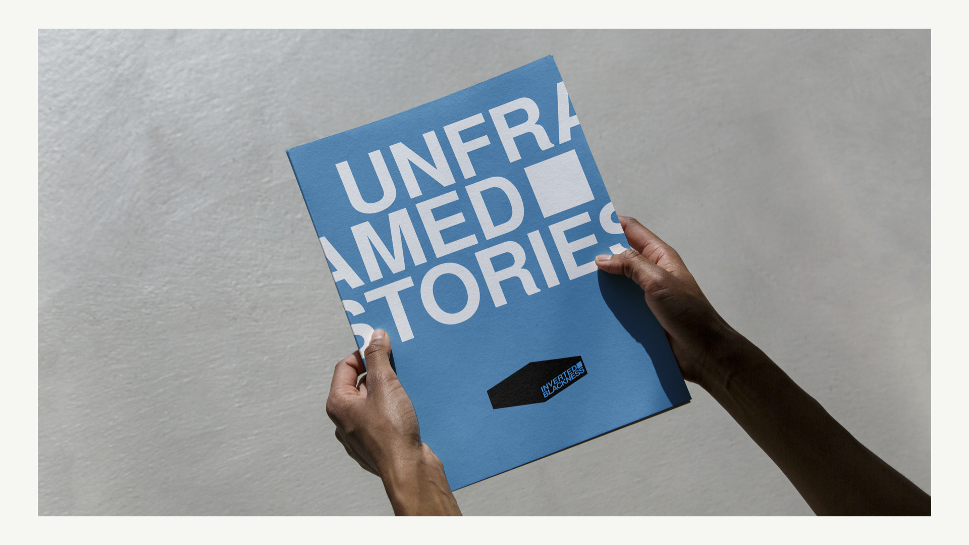
The design process began with a deep exploration of what “inverted Blackness” could mean beyond visuals—emotionally, politically, and culturally. Rather than approach it as a simple logo exercise, I treated it as a narrative system. We developed the conceptual direction Unframed Stories, a theme centered on shifting perspectives and refusing to contain identity within imposed boundaries.
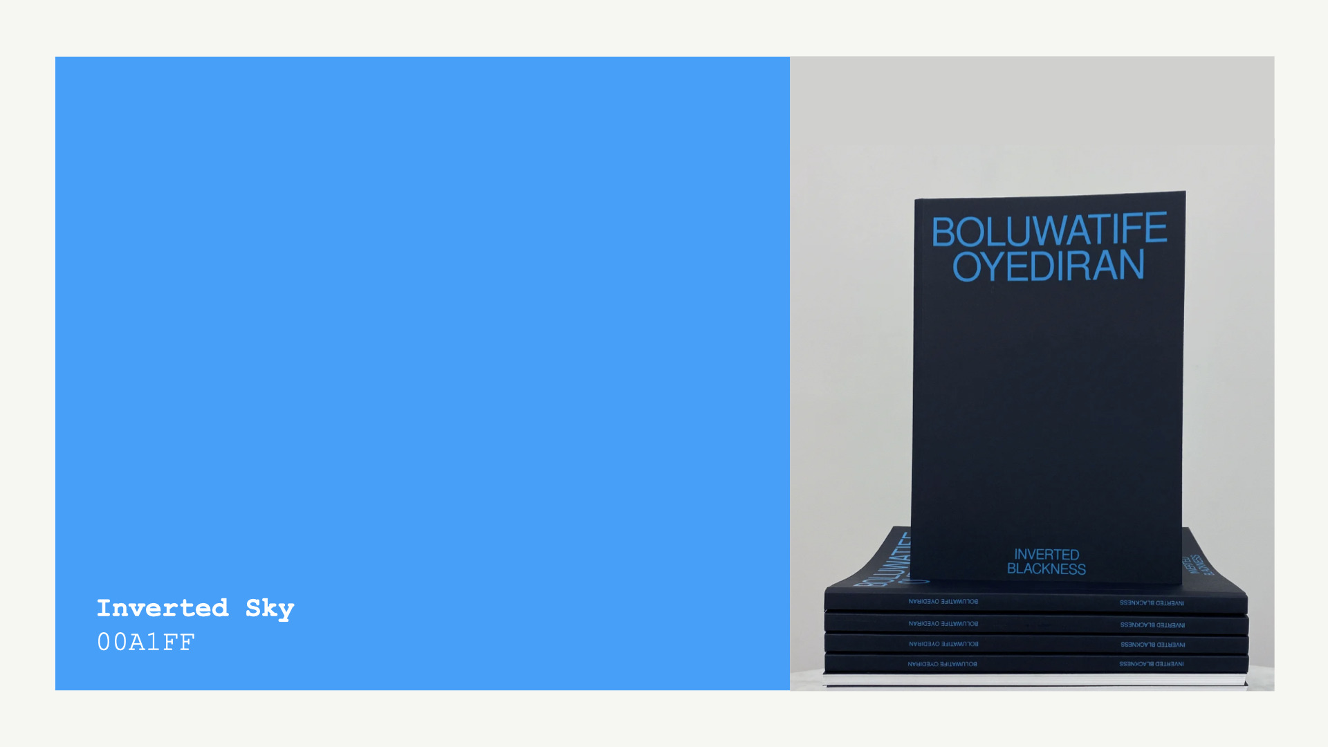
Visually, I explored the idea of a frame-as-box—as both limitation and container. This led to the development of a three-dimensional hexagonal form that could feel static or dynamic depending on how it’s viewed. Typography and color (notably Cerulean Blue) were chosen to reflect emotional clarity and visual inversion, with special attention to how color shifts echo the project’s themes.
Client feedback helped refine the layout, type, and use cases. The mark eventually evolved into a modular identity—one that could live on apparel, in galleries, or even as architectural interventions. Collaborators contributed alternate styles of the logo, forming a rotating system that invites reinterpretation with each use. The final output is not a fixed symbol, but a living identity that can stretch and shift alongside the stories it represents.

CREDIT
- Agency/Creative: Alamu Temitayo
- Article Title: Alamu Temitayo Designs a Living Identity for Inverted Blackness That Reframes Narrative Space
- Organisation/Entity: Freelance
- Project Type: Identity
- Project Status: Published
- Agency/Creative Country: Nigeria
- Agency/Creative City: Ibadan
- Market Region: Africa, North America
- Project Deliverables: Brand Identity, Creative Direction, Graphic Design, Identity System, Logo Design, Motion Graphics
- Industry: Entertainment
- Keywords: Logo Design, storytelling, brand identity
-
Credits:
Brand Designer: Temitayo Alamu


