


Born in Vancouver, Canada, Hometown Coffee was founded by a Colombian-Chinese couple who left their countries behind —but not their identity— to build something of their own. This brand is not a nostalgic wink to the past or a migrant postcard: it’s a statement of power. A declaration of belonging, built from scratch by two hands, two accents, and one shared vision.
From the beginning, the project was conceived as a visual system with both heart and structure. The name “Hometown” isn’t about geography —it’s about connection. About everything you carry with you when you leave. And what you choose to plant again.
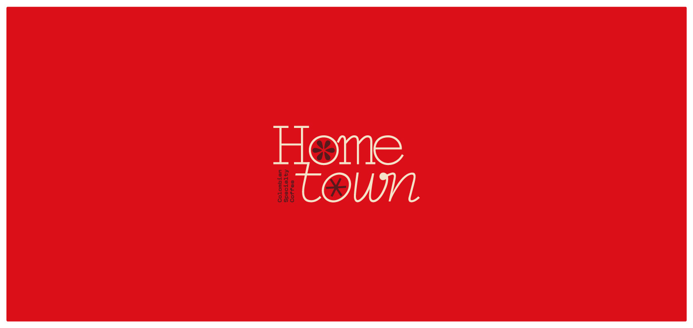
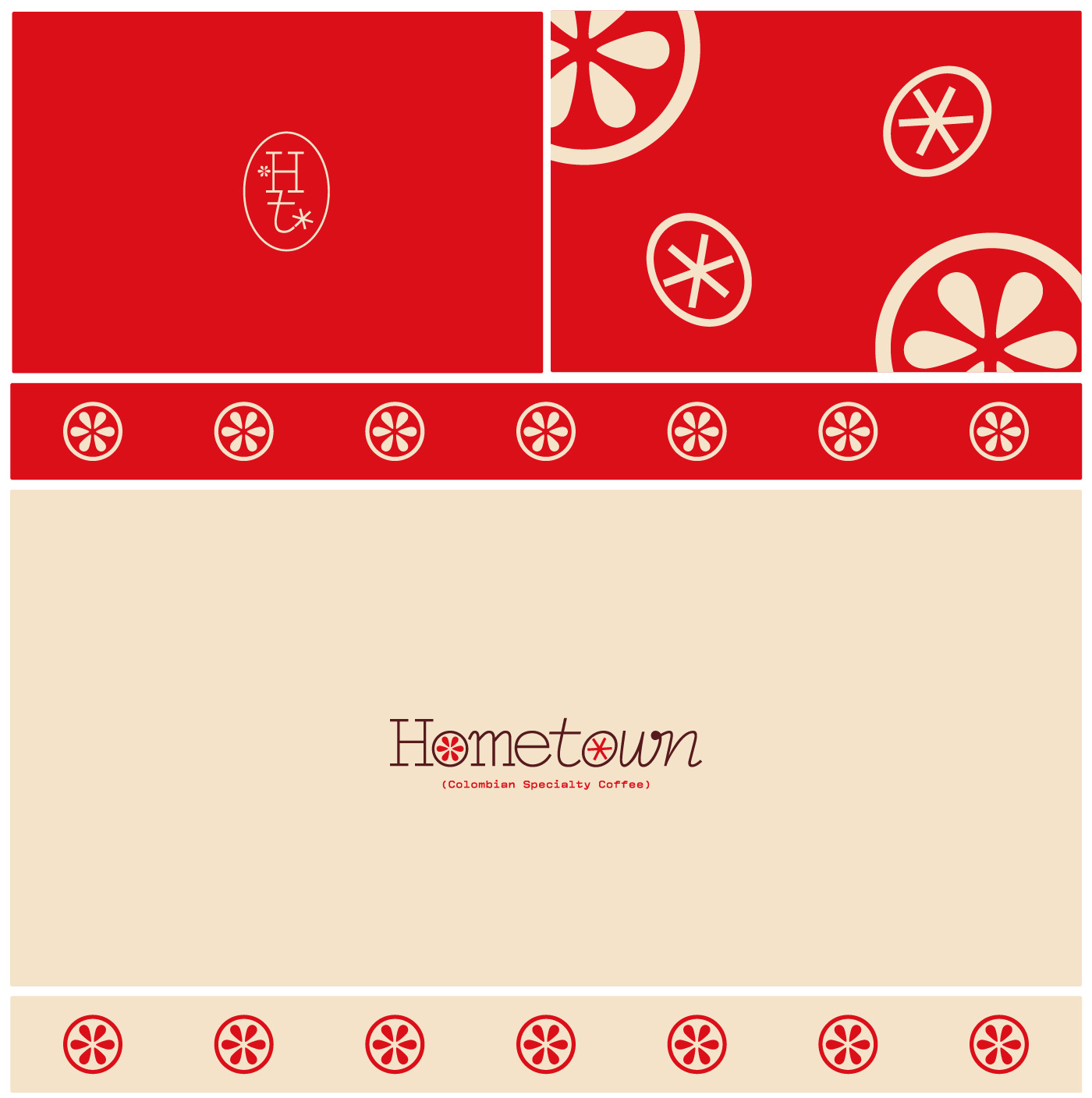
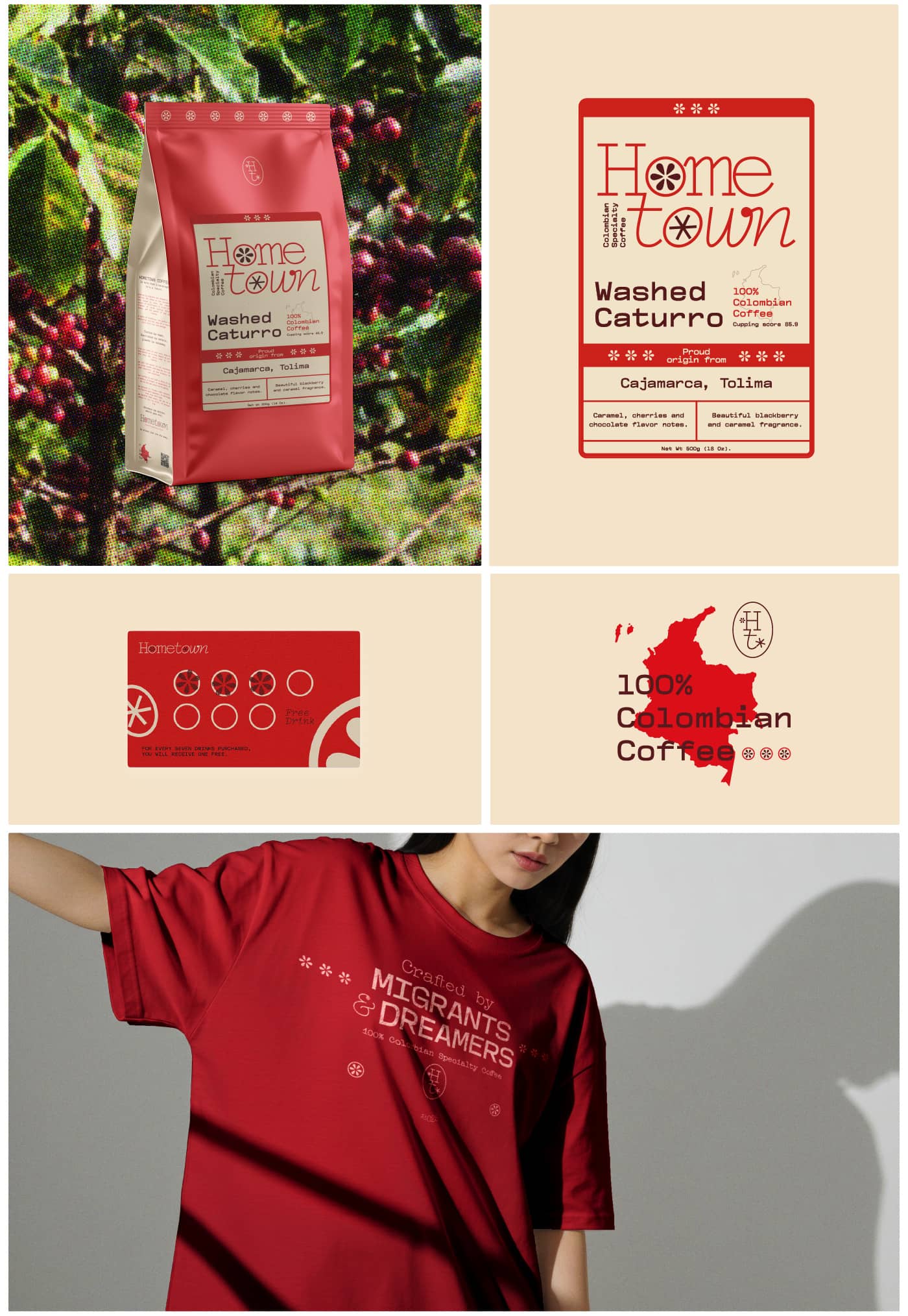
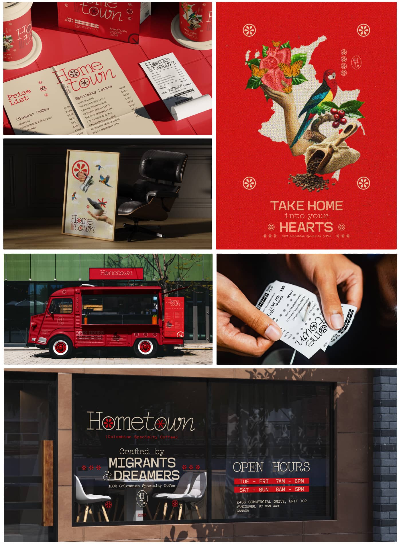
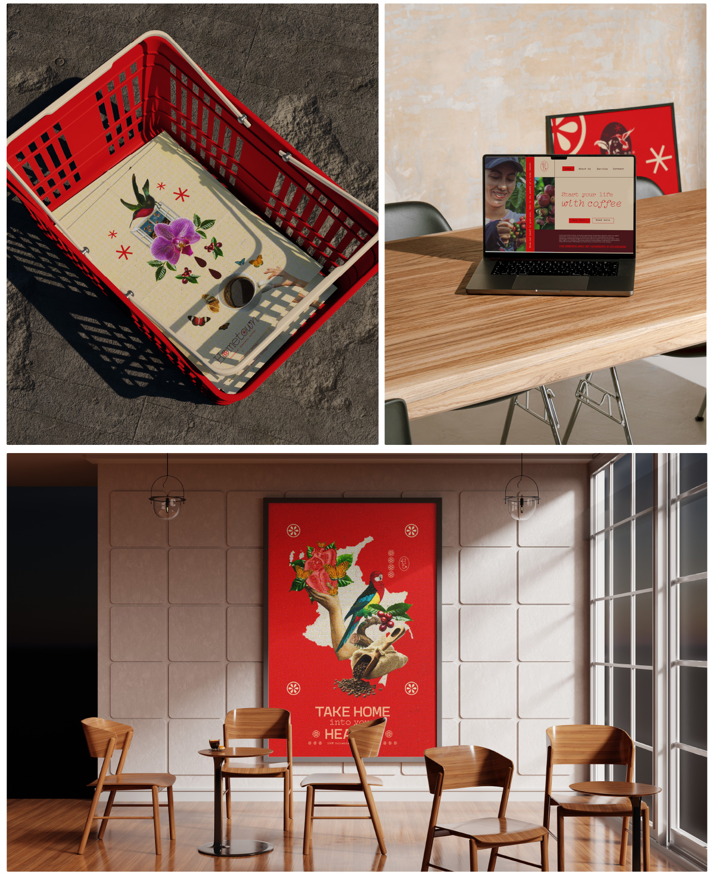
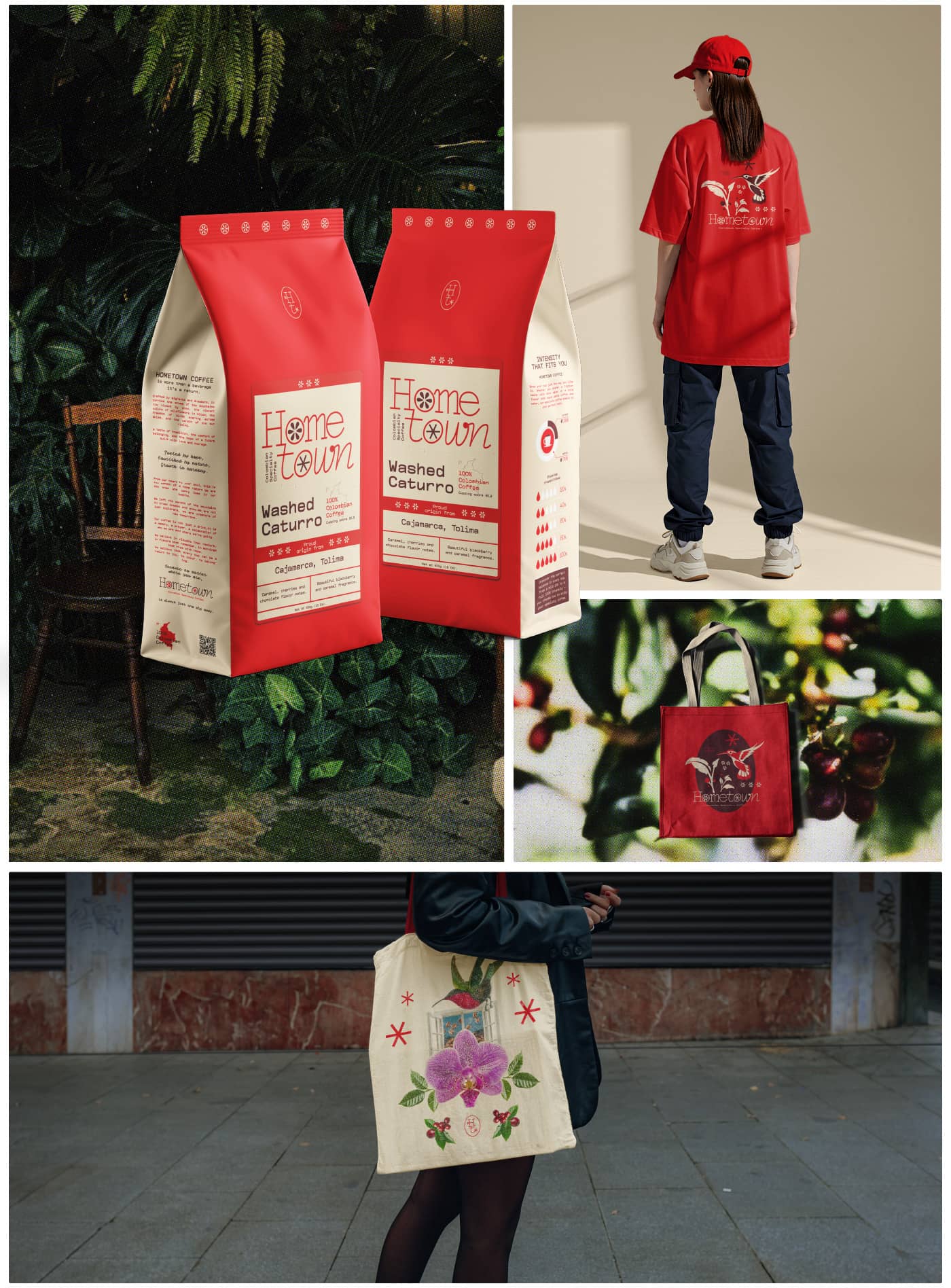
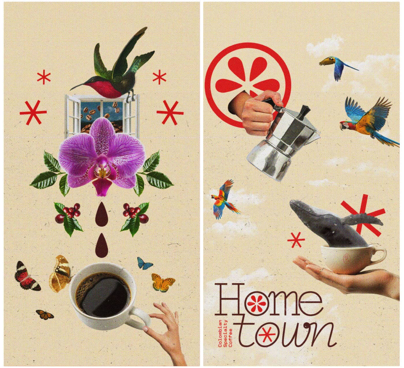
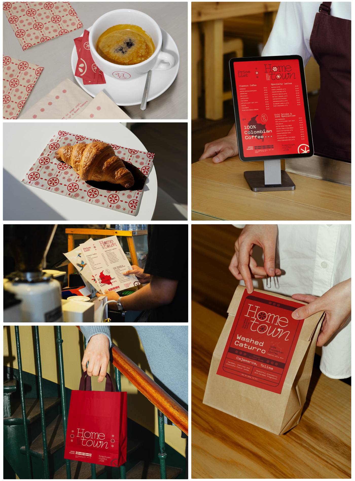
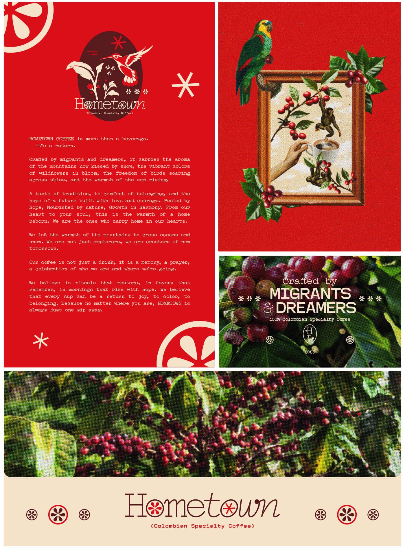
Red was the starting point. Not a trend, but an instinct. It later revealed its meaning: the power of red as a cultural bridge, as shared blood, as a symbol of celebration across both East and Latin America. That idea became the emotional and chromatic backbone of the system, present in the logotype, accents, illustrations, and backgrounds.
The identity is typographic at its core, built around a serif typeface with an editorial, rather than decorative, logic. It conveys warmth and solidity —a voice that doesn’t need to raise its tone to be heard. Supporting texts use variations: a simple sans serif and a lighter, more curved serif. Clear supporting fonts that prioritize functionality without competing for attention.
Visually, Hometown avoids the obvious. No nostalgic landscapes, no travel symbols, no tired migration clichés. Just intentional decisions: white space used as an active design element, modular structures, and a clean, scalable graphic system that holds emotional weight. This brand doesn’t sell origin —it builds presence. Hometown Coffee is about shared rituals, the quiet strength of the everyday, and that small miracle we all seek: feeling at home, even when we’re far away. Because sometimes, belonging is as simple as a warm cup of coffee served with intention.

CREDIT
- Agency/Creative: Kiddo™ Estudio
- Article Title: Hometown Coffee: A Migrant Love Story Brewed in Vancouver by Kiddo Estudio
- Organisation/Entity: Agency
- Project Type: Identity
- Project Status: Published
- Agency/Creative Country: Colombia
- Agency/Creative City: cali
- Market Region: Africa, Asia, Europe, Middle East, North America, Oceania, South America, Global
- Project Deliverables: 2D Design, 3D Art, 3D Design, Advertising, Art, Art Direction, Brand Creation, Brand Design, Brand Experience, Brand Guidelines, Brand Identity, Brand Mark, Brand Strategy, Brand Tone of Voice, Brand World, Branding, Copywriting, Creative Direction, Design, Digital Art, Editorial Design, Environmental Graphics, Graphic Design, Identity System, Illustration, Logo Design, T-Shirt Design, Tone of Voice, Window Design, Writing
- Industry: Food/Beverage
- Keywords: branding, brand, brand identity, brand creation, visual identity, graphic design, logo, logo design, logo creation, logo designer, brand designer, visual designer, graphic designer, coffee, specialty coffee, packaging colombia, branding colombia, colombia, café colombiano, café de colombia, 100% colombiano, colombian coffee, calico, canada, vacouver, red, typography, color, illustration, type, fauna, café, café de especialidad, packaging para café, coffee packaging, coffee branding, coffee identity, identidad para café, branding para café, marcas de café, diseño de marcas, marcas, diseño colombiano, graphic system, prints, social media, digital art, art, art direction, digital, start-up, china, chinesse, love, story, storytelling, love story, coffee lovers, coffeeholics
-
Credits:
Creative Studio:: Kiddo™ Estudio
Creative Director:: Gütt Kiddo
Creative Copywritter:: Adelle Bonilla
Graphic Designer: Andrea Nuñez


