


Task:
Minim Design was approached to create comprehensive branding for a new premium drinking water, sourced from a pristine underground aquifer dating back to 1968 and located 280 meters beneath lush, untouched terrain. Our challenge was to craft a compelling name, logo, and packaging design, clearly reflecting the purity, strength, and rich story of the water’s origin.
Research & Insight:
Thorough analysis of local and international bottled water brands showed dominance of predictable visuals light blue and white palettes emphasizing freshness and purity. To set Tetsu apart, we strategically shifted our creative focus toward symbolic form, storytelling, and distinctive visual presentation rather than relying solely on traditional color schemes.
Creative Solution:
Naming:
We crafted the name “Tetsu,” derived from the Uzbek phrase “tetiklantiruvchi suv,” meaning “invigorating water.” The concise, memorable name also serendipitously means “iron” in Japanese a mineral naturally present in spring water, perfectly aligning with the product’s identity and story of strength, vitality, and natural energy.
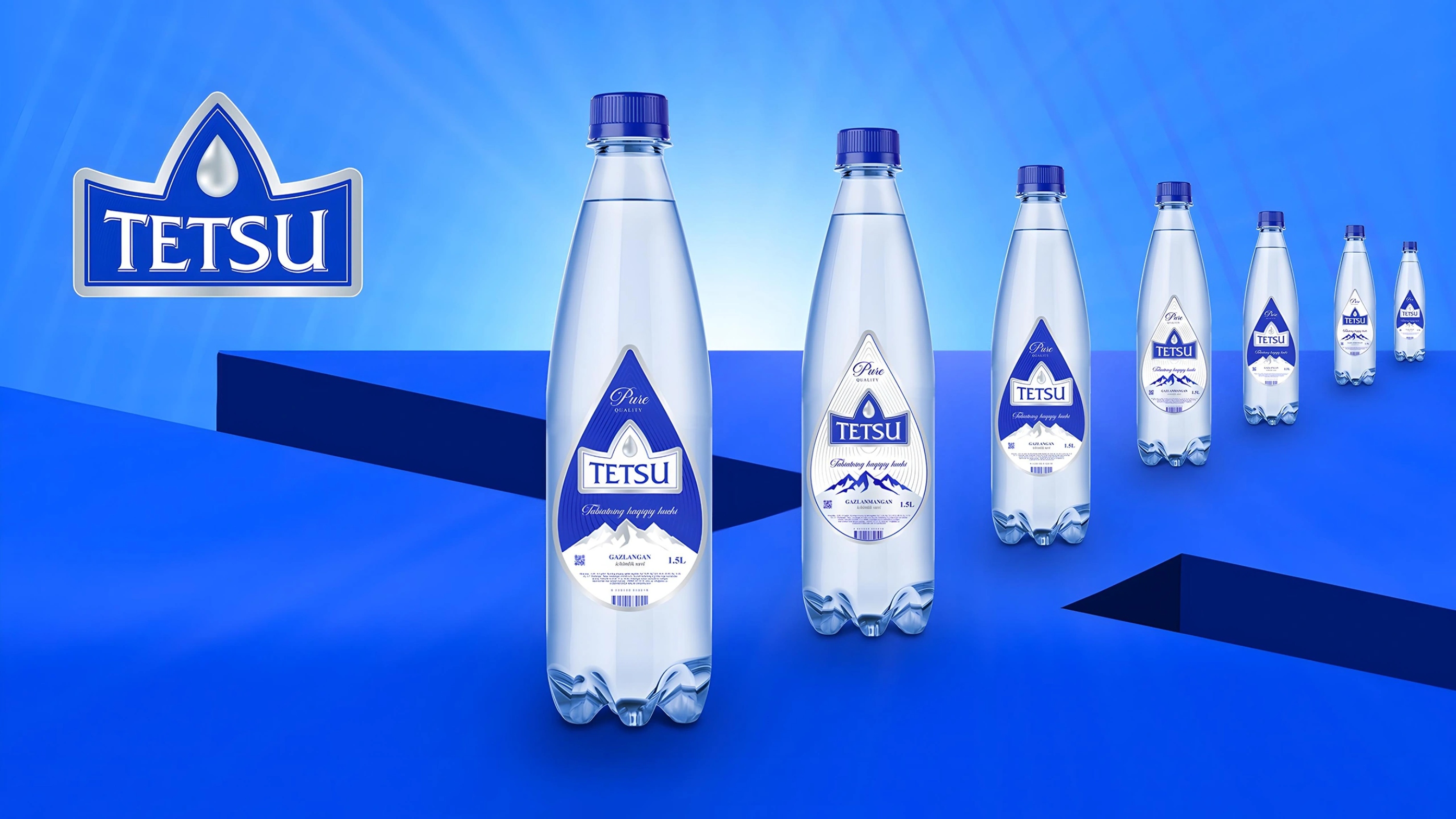
Logo Design:
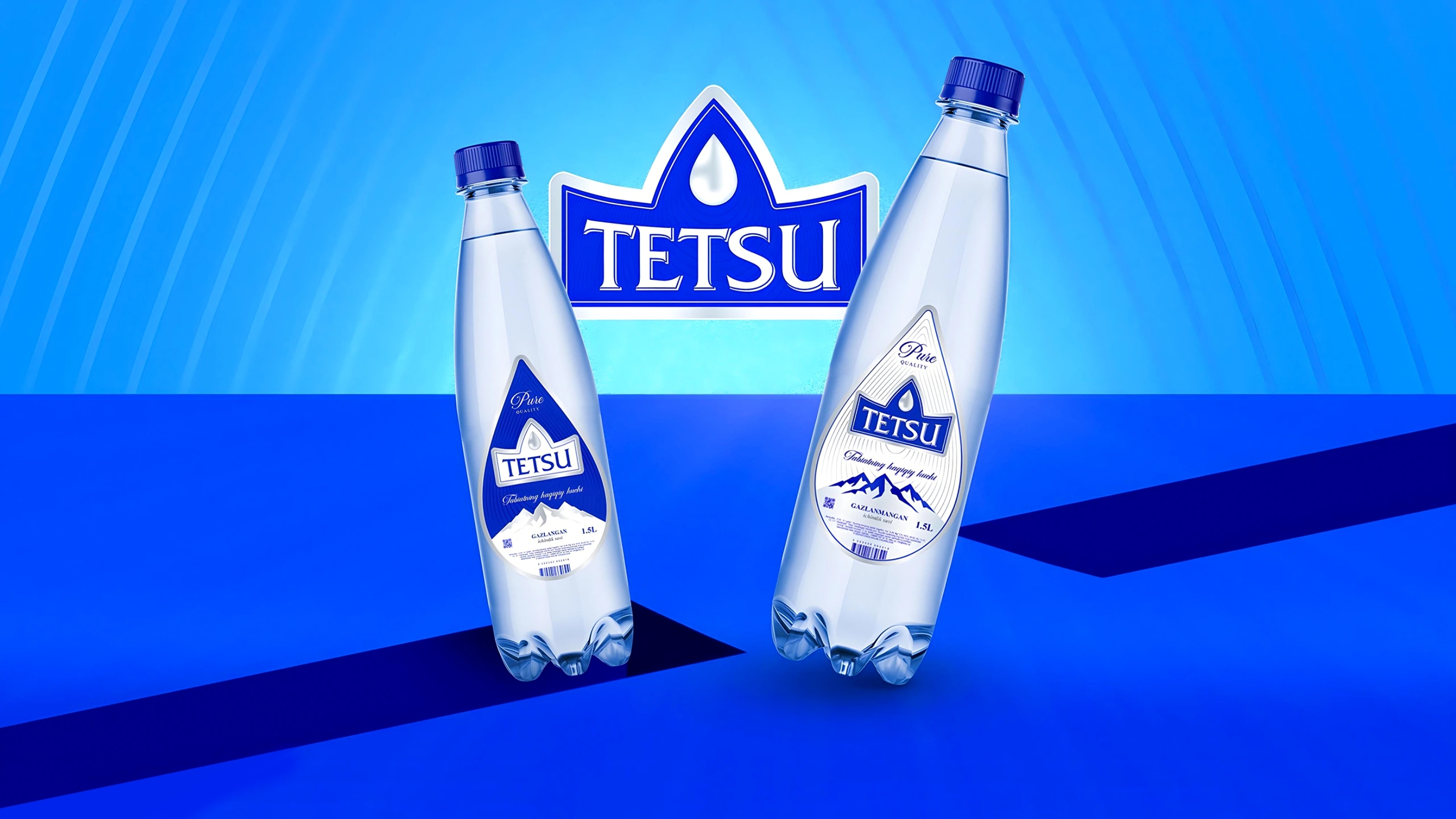
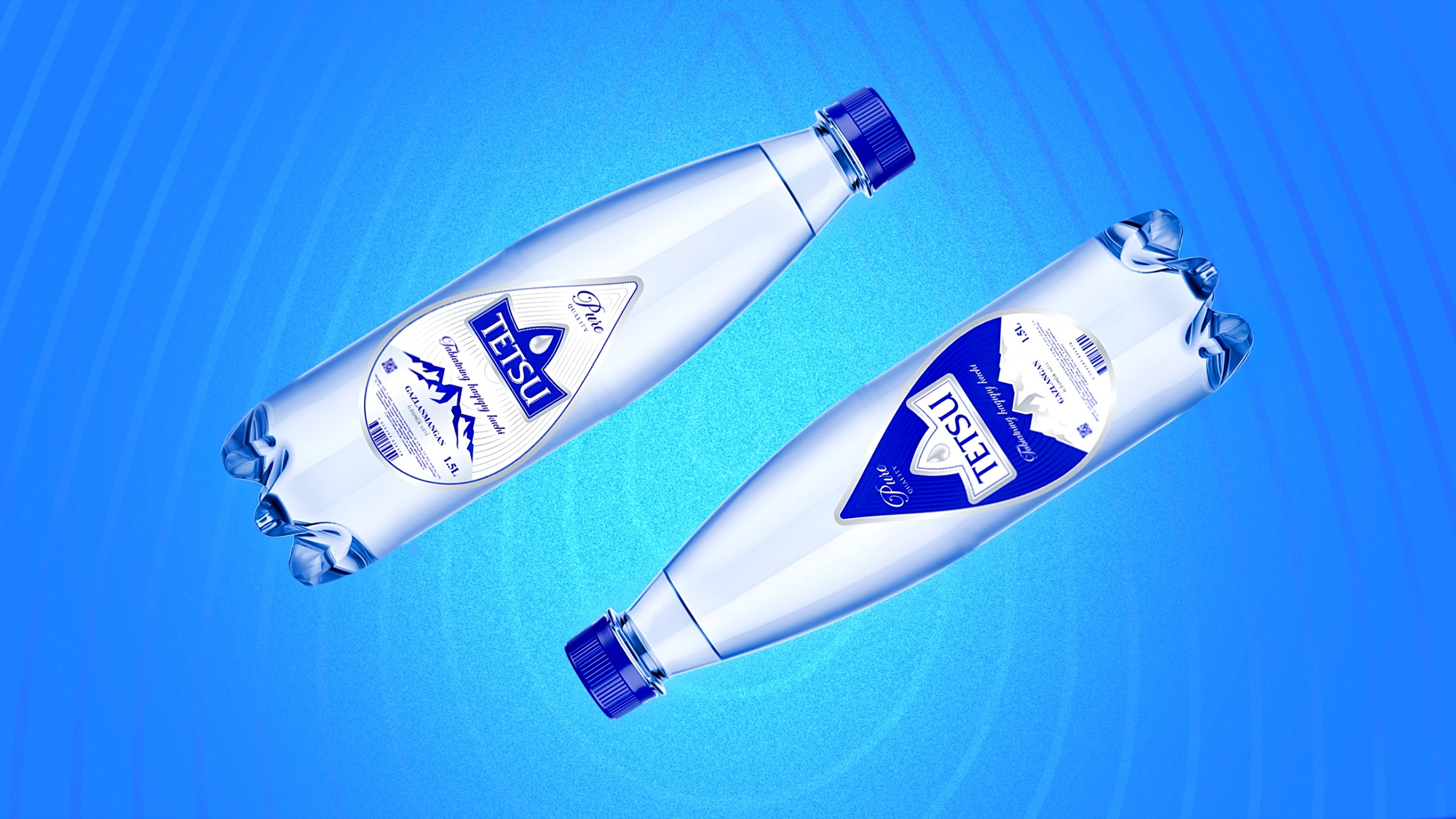
The minimalist logo integrates a clear water droplet within a shape evocative of both mountains and a crown, symbolizing purity, elevation, and prestige. Paired with a clean, contemporary typeface, the logo communicates premium quality and strength.
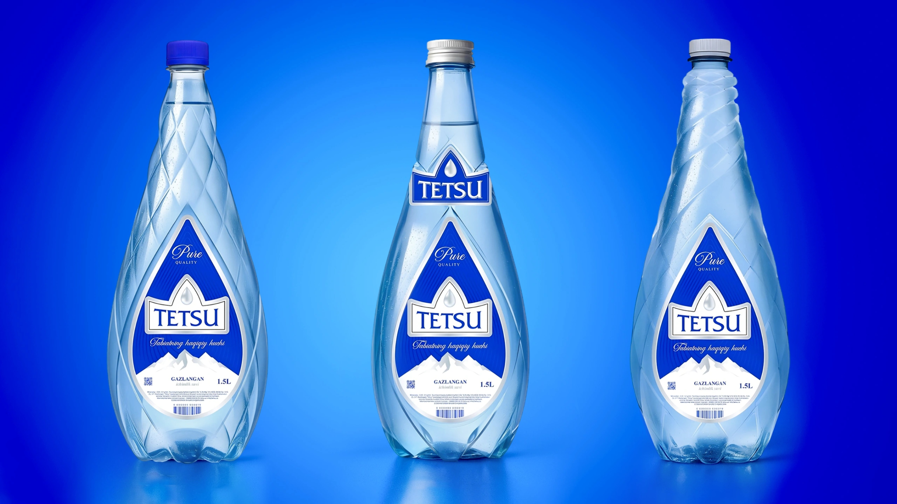
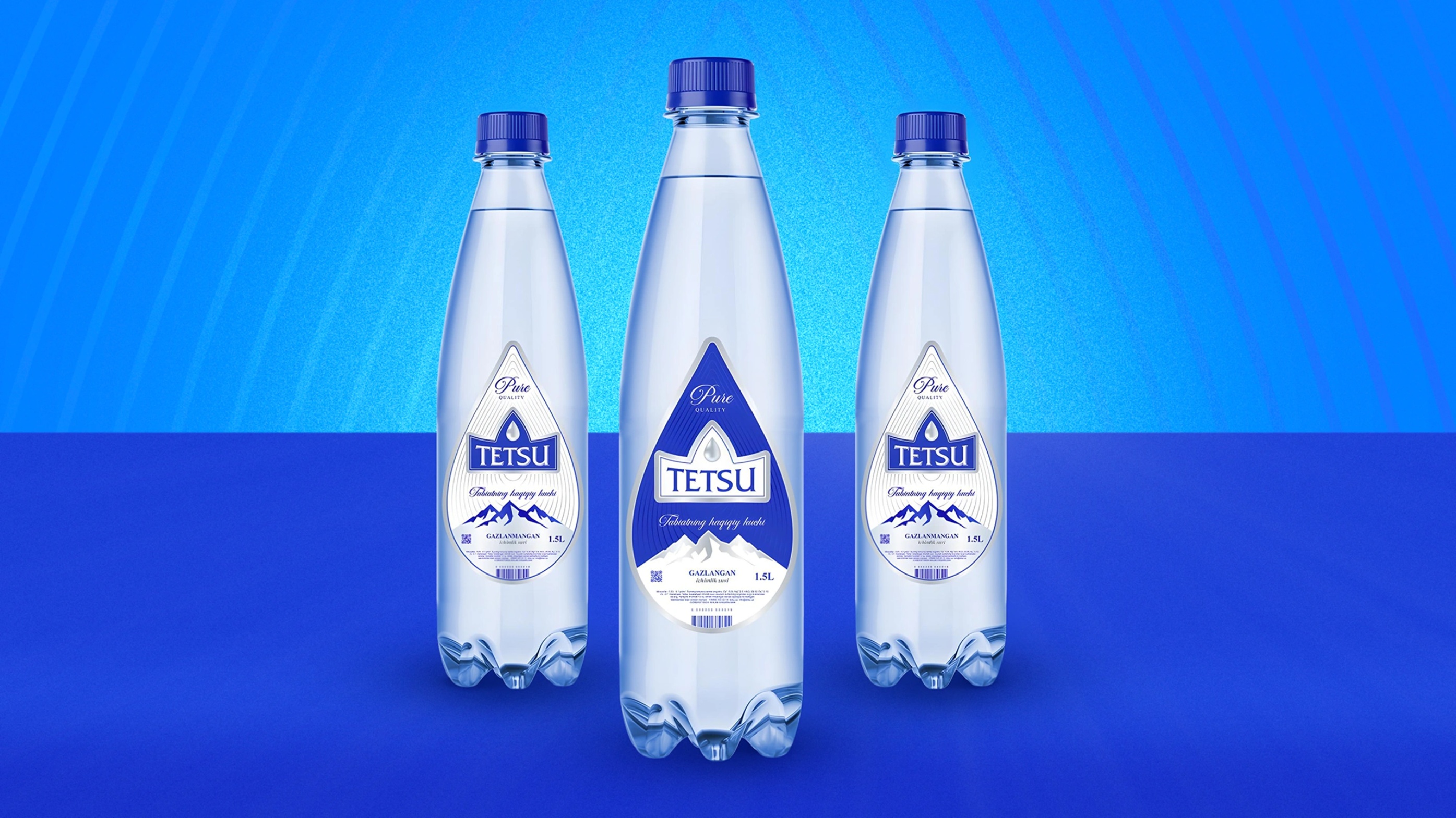
Packaging Design:
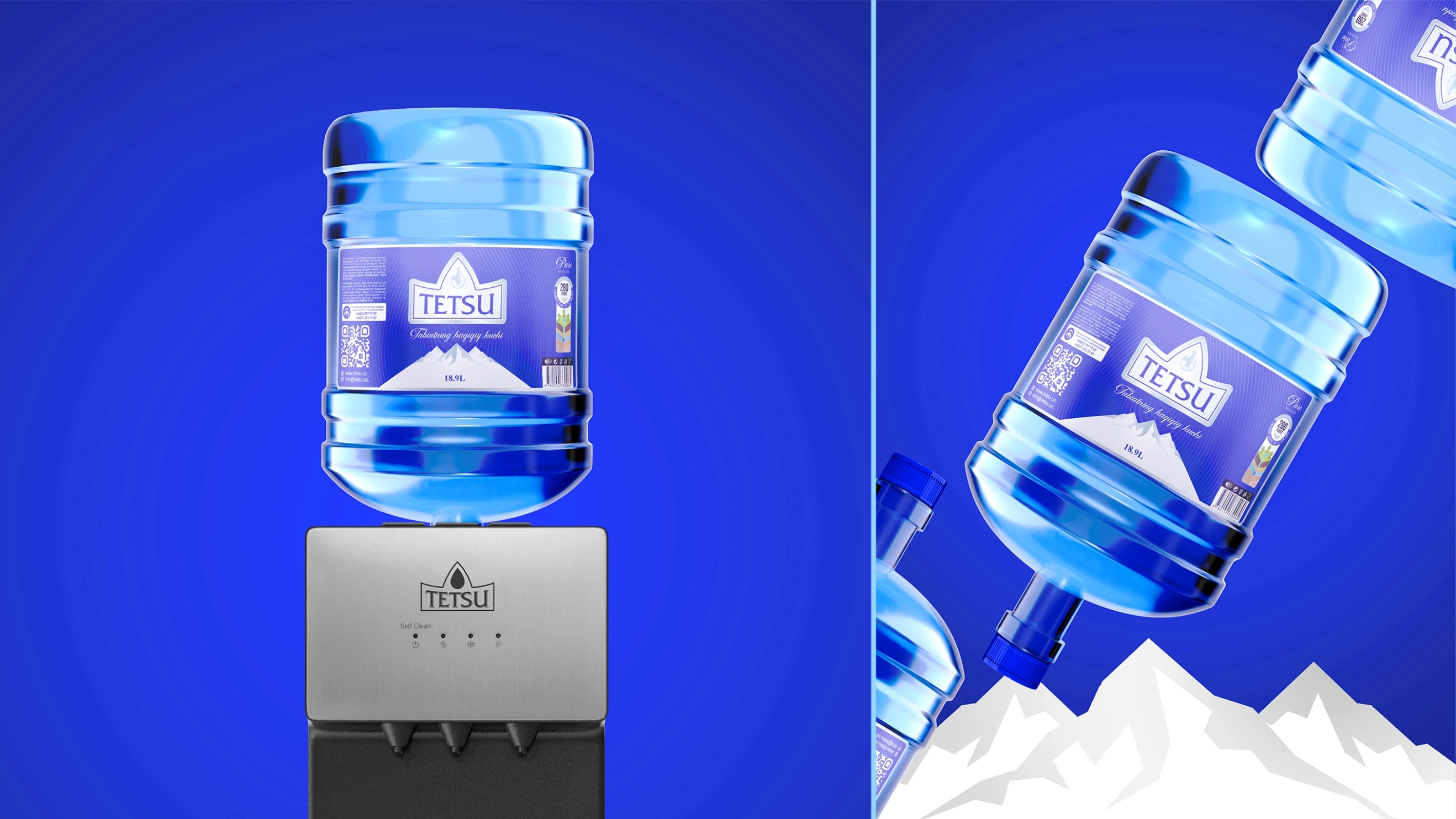
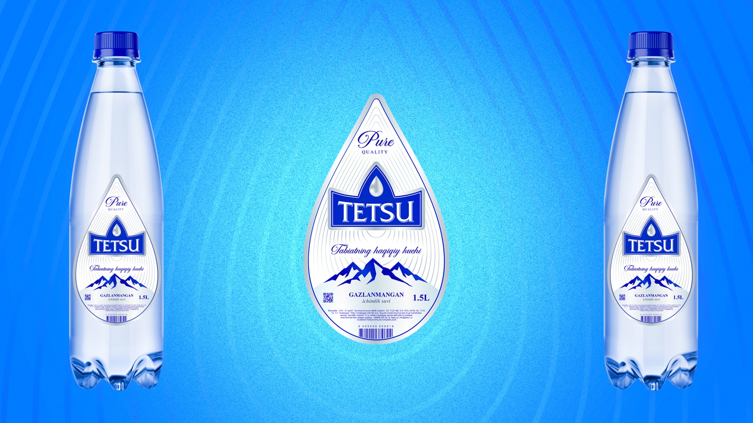
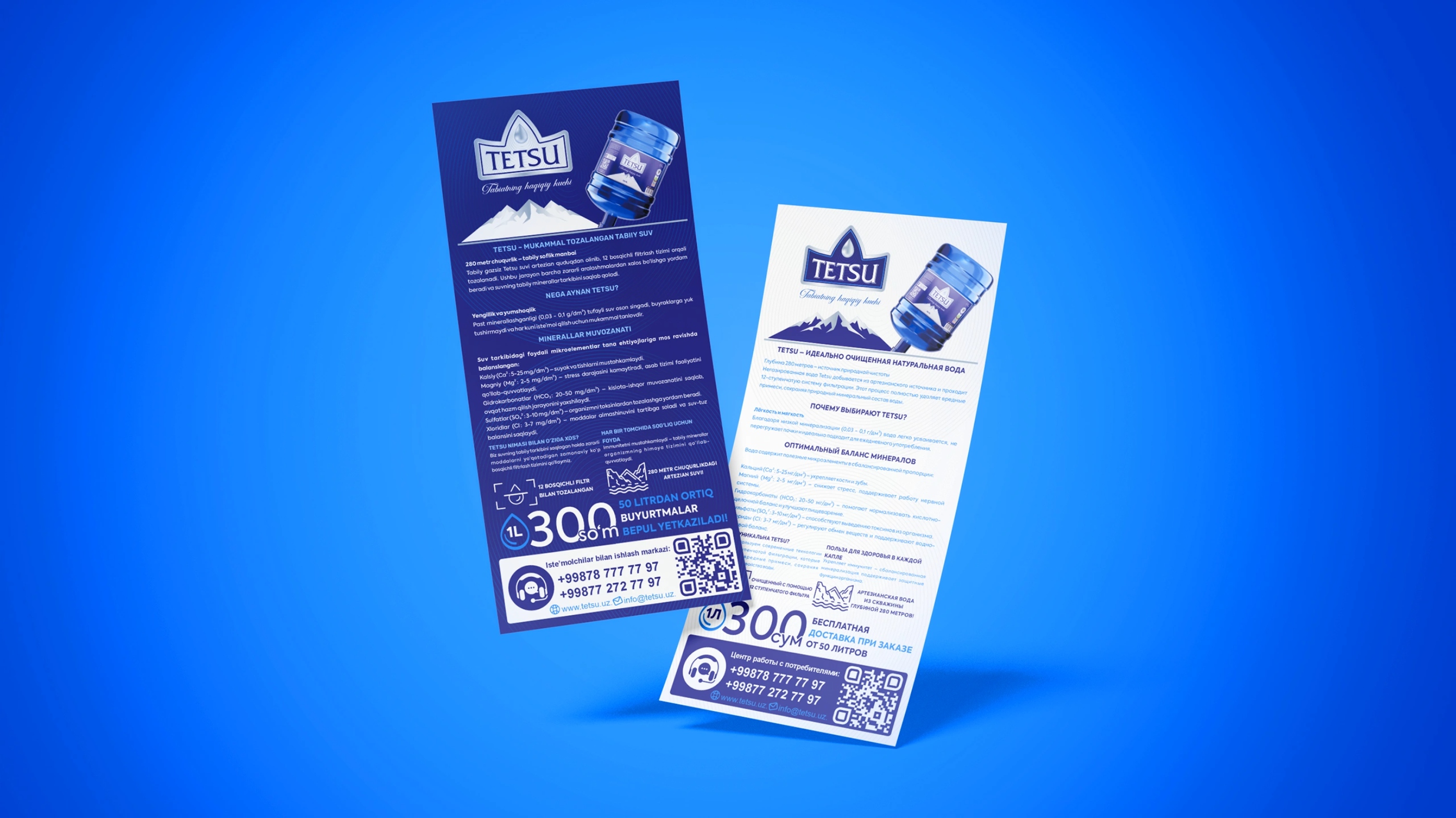
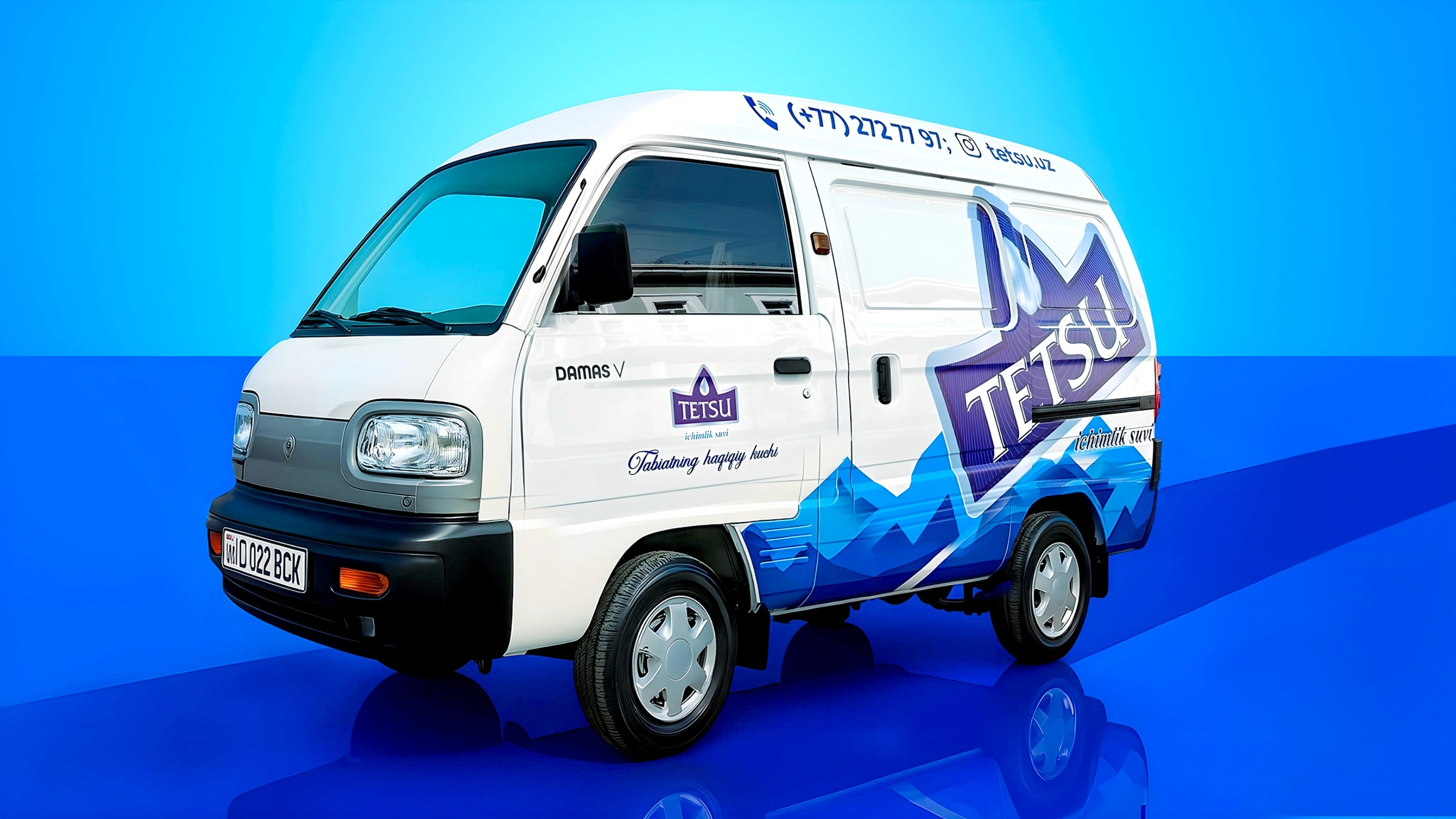
Packaging was meticulously developed for multiple bottle sizes, clearly distinguishing still and sparkling varieties through inverted color schemes. The premium product line features labels inspired by crystalline ice formations and mineral textures. Additionally, the droplet-shaped labels reinforce the visual identity, ensuring high brand recall and shelf standout. Ancillary branding elements, including promotional flyers, branded vehicles, and large-format (19-liter) containers, consistently reflect the overall premium image.
Results:
The finalized branding and packaging transcended mere aesthetics, delivering a coherent and powerful narrative. Tetsu emerged as a compelling premium water brand, authentically communicating purity, strength, and natural energy, ready to deeply resonate with consumers seeking both quality and a meaningful brand experience.
CREDIT
- Agency/Creative: Minim Design Agency
- Article Title: Tetsu Premium Water Branding and Packaging Inspired by Nature’s Pure Power by Minim Design
- Organisation/Entity: Agency
- Project Type: Packaging
- Project Status: Published
- Agency/Creative Country: Uzbekistan
- Agency/Creative City: Toshkent
- Market Region: Asia
- Project Deliverables: 3D Design, Brand Naming, Logo Design, Packaging Design
- Format: Bottle
- Industry: Food/Beverage
- Keywords: Premium Water, Branding, Naming, Logo Design, Packaging Design, Mineral Water, Visual Identity, Storytelling, Minimalist Design, Symbolism, Natural Origin, Strength, Authenticity, Consumer Goods, Premium Positioning
-
Credits:
Agency: Minim Design


