Enriching the Everyday – Outlaw’s latest work with Billington’s and The Silver Spoon Company.
Billington’s is a renowned British brand that specialises in natural unrefined cane sugars grown in the tropical Mauritian sunshine. Established in 1858, the brand is committed to preserving the natural molasses content of sugar cane, resulting in sugars with rich flavour, deep colour and moist texture – perfect for sweetening those everyday moments.
But over the years, Billington’s unique proposition hadn’t been consistently communicated, presenting a valuable opportunity to strengthen consumer understanding of what the brand stands for and the distinctive qualities that justify its premium price point.
Research had found that Billington’s had low levels of brand awareness, with only a third of those aware of the brand also willing to considering purchasing it. In addition, our own retail audit revealed that the sweetening aisle is busy and hard to navigate, with confused consumers defaulting to the cheapest or promoted products vs. seeking out the best sugar for their needs.
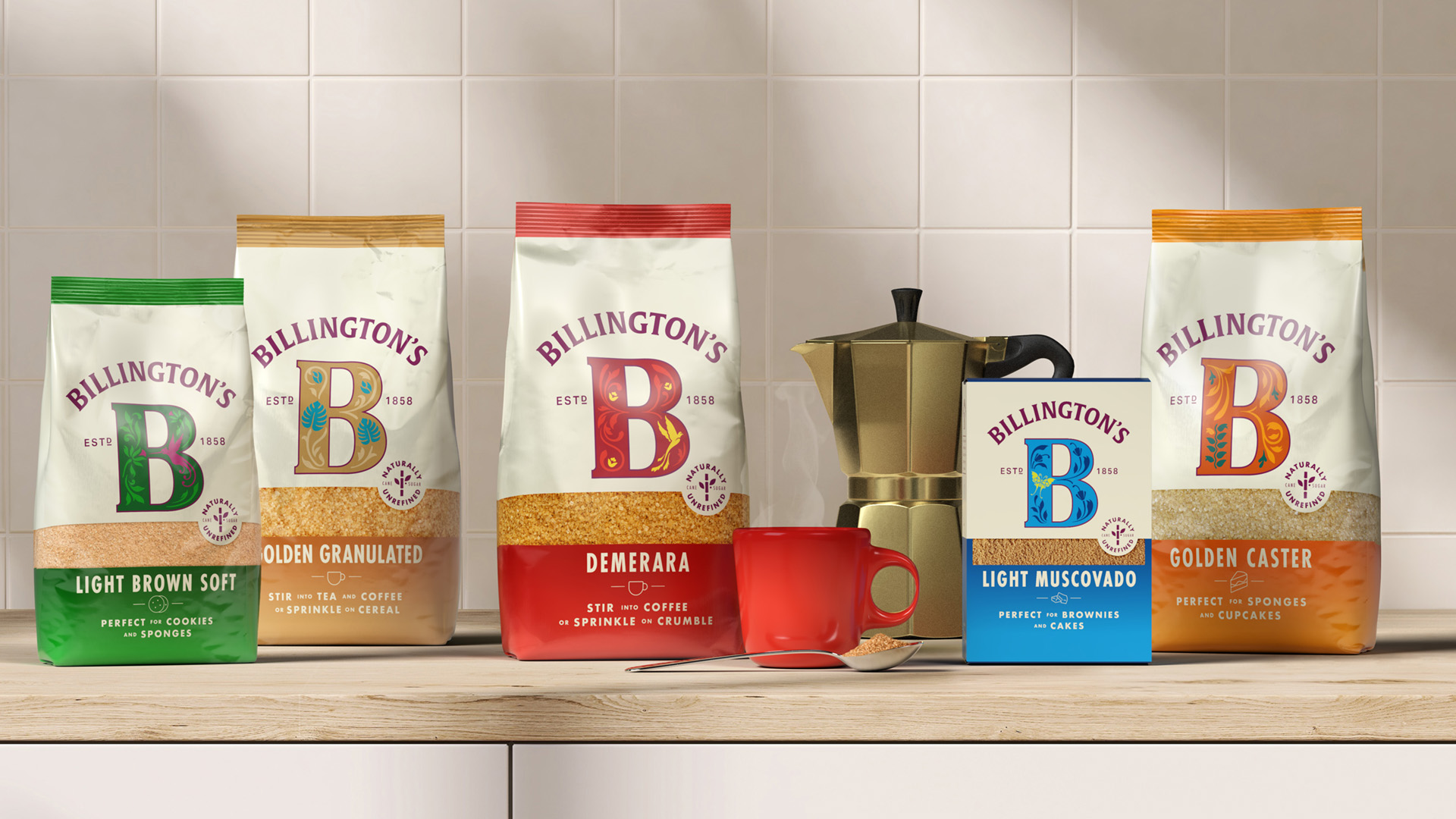
Armed with these insights we set out to increase consideration of the Billington’s brand by helping consumers to understand its unique story, while also modernising key elements to improve standout and premium cues.
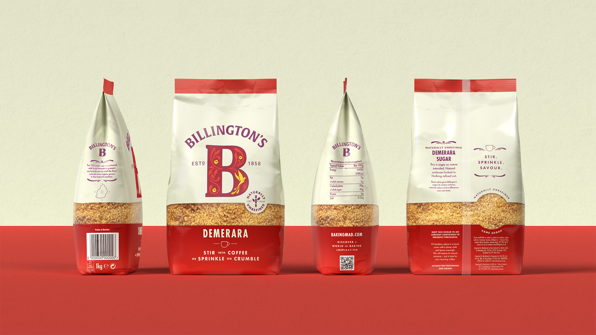
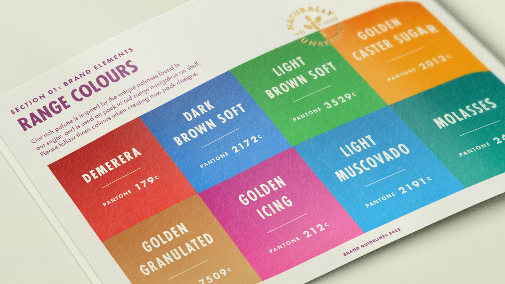
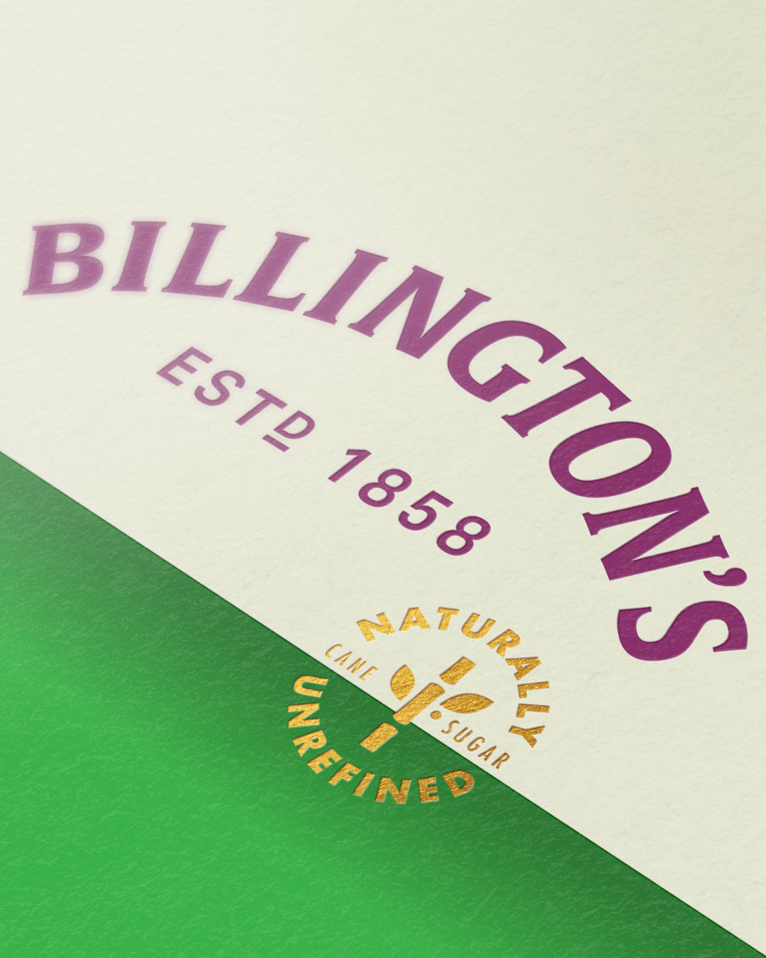
We began by evolving the pack architecture for better shelf impact and clarity of usage, as well as introducing a refined, foodie colour palette to elevate the brand’s position within the category. Next, we crafted the iconic ‘B’ to boost visibility from a distance without losing brand recognition and paired it with a new Billington’s word marque which feels considered and detailed.
Finally, we made sure the whole pack delivered on the brand’s premium positioning by introducing moments of craft throughout, from quality marks and stories of heritage through to illustrative touches, shaped product windows and an overall soft touch matte finish.
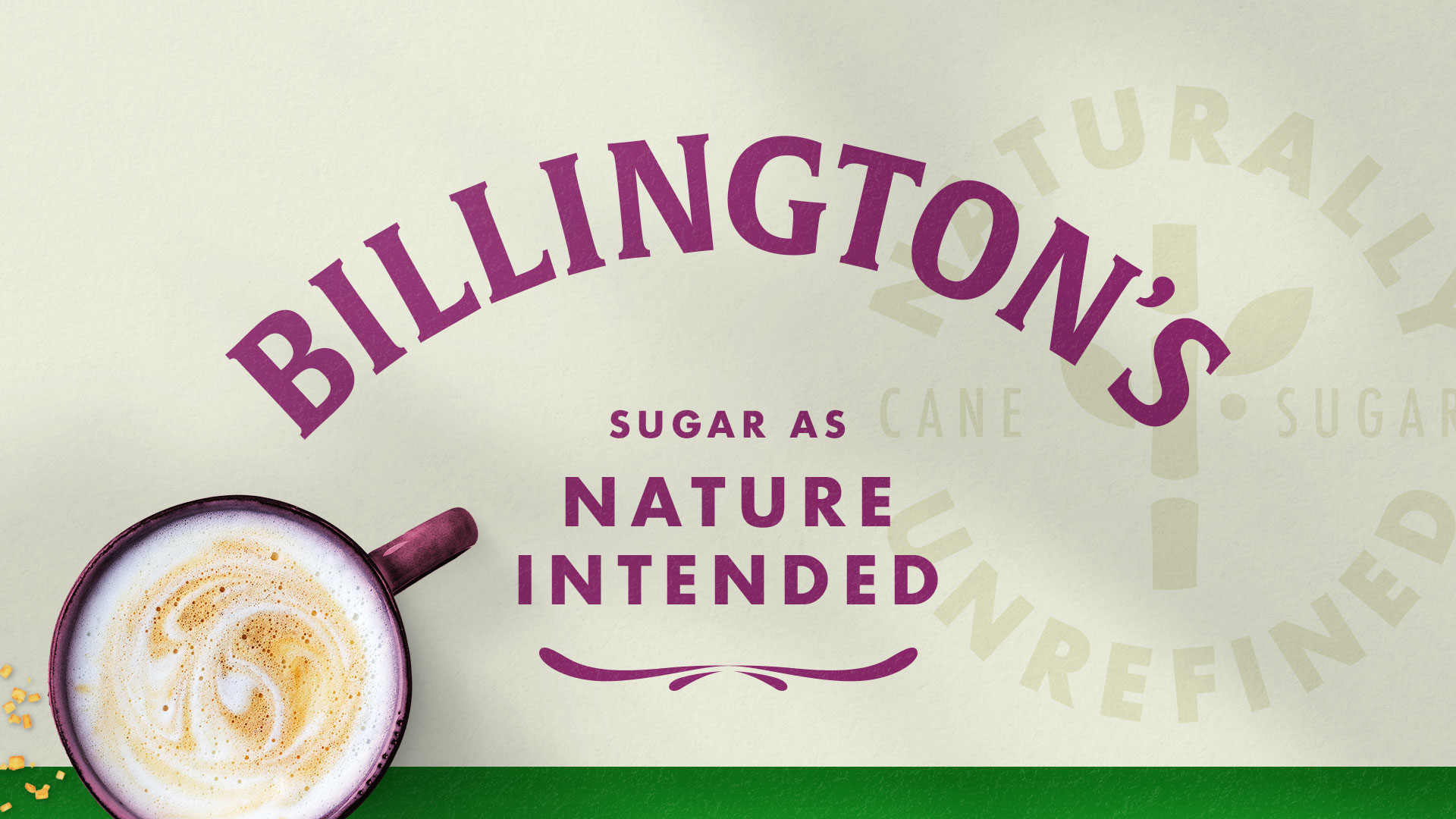
The result is a new packaging design system that strengthens Billington’s positioning, brings clarity to its baking and beverage role in a commoditized category, and gives consumers everywhere the opportunity to enrich their everyday.
CREDIT
- Agency/Creative: Outlaw
- Article Title: Outlaw Revitalises Billington’s with a Premium Design System That Elevates Everyday Sweetening
- Organisation/Entity: Agency
- Project Type: Packaging
- Project Status: Published
- Agency/Creative Country: United Kingdom
- Agency/Creative City: BRISTOL
- Market Region: Europe
- Project Deliverables: Brand Architecture, Brand Design, Brand Identity, Brand Mark, Brand Redesign, Brand Refinement, Brand Rejuvenation, Brand Strategy, Packaging Design, Packaging Guidelines
- Format: Bag
- Industry: Food/Beverage
- Keywords: Sugar, baking, coffee
-
Credits:
Marketing Manager: josh matthews


