


Accelerating What Matters: The Global Rebrand of Molygraph
For decades, Molygraph quietly led the charge in India’s specialty lubricants space. Known for their technical precision, trusted products, and deep expertise, the company had earned its place in the industrial ecosystem — not just as a supplier, but as a partner in performance. But as the business evolved, the brand didn’t always keep up.
Like many legacy companies, Molygraph had grown organically. What began as a strong product-driven identity had, over time, become a fragmented system — one that didn’t quite reflect the scale, systems, or ambitions of the company it was becoming. The result? Inconsistencies in brand recall, unclear messaging, and a lack of resonance with global audiences.
When Molygraph approached us, they weren’t just looking for a fresh coat of paint. They were preparing to enter a new chapter — expanding their international footprint, investing heavily in R&D, and building future-ready systems to serve evolving industrial needs. What they needed was a brand transformation that could match that ambition. Something bold, yet grounded. Distinct, yet flexible. Global, but unmistakably Molygraph.
And that’s where the reimagining began.
Looking Beyond the Logo: The Real Need for Change
At its core, this wasn’t a project about aesthetics. It was about alignment — aligning the way Molygraph looked and sounded with who they had become and where they were going.
The inconsistencies weren’t just visual; they were strategic. With different verticals and product categories growing in parallel, the lack of a unified brand system was starting to dilute clarity and impact. Internal teams felt it. Customers felt it. And in global conversations, the brand wasn’t cutting through.
Molygraph needed a system — one that could scale across regions, industries, and formats. One that could flex across high-touch digital environments and gritty industrial contexts. One that could hold its own next to international players, without losing its distinct legacy.
Strategy First: Rooting the Brand in Performance
Before we got into colours or typefaces, we went deep into the DNA of the business. What makes Molygraph different? What do their customers really value? Where is the industry headed — and how can Molygraph lead, not follow?
From stakeholder interviews to competitive audits, our strategic phase uncovered a key truth: Molygraph isn’t just in the business of lubrication — it’s in the business of industrial performance.
This insight became the foundation of the rebrand. It allowed us to position Molygraph not as just a product supplier, but as a performance enabler. A company that doesn’t just keep systems running — but helps them run better, longer, and more efficiently.
This led to a new brand idea that cut across communication, behaviour, and visual identity:
“Accelerating Industrial Performance with the Most Efficient Lubrication Solutions.”
A mouthful? Maybe. But powerful. Because in this one line, we brought together Molygraph’s purpose, its value proposition, and its edge.
Design That Drives Clarity, Consistency, and Confidence
With the strategy in place, we moved into visual identity. The goal wasn’t to be flashy — it was to be unmistakable. We created a refined identity system that balanced technical sophistication with industrial strength.
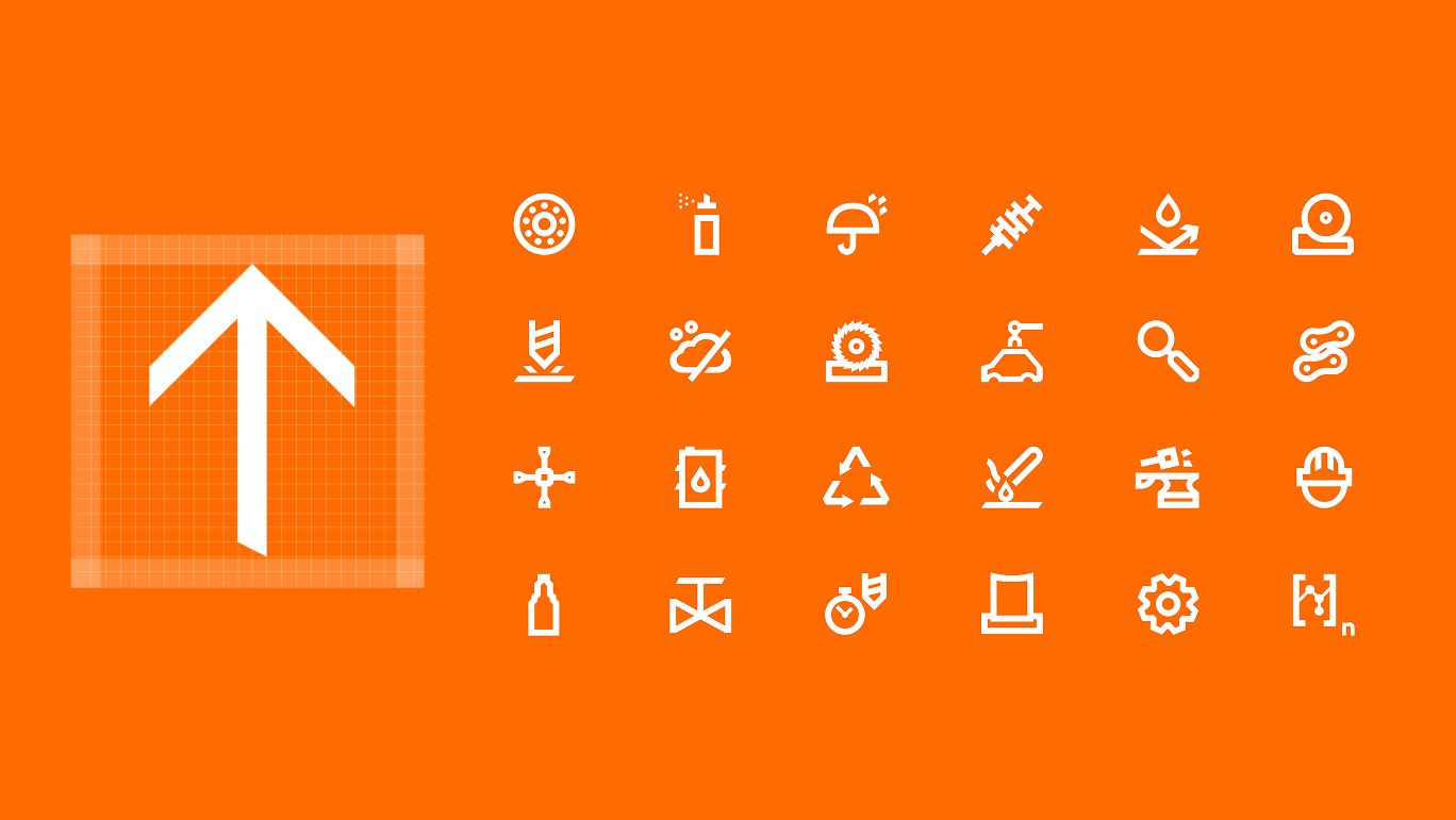
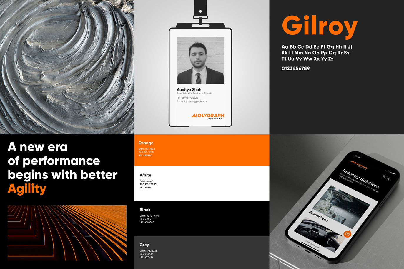
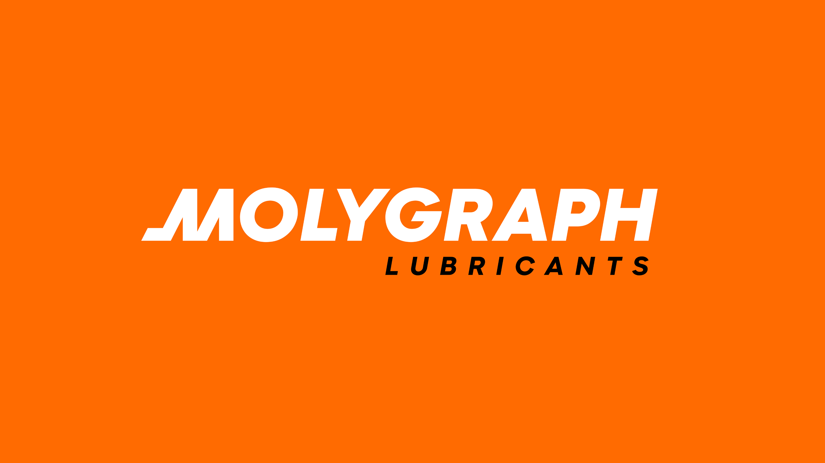
The new logo was designed to feel bold, engineered, and clean — evoking a sense of momentum and movement. The type system was chosen for clarity and legibility across physical and digital formats. The colour palette leaned into Molygraph’s heritage while introducing a modern, energetic accent that stood out in a sea of industrial blues and greys.
But more than the individual elements, it was the system that mattered.
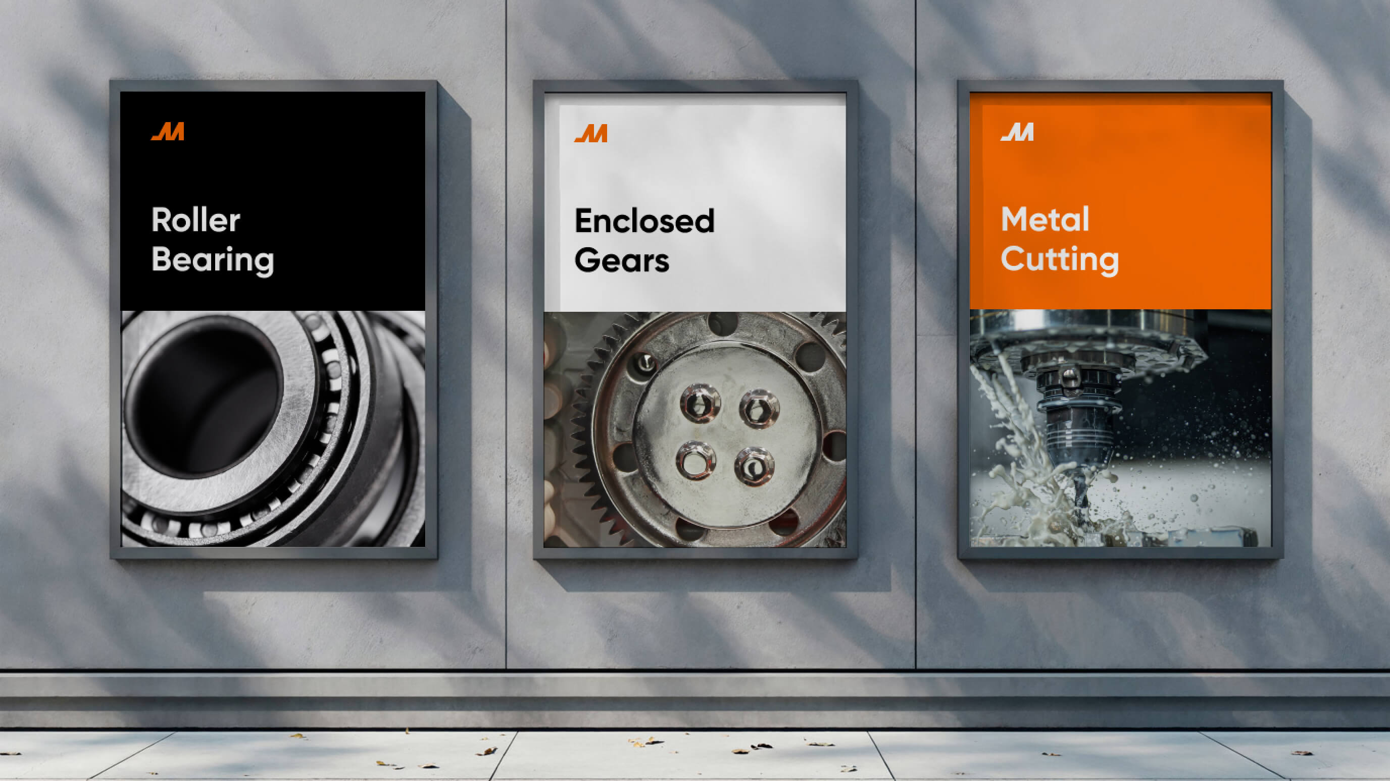
We built a modular, scalable visual language that could adapt across divisions, markets, and media. Whether it was a brochure for mining lubricants or a digital ad for food-grade oils, the design language allowed for both consistency and customization ensuring everything felt connected without being repetitive.
Bringing the Brand to Life Across Every Touchpoint
A brand isn’t a logo on a wall it’s how you show up in the world. And Molygraph had a lot of places to show up.
We mapped every single brand touchpoint — internal, external, digital, physical and built guidelines and assets that could scale across them.
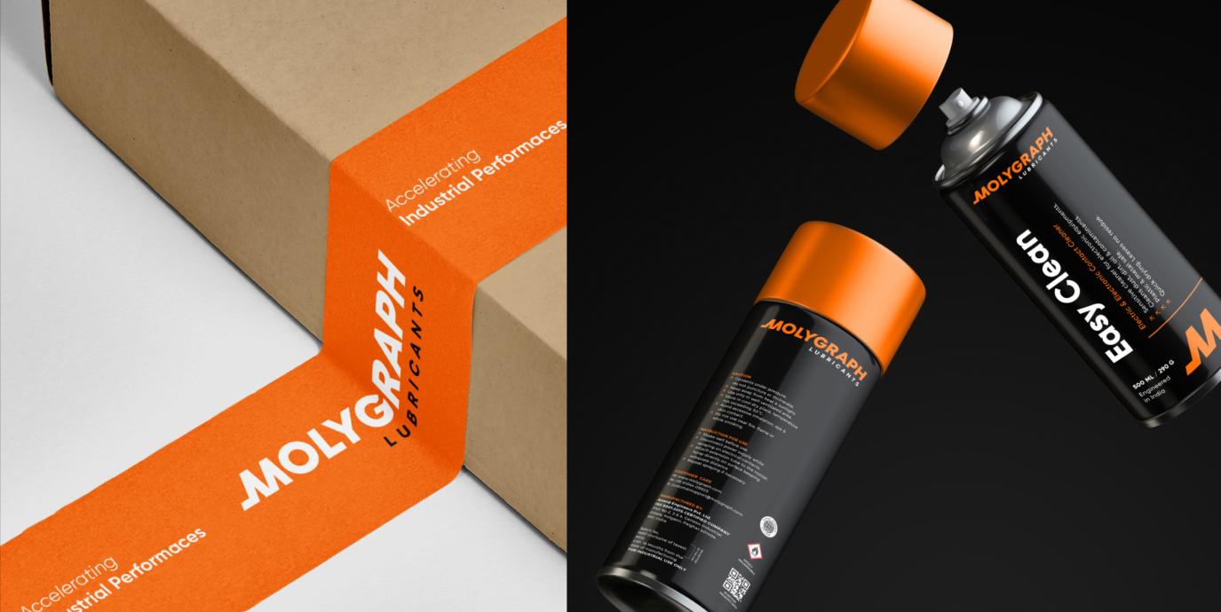
Packaging & Labelling: We developed a new packaging system that integrated seamlessly with Molygraph’s SAP-based production framework, reducing manual dependencies while improving visual consistency. The packaging was designed to be instantly recognizable, easy to navigate, and informative — critical in fast-paced industrial environments.
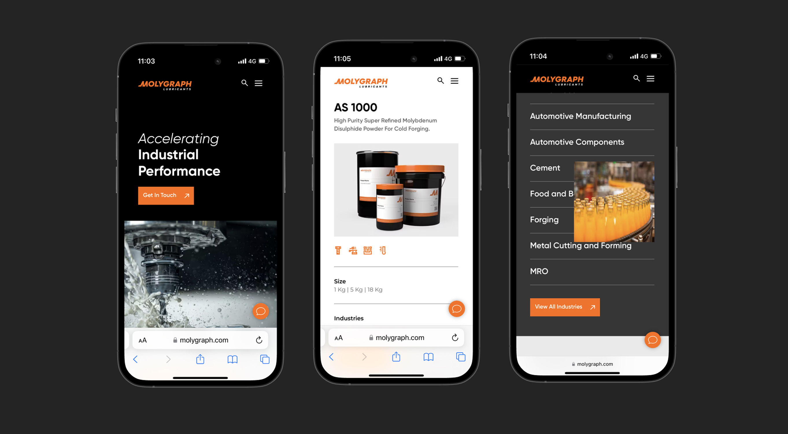
Website & Digital Presence: The website wasn’t treated as a brochure — it was treated as a business tool. Designed with a clear content structure, simplified navigation, and an upgraded UI, the new site positioned Molygraph as a modern, future-focused company. Industry-specific solutions were highlighted to aid both exploration and conversion, while backend flexibility allowed the internal team to scale content with ease.
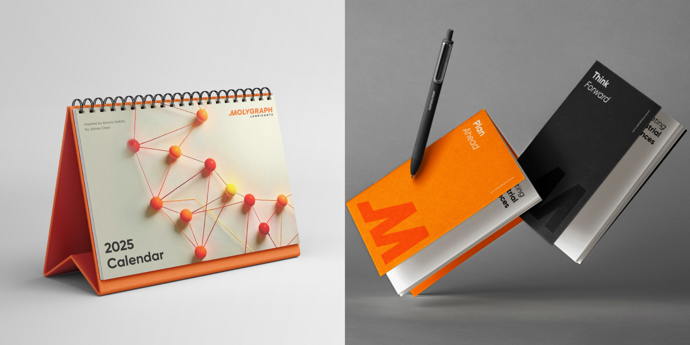
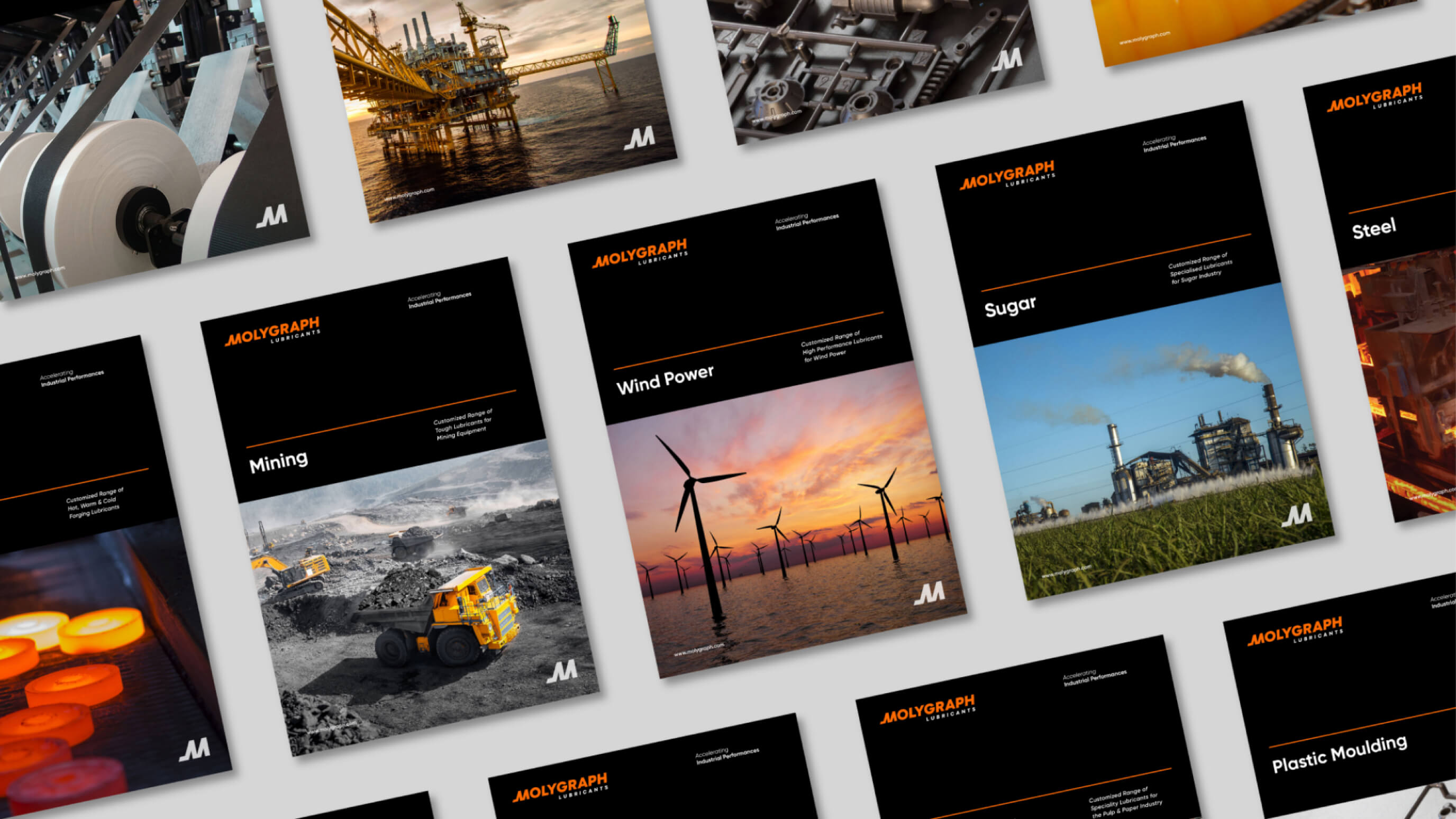
Sales & Marketing Collaterals: From brochures and spec sheets to product flyers and stationery, we reworked every asset to ensure it reflected the new brand voice and visuals. Templates were built for internal teams to maintain consistency while enabling agility.
Event & Exhibition Design: Molygraph often participates in industry exhibitions — a key opportunity to make an impression. We created modular exhibition designs that could scale to different booth sizes and industry types, while staying true to the brand’s visual story.
Internal & Vehicle Branding: We extended the system to vehicle wraps, uniforms, internal posters, calendars, and more — helping Molygraph reinforce pride and clarity within its own teams.
Every piece was a chance to reinforce the same message: Molygraph is not just keeping up — it’s leading the way.
More Than a Makeover: Measurable Impact
Since the rebrand, Molygraph has seen a tangible shift in how it’s perceived — both within the industry and among its own teams. Prospects are engaging more meaningfully with digital touchpoints. Existing customers have expressed renewed confidence in the brand’s evolution. And internally, there’s a stronger sense of alignment and ownership.
But what excites us most isn’t what the rebrand has achieved so far — it’s what it’s made possible.
The new identity has created room for Molygraph to grow — to launch new categories, enter new markets, and deepen its impact without constantly retooling its brand infrastructure. It’s a system built for longevity, not just launch day.
Final Thoughts: A Brand That Moves as Fast as Its Clients
Working with Molygraph was a reminder of why strategic branding matters — especially in B2B and industrial spaces, where it’s often overlooked. When done well, branding doesn’t just make a company look better. It makes them work better. Communicate better. Sell better. Scale better.
This wasn’t about reinventing Molygraph. It was about revealing its true potential — and giving it the identity, language, and tools to compete on the world stage.
From lubricants to performance. From legacy to leadership.
This is Molygraph — reimagined, realigned, and ready for what’s next.


CREDIT
- Agency/Creative: Empirici Designs
- Article Title: Empirici Redefines Molygraph Lubricants with a Rebrand for Global Growth
- Organisation/Entity: Agency
- Project Type: Identity
- Project Status: Published
- Agency/Creative Country: India
- Agency/Creative City: Bangalore
- Market Region: Africa, Asia, Middle East, Global
- Project Deliverables: Brand Design, Brand Guidelines, Brand Identity, Brand Redesign, Brand Strategy, Brand Tone of Voice, Branding, Exhibition Design, Identity System, Logo Design, Packaging Design
- Industry: Manufacturing
- Keywords: Scalable Brand System, Specialty Lubricants, Brand Evolution, B2B Branding, Information Design, Communication design, Brand Collaterals and Expansion, India, Speciality Lubricants, Make in India
-
Credits:
Creative Director: Isha Vora
Brand Strategist: Athen Puthiyangath
Design Team: Harshita Bhargava
Design Team: Shailly Maheshwari
Design Team: Nivethitha Anand
Design Team: Samruddhi Godbole
Design Team: Navami Natraj
Design Team: Simran Satija


