


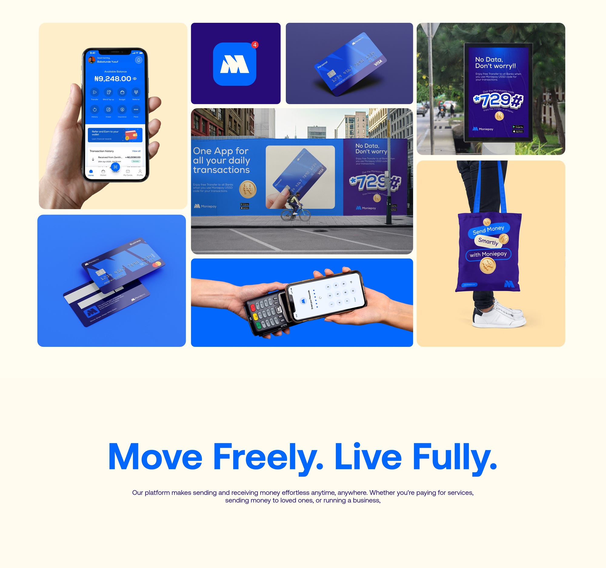
MoniePay Brand Identity
The MoniePay brand identity presents a bold and youthful visual system designed to reflect the energy of a modern, fast-paced financial platform. It emphasizes clarity, trust, and a refreshing modern feel, aligning with MoniePay’s mission to simplify how people send, receive, and manage money digitally.
Brand Essence
MoniePay positions itself as the go-to digital payment platform for a new generation—users who value speed, ease, and style in their financial transactions. The identity reflects this vision with a clean, energetic, and user-first design, ensuring the brand feels both secure and exciting to interact with.
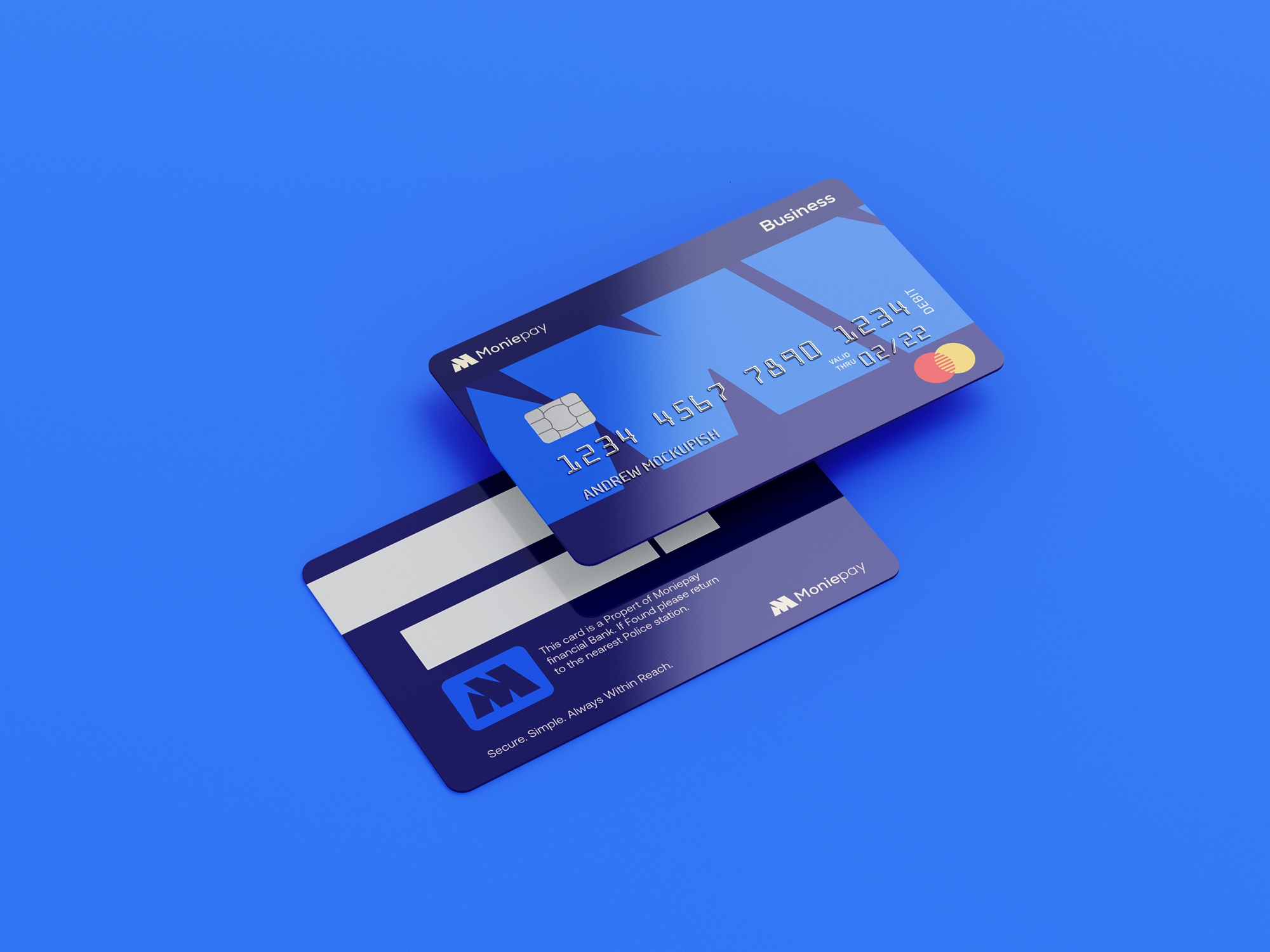
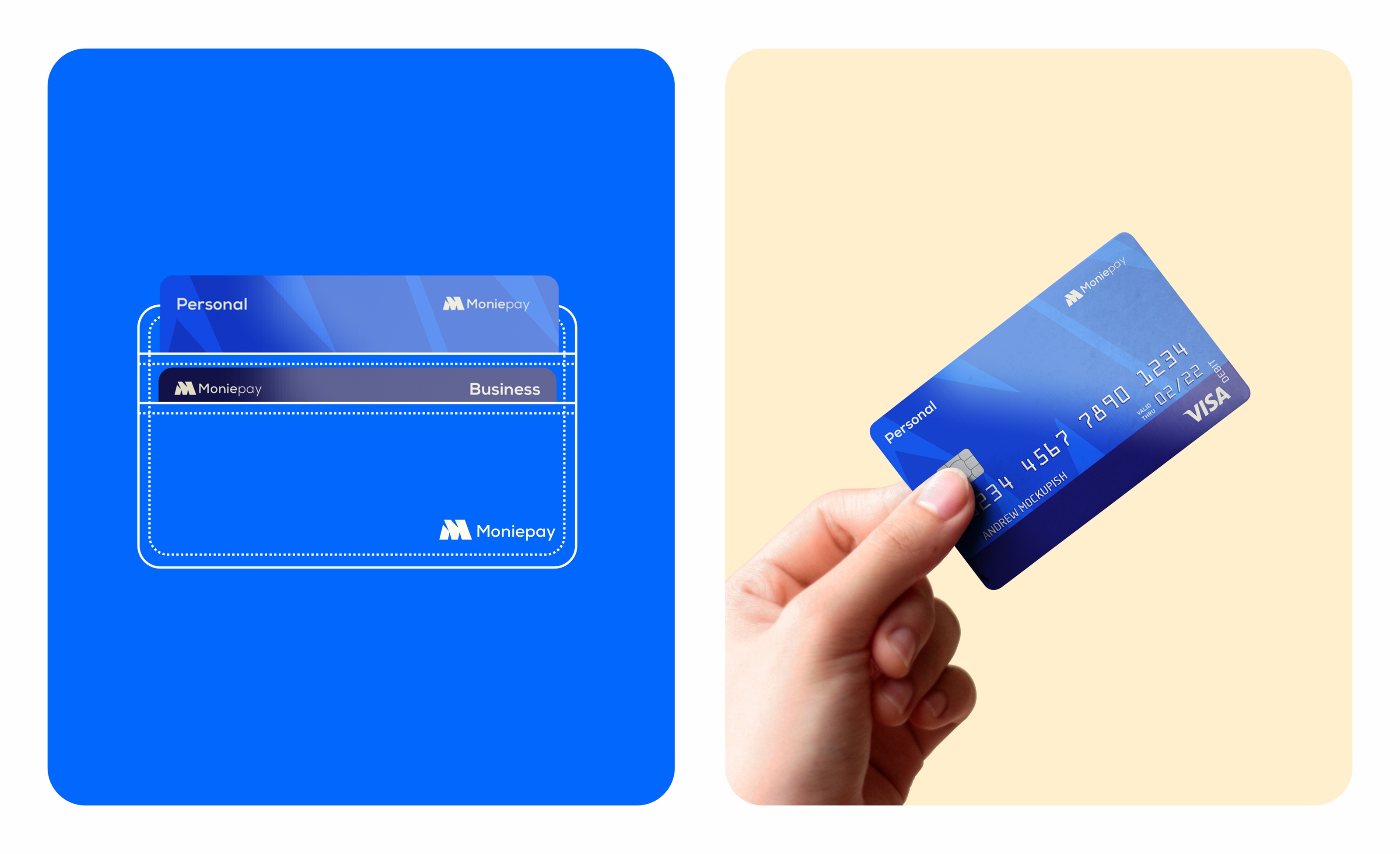
Logo Design
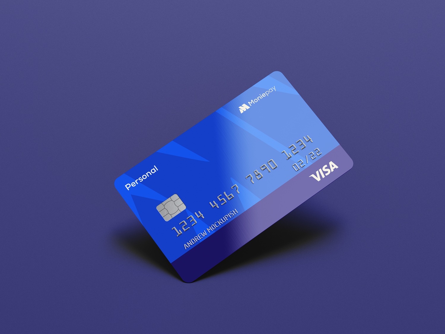
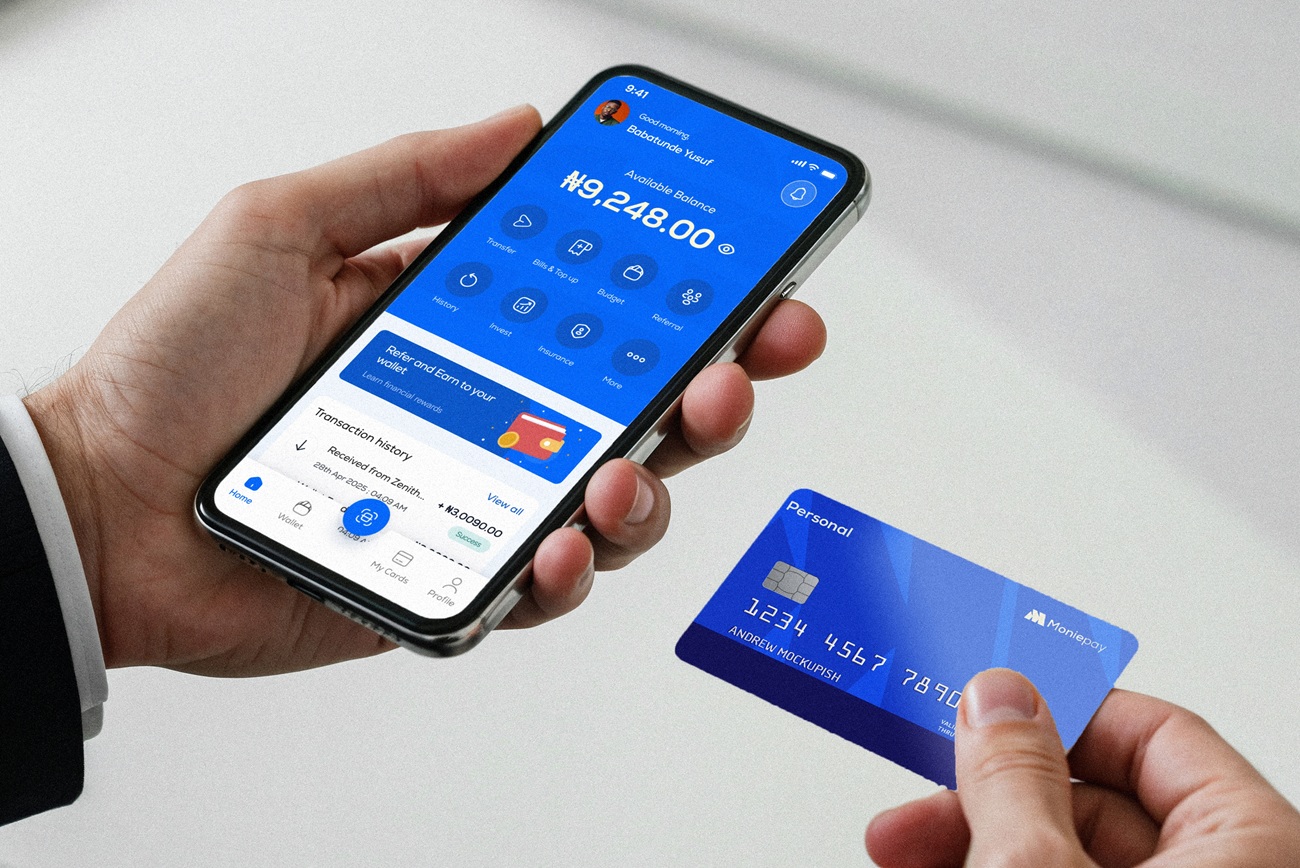
The MoniePay logo combines clean geometric strength with subtle playfulness. It’s designed to stand out across fintech landscapes—whether on app icons, cards, or digital ads. The modern logomark supports brand memorability, while the wordmark maintains readability and professional appeal.
Typography
MoniePay uses modern sans-serif fonts to communicate transparency, ease, and forward thinking. The type choices are consistent across all brand materials, reinforcing clarity while supporting the platform’s digital-native nature. Every text element, from onboarding screens to payment receipts, feels part of the same visual family.
Color Palette
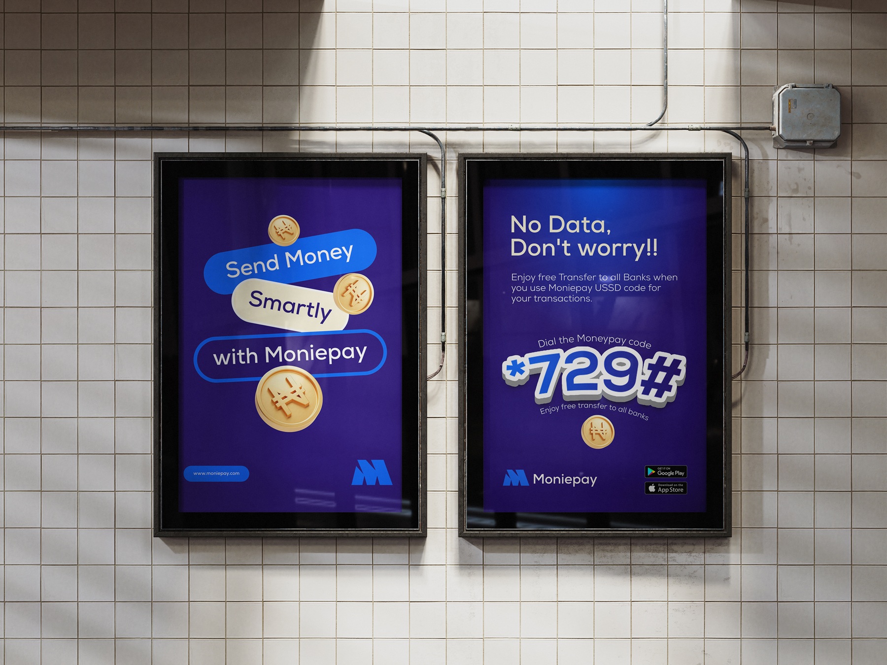
The brand palette uses a vibrant blue accent, paired with neutral backgrounds, balancing energy and trust. Blue evokes security and reliability—core to fintech—while the youthful tone ensures MoniePay resonates with digital-savvy users. This controlled use of color creates visual hierarchy and supports intuitive navigation.
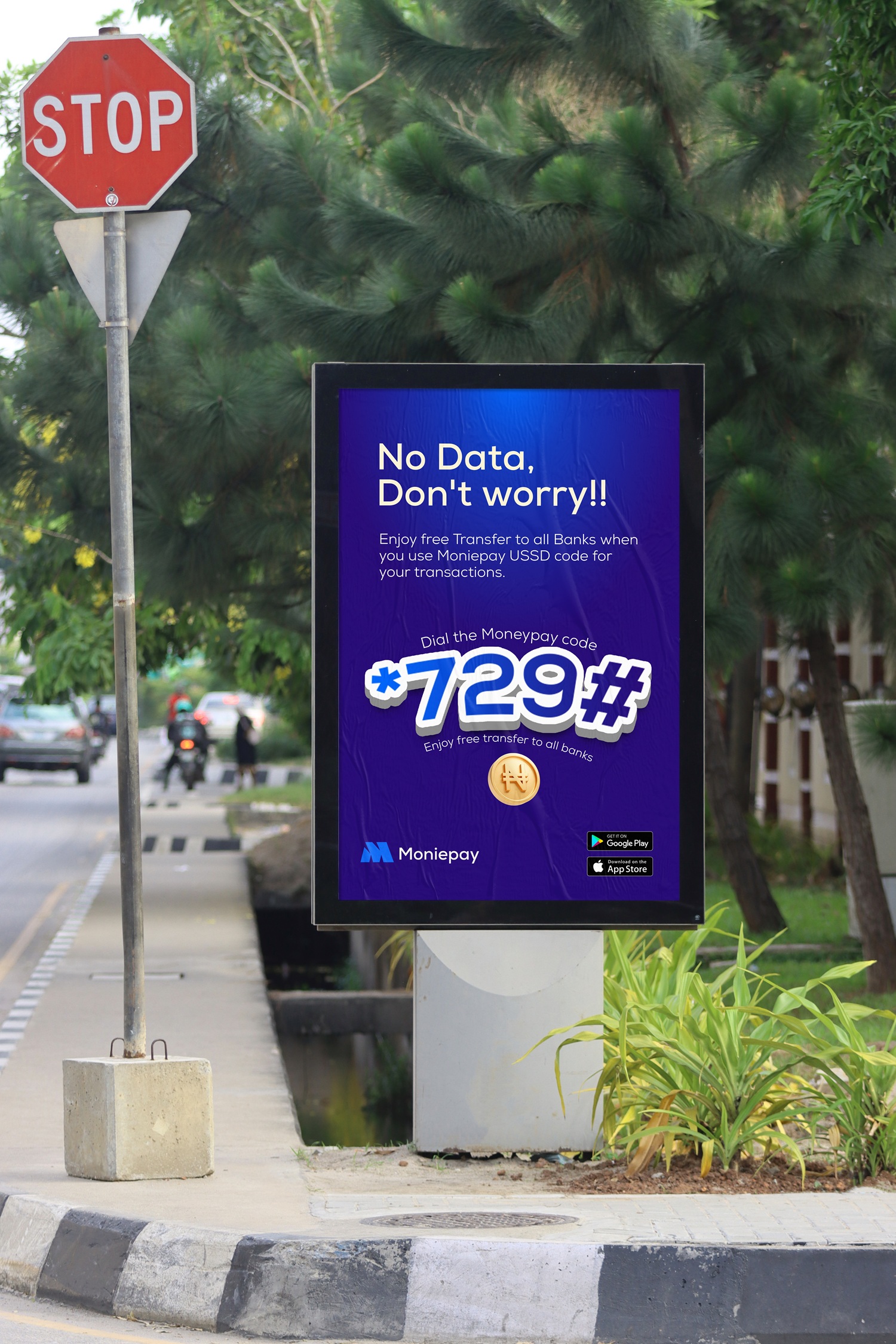
Visual Elements
Subtle design motifs—like icons, wave patterns, and motion lines—suggest speed, flow, and connectivity. These elements enrich the UI without overwhelming it, supporting the core narrative: MoniePay is fast, intuitive, and built for how modern users move money.
The MoniePay brand identity is more than a design system—it’s a visual expression of accessibility, speed, and youthful trust. By prioritizing clarity, personality, and scalability, the branding positions MoniePay as a standout in the fintech space—ready to grow with its users and stay ahead in a competitive market.


CREDIT
- Agency/Creative: Creadify Studios
- Article Title: Creadify Studios Positions MoniePay as a Fintech Brand Built for Speed and Style
- Organisation/Entity: Agency
- Project Type: Identity
- Project Status: Published
- Agency/Creative Country: Nigeria
- Agency/Creative City: Lagos
- Market Region: Africa
- Project Deliverables: App Design, Brand Design, Brand Experience, Brand Guidelines, Brand Identity, Brand Strategy, Creative Direction, Logo Design
- Industry: Financial
- Keywords: Fintech, finance, Banking
-
Credits:
Brand Identity Designer: Bamidele Segun


