Behind the Bottle: Happy Cow Vodka’s Label Design Story
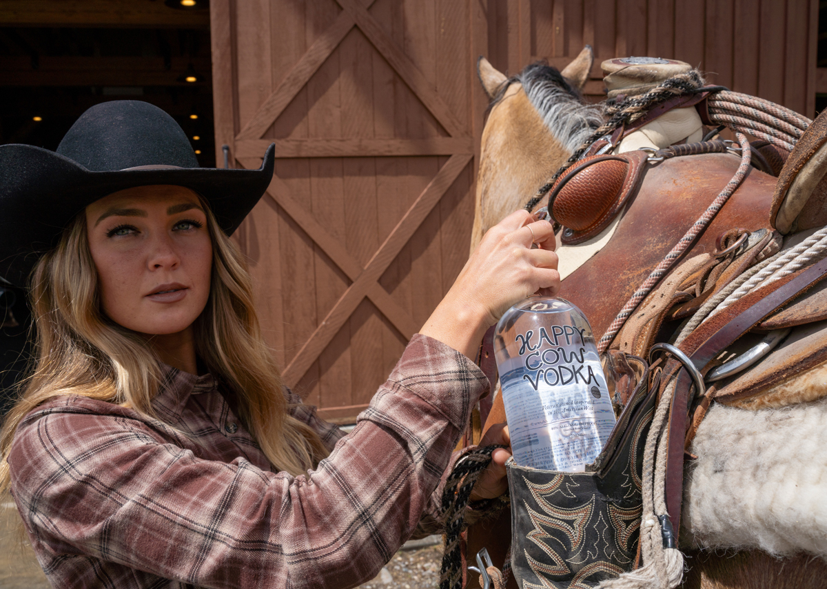
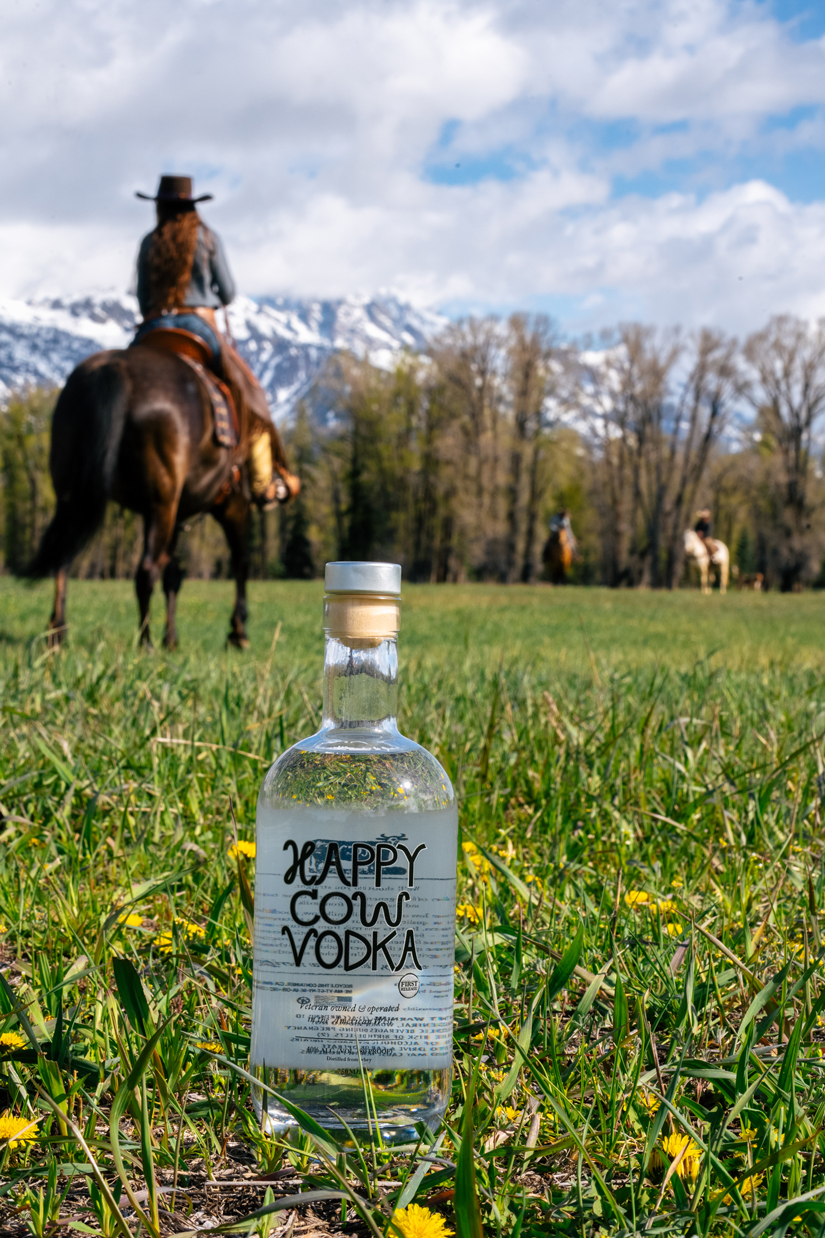
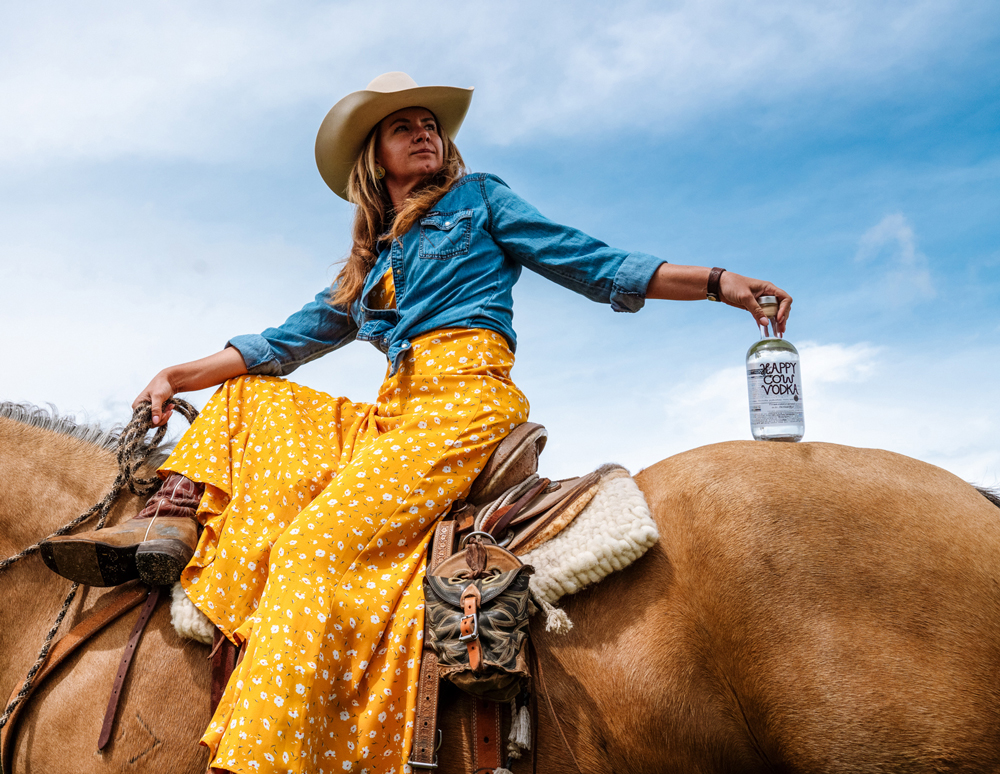
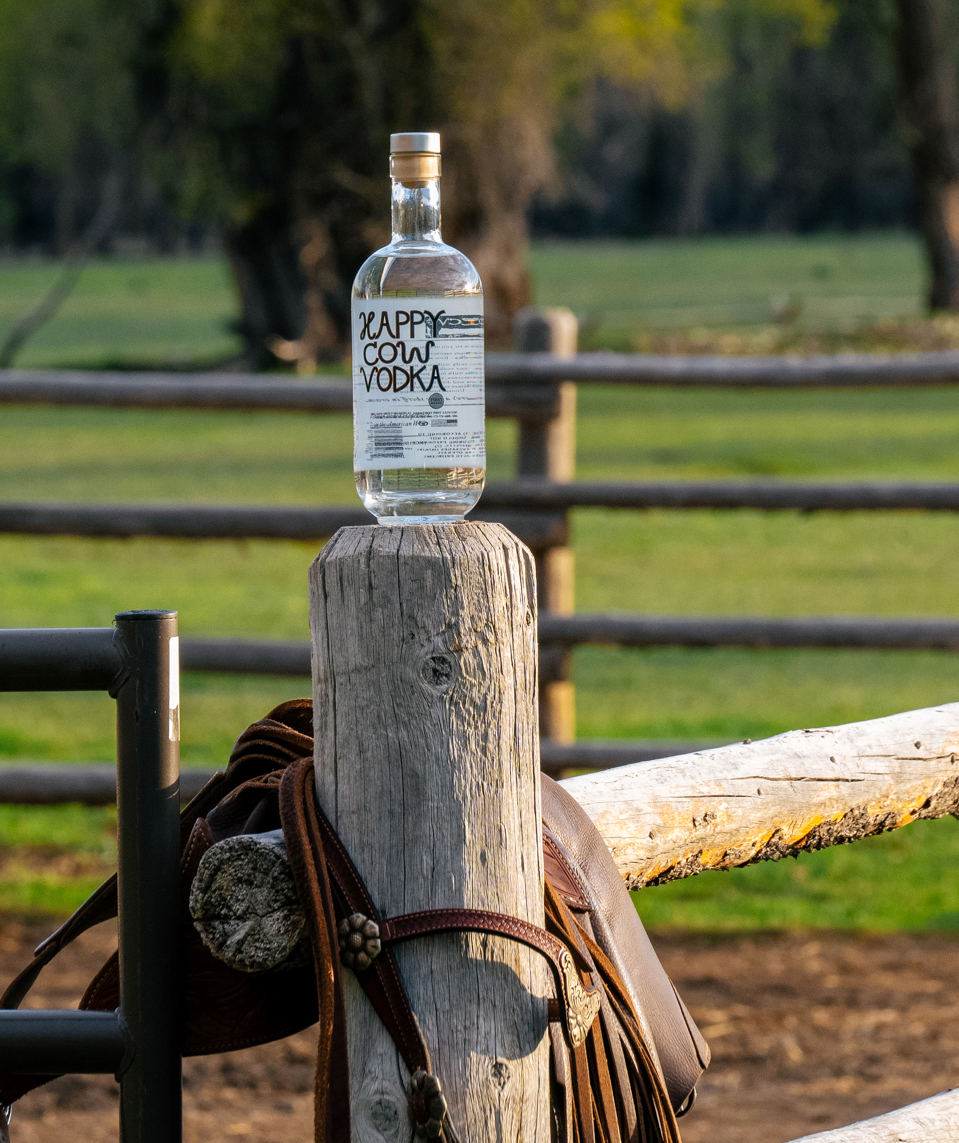
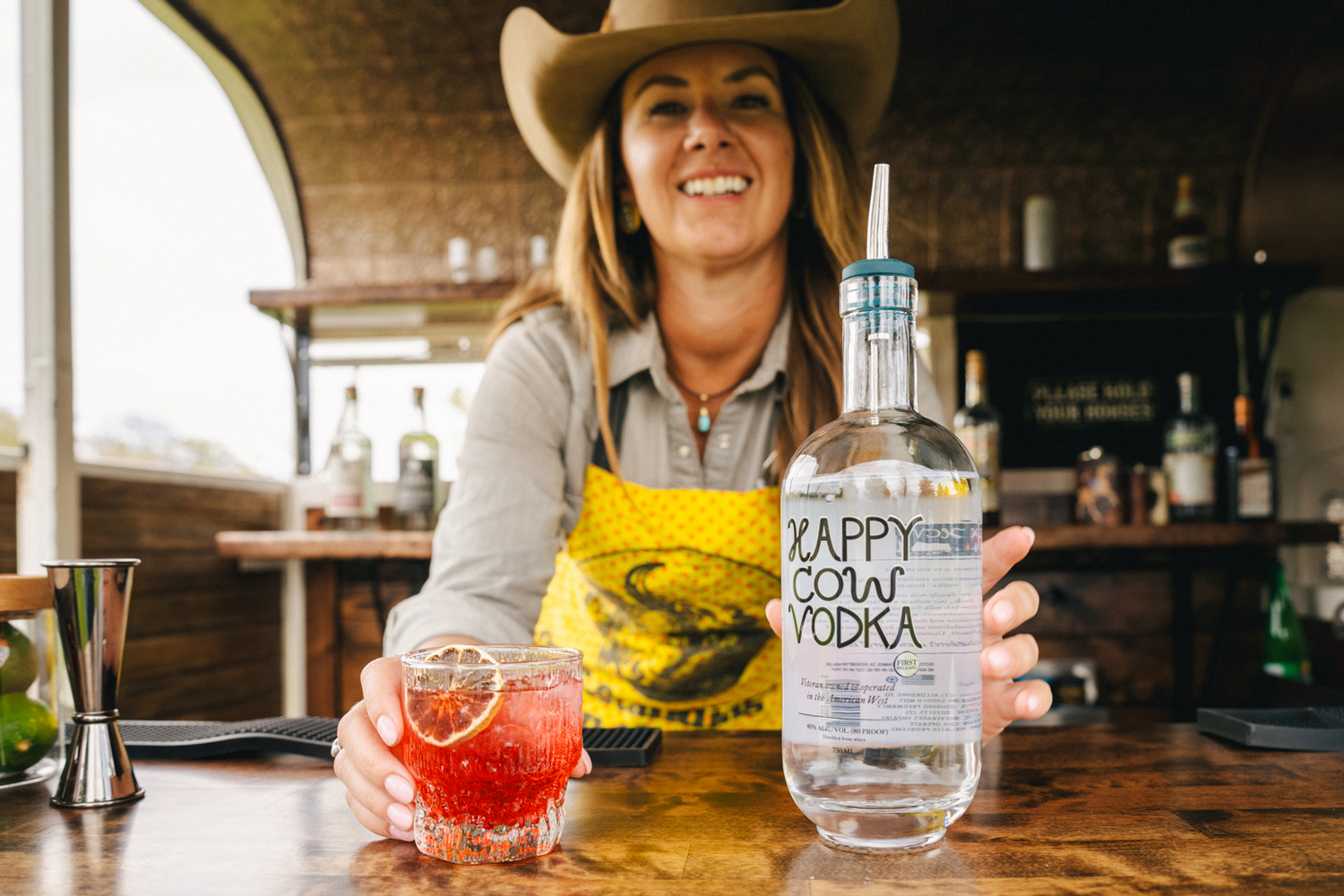
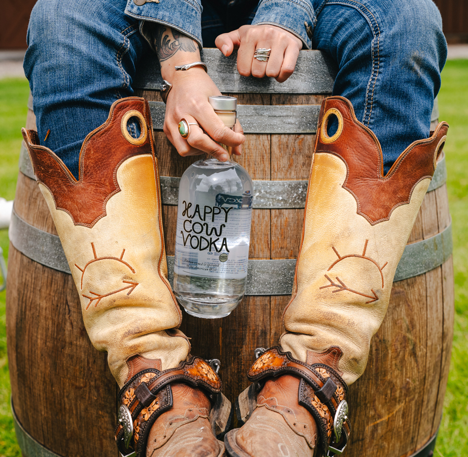
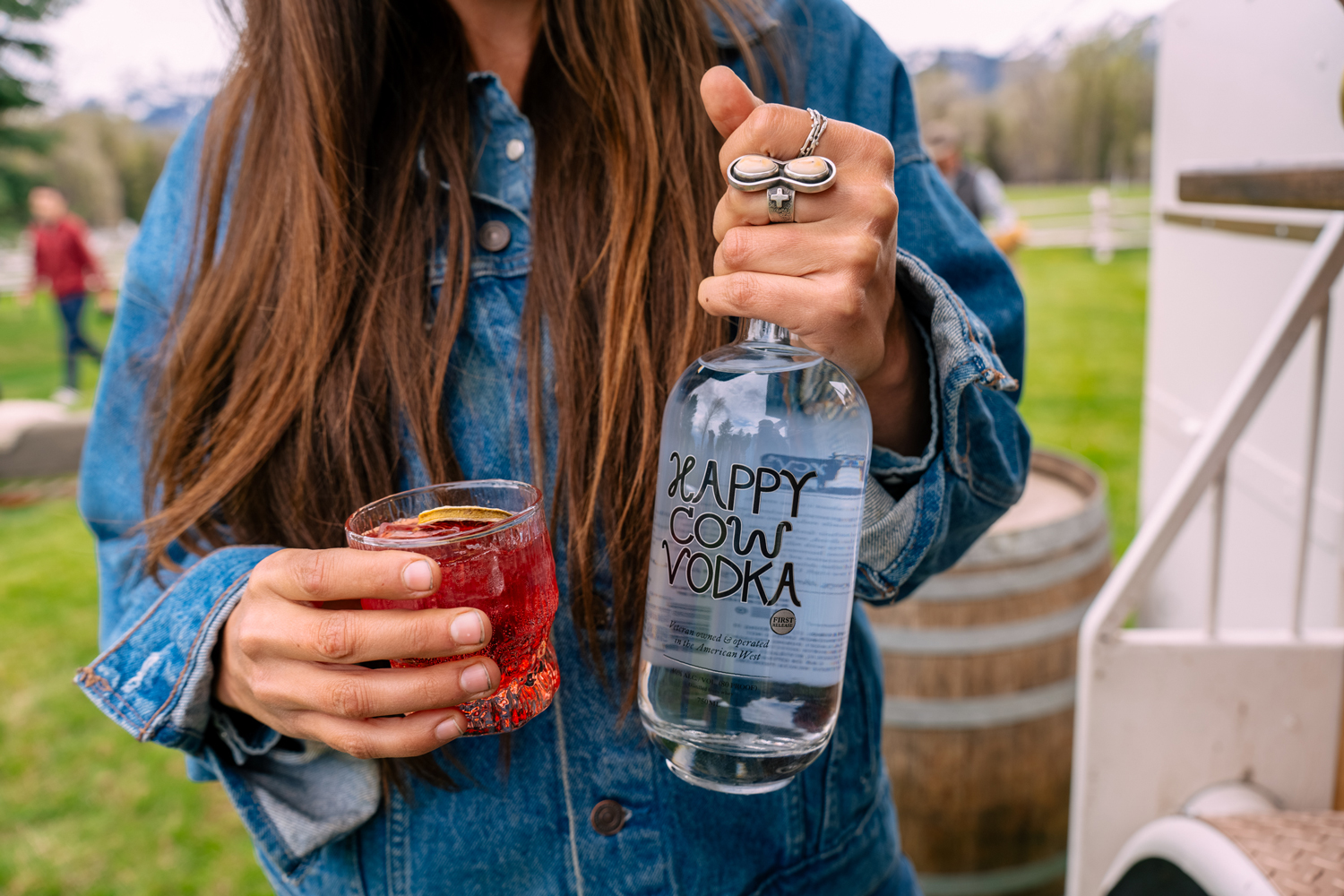
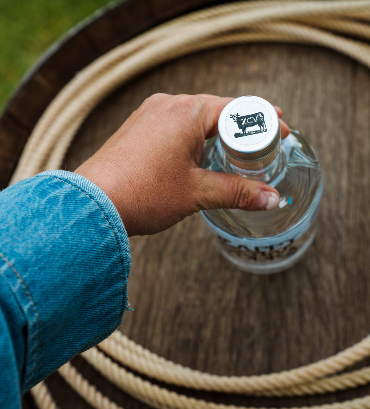
When we set out to craft the logo and label for Happy Cow Vodka, we knew the bottle had to speak as clearly as the spirit inside. Our branding and design process was all about honoring the heartland — think dusty boots, open pastures, and a down-to-earth, good-time spirit.
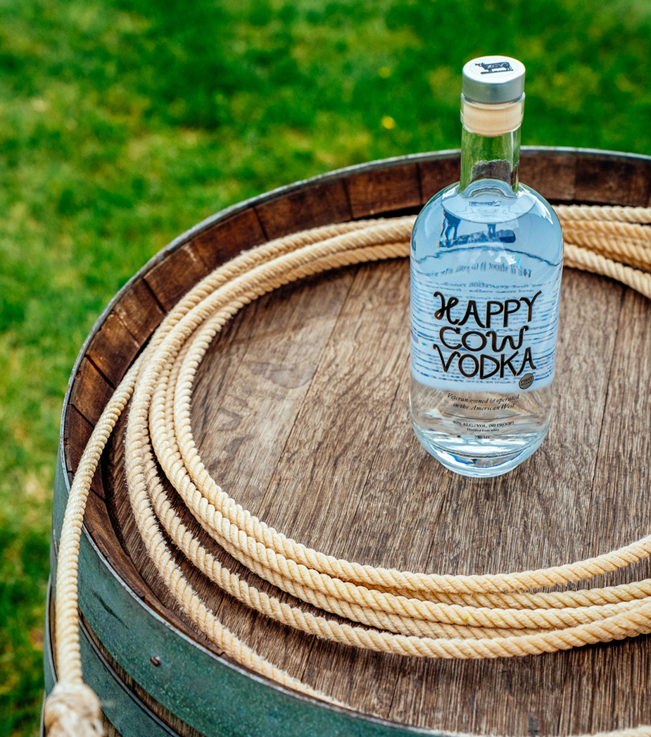
We blended rustic charm with a touch of cheeky personality, using hand-drawn type and subtle Western motifs to create a look that’s as memorable as your first sip. The lettering mimics a branding iron used on cattle in the early 20th century. Even the shape of the bottle was carefully selected, giving nods to the cows in an almost milk bottle rounded shape.
This isn’t just vodka. It’s a vibe. A lifestyle. A bold nod to craftsmanship with a wink of mischief.
Logo Design Spotlight: Happy Cow Vodka
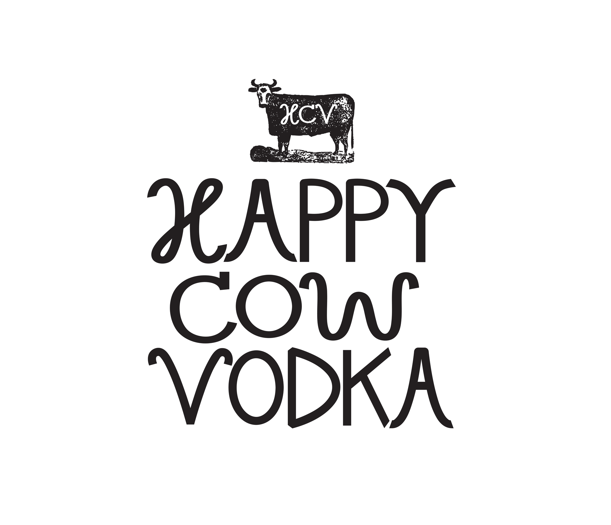
We wanted the Happy Cow Vodka logo to strike the perfect balance between rustic charm and bold simplicity. This hand-drawn, line-art style logotype feels playful yet confident—just like the brand itself.
The cow’s expression is relaxed and slightly cheeky, evoking the laid-back, feel-good spirit of a crisp sip of vodka on a sunny afternoon. The bold, clean lines keep it versatile for everything from bottle labels to merch, while the hand-rendered aesthetic gives it warmth and authenticity.
We sketched dozens of cows (seriously, so many cows) before landing on this one. Her posture, her horns, her happy little smirk—she just felt right. From there, we refined the lines, played with proportions, and ensured she could hold her own in both small and large-scale formats.
Sometimes, simplicity says it all.
The lettering was crafted to feel strong and confident, with clean lines and wide spacing that give it room to breathe. We wanted it to be modern and memorable, while still feeling approachable—like a premium brand that doesn’t take itself too seriously. The all-caps style emphasizes boldness and shelf presence, making it instantly recognizable on a bottle or sign.
Pairing this with the hand-drawn cow illustration created the perfect contrast: structured meets playful, refined meets rustic. The simplicity of the type allows the personality of the cow to shine, while still holding its own as a core brand mark.
Every detail—from the curve of the horns to the weight of each letter—was intentionally designed to reflect the spirit of Happy Cow Vodka: fun, handcrafted, and proudly original.
CREDIT
- Agency/Creative: Hoot Design Studio
- Article Title: Behind the Bottle: Happy Cow Vodka’s Label Design Story by Hoot Design Studio
- Organisation/Entity: Freelance
- Project Type: Identity
- Project Status: Published
- Agency/Creative Country: United States
- Agency/Creative City: York
- Market Region: North America
- Project Deliverables: Brand Design, Brand Identity, Branding, Identity System, Label Design, Lettering, Logo Design, Packaging Design
- Industry: Food/Beverage
- Keywords: vodka, alcohol, label, packaging, logo, wordmark, branding, cow, spirits, bottle, label design, packaging design, whey, milk, western, ranch, logo design, lettering, hand lettering, custom lettering, logotype
-
Credits:
Graphic Designer: Jen Borror


