


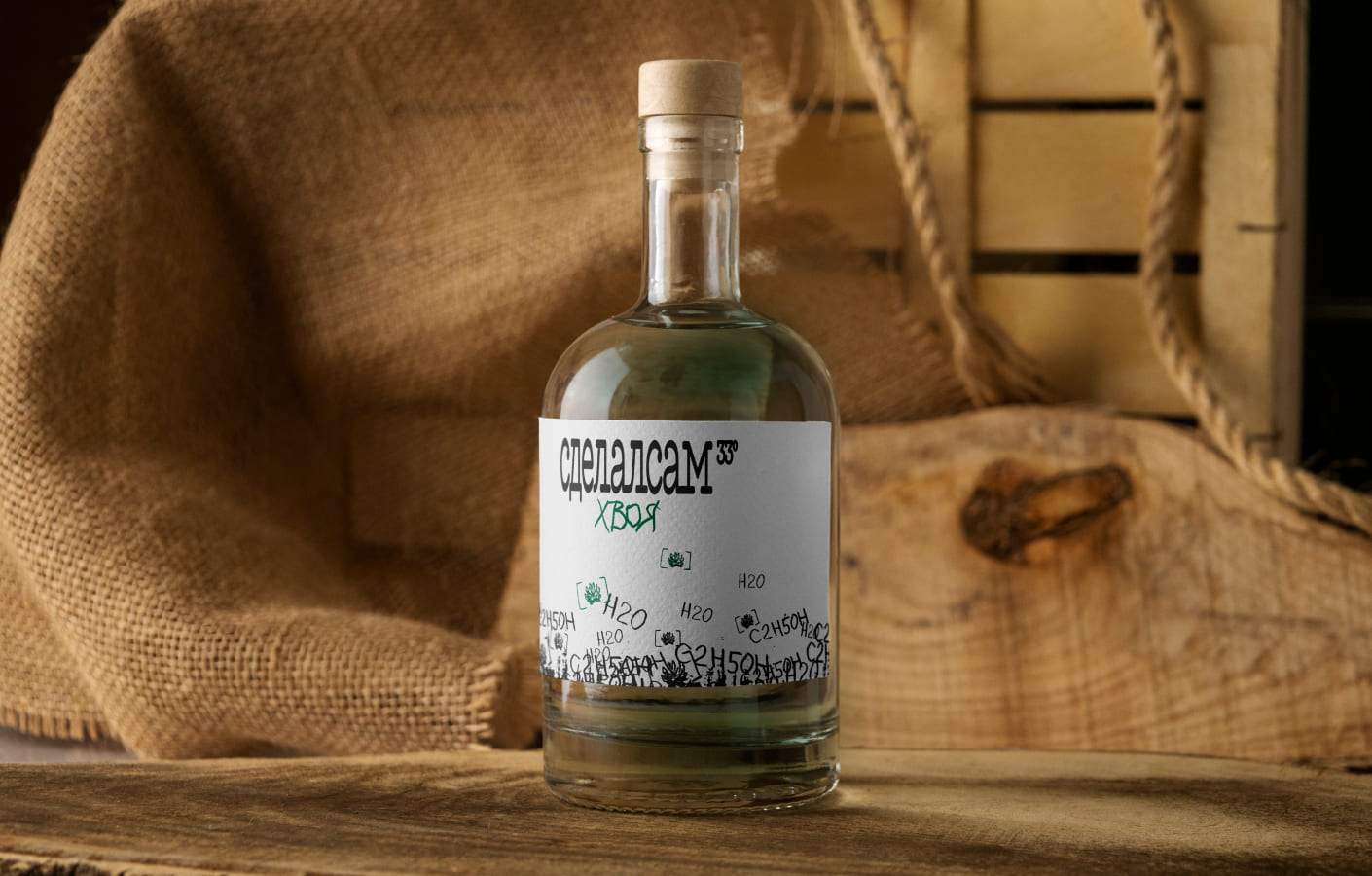
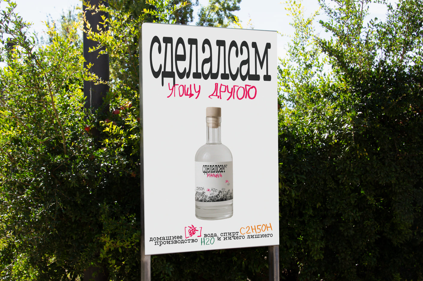
“Sdelalsam” (Russian for “I made it myself”) speaks to the burgeoning consumer desire for authenticity, tradition, and artisanal self‑production. The project celebrates homemade tinctures – plant‑based, alcohol‑extracted herbal preparations – crafted in small batches and brought to life through elegant, deeply engaging packaging.
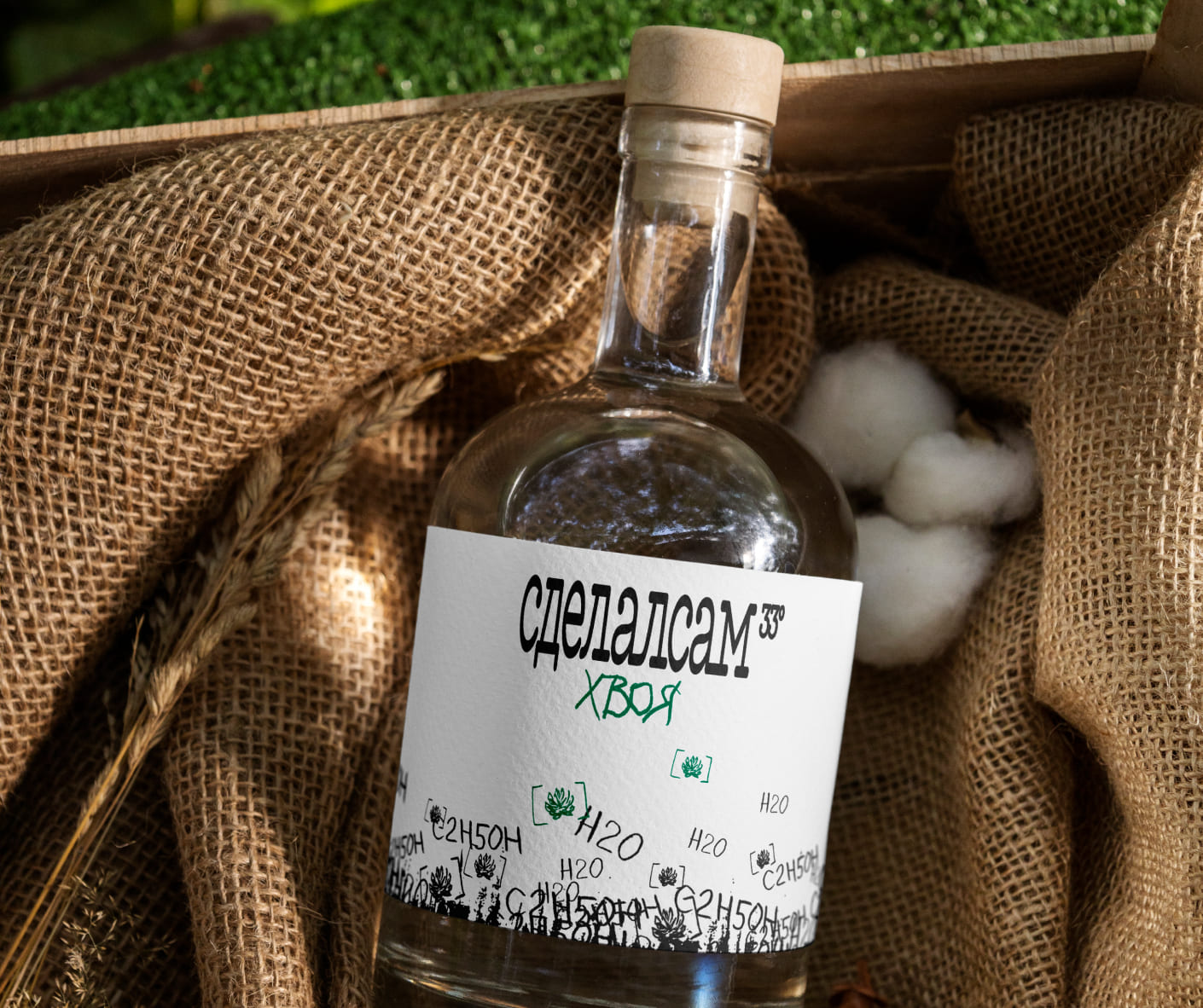
This design isn’t about mass‑produced tinctures but about the intimate act of creation: gathering botanicals, macerating them in alcohol, aging them in dark glass jars, and finally dosing them in amber dropper bottles. The visual identity seems to bridge vintage apothecary aesthetics with a modern minimalist sensibility – think hand‑drawn plant and berry illustrations, refined typography echoing antique labels, and clean layouts that foreground the tinctures’ color and texture.
The goal: elevate home‑made remedies to something not just functional, but also beautiful and collection‑worthy – boxes you’d leave on your counter, bottles you’d display as part of ritual.
At the heart of Sdelalsam’s packaging is a dual narrative: homely authenticity + premium craftsmanship. Former emphasizes care, warmth, approachability; latter, precision, refinement, educated expertise.
To execute this, the design uses:
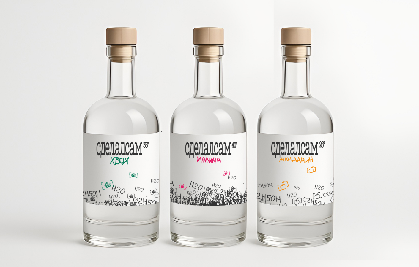
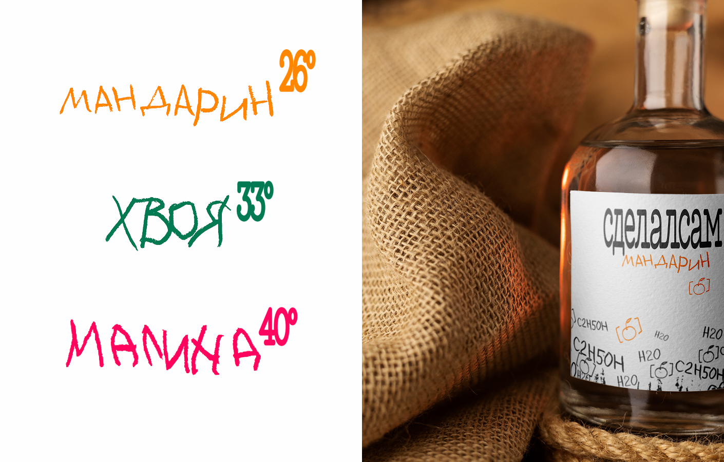
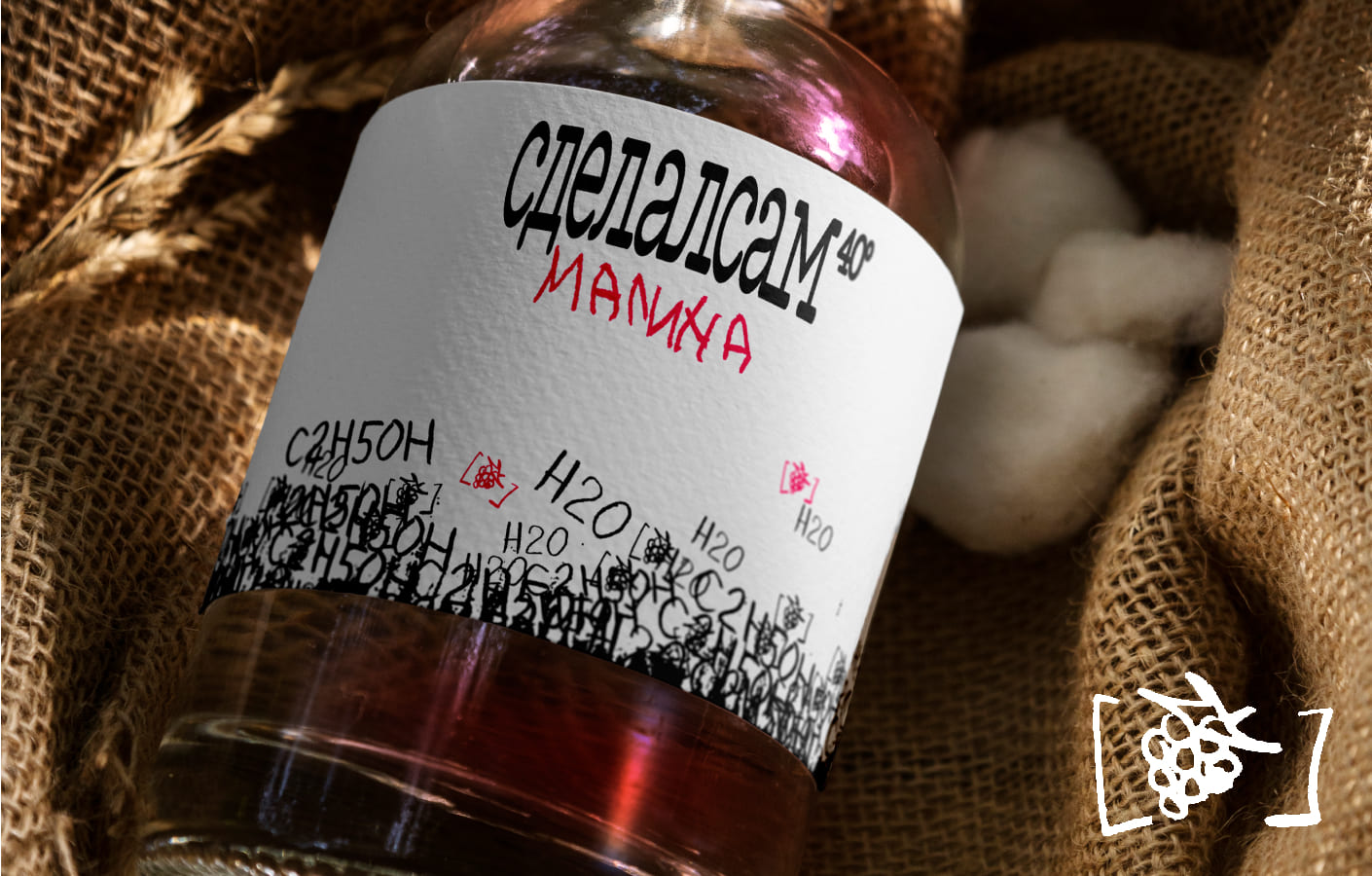
Color palettes drawn from herbs themselves – deep sage, rich mandarin, slate botanical prints – resonating with flavors and functions (calming, energizing, immune‑support).
Typography pairing a modernised serif (evocative of old medicinal texts, yet with a twist) with a hand‑lettered script that asserts “home‑grown personality” and varies according to the drink strength. The stronger the degree, the more playful and illegible the font, reflecting the way a drunk person tries to write after a few shots of tincture.
Graphics: botanical line‑drawings or woodcut motifs echoing the plants in each tincture – raspberry, mandarin, cone – inviting tactile/visual connection.
CREDIT
- Agency/Creative: Daria Shefer
- Article Title: Sdelalsam Homemade Tinctures Packaging Design by Student Daria Shefer
- Organisation/Entity: Student
- Project Type: Packaging
- Project Status: Non Published
- Agency/Creative Country: Russia
- Agency/Creative City: Moscow
- Market Region: Europe
- Project Deliverables: Art Direction, Design, Graphic Design, Illustration, Packaging Design
- Format: Bottle
- Industry: Food/Beverage
- Keywords: graphic design, illustration, alcohol, beverage, coal, scan, packaging, bottle, tincture
-
Credits:
Graphic Designer: Daria Shefer


