


Introduction
Erato is a brand born from emotion, mythology, and the human need for meaningful connection. Inspired by Erato, the Muse of lyrical poetry and love, the brand was conceived as a tribute to life’s intimate transitions: weddings, celebrations, and moments of poetic transformation. From the early stages of brand strategy to the visual identity system and digital presence, every element was developed to evoke clarity, elegance, and emotional resonance.
This is a project about more than aesthetics. It is a strategic, holistic approach to storytelling through design, a visual identity crafted to reflect values, inspire trust, and honor experience.
Strategic Foundations
The project began with deep research into the event and wedding services industry, focusing on how brands in the space communicate intimacy, trust, and professionalism. Most visual languages within the sector tended to oscillate between over-romanticized clichés and rigid minimalism. Our goal with Erato was to find balance: to design a brand that speaks softly, yet meaningfully, romantic without being overly sentimental, structured without losing warmth.
We built the strategy around three guiding principles:
Emotion as structure: Every design decision had to reflect an emotional dimension, whether subtle or symbolic.
Mythology as context: Erato, the muse, gave the brand its name and narrative core, anchoring it in the world of poetic symbolism.
Simplicity with depth: From color palette to typography, nothing was ornamental. Every element served a meaning.
Naming and Concept
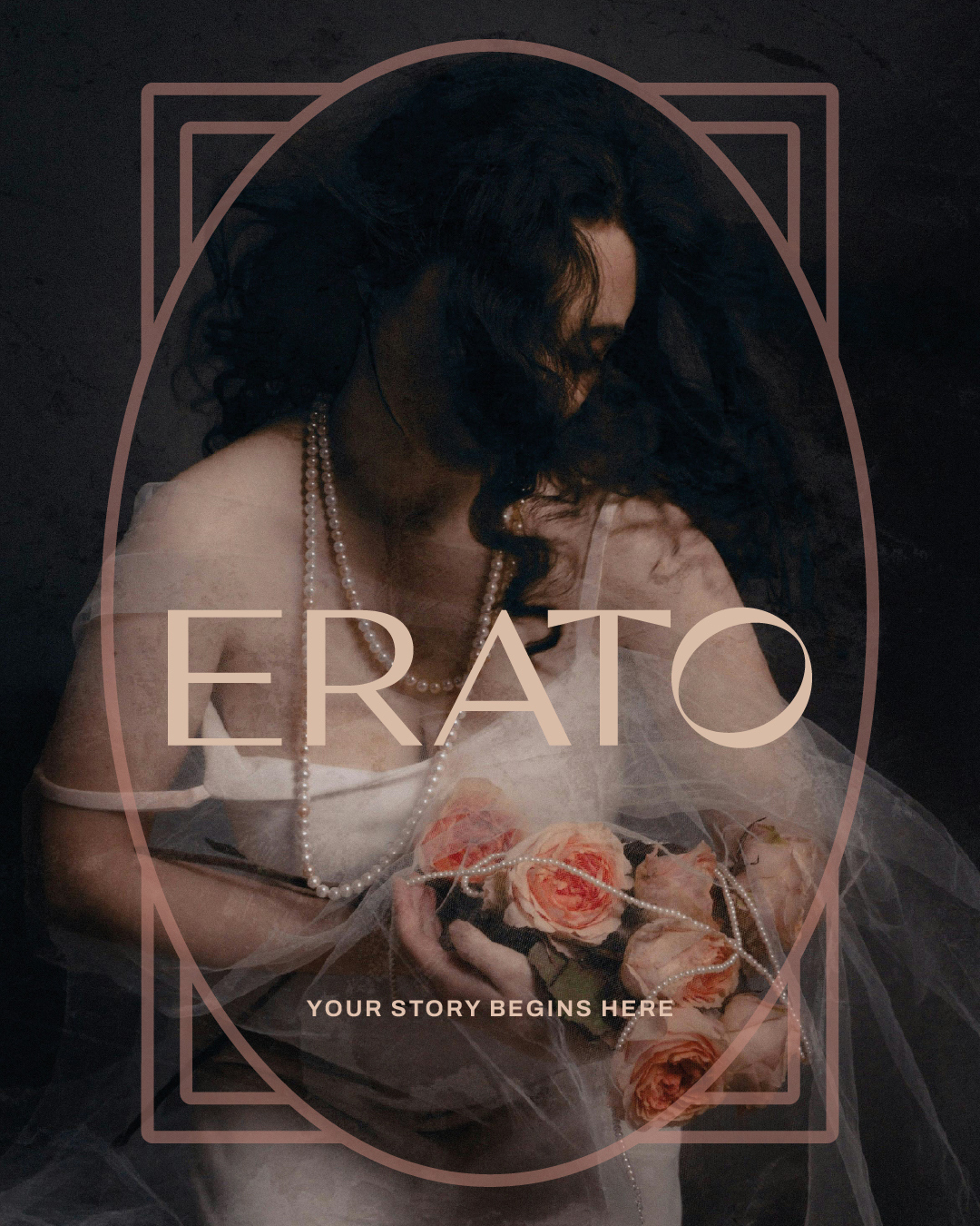
The name Erato was selected not only for its mythological roots, but for its phonetic and visual clarity. It is soft, melodic, and instantly memorable. More importantly, it evokes a world of lyricism, of beauty and emotional cadence.
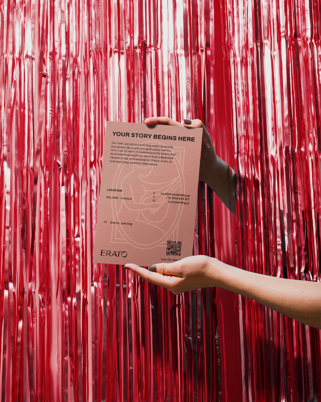
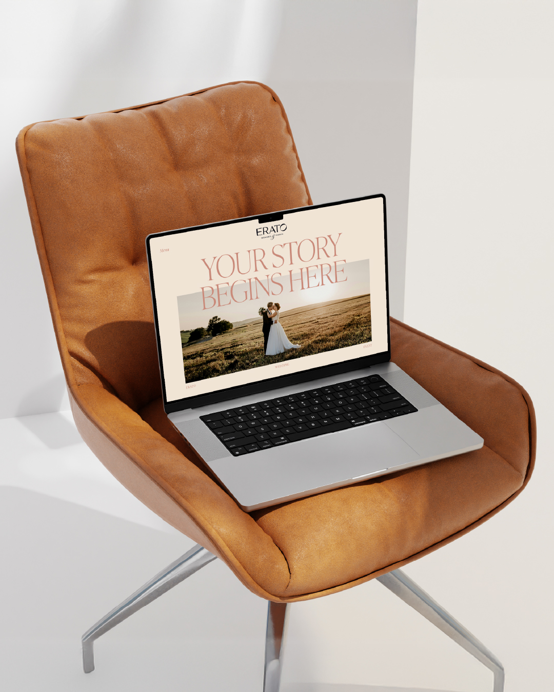
The tagline “Your Story Begins Here” frames the brand as more than a service provider; Erato becomes a collaborator in shaping personal narratives. It positions the brand within life’s most significant turning points, offering both guidance and aesthetic curation.
Symbolism & Visual Language
At the heart of the brand identity lies symbolism, a subtle but powerful framework that informs the entire visual system.
Two central symbols were chosen:
The Lyre represents harmony, art, and poetic expression. It recalls the musical and emotional undertones of human connection.
The Mirror: A quieter symbol of introspection, self-awareness, and truth, serving as a metaphor for honest celebration and inner alignment.
These symbols are not used literally but serve as undercurrents. Their influence is felt in the logo’s curves, the balance of form and space, and the soft rhythm of the typographic grid.
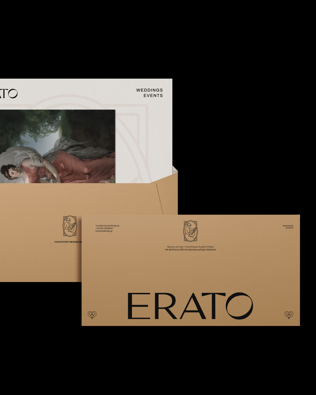
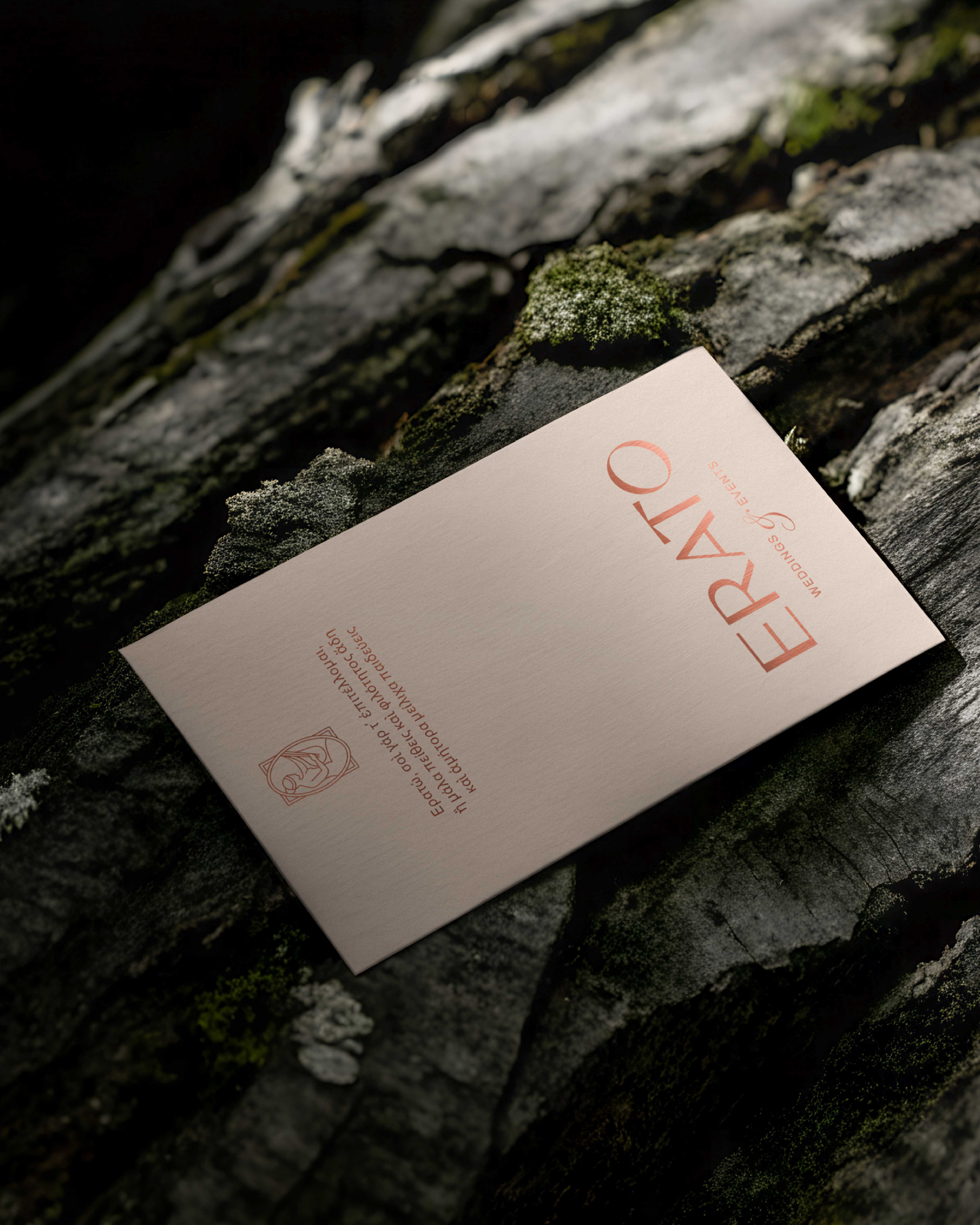
Logo & Typography
The logotype was designed to feel both timeless and contemporary. Its structure is elegant and precise, with gentle contrast and measured spacing that alludes to handwritten rhythm without mimicking script.
Color System & Mood
The color palette is restrained but expressive. Earthy neutrals, off-whites, and muted warm tones create a sense of softness and trust.
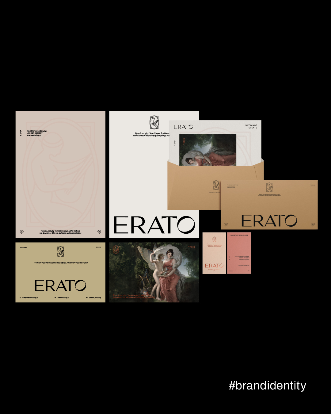
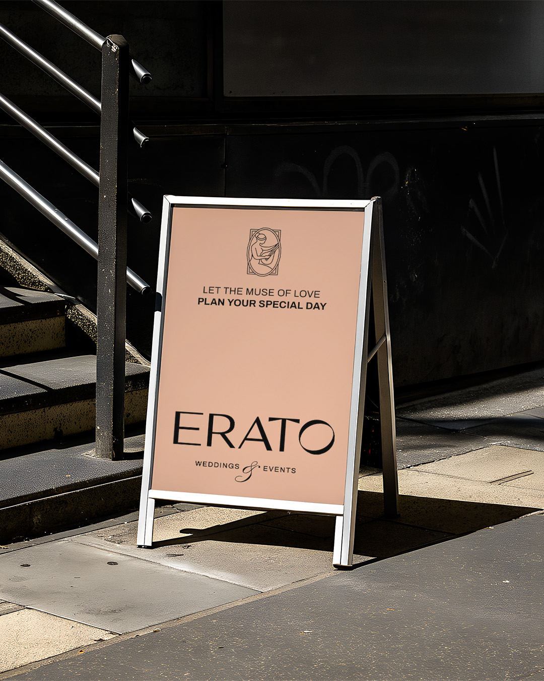
Brand Applications
With the identity defined, we moved into real-world applications. The goal was not to simply decorate, but to create tangible experiences that express the essence of the brand.
We designed a full set of brand collateral, including:
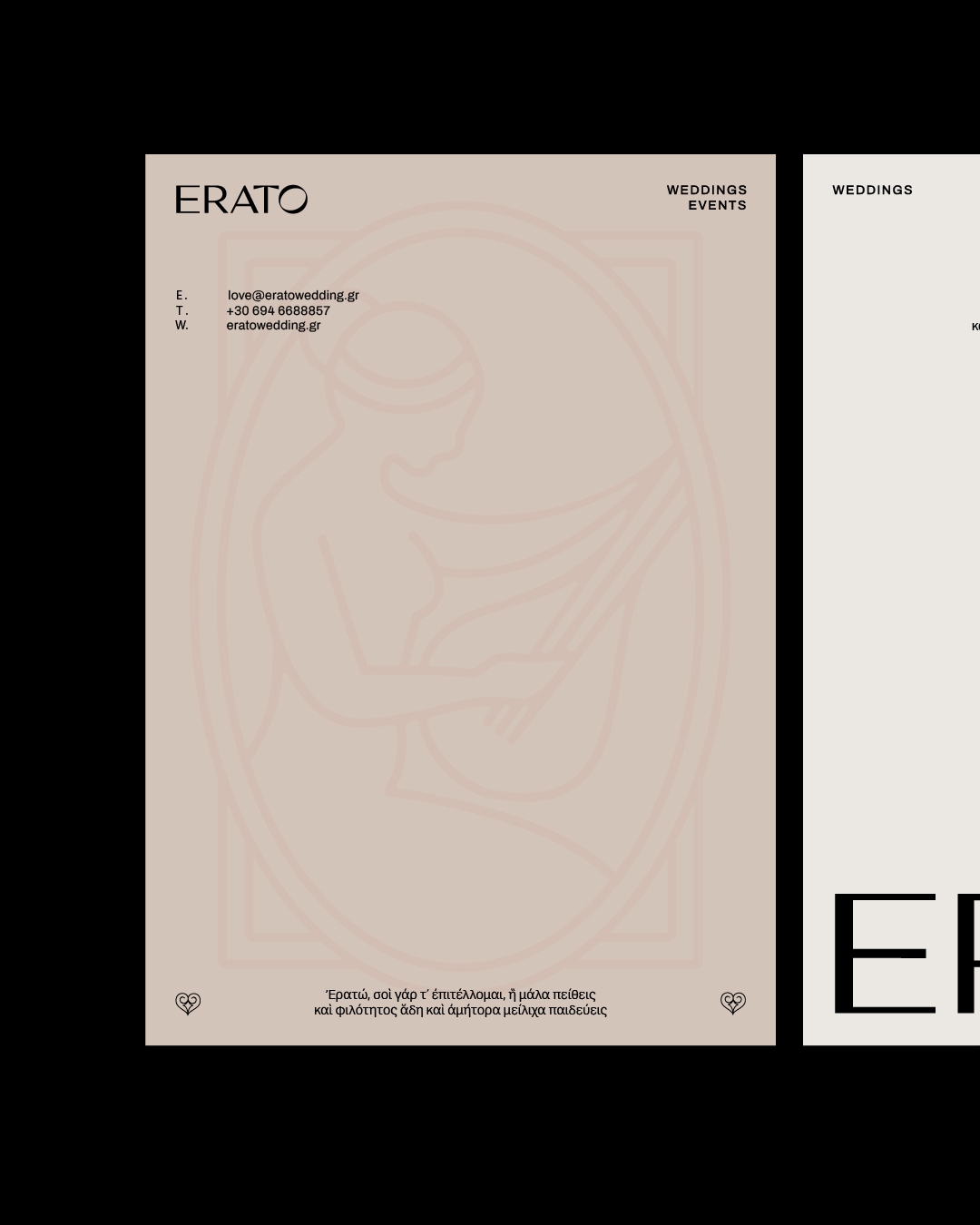
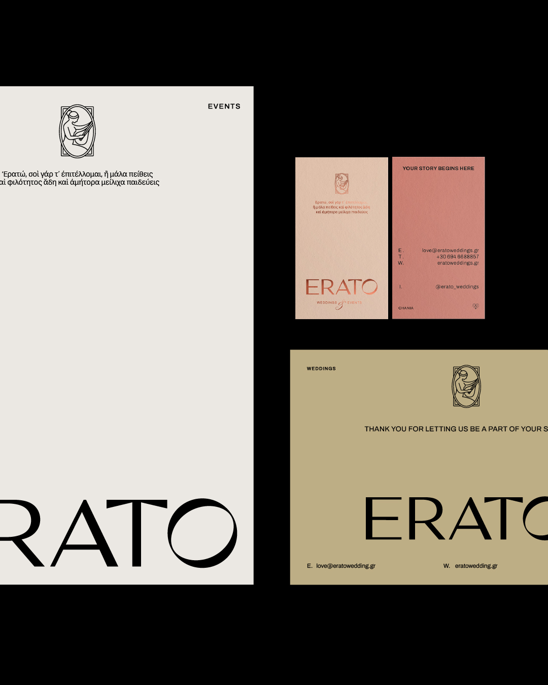
Business cards & stationery
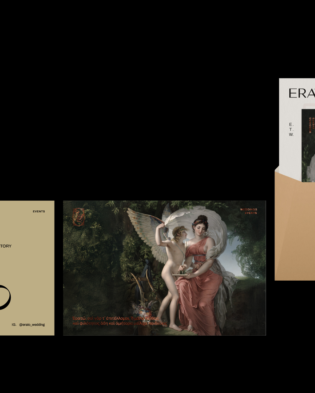
Advertising materials
Internal templates & documents
Wayfinding & signage elements
Particular attention was paid to material selection. Paper textures, print finishes, and format proportions were all selected to reflect the brand’s understated elegance. The visual system was applied with restraint; the design always served the message, never the other way around.
Every application contributed to a cohesive brand atmosphere: one of care, presence, and clarity.
Digital Presence: eratowedding.gr
With the visual identity established, the next challenge was to bring Erato into the digital space through the design and development of its official website: eratowedding.gr.gr.
The website was envisioned not just as an informational hub, but as a digital extension of the brand’s tone, minimal, poetic, and structured. It needed to communicate professionalism while also evoking emotion.
Key design decisions included:
A clear, intuitive layout with thoughtful spacing and visual rhythm
A soft, restrained typographic system that reflects the brand’s voice
Responsive behavior across devices, ensuring a consistent experience
Subtle transitions and hover interactions that guide without distracting
The site’s architecture supports the brand narrative. Content flows naturally, allowing users to discover the brand’s philosophy, services, and approach at their own pace.
The goal was simple: To create a digital environment that reflects what Erato truly offers — not just services, but presence. Not just decoration, but meaning.
Design Philosophy
Throughout the project, our team followed a clear design philosophy:
Design is not decoration. Design is direction.
Every decision, visual, strategic, or technical, was made in service of this principle. From the initial research to the final execution, our focus remained on creating systems, not just visuals. On helping the brand not only look beautiful, but also behave beautifully, across all platforms and media.
Outcome
The result is a brand that is not just cohesive, but alive, adaptable, human, and emotionally resonant. Erato communicates with clarity and character, across print, space, and screen.
More than a wedding service provider, Erato positions itself as a creative partner in life’s most intimate celebrations. A brand that invites, listens, and elevates. A brand with a voice that’s quiet, but deeply heard.
CREDIT
- Agency/Creative: Nook Studio
- Article Title: Nook Studio Shapes Erato into a Poetic Identity for Modern Wedding Rituals
- Organisation/Entity: Agency
- Project Type: Identity
- Project Status: Published
- Agency/Creative Country: Greece
- Agency/Creative City: Chania
- Market Region: Europe
- Project Deliverables: Art Direction, Brand Identity, Brand Naming, Brand Strategy, Logo Design, Web Design
- Industry: Professional Services
- Keywords: Brand Identity, Logo, Art Direction, Branding, Web Design, Web Development
-
Credits:
Agency: Nook Studio


