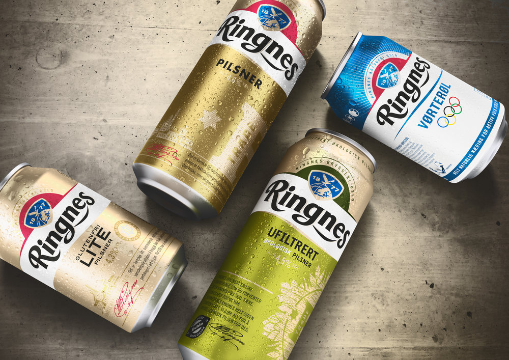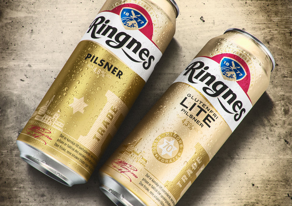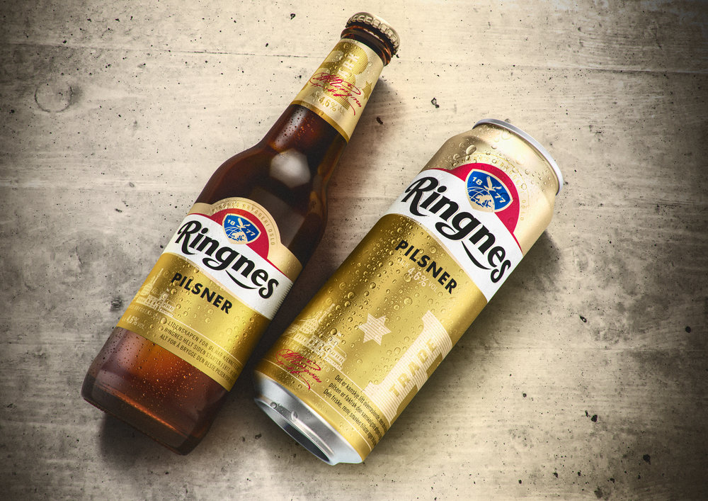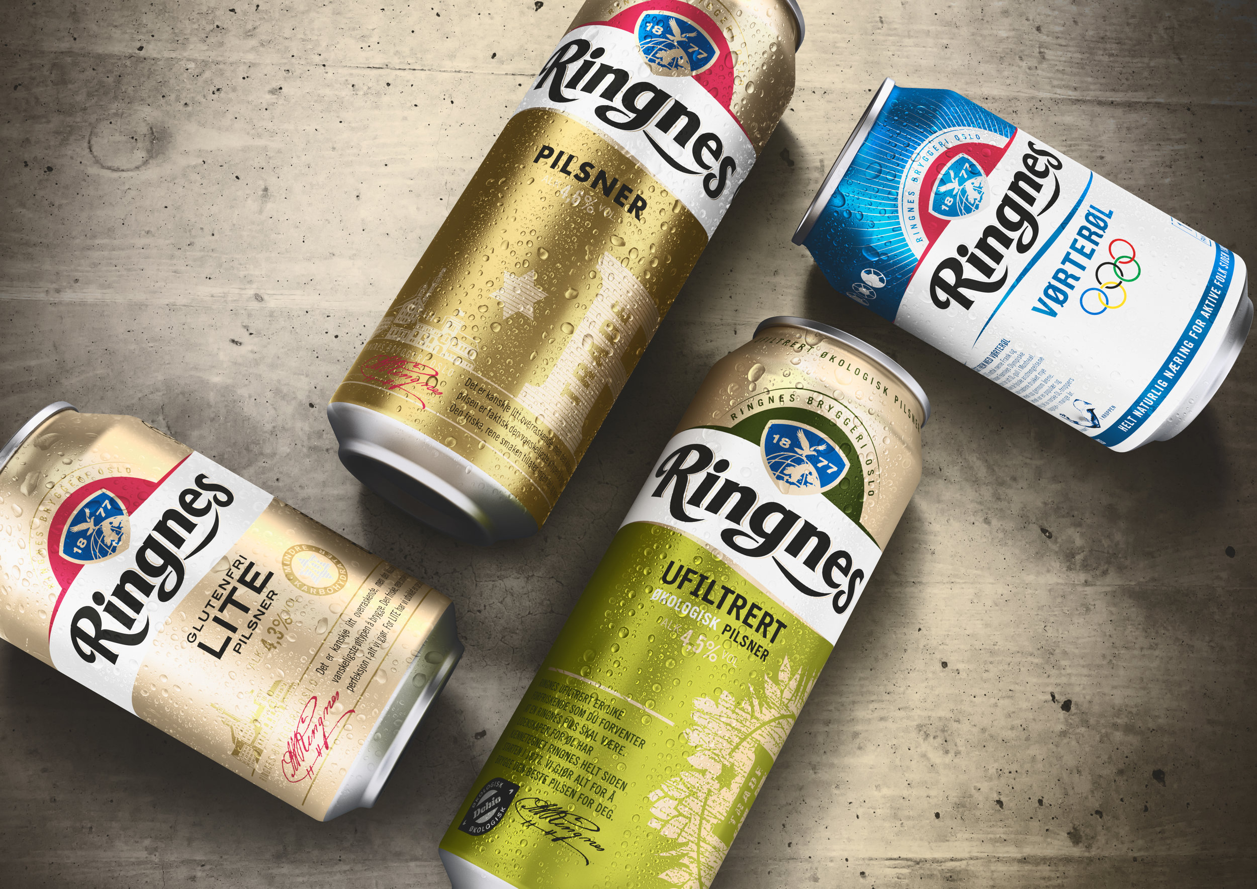
” With craft beer indicating a big shift in consumer demand, Ringnes are seizing the opportunity to regain relevance with the modern beer drinker by tapping into new trends. The Carlsberg owned beer brand partnered with JDO Brand & Design to rejuvenate the identity, portfolio and pack design, in order to unify the brands equity, deliver stand out at shelf, and ultimately allow for innovation and extension.For 140 years, Ringnes’ biggest volume contributor has been Pilsner. But with expansion on the horizon, the role of the new design was to adapt to features of new variants, while always delivering the brands core principles; to be proud, authentic, honest and inclusive. The new portfolio strategy broadens the brands appeal offering products across three distinct pillars of ABV-based liquids; speciality variants and seasonal beers. Each range owns a unique twist on the traditional logo, to help consumers navigate with ease and bring continuity as well as choice.“The Ringnes brand has been loved for a long time, but as a brewery we always need to stay one step ahead. With our new approach, we broaden relevance by introducing distinct innovations under the umbrella of Ringnes. We believe the new ranges will benefit from close association with Ringnes’ heritage and re-establish us as a brewing house dedicated to expertise, passion and importantly, choice.” Daniel Bernstein, Brand Manager of Ringnes Beer.”

” The new designs signal a shift in Ringnes’ visual language where the brand’s typography, banner and shield become a trademark feature across every product, and the iconic red and gold is a standout element that visually unites the range. The design is bold and simple, as to make consistent impact across the entire Ringnes family of today and the future.“This new approach has created a core design language for Ringnes that allows them to innovate with flexibility, and cohesion” said Paul Drake, JDO Executive Creative Director. “The Ringnes gold banner, iconic blue shield and signature script allow us to preserve the rich brand heritage, while helping consumers identify with their own personal taste; small batch or large, speciality or seasonal.”Bespoke illustrations and colours bring to life the personality behind each product and work to market the different characteristics behind each of the new ranges. First to market was Ringnes Økologisk Ufiltrert, delivering a rich drinking experience, launched in February of this year.Daniel Bernstein, Brand Manager of Ringnes Beer concluded: “JDO’s portfolio design strategy marks the first time that the brands iconic history will be shared across all beers, new and old, in such a prominent way. A manifesto of the Ringnes unique heritage presented in a new and modern way, ready to retake the position as Norway’s number one beer brand.”JDO. The Shape of Things to Come.”


