


Introduction / Context
Gloop is a skincare brand built around the idea that beauty should be strange, emotional, and unapologetically real. In a market dominated by sterile “clean beauty” clichés and polished minimalism, I set out to create something entirely new—a brand space that celebrates texture, tactility, and personal expression.
My goal was to develop a comprehensive brand identity system that would stand out in a crowded field while offering depth and flexibility. I wanted to move beyond surface-level aesthetics and build a meaningful brand that could evolve over time, support multiple product lines, and remain consistent across all touchpoints—from packaging and advertising to digital channels and social media.
This project wasn’t just about making Gloop “look good.” It was about giving it a voice, a personality, and a clear point of view. I wanted the brand to feel alive, evocative, and unmistakably itself—connecting emotionally with users who are tired of bland, predictable skincare branding.
Brand Strategy / Naming
At the core of Gloop’s strategy is embracing the weird, the messy, and the tactile. From the beginning, naming was critical: the word “Gloop” is onomatopoeic, evoking thickness, stickiness, and a playful, sensory quality. It immediately conjures images of richness and viscosity—the exact qualities you want in a skincare product.
This naming choice was intentionally bold and even polarizing. Unlike generic, safe-sounding skincare brands with words like “pure” or “clean,” Gloop rejects sanitized clichés. Instead, it leans into its own weirdness and irony, signaling that it doesn’t take itself too seriously—and doesn’t expect its users to conform to sterile ideals of beauty.
My strategy was to ensure that every element of the brand’s visual and verbal language embodied this concept. The idea was to make Gloop feel like an experience, not just a product—a brand you could feel, hear, and remember. By turning the name itself into a sensory trigger, I laid the foundation for an entire design system that celebrates the raw, real, and imperfect nature of self-care.
Brand Philosophy & Tone of Voice
Gloop was designed as an antidote to the sameness that dominates skincare branding. Where many brands promise purity and perfection, I wanted Gloop to celebrate the tactile, the sensory, and the strangely beautiful.
The brand is about freedom—freedom to express yourself without rules or apologies. It’s for people who don’t want to be told how to be beautiful but want to define it themselves. This philosophy demanded a tone of voice that is direct, playful, irreverent, and always authentic.
I avoided generic marketing speak in favor of language that feels human and real. Short, punchy phrases, ironic twists, and evocative descriptors help Gloop talk to people on their level, without condescension or false promises. It doesn’t sell “flawless skin”; it offers an experience and an emotional connection, celebrating imperfection.
This tone is deliberately inclusive and anti-elitist. Instead of selling unattainable ideals, Gloop invites everyone to explore, play, and enjoy the messy, personal nature of self-care.
Visual Concept & Art Direction
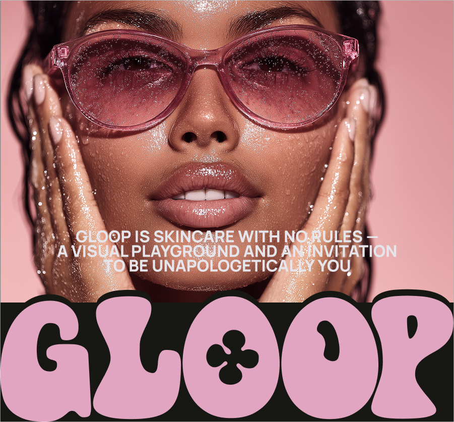
From the start, I wanted Gloop’s visuals to be as memorable as its name. The concept centered on tactility—thickness, fluidity, and organic movement—turning skincare textures into a visual language.
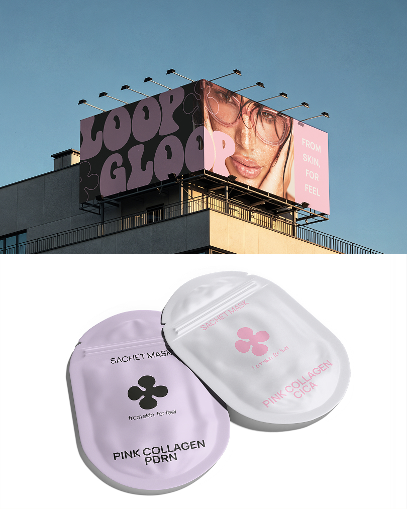
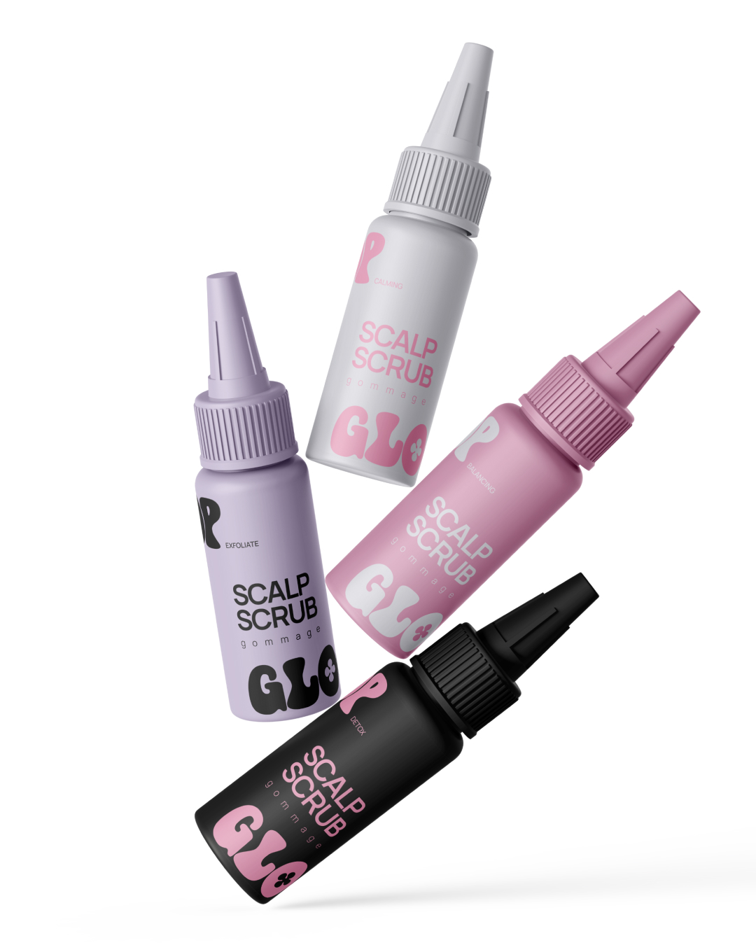
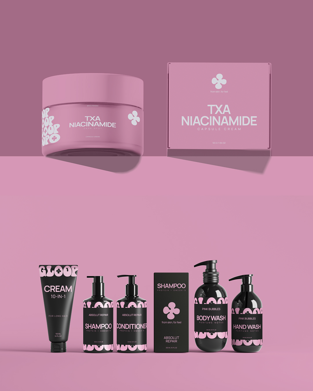
I chose a deep black background as the base, rejecting sterile white space in favor of drama and contrast. Black isn’t typical for skincare but here it serves as a bold canvas that amplifies the candy-colored accents. Soft pinks and lilacs feel playful, edible, and deliberately out-of-place, breaking category conventions and catching the eye.
Abstract, irregular shapes are central to the system. Inspired by drips, smears, and viscous movement, these forms are intentionally imperfect, reflecting the brand’s embrace of authenticity. The art direction is bold and strange but never alienating. Every element invites touch, rewards curiosity, and communicates the brand’s promise: skincare as a sensory, emotional experience.
I also prioritized adaptability, ensuring the system works in minimalist social media posts and richly layered packaging alike.
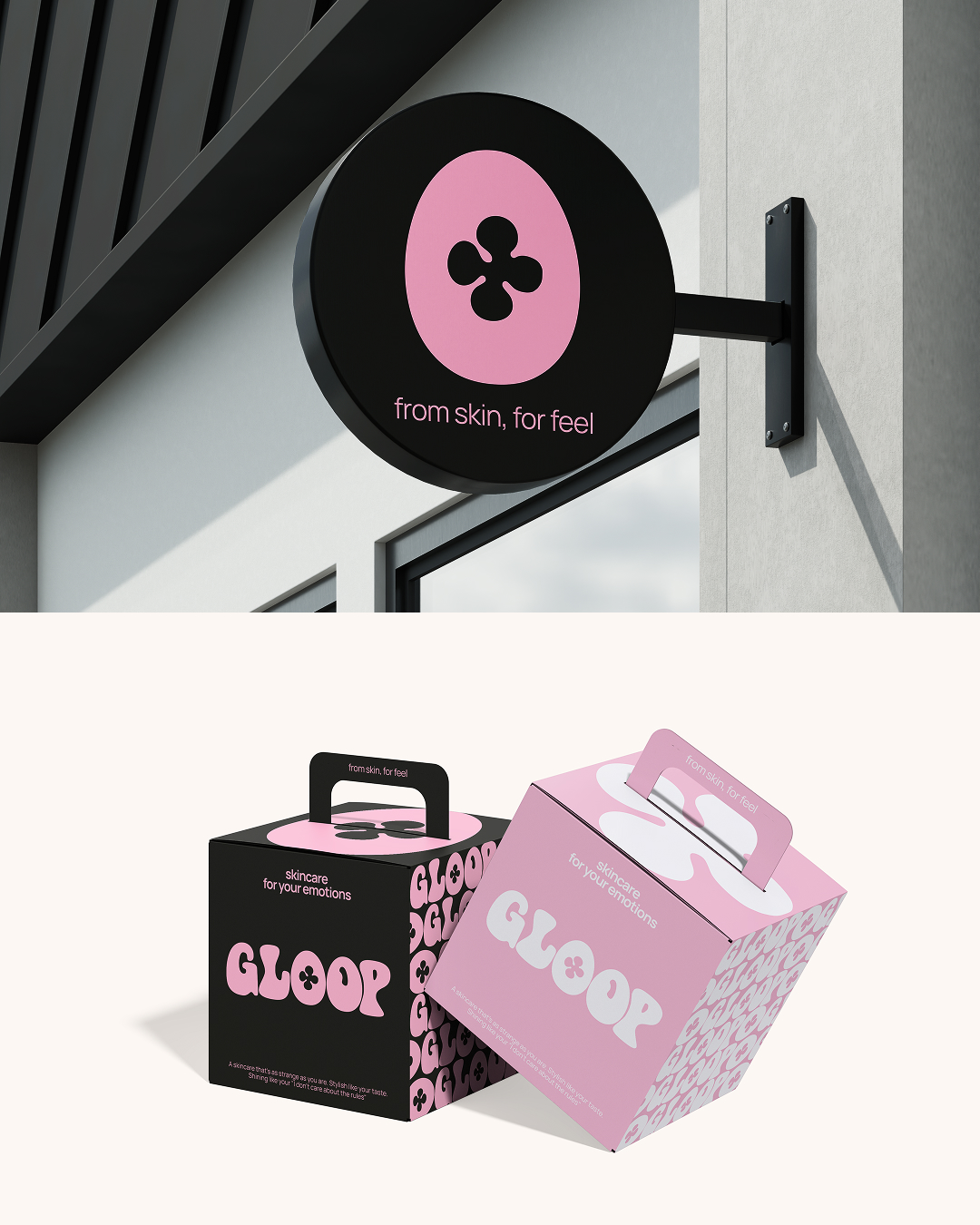
Logo Design
The logo is one of the brand’s most critical elements, acting as its first sensory trigger. I wanted it to evoke thickness and fluidity even in static form.
I designed custom letterforms that feel as if they’re melting or stretching, with organic curves that reject perfect geometry. The result is unmistakable at first glance but also rewards closer inspection.
Letter shapes are slightly irregular, with subtle variations in weight and proportion. This introduces a sense of movement and viscosity without sacrificing legibility. The balance ensures the logo is practical for packaging and digital use while carrying strong emotional and aesthetic weight.
Crucially, the logo is adaptable—it works as a wordmark, a monogram, or a repeating pattern element. This versatility allows it to scale seamlessly across everything from tiny icons to large-format advertising. Overall, the logo signals that Gloop is not another sterile beauty brand but one with humor, character, and tactile appeal.
Color Palette
Gloop’s color palette is designed to emphasize contrast and sensory appeal. Instead of typical “clean beauty” neutrals, I chose dramatic combinations that signal character.
Black is the foundation—a deep, pure canvas that makes other colors pop. It’s provocative and unexpected for skincare, immediately differentiating Gloop on the shelf.
To balance the darkness, I introduced candy-inspired pinks and lilacs. These colors are soft yet bold, playful, and even a bit surreal. Against black, they stand out in an intentionally offbeat way, teasing expectations and boosting brand recall.
This limited palette ensures cohesion while allowing creative freedom. It works across packaging, advertising, and digital interfaces, delivering consistent brand recognition and supporting Gloop’s philosophy of embracing imperfection and sensory experience.
Typography
Typography is critical to Gloop’s voice. I avoided generic minimalist sans-serifs in favor of a pairing that combines character and utility.
The primary display type is bold, slightly rounded, and intentionally imperfect. It features subtle quirks in stroke width and shape that echo themes of viscosity and tactility. It’s friendly yet strange enough to stand out.
Supporting text uses a clean, legible sans-serif that balances the expressive headline type. This secondary font ensures clarity for product details, instructions, and storytelling while maintaining the brand’s playful tone.
Together, this typographic system creates contrast and hierarchy while staying cohesive. It lets Gloop speak in a direct, authentic, and just-weird-enough voice that cuts through the noise.
Patterns & Brand Elements
Beyond logo, color, and type, I developed brand patterns and graphic elements that give Gloop its unique DNA.
Abstract, organic shapes evoke drips, smears, and puddles. They’re deliberately irregular, rejecting sterile uniformity in favor of messy, tactile realism. These patterns celebrate the act of applying skincare—turning it into a sensory ritual.
The custom letterforms also function as modular elements. By repeating, stretching, or layering them, I created dynamic compositions for packaging, social media, and advertising. This approach ensures brand recognition even when the logo isn’t shown in full.
These patterns aren’t decorative extras—they’re integral to communicating Gloop’s philosophy of real, personal, imperfect beauty. They invite exploration and give the brand a highly ownable visual language.
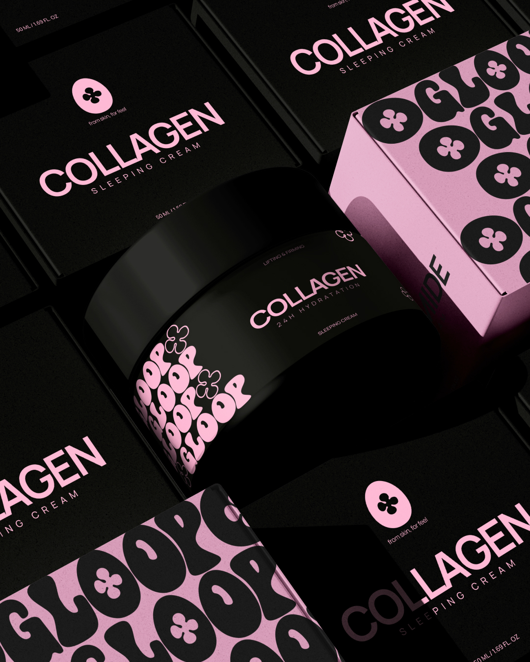
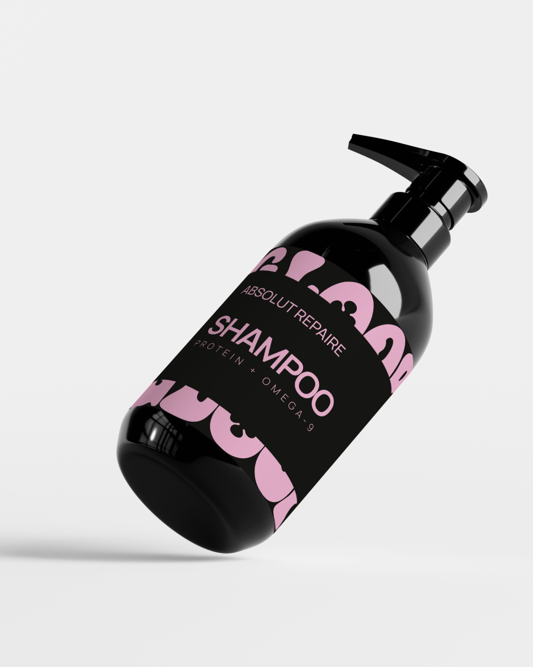
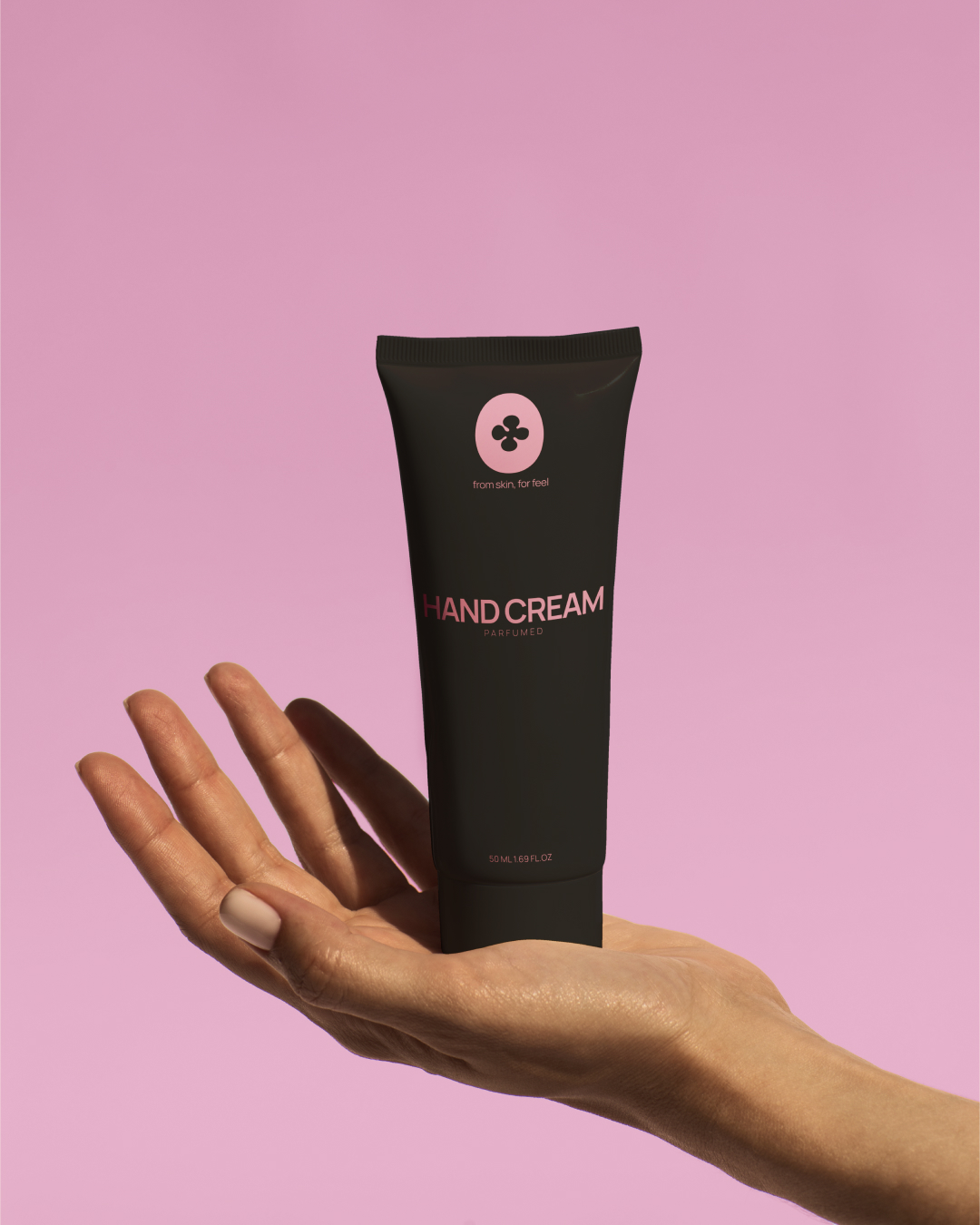
Packaging Design
Packaging is one of Gloop’s most important touchpoints. I designed it as an invitation to touch and explore, not just a container.
Black serves as the backdrop, making candy-colored accents and abstract shapes vivid and striking. The contrast draws attention and signals the brand’s unapologetic character.
Patterns derived from the custom letterforms create dynamic wraps and panels. Slight variations between product lines allow individuality within a unified system, supporting sub-brands and seasonal collections while maintaining consistency.
Typography balances clarity and personality: expressive headlines for names and benefits, clean sans-serifs for ingredients and instructions. Proposed finishes include matte coatings, subtle embossing, and spot UV to add tactile richness—turning the act of opening a product into an experience.
Applications & Touchpoints
Gloop’s brand system is designed to work consistently across all touchpoints while staying adaptable.
Advertising assets use high-contrast visuals and punchy typography to grab attention. Social media posts leverage abstract patterns and modular design elements, creating engaging, playful layouts that stay on-brand.
In-store materials bring the brand’s tactile, strange character into the physical environment. For e-commerce, clean layouts maintain usability while color, patterns, and typography reinforce a distinct, ownable atmosphere.
The system ensures every touchpoint feels like part of the same story—immersive, sensory, and unmistakably Gloop.
System & Scalability
Scalability was a core requirement. The system is modular, with color, typography, patterns, and logo all designed for reconfiguration.
It supports product expansion into sub-lines like Gloop Skin or Lab, with each able to introduce variations while staying on-brand.
The design can simplify for minimal executions or layer richly for packaging and print. This flexibility ensures Gloop can grow, launch campaigns, or develop sub-brands without losing its identity.
Results & Impact
This branding project redefines what skincare design can be: raw, emotional, and sensory. By rejecting sterile minimalism, Gloop claims a space of its own—one that celebrates imperfection and invites users to engage on their terms.
The system’s flexibility supports growth, new product lines, and campaigns, ensuring long-term relevance. Visually, it stands out immediately while rewarding closer inspection, building brand recognition and emotional connection.
Clients and test audiences responded to the brand’s boldness and authenticity, recognizing it as a genuine alternative in a sea of sameness.
Conclusion & Vision
Gloop isn’t just a skincare brand—it’s a philosophy of embracing what’s real, messy, and uniquely yours. The design system is built to last, adapt, and evolve without losing its soul.
My goal was to create not just packaging or advertising but a complete, living language that invites touch, emotion, and self-expression.
In a market that too often tells people what beauty “should” be, Gloop offers them the space to decide for themselves.


CREDIT
- Agency/Creative: Olga Aleksandrova
- Article Title: Olga Aleksandrova Designs Gloop to Challenge Clean Beauty Stereotypes
- Organisation/Entity: In-House
- Project Type: Identity
- Project Status: Published
- Agency/Creative Country: Russia
- Agency/Creative City: Saint-Petersburg
- Market Region: Global
- Project Deliverables: Brand Creation, Brand Design, Brand Identity, Brand Naming, Brand Tone of Voice, Branding, Design, Graphic Design, Identity System, Logo Design, Packaging Design
- Industry: Beauty/Cosmetics
- Keywords: Skincare, Branding, Packaging, Identity, Logo, Typography, Color, Abstract, Tactile, Sensory, Cosmetic, Bold, Art, Modular, Pattern, Storytelling, Emotional, Modern, Black, Candy, Naming, Flexible, Premium, Contemporary, Creative, Unique, Organic, Imperfect, Expression, Experience
-
Credits:
Designer: Olga Aleksandrova


