


There are moments when a total rebranding is necessary – one that rebuilds the brand from the ground up, in a way that’s appropriate to its category. This was the case with Stock Prosecco, where it was necessary to shift the brand from the world of strong alcohols and reposition it to culturally and semantically highlight the sparkling nature of prosecco.
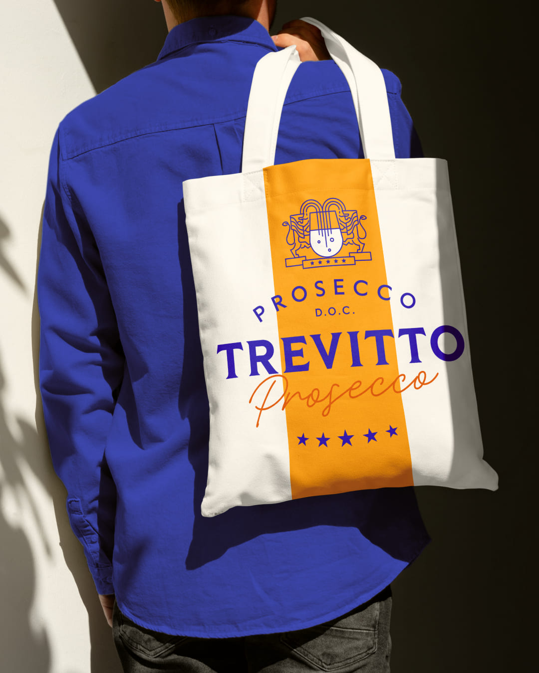
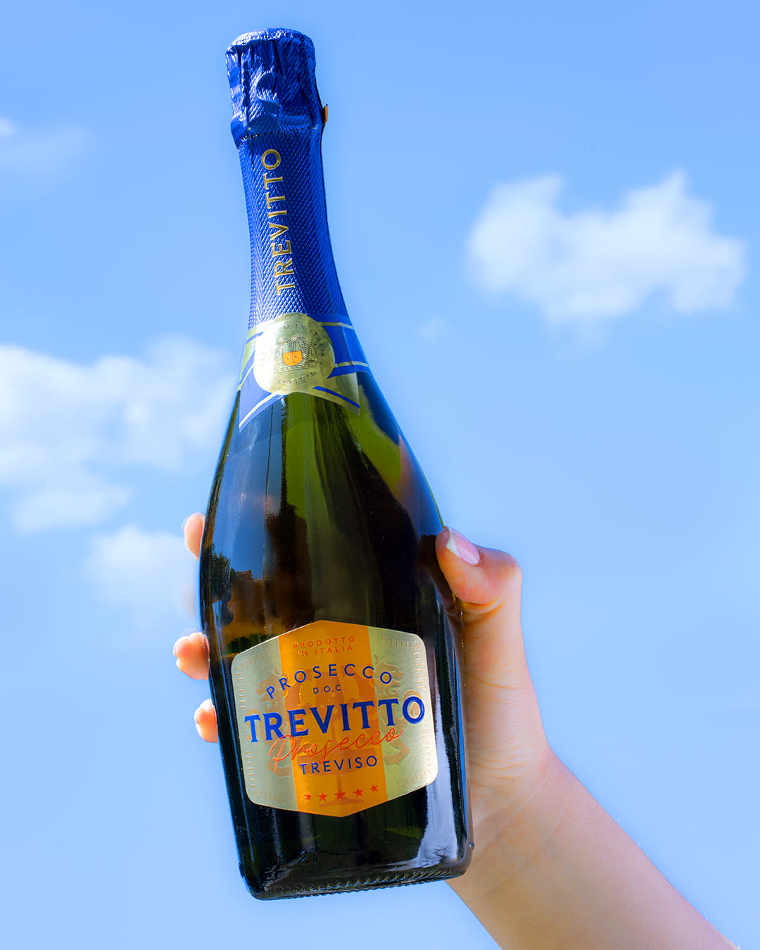
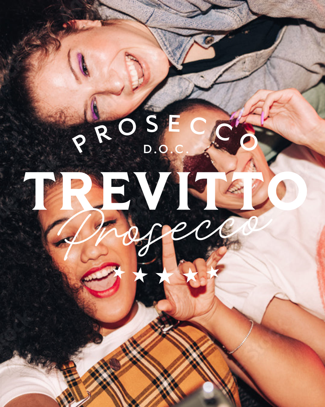
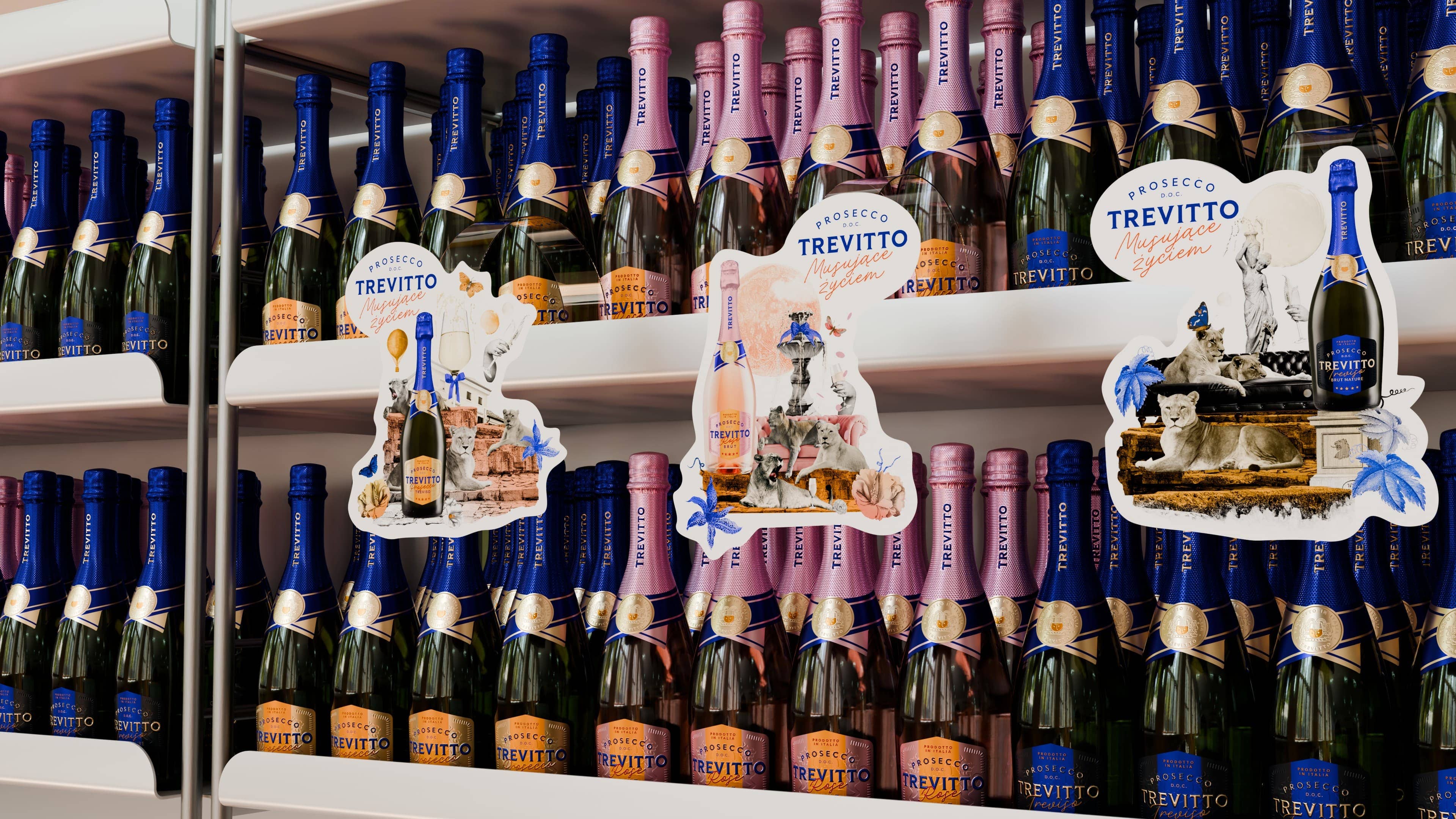
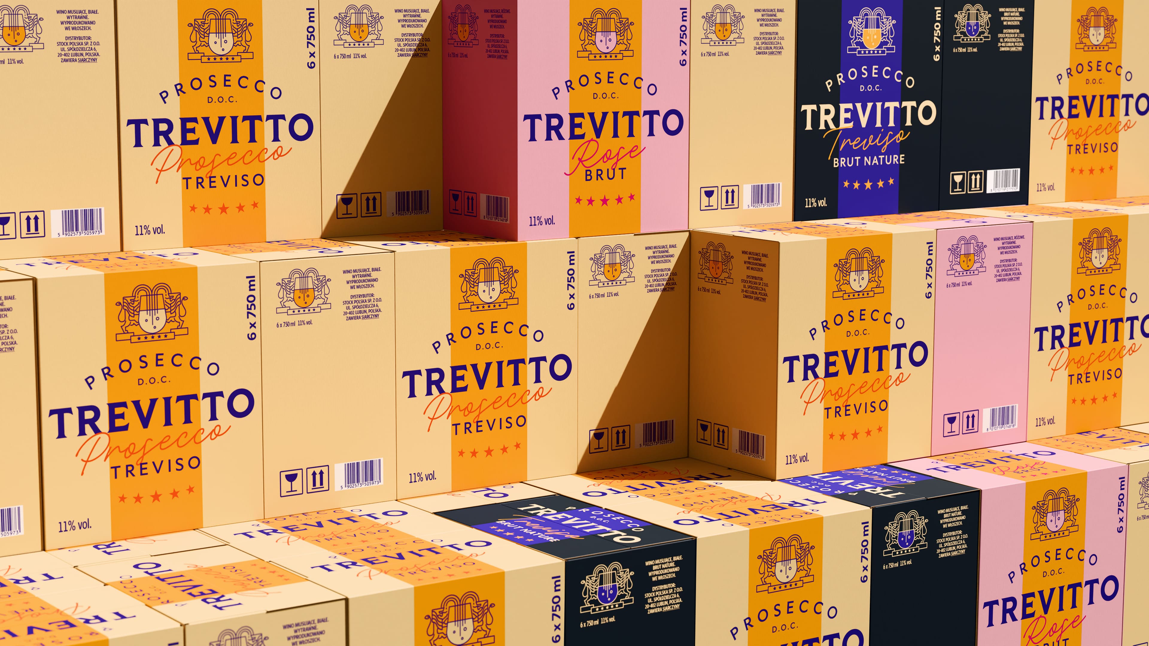
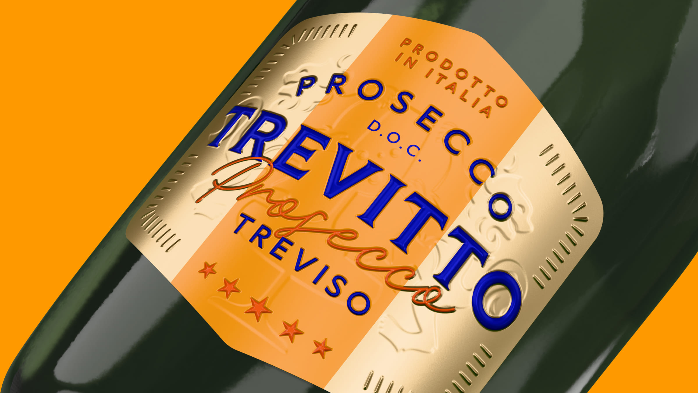
What was 3 steps to achieve this? 1. Italian essence: The name Trevitto evokes Italian origin – referring to the Treviso region – and the Italian dolce vita, carefree living with a touch of luxury. The color azzurro, tied to Italian history and culture, the House of Savoy dynasty, and Italian national sports teams, was also key. 2. Breaking conventions: Prosecco Trevitto is subversive. It breaks away from the exclusivity and inaccessibility of luxury. It creates a world ćian luxury—“on my terms and yours,” on the terms of… Trevitto. It blends traditional elements with modern form and plays with layered meanings. Here, the protagonists are not proud heraldic lions but full-blooded lionesses. Here, there’s no need for a special occasion, fancy dress, or a suit. Everyday life can be celebrated—on the couch with friends. Because Trevitto is social—what matters is the moment, the encounter, the time spent together, the small celebration. 3. Three lionesses: They symbolize the three flavors of Trevitto (Treviso, Rosé, Brut).
The whole creates a blend that truly Sparkles with Life – perfectly aligned with the brand’s claim, proving that a celebration and a sip of luxury don’t require a suit or a special place.
CREDIT
- Agency/Creative: BNA/ Brand New Attitude
- Article Title: BNA Reimagines Prosecco Branding with Trevitto’s Contemporary Italian Flair
- Organisation/Entity: Agency
- Project Type: Packaging
- Project Status: Published
- Agency/Creative Country: Poland
- Agency/Creative City: Warsaw
- Market Region: Europe
- Project Deliverables: 3D Design, Brand Creation, Brand Design, Brand Identity, Brand Strategy, Packaging Design, Product Naming
- Format: Bottle
- Industry: Food/Beverage
- Keywords: brand identity, packaging, bevarages, brand strategy, brand identity
-
Credits:
Strategy: Dominika Sikora
Branding & Packaging: Tanya Roslyak
Branding & Packaging: Zuza Rawa
Naming: Michał Majczak
3D Visualizations / DTP: Jacek Stankiewicz
Key Visuals (KV): Aurelia Milach
Key Visuals (KV): Dominika Sikora
Design: Bogusław Gelba
Design: Liza Orlowska
Project Management: Maria Łapiedon


