


Once you hop, op, op… you can’t stop. That’s the playful spirit at the heart of Hopopop, a bold new brand of refreshingly mouth-watering ice pops designed to shake up the frozen treats aisle. But this isn’t just a snack—it’s a movement. In a world increasingly driven by conscious consumption, Hopopop emerged to meet a growing demand for indulgent products that don’t compromise on health, quality, or flavour.
The creators of Hopopop envisioned a better kind of ice pop. One that doesn’t hide behind artificial flavours, added sugars, or synthetic colouring, but instead celebrates nature’s own palette. They’ve redefined what “fruit-packed” really means by crafting recipes that are made with up to 90% or more of real fruit—and nothing else. The result is a treat that’s as clean as it is crave-worthy: no nasties, no gimmicks, just the good stuff.
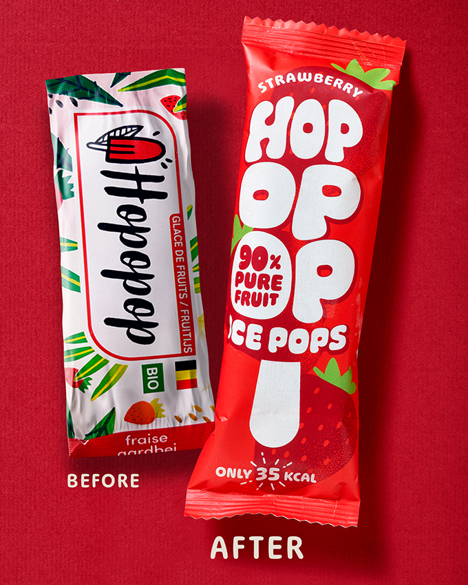
Despite this powerful product story, Hopopop’s original visual identity didn’t reflect its energetic mission or innovative offering. The brand name—rhythmic, joyful, and inherently memorable—was bursting with potential. So when we took on the redesign, it was clear where the creative energy needed to go: straight into building a brand world as vibrant and alive as the pops themselves.
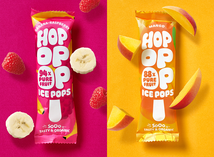
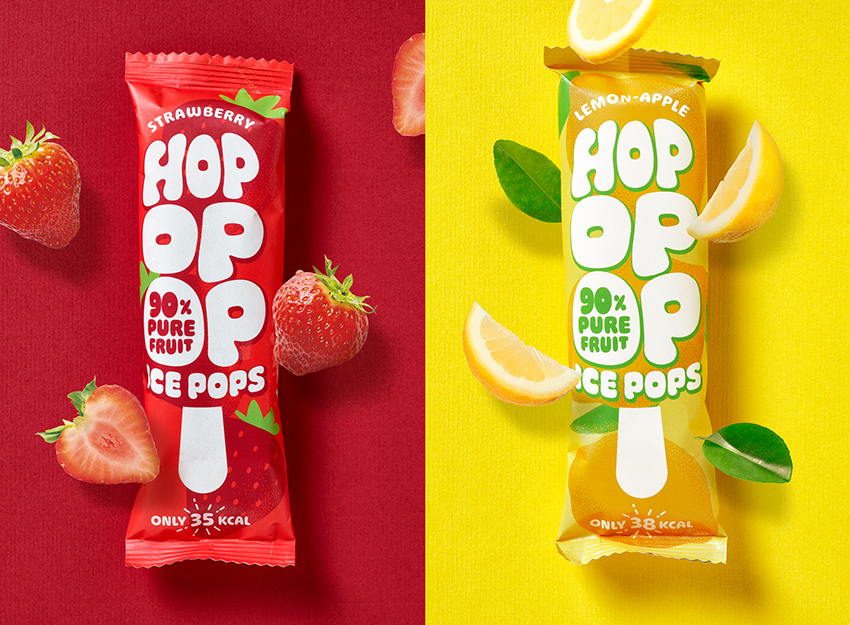
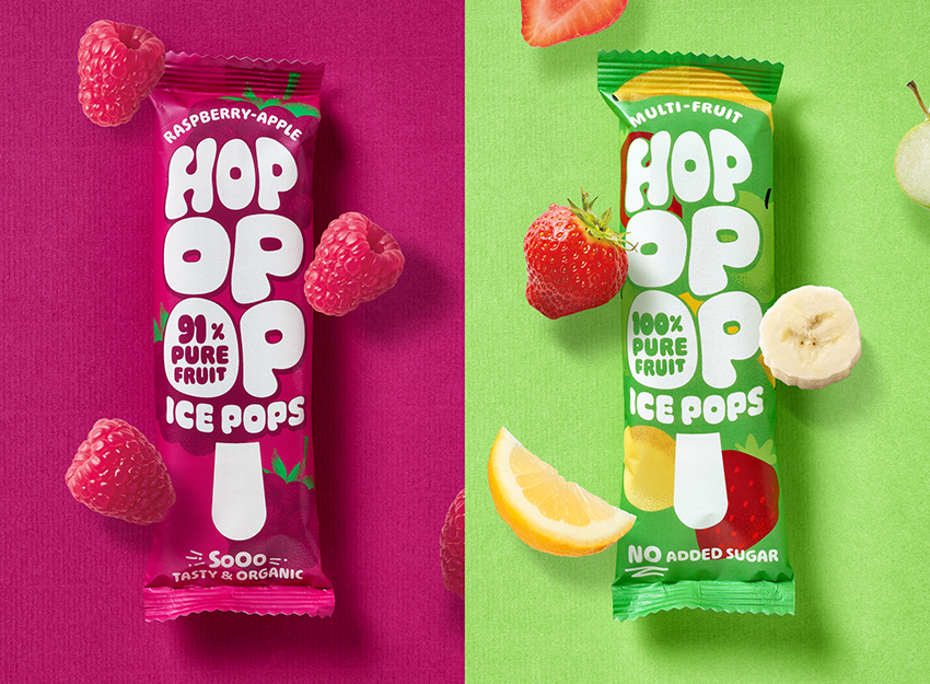
We approached the redesign with one core idea in mind: if Hopopop is full of character and goodness, then the packaging should be too. Our solution was a typographically expressive design system built entirely around the unique rhythm and bounce of the name. The wordmark itself became the hero—a dynamic, hand-crafted type treatment that visually “pops” with energy, echoing both the playful sound of the brand and the product’s refreshing burst of flavour.
In terms of visual language, we let the real fruit ingredients shine. Bright, saturated tones inspired by mangoes, berries, citrus, and tropical blends drive the colour palette, while each variant leans into its fruit identity with juicy, eye-catching cues. The brand system extends across formats, from single-stick packaging to multipacks, ensuring Hopopop is consistently bold, approachable, and unmissable—no matter where it lives.
Crucially, the structure of the packaging also echoes the product itself. With a vertical layout that mimics the shape of the ice pop and illustrations that feel hand-touched and organic, Hopopop delivers a shelf presence that’s just as refreshing as the snack inside. Every element—from typography to tone of voice—was carefully considered to reinforce the brand’s central promise: indulgence without compromise.
By creating a visual identity that’s as pure, fun, and flavour-forward as the product, we’ve positioned Hopopop to confidently compete with major commercial brands that often over-promise and under-deliver. In contrast, Hopopop over-delivers on both taste and transparency—without the sugarcoating.
This rebrand isn’t just a visual uplift—it’s a full expression of what Hopopop stands for: real ingredients, real joy, and a whole lot of pop. From the first glance to the final bite, this is a brand experience designed to stick with you—because once you hop, op, op… well, you really can’t stop.
CREDIT
- Agency/Creative: Quatre Mains
- Article Title: Brand Redesign for Hopopop – A Fruity Revolution That Pops Off the Shelf
- Organisation/Entity: Agency
- Project Type: Packaging
- Project Status: Published
- Agency/Creative Country: Belgium
- Agency/Creative City: Donk
- Market Region: Europe
- Project Deliverables: Brand Creation, Brand Design, Brand Identity, Brand Redesign, Packaging Design
- Format: Wrap
- Industry: Food/Beverage
- Keywords: Branding, Packaging design, Icecream, Festival
-
Credits:
Creative farmer: Patrick De Grande


