


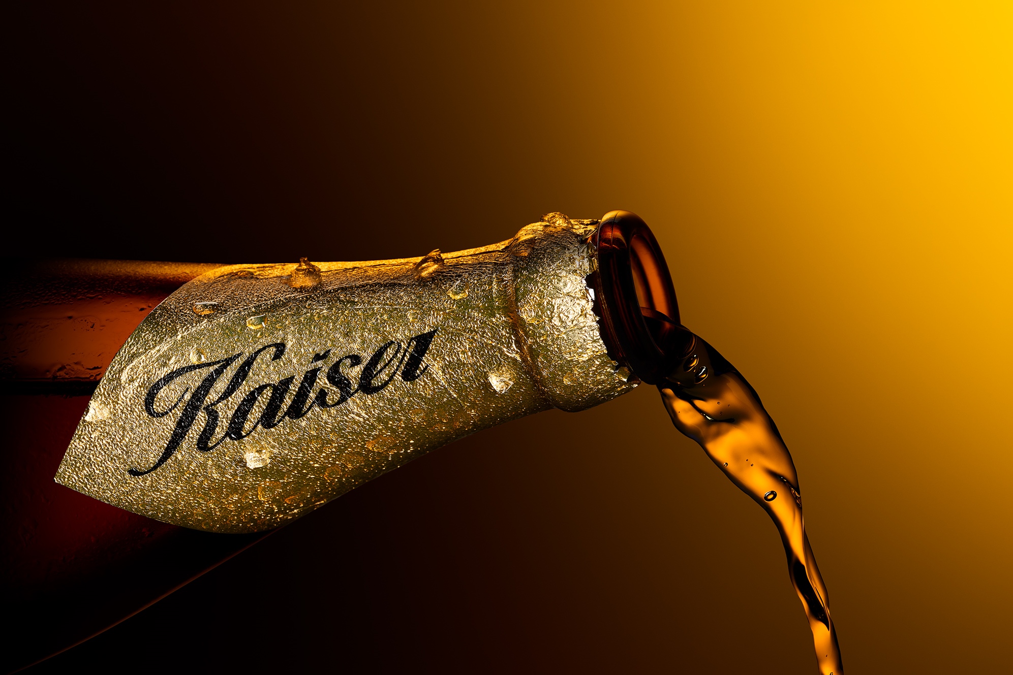
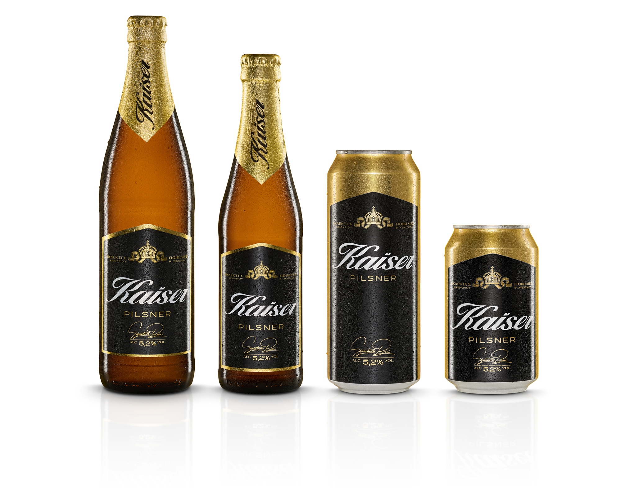
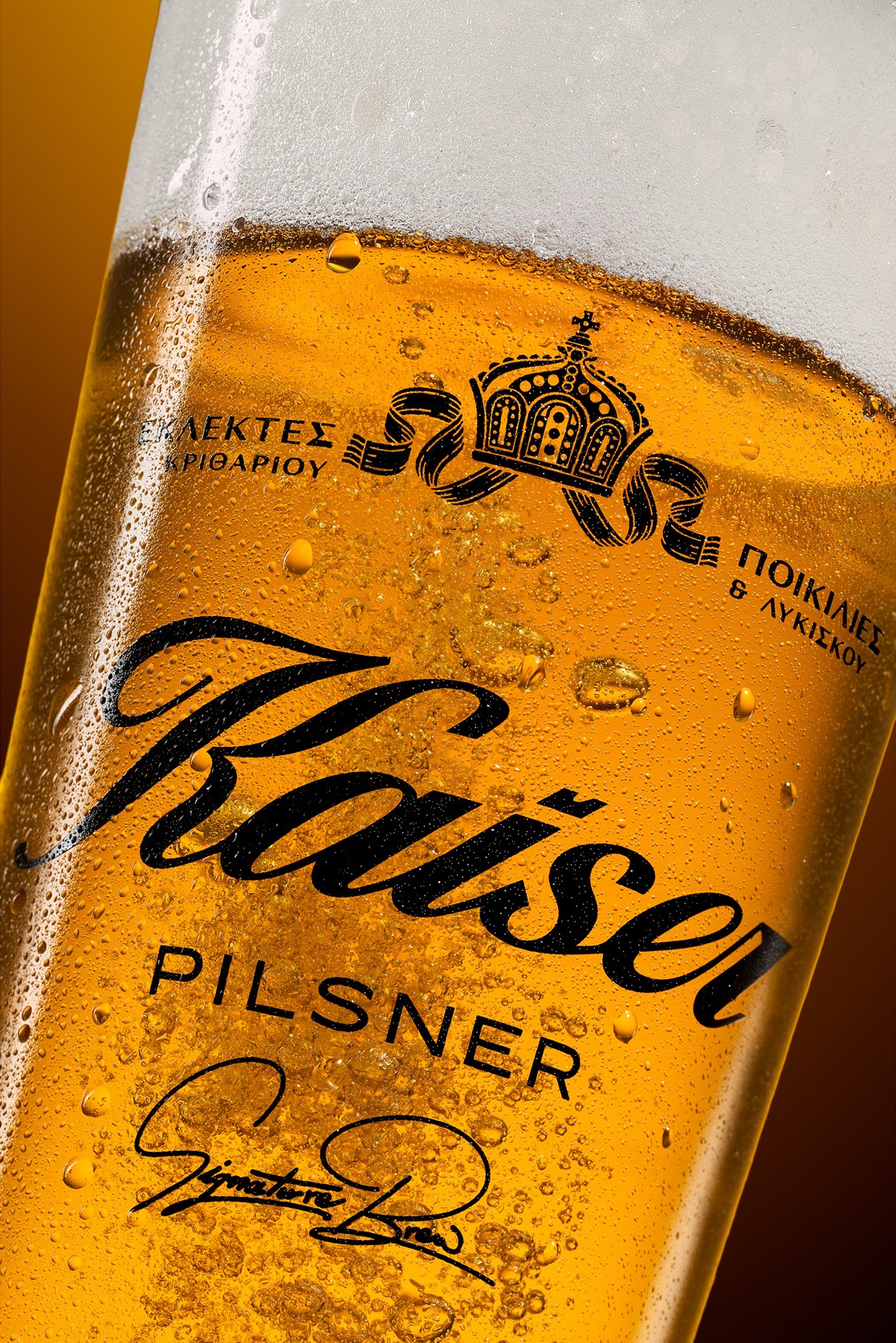
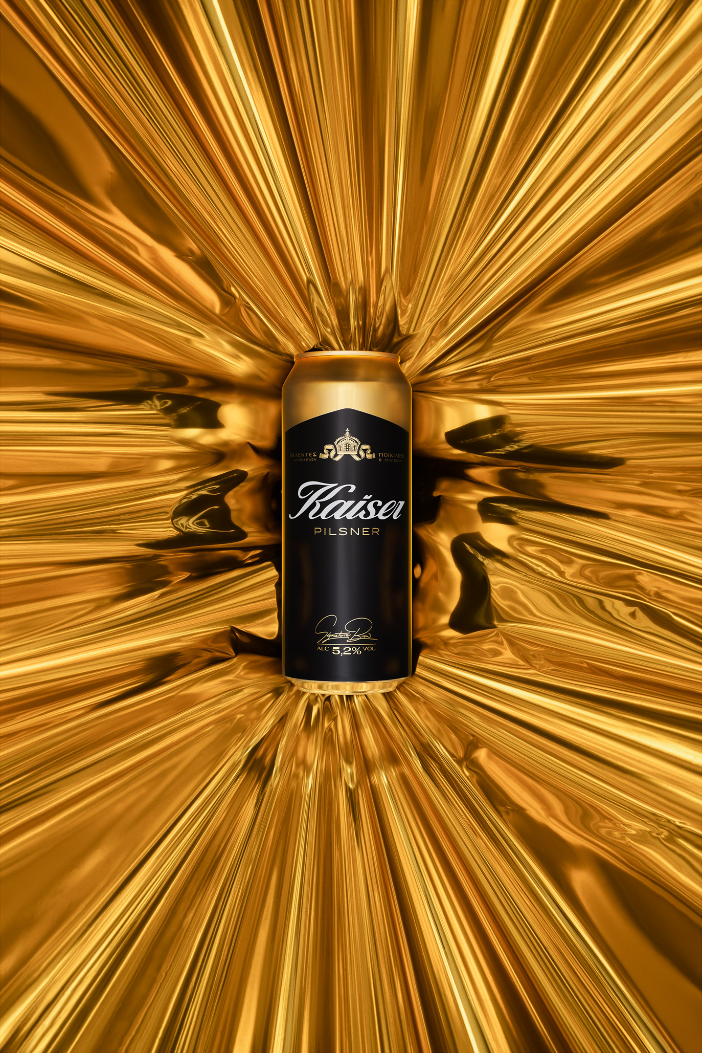
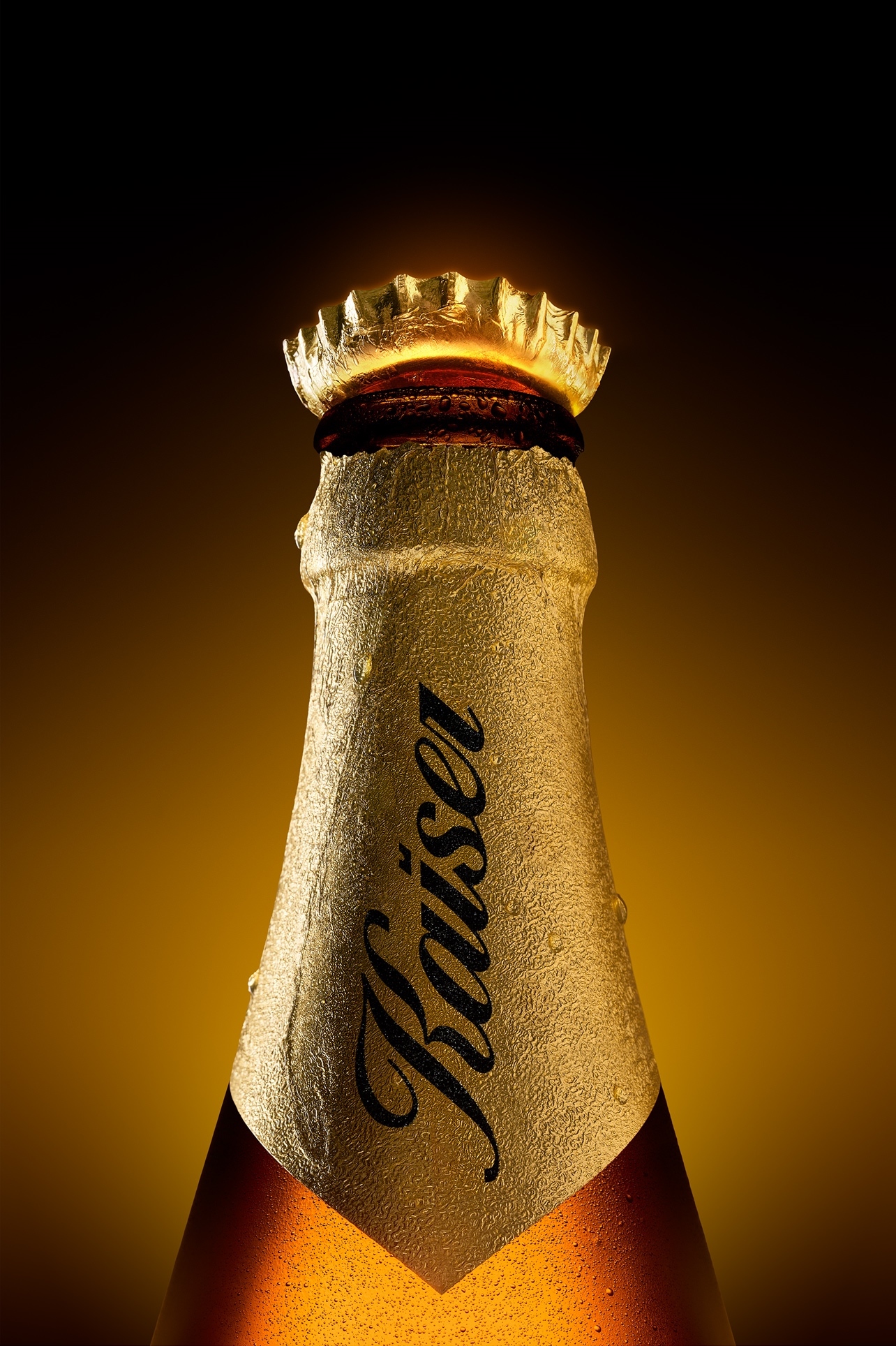
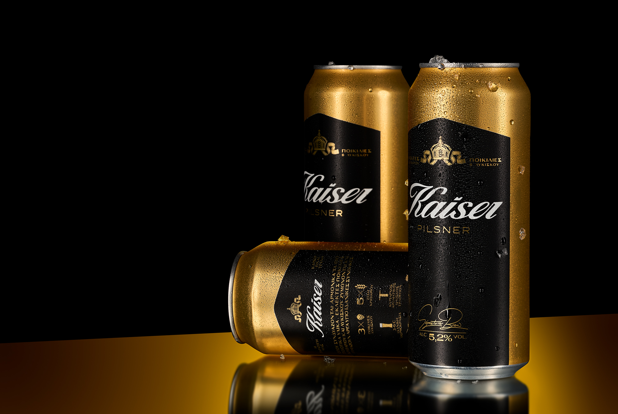
A redesign at 45° / Kaiser is a beer based on consistency – from day one. Consistent in taste, in character, in presence. When Olympic Brewery entrusted us with the redesign of the brand’s visual identity, the goal was not to change what Kaiser is, but to reveal it more clearly: a beer with nothing over the top, nothing superfluous – just clarity and confidence. Building on that, we revisited the brand’s assets with precision and respect, striking a balance between design and function. Kaiser wordmark had always carried a sense of movement – a subtle italic tilt, almost instinctive, like a natural flow. In the new design, that motion is made intentional: the wordmark now sits at a precise 45° angle – the same angle used to pour the perfect glass of Kaiser. A design choice that connects the visual with the ritual. A reminder that behind the label, there’s a whole experience.
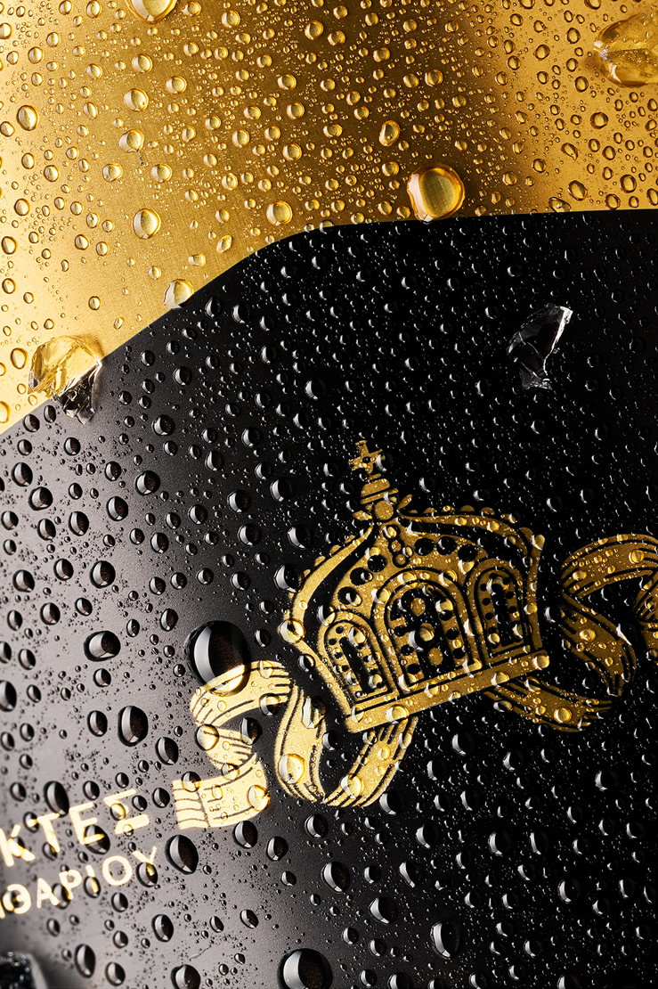
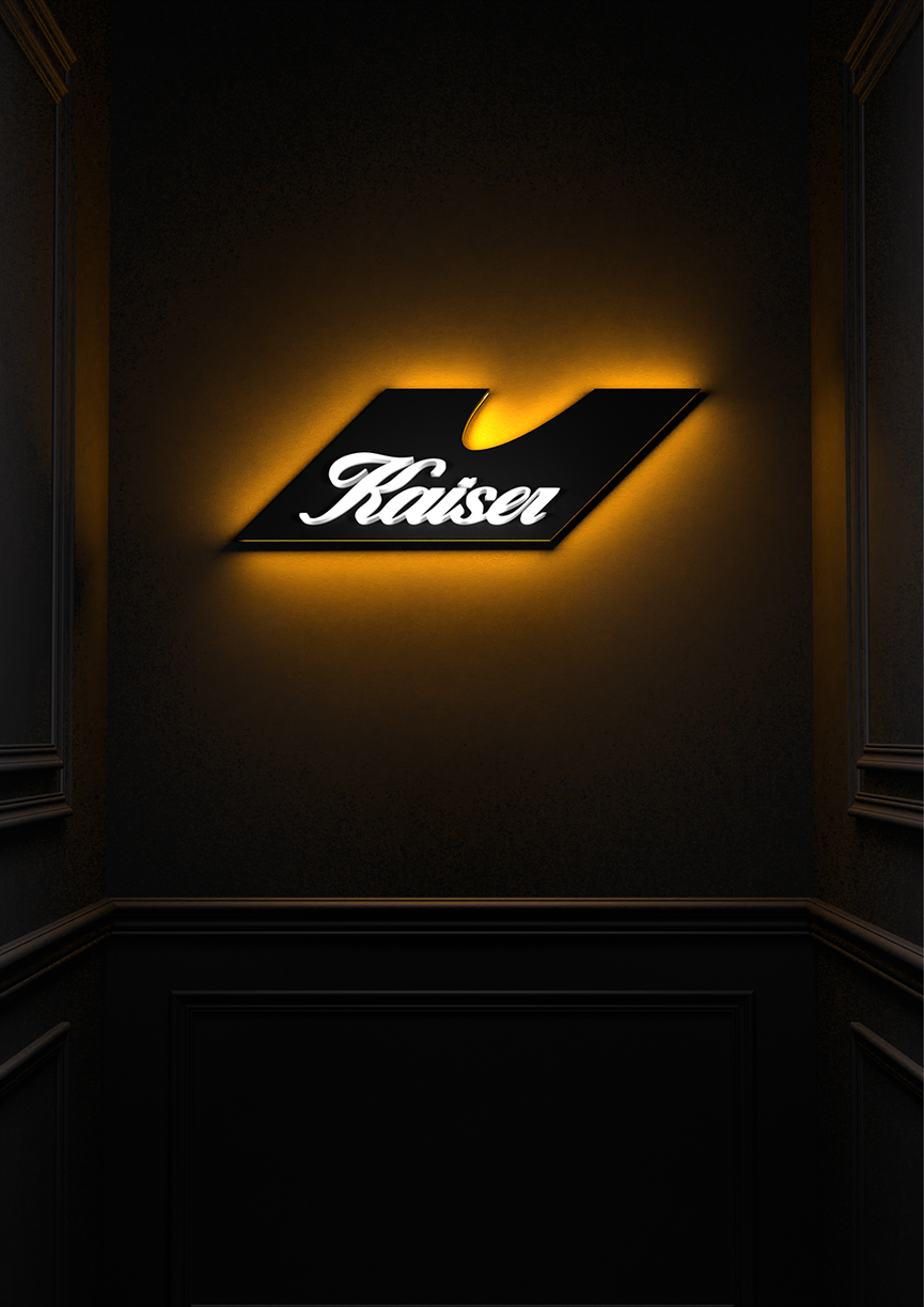
Kaiser’s signature crown – one of its most iconic brand assets – also needed to be reimagined. With careful refinement, we simplified its forms and lines, giving it new clarity while preserving its weight and recognizability, even at the small sizes where it often appears. We also introduced the tagline Signature Brew – a reference to Kaiser’s distinct flavor profile. Crafted as a handwritten signature, it reinforces the promise of quality that has always defined the brand. A reintroduction that brings new meaning to every design detail – without losing the brand’s DNA. A quiet evolution that speaks louder the closer you look.

CREDIT
- Agency/Creative: Luminous Design Group
- Article Title: Luminous Design Group Redefines Kaiser with a Visual Tilt Toward Ritual
- Organisation/Entity: Agency
- Project Type: Packaging
- Project Status: Published
- Agency/Creative Country: Greece
- Agency/Creative City: Luminous Design Group / Athens
- Market Region: Europe
- Project Deliverables: Brand Identity, Packaging Design
- Format: Bottle, Can
- Industry: Food/Beverage
- Keywords: beer packaging design, redesign identity
-
Credits:
Design: Design


