


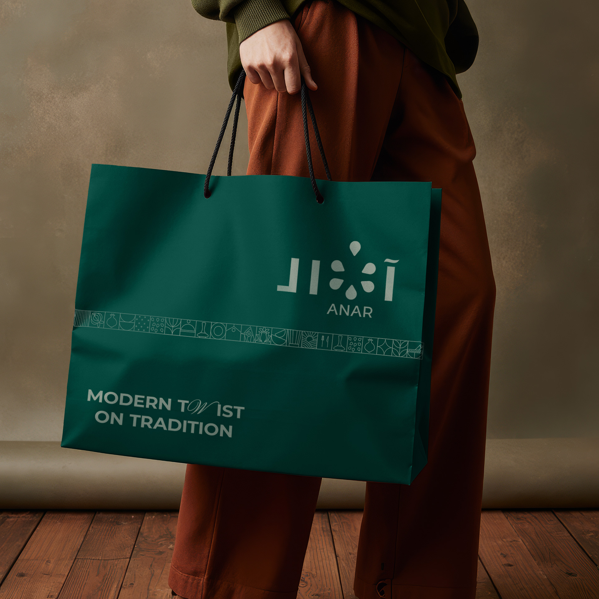
In a world increasingly shaped by globalization and homogenized aesthetics, Anar emerged not simply as a restaurant, but as a cultural counterpoint—a statement about identity, memory, and modernity. Based in Baghdad, Anar is not just another fine-dining destination; it is a bold reimagination of what it means to eat Iraqi food in the 21st century. Its brand is deeply rooted in history, yet it consciously pushes toward the future, drawing from the richness of Eastern traditions and elevating them through contemporary design, cuisine, and experience. At the heart of Anar’s identity lies a core belief: heritage is not static—it is living, evolving, and capable of becoming something strikingly new. The brand journey began with a single, poetic word: Anar. Derived from the Kurdish word for pomegranate, Anar was chosen with intention and cultural sensitivity. The pomegranate is more than a fruit—it is a historical motif across the Middle East, known for symbolizing abundance, prosperity, fertility, and divine blessing. Found in ancient Mesopotamian art, Persian poetry, and Levantine folklore, it is a visual and culinary thread that connects generations and geographies. Choosing a Kurdish term in an Iraqi context was itself a progressive branding decision—one that nods to the diverse ethnic and cultural makeup of Iraq. It honors Kurdish identity within a unified national framework, subtly positioning Anar as a space of cultural inclusivity, openness, and plurality. Phonetically, “Anar” has a melodic, soft strength—it is easy to remember, pleasurable to pronounce, and distinctly different from typical Arabic restaurant names. In a competitive market where restaurants often default to generic or cliché naming conventions, Anar instantly sets itself apart—both visually and vocally.
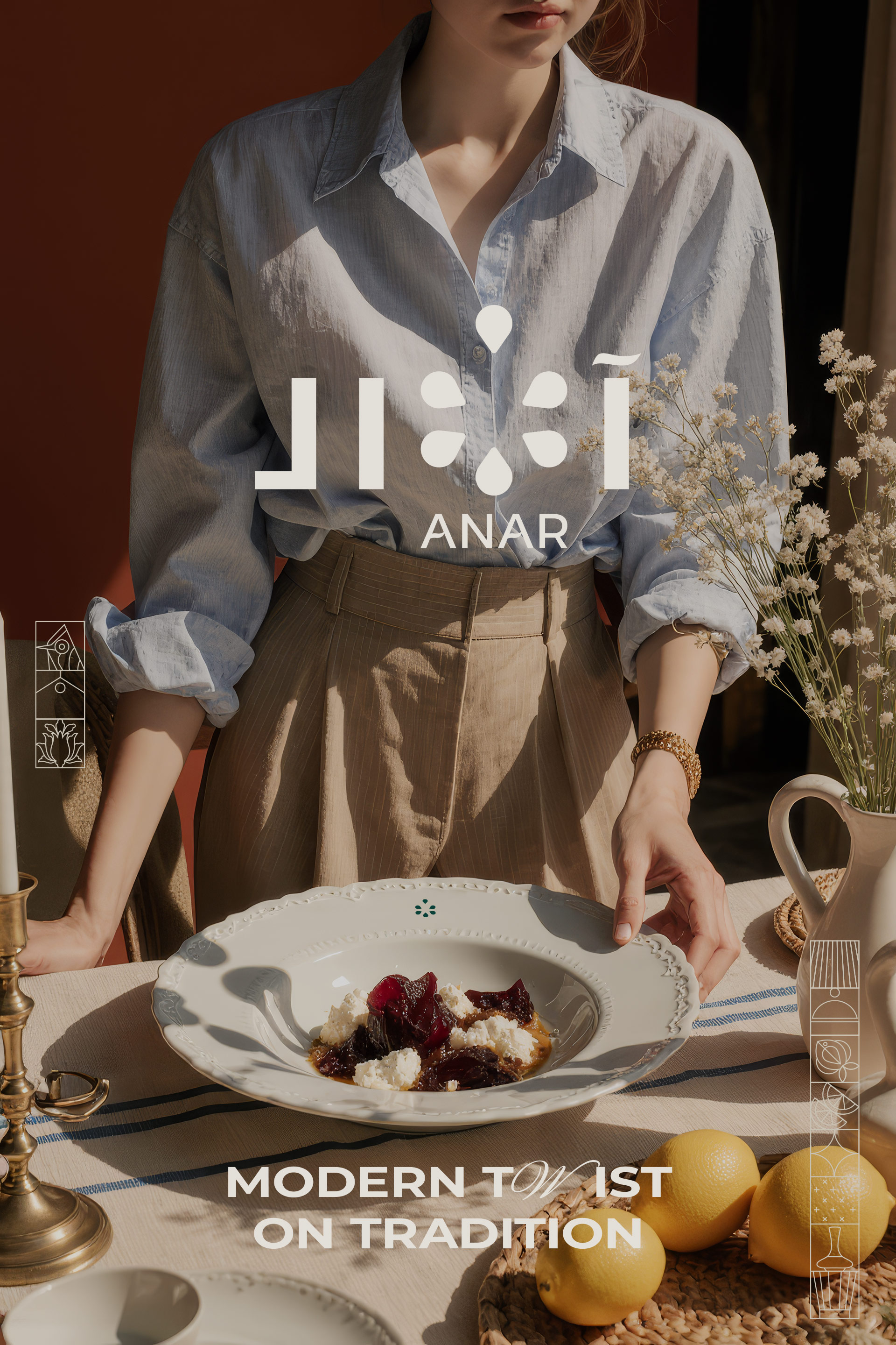
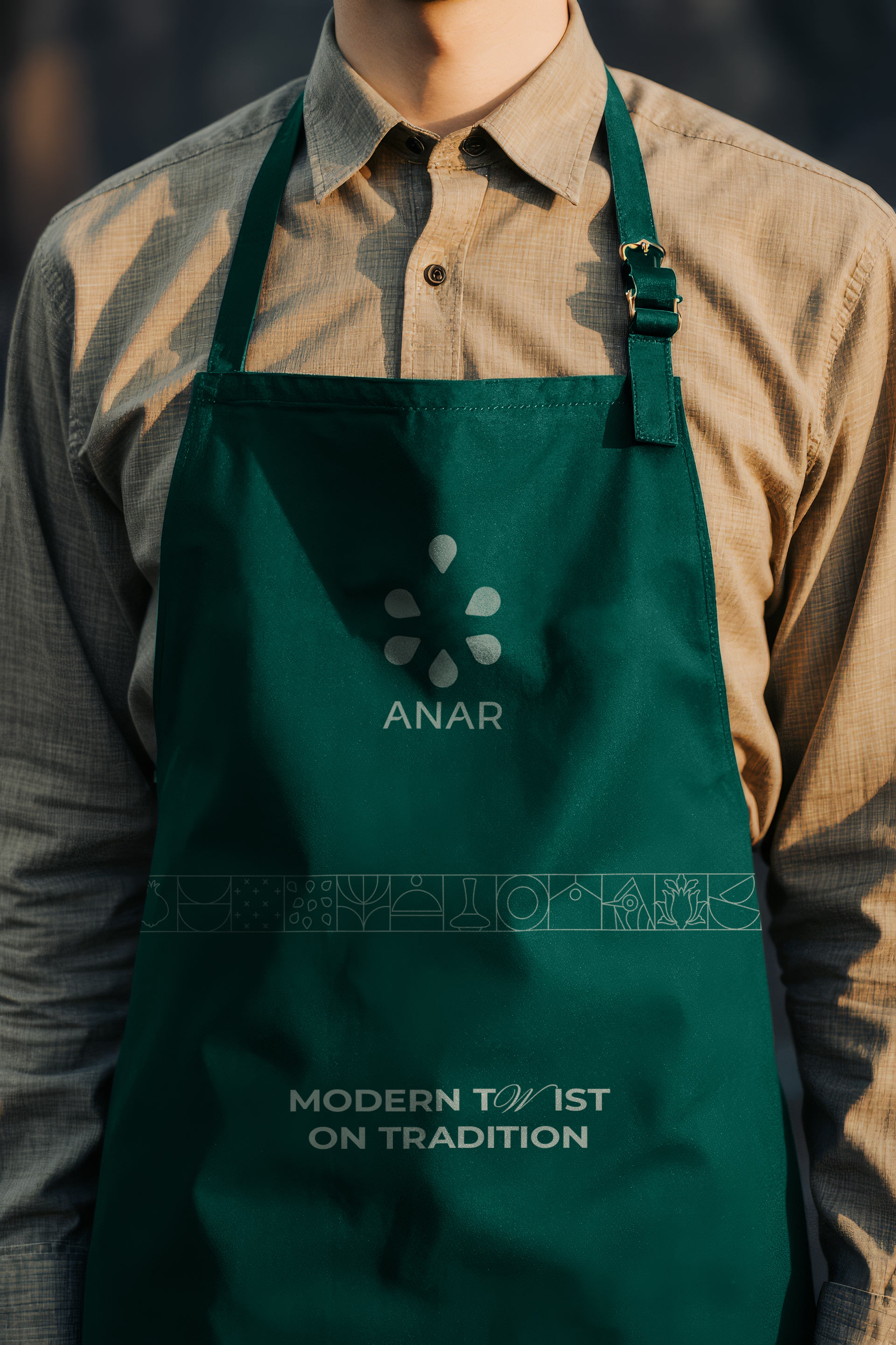
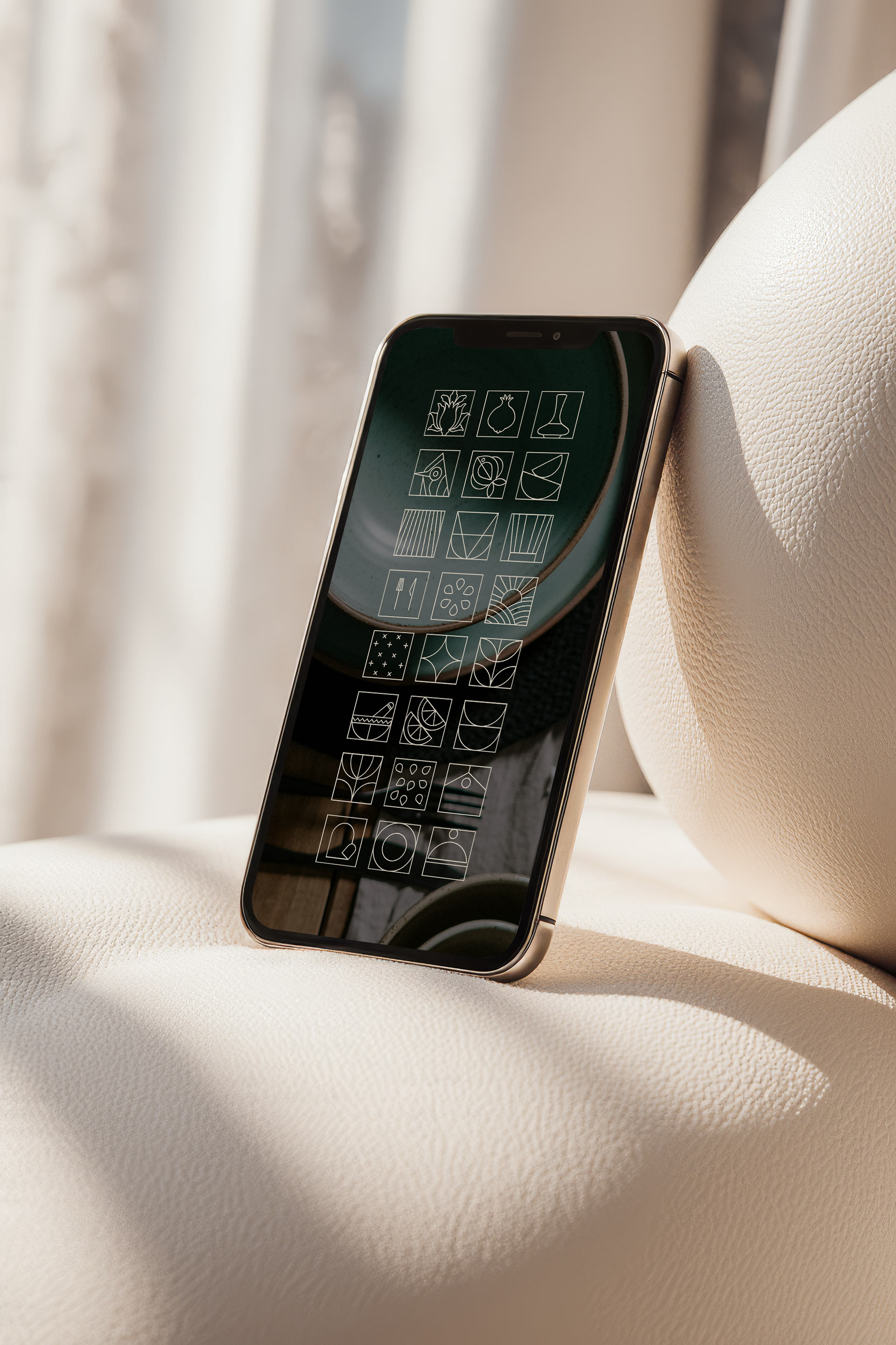
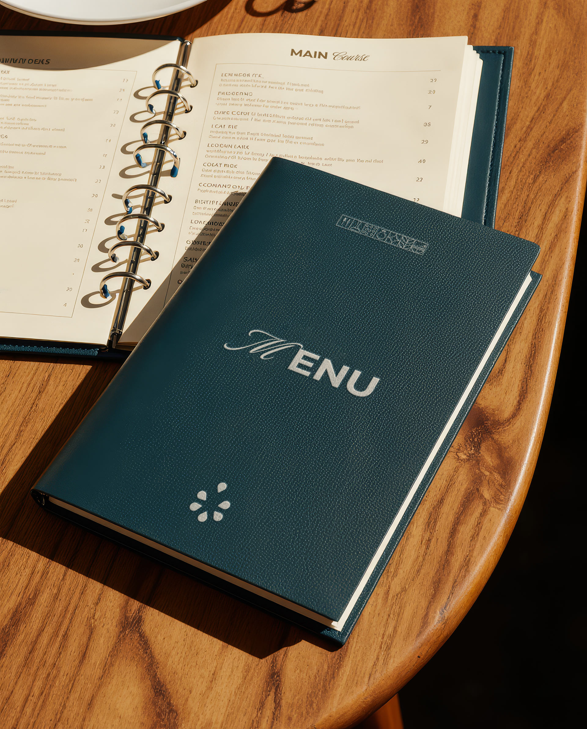
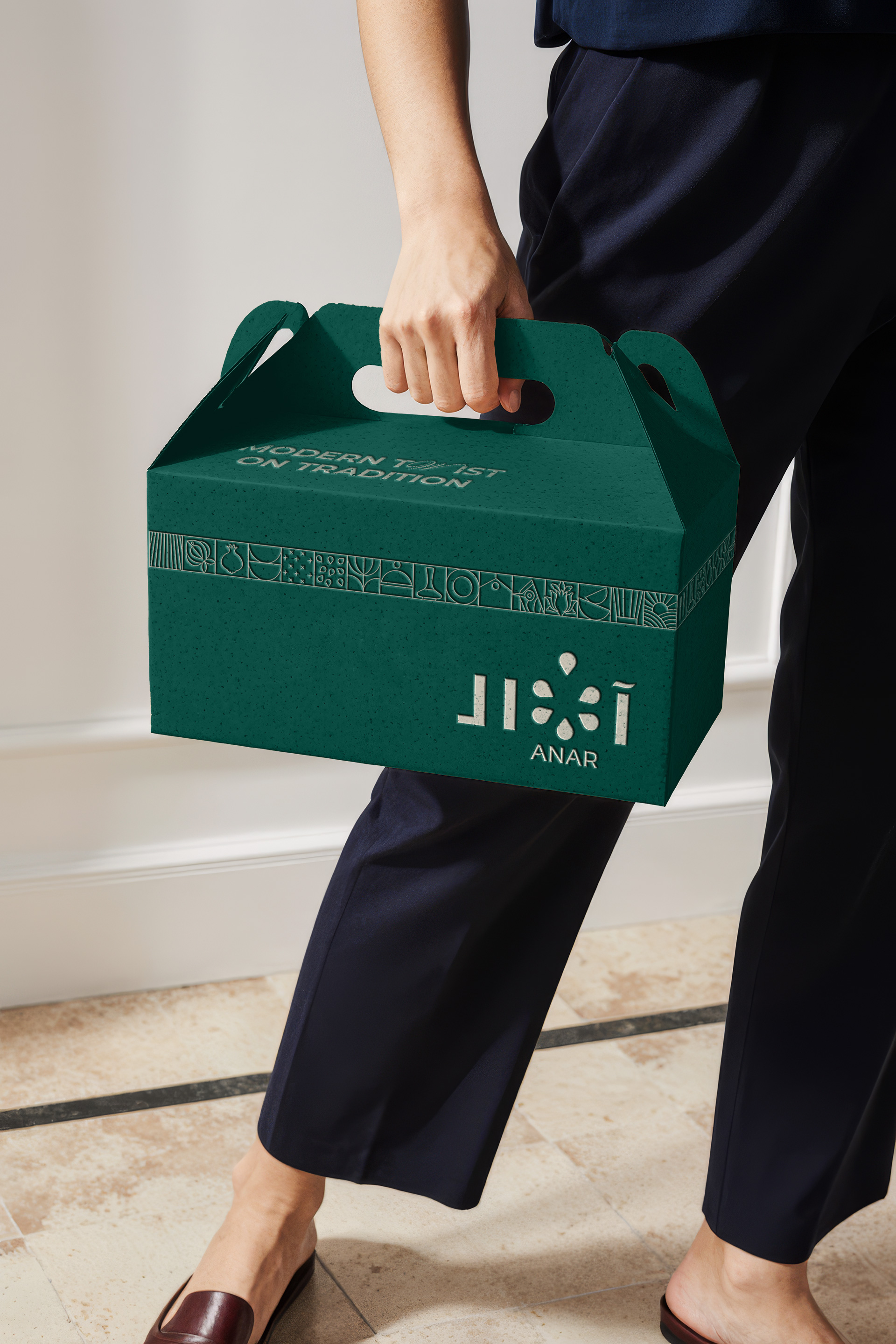
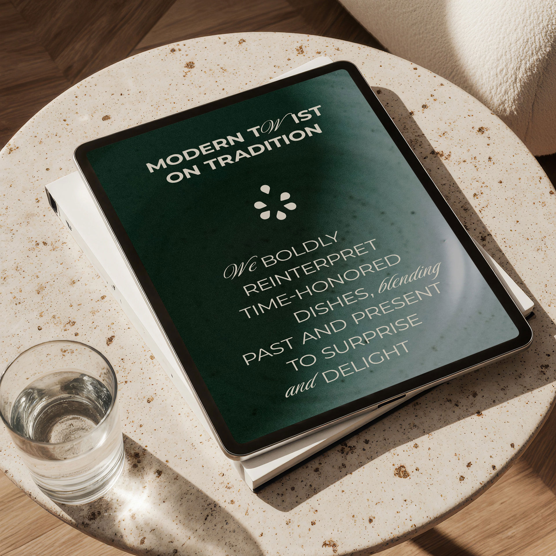
Anar was born from a vision to reintroduce traditional Middle Eastern and Iraqi food not as nostalgic relics of the past, but as expressions of contemporary life. In a region often caught between tradition and change, Anar navigates this tension beautifully. The restaurant does not reject the old—rather, it revives and reinvents it. The core culinary philosophy is: “Traditional flavors, modern experiences.” Dishes are designed with familiarity in mind but plated with elegance. Ingredients are sourced locally where possible, celebrating the land and its abundance. Each menu item is a reinterpretation—a respectful remix that surprises without alienating. This duality between respect and reinvention is what defines Anar’s identity. From a branding standpoint, this concept needed to be translated visually, verbally, and experientially across every touchpoint: from logo to lighting, from music to menu, from typography to tone of voice. The visual identity of Anar balances modern minimalism with cultural depth. Inspired by the geometry and symmetry of Islamic design, the visual system incorporates subtle, abstracted motifs from pomegranate patterns and traditional Kurdish and Mesopotamian art forms—presented in a clean, restrained manner. The color strategy is built on symbolism: pomegranate red conveys richness, appetite, warmth, and sensuality; deep aubergine or ink tones add depth and contrast, evoking sophistication; brushed gold is a nod to luxury and heritage, used minimally for elegance; warm beige and sandstone provide grounding neutrality, inspired by local architecture and materials. A combination of modern serif and clean sans-serif typefaces was chosen to reflect Anar’s duality—the serif type representing heritage and refinement, while the sans-serif reinforces clarity and contemporary sensibility. In Arabic usage, great care was taken to ensure the typography retained cultural authenticity while aligning with modern design standards. Custom-designed pomegranate motifs were stylized into decorative yet minimal graphics—adaptable for packaging, menu borders, digital icons, and wall treatments. These motifs also create a sense of familiarity without over-the-top ornamentation.
Anar’s spatial branding is just as considered as its visual identity. The architecture and interior design were developed to evoke a sense of calm luxury, inspired by traditional Eastern design elements such as arches, handmade tiles, and brass accents—all reinterpreted with a modern sensibility. Lighting is warm and ambient, designed to feel intimate yet upscale. Materials include textured plaster, natural woods, and matte ceramics—tactile elements that reflect both craft and care. Music is curated to match the brand’s ethos—a blend of Eastern instrumental melodies and modern fusion tracks. Live music nights and special events transform the restaurant into a cultural salon, not just a place to eat. Every element—from plateware to playlist—contributes to an atmosphere where the guest feels both at home and somewhere entirely new. On social media, Anar’s brand voice is elegant, poetic, and subtly playful—like an old soul with a modern spirit. The goal is not only to market food but to tell stories—about ingredients, origins, moments of joy, and customer experiences. The visual grid is carefully curated: rich textures, deep shadows, minimalist typography, and warm filters. Photography highlights the food in its natural beauty—no over-saturation or heavy editing—combined with lifestyle shots that portray guests enjoying quiet, luxurious moments. Content categories include dish stories, origin or inspiration behind a menu item, moments at Anar spotlighting customers, occasions, or live events, flavors of home reimagined through showcasing traditional dishes with a twist, and pomegranate chronicles exploring cultural stories, proverbs, or folklore around the fruit and its symbolism.
Anar caters to a sophisticated, diverse audience: business professionals and VIPs seeking an upscale venue for meetings or client dinners; families looking for an elegant yet warm place to gather; young professionals and university students attracted to the fusion of authenticity and trendiness; tourists and diaspora Iraqis searching for a meaningful culinary and cultural experience. But deeper than demographics, Anar’s brand is designed to evoke specific emotional responses—nostalgia without cliché, sophistication without pretension, warmth without excess, and luxury with soul. In the Baghdad market, restaurants like Naranj, Nara, and Em Sherif Café have defined their own upscale niches. But Anar distinguishes itself by not mimicking Levantine or pan-Arab styles. Instead, it builds from Iraqi and Kurdish roots—using modern branding not to emulate the West, but to reframe the East. Anar doesn’t shout. It whispers. It doesn’t over-embellish. It refines. It doesn’t sell tradition as a tourist fantasy—it invites the guest to live it, taste it, and see it anew. Anar is not just branding for the sake of design—it is branding as cultural storytelling. It is an aesthetic, emotional, and culinary experience shaped by heritage and made relevant for today’s discerning customer. By reviving Eastern identity in a modern way, Anar reclaims space—for tradition, for artistry, for refinement. It is a restaurant. It is a brand. But more than that, it is a quiet revolution in how Iraq and the Middle East can see, taste, and design for themselves.


CREDIT
- Agency/Creative: Ziad Al Halabi
- Article Title: Ziad Al Halabi Elevates Restaurant Branding with the Cultural Narrative of Anar
- Organisation/Entity: Freelance
- Project Type: Identity
- Project Status: Published
- Agency/Creative Country: United Arab Emirates
- Agency/Creative City: Ziad Al Halabi
- Market Region: Middle East
- Project Deliverables: Art Direction, Brand Identity, Branding, Logo Design, Packaging Design
- Industry: Hospitality
- Keywords: Ziad Al Halabi, Anar Restaurant, Anar, Restaurant, Branding, زياد الحلبي, Iraq, Food.
-
Credits:
Creative Art Director, Graphic Designer: Ziad Al Halabi


