


Boiling point is the packaging brand of the soup sets.
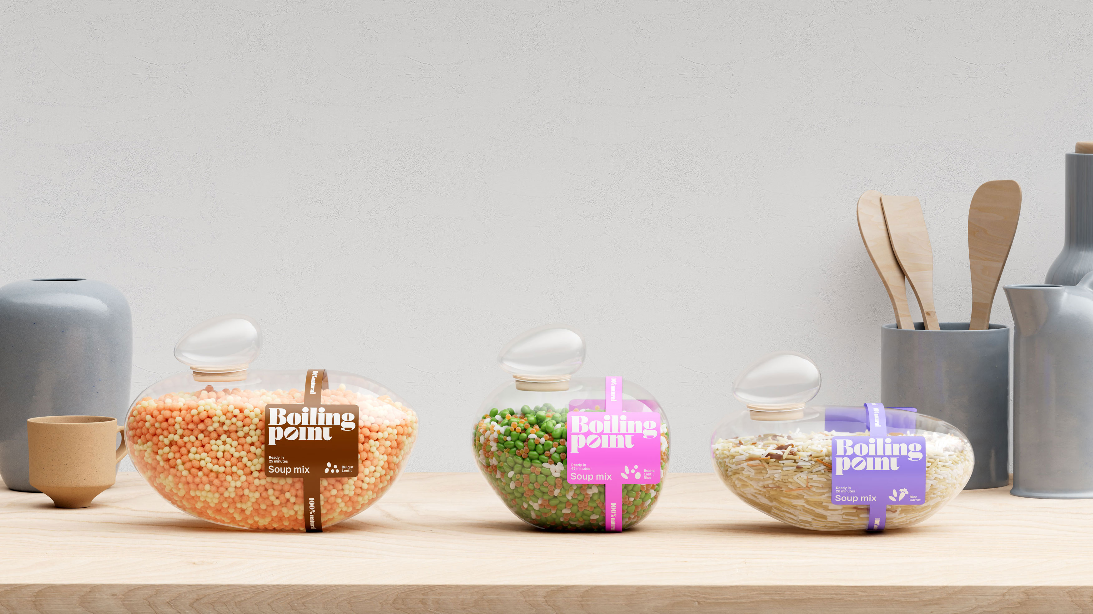
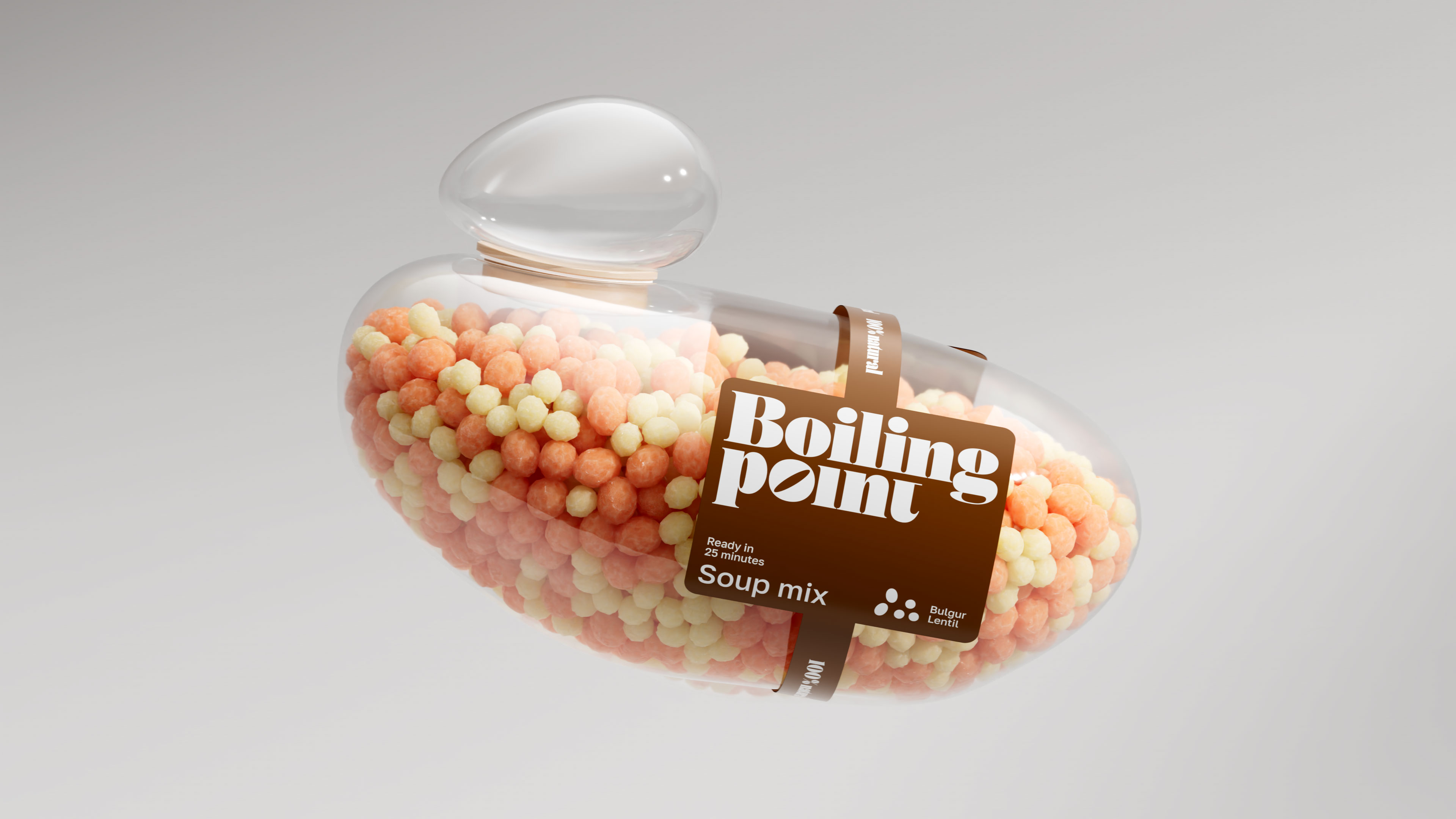
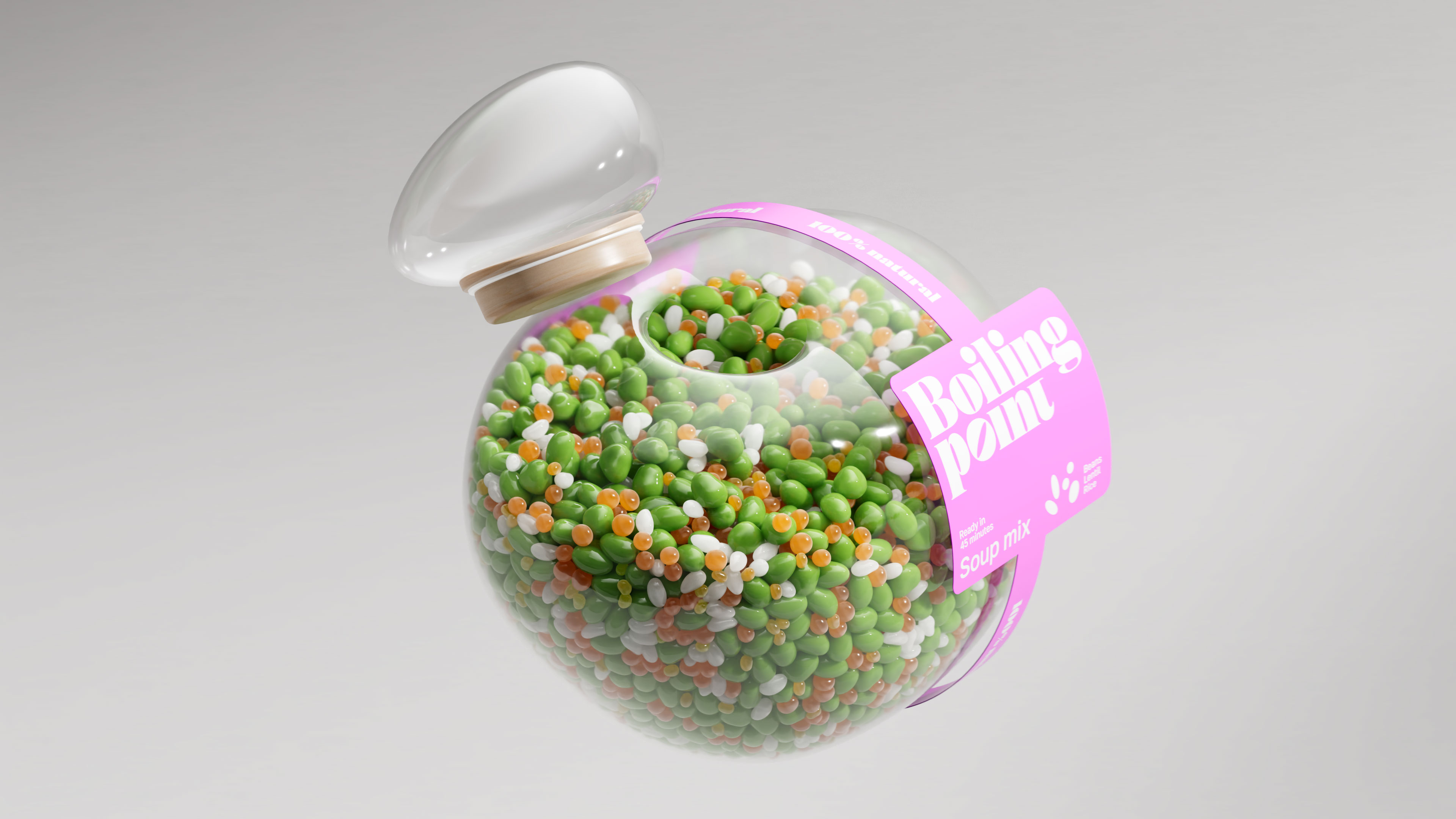
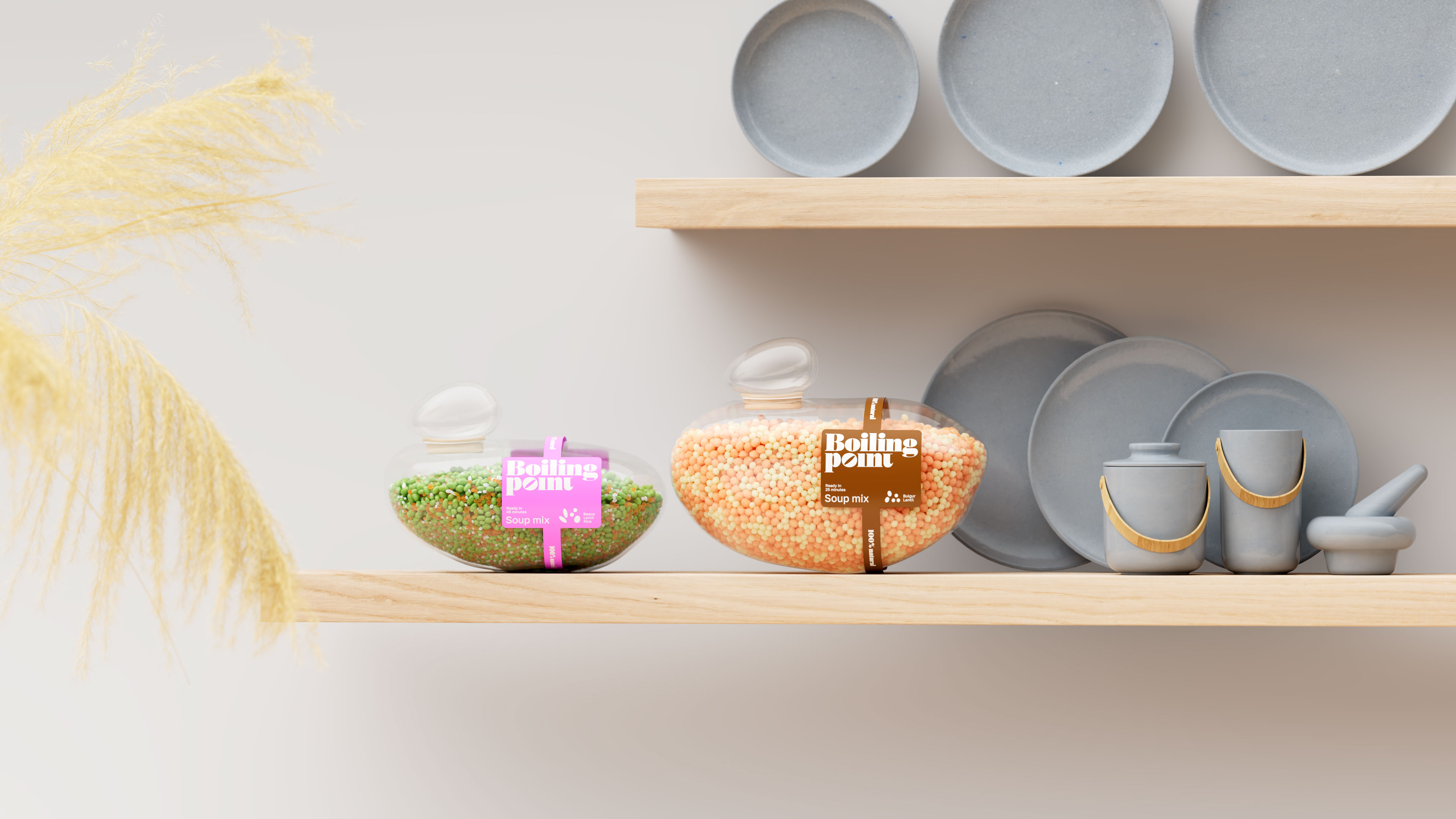
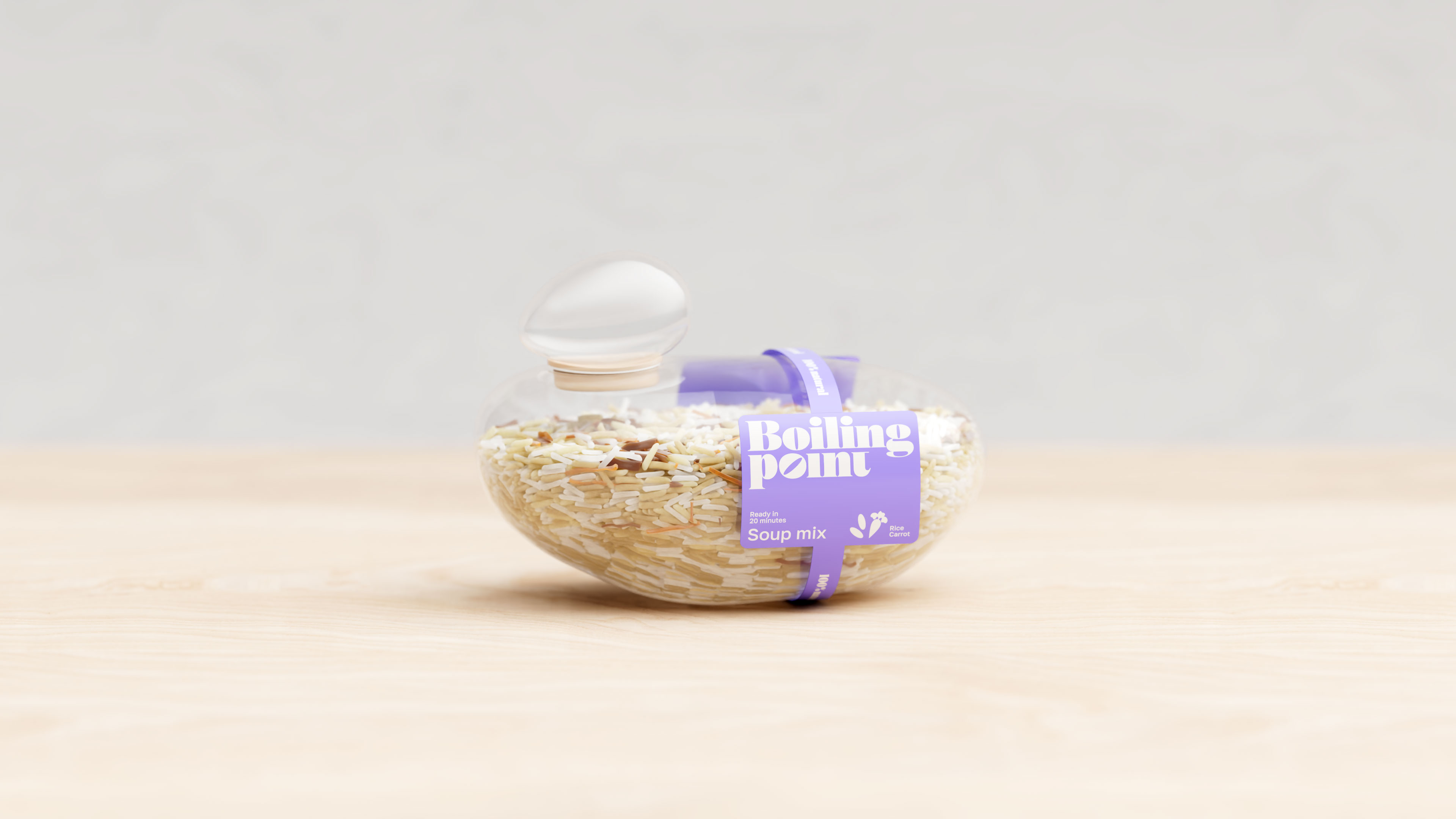
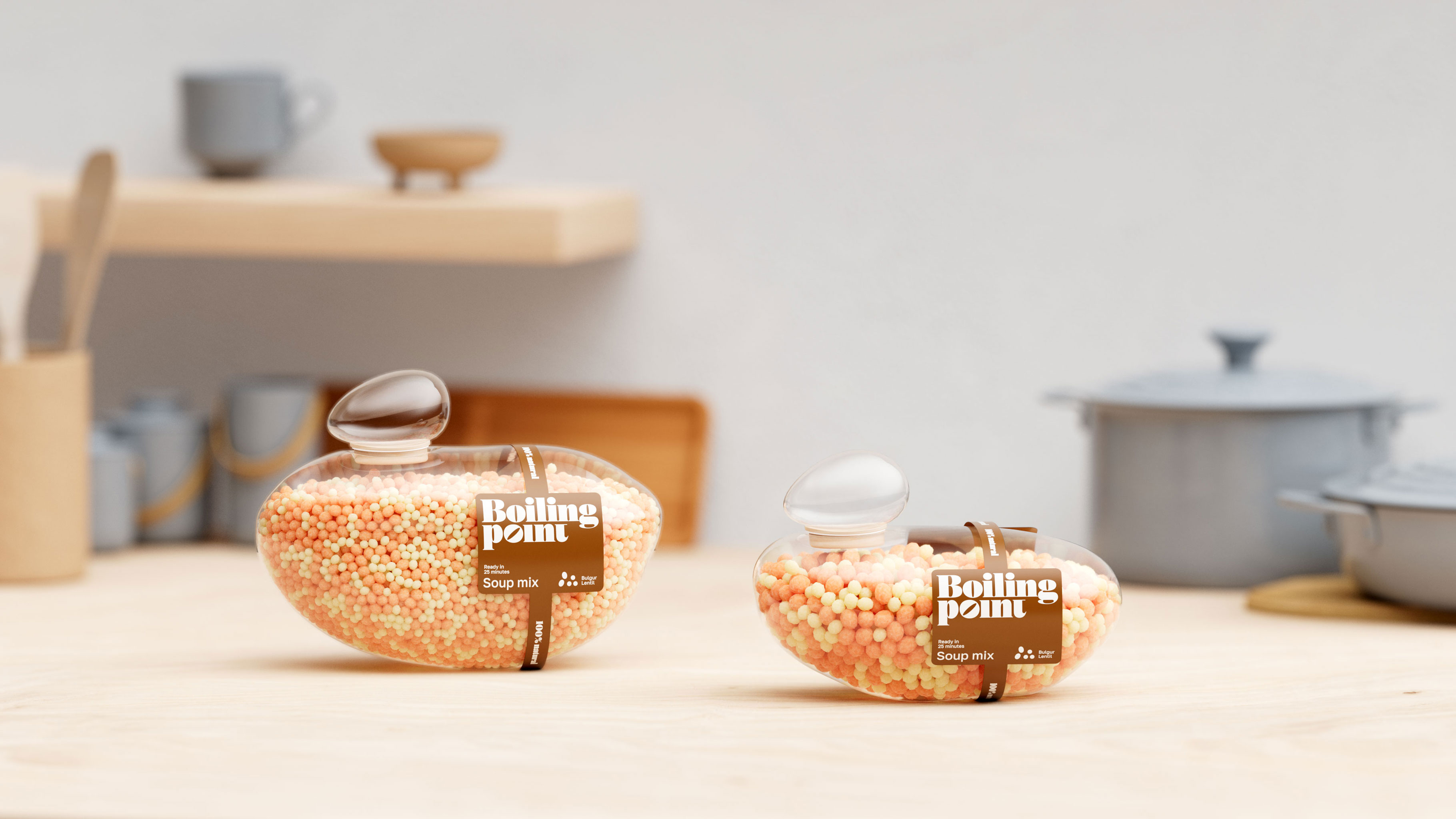
The packaging design for this innovative soup set draws its inspiration directly from the natural process of boiling — a fundamental step in soup preparation. When water reaches its boiling point, countless bubbles form and burst on the surface, creating a dynamic, ever-changing scene. These bubbles are not uniform; each one has its own unique, organic shape, reflecting the beauty and unpredictability of nature. Our packaging echoes this moment, capturing the fluidity and softness of boiling water through smooth, flowing contours that deliberately avoid perfect spheres, embracing the imperfect, natural forms that occur in real life.
This intentional design choice serves a dual purpose. Not only does the shape evoke the essence of the cooking process, but the materials selected for the packaging underscore a commitment to environmental responsibility. The texture and finish suggest naturalness and sustainability, signaling to consumers that this product respects the planet while focusing on the art of cooking.
At the heart of the design is Boiling point — the product’s clear window that prominently showcases the contents inside. Transparency here is key: it empowers consumers to make informed choices by visually assessing the quality and variety of cereals and soup ingredients contained within. This openness builds trust and highlights the fresh, wholesome nature of the product.
Convenience and flavor variety are also central to this concept. The soup sets come in three thoughtfully curated flavor combinations: Bulgur and Lentil; Beans, Lentil, and Rice; and Rice and Carrot. These blends have been carefully selected to cater to diverse palates, ensuring that everyone can find a mix that suits their taste preferences. Whether used as a quick addition to a meal or prepared as a full soup, these sets offer flexibility and ease, designed for today’s busy lifestyle where time and simplicity matter.
Understanding consumer needs further, the packaging is available in three size options: 300g, 150g, and 75g. This range allows users to choose the portion size that best fits their cooking habits, reducing waste and encouraging trial without commitment to large quantities. Smaller packages make it easier for consumers to experiment with new flavors and find their perfect serving size.
Sustainability is woven into every aspect of the product, from design to disposal. Once the last delicious portion is enjoyed, the packaging can be easily recycled, closing the loop and minimizing environmental impact. This approach aligns with growing consumer demand for eco-friendly solutions that do not compromise on quality or aesthetic appeal.
This packaging design has been recognized internationally, winning a Bronze Award at the prestigious Dieline Packaging Design Competition and a Silver Award at the London Design Awards. Additionally, it received honors at the Applied Arts Awards, further validating its excellence in creativity, functionality, and sustainability.
In sum, this packaging concept beautifully marries form and function: inspired by the natural rhythm of boiling water, crafted with an eye towards ecological mindfulness, and designed to enhance the consumer’s culinary experience with convenience, transparency, and choice. It is more than just a container — it is a reflection of a thoughtful approach to food, design, and the environment.
CREDIT
- Agency/Creative: Inna Efimova
- Article Title: Inspired by Nature: Boiling Point Explores Organic Form
- Organisation/Entity: Freelance
- Project Type: Packaging
- Project Status: Non Published
- Agency/Creative Country: Spain
- Agency/Creative City: Barcelona
- Market Region: Asia, Europe, North America, South America
- Project Deliverables: 3D Design, 3D Modelling, Art Direction, Brand Creation, Brand Design, Branding, Graphic Design, Packaging Design
- Format: Pot
- Industry: Food/Beverage
- Keywords: WBDS Creative Design Awards 2025/26 , Packaging Design. Branding Brand Identity. Graphic Design. Visual Identity. Product Packaging. Creative Packaging. Sustainable Design. Art Direction
-
Credits:
Art director, designer: Inna Efimova
3d artist: Vladimir Kuznetsov


